Quantcast
Channel: Newgeography.com - Economic, demographic, and political commentary about places
Viewing all 3795 articles
Browse latest View live

Millennials Ready to Play Key Role in Housing Market Recovery

$
0
0

Recent data from a survey commissioned by Better Homes and Garden Real Estate (BHGRE) suggests a pent up desire among 18-35 year olds to own a home of their own that could easily fuel a real estate boom for at least the rest of this decade. 

In contrast to predictions from some futurists that the Millennial generation, born 1982-2003, will be content to be lifelong renters, BHGRE’s survey found home ownership still ranked as young Americans’ most important definition of personal success.  Overall, three-fourths of those surveyed named home ownership as an indicator of having succeeded financially, more than seven times the number who named other major expenditures such as taking extravagant vacations, buying an expensive car, or owning designer clothing. Even among those living in the Northeast or in cities, seventy percent identified home ownership as the best indicator of having made it financially. This is fully in line with earlier studies by Pew Research that found home ownership was among the top three priorities in life for members of the Millennial generation.

Unlike comments often made about this generation by some of their elders, most Millennials didn’t express sentiments suggesting that they feel entitled to be simply handed this badge of success.  Seventy percent of those in BHGRE’s survey said they needed to possess the skills to own a home; only thirty percent said they “deserved it.” Respondents also made it clear they were prepared to sacrifice to achieve their dream of home ownership.  About sixty percent were willing to eat out less and/or only spend on necessities to save the money needed to buy a home. These sentiments were most strongly expressed by those who had grown up in a home  owned by their parents.  In addition, forty percent were willing to take a second job. And, almost a quarter  of the generation accused of  “failing  to launch”  were prepared to live with their parents for a couple of years to save the money they would need to own a piece of the American Dream.  

The collapse of the housing market that triggered the Great Recession also has made Millennials sophisticated, knowledgeable consumers when making decisions about how and when to purchase a home.  Rather than thinking they should buy a home as soon as they get married or qualify for a mortgage, seventy percent of BHGRE’s respondents said the time to buy a house is when a person can “afford it and maintain their lifestyle.” 

Millennials are careful consumers, as befits a group shaped by the most lengthy economic downturn in decades. Sixty-one percent suggested they would want to have a secure job before buying a house and more than half said people should wait until they had saved enough for the down payment before making such a purchase.  When asked to indicate the factors they would research in determining whether to buy a home, financial considerations were cited by a majority of the respondents.

They understand the power of money. Interest rates, home prices and how those two factors impacted their ability to secure a mortgage, all ranked much higher in importance than the type of neighborhood a house was in, school district ratings or foreclosure rates.  With the median sales price of both new and existing homes up almost five percent this year, Millennials are likely to jump into the market soon before it becomes too expensive for them to do so.      

These findings suggest the current policies of the Federal Reserve and its Chairman, Ben Bernanke to keep interest rates low in order to stimulate this key part of the U.S. economy are right on target. If home builders and sellers can tailor their offerings to these technologically sophisticated, family-oriented potential buyers, Millennials could well play an important role in reinvigorating the nation’s housing market, further spurring the nation’s recovery from the Great Recession.

Morley Winograd and Michael D. Hais areco-authors of the newly published Millennial Momentum: How a New Generation is Remaking America and Millennial Makeover: MySpace, YouTube, and the Future of American Politics and fellows of NDN and the New Policy Institute.

Homes image by BigStock.


Where Americans Are Moving

$
0
0

The red states may have lost the presidential election, but they are winning new residents, largely at the expense of their politically successful blue counterparts. For all the talk of how the Great Recession has driven people — particularly the “footloose young” — toward dense urban centers, Census data reveal that Americans are still drawn to the same sprawling Sun Belt regions as before.

An analysis of domestic migration for the nation’s 51 largest metropolitan statistical areas by demographer Wendell Cox shows that the 10 metropolises with the largest net gains from 2000 through 2009 are in the Sun Belt, led by Phoenix, and followed by Riverside-San Bernardino, Calif.; Atlanta; Dallas-Ft. Worth; and Las Vegas.

Migration has slowed from a high of nearly 2 million annually in 2006 to less than 800,000 last year, but the most recent numbers show that the Sun Belt states, though chastened by the recession, are far from dead, as often alleged. This part of America, widely consigned to what the Bolshevik firebrand Leon Trotsky called the “dustbin of history” by Eastern pundits, somehow manages to continue to draw Americans seeking opportunities, in particular from the large coastal metropolitan regions.

Migration data for the most recent one-year period available, July 2010 t0 July 2011, show the Great Recession has shaken the rankings up quite a bit within the circle of fast-growth regions. The biggest winner has been Texas. The Lone Star state boasts four of the 10 metro areas with the largest net migration gains for the past two years.  Dallas ranks first, followed by Austin in third place, Houston in fifth and San Antonio in eighth. In contrast, some of the growth leaders over the 2000-09 period, notably Las Vegas, and to a lesser extent Phoenix, have tumbled considerably in the rankings. The lesson here: a strong economy has to be based on something more than gaming, tourism and home construction. Energy, technology, manufacturing and trade are far preferable as an economic base.

Also posting strong net migration gains for 2010-11 were Miami (second place), Washington, D.C. (sixth), and Seattle (ninth). In each of these areas, economic conditions appear to have improved. The once disastrous condo glut in the Miami area, which includes Dade, Broward and Palm Beach counties, has begun to clear up as foreign buyers pour into the region. Taxpayer-funded Washington is surging with new jobs and the highest incomes in the land. Seattle continues a long-term evolution toward the healthiest of the blue-state private economies. San Francisco, a consistent big loser for the last decade, jumped to 19th, presumably as a result of the current dot.com bubble.

Another huge turnaround can be seen in New Orleans, which ranked a dismal 43rd for 2000-09 as residents fled not only Katrina but a stagnant, low-wage, corruption-plagued economy. But in our 2010-11 ranking, the Crescent City surged to a respectable 16th, one of the biggest migration turnarounds in the country.

How about the biggest losers? From 2000-09, the metropolitan areas that suffered the biggest net domestic migration losses resemble something of an urbanist dream team: New York, which saw a net outflow of a whopping 1.9 million citizens, followed by the Los Angeles metro area (-1,337,522), Chicago, Detroit, and, despite recent improvements, San Francisco-Oakland. The raw numbers make it clear that California has lost its appeal for migrants from other parts of the U.S., and has become an exporter of people and talent (and income).

And despite the cheap money Bernanke-Geithner policies of the past few years that have benefited giant banks centered in the bluest big cities, people continue to leave these areas.  The 2010-11 numbers show the deck chairs on the migratory titanic have stayed remarkably similar, with New York still ranking first among the 51 biggest metro areas for net migration losses, followed by Chicago, Los Angeles, Detroit and Philadelphia. In most of these cases only immigration from abroad, and children of immigrants, have prevented a wholesale demographic decline.

What can we expect now? It seems clear that the urban-centric policies of the Obama administration have not changed Americans’ migration patterns. The weak recovery has slowed migration, but expensive, overregulated and dense metropolitan areas continue to lose population to lower-cost, less regulated and generally less dense regions. This may speed up as recent tax hikes squeeze the hard-pressed middle class and if, as appears likely, the social media bubble continues to deflate.

If the economy somehow gains strength, it may only serve to further accelerate these trends. The incipient recovery in housing prices seems likely, at least in places like California and the Northeast, to create yet another bubble. This will give people more incentive to move to less expensive areas, particularly those who can cash in by selling a house in a pricier city and moving to a less expensive one. The differential in housing costs between New York and Tampa-St. Petersburg now stands at historic highs, and near peak bubble highs between Los Angeles and Phoenix; the traditional growth states are looking more attractive all the time for people looking to make quick money in an economy with shrinking opportunities elsewhere. This includes the massive wave of aging boomers, many of whom may see selling a house in California or the Northeast as a way to make up for less than adequate IRAs. The combination of low prices and warmer weather in the past has proven an irresistible one for those retiring or simply down-shifting their careers. This appeal is likely to grow as the senior population expands.

Other demographic factors could further drive this trend. As the millennial generation ages and starts looking for places to buy homes and raise families, many will seek out places that are both affordable and offer better economic opportunities. These will tend to be in the South and Southwest, particularly Texas, and Plains States metro areas such as Oklahoma City.

Finally we can expect immigrants, particularly from Asia, to continue to seek out housing bargains and new opportunities primarily in the Sun Belt states, as our recent study of changing Asian settlement patterns revealed. More will be shifting from the high-priced, low-growth big metros for opportunity cities such as Houston, Dallas-Fort Worth, Raleigh and Charlotte.

Overall we can  expect domestic migration to pick up, and to follow the well-trodden path from the great cities of the Northeast and California to the Sun Belt’s  resurgent boom towns. This may be bad news to many urban pundits and big city speculators, but it also should create new opportunities for more perceptive, and less jaded, investors.


2010-2011 Net Domestic Migration for the Nation's 51 Largest Regions
Rank by Net FlowMetropolitan AreaNet FlowRate Per 1,000 ResidentsRank by Rate
1Dallas-Fort Worth-Arlington, TX39,0216.0410
2Miami-Fort Lauderdale-Pompano Beach, FL36,1916.439
3Austin-Round Rock-San Marcos, TX30,66917.471
4Tampa-St. Petersburg-Clearwater, FL27,1579.683
5Houston-Sugar Land-Baytown, TX21,5803.5816
6Washington-Arlington-Alexandria, DC-VA-MD-WV21,5173.8015
7Denver-Aurora-Broomfield, CO19,5657.597
8San Antonio-New Braunfels, TX19,5158.974
9Seattle-Tacoma-Bellevue, WA17,5985.0713
10Riverside-San Bernardino-Ontario, CA15,1313.5417
11Charlotte-Gastonia-Rock Hill, NC-SC13,7787.746
12Raleigh-Cary, NC13,26211.532
13Atlanta-Sandy Springs-Marietta, GA12,4192.3318
14Portland-Vancouver-Hillsboro, OR-WA11,3885.0712
15Orlando-Kissimmee-Sanford, FL10,3944.8214
16New Orleans-Metairie-Kenner, LA10,1538.595
17Nashville-Davidson--Murfreesboro--Franklin, TN9,3235.8111
18Oklahoma City, OK8,7466.908
19San Francisco-Oakland-Fremont, CA5,8801.3522
20Phoenix-Mesa-Glendale, AZ5,5851.3224
21Pittsburgh, PA3,7401.5920
22Jacksonville, FL2,9112.1519
23Sacramento--Arden-Arcade--Roseville, CA2,8561.3223
24Columbus, OH2,2191.2026
25Indianapolis-Carmel, IN1,9401.1027
26Louisville/Jefferson County, KY-IN1,8861.4621
27Richmond, VA1,5461.2225
28Salt Lake City, UT9150.8028
29San Diego-Carlsbad-San Marcos, CA8160.2629
30Minneapolis-St. Paul-Bloomington, MN-WI5360.1630
31Baltimore-Towson, MD-1,341-0.4932
32Boston-Cambridge-Quincy, MA-NH-1,627-0.3631
33Birmingham-Hoover, AL-2,452-2.1735
34Buffalo-Niagara Falls, NY-2,558-2.2538
35San Jose-Sunnyvale-Santa Clara, CA-2,704-1.4634
36Kansas City, MO-KS-2,820-1.3833
37Memphis, TN-MS-AR-2,933-2.2237
38Rochester, NY-3,320-3.1540
39Hartford-West Hartford-East Hartford, CT-4,749-3.9245
40Milwaukee-Waukesha-West Allis, WI-4,862-3.1239
41Providence-New Bedford-Fall River, RI-MA-6,254-3.9144
42Las Vegas-Paradise, NV-6,353-3.2441
43Virginia Beach-Norfolk-Newport News, VA-NC-7,086-4.2247
44Cincinnati-Middletown, OH-KY-IN-7,149-3.3542
45St. Louis, MO-IL-10,260-3.6443
46Cleveland-Elyria-Mentor, OH-12,521-6.0451
47Philadelphia-Camden-Wilmington, PA-NJ-DE-MD-13,133-2.2036
48Detroit-Warren-Livonia, MI-24,170-5.6449
49Los Angeles-Long Beach-Santa Ana, CA-50,549-3.9246
50Chicago-Joliet-Naperville, IL-IN-WI-53,908-5.6850
51New York-Northern New Jersey-Long Island, NY-NJ-PA-98,975-5.2248


Joel Kotkin is executive editor of NewGeography.com and is a distinguished presidential fellow in urban futures at Chapman University, and contributing editor to the City Journal in New York. He is author of The City: A Global History. His newest book is The Next Hundred Million: America in 2050, released in February, 2010.

This piece originally appeared at Forbes.

Dallas photo by Bigstock.

The Expanding Economic Pie & Grinding Poverty

$
0
0

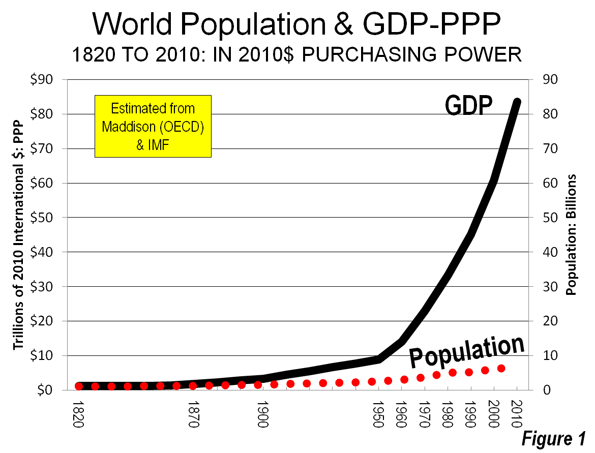
A review of data from the past 200 years indicates not only a huge increase in the world's population, but an even more significant increase in real incomes. This is illustrated using the data series developed by the late Angus Maddison of the Organization for Economic Cooperation and Development that included historic estimates of economic performance by geographical area (nations and other reported geographies) from 1500 to 2000. The Maddison data is expressed in international dollars adjusted for purchasing power, so that the impact of inflation and differing prices is factored out, to the extent feasible. Caution is required, however, because there are difficulties with longer term purchasing power and inflation time-series, not least because technological advances make it nearly impossible to accurately account for the changed standard of living. For example, there were no telephones of any sort in 1820, yet today, low-income Nigeria has 143 million mobile phones, nearly 90 for every 100 persons.

I extended the Maddison data for another 10 years, to 2010, using the database of the International Monetary Fund (IMF) and converted all data to 2010 inflation adjusted international dollars.

Fast Population Growth and Faster Economic Growth

Between 1820 and 2010, the world population grew from 1.0 billion to 6.8 billion as indicated in the databases. This 550% increase, however, pales by comparison to the increase in the world real gross domestic product (GDP), which grew nearly 13 times as fast as the population (Figure 1). The relationship between rising urbanization and increasing wealth is evident in comparing Figure 1 to Figure 2 from the recent feature What is A Half-Urban World.   Between 1820 and 1900, the real economic growth rate was 1.5 times of that of population growth. This improved to 2.2 times between 1900 and 1950. In each of these succeeding decades, the economic growth rate relative to population growth was even greater, except in the decade of the 1980s when economic growth was 1.9 times population growth. Despite the economic difficulties, particularly in Japan and the West, 2000 to 2010 showed the largest rate of economic growth compared to population growth, at 3.0.

GDP Per Capita (Purchasing Power)

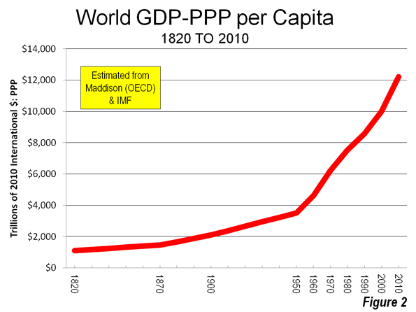
The real GDP per capita data strongly indicates the expanding economic pie. In 1820, the world GDP per capita was approximately $1100, expressed in 2010$, adjusted for purchasing power. By 1900, this had nearly doubled to $2100. The largest gains came after 1950 when the GDP per capita reached $3500. Since that time the GDP per capita has risen to $12,200 (Figure 2).

A History of Poverty

Even so, the history of economics is a history of poverty. University of Rochester (NY) Economist stated the case this way:

Modern humans first emerged about 100,000 years ago. For the next 99,800 years or so, nothing happened. Well, not quite nothing. There were wars, political intrigue, the invention of agriculture – but none of that stuff had much effect on the quality of people’s lives. Almost everyone lived on the modern equivalent of $400 to $600 a year, just above the subsistence level.

The $1100 GDP per capita from 1820 would rank among the poorest areas in the world today. The world's richest area at that time was the Netherlands, which had a GDP per capita of $3100. This is more than Nigeria today, with its 143 million mobile phones and nearly as high as the GDP per capita of India.

Distribution of Income

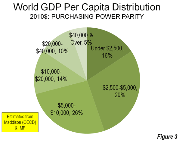
Today, the large majority of the world's population lives in lower income areas.

  • 16% of the population lives in areas with a GDP per capita of less than $2500. The largest of these are Bangladesh and Tanzania.
  • 29% of the world's population is in areas with a GDP per capita of $2500 to $5000. The largest are India, Indonesia, Pakistan, Bangladesh, Nigeria and the Philippines.
  • 26% live in low middle income areas with a GDP per capita of between $5000 and $10,000, such as China and Ukraine.
  • 14% live higher middle income areas (a per capita GDP of $10,000 to $20,000). The largest such areas are Brazil, Mexico and Russia.
  • 10% of the population lives in relatively well off areas (a GDP per capita of $20,000 to $40,000) including France, the United Kingdom, Korea and Japan.
  • Only 5% of the world's population enjoys a GDP per capita exceeding $40,000, the largest of which are the United States, Germany, Canada and Australia. (Figure 3).

The Richest Areas

The very richest countries in the world on a per capita basis are generally small. Oil rich Qatar has the highest GDP per capita at nearly $100,000 annually. Europe's Luxemburg is the second most affluent, followed by the city-state of Singapore. Resource rich Brunei-Darassalam is the world's fifth richest area. The United States ranks sixth and is by far the largest of the richest areas. More than 55% of the world's population in areas with more than $40,000 GDP per capita lives in the United States. The balance of the richest 10 is completed by the United Arab Emirates, another oil rich Gulf state, the world's other large city-state, Hong Kong,  as well as the Netherlands and Switzerland in Europe (Figure 4).

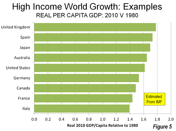
Generally, IMF data indicates that the largest high-income world economies have experienced real GDP per capita growth of from 40% to 80% since 1980. The UK has grown the most among the examples, while Italy has grown the least (Figure 5). Germany's lower growth rate is, at least in part, due to the complexity of combining virtually bankrupt East Germany with far healthier West Germany in the early 1990s. The US has been hobbled by its housing bubble-induced economic bust, which hurt other economies as well. Canada's recent stronger growth could presage an improved ranking in the years to come. Other areas, such Italy, Spain, Japan and France could experience slower growth in the future, due to the seemingly intractable fiscal difficulties and, in some cases, demographic stagnation or even decline.

Who’s Growing Rich Fastest?

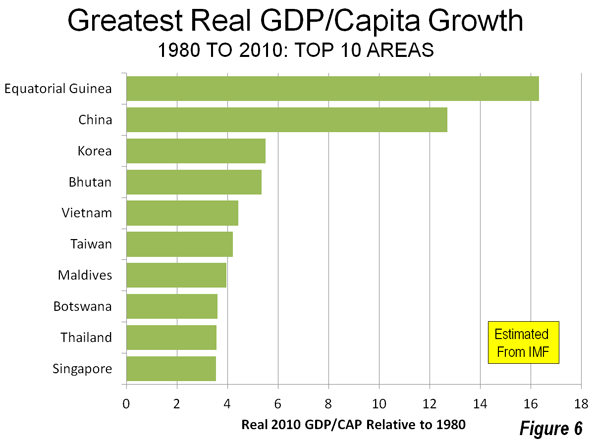
A number of countries have experienced spectacular growth in their GDP per capita over the past three decades, according to the IMF data (Figure 6). Oil rich Equatorial Guinea experienced the greatest growth, reaching a GDP per capita more than 16 times the 1980s figure. Equatorial Guinea is small, with a population of only 700,000 people (similar to the size of metropolitan areas such as Colorado Springs, Colorado, Hamilton, Ontario or Florence, Italy).

The broadest and most significant progress has been made by China. According to the IMF data, in 1980 China had the second lowest GDP per capita of any reporting area, ranking above only Mozambique. This was approximately the same time that the economic reforms began, under the leadership of Deng Xiaoping.  By 2010, China's GDP per capita had reached more than 12 times the 1980 figure. China's gross GDP-PPP grew more than that of any other area. Once on the low end of the poverty league table    China now has entered the middle rank in terms of wealth.

Other areas have also done well, especially in Asia. The largest of these include Korea, Vietnam, Taiwan, Thailand and Singapore. One African area is included among the fastest growing per capita economies, Botswana (Figure 6). Each of these areas grew from four to five times in GDP per capita from 1980.

The Poorest Areas

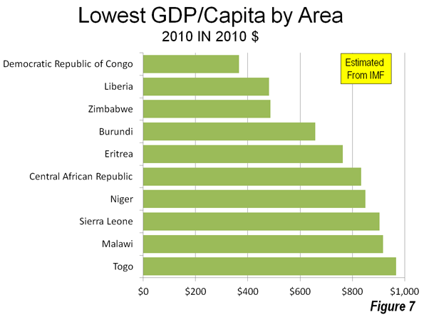
All 10 of the world's poorest areas are located in Africa. The poorest is the Democratic Republic of the Congo, with a GDP per capita of less than $400.   Torn by civil war its GDP per capita would rank it among the poorest areas even in the 1820 listing. The four next poorest areas have also faced severe domestic disruptions, Liberia, Zimbabwe, Burundi and Eritrea (Figure 7).

Some Areas Getting Poorer

The severity of the world's poverty is indicated by the fact that 26 of the 138 areas for which there is data experienced declines in their GDPs per capita from 1980. The population of these declining areas was about 300 million, or approximately four percent of the world’s total. The Democratic Republic of the Congo, the world's poorest area, experienced a 60% decline in real GDP per capita, which was the largest decline.

Conclusion

While the economic pie has expanded much faster than its population, there is still plenty of poverty in the world. It is no surprise that the developing world focused the attention of the recent 2012 Rio +20 conference on poverty, with a declaration that eradicating poverty is the greatest global challenge facing the world today.

Wendell Cox is a Visiting Professor, Conservatoire National des Arts et Metiers, Paris and the author of “War on the Dream: How Anti-Sprawl Policy Threatens the Quality of Life.”

Photo: Regency Park, Shanghai (by author)

Angry Gran: Mobile Game or Demographic Game-Change?

$
0
0

“Angry Gran” was one of the top mobile app games of 2012 globally. In it, the gamer assumes the persona of a grandmother gone rogue: Angry Gran is angry and needs money! Whack your enemies like piñatas until the cash comes flying out... The objective? Support Gran’s ‘active’ and ‘financially savvy’ retirement by assaulting unsuspecting passers-by with various weapons. If the assault succeeds, Gran steals their money and the gamer’s score rises; if the assault fails, Gran sprains her back and the gamer’s progress is delayed. Given the aging global demographic, one wonders if this sense of humour is best categorized as fiction, or as paradoxical truth?

Gran gone rogue – an emerging trend? - In Japan, there's more truth than fiction to angry Gran (and, presumably, Gramps). Its elderly population is 23% of the total; that's the highest in the world. The National Policy Agency notes that the overall crime rate has fallen steadily, with the exception of offenses committed by the elderly. Theft offenses by the elderly increased 98% in the past eight years, from about 17,000 to more than 34,000. Previously, it was suggested that elderly offenders committed non-violent offenses due to loneliness, social isolation and poverty. But a more brutal streak is emerging, too: Elderly offenders of assault-related crimes increased a startling 570%, from 348 to 2,337.

In 2008, Japan’s Ministry of Justice dedicated an entire section to elderly offenders in its annual white paper on crime, that is now a regular feature. In recognising the need for additional analysis, the Ministry cited an increase in the proportion of elderly offenders in each stage of the criminal justice system, which was disproportionately higher than the increase in the elderly within the total population.

While the numbers are low, the rate of increase in elderly offenders raises a chilling prospect. Will an aging demographic result in a “geriatric crime wave”? It does not seem to be the case in the US: the national increase in elder arrests has not been disproportionate to increases in the national crime rate. Contribution to the national crime rate by the elderly remains low, with swings in, for example, the US murder rate largely accounted for by the percentage of young adults 15 – 29 years old.

But Japan’s situation is not isolated. Other countries also show divergences from the usual age-crime assumptions. In Korea, the number of elderly sex offenders aged 61 or older increased by more than 50% in three years, beginning in 2008.

In a 1990s report from Canada's correctional services, 72.8% of older offenders were first time offenders admitted late in life; their rate of sexual crimes, homicide and manslaughter was double that of young offenders. In the Netherlands, older age groups were also over-represented in organized crime offenses, where 33% were over 40, and 76% over 30.

Health and a swinging hatchet: Declining elderly disability - Florida, which is demographically similar to Japan, offers other insights. Between 1980 and 1998, there was a marked increase in elderly offenders committing forcible sex offenses, robbery and aggravated assault. The nature of such crimes indicates that these elderly offenders are not frail, but rather, somewhat able-bodied.

Data remains scarce, but within a similar time frame across the US, severe disability among those 65 years and older declined approximately 25%. Studies also show that better childhood health reduces the risk factors for old-age disability and other serious illnesses. The future Gran who was born in the 1970s may eventually be quite sprightly in comparison to the one born in the 1920s.

So the likelihood that Gran is healthy enough to grab the hatchet and swing it with full force has increased. It was recently reaffirmed that personality characteristics which predict criminal activity in young people may apply to older people, as well. Late-life stressors such as loneliness and caregiving situations gone bad are specific to older offenders, and, equally worrying are the onset of age-related mental illness, and the lack of early detection and management. For instance, family members have almost no recourse against an elderly relative who owns a firearm. Yet in a study of elderly charged with violent offenses and referred for psychiatric evaluation in South Carolina, 78.3% used guns and 40.7% of victims were family members – and nearly half of the perpetrators presented with dementia.

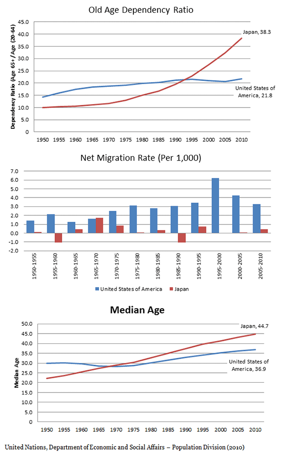
We’re not Japan - In 2011, Wendell Cox and I wrote about aging global demographics. The differences between the US and Japan were notable. Currently, Japan’s old age dependency ratio (the ratio of those aged over 65 to those from 20 – 64) is 76% higher than that of the US. But the US median age continues to rise: At 36.9 years it is currently only 8 years lower than Japan’s 44.7 years. Given the aging global demographic, migration is unlikely to offset these rises indefinitely. In the coming years, will age-crime assumptions be challenged in the US too?

The Future: An Aging Criminal Class? - Sixteen percent (246,600) of the US prison population is age 50 and older. The burgeoning elderly prison population has been attributed to longer prison sentences, brought on by more punitive sentencing principles during the 1970s and onwards. Yet there appear to be few studies on elderly or older prisoner release, rehabilitation and recidivism.

And stemming the inflow of older offenders into prisons is also necessary. In Florida, admissions of offenders over 50 increased 205%, from 1,130 in 2000 to 3,452 in 2010 – from just 4.4% to almost 10% of total admissions. Despite an increased need to dedicated research on the behaviour and characteristics of older groups, a proportion of whom will reoffend in their golden years, the current work focuses largely on juveniles. In Japan, 25% of offenders in their late 40s become repeat offenders within 10 years of their first conviction, almost five times more frequently than those who are first convicted in their early 20s.

Little is understood about what motivates the Colt-wielding Granny or Gramps. Older offenders present new challenges for justice systems, and for society as a whole. The opportunity now is to prevent criminal acts by the elderly. Discussion and analysis of geriatric crime is very much warranted.

Emma Chen was a Senior Strategist at the Centre for Strategic Futures, Singapore. She is currently pursuing postgraduate studies.

South Pacific Island "Undiscovered" by Scientists

$
0
0

Have you ever tried to visit a South Pacific island near New Caledonia called Sandy Island? A team of Australian scientists attempted just that and found no sign of the supposedly sizeable landmass. Instead, the team from the University of Sydney were greeted by open ocean and nothing more.

In the 21st century, stories like this are rare. Exciting tales of exploration surface from time to time, like Curiosity’s ongoing scientific expedition to Mars. Such occurrences on Earth are now fleeting – it feels like we have discovered almost everything there is to discover. So, maybe it shouldn’t prove too surprising that the Australian scientists actually ‘undiscovered’ some charted and documented territory.

Sandy Island was located somewhere between northern Australia and New Caledonia, albeit closer to the latter. Supposedly, it measured 24 km by 4 km and has been ever-present in maps and publications for the last ten years. Praised continuously for its reliability and accuracy, Google’s mapping program also prominently featured this phantom island. According to statistics released in April 2012, Google Maps is the most popular travel website in the United States.

The entire story seems extremely bizarre – nobody can account for the origin of Sandy Island nor its inclusion on countless maritime charts, maps and online navigation programs. According to Australian news sources, the island would sit within French territorial waters but no trace of it can be found on French government maps.

A marine research vessel named ‘The Southern Surveyor’ was in the region documenting fragments of the Australian continental crust under the Coral Sea. Passing near Sandy Island, navigational charts displayed the considerable depth of 1,400 meters, generating a sense of curiosity amongst the Australian scientists onboard. They investigated further and were quite surprised by what they found…or more specifically, what they did not find.  Instead of a white sandy beach lined with palm trees and coconuts, they found the clear undisturbed waters of the Coral Sea.

Dr. Steven Micklethwaite was present on the ship and he shared his views with the Guardian on the expedition to find Sandy Island: “We went upstairs to the bridge and found that the navigation charts the ship uses didn't have it. And so at that point we thought: Well, who do we trust? Do we trust Google Earth or do we trust the navigation charts? This was one of those intriguing questions. It wasn't far outside of our path. We decided to actually sail through the island ... Lo and behold there was nothing! The ocean floor didn't ever get shallower than 1300 metres below the wave-base. There's an island in the middle of nowhere that doesn't actually exist."

Apparently, the captain of the Southern Surveyor was concerned about running aground as his ship approached the phantom island. Once they were sailing through it, however, the entire crew had a laugh at Google’s expense. The search engine giant said it always welcomes feedback on its maps and “continuously explore(s) ways to integrate new information from our users and authoritative partners into Google Maps”.

Experts seemed equally puzzled by Sandy Island’s undiscovery, but most agreed it was probably down to human error or oversight. While some map makers intentionally include phantom streets to avoid copyright violations, maritime charts are usually made as accurate as possible due to the hazards of navigation on the open ocean. Some analysts pointed out that this kind of mistake would never happen in a busy international shipping lane, but due to the immense isolation of the Coral Sea, it escaped attention.

It is quite possible that Sandy Island does exist somewhere nearby – somebody might have just placed it in the wrong location. People have been making maps for thousands of years and many older charts were compiled through the use of watches and longitude measurements. Before that, sailors travelled using the stars, a technique which can still be used today if our GPS systems and maps somehow fail us.

Even though there may be one less island in the world today, the map is constantly changing anyway. New island chains sometimes appear and disappear through volcanic activity, so this certainly won’t be the end of the discovery versus undiscovery topic. Even though the mistake may seem embarrassing for Google, it’s nothing compared to the disastrous debut of Apple’s mapping software which, among other things, was missing Israel’s capital and gave the incorrect address for Dulles Airport in Washington D.C. At the end of the day, a small uninhabited island in the South Pacific is just a tiny speck of dust on a massive picture of the world.

Seamus Murphy grew up in Limerick, Ireland and has since lived in the Netherlands, Germany and Poland. He has a background in public relations and teaching and has become an enthusiastic blogger. Seamus enjoys writing about international affairs, communication, technology and environmental issues at Trenditionist.com. He is a keen fan of traditional Irish music.

China's Second-Tier Cities: Sichuan Rises

$
0
0

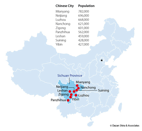
Recent media attention has focused on a slowdown in China. The actual state of play in China that should be watched, though, is rather different. While residents of first and second-tier cities such as Shanghai, Beijing and Shenzhen can still be seen holding Louis Vuitton bags and iPhones, a significantly larger, yet less individually affluent, market has begun to rise within the country. It is within this terrain of lower-tier cities that China’s breakneck growth is now being demonstrated. It’s still a bit too early for these residents to be showing off designer handbags and Apple gimmickry, yet a solid and highly-sustainable growth wave is happening across China’s fourth, fifth, and sixth-tier cities in the central and western regions.

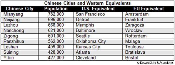
Here are some examples, in terms of rough population equivalents:

While many readers are familiar with most of these American and European cities, hardly any know their Chinese counterparts. And all of the Chinese cities in the chart above are in just one province – Sichuan.

When one factors in Shanxi, Henan, Hubei, Hunan, Anhui, and Jiangxi in Central China, and Gansu, Guizhou, Ningxia, Qinghai, Shaanxi, Yunnan and Xinjiang in West China, the sheer vastness of China’s own emerging markets becomes apparent. There are some 500 cities across the region with populations similar to those listed above.

What’s happening in these lower-tier Chinese cities? The local populations are now becoming more affluent. Crucially, this is a phenomenon driven by state policy, as Beijing wishes to reduce the national East-West income gap and raise the standards of wealth across the country. It has been doing this by embarking on an aggressive policy of increasing minimum wages on a national basis, and especially so in the hinterlands. That is having the effect of increasing disposable income levels, and these consumers are now upgrading purchases from previously purely Chinese brands towards increasing levels of Western products.

This includes the use of fast-food chains such as McDonald’s, KFC and Starbucks; massive multi-brand retailers such as Wal-Mart, Carrefour, and others that are also making inroads into these further-flung destinations. The Louis Vuitton bag may still be the preserve of China’s super wealthy in Shanghai, but in cities such as Mianyang, youths are trading up their cheap Chinese sneakers for Nikes, and looking to acquire Levis instead of the local jeans. With these consumer patterns being duplicated across the rest of China’s inland provinces, the result is little less than a revolutionary 'upgradation' of inland consumer power.

The other markets in China worth keeping an eye on are those located along China’s borders. I wrote about Urumqi as a springboard for Central Asia recently. Developments elsewhere in Asia dictate that other border areas will also begin to experience significant growth, not least because of the Association of Southeast Asian Nations’ (ASEAN’s) full free trade agreement that is set to abolish tariffs between member nations by 2015.

ASEAN includes countries that rub up alongside China’s southwest border, such as Myanmar, Vietnam and Cambodia, and adds to that countries including Laos, Malaysia, and Thailand, while to the south of China (and Guangdong Province in particular), ASEAN nations such Indonesia and the Philippines provide easy access. Why is this important? Because China has its own free trade agreement with ASEAN, and those 0 percent export tariffs among ASEAN nations are largely duplicated within China’s own agreements with the bloc.

That means cities such as Jinghong and Luxi in Yunnan are also poised to become trade hubs. Jinghong, with a population of 520,000 is equivalent in size to Tuscon, Arizona and Sheffield in the United Kingdom, and borders Vietnam, while Luxi borders Myanmar, and with a population of 350,000 is similar in size to Tampa, Florida or Bilbao.

Demand from the West does continue to remain sluggish, and inattentive analysts like to point to a drop in national GDP growth rates as evidence of some sort of cataclysmic event concerning development in China. That is only one, rather blinkered way of assessing the situation. Since China’s annual growth has moved briskly along at 10 percent for much of the past 15 years, a deviation from that is greeted by analytical soothsayers with cries of doom. Yet China’s 10 percent growth was never capable of being sustained, as each successive year of double-digit growth has, naturally, expanded the base to the point where it is now the world’s second-largest economy.

China’s national GDP rates have slipped to between seven and eight percent, and it may be experiencing a “slowdown” to single-digit GDP growth when measured on a national basis. But the real story is the continued fast-paced development of wealth, disposable income, and increasing consumerism in China’s own emerging markets and the fourth, fifth and sixth-tier cities that help make up this this gigantic consumer sector. The challenge for the foreign investor will now be to reach out and go after these less glamorous locations.

Chris Devonshire-Ellis is the founder of Dezan Shira & Associates. His clients include North American-based legal and tax firms, chambers of commerce, commercial trade institutions and universities. Following a 26-year career based in Asia, including 20 in mainland China, Chris is now based in North America and oversees client development and investment strategies for U.S. corporations looking to invest in China, India and Emerging Asia.

Flickr photo by Ken Larmon: Downtown mall in Mianyang, Sichuan.

No Reservations Cleveland

$
0
0

There is a new video out marketing Cleveland and a new slogan: “Downtown Cleveland: It’s here”. Now, I struggle with critiquing it. One the one hand, I get its energy and optimism: the energy in Downtown is palpable, real—there is a bit of a youth movement to the core—and hence the compilation of images, sounds, and narratives that are trying to capitalize and communicate what is going down.

On the other hand, I see it as another missed opportunity. The message reads blasé. Tastes like a spoon of new car smell. In fact it could be about anywhere—Nashville, Cincinnati, Tampa, etc.; that is, instead of exposing what Cleveland really is and what’s unique about it, it’s distinctiveness as an attraction is buried in amenity-driven microphone-ing that screams we have sports teams and a casino and restaurants and the yet-spoiled exuberance of the young. But when you think about Cleveland—I mean honestly think about Cleveland: about its guts and soul and heart and people—is this the kind of stuff that comes to mind?

Of course not. So why do it?

Firstly, it speaks to a larger method of city revitalization that has been running America for some time. Here, the creative classification method entails imposing a rather homogenous, universal cool over a given city topography. Glitz, glamor, glass condos, and sports heroes. Bike paths and food trucks. Millennium Park Jr.’s. Etc. But with this whitewashing comes the chipping away at Cleveland’s Rust Belt soul. And it is this soul, mind you, that is a real attraction. After all, what is so hot about going everywhere when you can go somewhere?

And yes: Cleveland is a somewhere and has a something. This thing is part cultural, part aesthetic, part historical, and part a consequence of having to go on in the face of adversity. It is part wit, part ironic, part self-deprecating, but also part stand your ground in the defense of where you came from. And it’s all real, not ephemeral: our distinctiveness arising less from donning another city’s success than stripping naked and showing our nuts and bolts. Our warts. Our knuckles and heart.

Secondly, and this speaks to the marketing machine in general, but outfits that produce messaging at this level just cannot get beyond the culture of the boardroom from which the message emerges. Corporatism repels risk. And this not only relates to branding professionals but also to the customers seeking the brand. It’s like everyone knows their audience and their audience is everyone. It’s all about that one type we want, they say, and we want thousands of them. It is a safe strategy, riskless. But Cleveland doesn’t need safe. Playing it conservative has just kept us secure in our knowledge that we are always revitalizing. Instead, step outside, show your face to the world, as branding is and always has been about differentiation. But to do that you need to be aware and secure in knowing what makes you different.

It is alright. People will like you. And if they don’t, so be it. The coolest will. Said Anthony Bourdain in his “No Reservations: Cleveland” trip:

I think that troubled cities often tragically misinterpret what’s coolest about themselves. They scramble for cure-alls, something that will “attract business”, always one convention center, one pedestrian mall or restaurant district away from revival. They miss their biggest, best and probably most marketable asset: their unique and slightly off-center character. Few people go to New Orleans because it’s a “normal” city — or a “perfect” or “safe” one. They go because it’s crazy, borderline dysfunctional, permissive, shabby, alcoholic and bat shit crazy — and because it looks like nowhere else. Cleveland is one of my favorite cities. I don’t arrive there with a smile on my face every time because of the Cleveland Philharmonic.

A friend recently commented to me that authenticity and grit can’t be marketed. Well, check this new video out from Memphis. They got it. I get a feel for who they are. And it makes me want to check the city out.

Richey Piiparinen is a writer and policy researcher based in Cleveland. He is co-editor of Rust Belt Chic: The Cleveland Anthology. Read more from him at his blog and at Rust Belt Chic, where this piece originally appeared.

Cleveland nuts photo by Flickr user The Cleveland Kid.

The Blue-State Suicide Pact

$
0
0

With their enthusiastic backing of President Obama and the Democratic Party on Election Day, the bluest parts of America may have embraced a program utterly at odds with their economic self-interest. The almost uniform support of blue states’ congressional representatives for the administration’s campaign for tax “fairness” represents a kind of  bizarre economic suicide pact.

Any move to raise taxes on the rich — defined as households making over $250,000 annually — strikes directly at the economies of these states, which depend heavily on the earnings of high-income professionals, entrepreneurs and technical workers. In fact, when you examine which states, and metropolitan areas, have the highest concentrations of such people, it turns out they are overwhelmingly located in the bluest states and regions.

Ironically the new taxes will have relatively little effect on the detested Romney uber-class, who derive most of their income from capital gains,   taxed at a much lower rate. They also have access to all manner of offshore dodges. Nor will it have much impact on Silicon Valley millionaires and billionaires, or the Hollywood moguls and urban land speculators who constitute the Democratic Party’s “good rich,” and enjoy many of the same privileges as their wealthy conservative counterparts.

The people whose wallets will be drained in the new war on “the rich” are high-earning, but hardly plutocratic professionals like engineers, doctors, lawyers, small business owners and the like. Once seen as the bastion of the middle class, and exemplars of upward mobility, these people are emerging as the modern day “kulaks,” the affluent peasants ruthlessly targeted by Stalin in the early 1930s.

The ironic geography of the Democratic drive can be seen most clearly by examining the  distribution of the classes now targeted by the coming purge. The top 10 states with the largest percentage of “rich” households under the Obama formula include true blue bastions Washington, D.C., which has the highest concentration of big earners, Connecticut, New Jersey, Maryland, Massachusetts, New York, California and Hawaii. The only historic “swing state” in the top six is Virginia, due largely to the presence of the affluent suburbs of the capital. These same states, according to the Tax Foundation, would benefit the most from an extension of the much-lambasted Bush tax cuts.

The pattern of distribution of “the rich” is even more marked when we focus on metropolitan areas. Big metro areas supported Obama, particularly their core cities, by margins as high as four to one. Besides New York, the metro areas with the highest percentage of high-earning households include such lockstep blue cities as San Francisco, Washington, San Jose, Atlanta and Los Angeles.

The income tax hit may not be the only pain inflicted on these areas in the President’s drive for greater “fairness.” Moves to curb mortgage interest deductions for affluent households also would fall predominately on these same areas. The states with the highest listing prices — and the biggest mortgages on average – are the president’s home state of Hawaii, followed by the District of Columbia, New York, California and Connecticut. According to the Census Bureau and the Federal Housing Agency, median home values in California are 200% higher than the national median, and in New York they’re 150% higher; in contrast, red Texas’ prices are below the median.

The contrast in prices is even greater between metropolitan areas. The highest prices — and thus largest mortgages — are in the deep blue havens of San Francisco, New York and Los Angeles. If the mortgage interest deduction is capped for loans, say, over $300,000, homeowners in these cities will suffer far more than in key red state cities like Dallas or Houston, where homes are at least half the price.

The curbing of the mortgage interest deduction constitutes only one part of a broader effort to cut back on all itemized deductions. This would hit states with the highest rates of people taking such deductions: California, New York, the District of Columbia, Connecticut and New Jersey, according to the Wall Street Journal. In contrast, the states least vulnerable to this kind of leveling reform would be either red states such as Indiana, Alaska or Kentucky, or classic “swing” states such as Iowa and Ohio.

Of course, one can argue that these changes follow the precepts of social justice: Rich people and rich regions should pay more. Yet being “rich” means different things in different places, due to vast differences in costs of living. The cost of living   in New York and Los Angeles, for example, is so high that the adjusted value of salaries rank in the bottom fifth in the nation. In other words, a couple with two children with a $150,000 income in Austin or Raleigh may be, in terms of housing and personal consumption, far “richer” than one making twice that in New York or Los Angeles.

What would a big tax increase on the “rich” mean to the poor and working classes in these areas? To be sure, they may gain via taxpayer-funded transfer payments, but it’s doubtful that higher taxes will make their prospects for escaping poverty much brighter. For the most part, the economies of the key blue regions are very dependent on the earnings of the mass affluent class, and their spending is critical to overall growth. Singling out the affluent may also reduce the discretionary spending that drives employment in the personal services sector, retail and in such key fields as construction.

This prospect is troubling since many of these areas are already among the most unequal in America. In the expensive blue areas, the lower-income middle class population that would benefit from the Administration’s plan of  keeping the Bush rates for them is proportionally smaller, although  the numbers of the poor, who already pay little or nothing in income taxes, generally greater. Indeed, according to a recent Census analysis, the two places with the highest proportions of poor people are Washington, D.C., and California. By far the highest level of inequality among the country’s 25 most populous counties is in Manhattan.

Finally we have to consider the impact of the new tax rates on the fiscal health of these states. Four of the five states in the poorest shape fiscally, according to a recent survey by 24/7 Wall Street, all have congressional delegations dominated by Democrats — California, New Jersey, Rhode Island and Illinois (the one red state is Arizona). Slower economic growth brought about by higher taxes — compounded by high state taxes — is unlikely to make their situation any better.

So what can we expect to happen if the fiscal cliff appears, or if the President and his party get their taxes on the rich? One can expect a proportionally greater impact on citizens and the budgets of the already expensive, high-tax states, where the new kulak class is concentrated. It may also spark a greater migration of people and companies to less expensive, lower-tax areas.

Perhaps the greatest  irony in all this is that the Republicans, largely detested in the deep blue bastions, are the ones most likely to fall on their swords to maintain lower rates for the the  mass affluent class in the bluest states and metros. If they were something other than the stupid party, or perhaps a bit more cynical, they would respond to the President’s tax proposals by taking a line from their doddering cultural icon, Clint Eastwood: make my day.

Joel Kotkin is executive editor of NewGeography.com and is a distinguished presidential fellow in urban futures at Chapman University, and contributing editor to the City Journal in New York. He is author of The City: A Global History. His newest book is The Next Hundred Million: America in 2050, released in February, 2010.

This piece originally appeared at Forbes.

Income tax photo by Bigstock.


Separation of Church and Urban Planning

$
0
0

Recently, the Journal of theAmerican Planning Association(JAPA) published research that directly challenged prevailing views in urban planning. In an article entitled Growing Cities Sustainably, Marcial H. Echenique, and Anthony J. Hargreaves from Cambridge University, Gordon Mitchell (University of Leeds) and Anil Namdeo (University of Newcastle) found that compact development (smart growth) had only a marginal impact on sustainable development and should not "automatically be associated with the preferred spatial growth strategy" (See Questioning The Messianic Conception of Smart Growth). This was particularly unsettling to the powers-that-be in urban planning, who have struggled for years – predating the current greenhouse gas emission (GHG) reduction concerns – to make anything but smart growth virtually illegal.

The Reaction

Soon after, the JAPA editor (Randy Crane of UCLA) was criticized by fellow academics in the "PLANET" listserv for permitting publication, at least partly because the research questioned the value of compact development (smart growth) in achieving environmental sustainability.

In early November, a session was held at the 53rd Annual Association of Collegiate Schools of Planning conference in Cincinnati entitled "Spinning Wheels and Witch Hunts: Debating the Merits of Planning Research," devoted to discussion of what at least some considered the heresy of Echenique, et al. The conference program description of the session included questions such as the following:

"What are the dangers of applying the “scientific method” in planning?"

My comment: Any dangers are problems of planners, not the scientific method

"How do ethics, politics and normative values factor into what gets published?"

My comment: It is hoped as little as possible, which is why concern is expressed here.

"On the issue of compact cities, are we spinning our wheels, or are we provocatively challenging conventional wisdom? Is the problem of sprawl still an open question? Do these debates ever end, or, with JAPA’s help, do they keep going indefinitely?"

My comment: The debates must continue until perfect knowledge has been achieved and all relevant information has been objectively considered (with or without JAPA). Neither condition has been satisfied.

A Report from the Front

Professor Lisa Schweitzer of the University of Southern California provided comments on the session in an article entitled ACSP Reflections #1 Should Researchers be Allowed to Question Smart Growth?. Professor Schweitzer describes only the beginning of the session, indicating that she left because the room was too crowded and out of a concern that the authors would not be represented. This is despite the fact that the purpose of the session was, in effect, to discuss whether the researchers were "out of bounds" in raising the issue. Even abbreviated, Professor Schweitzer's account raises substantial concerns, which are described below.

The session began with a critique of the Echenique, et al research by Professor Emily Talen of Arizona State University. Professor Schweitzer characterized Talen's criticism as boiling down to "practitioners have a tough time convincing people to pursue smart growth."

Censoring Criticisms of Smart Growth?

Professor Schweitzer continues: "The problem with Talen's idea is that it suggests researchers 'owe' it to practitioners to only inquire within the framework that compact development is unambiguously meritorious and sprawl is ambiguously not." Professor Schweitzer rightly questions how compact development can be considered "unambiguously good" if it is not examined closely.

In fact, there is no room for icons or the sacred in academic inquiry. The imperative to question is the very justification for publication of the Echenique, et al research.

Avoided Issues

Indeed, there is considerable evidence that compact development has not been examined closely enough. For example, urban planning research has usually discounted, ignored or even denied the association of compact development with inordinately higher house prices relative to incomes – despite massive evidence to the contrary. This is because housing is the largest element in the cost of living, higher house prices necessarily reduce discretionary incomes and increase poverty.

This is an issue not only for high-income cities but also for developing ones. New York University Professor Shlomo Angel expresses concern that: ...strict measures to protect the natural environment by blocking urban expansion could "choke the supplies of affordable lands on the fringes of cities and limit the abilities of ordinary people the house themselves." (See: A Planet of People: Angel's Planet of Cities).

Similar concern is raised by Brandon Fuller of Charter Cities: ... if governments respond by trying to contain urban expansion with greenbelts or urban growth boundaries that artificially restrict the supply of developable land, the result will be prices and rents higher than many arriving families can afford.

The association between higher densities and more intensive traffic congestion is also avoided in much of the planning press. Echenique, et al are an exception, citing research showing that when density rises, vehicle travel rises almost as much. This is no small matter, since expanding mobility throughout metropolitan areas means more economic growth (read more affluence and less poverty). This is before considering the negative impacts of greater traffic intensity on localized air pollution and health.

Sanctioning Objective Inquiry?  

The need for greater openness in academia also caught the attention of Australian transport and urban development consultant Alan Davies (in Will Compact Cities Deliver on the Environment), who wrote:

There needs to be more consideration of evidence-based research by those interested in cities. One reason why there isn’t is illustrated by the reaction to the Echinique et al paper by some members of the US Association of Collegiate Schools of Planning (ACSA).

On a similar note, Professor Schweitzer noted that it is common for advocates of compact development to charge skeptics with unethical behavior. This creates an environment that is not conducive to developing objective and reliable strategies that effectively addresses objectives such as environmental sustainability.

Back to the (17th Century) Future?

Open minds have always been a threat to dogma and its proponents. Progress comes from the objective application of science, which is the very opposite of dogma.

Yet, there is a long tradition of sanctioning thought and publication that questions the conventional wisdom. It is not an honorable tradition. In the 17th century, Galileo was bold enough to challenge the doctrines of the Church about the relationship of Earth to the sun. The Church determined that it was inappropriate for him to publish such views and Galileo spent the rest of his life under house arrest. Of course, doctrines change, especially when exposed to the light of new or ignored evidence.

Researchers like Echenique, et al should not be confined to an ivory tower equivalent of house arrest. Their work and that of researchers disagreeing with them should be roundly debated in an open, academically free environment. All of this requires a separation of church and urban planning.

Wendell Cox is a Visiting Professor, Conservatoire National des Arts et Metiers, Paris and the author of “War on the Dream: How Anti-Sprawl Policy Threatens the Quality of Life.”

------

Photo: Sather Tower, University of California, Berkeley (by author)

What Is a Global City?

$
0
0

We hear a lot of talk these days about so-called “global cities.” But what is a global city?

Saskia Sassen literally wrote the book on global cities back in 2001 (though her global cities work dates back well over a decade prior to that book). She gave a definition that has long struck with me. In short form, in the age of globalization, the activities of production are scattered on a global basis. These complex, globalized production networks require new forms of financial and producer services to manage them. These services are often complex and require highly specialized skills. Thus they are subject to agglomeration economics, and tend to cluster in a limited number of cities. Because specialized talent and firms related to different specialties can cluster in different cities, this means that there are actually a quite a few of these specialized production nodes, because they don’t necessarily directly compete with each other, having different groupings of specialties.

In this world then, a global city is a significant production point of specialized financial and producer services that make the globalized economy run. Sassen covered specifically New York, London, and Tokyo in her book, but there are many more global cities than this.

The question then becomes how to identify these cities, and perhaps to determine to what extent they function as global cities specifically, beyond all of the other things that they do simply as cities. Naturally this lends itself to our modern desire to develop league tables.

A number of studies were undertaken to produce various rankings. However, when you look at them, you see that the definition of global city used is far broader than Sassen’s core version. Wikipedia lists some of the general characteristics people tend to refer to when talking about global cities. It cites a very lengthy list, but some of them are:

  • Home to major stock exchanges and indexes
  • Influential in international political affairs
  • Home to world-renowned cultural institutions
  • Service a major media hub
  • Large mass transit networks
  • Home to a large international airport
  • Having a prominent skyline

As you can see, this is quite a hodge-podge of items, many of which are only tangentially related to globalization per se. In effect, many of them seek to define cities only in term of global prominence rather than functionally as related to the global economy. That’s certainly a valid way to look at it, but it raises the point that we should probably clarify what we are talking about when we talk about global cities.

To clarify our thinking, let’s look at how various ranking studies have defined global city for their purposes.

One oft-cited such ranking was a 1999 research paper called A Roster of World Cities. The authors, Jon Beaverstock, Richard G. Smith and Peter J. Taylor, explicitly reference Sassen’s work, seeking to define global cities in terms of advanced producer services.

Taking our cue from Sassen (1991, 126), we treat world cities as particular ‘postindustrial production sites’ where innovations in corporate services and finance have been integral to the recent restructuring of the world-economy now widely known as globalization. Services, both directly for consumers and for firms producing other goods for consumers, are common to all cities of course, what we are dealing with here are generally referred to as advanced producer services or corporate services. The key point is that many of these services are by no means so ubiquitous; for Sassen they provide a limited number of leading cities with ‘a specific role in the current phase of the world economy’ (p. 126).

They took lists of firms in four specific service industries – accounting, advertising, banking, and law – and determined where those firms maintained branches and such around the world in order to determine the importance of various cities as production nodes of these services. This has some weaknesses in that it doesn’t necessarily distinguish whether say a particular accounting firm is doing routine type work of the sort accountants have always been doing, or performing advanced work of a type specific to globalization, but it at least tries to derive lists related to the production of services.

As the global city concept grew in popularity, various other organizations entered the fray. Most of these newer lists take a very different a much broader approach closer to the Wikipedia type lists of characteristics rather than a Sassen-like definition.

One example is AT Kearney’s list, developed in conjunction with the Chicago Council on Global Affairs. Their most recent version is the 2012 Global Cities Index. This study uses criteria across five dimensions:

  • Business Activity (headquarters, services firms, capital markets value, number of international conferences, value of goods through ports and airports)
  • Human Capital (size of foreign born population, quality of universities, number of international schools, international student population, number of residents with college degrees)
  • Information Exchange (accessibility of major TV news channels, Internet presence (basically number of search hits), number of international news bureaus, censorship, and broadband subscriber rate)
  • Cultural Experience (number of sporting event, museums, performing arts venues, culinary establishments, international visitors, and sister city relationships).
  • Political Engagement (number of embassies and consulates, think tanks, international organizations, political conferences)

The Institute for Urban Strategies at The Mori Memorial Foundation in Tokyo published another study called “The Global Power City Index 2011.” This report examined cities in terms of functions demanded by several “actor” types: Manager, Researcher, Artist, Visitor, and Resident. The functional areas were:

  • Economy (Market Attractiveness, Economic Vitality, Business Environment, Regulations and Risk)
  • Research and Development (Research Background, Readiness for Accepting and Supporting Researchers, Research Achievement)
  • Cultural Interaction (Trendsetting Potential, Accommodation Environment, Resources of Attracting Visitors, Dining and Shopping, Volume of Interaction)
  • Livability (Working Environment, Cost of Living, Security and Safety, Life Support Functions)
  • Environment (Ecology, Pollution, Natural Environment)
  • Accessibility (International Transportation Infrastructure, Inner City Transportation Infrastructure)

Another popular ranking is the Economist Intelligence Unit’s Global City Competitiveness Index. They rank cities on a number of domains:

  • Economic Strength (Nominal GDP, per capita GDP, % of households with economic consumption > $14,000/yr, real GDP growth rate, regional market integration)
  • Human Capital (population growth, working age population, entrepreneurship and risk taking mindset, quality of education, quality of healthcare, hiring of foreign nationals)
  • Institutional Effectiveness (electoral process and pluralism, local government fiscal autonomy, taxation, rule of law, government effectiveness)
  • Financial Maturity (breadth and depth of financial cluster)
  • Global Appeal (Fortune 500 companies, frequency of international flights, international conferences and conventions, leadership in higher education, renowned think tanks)
  • Physical Capital (physical nfrastructure quality, public transport quality, telecom quality)
  • Environment and Natural Hazards (risk of natural disaster, environmental governance)
  • Social and Cultural Character (freedom of expression and human rights, openness and diversity, crime, cultural vibrancy)

Note that these were not all equal weighted. Economic strength is paramount.

Yet another ranking comes from the Knight Frank/Citibank Wealth Report. This ranking is purely subjective and was based on surveying wealth advisors as to which cities they felt would be most important to their clients today and in the future based on four areas: economic activity, political power, knowledge and influence, and quality of life.

It’s worth noting that Sassen contributed to various of these surveys.

Looking at the newer surveys versus the Roster of World Cities, it’s clear that the game has changed. Rather than attempting to look at specific global economic functions, the global city game has become effectively a balanced scorecard attempt to determine, as I like to put it, the world’s “biggest and baddest” cities.

There are quite a few differences in methodologies, which is inevitable. But a few things jump out at me. First the focus on aggregate measures in these surveys. For example: total GDP, total foreign population, number of headquarters. There is a remarkable lack of attention to dynamism variables such as growth in various metrics, though the Economist survey includes a couple.

The focus on static totals versus dynamism tends to reward large, developed world cities versus rapidly growing or emerging market cities. (The AT Kearney survey has a separate emerging cities list). In a sense, these rankings are biased in favor of important legacy cities.

It’s also interesting to see what was included vs. not included in quality of life type ratings. For example, items like censorship, media access, the rule of law, and the environment are listed. But measures of upward social-economic mobility or income inequality or not.

Lastly, a number of the rankings suggest a self-consciously elite mindset, such as shopping and dining options. As with many quality of life surveys, these seem to orient them towards expatriate executive types rather than normal folks.

Looking at these, I can’t help but think that the criteria were the product of an iterative process where the results were refined over time. Thus in a sense the outcomes were likely somewhat pre-determined. That’s not to say that the game was rigged necessarily. But I suspect if anyone were doing a global city survey and London and New York did not rank at the top, the developers would question whether they got the criteria right. In a sense, a global city is like obscenity: we know one when we see it, but we don’t necessarily have a widely agreed upon objective set of criteria to measure it by.

I sense that these rankings attempt to look at global cities in four basic ways:

  1. Advanced producer services production node. This is basically Sassen’s original definition. I think this one remains particularly important. Because the skills are specialized and subject to clustering economics, the cities that concentrate in these functions have a Buffett-like “wide moat” sustainable competitive advantage in particular very high value activities. For cities with large concentrations of these, those cities can generate significantly above average economic output and incomes per worker.
  2. Economic giants. Namely, this is a fairly simple but important view of that simply measures how big cities are on some metrics like GDP.
  3. International Gateway. Measures of the importance of a city in the international flows of people and goods. Examples would be the airport and cargo gateway figures.
  4. Political and Cultural Hub. An important distinction should perhaps be made here between hubs that may be large but of primarily national or regional importance, and those of truly international significance. For example, there are many media hubs around the world, but few of them are home to outlets like the BBC that drive the global conversation.

There may potentially be other ways to slice it as well. The fact that these various ways of viewing cities can often overlap can confuse things I think. For example, New York and London score highly on all of these. And there are surely underlying reasons why they do. Yet trying to sum it all up into one overall ranking or score, while making it easy to get press, can end up obscuring important nuance.

So when thinking about global cities, I think we need to do a couple of things:

  1. Clarify what it is we are talking about at the time.
  2. Relative to the definition we are using, seek to identify the specific parts of the city in question that generate real above average value at the global level.

Aaron M. Renn is an independent writer on urban affairs and the founder of Telestrian, a data analysis and mapping tool. He writes at The Urbanophile, where this piece first appeared.

Chicago photo by Bigstock.

Obama’s Energy Dilemma: Back Energy-Fueled Growth or Please Green Lobby

$
0
0

Talk all you want about the fiscal cliff, but more important still will be how the Obama administration deals with a potential growth-inducing energy boom. With America about to join the ranks of major natural gas exporters and with the nation’s rising oil production reducing imports, the energy boom seems poised to both  boost our global competitiveness and drive economic growth well above today’s paltry levels.

This puts President Obama in a dilemma. To please his core green constituency, he can strangle the incipient energy-led boom in its cradle through dictates of federal regulators. On the other hand, he can choose to take credit for an economic expansion that could not only improve the lives of millions of middle- and working-class Americans, but also could assure Democratic political dominance for a decade or more.

Stronger economic growth remains the only way to solve our nation’s fundamental fiscal problems other than either huge tax hikes or crippling austerity. As economist Bret Swanson has pointed out, the best way to raise revenues and reduce expenditures, particularly for such things as welfare and unemployment, would be to increase overall growth from the current pathetic 2 percent rate to something closer to 3 or 4 percent.

Swanson suggests in a few simple charts (PDF) that a 4 percent growth rate would drive output to levels that would cover even our current projected spending levels. Even at 3 percent, the additional revenue would be enough, for example, to fill in Medicare’s looming $24.6 billion liability that is projected to 2050. The effects of higher growth are likely far greater than either any anticipated bonanza by raising taxes on the “rich” or enacting the most extreme austerity.

The energy revolution presents Obama with the clearest path to drive this critical boost to greater economic growth. New technologies for finding and tapping resources, such as fracking and other new technologies to tap older oil fields, could make America potentially the largest oil and gas producer by 2020, according to the International Energy Agency.

Equally important, an increasingly energy self-sufficient America would enjoy significantly greater independence from pressure from the often hoary influence of such unattractive regimes as Saudi Arabia, Venezuela, and Russia. Approval of the controversial Keystone pipeline from Canada to Texas would cement what would effectively be a North American energy community utterly independent of these trouble spots.

Those that have embraced the energy revolution have already created a gusher in energy jobs, which pay wages on average higher (roughly $100,000 annually )  than those paid by information, professional services, or manufacturing . The six fastest-growing jobs for 2010-11, according to Economic Modeling Specialists International, are related to oil and gas extraction. In total, nine of the top 11 fast-growing jobs in the nation over the past two years are tied in one way or another to oil and gas extraction.

Over the decade, the energy sector has created nearly 200,000 jobs in Texas, as well as 40,000 in Oklahoma, and more than 20,000 in Colorado. Growth on a percentage basis is even higher in North Dakota, which saw a 400 percent increase in these jobs, as well as Pennsylvania, where jobs increased by 20,000.

In contrast California, whose Monterey Formation alone is estimated to be four times larger than North Dakota’s Bakken reserve, has chosen, in its irrepressible quest for ever greater greenness, to sharply limit its fossil-fuel industry As a result, it has generated barely one-tenth the new fossil fuel jobs generated in archrival Texas. Not surprisingly, California and other green-oriented states have lagged behind in GDP and income growth while the energy states have for the most part enjoyed the strongest gains.

In addition, domestic energy growth directly spurs the construction of new, as well as the rehabilitation of old, industrial facilities. This already is occurring across a vast swath of America, from revived steel mills in Ohio and Pennsylvania to massive new petrochemical plants being planned along the Gulf Coast. Further development of energy resources, according to a study by Price Waterhouse Coopers, could create upwards of a million industrial jobs over the next few years.

For Obama, getting behind energy boom presents both enormous opportunities as well a serious political dilemma. In terms of cutting emissions, the rising use of natural gas has been a huge boon, allowing the U.S. to make greater cuts than any other major country over the past four years. Yet, the green lobby, once sympathetic to this relatively clean fuel, has turned decisively against any new gas development.

As a major component of Obama’s wide-ranging  coalition of grievance holders, environmentalists expect  to exercise greater influence in the second Obama term. Hollywood, now virtually an adjunct to the “progressive” coalition, will soon weigh in with Promised Land, a predictably anti-fracking movie, starring Matt Damon. Living up to Hollywood’s tradition of serving as what Lenin called “useful idiots”, the movie is financed in large part  by investors from the United Arab Emirates, whose profits would be threatened by the growth of American energy production.

The ideological stakes for the green movement are tremendous . Greatly expanded American fossil-fuel production violates the “peak oil” mantra that has underpinned environmental thinking for decades, and undermines some of the core rationale for subsidizing expensive renewables such as solar and wind.

Geography also may play a major role here. Outside of Colorado, the industrial Midwest and western Pennsylvania, where the shale boom is widely seen as boosting local economies, the vast majority of energy-producing states tilt strongly to the GOP. In contrast, Obama’s strongest support comes from green-oriented coastal residents whose familiarity with energy production starts and ends with turning on a light or switching on an Ipad.

Obama’s financial base—in contrast to that enjoyed by the Republicans—relies little on the energy industry. The president’s corporate support comes largely from the entertainment, media, and software industries. Many of Obama’s strongest business backers, particularly in Silicon Valley, have become entangled financially with “renewable energy” schemes, many of which can only survive with massive subsidies in the form of tax credits, loans, and surcharges on energy consumers.

Yet the president has good political reasons not to undermine the energy boom tht can deliver on his promise to deliver high-wage jobs and prosperity to the beleaguered middle class and working classes. In the campaign, the president wisely and openly sublimated his inner green, even taking credit for the expansion of fossil-fuel production. As the campaign came to a close, as Walter Russell Mead observed, “the less we hear about green and the more we hear about brown, about oil and gas drilling.”

As in so many areas, Obama’s political judgments were on target. His “brown” shift helped deprive the GOP of a key issue in critical swing states such as Colorado, Ohio, and Pennsylvania. Seeming moderation on energy also helped keep Democratic Senate seats in such key producing states as West Virginia, North Dakota, and Montana. A sharp turn back to a hard green position, particularly a ban on fracking, would leave these and other energy-state Democratic miracle babies isolated and vulnerable .

Right now, the administration’s energy policy seems a bit muddled, as the Obama team emerges from the fog of the campaign wars. On the one hand, there are signs that the Bureau of Land Management may take upwards of 1.5 million acres of western lands off the table for energy production. Yet at the same time, the bureau has announced plans to open 20 million acres off the Gulf Coast for exploration.

One can understand Obama’s ambivalence on the issue. Embracing the energy boom, and the ensuing economic expansion, could create an economic bonanza while continuing to reduce carbon emissions. This can be further enhanced by backing efforts by natural-gas producers to expand more into the bus, heavy equipment and truck market. On the other hand, this tack will risk the ire of rent-seeking renewable-energy firms and greens,  as well as their media and Hollywood claques.

Rather than divide the country into green and brown camps, the Breakthrough Institute’s Ted Nordhaus and Michael Shellenberger suggest, the administration should seek “a rapprochement” between the natural gas industry and the environmental movement. Dirtier energy sources, notably coal, could be jettisoned while the country shifts, at least for the medium and short run, toward a greater reliance on cleaner gas energy.

Ultimately, the decision whether to embrace an energy-led growth strategy may well determine whether President Obama can improve middle-class prospects. In the coming months, he will need to choose between pleasing the green purists around him and generating a long boom that would elevate him to Mount Rushmore levels, and assure his party’s political dominion for a generation.

Joel Kotkin is executive editor of NewGeography.com and is a distinguished presidential fellow in urban futures at Chapman University, and contributing editor to the City Journal in New York. He is author of The City: A Global History. His newest book is The Next Hundred Million: America in 2050, released in February, 2010.

This piece originally appeared at The Daily Beast.

Midwest drilling rig photo by Bigstock.

Born Into Ruin: How the Young are Changing Cleveland

$
0
0

It’s true. I am not happy all the time living in Cleveland. But I don’t want to be happy all the time. That’s unnatural. Said Nietzsche:

“Sometimes, struggles are exactly what we need in our life. If we were to go through our life without any obstacles, we would be crippled. We would not be as strong as what we could have been.”

Cleveland is a struggle. But that is how I know it. That is how many Clevelanders in their 20’s to 40’s know it. We didn’t know the city of Mr. Jingeling and Bob Hope—the city of a near million—the “Best Location in Nation”. No, we knew Cleveland on its knees. We knew Cleveland praying. But being born into post-industry is a good first lesson. Life is an obstacle. Cleveland prepares you.

For what?

Bullshit, or at least the proclivity of it.

Aspirations abound now. If you were only creative enough, rich enough, worldly and knowledgeable enough, then: you can become something, a star—evolved from your basic beginnings. Fine. But it’s this ambition-before-all-else mindset that has also extended our eyes from our feet, or our aspirations from our selves, and so for long the country has left its principles behind to build castles in the air with no foundation. Consequently, our culture—our sense of being from somewhere, of bleeding the aesthetic of someplace—has taken a hit. It’s no surprise, then, that our castles keep falling down into a pile of broken promises that never seem to be able to feed, clothe, or employ us properly.

To hell with it. Time to be proud in the gift of being grounded. It is the only way up.

Grounded. It’s how we are grown here in the Rust Belt. For you see it everywhere: the reality of things. You see it in the cracked sidewalks, and in the seriousness on the faces of the people all around you. You see it in the empty brownfields behind chain link fences. Yet there is a comfort in the Rust Belt aesthetic, one tied to the fact there’s little pretentiously precious. From the bodies we are built with to the handshakes we make to the food we eat to the buildings we see, shit is heavy here. And it’s a ritual you learn simply by living on Rust Belt ground.

I am watching this unfold first hand with my 2-year old daughter. You see, I have a place near the rail ties, and each time the train rides through my girl runs to the window to see the power of the “choo choo”. I watch her with a smile as she watches with awe as the force of the box cars enter our bodies through the vibrations coming up from the ground. She is becoming Rust Belt, I think. I do this every time this happens.

But this groundedness, this Rust Belt-ness, it’s not a settling or a lack of aspiration, but rather—for Clevelanders populating the city that never knew its heights— a chance to look around and see nothing but work to do, and an opportunity to do it. There are a lot of fresh eyes around. The city psychology is changing. And I think this may save Cleveland, because people are no longer waiting for Cleveland to save us.

This is happening all across the Rust Belt. For instance, Detroit native Bill Morris recently wrote about his trip back to Motown to “see that Detroiters had stopped waiting for salvation from above – a new auto factory, a new government program, a new housing development – because they were too busy saving themselves down at street level.”

Morris goes on to interview Jack Kushigan, a Detroiter who grew up working in the family’s machine shop before moving to San Francisco and then back. He writes of Kushigan:

I met him in the woodworking shop he’d set up in a church basement on the city’s hard-hit East Side, where he was teaching neighborhood people how to make furniture out of wood harvested from abandoned buildings, a virtually limitless source of raw materials. “Detroit for years, during its decline, has been hoping for a Messiah,” Kushigian told me. “Detroit has finally given up on that. A lot of people in Detroit have a fire burning inside them that I don’t see anywhere else. My feeling is that the Messiah is us.”

I feel the same thing is happening in Cleveland. The work the young people are doing. The fact they are entering the broken dreams of past generations with no illusions, little skeletons, but with a determination that comes with being grounded. And it is this kind of collective turn-the-page energy that will end the endless recent history of our decline.

Call it the benefit of struggle, or of not having your castles yet crumble because you’d been born into the ruin.

This piece originally appeared on Cool Cleveland.

Richey Piiparinen is a writer and policy researcher based in Cleveland. He is co-editor of Rust Belt Chic: The Cleveland Anthology. Read more from him at his blog and at Rust Belt Chic.

Our Dysfunctional Housing Market

$
0
0

This is the story of how elites prospered while killing the singular trend that built America, and all that you proles got in return was a dysfunctional housing market. In a reversal of more than 100 years of American history, the unique force that built the United States and the wealth of its inhabitants – geographic convergence – has been stopped. Based on labor mobility and the income convergence it engendered, geographic convergence was our great equalizer, our economy’s ace in the hole: even in the worst of times people could always move from where they were to somewhere else to improve their prospects. Well, they can’t anymore, and the reason is housing.

Who killed geographic and income convergence? Well, we wealthy, older, property-rich elites in desirable zip codes did. Call us the new landed gentry if you like. I would like to say we’re really, really, sorry but I don’t see us doing anything to correct it. It wasn’t on purpose; it was an inadvertent, unintended consequence of well-intentioned laws and regulations concerning land use, zoning, building codes, permits, property taxes and the like. We didn’t undertake those restrictions on building and development specifically to exclude you people (wait – did I really just say “you people?”). Why heck, we’re concerned as all get-out about rising inequality and income disparity, just not in our own neighborhoods, okay? And besides, residential segregation is voluntary, isn’t it? Didn’t you read Bill Bishop's “The Big Sort”? We all naturally prefer to cluster with the like-minded and socioeconomically similar, don’t we?

We used to have a housing market that consisted of buyers, sellers, and the supply of homes for sale. Today, the housing market is artificial and even fraudulent — it's anything but a free market in which inventory is allowed to clear. Millions have defaulted, and millions more are in the pipeline to do so. Because of this massive shadow inventory of underwater and foreclosed homes that is only slowly being leaked out to market, there are millions of people who can’t sell the houses where they live, millions who can’t buy houses where they want to live, and millions who may never get a foot on the housing ladder at all.

The government response — bless ’em, they do represent us — is to do everything possible to keep housing prices inflated. Interest rates are kept absurdly low (if you can qualify, and we do!), and the federal government now guarantees 90% of all mortgage loans (defaults and delinquencies are staggering, but so what?). Inventory is being constrained by banks which have not only been bailed out, but given the ability to rewrite accounting rules, for example, suspending mark-to-market and taking years to move on non-performing loans. Some of your neighbors haven’t made a mortgage payment in years but have yet to receive a notice of default. The result? In some markets, housing mania has returned. Flippers and non-resident investors are flooding in and crowding out people who actually want to buy homes in which to live. We’re inflating the bubble again. Thank you so much — don’t mind the feudalism!

All of this allows us to continue to buy expensive homes with low down payments and monthly payments (relative to income, of course, and ours is larger than yours), max out the tax deduction on the back-end, and escape capital gains taxes on the first $500,000 of profit on the sale of a home. Sweet. I guess they’re trying to goose consumption, but with your flat household incomes, it doesn’t seem to be working.

How We Got Here - In a recent working paper two Harvard economists, Peter Ganong and Daniel Shoag, explain how geographic and income convergence started to slow in the 1960s, when rich people in rich places started constraining land use through regulation. This limited the housing supply in those places, which forced prices up, and started to squeeze out those with lower incomes.

Housing prices have always been more expensive in high-income places, but the difference now is unbridgeable. The result is that people can’t get on the upward mobility ladder, thus increasing the inequality that these same elites bemoan. But they don’t see or understand the connection between this income divergence and their own regulations and restrictions.

What to Do? - I recently had the opportunity to contribute to a symposium hosted by CORE (National Community Renaissance), one of the largest nonprofit affordable housing development corporations in the United States. As a catalyst we used an article by Joel Kotkin and Steve PonTell, CORE’s President and CEO, “Is the Dream Dead? Housing’s Next Challenge.” The authors note that homeownership is at a 15-year low, despite the fact that owning a home is now cheaper than renting in most of the top 100 metro areas, but that lower housing prices have not done much to improve the conditions for lower-income people. Indeed, as people who would normally own housing become renters, price pressure has actually worsened for renters.

Housing has traditionally been the main way Americans accumulated assets, created wealth, raised families, became part of communities, and contributed to social stability. But housing is only one factor squeezing lower and middle income Americans. The real culprit has been stagnant and even declining incomes. The authors conclude, as I read it, that if you want to champion those less well-off, the way to do it is with solutions that are less government-centric: not to give them housing and income, but to take away the barriers to housing, allow the construction of new, market-friendly housing, and boost wealth creation through economic development.

What If Housing Declines For A Generation? - A strong case can be made that the fundamental supports of the housing market – demographics, employment, creditworthiness and income – will not recover for a generation, and that housing has lost its status as the foundation of middle class wealth, not for a generation, but for the long term.

Charles Hugh Smith has written that rising rates of home-ownership require five conditions: favorable demographics, rising household formation rates, a large cohort of creditworthy potential buyers, an economy that generates rising incomes to support home-ownership, and an unshakable belief that owning a house is a favorable and secure investment that will rise in value in the decades ahead.

If the first four conditions have eroded, then the belief in the permanence of a rising housing market will also erode. And they all have in fact eroded:

  • Today's demographics are not favorable to housing on a number of fronts.
  • Household formation is in a long-term decline.
  • Labor's share of the national income has plummeted to historic lows, and
    income has declined, especially for young workers.
  • Part-time jobs and temp jobs do not generate enough stable income to support a mortgage. It's easy to qualify people for a mortgage. The hard part is making sure that they will have enough income and faith to service the mortgage for the next 30 years.

Arnold King of George Mason University has argued that home ownership subsidies have imposed costs on the economy and society that are large and clear, while the benefits of such subsidies are, at best, small and vague. His conclusion: Who needs home ownership?

I’m more worried about Smith's conclusion, which is an idea that few are willing to entertain: the possibility that housing is no longer the foundation of middle class wealth, and that its decline is structural, not cyclical. What if he’s right?

Dr. Roger Selbert is a trend analyst, researcher, writer and speaker. Growth Strategies is his newsletter on economic, social and demographic trends. Roger is economic analyst, North American representative and Principal for the US Consumer Demand Index, a monthly survey of American households’ buying intentions.

Flickr photo by Sean Dreilinger: For Sale signs posted in Lake Oswego, Oregon

Hong Kong’s Decentralizing Commuting Patterns

$
0
0

Hong Kong is a city of superlatives. Hong Kong has at least twice the population density of any other urban area in the more developed world, at 67,000 per square mile or 25,900 per square kilometer. The Hong Kong skyline is rated the world's best by both emporis.com (a building database) and diserio.com, which use substantially different criteria. This is an honor that could not have been bestowed on any city outside New York for most of the 20th century.

No world city is better suited to mass transit than Hong Kong. Hong Kong may also be the best served --- it has the transit usage levels to prove it. According to Hong Kong 2011 census data, 87 percent of combined transit and car work trip travel in Hong Kong is by transit, though this is a small decline from the 90 percent of 2001. This is the highest transit market share of any high-income world metropolitan area.

Change in Work Access Patterns

Between 2001 and 2011 Hong Kong's employment increased nine percent. Most of these new workers (38 percent), however, did not travel to fixed work locations in Hong Kong. Reflecting continuing decentralization and the impact of information technology, 62 percent of the new workers (1) worked at home, (2) had no fixed place of work or (3) worked outside Hong Kong, especially in Macau and the province of Guangdong, principally in Shenzhen (Figure 1). The 2001 and 2011 census data is summarized in the table below.


HONG KONG WORK ACCESS: METHODS: 2001 AND 2011
20012011Change% ChangeShare: 2001Share: 2011
MASS TRANSIT   2,091,552    2,226,818      135,266 6.5%70.4%70.1%
Bus & Coach   1,400,770    1,188,897   (211,873)-15.1%47.2%37.4%
   Large Bus   1,118,388       938,467    (179,921)-16.1%37.7%29.5%
   Minibus (Public Light)      226,646       217,219        (9,427)-4.2%7.6%6.8%
   Residential Coach        55,736         33,211      (22,525)-40.4%1.9%1.0%
Rail      690,782    1,037,921     347,139 50.3%23.3%32.7%
   Metro (Original MTR)      495,128       697,475      202,347 40.9%16.7%21.9%
   Suburban Rail (Original KCR)      195,654       297,416      101,762 52.0%6.6%9.4%
   Light Rail                -           43,030        43,030 NA0.0%1.4%
CAR & TAXI      232,978       333,192      100,214 43.0%7.8%10.5%
WALK      335,859       266,574      (69,285)-20.6%11.3%8.4%
OTHER      123,455         68,509      (54,946)-44.5%4.2%2.2%
TRAVEL TO HK FIXED PLACE OF WORK   2,783,844    2,895,093      111,249 4.0%93.8%91.1%
WORK AT HOME      185,367       283,497        98,130 52.9%6.2%8.9%
FIXED PLACE OF WORK   2,969,211    3,178,590      209,379 7.1%100.0%100.0%
NO FIXED WORK PLACE      188,998       247,916        58,918 31.2%
WORK IN HONG KONG   3,158,209    3,426,506      268,297 8.5%
WORK OUTSIDE HONG KONG        94,497       120,858        26,361 27.9%
WORKING RESIDENTS   3,252,706    3,547,364      294,658 9.1%
EXHIBIT
Travel to Work in Hong Kong   2,783,844    2,895,093      111,249 4.0%
Home, No Fixed Place, Outside HK      468,862       652,271      183,409 39.1%
TOTAL   3,252,706    3,547,364      294,658 9.1%
Source: Hong Kong Census, 2001 & 2011
No Fixed Place of Work: Access method not determined


The Shift from Bus to Rail: Transit's overall share of work trip access was 70.1 percent in 2011 (all methods). This is a slight decline from the 70.4 percent in 2001. Over the last decade, Hong Kong has substantially expanded its urban rail system, including major improvements such as a new tunnel under Hong Kong Harbor and the new West rail line (former Kowloon Canton Railway) to Yuen Long and Tuen Mun. I wrote a supporting commentary in the Apple Daily (Hong Kong's largest newspaper) supporting the rail expansion program in 2000.

The results are apparent in the ridership data. The rail work access market share rose nearly 10 points to 32.7 percent. At the same time, the bus market share dropped nearly 10 points to 37.4 percent. Overall, in a modestly growing labor market, transit added 135,000 new one away work trips.

Car Commuting Up: Cars and taxis experienced a much larger percentage gain, largely as a result of starting from a much smaller base. The car and taxi work trip access market share rose from 7.8 percent to 10.5 percent. Overall, approximately 100,000 more people commuted one way by car to work in 2011 than in 2001. The median incomes of car and taxi commuters are the highest, at more than twice that of rail and bus users.

More Working at Home:Hong Kong's working at home grew the most of any category, rising 53 percent from 185,000 to 283,000 daily. As a result, working at home now accounts for 8.9 percent of work access, compared to 6.2 percent in 2001. Hong Kong's reliance on working at home was greater than that of the United States in the early 2000s. Over the last decade Hong Kong's 53 percent increase in working at home was well above the 41 percent increase in the United States. In Hong Kong, 33 percent of new employment was home-based work between 2001 and 2011. This is greater than in the US, where 20 percent of new jobs involved working at home as the usual mode of access between 2000 and 2010.

The Decline of Walking: Given Hong Kong's intensely high densities, it may come as a surprise that there was a huge loss in walking to work. Nearly 70,000 fewer people walked to work in 2011 than in 2001, as the walking market share dropped 21 percent. In 2011, commuters who walked (and those who used light rail) had the lowest incomes. In 2001, more people walked to work than either travelled by car or work at home. By 2011, fewer people walked to work than travel by car or work at home.

There was also a nearly 55,000 loss in work access by other modes (such as ferries, motorized 2-wheelers and cycling).

Finally, Hong Kong separately categorizes workers without a fixed place of employment and does not obtain information on how they access work. This category experienced an increase of nearly 60,000 from 2001 to 2011.

The Decentralization of Hong Kong's Labor Markets

The distribution of employment changed little over the 10 years, with Hong Kong Island and Kowloon sectors retaining two-thirds of the jobs. These two areas also have more than one-half of the population.  Even so, the Hong Kong labor market followed the global pattern of decentralization.   More people traveled outside their home areas in 2011 than in 2001. Among resident workers living on Hong Kong Island and in Kowloon, there was an 18 percent increase in working outside these home sectors. Further, the increase in people with no fixed place of work reflects greater mobility and labor force decentralization.

Jobs-Housing Balance? Not Much

The high density of jobs and population, its short trip distances, its extraordinary transit system and its high transit market share would seem to make Hong Kong a poster city for the jobs – housing balance ("self containment") that urban planners seem so intent to seek. The data indicates no such thing.

Hong Kong's 18 districts illustrate a comparatively low rate of self containment. Only 21.4 percent of working residents are employed in their home districts, including those who work at home. This is only slightly higher than in highly decentralized suburban Los Angeles County, where 18.5 percent of resident workers are employed in their home municipalities. With far lower population and employment densities and a 50 percent smaller geographical size, the suburban municipalities of Los Angeles County (city of Los Angeles excluded, see Note below) nearly equal the local-area jobs-housing balance of the Hong Kong districts (Figure 4).

This tendency to work away from home districts contributes to Hong Kong's extraordinarily long average commute times. In 2002, the average work trip was 46 minutes, longer than any high-income world metropolitan area except Tokyo. By comparison, Dallas-Fort Worth, with a similar population and a population density less than 1/20th that of Hong Kong, has an average work trip travel time of 26 minutes. Los Angeles, with its world-class traffic congestion has a work trip travel time of 27 minutes, principally because its automobile dominant commuting is much faster than Hong Kong's world class, rail based transit system.

These data, both in Hong Kong and Los Angeles, show that, within a metropolitan area (labor market),  people will tend to seek the employment that best meets their needs, just as employers will hire the people best suited to theirs. Within a labor market, this can be anywhere, subject to the preferences of people and employers, not of planners. This is the basis of former World Bank principal planner Alain Bertaud's caution that a city's economic efficiency requires ... avoiding any spatial fragmentation of labor markets.

The Mistake of Trying to Emulate the Unique

It is a mistake to think that urban planning can emulate Hong Kong. Besides its superlatives, Hong Kong did not become so dense as a result of urban planning or the unfettered preferences of people (market forces). Hong Kong's uniqueness is the result of unique geo-political influences. This history forced an unprecedented accommodation of millions in a small space, especially in the third quarter of the 20th century when it stood as a capitalist island in the midst of a Communist sea.

Hong Kong is unique and will be for a long time.

Note: The city Los Angeles has a very high jobs-housing balance (61 percent). However, this is largely due to its huge geographic size (more than 40 times the average suburban jurisdiction).

Wendell Cox is a Visiting Professor, Conservatoire National des Arts et Metiers, Paris and the author of “War on the Dream: How Anti-Sprawl Policy Threatens the Quality of Life.”

----

Photo: West Rail Line, Tin Shui Wai Station bus interchange, Yuen Long (by author)

Entrepreneurial Software Developers and the App Economy

$
0
0

The New York Times continued its excellent iEconomy series with an article on the job prospects for app developers. The lengthy piece gives a few snippets of labor market data for software developers and touches on the work of economist Michael Mandel in measuring the “App Economy.”

The gist of the NYT piece, and something that Mandel doesn’t go along with, is that the majority of entrepreneurs in the app writing realm have a difficult time making a living — despite all the buzz that surrounds the growing field.

Mandel’s recent paper (PDF) on the subject “makes it clear that large companies are hiring droves of app developers in-house to create and maintain apps,” he writes on his blog. (Note: Mandel’s paper was written for a software development industry association, and his previous App Economy paper was written for advocacy group TechNet.)

Using all this as a jumping-off point, we explored EMSI’s data on software developers — both those in traditional employment settings and those who are self-employed or write code on the side. Our analysis shows that while wages for independent app developers significantly lag those of salaried employees in the field, proprietors have grown at a faster pace than their salaried counterparts in app development over the last decade.

Mandel relied on job posting data for his research. For this post, we used standard labor market data from EMSI — understanding its limitations in measuring relatively new occupations such as this one — and specifically focused on application software developers (SOC 15-1132). Not all these workers create mobile apps for the iPhone or Android mobile operating system, but this is the closest we can get to approximating the labor market characteristics of app developers with historic, detail-rich data.

Background & Wage Comparison

Mandel estimates there are 519,000 jobs in the App Economy, with only a portion of those being app developers. Meanwhile, as the Times writes, there are roughly one million software developer jobs in the U.S., and the growth has been robust outside hiccups during the 2001 and 2007-2009 recessions (see the image to the left). When we narrow our focus to application software developers, removing systems software developers from the picture, the national job total shrinks to fewer than 570,000. Self-employed app developers and those who work on the side on top of their primary job (what EMSI refers to as “extended proprietors”) account for another 40,000-plus estimated jobs, or 7% of the total app developer workforce as of 2012.

We should note here that EMSI’s proprietor datasets offer a window into entrepreneurial activity for app developers and any other occupation, but we caution against labeling all workers in the self-employed or extended proprietor classes as entrepreneurs. More accurately, inside the extended proprietors dataset are those who pursue extra work opportunities while maintaining their day job, while the self-employed dataset includes those who have taken the additional step and are primarily on their own. Once start-up owners incorporate their business, they fall under the traditional wage-and-salary worker datasets.

SOCDescriptionSalaried Jobs (2012)Proprietor Jobs (2012)Proportion of Proprietors
Source: QCEW Employees, Non-QCEW Employees, Self-Employed & Extended Proprietors - EMSI 2012.3 Class of Worker
15-1132Software Developers, Applications568,95342,8197%
15-1133Software Developers, Systems Software410,20227,9836%
15-1131Computer Programmers330,06782,80220%
15-1179Information Security Analysts, Web Developers, and Computer Network Architects285,478115,13629%
Total1,594,700268,74114%

The U.S. has nearly twice as many proprietors classified as generic computer programmers (SOC 15-1131) as app developers — and nearly three times as many proprietors in SOC 15-1179: information security analysts, web developers, and computer network architects. Still, with proprietors and salaried employees taken together, there are more app developers than any programming-related occupation, and it’s the second-highest paying programming-related occupation behind systems software developers.

What’s really eye-opening, however, is the difference in hourly earnings for salaried app developers and independent app developers. As shown in the chart below, the wages for proprietors are substantially lower than their traditional counterparts. The earnings disparity for app developers at the bottom 10% in wages — what can be considered entry level — isn’t huge, but it quickly escalates. At the median wage level, salaried app developers make 1.5 times more than proprietors ($43.18 vs. $28.22 per hour); that jumps to almost twice as much among the top 10% of earners ($63.45 vs. $32.13).

This wage gap isn’t confined to app developers; across the board, self-employed workers and extended proprietors make far less (see “Characteristics of the Self-Employed” for more). But what stands out for application developers is how dramatically the gap widens for salaried workers from the bottom to top 10th percentile of workers, and how comparatively small that gap is for proprietors. The top earners among proprietors make just $8 more per hour more than the bottom 10th percentile; for salaried workers, the difference is $36 per hour (or an additional $75,000 per year).

Job Growth and Proprietor Breakdown by State

We’ve already mentioned that 7% of application software developers nationwide are either self-employed or write code as a side gig. That’s up from 6.8% in 2001. Not a huge bump. But this segment of the app developer workforce has grown 13% since 2001, compared to 9% growth for standard salaried workers. Since 2007, when the App Economy took off, each group of workers has grown 6%.

The following table provides the salaried employee/proprietor breakdown by state. It also gives the median hourly earnings and top 10% earnings for both classes of workers.

A few items of note:

  • Wyoming (22.7%) and Nevada (21%) have the largest share of proprietors in app development. Both have small app developer workforces, a common thread among the other top states in this category (Montana, Louisiana, Mississippi, Hawaii, New Mexico, and Idaho). With fewer established software companies in these states, developers could be more likely to go at it on their own (though we should mention: many software developers can work from anywhere).
  • Washington (3.8%) and Virginia (3.9%) have the smallest proportion of proprietors. These two states have also seen the largest percentage increase in salaried app developers since 2001, at 35% and 38% respectively.
  • In addition to having the second-highest percentage of proprietors in app development, Nevada has seen the fastest proprietor growth since 2001 (52%). Among states with more than 1,000 self-employed and extended proprietors in this field, Georgia has increased the fastest (39%), followed by Florida (36%), Texas (32%), and Michigan (31%).
  • While Michigan’s proprietor growth has been strong, salaried app developers there have declined 11% since ’01. At least some of those laid-off developers could be fueling the proprietor growth by starting their own businesses.
  • For salaried app developers in the top percentile for wages, California ($71.00) and Maryland ($70.27) lead the U.S. with the most lucrative wages. It’s not a surprise to see either of these state at the top: California has the most developers in the nation, many of which are clustered around San Jose, the nation’s highest-paying metro area; part of Maryland feeds into the high-paying Washington, D.C., metro area.
  • For proprietors in the top percentile for wages, New Jersey ($41.02) is the highest-paying state. According to Mandel’s latest study, the App Economy has a more than $1 billion annual impact in New Jersey, based on wages generated in the sector. That’s the sixth-highest impact in the nation. New Jersey is also fifth among all states in its concentration of app developers, at 68% more per capita than the national average.
APPLICATION SOFTWARE DEVELOPERS
Source: QCEW Employees, Non-QCEW Employees, Self-Employed & Extended Proprietors - EMSI 2012.3 Class of Worker
SALARIED EMPLOYEESPROPRIETORS
State Name2012 Jobs% Job Change (2001-12)Median Hourly EarningsTop 10% Hourly Earnings2012 Jobs% Job Change (2001-12)Median Hourly EarningsTop 10% Hourly EarningsProportion of Proprietors (vs. Total Workforce)
Wyoming214-10%$29.52$41.296315%$25.89$29.4722.7%
Nevada1,5208%$38.40$55.0940452%$30.96$35.2621.0%
Montana5553%$28.29$50.6214537%$22.52$25.6420.7%
Louisiana1,373-12%$34.58$55.3435518%$29.00$33.0220.5%
Mississippi905-8%$33.37$52.3117730%$24.81$28.2516.4%
Hawaii7496%$37.43$60.07145-3%$27.79$31.6416.2%
New Mexico1,3282%$37.31$56.6922522%$22.82$25.9814.5%
Idaho1,390-12%$30.83$50.8623241%$27.57$31.3914.3%
Tennessee4,9780%$36.77$51.5071734%$25.68$29.2412.6%
Rhode Island9794%$45.67$63.2713612%$28.53$32.4912.2%
Maine1,355-9%$35.04$55.2318721%$22.32$25.4112.1%
Oklahoma2,531-10%$31.26$48.063376%$23.18$26.3911.8%
West Virginia83510%$38.51$56.2511211%$20.80$23.6811.8%
Arkansas1,7733%$34.81$47.3623442%$24.04$27.3711.7%
Alaska69724%$35.27$53.228618%$26.40$30.0611.0%
Utah4,80118%$38.49$55.5158740%$22.95$26.1310.9%
Vermont93914%$34.87$65.4910411%$23.88$27.1910.0%
Kansas2,901-11%$39.30$61.353178%$27.35$31.149.9%
Florida22,10214%$36.68$56.372,41136%$25.29$28.209.8%
Georgia12,4502%$40.86$56.961,34739%$27.86$31.729.8%
Connecticut6,441-1%$43.78$59.8769114%$33.66$38.339.7%
Oregon7,6324%$41.57$61.2678628%$21.86$24.899.3%
South Dakota809-14%$33.84$52.858320%$21.83$24.859.3%
Arizona8,82213%$42.05$62.3288525%$26.79$30.509.1%
South Carolina3,85315%$35.42$52.2938442%$24.66$28.089.1%
Michigan12,865-11%$36.02$54.461,22831%$27.02$30.778.7%
Indiana6,18912%$34.08$51.575859%$25.33$28.848.6%
Pennsylvania16,1236%$40.93$58.461,4608%$27.36$31.158.3%
Texas40,23015%$43.17$64.353,59032%$30.82$35.098.2%
Alabama4,2958%$40.13$58.0538130%$23.81$27.128.1%
Maryland13,18325%$43.61$70.271,08616%$29.93$34.087.6%
Illinois19,390-1%$42.78$67.651,5812%$27.55$31.377.5%
Kentucky4,10016%$33.66$49.6932821%$25.85$29.437.4%
California91,7835%$49.69$71.006,813-5%$30.66$34.916.9%
New York33,5542%$44.44$70.122,325-11%$29.27$33.336.5%
Wisconsin9,68216%$36.75$52.9565836%$22.10$25.166.4%
North Dakota97020%$30.38$41.906428%$20.22$23.036.2%
North Carolina16,12213%$41.49$58.841,04424%$24.85$28.306.1%
Delaware2,0720%$43.28$64.2713043%$33.01$37.595.9%
Iowa4,57415%$34.54$49.232808%$25.58$29.125.8%
New Hampshire4,412-3%$44.45$65.62274-8%$28.08$31.975.8%
New Jersey27,6175%$44.89$68.601,63115%$34.38$39.145.6%
Colorado19,887-3%$42.75$62.441,15616%$28.58$32.545.5%
Ohio23,37819%$38.56$54.451,3058%$27.77$31.625.3%
Massachusetts25,5670%$46.04$67.521,3851%$27.23$31.015.1%
Minnesota14,8934%$42.59$58.4377613%$26.56$30.245.0%
District of Columbia2,72033%$45.28$67.8913810%$36.03$41.024.8%
Missouri12,67111%$39.57$56.5360311%$25.18$28.674.5%
Nebraska4,12810%$34.43$51.5719321%$27.55$31.374.5%
Virginia33,59938%$47.87$69.491,35020%$31.72$36.123.9%
Washington33,01635%$46.34$65.561,30523%$27.26$31.043.8%
Total568,9539%$43.18$63.4542,81913%$28.22$32.137.0%

Further Reading

Measuring the Impact of Apple and the App Economy

An IT Worker Shortage? It Depends on the State

INDUSTRY REPORT: Internet Publishing, Broadcasting, and Search Engines

The Emerging Professional, Scientific, and Technical Sector

Data and analysis for this infographic came from Analyst, EMSI’s web-based labor market tool. Follow us on Twitter @desktopecon. Email Josh Wright if you have any questions or comments, or would like to see further data.

Illustration by Gabe Stevenson


Aging America: The Cities That Are Graying The Fastest

$
0
0

Notwithstanding plastic surgery, health improvements and other modern biological enhancements, we are all getting older, and the country is too. Today roughly 18.5% of the U.S. population is over 60, compared to 16.3% a decade ago; by 2020 that percentage is expected to rise to 22.2%, and by 2050 to a full 25%.

Yet the graying of America is not uniform across the country — some places are considerably older than others. The oldest metropolitan areas, according to an analysis of the 2010 census by demographer Wendell Cox, have twice as high a concentration of residents over the age of 60 as the youngest. In these areas, it’s already 2020, and some may get to 2050 aging levels decades early.

For the most part, the oldest metropolitan areas — with the exception of longtime Florida retirement havens Tampa-St. Petersburg and Miami — tend to be clustered in the old industrial regions of the country. These are regions that have suffered mightily from deindustrialization and the movement of people toward the South and West. These metro areas now make up eight of the 10 oldest among the nation’s 51 largest metropolitan statistical areas.

The oldest city in America is Pittsburgh, where 23.6% of the metro area’s population is over 60 (see the full list in the table below). The old steel capital is followed by such former robust manufacturing hubs as Buffalo (No. 3 on our list), Cleveland (fifth), and Detroit (ninth).

How did these places get so old? The biggest factor: migration deficits. More Americans have been leaving these cities than moving there, and people who move tend to be younger. Meanwhile these graying cities attract relatively few immigrants from abroad. Pittsburgh, for example, ranks 34th among the 51 biggest metro areas in net domestic migration, losing some 2% of its population to other places over the past decade. It also stands 50th in foreign immigration over the same period. Buffalo has fared even worse: it’s 40th in domestic migration and 49th in new foreign-born residents.

Another factor is low birth rates. An aging population, not surprisingly, does not produce many children. In 2000 only three U.S. metro areas had more elderly than children under the age of 15 (Pittsburgh, Miami and Tampa-St. Petersburg, Fla.). The 2010 Census showed we now have 10, with the addition of Buffalo, Boston, Cleveland, Hartford, Providence, Rochester and San Francisco to the first three. Thus the elderly population is overtaking the younger population not only in Florida’s retirement havens, but in a number of Rust Belt and Northeastern cities — and the West Coast may not be far behind.

The graying trend, like aging itself, is pervasive. The number of children relative to elderly declined over the past decade in every one of the 51 largest major metropolitan areas.

But not all of America’s most rapidly aging cities are in Florida and the Rust Belt. Even the New York metro area, usually associated with the “young and restless,” is also getting senescent, with an elderly population nearly equal to that of the young. It ranks 15th on our list of the grayest cities. This is surprising, since like more-old-than-young San Francisco (17th place), immigration from abroad has been strong.

Other metropolitan areas widely celebrated as magnets for the young and hip are also aging rapidly. For example, while Portland remains younger than average, it rose from 36th oldest in 2000 to 29th oldest in 2010. Even Seattle got older, rising from 39th place in 2000 to 34th in 2010.

This pattern is surprisingly prevalent even in the urban cores that are at the heart of these regions. In New York County, better known as Manhattan, roughly 19% of the population is over 60, well above the national average. In San Francisco the percentage of elderly is a tad higher at 19.2%. These choice places are expensive to move into, so getting there some decades ago is a big plus. As the entrenched populations age, these places may become far more geriatric than commonly assumed.

But it’s not just the core cities that are getting older. In fact, in terms of rate of aging, some of the places going gray the fastest include suburbs of these cities that used to be the primary destinations of young families. Among the most rapidly aging places within the country’s largest metro areas are New York City’s bedroom communities of Nassau County, N.Y., and Bergen County, N.J.; Middlesex outside of Boston; and suburban St. Louis County.

What does this mean to employers, investors, and, most importantly, residents of these regions? In some cases there are positives in the near-term economic picture. Some aging metro areas like Pittsburgh and Boston have done relatively well over the course of the recent long recession. This may be in part because older homeowners were less impacted by the housing bubble than younger ones, who tend to cluster in Sun Belt cities such as Atlanta.

In some cases, inertia from a large employed base of older skilled workers may have also insulated local economies. Older workers have tended to weather the recession better than younger ones and a surprising number have managed to stay in the workforce. Indeed, senior employment has jumped 27% in the last five years while that of younger and middle aged workers has fallen notably.

Seniors may also become something of an entrepreneurial engine for local economies, notes one recent Kauffman Foundation Study. In fact, the share of new entrepreneurs who are 55 to 64 year old has risen from 14.3% in 1996 to 20.9% in 2011.

Yet there are also long-term problems implicit in too rapid graying, chiefly in the prospect of a deficient future workforce. In Massachusetts, known among some demographers as “the granny state,” the population under 18 fell 5% over the past decade and there was a slightly larger drop in the 18 to 44 demographic. As the population of those 45 and older grows, there may not be sufficient new income to cover the rising costs for elder care.

More troublesome may be the labor force impacts of rapid aging, as there is a shortage of some skilled workers, both in the Rust Belt and tech centers, particularly younger ones. This reality is already causing problems in Europe, particularly in the economically devastated south, and also more prosperous East Asia, particularly Japan.

An older population, and fewer families, tend to depress economic growth, consumer demand and entrepreneurial creativity. Japan today is not only much older, but also more financially hard-pressed than in its ’80s heyday, heavily in debt and losing its once dominant position in several critical industries.

It is conceivable that some now rapidly aging metropolitan areas will be able to shrug off these effects, by attracting immigrants and newcomers from other parts of the country. But to do so, they will have to become more attractive to families, by creating more affordable, lower density housing and growing the local economy.

This, however, may prove difficult to achieve, especially in cities that seeking to severely limit or even outlaw “family friendly” detached housing (such as in California and the Northwest). Economic growth could also be hampered as the electorate ages and political pressure builds to increase support for the elderly (a dynamic already evident in Europe and Japan), even at the expense of future generations.


Major Metropolitan Areas Ranked by 60 & Over Share of Population
Metropolitan Area2000Rank2010Change
1Pittsburgh, PA22.1%223.6%6.8%
2Tampa-St. Petersburg, FL23.8%123.5%-0.9%
3Buffalo, NY19.9%421.6%8.6%
4Miami, FL20.6%321.3%3.5%
5Cleveland, OH18.6%521.2%14.0%
6Hartford, CT17.9%720.0%11.7%
7Providence, RI-MA18.1%619.9%9.8%
8Rochester, NY16.5%1219.8%20.0%
9Detroit,  MI15.6%1818.9%21.5%
10St. Louis,, MO-IL16.8%918.9%12.2%
11Birmingham, AL16.8%1018.8%11.8%
12Philadelphia, PA-NJ-DE-MD17.2%818.7%8.7%
13Louisville, KY-IN16.2%1418.7%14.9%
14Boston, MA-NH16.3%1318.6%13.9%
15New York, NY-NJ-PA16.6%1118.4%11.1%
16Baltimore, MD15.9%1718.2%14.9%
17San Francisco-Oakland, CA15.4%2018.1%17.6%
18New Orleans. LA15.0%2518.0%19.4%
19Jacksonville, FL14.7%2817.9%21.6%
20Richmond, VA15.1%2317.9%18.2%
21Milwaukee,WI16.1%1617.8%10.4%
22Cincinnati, OH-KY-IN15.4%2117.7%15.0%
23Orlando, FL16.2%1517.6%8.8%
24Phoenix, AZ15.5%1917.5%12.6%
25Sacramento, CA14.9%2717.3%16.2%
26Kansas City, MO-KS15.2%2217.2%13.8%
27Oklahoma City, OK15.1%2417.0%12.7%
28Las Vegas, NV14.9%2616.9%13.1%
29Portland, OR-WA13.6%3616.8%22.9%
30Virginia Beach-Norfolk, VA-NC13.8%3416.7%21.2%
31Chicago, IL-IN-WI14.4%2916.4%14.0%
32San Diego, CA14.3%3016.1%12.7%
33San Antonio, TX14.3%3116.0%12.4%
34Seattle, WA13.4%3915.9%18.6%
35Nashville, TN13.9%3315.9%14.4%
36Indianapolis. IN14.1%3215.8%12.0%
37Memphis, TN-MS-AR13.5%3815.8%17.4%
38Los Angeles, CA13.0%4115.7%21.0%
39Columbus, OH13.5%3715.7%16.3%
40San Jose, CA12.9%4215.7%21.6%
41Minneapolis-St. Paul, MN-WI12.8%4315.6%22.1%
42Denver, CO12.1%4515.2%25.6%
43Washington, DC-VA-MD-WV12.4%4415.0%21.2%
44Charlotte, NC-SC13.2%4015.0%13.6%
45Riverside-San Bernardino, CA13.7%3515.0%9.5%
46Atlanta, GA10.8%4813.8%28.2%
47Raleigh, NC11.0%4613.6%23.7%
48Dallas-Fort Worth, TX10.8%4713.3%23.2%
49Houston, TX10.8%4913.2%23.0%
50Salt Lake City, UT10.7%5012.7%19.3%
51Austin, TX9.8%5112.4%26.4%
Data from US Census


Joel Kotkin is executive editor of NewGeography.com and is a distinguished presidential fellow in urban futures at Chapman University, and contributing editor to the City Journal in New York. He is author of The City: A Global History. His newest book is The Next Hundred Million: America in 2050, released in February, 2010.

This piece originally appeared at Forbes.com.

"Senior Citizens Crossing" photo by Flickr user auntjojo.

The Gun Control Debate That Went MIA

$
0
0

Intellectually -- despite the events in Newtown, Connecticut -- I can appreciate that the “right to bear arms” is a fundamental constitutional guarantee, inherited from both the Glorious (1688) and American revolutions. I still wonder, though, whether it applies to a society in which most people live in suburban condos and tract houses, which are largely absent of Redcoats or the Hole in the Wall gang. Why have guns in our lives? We know the status quo ante of the 18th century Second Amendment isn’t working. The issues surrounding guns failed to make even a cameo appearance in the recent election, and, when they have been raised in the recent past they certainly did not elicit the same tears that they did at the Newtown press conferences.

Americans own 300 million guns, which kill about 30,000 people each year; about half of the deaths are suicides. Teenagers are involved in a disproportionate number of the shootings and deaths in the violent exchanges, and teens and children are at high risk from all gun violence, which in 2007 and 2008 claimed the lives of 5,740 young victims across the United States (that's almost three "Newtowns" a week). What has become of the original intent of gun rights, if in those years firearms wounded 34,387 teens and children?

Ironically, gun legislation is not much of a deterrent to loss of life from gunshot wounds. In 2008, shooting deaths per thousand in Vermont, with few gun laws, were about the same as those in nearby Massachusetts, which has some of the most strict gun-control laws in the country. The gun laws in the District of Columbia do little to prevent criminals from carrying them into the capital from nearby Virginia or Maryland.

On average about 24 Americans are murdered every day with a gun, and since 9/11 some 300,000 have been gunned down. I came to many of these statistics and reflections while reading Craig Whitney’s Living with Guns: A Liberal’s Case for the Second Amendment, which searches for the middle ground between the National Rifle Association “standing its ground,” and those that would wish away the 300 million firearms that are in American hands.

I had turned to the book hoping to find an argument that the gun right of the Second Amendment was tied to militia enlistment, and that without a call to arms at Lexington or Concord few outside of law enforcement officers needed firearms. What I got instead was a well-reasoned argument for gun ownership, provided that the firearms are handled, bought and sold with care.

Whitney, a former New York Times editor, argues that guns are synonymous with the founding of the American republic, and that the only way to reduce gun violence is to see that firearms, like the equally deadly automobile, are only used in safe hands and in a responsible manner. He believes strict laws that prevent ordinary citizens from having guns to ward off intruders and attackers are unproductive and unconstitutional.

Among his suggestions for ways to keep guns out of the hands of those that would open fire in malls and schools are tighter background checks for buyers and sellers, including at gun shows; nationwide standards to teach responsible gun handling and the issuance of permits for owners who complete rigorous courses; better data bases to trace missing or stolen guns; harsher penalties for illegal gun use; and easier methods to trace bullets and handguns discharged in a criminal act.

My own view of guns is that they scare me. Before moving to Europe in 1991, we lived in New York City. One evening, standing on the doorstep of our Flatbush brownstone, I heard the firing from an automatic weapon on a nearby block and decided that maybe there were other places to raise my children.

Living in Brooklyn didn't give me much sympathy for the NRA, given that the borough has more liquor stores than deer, and that most local weapons are used during open seasons on shop owners. I constantly had in mind a newspaper report about teenagers carrying concealed weapons on the subway. A police detective interviewed for the story said, “I can’t say that every fourteen-year-old on the subway is carrying a gun. But I can say that every other kid has one.”

Part of the reason I react so negatively to guns is because I came of age between the assassinations of John and Robert Kennedy in, respectively, 1963 and 1968. By chance, I saw each one in person just before he was killed, so the image of their head wounds (from cheap mail-order or pawn shop guns) contrasted vividly with my recent memories of their thick, wavy hair and broad smiles.

Like many, I only think about guns after hearing about shootings like those at Sandy Hook Elementary, or that a madman went berserk at Virginia Tech or at the movies in Colorado, sacrificing dozens of innocent lives on an altar that is later covered with flowering clichés from the Second Amendment (“If only the Batman moviegoers had been armed...”). Does a linebacker for the Kansas City Chiefs really need nine guns for protection, especially when he is only hunting down his girlfriend?

Despite these negative feelings, I listened carefully to Whitney’s arguments that gun control has little effect on preventing murders or crimes, and that guns are in America to stay, whatever the consequences. I found myself uncomfortably weighing his long interview with a gun advocate who believes that the only deterrence to gun violence is to have everyone packing heat. Could he be right?

Although I can accept hunting rifles over the hearth and even registered handguns for home defense, I have a harder time with “the right to bear arms” when I think how easy it is anywhere in the country for a lunatic to buy an automatic weapon and use it on school kids or postal coworkers. Better registration procedures and tracking of guns might keep them away from the likes of Tucson’s Jared Lee Loughner. But do we really want the dress code at places like Sandy Hook elementary to include full metal jackets?

Flickr photo: Newtown, Connecticut, Bus Arriving by AskJoanne.

Matthew Stevenson, a contributing editor of Harper's Magazine, is the author of Remembering the Twentieth Century Limited, a collection of historical travel essays. His next book is Whistle-Stopping America.
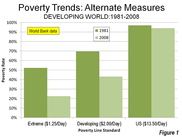
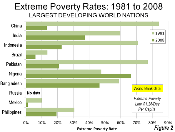
Want to See Better US-Chinese Relations? American and Chinese Millennials Could Be Key

$
0
0

While it is still fashionable for politicians in both China and the United States to prove their domestic leadership credentials by taking tough stances against their nation’s chief economic rival, the results of recent Pew surveys conducted in the two countries suggest that this type of rhetoric is a holdover from an earlier era. An examination of the beliefs among the youngest generational cohorts in each country shows a distinct lack of the ideological vitriol so common in the 1960s and 1970s. As a result, we might see a far more congenial relationship between the world’s two great powers --- at least once the older generations fade away.  

Let’s hope so, because older generations sometimes seem  more committed to discord  than accord. During the 2012 US presidential campaign both President Barack Obama and Governor Mitt Romney took full advantage of opportunities to criticize their opponent for the softness of his approach to China.  Xi Jinping, who was named the General Secretary of the Chinese Communist Party about a week after Obama was reelected and will become China’s Premier early next year, has been no less willing to rhetorically censure the United States.

Yet the Pew research indicates that the youngest generational cohort in both the US and China holds positive attitudes toward and favors contact with the other country.   In the United States that youthful cohort is the Millennial Generation (born 1982-2003), America’s largest and most ethnically diverse and tolerant generation to date. Of the 95 million US Millennials, about four in ten are nonwhite and one in twenty is of Asian descent, with Chinese-Americans comprising the largest portion of that segment. By contrast, among U.S. seniors and Boomers, only about one in five is nonwhite and about two-percent of Asian heritage.

Generational theorists have not definitively named the Millennials’ Chinese counterparts. Some observers, however, have called at least their urban segment “Little Emperors.” Similar to American Millennials, this generation was often reared by their own hovering “helicopter parents” in a highly protected, hyper-attentive manner that reflected the importance of these special children—the  product of China’s  “one child” policy—and the  great expectations their parents had and continue to have for their offspring. The result of this  upbringing are cohorts of civic-minded, pressured, conventional, patriotic American and Chinese young people who revere their parents, are optimistic about their nation’s future, and  open to the world.

In China, the Pew research, conducted in March and April, 2012, contained a battery of questions probing attitudes toward the United States, its interactions with China, and its influence on Chinese society. Across all of these questions, the youngest cohort (18-29 year olds) held significantly more favorable opinions about America than older Chinese. Given that Chinese who are 50 or older include generations that established the Communist regime in 1949, fought American troops in Korea, and were part of the ideological Red Guards of the 1960s, this is not altogether surprising.   

Overall, a majority (51%) of China’s youthful cohort held a positive view of the U.S. as compared with only 38% of older Chinese. More specifically, majorities of 18-29 year olds said they admired American technological and scientific advances (77%), American ideas about democracy (59%), U.S. music, movies, and television (56%), and agree that it is good that American ideas and customs are spreading to China (50%). Across all of these dimensions favorable attitudes toward the United States and its influence were at least 15 percentage points higher among the youngest Chinese cohort than the oldest. In only one area, the American way of doing business, did less than a majority of 18-29 year old Chinese (48%) indicate admiration of the United States; even on this dimension there was a 12-point gap between the positive opinions of younger and older Chinese respondents.

Pew did not ask the same questions in its American surveys that it did in the Chinese study. However, it did examine many of the same dimensions permitting valid comparison of survey results in the two countries. In a November 2011 survey examining the large generation gap in U.S. politics Pew asked if it was better for the United States to build a stronger economic relationship with China or to get tough with China on economic issues. American Millennials, a generation corresponding to Chinese 18-29 year olds, overwhelmingly favored a policy focusing on building stronger trade relations with China rather than one based on toughness (69% to 24%). By contrast, a plurality of the two oldest American generations—Boomers and seniors—believed that a tougher approach instead of closer economic ties with China was best (48% to 45%). These results reflect the far greater support of Millennials than older generations for free trade agreements overall (63% to 42%).

In its April 2012 Values survey, Pew examined the openness of Americans to “foreign,” if not specifically Chinese, influences. In one question, respondents were asked to agree or disagree with the statement: “It bothers me when I come in contact with immigrants who speak little or no English.” Only 32% of American Millennials compared to 44% of all older generations agreed. In another item Pew asked for agreement or disagreement with this statement: “the growing number of newcomers from other countries threatens traditional American customs and values.” Only four in ten Millennials (41%) as compared with a majority (53%) of Boomers and seniors agreed.

American Millennials are a generation that seeks to resolve disputes and conflicts by searching for win-win solutions rather than absolute victories over their opponents. Recent research suggests that their Chinese counterparts share many of the same attitudes. This bodes well for relations between their two countries in coming decades. The big question for the more immediate future is whether older generations in America and China will be able and willing to set aside the attitudes based on the ideologies and policies of the past long enough for Millennials on both sides of the Pacific to forge a new, less contentious relationship.  

Morley Winograd and Michael D. Hais areco-authors of the newly published Millennial Momentum: How a New Generation is Remaking America and Millennial Makeover: MySpace, YouTube, and the Future of American Politics and fellows of NDN and the New Policy Institute.

Shanghai photo by Bigstock.

Alleviating World Poverty: A Progress Report

$
0
0

p>There has been a substantial reduction in both the extreme poverty rate and the number of people living in extreme poverty since the early 1980s, according to information from the World Bank poverty database. The World Bank maintains data on developing world nations, which include both low income and middle income nations. The analysis below summarizes developing world (low and middle income nations) poverty trends from 1981 to the latest available year, 2008 (Table and Figure 1).


Evolution of Low and Middle Income World Poverty: 1981-2008
 Poverty RateChange in Millions% of New Population Not in Poverty
   People in PovertyPeople Not in Poverty
POVERTY RATE & Region19812008
EXTREME POVERTY LINE  ($1.25/Day per capita)   
East Asia and Pacific77.2%14.3%          (812)          1,374 >100.0%
Europe and Central Asia1.9%0.5%               (6)               50 >100.0%
Latin America and the Caribbean11.9%6.5%               (6)             212 >100.0%
Middle East and North Africa9.6%2.7%               (8)             155 >100.0%
South Asia61.1%36.0%                 2              655 99.6%
Sub-Saharan Africa51.4%47.5%            181              233 56.3%
Total52.2%22.4%          (649)          2,679 >100.0%
DEVELOPING WORLD POVERTY LINE ($2.00/Day per capita)  
East Asia and Pacific92.5%33.4%          (652)          1,214 >100.0%
Europe and Central Asia8.4%2.2%             (26)               70 >100.0%
Latin America and the Caribbean23.8%12.4%             (16)             221 >100.0%
Middle East and North Africa30.2%14.0%               (7)             155 >100.0%
South Asia87.3%71.1%            316              341 51.9%
Sub-Saharan Africa72.3%69.3%            275              139 33.5%
Total69.7%43.1%          (109)          2,140 >100.0%
US POVERTY LINE: FAMILY OF FOUR ($13.50/Day per capita)  
East Asia and Pacific99.8%96.6%            499                64 11.3%
Europe and Central Asia88.3%72.1%             (38)               82 >100.0%
Latin America and the Caribbean86.3%79.7%            139                66 32.1%
Middle East and North Africa96.0%95.3%            140                   8 5.5%
South Asia100.0%99.7%            652                   5 0.8%
Sub-Saharan Africa98.7%98.6%            408                   6 1.5%
Total96.9%94.0%         1,799              231 11.4%
Source: World Bank PovcalNet database
Poverty rates lines in 2005 US$ per capita

Extreme Poverty Line ($1.25 Daily per Capita)

Extreme poverty is defined as an income of $1.25 daily per capita, measured in 2005 United States dollars. The extreme poverty line is the average of the poverty rate among the "10 to 20" lowest income nations.

The World Bank data indicates a nearly 60 percent reduction in the extreme poverty rate between 1981 and 2008, from 52.2 percent to 22.4 percent. By far the largest reduction was in the East Asia and Pacific region (which includes the large nations of China, Indonesia, Viet Nam, the Philippines stretches westerly to Myanmar) where the extreme poverty rate dropped more than 80 percent from 77.2 percent to 14.3 percent. Reductions of more than 70 percent were also experienced in the Middle East and North Africa and Europe and Central Asia, which is by far the most affluent of the developing world regions as designated by the World Bank (generally Eastern Europe, including Russia and Ukraine and the Central Asian nations to the western border of China, such as Kazahkstan).

In 2008, approximately 650 million fewer people were living in extreme poverty than in 1981. This gain was dominated by East Asia and the Pacific, which experienced a reduction of 812 million people living below the extreme poverty line. Nearly all of the increase (181 million) in people living below the extreme poverty line occurred in Sub – Saharan Africa, a result of surging populations and still insufficient economic growth.

Even so all six of the regions experienced an increase in the number of people living above the extreme poverty line. Further, in four regions, the increase in people above the extreme poverty line was greater than the overall population increase, and was nearly equal in a fifth. The increase in above extreme poverty population was less than the overall increase only in Sub-Saharan Africa.

More than one half of the new population living above the extreme poverty line (1.37 billion) are in East Asia and the Pacific. Another quarter (0.65 billion) were in South Asia, which includes India, Pakistan and Bangladesh. Gains of from 155 million to 233 million were made in Sub-Saharan Africa, Latin America and the Caribbean and the Middle East and North Africa (in descending order). The sixth region, Europe and Central Asia had by far the lowest extreme poverty rate among the region, yet still managed a 50 million person reduction. 

Developing World Poverty Line ($2.00 Daily per Capita)

The success in reducing poverty was even more skewed to East Asia and the Pacific as measured against a somewhat higher average developing world poverty line of $2.00 daily per capita. The developing world under $2.00 poverty rate declined approximately one-third, from 69.7 percent to 43.1 percent

The largest reduction was in Europe and Central Asia, where such poverty is rapidly becoming a thing of the past. The poverty rate declined almost three-quarters, to 2.2 percent. The $2.00 poverty rate fell 64 percent in East Asia and the Pacific, from 92.5 percent to 33.4 percent. Each of the other four regions also experienced declines in the $2.00 poverty line.

There were 109 million fewer people living below the $2.00 poverty line in 2008 than in 1981. The improvement was heavily skewed toward East Asia and the Pacific, where there was a reduction of more than 650 million living below the $2.00 poverty line. There were, however, substantial increases in the number of people living below the $2.00 poverty line in South Asia (275 million) and Sub-Saharan Africa (316 million).

Nonetheless, more than 2.1 billion additional people lived above the $2.00 poverty line in 2008 than in 1981. All regions experienced gains. East Asia and the Pacific accounted for 1.2 billion of this number, followed by South Asia (341 million) and Latin America and the Caribbean (221 million).

United States Poverty Line ($13.50 Daily per Capita)

Despite these gains, the extent of poverty in the developing world is substantial compared to high income world standards. For comparison, the 2008 poverty line for a family of four in the United States is used, which was $13.50 daily per capita. This is more than 10 times the extreme poverty line and nearly 7 times the $2.00 developing world poverty line.

Between 2001 and 2008, the percentage of people in the developing world living below the US poverty line is estimated to have declined from 96.9 percent to 94.0 percent. Progress was made in each of the six regions, but even in the most affluent developing world region of Europe and Central Asia the poverty rate relative to the US standard remained at 72 percent. Even in largely middle-income Latin America and the Caribbean, the poverty rate, measured by the US standard was 80 percent. All of the other regions were at 95 percent or more. The highest poverty rate relative to the US standard was in South Asia, at 99.7 percent.

Overall, nearly 1.8 billion additional people lived below the US poverty standard in 2008. The number of people living below the poverty standard declined only in the Europe and Central Asia. The largest increase in people living below the US poverty standard was in South Asia, at 652 million, while both East Asia and the Pacific and Sub – Saharan Africa added between 400 million and 500 million.

The increase in the number of people living above the US poverty standard was modest, at 231 million. The largest increase was in Europe and Central Africa, at 82 million, while East Asia and the Pacific and Latin America and the Caribbean added approximately 65 million each.

National Highlights

East Asia and the Pacific have experienced the greatest reduction in poverty rates, as has been shown above. This is largely due to the substantial progress made by its largest nation, China. China experienced the largest reduction in its extreme poverty rate in the world, with a drop from 84.0 percent in 1981 to 13.1 percent in 2008. Among other developing world nations with more than 100 million population, eight experienced significant declines in their extreme poverty rates. One, however, Nigeria, had an increase. There was no data for Russia (Figure 2).

China's below extreme poverty line population declined 662 million, more than 10 times the second largest reduction, in Indonesia at 56 million. In fact, China's reduction in its extreme poverty population exceeded that of the rest of the world (Figure 3).

The number of people living above the extreme poverty line is increasing across the developing world.
Nearly 85 percent of China’s 2008 population lived above the extreme poverty line, an increase of nearly one billion from 1981In India nearly 60 percent of its 2008 population lived above this line, an increase of 450 million. Other large nations experienced large increases in the number of people living above extreme poverty, such as Indonesia (135 million) and Pakistan (115 million) (Figure 4).

Only a few nations had reductions in their number of people living above the extreme poverty rate. The Democratic Republic of the Congo had the largest increase, at 6 million.

Eradicating Poverty: The Highest Priority

The story on world poverty contains both good news to bad news. There is clearly substantial progress is being made in reducing extreme poverty in East Asia and the Pacific but this has not been replicated in other parts of the developing world. The bad news is that, for all the progress, the standards of living for the overwhelming majority of people remain far below first world poverty levels.

Yet, there are signs of hope. A recent report by the Institute of International Finance indicates that over the last decade, Sub-Saharan Africa, long perceived to be synonymous with the world's most intense poverty, has ranked second in economic growth only to East Asia for a decade.

Yet, it can only be hoped that the natural aspiration of the world's billions for much better lives will be achieved. The highest priority should be placed on eradicating poverty, as the recent Rio +20 Conference declared.

-----

Wendell Cox is a Visiting Professor, Conservatoire National des Arts et Metiers, Paris and the author of “War on the Dream: How Anti-Sprawl Policy Threatens the Quality of Life.”

Photograph: New houses in León (Guanajuato) Mexico (by author)

The Rise of Management Consultants

$
0
0

The always-entertaining Freakonomics podcast last week devoted a full episode to the emergence of management consulting firms in the U.S. The podcast got our attention right away when Stephen Dubner rattled off labor market statistics — something that always piques our interest — for management consultants.

DUBNER: Raise your hand if you know somebody who works as a consultant. Yeah, I thought so – pretty much everybody. There are more than 500,000 management consultants in the U.S. – more than 700,000 if you count the self-employed. And there are even more on the way. The Bureau of Labor Statistics estimates the consulting field will grow another 22 percent over the next decade, which means there will be more new jobs for consultants than there will be for computer programmers or lawyers. Now, how does consulting pay? Quite well, thank you. A median salary of about $78,000. That’s more than architects, postsecondary teachers, and a lot of scientists and engineers.

What Dubner referred to as management consultants are actually known, according to the Bureau of Labor Statistics, as management analysts (SOC 13-1111). In this post we’ll explore the growth of this field, especially among those who work as self-employed or contract consultants, and where it’s grown the most (hint: Washington, D.C. and state capitals with government-heavy workforces).

Overview of Management Analysts

Management consulting firms specialize in solving companies’ problems and providing outside advice. And judging by the uptick in employment, they’re providing more of this expertise. The number of management analysts — the wage-and-salary variety who work as employees for big or little firms — has grown 13% since 2001 (from just over 500,000 jobs to an estimated 566,282 in 2012). Approximately 62% of these workers are men, and as Dubner points out, they tend to be young (55% are 25-44 years old). Their median salary is indeed about $79,000 per year ($37.74 per hour), and their wage curve steepens quickly for the top percentile of workers ($68.16 per hour, or nearly $142,000).

But would you guess that there are more self-employed and extended proprietors than salaried employees in this field? Check out EMSI’s class-of-worker breakdown for management analysts:

  • Salaried employees: 566,282 jobs, 13% growth since 2001
  • Self-employed: 155,801 jobs, 52% growth since 2001
  • Extended proprietors: 462,005, 77% growth since 2001

Taken together, there are nearly 1.2 million management analyst jobs in the workforce, and 617,807 of those are in the self-employed or extended proprietor category. And as you can see from our breakdown, those last two segments of workers have seen immense growth since 2001, almost all of which occurred before the recession.

Why So Many Self-Employed and Extended Proprietors?

What’s driving the huge number of self-employed and extended proprietors in management consulting? One possible explanation is that as business executives near retirement, they start working on their own — or on a contract basis with firms — as management analysts. Consider that 62% of the self-employed and extended proprietors in the field are at least 55 years or old (and 25% are 65 and above). That’s a drastic difference from the age breakdown of salaried workers, as illustrated in the following chart.

Note: What we refer to as “extended proprietors” are workers who are counted as proprietors, but classify the income as peripheral to their primary employment. Many industries (primarily oil & gas extraction, finance & insurance, and real estate) include people who are considered sole proprietors or part of a partnership, yet have little or no involvement or income in the venture. Read more here.


The Geography of Management Analysts

Two of the largest management consulting firms, Boston Consulting Group and Bain, are headquartered in Boston. But the epicenter for management analysts is the Washington, D.C. metro. For salaried employees, the nation’s capital is 4.4 times more concentrated with management analysts than the national average. Overall, D.C. has an estimated 87,486 of these jobs — about the same number as the Boston and Los Angeles metro areas put together.

D.C. is also the most saturated with self-employed and extended proprietors, with more than twice the national average. But as the table below shows, San Francisco, San Jose, Boston, and Bridgeport, among others, have much larger percentages of independent management analysts as compared to the total workers in the field in each metro. And when it comes to proprietor growth, Atlanta — the second-most concentrated metro overall — has added a whopping 140% since 2001, compared a more tepid 7% among salaried employees.

Smaller metros also have significant shares of management analysts. Looking at just salaried employees, Madison, Wis., Richmond and Virginia Beach, Va., and Harrisburg, Pa. are among the 10 most concentrated metros.

The bottom line: Metros with a considerable presence of government workers — state capitals and D.C. — have higher saturations of these workers than metros of comparable size.

The following map is for all U.S. metros and shows the percentage job growth since 2001 (ranging from 306% growth to 73% decline). Notice the overwhelmingly widespread growth, with a few pockets of job loss.

MANAGEMENT ANALYSTS - LARGEST 100 METROS
Salaried EmployeesSelf-Employed and Ext. Proprietors
MSA Name2001 Jobs2012 JobsJob Change% Job Growth2012 Conc.Median Hourly Earnings2001 Jobs2012 JobsJob Change% Job GrowthMedian Hourly Earnings2012 Conc.Proportion of Total Workforce
Washington-Arlington-Alexandria, DC-VA-MD-WV40,60756,75116,14440%4.44$45.3714,53827,12412,58687%$33.492.2532%
Atlanta-Sandy Springs-Marietta, GA21,43023,0131,5837%2.43$41.066,20614,9138,707140%$29.671.1639%
Madison, WI2,3672,93857124%2.07$32.721,0001,75375375%$21.051.437%
Richmond, VA4,4685,15168315%2$38.931,2292,4781,249102%$24.011.132%
Virginia Beach-Norfolk-Newport News, VA-NC4,9635,9861,02321%1.76$36.961,3902,6741,28492%$25.601.0831%
Boston-Cambridge-Quincy, MA-NH16,99717,4694723%1.7$45.4411,92517,9556,03051%$32.901.8651%
Harrisburg-Carlisle, PA2,1062,2101045%1.68$30.4060193733656%$28.381.0530%
Baltimore-Towson, MD7,5048,8761,37218%1.63$42.864,0417,4033,36283%$26.701.445%
San Francisco-Oakland-Fremont, CA12,25513,5471,29211%1.6$45.7712,99020,3117,32156%$34.461.8760%
Des Moines-West Des Moines, IA1,9542,18523112%1.6$30.506431,13949677%$31.600.9934%
Columbus, OH5,4595,9044458%1.52$35.682,1794,0471,86886%$26.431.1141%
Columbia, SC1,7642,25148728%1.52$29.895651,223658116%$25.740.7935%
Bridgeport-Stamford-Norwalk, CT2,7922,523-269-10%1.47$43.972,5414,1881,64765%$37.381.562%
San Jose-Sunnyvale-Santa Clara, CA5,9575,619-338-6%1.45$49.585,3138,2412,92855%$36.072.1859%
Chicago-Joliet-Naperville, IL-IN-WI24,84325,3645212%1.43$40.0211,00118,5667,56569%$30.131.0442%
Hartford-West Hartford-East Hartford, CT3,8833,554-329-8%1.42$35.621,6752,7541,07964%$23.681.1344%
Sacramento--Arden-Arcade--Roseville, CA4,2195,09687721%1.4$34.803,0904,8061,71656%$24.931.1649%
Palm Bay-Melbourne-Titusville, FL9321,05412213%1.3$38.085711,02445379%$21.811.0849%
Tampa-St. Petersburg-Clearwater, FL5,3406,07573514%1.29$31.062,4964,9462,45098%$23.220.9645%
Seattle-Tacoma-Bellevue, WA8,0239,2661,24315%1.25$41.545,66910,5464,87786%$31.691.653%
Minneapolis-St. Paul-Bloomington, MN-WI8,4619,2287679%1.25$38.974,9058,7713,86679%$27.071.3349%
San Diego-Carlsbad-San Marcos, CA5,9327,0851,15319%1.21$35.996,1579,0982,94148%$28.581.456%
North Port-Bradenton-Sarasota, FL9791,20122223%1.18$28.501,0182,1521,134111%$29.831.1164%
Indianapolis-Carmel, IN3,6804,29261217%1.17$31.811,9273,7261,79993%$31.061.1646%
Philadelphia-Camden-Wilmington, PA-NJ-DE-MD12,41812,8734554%1.16$42.357,76614,3346,56885%$33.441.453%
New York-Northern New Jersey-Long Island, NY-NJ-PA38,29940,3172,0185%1.16$44.9923,81142,73418,92379%$30.641.0651%
Jacksonville, FL2,3292,88956024%1.16$33.431,3102,6241,314100%$23.780.9248%
Albany-Schenectady-Troy, NY1,9052,0401357%1.15$33.131,3092,04974057%$24.651.3250%
Kansas City, MO-KS4,2484,65640810%1.14$34.102,3503,9491,59968%$30.751.0146%
Dayton, OH1,8141,771-43-2%1.14$35.699611,28632534%$25.490.9942%
Phoenix-Mesa-Glendale, AZ7,6088,34073210%1.13$32.404,6399,1694,53098%$33.221.1452%
Albuquerque, NM1,6161,689735%1.11$32.901,1941,86366956%$22.581.2252%
Nashville-Davidson--Murfreesboro--Franklin, TN2,7983,46566724%1.09$35.651,9743,6931,71987%$30.350.9852%
Charleston-North Charleston-Summerville, SC8351,37253764%1.09$33.585531,384831150%$35.790.8450%
Miami-Fort Lauderdale-Pompano Beach, FL8,4939,9351,44217%1.08$32.235,86111,6625,80199%$25.000.7854%
Worcester, MA1,4601,449-11-1%1.07$38.831,2261,82359749%$25.441.3256%
Ogden-Clearfield, UT69388919628%1.06$35.295161,053537104%$21.400.9254%
Denver-Aurora-Broomfield, CO5,0205,4754559%1.05$35.874,3638,2223,85988%$31.821.2860%
Salt Lake City, UT2,2282,82059227%1.04$29.721,4872,4951,00868%$28.770.9847%
Oxnard-Thousand Oaks-Ventura, CA1,1741,31113712%1.02$35.601,3811,78340229%$28.251.158%
Orlando-Kissimmee-Sanford, FL3,2684,2891,02131%1.02$32.161,6523,3741,722104%$21.700.8444%
Los Angeles-Long Beach-Santa Ana, CA21,06322,9061,8439%1.01$40.1820,89027,3976,50731%$28.440.9554%
Milwaukee-Waukesha-West Allis, WI3,0353,2281936%0.97$34.751,3632,34398072%$24.851.0542%
Colorado Springs, CO1,1161,144283%0.95$39.338951,45656163%$24.091.1156%
Providence-New Bedford-Fall River, RI-MA2,4632,6281657%0.95$36.021,9862,51152526%$23.940.9749%
Cincinnati-Middletown, OH-KY-IN3,5903,9253359%0.94$37.232,2874,1791,89283%$29.331.1352%
Dallas-Fort Worth-Arlington, TX9,43211,6642,23224%0.93$39.317,54316,2528,709115%$32.061.0358%
Cleveland-Elyria-Mentor, OH3,8233,779-44-1%0.92$34.772,5274,0221,49559%$27.451.0752%
Omaha-Council Bluffs, NE-IA1,5481,78223415%0.91$35.498091,33652765%$21.030.8743%
Austin-Round Rock-San Marcos, TX2,3183,10678834%0.9$38.242,7686,8274,059147%$30.821.5269%
Charlotte-Gastonia-Rock Hill, NC-SC2,5253,12660124%0.89$37.001,5353,5001,965128%$26.99153%
Boise City-Nampa, ID86097311313%0.88$25.777011,37167096%$26.390.9758%
Springfield, MA1,1001,068-32-3%0.87$38.839051,34143648%$21.141.1456%
Syracuse, NY1,0331,094616%0.86$33.497501,08433445%$23.921.0750%
Greensboro-High Point, NC1,0741,23916515%0.86$33.315831,12053792%$21.040.9347%
Oklahoma City, OK1,8322,11328115%0.85$32.651,2612,11685568%$21.180.7650%
New Haven-Milford, CT1,3881,259-129-9%0.84$35.651,2032,01881568%$24.781.1962%
Augusta-Richmond County, GA-SC6427389615%0.81$31.58326793467143%$25.980.752%
Greenville-Mauldin-Easley, SC941955141%0.79$30.95475964489103%$29.360.7950%
Rochester, NY1,5361,612765%0.78$42.311,5092,09358439%$24.081.1856%
Honolulu, HI1,4141,63822416%0.78$38.001,1191,71359453%$23.041.0351%
Cape Coral-Fort Myers, FL41865023256%0.78$29.026231,19256991%$34.260.965%
Chattanooga, TN-GA746758122%0.78$30.2145276931770%$32.130.850%
San Antonio-New Braunfels, TX2,1822,79861628%0.74$36.561,8983,7621,86498%$25.260.8457%
Raleigh-Cary, NC1,3271,56323618%0.72$35.671,1813,0571,876159%$28.881.466%
Pittsburgh, PA3,4623,407-55-2%0.72$39.853,0224,7241,70256%$29.951.2258%
Houston-Sugar Land-Baytown, TX6,4508,0671,61725%0.72$45.887,16614,4807,314102%$34.851.0664%
Portland-Vancouver-Hillsboro, OR-WA2,5713,02945818%0.71$35.493,1985,6322,43476%$29.721.2265%
Riverside-San Bernardino-Ontario, CA2,2643,5861,32258%0.71$33.823,2414,9911,75054%$21.480.7358%
Knoxville, TN914964505%0.7$36.299861,57959360%$30.401.0662%
Little Rock-North Little Rock-Conway, AR86998011113%0.69$25.446141,05644272%$25.470.952%
Louisville/Jefferson County, KY-IN1,4721,75828619%0.69$32.211,0901,90581575%$29.220.8752%
Provo-Orem, UT40354314035%0.67$27.335691,394825145%$25.341.1472%
Detroit-Warren-Livonia, MI6,3884,878-1,510-24%0.67$38.723,8477,7563,909102%$25.810.9961%
Tucson, AZ9019979611%0.66$26.221,3222,09877659%$23.631.2268%
Akron, OH75287212016%0.65$32.307901,24345357%$28.091.0759%
St. Louis, MO-IL3,9083,529-379-10%0.65$36.832,7174,6191,90270%$29.330.9557%
Tulsa, OK1,1411,096-45-4%0.63$32.871,0451,63458956%$21.730.7860%
Bakersfield-Delano, CA59276016828%0.63$41.2753980927050%$26.870.6852%
Memphis, TN-MS-AR1,4991,50560%0.61$36.091,1151,86074567%$28.320.6855%
Allentown-Bethlehem-Easton, PA-NJ759828699%0.59$37.077951,21942453%$27.540.9860%
Buffalo-Niagara Falls, NY1,1751,266918%0.57$35.821,1061,63452848%$21.491.0456%
Las Vegas-Paradise, NV1,5801,95437424%0.57$34.801,8323,5551,72394%$30.500.9665%
Wichita, KS769688-81-11%0.57$36.4058378520235%$25.830.6753%
Birmingham-Hoover, AL1,1231,083-40-4%0.54$39.709041,893989109%$29.650.8164%
New Orleans-Metairie-Kenner, LA1,3471,176-171-13%0.53$34.931,3222,09477258%$34.330.7464%
Poughkeepsie-Newburgh-Middletown, NY559522-37-7%0.5$34.216691,18251377%$26.261.0469%
Jackson, MS468499317%0.49$25.355071,01150499%$25.580.8267%
Baton Rouge, LA6867607411%0.49$31.817051,518813115%$25.830.8167%
Stockton, CA43243751%0.49$33.9041960618745%$23.690.6558%
Modesto, CA33033662%0.49$35.8227939411541%$21.030.5854%
Grand Rapids-Wyoming, MI745740-5-1%0.48$31.456201,239619100%$21.660.8863%
Toledo, OH649580-69-11%0.47$38.5462293531350%$25.120.962%
Lakeland-Winter Haven, FL347367206%0.45$30.1530353423176%$21.030.6159%
Fresno, CA5155907515%0.41$33.2661085124140%$23.130.6159%
Scranton--Wilkes-Barre, PA424419-5-1%0.4$34.7436258822662%$23.070.7358%
Lancaster, PA330355258%0.37$39.3748476528158%$27.270.7668%
El Paso, TX3554115616%0.32$31.72374775401107%$21.030.665%
Youngstown-Warren-Boardman, OH-PA246186-60-24%0.2$28.7838257118949%$24.920.6775%
McAllen-Edinburg-Mission, TX1581953723%0.2$35.50222555333150%$21.030.4374%

Data and analysis for this infographic came from Analyst, EMSI’s web-based labor market tool. Follow us on Twitter @desktopecon. Email Josh Wright if you have any questions or comments, or would like to see further data.

Young woman in a field photo by BigStock.

Viewing all 3795 articles
Browse latest View live


Latest Images