Quantcast
Channel: Newgeography.com - Economic, demographic, and political commentary about places
Viewing all 3794 articles
Browse latest View live

America’s Shrinking Cities Are Gaining Brains

$
0
0

If there’s one thing that’s a nearly universal anxiety among cities, it’s brain drain, or the loss of educated residents to other places. I’ve written about this many times over the years, critiquing the way it is normally conceived.

Since brain drain seems to be a major concern in shrinking cities, I decided to take a look at the facts around brains in those places. Looking at the 28 metro areas among the 100 largest that had objective measures of shrinkage – in population and/or jobs – between 2000 and 2013, I looked what what happened to their educational attainment levels.

My results were published in my Manhattan Institute study “Brain Gain in America’s Shrinking Cities.” As the title implies, my key findings were:

  • Every major metro area in the country that has been losing population and/or jobs is actually gaining people with college degrees at double digit rates.
  • As a whole the shrinking city group is holding its own with the country in terms of educational attainment rates, and in many cases outperforming it.
  • Even among younger adults, most shrinking cities are adding more of them with degrees, increasing their educated population share, and even catching up with the rest of the country in their college degree attainment levels.

The following chart of metro area population change vs. degree change for select cities should drive the point home.

Click through to read the whole thing.

In short, for most places, it looks like the battle against brain drain has actually been won. As people there can attest, thanks to many improvements public and private over the years, they are now viable places to live for higher end talent in a way they weren’t say 20 years ago. This means the attention and resources that have been devoted to this issue can now be put to more present day tasks such as repairing civic finances, rebuilding core public services, and creating more economic opportunity for those without degrees.

More commentary later perhaps, but for now please check out the report and share widely.

Aaron M. Renn is a senior fellow at the Manhattan Institute and a Contributing Editor at City Journal. He writes at The Urbanophile.


As Rivals Stumble, America Steps Up

$
0
0

As its former rivals in Asia and Europe slip into torpor and even decline, America, almost despite itself, is recovering its perch as the world’s bastion and predominant power. This is all the more remarkable given that our government is headed by someone who largely rejects traditional ideas about American exceptionalism, preferring to “lead from behind.”

Just a quick look around the world makes clear that the United States has emerged as a relative hot spot in a chilly global economy. China is devaluating its currency and ratcheting down its growth expectations. Japan and Europe continue to lag, as they have for the past decade or two. Indeed, with the possible exception of India, no major country appears on the rise, and several once-ballyhooed rising stars – Russia, Brazil, South Africa – now seem headed for prolonged economic eclipse.

Time for new thinking

America’s mainstream media and intellectual classes now face a quandary. Generally attracted over the past century to economic models other than our own, they have shifted their admiration from Mussolini’s Italy and Stalin’s Soviet Union in the 1930s and, in the 1960s and beyond, Japan, Germany and, most recently, China.

Now all those fashionable role models are clearly unravelling. Instead of seeking to imitate other countries, perhaps it’s time to find ways to bolster our own capabilities. President Obama may prefer to lead from behind, but that has not turned America into the world’s caboose. The country, in its fundamentals, is potentially far stronger and resilient than many believe.

This is not to say that we cannot learn from abroad. There are specific things we should try to emulate, like the Chinese commitment to infrastructure building, northern Europe’s craft training, Japanese industrial precision, Korean technological development and water management strategies from Israel. Even Stalinism produced a terrific subway system in Moscow that still puts ours to shame.

Read the entire piece at The Orange County Register.

Joel Kotkin is executive editor of NewGeography.com and Roger Hobbs Distinguished Fellow in Urban Studies at Chapman University, and a member of the editorial board of the Orange County Register. He is also executive director of the Houston-based Center for Opportunity Urbanism. His newest book, The New Class Conflict is now available at Amazon and Telos Press. He is also author of The City: A Global History and The Next Hundred Million: America in 2050. He lives in Orange County, CA.

Baby photo by Bigstock.

Traffic Congestion: The Latest Urban Mobility Report Ratings

$
0
0

In recent years there has been a proliferation of traffic congestion rating reports. Tom Tom and Inrix are now making it possible to compare traffic congestion in Louisville or even Lexington to Moscow or Paris. The Castrol Magnatic Start-Stop Index adds places like Jakarta and Bangkok. But the granddaddy of them all is the Texas A&M Transportation Institute Urban Mobility Report, which has just been released with 2014 data.

Los Angeles

Los Angeles remains the most congested major urban area in the nation with an average 43 percent added to travel times during peak hours. This article discusses the largest urban areas in the 53 US metropolitan areas with more than 1 million population.

Los Angeles is long been the champion of traffic congestion in the United States. Since Texas A&M began publishing a traffic congestion scorecard in 1982, Los Angeles has usually had the worst traffic congestion, though Houston was reported to have the worst congestion for a few years in the mid-1980s.

It should not be surprising that Los Angeles has the worst traffic congestion. Los Angeles is the nation's most densely populated larger urban area, with 7000 residents per square mile. This high density means that the demand for both car and truck travel is higher than it would be in a lower density city. The Los Angeles freeway system is extensive and its roadways tend to be very wide. Part of the problem is that much of the planned freeway system was not built, such as the Slauson Freeway, the Reseda Freeway, the Topanga Canyon Freeway, the Laurel Canyon Freeway, the Beverly Hills Freeway and the missing link northern extension of the Long Beach Freeway through South Pasadena. None of these freeway cancellations drove people to transit, as some might suggest, as traffic volumes just continued to increase. Despite billions that were spent on rail and busway systems, Southern California's largest transit system continues to draw fewer riders than when there were only buses in 1985.

Congested in Other Urban Areas

The top 10 congested urban areas include two that share commuting sheds with larger urban areas. These are third-ranked San Jose and 10th ranked Riverside-San Bernardino, which can blame part of their traffic congestion on their larger neighbors, Los Angeles and San Francisco (Figure 1).

San Francisco is the second most congested urban area in the nation. The three most congested urban areas are also the three densest urban areas, Los Angeles, San Francisco and San Jose. Seattle ranks fourth and Portland ranks fifth, despite their much lower densities. Seattle's intense traffic congestion is understandable, given its long, narrow geographical shape and the fact that there are only two north to south freeway routes through the urban area. Moreover, things are likely to get worse, as Seattle seeks to implement urban containment (densification) policies that are likely to worsen traffic congestion (Greater  traffic congestion is associated with higher densities).

Portland has obtained the worldwide praise of urban planners who like its densification and anti-automobile policies. Portland, however is paying the price for that with traffic congestion 80 percent as bad as Los Angeles, even with a population density barely half that of Los Angeles.

Austin may also be surprising, because it has a relatively small population (about 2 million) compared to most of the 10 worst congested urban areas. Austin was not large enough to justify more than a single route when the interstate system was designed in the 1950s and was very slow to develop its freeway system. At the same time, in recent years Austin has been the fastest-growing major metropolitan area in the United States, which has also added to traffic pressures.

The least traffic congestion is in Richmond, which has also been estimated to have the best composite traffic congestion among international scorecards. Most of the least congested urban areas have metropolitan population between 1 million and 2 million residents and are located in the East, South or Midwest (Figure 2).

Wasted Fuel

Driving in congested traffic reduces fuel economy and results in wasted fuel (each gallon of gasoline consumed produces the same amount in greenhouse gas emissions). New York and Washington have the largest amount of wasted fuel per commuter, followed by San Francisco, Boston and Portland (Figure 3). The least wasted fuel per peak period commuter is in San Diego, Raleigh, Richmond, Jacksonville and Birmingham (Figure 4).

Changes Since 1982

There have been major changes in traffic congestion indexes among the 53 urban areas since 1982. San Jose has experienced the worst percentage point increase in excess travel time, adding 27 percentage points to its excess peak period travel time. Riverside-San Bernardino, Austin, Portland and New Orleans round out the five urban areas with the greatest increases in traffic congestion (Figure 5). With less growth in recent decades, however, traffic congestion has not increased enough to place in the worst ten in trend.

The urban areas best at controlling their traffic congestion include some surprises. Dallas-Fort Worth has been one of the three fastest growing metropolitan areas in the high income world over the period, but has managed to keep up with its traffic congestion as well as any other urban area (Figure 6).

Similarly, Phoenix has been very rapidly growing and has tied Dallas-Fort Worth for first place in best traffic congestion trend. Phoenix undertook a substantial Freeway building program in the 1980s. Detroit also ties Dallas-Fort Worth and Phoenix, though this reflects its long term economic difficulties and shows that better traffic congestion that results from less growth and job creation is not a positive. Five urban areas tied for fourth best traffic congestion trend, Richmond, Tampa St. Petersburg, St. Louis, Indianapolis and Houston. Like Dallas-Fort Worth, Houston was among the three fastest growing metropolitan areas of more than 5 million people over the period. Like Phoenix, Houston began a major freeway and arterial street improvement program in the late 1980s (perhaps partially in response to the publicity about having the worst congestion).

Four Other Cities

Four urban areas rank in the worst ten in each of the categories of traffic congestion, wasted fuel and congestion trend. San Jose abuts San Francisco which has the second worst congestion in the nation. Among the four, Portland is the most consistent, ranking 5th worst in traffic congestion, tied for 5th worst in wasted fuel and ranked fourth worst in congestion trend. Portland also seems the most out of place, being smaller and not having a more congested, larger urban area abutting it. New York is not a surprise, being the nation's largest urban area, and having many bridges and tunnels, which concentrates traffic. Seattle has long been one of the most congested urban areas and also has geographical challenges, with a number of water crossings, as well as its limited north-south freeway capacity.

The Texas A&M Annual Mobility Report pioneered the way for important urban competitiveness information that allows comparisons by public official and companies that were not possible before. The latest edition advances that purpose.

Wendell Cox is Chair, Housing Affordability and Municipal Policy for the Frontier Centre for Public Policy (Canada), is a Senior Fellow of the Center for Opportunity Urbanism (US), a member of the Board of Advisors of the Center for Demographics and Policy at Chapman University (California) and principal of Demographia, an international public policy and demographics firm.

He is co-author of the "Demographia International Housing Affordability Survey" and author of "Demographia World Urban Areas" and "War on the Dream: How Anti-Sprawl Policy Threatens the Quality of Life." He was appointed to three terms on the Los Angeles County Transportation Commission, where he served with the leading city and county leadership as the only non-elected member. He served as a visiting professor at the Conservatoire National des Arts et Metiers, a national university in Paris.

Top Image: Los Angeles Traffic Congestion: AM Peak, September 2, 2015 From: Google Traffic

The Comeback Of The Great Lakes States

$
0
0

For generations the broad swath of America along the Great Lakes has been regarded as something of a backwater. Educated workers and sophisticated industries have tended to gather in the Northeast and on the West Coast, bringing with them strong economic growth.

Yet increasingly these perceptions are outdated. The energy hotbeds of Texas, Oklahoma and North Dakota may have posted the strongest employment growth since 2007, and were among the first states to gain back all the jobs lost in the recession. But a group of less heralded places from Minnesota to western Pennsylvania have also enjoyed a considerable revival, as energy, manufacturing, logistics and other basic industries have rebounded.

Every Great Lakes state except for Illinois now has an unemployment rate below the national average, a stunning reversal from previous decades.

Ironically the state most popularly associated with long-term economic decline, Michigan, has been lauded in a Pew study as perhaps the ”biggest success story.” From the state’s nadir of household employment in November 2009 through this July, the Wolverine State has added 302,543 jobs, a 7.2% increase.

An Industrial Comeback

One clear key to improving conditions in Michigan and elsewhere is the revival of America’s industrial economy. Following a generation of falling employment, the sector has been on something of a rebound since 2010, adding some 855,000 jobs. Although many of these new jobs are in the Southeast and Texas, Great Lakes states have been at the center of the turnaround. The fastest growth in industrial employment over the past five years has been in three Michiganmetro areas -- Detroit, Warren and Grand Rapids – and Toledo, Ohio.

Structural and political factors are behind the Midwestern recovery. Rising wages in China and the North American energy boom have helped make U.S. companies more cost competitive. German electricity prices, for example, are almost three times the average for the United States. Energy production has been a major driver in large swaths of the heartland, notably Pennsylvania, Ohio, and Oklahoma, where fracking has sparked new development.

This growing competitiveness can be seen in a surge of capital investment. Four of the top 10 statesfor new plant and equipment investment in 2014 are in the Great Lakes region, according to Site Selection Magazine: Ohio, Illinois, Michigan, and Pennsylvania.

Changing Geography Of Human Capital

For generations the Great Lakes has been hemorrhaging people to the rest of the country, mainly the South and West. But that outflow has recently slowed, and in some cases reversed. According to demographer Wendell Cox, the rate of outmigration from Cleveland and Detroit has been cut by half or more while some metro areas, including Indianapolis and Columbus, Ohio, are firmly in positive territory. In contrast, Los Angeles, New York and even the Silicon Valley hub of San Jose continue to lose people to other regions.

More surprising is the movement of younger college-educated people. American Community Survey numbers show some of the fastest growth in the population of educated workers between 2005 and 2013 occurred in places such as Pittsburgh, Columbus, Indianapolis and, yes, Cleveland, which, according to Cleveland State’s Richey Piiparinen, are attractive due to lower costs and a more family-friendly environment.

Another analysis of the changes in the population of educated workers since 2005, by Mark Schill at the Praxis Strategy Group, reflects this shift. The rate of increase in the population of people 25 to 35 with graduate degrees was slightly higher in Pittsburgh than in San Francisco. Grand Rapids, Buffalo, Indianapolis, Columbus and Louisville did even better (albeit off low bases). These citiesare even considered something of new “hipster havens,” as young people look to these old industrial cities as better bargains for life and work.

This brain gain parallels another important shift — the growing relevance of the Great Lakes workforce to companies here and around the world. The region already possesses the nation’s largest store of engineers in the country. STEM employment in a host of fields from manufacturing and medicine to business services is surging fast in many of these areas. Between 2004 and 2014, according to an analysis by Schill, several Midwestern states — Iowa, Michigan, Oklahoma, the Dakotas — added STEM jobs at double digit rates, equaling the percentage increases enjoyed by California and easily outpacing New York.

It turns out that much STEM growth takes place out of the high-profile world of search engines, social media and “disruptive” business service firms. In many cases technical innovations, in the words of the French sociologist Marcel Mauss, constitute “a traditional action made effective,” often in manufacturing, medicine and other fields not always associated with “tech.” The social media and search explosion, so prominent in the Bay Area, home to a remarkable 40% of such jobs, often obscures the serious innovation taking place in the Midwest. For example, much of the earliest advances in self-driving vehicles came not from Google but tractor maker John Deere.

As it looks to develop auto software for cars, Google looks to, in the words of the autonomous car project’s director, “a lot of amazing companies in the Detroit area and international than know how to make cars.”

The Great Lakes position as an innovation center is based on a unique combination of engineeringschools and a high concentration of engineers. Dayton and Detroit rank among the top 12 metro areas in the country in terms of engineers per capita, with a higher concentration than Boston, San Francisco, New York, Los Angeles and Chicago.

One particular hot spot is the area around Warren and Troy, Mich., sometimes referred to “automation alley.” This is where software meets heavy metal, with a plethora of companies focusing on factory software and new computer-controlled systems for automobiles. It is home to engineering software firms like Altair, which has been expanding rapidly, and also where General Motors recently announced plans for a $1 billion tech center, employing 2,600 salaried workers.

Other tech development has been tied to the health care industry, including such regional standouts as the Cleveland Clinic and Mayo Clinic. Madison, Wisc., has a strong government and education employment base but also is home to growing number of technology firms, with information employment since 2009 up an impressive 36.1%. But much of the growth is related to health care, with the leading local company being medical software maker Epic, which employs 6,800 at its sprawling campus in nearby Verona.

Qmed ranks California as the best state for medical device makers, but also ranking highly are Minnesota, Indiana, Pennsylvania and Wisconsin.

In the coming years, more talent should be heading to these area. Housing prices in the San Francisco Bay Area, Los Angeles and New York are at least two to three times higher than most Great Lake metro areas. This is a boon to those who bought far in the past, but a barrier to entry to young aspirational families. To live in San Francisco, particularly for those who hope to raise a family, is increasingly impossible.

It has also led some companies to locate elsewhere, particularly to the Pacific Northwest. In 2011, 1 in 7 people in the Bay Area searched Redfin.com for homes outside of the Bay Area. Now it’s 1 in 4. Adam Wiener, Redfin’s chief growth officer, announced to other executives last month: “The dam has broken.”

Potential Threats

Ultimately the durability of the Great Lakes recovery depends on building off its natural strengths in engineering, its central location along water routes, ample natural resources and low living costs. Pro-business policies have enhanced these advantages and made several Midwestern governors intoserious national political figures, namely Snyder in Michigan, Walker in Wisconsin, and Ohio’s Kasich.

Yet there are serious clouds on the horizon, perhaps the biggest of which is looming EPA greenhouse gas regulations, which could shut down many coal-fired power plants in the region and raise electric rates. 

International forces – notably the devaluation of the Chinese yuan – threaten the industrialresurgence. A strong dollar tends to make exports pricier and imports more competitive. Such changes may not matter too much on the coasts, but Midwestern states are far more dependent on manufacturing. According to the U.S. Bureau of Economic Analysis, many of the states with the highest percentage of their GDP tied to manufacturing are in the region, led by Indiana, where 25%of GDP is tied to industry, followed closely by Iowa, Ohio, Wisconsin, and Michigan.

Ultimately the Great Lakes cannot recover fully unless it continues the revival of its core industries, while expanding in other fields based on the movement of skilled labor coming to the region. If the region can continue its progress, it will be a major boon not only to the people who live there, but to the country that needs an infusion of economic sanity, and down to earth production, to complement the growth of finance, media and communications that dominate so many business headlines.

This piece first appeared in Forbes.

Joel Kotkin is executive editor of NewGeography.com and Roger Hobbs Distinguished Fellow in Urban Studies at Chapman University, and a member of the editorial board of the Orange County Register. He is also executive director of the Houston-based Center for Opportunity Urbanism. His newest book, The New Class Conflict is now available at Amazon and Telos Press. He is also author of The City: A Global History and The Next Hundred Million: America in 2050. He lives in Orange County, CA.

Photo courtesy of BigStockPhoto.com.

Family Friendly Cities

$
0
0

One of the common criticisms leveled at people who promote urban living goes something like this. “Cities are great for college kids, people starting off in their careers, bohemians, and maybe some older empty nesters with money who have a taste for theater and art. But most people have families and tight budgets. Suburbia is the only place that provides a high quality, safe, affordable life for regular folks with children.”

Last year I flew to Pittsburgh, Pennsylvania to attend a wedding. As we were all milling about with friends and family on the porch eating ice cream on a gorgeous September afternoon I noticed some of my fellow out-of-town visitors from New York and San Francisco looking around with a peculiar expression. It was the same kind of look that dogs get when they’re curious and a little confused – one ear up and one ear down. They looked at their kids playing in the grass and sitting on grandma’s lap. I knew very well what they were thinking. They were a family of four living in a tiny one bedroom apartment in Brooklyn and their oldest child will be starting school next year.

IMG_0202 (800x533) (2) Screen Shot 2014-10-11 at 11.03.48 PM Screen Shot 2014-10-11 at 11.08.00 PM Screen Shot 2014-10-11 at 11.02.26 PM

Now, I need you to picture the neighborhood so you get the context here. This is a century old streetcar suburb five miles from downtown. There are tree lined streets, front porches on elegant old homes, a charming Main Street with mom and pop shops a couple of blocks away, and an elementary school directly across the street. Even in this very comfortable and pricey neighborhood a grand home with a patch of grass could be purchased for significantly less than the cost of a one bedroom apartment in Brooklyn. You can actually ride a bicycle to downtown Pittsburgh – and it would be a pleasant and convenient ride. Carnegie Mellon University and a dozen other prominent institutions are nearby.

Screen Shot 2014-10-11 at 11.00.56 PM Screen Shot 2014-10-11 at 11.00.36 PM Screen Shot 2014-10-11 at 11.41.36 PM Screen Shot 2014-10-11 at 10.40.35 PM

In large expensive cities many young families are having to make harsh choices. They can stay where they are and pay exorbitant rents or a shockingly high mortgage for less than ideal accommodations in order to have access to good jobs and urban amenities. Or they can move to a more affordable suburb and spend a couple of hours each day schlepping in and out of the city. Or they can step away from the city entirely and organize their lives around a purely suburban set of arrangements: the subdivision, the office park, the shopping mall… For many people who value urban life these are difficult decisions with a lot of unsavory trade offs.

Screen Shot 2014-10-11 at 11.31.54 PM Screen Shot 2014-10-11 at 11.46.03 PM Screen Shot 2014-10-11 at 11.26.11 PM

Pittsburgh is just one of hundreds of small and medium sized cities in the interior that people in coastal cities like to dismiss as part of “Flyover Country”. What isn’t clearly understood is that Pittsburgh isn’t competing with New York or San Francisco. Instead Pittsburgh is competing with the distant suburbs of places like New York and San Francisco out in the endless smear of anonymous tract homes and strip malls that ring those cities. Pittsburgh wins that taste test hands down every time for anyone who shows up and actually looks around and experiences what’s on offer.

unnamed

John Sanphillippo lives in San Francisco and blogs about urbanism, adaptation, and resilience at granolashotgun.com. He's a member of the Congress for New Urbanism, films videos for faircompanies.com, and is a regular contributor to Strongtowns.org. He earns his living by buying, renovating, and renting undervalued properties in places that have good long term prospects. He is a graduate of Rutgers University.

Neither Olympics Nor NFL Will Rescue Los Angeles

$
0
0

We all tend to have fond memories of our greatest moments, and for Los Angeles, the 1984 Olympics has served as a high point in the city’s ascendency. The fact that those Summer Games were brilliantly run, required relatively little city expenditure and turned a profit confirmed all those things we Angelenos loved about our city – its flexibility and pragmatism and the power of its civic culture.

After Boston turned down its chance to be the U.S. entrant in the sweepstakes to host the 2024 Olympics, it’s natural that Mayor Eric Garcetti and the city establishment, at least what’s left of it, desire a return engagement. But the Los Angeles of today barely resembles the vibrant, optimistic city of 30 years ago.

“The city where the future once came to happen,” a devastating report from the establishmentarian Los Angeles 2020 Commission recently intoned, “is living the past and leaving tomorrow to sort itself out.”

Last Best Chance?

So rather than a bold move toward establishing the city’s preeminence, the current move smacks more of a Hail Mary pass. It also seems to embody a kind of nostalgia, a sentiment reflected not only in the desire to relive Olympic glory but also in the efforts to bring pro football back to town, including, perhaps, a return of the long-departed Rams.

Yet ultimately, neither a third Olympics (the first was in 1932) nor the return of NFL football can alter a city’s fate. After all, the 2000 Athens Olympics did not lead to a new Greek renaissance, but may, instead, have contributed to that country’s fiscal morass. Summer Games in Montreal (1976) and Atlanta (1996) did not usher in a golden age for those cities, but periods of decline.

Read the entire piece at The Orange County Register.

Joel Kotkin is executive editor of NewGeography.com and Roger Hobbs Distinguished Fellow in Urban Studies at Chapman University, and a member of the editorial board of the Orange County Register. He is also executive director of the Houston-based Center for Opportunity Urbanism. His newest book, The New Class Conflict is now available at Amazon and Telos Press. He is also author of The City: A Global History and The Next Hundred Million: America in 2050. He lives in Orange County, CA.

"Olympic Torch Tower of the Los Angeles Coliseum" by unknown, U.S. Air Force - http://www.defenseimagery.mil; VIRIN: DD-SC-85-08929. Licensed under Public Domain via Wikimedia Commons.

Peak People in Japan

$
0
0

Japan reached "peak people" in 2011, when its population reached 127.4 million residents. From that point, all trends point to significant population losses. But, there is by no means unanimity on the extent of those population losses. Population projection is anything but an exact science, and Japan provides perhaps the ultimate example.

Dueling National Population Projections

Japan's agency responsible for projecting population, the National Institute of Population and Social Security Research forecasts a stunning reduction of population to only 42.9 million residents in 2110. For every three Japanese residents today, there will be one in 2110 according to the National Institute of Population. If this projection is realized, Japan's population would drop to a level not seen since the middle 1890s.

The National Institute of Population projects a population loss to 97.0 million residents by 2050, for an annual population loss rate of 0.7 percent from 2015. By 2100, the population would fall to 49.6 million, for an annual loss rate of 1.3 percent. Over the 95 years from 2015, the annual population loss rate would accelerate from 0.4 percent annually to nearly 1.5 percent.

The United Nations is considerably more optimistic about Japan's future population than the National Institute of Population. The UN forecasts a population of 108.3 million residents by 2050, or 11 million more residents than expected by the National Institute of Population. The annual loss rate is 0.4 percent, one half the rate projected by the National Institute of Population. By 2100, the last year of the UN series, the population would be 84.5 million, 35 million more than the National Institute of Population figure. The UN's annual population loss rate would be 0.8 percent (Figure 1).

Major Metropolitan Areas

Much of Japan's urban population is in the dense corridor from Tokyo-Yokohama to Osaka-Kobe-Kyoto, a distance of approximately 300 miles (500 kilometers). The four metropolitan areas of this corridor (Tokyo-Yokohama, Shizuoka-Hamamatsu, Nagoya, and Osaka-Kobe-Kyoto) contain approximately 75 million residents. By comparison, the US Northeast Corridor is about 1.5 times as long and has under 50 million residents.

According to National Institute of Population data, each of the 10 largest metropolitan has reached its population peak. The most populous, Tokyo-Yokohama is the only major metropolitan area to have gained population between 2010 and 2015. Each of the others had already reached their population peaks, according to the forecasts that end in 2040 (Figure 2).

Tokyo-Yokohama:Tokyo-Yokohama is the world's largest metropolitan area (labor market area). Much of it is located on the Kanto plain that stretches in three directions from Tokyo Bay. Between 2010 and 2015, Tokyo-Yokohama grew from a population of 42.6 million to 42.8 million. However a strong turnaround is anticipated. By 2020, the population is expected to fall to 42.4 million. Tokyo-Yokohama is expected to decline to 38.0 million residents in 2040, a reduction approximately equal to the population of metropolitan areas such as Phoenix, Montréal, and Melbourne. The 2040 population would represent a loss of approximately 11 percent from 2015.

Osaka-Kobe-Kyoto: Osaka-Kobe-Kyoto has been Japan's second largest metropolitan area for decades. Osaka-Kobe-Kyoto is a true conurbation, with three separate core cities and their suburbs that have grown together to form a single urban area, which now also encompasses smaller Nara, the country’s ancient capital. Some of Japan's most important historical sites are in Kyoto and Nara. Despite having less than one half the population of Tokyo-Yokohama, Osaka-Kobe-Kyoto has been one of the world's largest metropolitan areas for at least the last half of the century. Osaka-Kobe-Kyoto's population fell from 20.9 million in 2010 to 20.7 million in 2015. By 2040, this large urban agglomeration is forecast to have a population of 17.5 million, down 16 percent from its 2015 level.

Nagoya: Nagoya is Japan's third largest metropolitan area and is located about two thirds of the way between Tokyo-Yokohama and Osaka-Kobe-Kyoto. Nagoya is renowned as the headquarters of Toyota. Nagoya is expected to fall from its 11.3 million residents in 2015 to 11.2 million in 2020 and 10.0 million in 2040. This population loss rate would be similar to that of Tokyo-Yokohama, at approximately 11 percent.

Fukuoka-Kitakyushu: The Fukuoka-Kitakyushu metropolitan area is comprised of two large and separate urban areas. It is the only metropolitan area of the largest five that is not in the Tokyo to Osaka corridor. Further, Fukuoka-Kitakyushu is on the island of Kyushu, to the south of the main island of   Honshu. Fukuoka-Kitakyushu had a population of 5.0 million in 2015 and is expected to fall to 4.4 million in 2040. This is an approximately 12 percent population loss rate, somewhat worse than Tokyo-Yokohama and Nagoya.

Shizuoka-Hamamatsu:The Shizuoka-Hamamatsu metropolitan area is located between the Tokyo-Yokohama and Nagoya metropolitan areas. In 2015, the population was 3.7 million, which is expected to drop to 3.0 million in 2040. This area, long a critical part of Japan’s industrial complex, would suffer the largest loss among the five largest metropolitan areas, at 18 percent.

The Rest of Japan: The balance of Japan would experience an even greater loss, dropping from 43 million in 2015 to 34 million in 2040. This would represent a decline of 20 percent.

Japan: Leading the Way?

Japan is just the first of a wave of nations that are expected to experience population declines. The challenges are likely to be great as the nation is forced to downsize its considerable infrastructure to accommodate a smaller population. With a growing imbalance of senior citizens relative to working age adults, there are likely to be significant difficulties in financing social services. Japan's strategies and successes or failures will be watched closely by national leaders from Berlin to Beijing and Brasilia whose nations  are likely to experience reductions in population and demographic imbalances starting mid-century or sooner.

Wendell Cox is Chair, Housing Affordability and Municipal Policy for the Frontier Centre for Public Policy (Canada), is a Senior Fellow of the Center for Opportunity Urbanism (US), a member of the Board of Advisors of the Center for Demographics and Policy at Chapman University (California) and principal of Demographia, an international public policy and demographics firm.

He is co-author of the "Demographia International Housing Affordability Survey" and author of "Demographia World Urban Areas" and "War on the Dream: How Anti-Sprawl Policy Threatens the Quality of Life." He was appointed to three terms on the Los Angeles County Transportation Commission, where he served with the leading city and county leadership as the only non-elected member. He served as a visiting professor at the Conservatoire National des Arts et Metiers, a national university in Paris.

Photo: Fukuoka (by author)

Is Owning A Car Too Expensive?

$
0
0

Many analysts—usually planners—have been regularly offering a wealth of exhortations concerning how uneconomical it is to purchase, operate and maintain a private car. Is this a valid assertion of a household economic burden? And what is the likelihood that the advice will ultimately prove useful? Household economic decision-making varies greatly, depending principally upon income levels, personal circumstances, and preferences. A single mother with children, or a part-time worker, will make transport choices for radically different reasons than a management executive. With their priorities already set, each of these individuals has little use for generic advice; it is either unhelpful or irrelevant to them.

Such advice often crops up in planning-related journals or web sites. Given that laypeople are unlikely to read these sources, however, the efforts may be largely wasted.

Underlying the production of advice is the presumption that households need it. In theory, consumers can be unaware of costs in certain cases, for example, if a product is relatively new or not universally used, such as e-cigarettes.

This could hardly apply to households and the car market. There are 828 cars per 1000 people in the US; 620 in Canada. Even more telling is market participation by households, as shown by the blue bars in Chart 1, below. By 2012, only about 9% of households did not own a vehicle, compared to over 20% in 1960. These figures speak of a large majority of households in the car market. As for households that opted not to own a car, their absence from the market may be due, at least partly, to their knowledge of the costs.

Chart 1 Source: Oak Ridge National Laboratory; Transportation Energy Data Book. Table 8.5.

If knowledge is not at issue, the question becomes whether households manage their expenses on this item prudently, or if they could use expert advice to do so.

Advice on how to manage household transportation expenses is, evidently, also unnecessary. Statistics on household expenditures leave little doubt that households manage their transportation budgets surprisingly well. Consumer surveys show that among all income quintiles, with total household expenditures ranging from about $31,000 to five times that ($155,000), the percentage allocated to transportation is fairly constant – around 15% (Chart 2). The only exception is found among the highest quintile, which may simply be indicative of higher disposable incomes. (We hope readers will be lenient about our use of statistics from multiple countries. The intent is to show trends, rather than report on the specifics of a chosen country.)

Not only is the mid-teen figure constant across different income groups, it is also constant across countries. The European Union, for example, reports 13.0% and 13.2% all across the EU (excluding its newest members). It is hard to interpret this consistency as anything other than an ability to control transportation costs in a way that meets a household’s needs and budget, particularly when seen in juxtaposition to the expenditure on shelter.

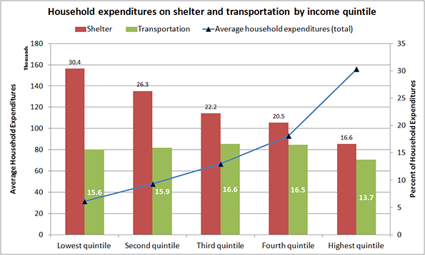
Chart 2 Source: Statistics Canada, Survey of Household Spending. Table 2: Budget Shares Of Major Spending Categories By Income Quintile, 2012.

This consistency of the transportation expense at all income levels is intriguing and instructive.Researchers have suggested that it represents a universal constant. Regardless of its universality, it indicates the adaptability people demonstrate in controlling this expense. This adaptability ranges from choosing the means of transport (foot, bike, transit, car or rail), their level of effort, the time they are willing to spend traveling, and their flexibility in reaching destinations.

For example, public transport lowers costs, but is generally slower than a car (Chart 3). In 2005, 21% of drivers recorded a 90+ minute round trip as opposed to three times that (64%) reported by transit riders. As might be expected, public transport users are predominantly lower quintile households that trade cost for time (Chart 4).

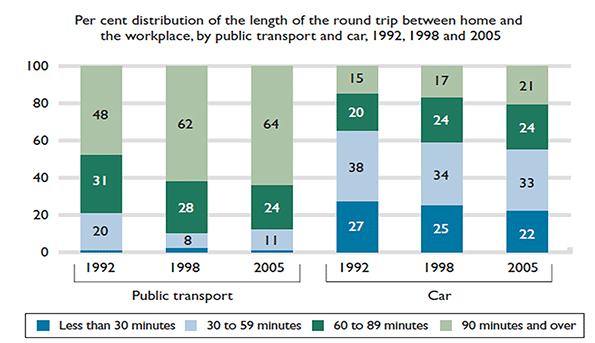
Chart 3 Source: Statistics Canada, General Social Survey, Trip Duration, 1992, 1998, and 2005.

Choosing the mode of transport is one path to controlling costs, and certain households are clearly doing so. As the chart below shows, about 75% of bus riders (adding the first three bars) earn up to $50,000 a year, a lower-rank quintile income. Riding the bus is a conscious choice, as percentages of riders of other income brackets suggest, but for the 75% it may also be an economic necessity.

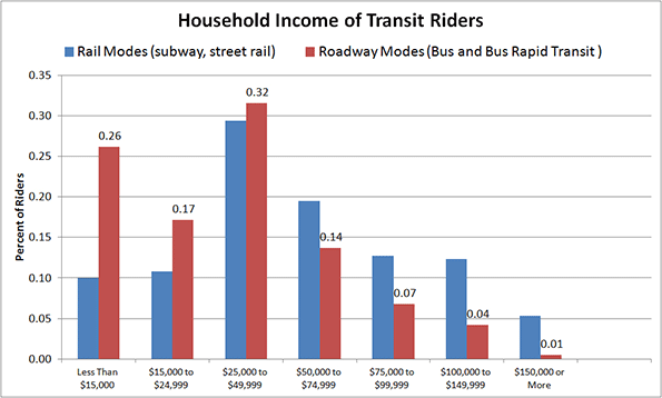
Chart 4 Source: American Public Transportation Association, A Profile of Public Transportation Passenger Demographics and Travel Characteristics, 2007.

Other options in controlling transportation costs include walking and bicycling where possible, accessing the second-hand car market, and choosing other motorized transport.

One good example of 'other' motorized transport is motor scooter ownership in developing nations, and in certain industrialized countries. In Taiwan, for example, “….Scooter is the primary mode of transport on this densely populated island - there are about 15 million for 23 million citizens.” Such wide-spread dependence on scooter-based motorized mobility correlates well with its cost and the per capita GDP of its users. Italy, for example, tops the EU in scooter/motorbike ownership. It may not be pure coincidence that it also has one of the lowest GDPs per capita among EU nations.

The resale market for cars in the US outstrips the new car market by about one to three (Chart 5). Not only is the market large but also, significantly the average cost of a pre-owned car is generally about half its original price.

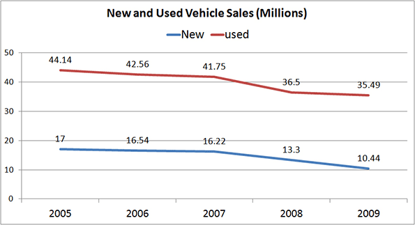
Chart 5 Source: NIADA’s Used Car Sales Industry Report; Relative Size of Car Markets for New and Used Cars, 2010.

The size of the resale market demonstrates yet another means by which consumers—particularly the lower quintile households— seek and grasp the opportunity to control car-related costs. As is evident from Chart 6, three of the five quintiles limit their new car purchases extensively; an overwhelming majority of consumers (averaging 77%) buy used cars. That figure reaches about 81% among the lowest quintile households.

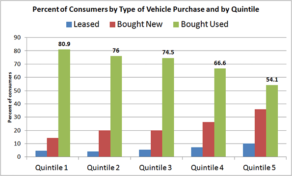
Chart 6 Source: Laura Paszkiewicz, The Cost and Demographics of Vehicle Acquisition, Consumer Expenditure Survey Anthology, 2003 (61) Division of Consumer Expenditure Surveys, US Bureau of Labor Statistics.

Not only does the resale market allow for control of a buyer's initial investment, but segments within the market further enhance that ability. As Chart 7 shows, the price differential between a private sale and that from a franchised dealer can range from double to triple.

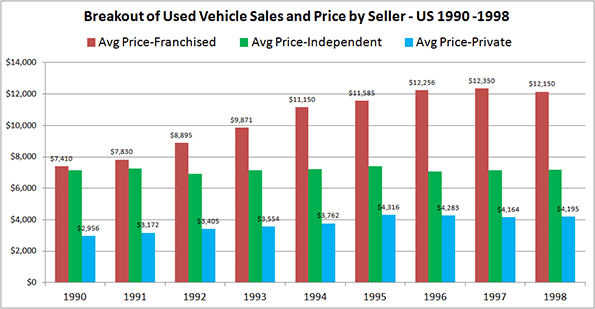
Chart 7 Source: The Used Vehicle Market in Canada, DesRosiers Automotive Consultants Inc., 2000.

The twentieth century saw momentous change and variety in the means of transport, both personal and collective. All new entries except bicycles are motorized, and were unimaginable a mere century earlier. The previous means of transportation — horse-dependent — lasted for at least forty centuries, during which collective transport was non-existent. Motorized personal transport is just one instance in a trend of displacing muscle-dependent activities with motor-driven ones (such as climbing stairs being supplanted by using elevators). The change has been astonishing, unusually fast, and, judging by the plethora of articles on the topic, a cause for concern to some.

Statistics and examples so far allow us to draw at least one indisputable conclusion: Households do know their transportation costs, and adjust their expenditures according to their needs and budget by taking advantage of available opportunities. It would appear that there is little need for guidance on either front.

Fanis Grammenos heads Urban Pattern Associates (UPA), a planning consultancy. UPA researches and promotes sustainable planning practices including the implementation of the Fused Grid, a new urban network model. He is a regular columnist for the Canadian Home Builder magazine, and author of Remaking the City Street Grid: A model for urban and suburban development. Reach him at fanis.grammenos at gmail.com.

After twenty-four years at Canada Mortgage and Housing Corporation, Tom Kerwin now leads an active volunteer life, including being the Science and Environment Coordinator for the Calgary Association of Lifelong Learners. He holds a Master’s degree in Environmental Studies from York University.

Special thanks to Luis Rodriguez for collaborating in shaping this article.

Flickr photo by promich: Car Town, a used car lot in Chicago.


Behind the Facade in St. Petersburg

$
0
0

St. Petersburg, Peter the Great’s new European style capital for imperial Russia, is the most visited city for tourists in Russia. It has a ton of great buildings, energetic street life in its smallish central core, and world-renowned cultural institutions like the Hermitage Museum and the Mariinsky Theater.

As with Moscow, however, I am not going to attempt to replicate what you can find better elsewhere online or in a guidebook. Rather, I want to show a few things that reflect on something a person there told me, namely that “St. Petersburg is like a facade of a city,” similar to the Hollywood western sets in which the “storefronts” have nothing behind them.

I’m not sure exactly what this guy was trying to communicate about his city, but I did experience a few things that I think relate to it, in which the interior of a space is completely different from what you might expect from the exterior. St. Petersburg would appear to be, like many places, a city where you need a local in the know to really show you around.

Consider, for example, this long, well-maintained, genteel, colonnaded, and I think somewhat dull facade.

St. Petersburg - August 2015

What do you think is behind it? Would you believe this:

St. Petersburg - August 2015

It’s a large and high energy street market in a sort of courtyard space. Here’s another passageway with vendor:

St. Petersburg - August 2015

And this place, which left me speechless:

St. Petersburg - August 2015

Then there’s this building, which the person I was with thought was actually abandoned.

St. Petersburg - August 2015

There was somebody sitting out front on a folding chair who looked like a construction worker because his trousers were covered in plaster. We asked to take a peek and it turns out the whole thing was being used as a studio by several artists.

St. Petersburg - August 2015

I had a much cooler picture of an amazing sculpture someone was working on, but he didn’t want it photographed.

Then there are derelict industrial buildings that are more than what they seem, like this one which is in the very center of town, which you can tell from the cathedral sticking up behind it.

St. Petersburg - August 2015

In addition to being home to several creative firms and software companies, the interior of this space also has clubs and bars, one of which I enjoyed a craft beer at. It was a very cool space but I sadly neglected to take a picture.

Here’s another building that at first look doesn’t appear to have much promise.

St. Petersburg - August 2015

But follow that path to a metal door on the back left corner, walk up the staircase to the roof, and there’s a great cafe with excellent coffee and amazing rooftop views of the city.

St. Petersburg - August 2015

What’s in here, I wonder? Not sure. It’s owned by Roman Abramovich, who did not invite me over for tea.

St. Petersburg - August 2015

I’ll wrap up with a couple of urban planning notes. First, a street sign warning of, well, you get it.

St. Petersburg - August 2015

Both St. Petersburg and Moscow have Uber, by the way. I’m not sure how useful it is for tourists, since the two times I took it in St. Petersburg, extensive phone conversations with the driver needed to take place to physically connect, and my Russian speaking companion took care of that. St. Petersburg, as you might have gathered, has a lot of canals and other bodies of water, and they have rolled out UberBOAT service there as well.

I’ll wrap up with a picture of a newish building.

St. Petersburg - August 2015

The local person who was showing me around noted that there were often disputes over buildings like this, with some architects demanding better designs. You’ll note the ground floor treatment could be improved, and the upper floors are EIFS or some similar product, which urbanists there seem not to like any more than we do here.

You can view more of my iPhone pictures of St. Petersburg on Flickr.

Aaron M. Renn is a senior fellow at the Manhattan Institute and a Contributing Editor at City Journal. He writes at The Urbanophile.

Wave of Migrants Will Give Europe an Extreme Makeover

$
0
0

The massive, ongoing surge of migrants and refugees into Europe has brought up horrendous scenes of deprivation, along with heartwarming instances of generosity. It has also engendered cruel remembrances of the continent’s darkest hours. But viewed over the long term, this crisis may well be the prelude to changes that could dissipate, and even overturn, some of the world’s most-storied and productive cultures.

Some may prefer to ignore the long-term impacts of huge migration from the often-chaotic developing world – where 99 percent of the world’s population growth will be taking place – to the more orderly, prosperous and low-fertility richer countries. Separated from the daily drama, the human movement from Syria, the rest of the Middle East and Africa can be seen as potentially changing European society forever by breaking its already-weak Christian foundations and threatening the future of Europe’s elaborate welfare states. In many ways this invokes the vision laid out in the 1973 French novel “Le Camp des Saints,” which envisioned a Europe overwhelmed by a tide of poor refugees.

These concerns, of course, are not simply European. The flow of generally lower-income people from Central and South America has emerged – largely courtesy of the demagogic Donald Trump – as a key political issue in the Republican presidential race. Claims, based on federal employment data, that immigrants have gained far more jobs in the recovery is the kind of thinking that keeps Trump in business. Concerns about other transfers from the Third World to the First World have also surfaced in a host of other countries, including Canada, Australia and even orderly Singapore.

Read the entire piece at The Orange County Register.

Joel Kotkin is executive editor of NewGeography.com and Roger Hobbs Distinguished Fellow in Urban Studies at Chapman University, and a member of the editorial board of the Orange County Register. He is also executive director of the Houston-based Center for Opportunity Urbanism. His newest book, The New Class Conflict is now available at Amazon and Telos Press. He is also author of The City: A Global History and The Next Hundred Million: America in 2050. He lives in Orange County, CA.

Gas Tax Still a Tax

$
0
0

Governor Jerry Brown recently released a plan to find funds to fix California’s roads. Infrastructure funding is one of the essential roles of government, so it’s refreshing to hear that our otherwise dysfunctional state government is taking action on this front. But who will be paying for it? Those who use the roads most, that is, California’s drivers, who disproportionately tend to be members of the middle and working classes.

The Brown plan has two main components: a $65 highway user fee, and a lifting of the gas tax by 6 cents per gallon. The rise of the California state gas tax from 66 cents to 72 cents and the imposition of an additional registration fee are the products of a fairly standard view on infrastructure funding. The underlying thought is that the people who use infrastructure should contribute to its maintenance. After all, this is how private enterprises and public utilities from the Washington State Ferries system to the Los Angeles Department of Water and Power stay afloat. Tolls and fees for road use are nothing new, so why should anybody be concerned with small increases in California’s fees, especially when the funds go to so crucial a cause as infrastructure repair?

Because although these new costs may seem to be a pittance, for middle and working-class families every rise in the cost of living eats away at social mobility by reducing the amount of cash individuals can invest in homeownership, education, and other middle-class privileges

The service-fee model of infrastructure maintenance is theoretically sound. But every policy comes with unintended consequences. In California, the cost of living is driving middle and working-class families to cheaper climes like Texas and Florida in droves every year.

The blue regulate-and-tax model does have its uses. It’s important that there are reasonable regulations addressing every area of economic activity, and for certain public goods like vehicle and firearm registration, slight fees are sensible. But regulations have a way of cropping up frequently and never going away, even once they’ve become irrelevant. One regulation turns to four, four to twelve, and taxes and fees proliferate as well. What was once a fair and reasonable system devolves into a tangled web of incomprehensible rules and restrictions, veritably stifling growth, innovation, and freedom.

That’s where the regulate-and-tax model of Governor Brown’s infrastructure funding plan is leading us. California drivers already face a plethora of rules and fees, and adding a gas tax and registration fee only complicates the system more. Whatever the benefits are for the state’s coffers, the results are disastrous for those who will be most affected.

And it’s not as if the proposed new fees revolutionize California’s infrastructure in any way. The funding plan won’t reduce congestion or improve the flow of people, goods or ideas around the state. The American Interest reports on some important trends in transportation which the money-grubbing Brown plan largely ignores, including smarter cars and busses and ultimately autonomous vehicles.

This funding plan is a short-term fix to repair crumbling infrastructure that was built decades ago. Were it something more visionary and transformative, like a series of test courses for driverless electric vehicles, perhaps the added weight on the middle class could be justified. But, like all blue policies, it is merely an attempt to repair a system that was built in another time, for another world. There’s nothing imaginative in it at all.

There must be a better way.

Most sensible political observers would agree that investment in infrastructure funding is one of the state’s most important responsibilities. It pays for itself in time, and the upfront cost is too high for the private sector to take on. The government is the only actor that can adequately plan for and fund infrastructure on a mass scale, and it should do it well.

But to pay for the repair of infrastructure, we shouldn’t soak the very people whom that repair is meant to help — the masses of middle-class and working-class California drivers. While service fees are justifiable at times, there are some things, like convenient transportation and quality education, that the government should strive to provide as a workable starting point for upward mobility.

The money has to come from somewhere. In the $168 million 2015 California state budget, only $12 million went to transportation and infrastructure development. And of the funds that went to other areas, especially the $50 million apiece going to K-12 Education and Health and Human Services, not all of the money the state spends is going into teaching children or healing illnesses. Public employee pensions make up an estimated 19% of the state’s budget, and while pensions are important for government workers, they don’t particularly benefit the broader economy or the masses of California's population. They also tend to drive polities into bankruptcy, as the fates of Stockton, Mammoth Lakes, and San Bernardino demonstrate.

California’s misaligned spending priorities are as titanic as those of the federal government. Funds ought to be redistributed to investments in infrastructure. More importantly, funding to other areas should be more efficient, with more money going directly to services the government is pledged to provide, so that existing taxation could be better dedicated to crucial public investments without soaking the middle and working classes.

Budget reform is the most pressing issue California faces today. That's why the issue of Governor Brown's gas tax proposal is so important this year. Only under a reformed budget system can the state make investments in infrastructure, education, and innovation, and run them properly, to promote broad-based economic growth and social mobility. Slapping taxes on the lower classes is a cheap, easy way out of making the uncomfortable steps necessary to realign the state budget.

Flickr photo by Pranav Bhatt of drivers in Los Angeles

Luke Phillips is a student studying International Relations at the University of Southern California. He has written for the magazine The American Interest and is a research associate at the Center for Opportunity Urbanism.

Black Exodus: African-American Children to the Suburbs

$
0
0

One of the most significant results of the 2010 census was the continuing shift of the African-American population from the core cities to the suburbs of major metropolitan areas (Note). In 2010, 55 percent of the African-American population was in the suburbs, up from 48 percent in 2000 (Figure 1). In 2000, 26 percent of African-Americans aged five to 14 lived in the core cities of the major metropolitan areas. By 2010, only 21 percent lived in the core cities (Figure 2).

Overall, the national African-American population increased 12.3 percent between 2000 and 2010. However, African-Americans aged 5 to 14 population dropped 6.5 percent. The loss in the core cities was 23.6 percent and there was a loss of 0.6 percent in the suburbs. Overall, the major metropolitan areas had a loss of 6.4 percent, while areas outside the major metropolitan areas suffered a smaller loss of 6.6 percent.

Core City Trends

Overall, the loss in African-American school children in the core cities was from 1,047,000 to 801,000. This was more than seven times the rate of decline of the overall African-American population of three percent in the core cities.

The largest core city school children loss was, not surprisingly, in New Orleans. A large share of the loss was the result of the Hurricane Katrina losses. The city of New Orleans lost more than one-half of its population in the year following Hurricane Katrina, dropping from 452,000 in 2005 to 223,000 in 2006. The 2000-2010 loss in African-American school children was 52.5 percent.

The intensity of the losses elsewhere, however, could not be excused by natural disasters or poorly maintained levies. The two core cities of the San Francisco metropolitan area, often ranked as the nation's most affluent, suffered the largest losses outside New Orleans. Both the cities of San Francisco and Oakland lost 45.9 percent of their African-American school children. Their huge losses without the disaster of New Orleans was even worse than in Detroit, which lost 45.0 percent of its African-American school children. The city of Detroit, of course, has lost more from its population peak than any other large core municipality in high income world. The 2000 to 2010 decade experienced the largest percentage decline among the last six decades (all of which had declines).

The fifth through tenth largest losing core cities were bunched from 35.9 to 33.2 percent losses, which were much less than the four largest losers, but still significant. These included San Diego, St. Louis, Los Angeles, Chicago, Pittsburgh and Cleveland (Figure 3).

The strength of these losses is particularly significant in the core cities that had overall population growth during the period, all in California (San Francisco, Oakland, San Diego and Los Angeles).

Not all metropolitan areas are losing black children. Ten core cities experienced increases in their African-American school children population. Raleigh had the greatest growth, at 51.3 percent. Salt Lake City had the second largest increase, at 45.8 percent, though from a very small base. Louisville had a 45 percent increase, however this was largely due to a city-county consolidation that more than doubled the city population. Two fast growing core cities ranked fourth and fifth. Charlotte experienced the fourth largest increase at 25.4 percent, while Phoenix added 14.7 percent. Columbus ranked sixth with an increase of 11.6 percent. Orlando, Nashville, St. Paul and Las Vegas rounded out the 10 core cities with the fastest growing African-American school children population (Figure 4).

Suburban Trends

The Salt Lake City suburbs had the largest gain in African-American school children population, at 88.5 percent. This, however, was on a very small population base. The fast growing suburbs of Phoenix ranked second at 66.3 percent. Minneapolis-St. Paul, which has long had a relatively small African-American population share gained 52.0 percent for a third placed ranking among metropolitan areas. All of the balance of the top ten suburban areas were in faster growing metropolitan areas, including Austin, Las Vegas, Atlanta, Dallas-Fort Worth, San Antonio, Raleigh and Orlando (Figure 5).

The suburban losses in African-American school children mirrored patterns of core city losses to some degree. Los Angeles had the largest loss, at 31.4 percent. The suburban Los Angeles loss was substantially greater even of second place New Orleans, at 27.6 percent. The three other coastal California metropolitan areas took three of the next four positions, with San Diego losing 25.2 percent (3rd), San Francisco losing 24.9 percent (4th), and San Jose losing 16.3 percent (6th). The suburbs of New York ranked 5th, with a loss of 17.3 percent. The suburbs of Pittsburgh, Chicago, Virginia Beach-Norfolk and Detroit occupied the 7th through 10th worst positions (Figure 6).

California's inland metropolitan areas, which have been attracting families looking for less unaffordable housing for years, did better. The Sacramento suburbs lost 0.3 percent and Riverside-San Bernardino lost 3.8 percent, both better than the national major metropolitan suburban average loss of 6.4 percent.

Major Metropolitan Trends

Salt Lake City had the greatest major metropolitan area gain, at 81.9 percent, again on a small 2000 population base. Fast growing Phoenix had the second greatest growth, at 51.7 percent. Raleigh placed third at 33.2 percent. Minneapolis-St. Paul was 4th, at 31.3 percent, Las Vegas 5th at 30.5 percent and Atlanta 6th at 25.9 percent. The top ten also included Charlotte, Atlanta, Dallas-Fort Worth and Columbus (Figure 7).

The metropolitan areas with the largest loss in African-American school children tended to be those with the largest core city losses. New Orleans suffered the largest loss, at 35.5 percent. Los Angeles lost the second most, at 32.1 percent, even without a devastating hurricane. San Francisco had the third greatest loss at 30.0 percent, followed by San Diego, at 28.3 percent. Detroit's loss was 24.7 percent. San Jose ranked sixth, with a loss of 19.7 percent. The coastal California metropolitan areas represented four of the six worst losses out of the 51 major metropolitan areas. New York, Chicago, Pittsburgh, and Cleveland completed the bottom ten (Figure 8).

Los Angeles, San Francisco, and San Diego each appear in the bottom 10 in retaining African-American school children between 2000 and 2010, in core city population, suburban population and metropolitan population. San Jose appears in the bottom 10 in two categories, suburban and metropolitan. Only New Orleans is featured as prominently, as would be expected given Hurricane Katrina related events, Detroit also appears in all three categories, principally due to its core, the politics and economics devastated city of Detroit.

Why are They Moving?

African-American kids (read families) are leaving the core cities around the nation for various reasons. Some of the exodus appears to be the result of gentrification, as more affluent groups migrate into formerly African-American neighborhoods. Sometimes this is due to market forces, but it can also be  facilitated by public subsidies,  Portland is such an example (see The White City and In Portland's heart, 2010 Census shows diversity dwindling).

But there’s good news too. Many African-American families are moving up the economic ladder and moving to where schools are perceived to be more functional and safer, and where they can have larger houses, larger yards and more privacy. City of St. Louis Alderman Antonio French reacted to the African-American population exodus noting that “Black families don't want to live in high-crime areas. They don't want to live where they don't feel safe. They don't want to live where there aren't educational opportunities, economic opportunities. A lot of black families went to [suburban] St. Louis County looking for a better life." Better lives is what really matters.

Note: Major metropolitan areas had more than 1,000,000 population in 2010. The metropolitan areas are defined as in 2010. Core cities are the historical core municipalities of the major metropolitan areas. These exclude principal cities that are suburban areas with large employment bases.

Wendell Cox is Chair, Housing Affordability and Municipal Policy for the Frontier Centre for Public Policy (Canada), is a Senior Fellow of the Center for Opportunity Urbanism (US), a member of the Board of Advisors of the Center for Demographics and Policy at Chapman University (California) and principal of Demographia, an international public policy and demographics firm.

He is co-author of the "Demographia International Housing Affordability Survey" and author of "Demographia World Urban Areas" and "War on the Dream: How Anti-Sprawl Policy Threatens the Quality of Life." He was appointed to three terms on the Los Angeles County Transportation Commission, where he served with the leading city and county leadership as the only non-elected member. He served as a visiting professor at the Conservatoire National des Arts et Metiers, a national university in Paris.

Photo by Martin Lenders for the U.S. Census Bureau (the U.S. Census Bureau Photo Services) [Public domain], via Wikimedia Commons

Are-You-Better-Off: An Update

$
0
0

Going into the silly-season of US Presidential campaigning, I want to get a head start on updating the “Are you better off today than you were four years ago?” discussion. In an April 2009 ng article, Rogue Treasury, I compared measures of our economic well-being before and after passage of the Emergency Economic Stabilization Act of 2008. Treasury assured Congress and the people that spending $700 billion would “ensure the economic well-being of Americans.” The Troubled Asset Relief Program (TARP) was going to save the American Dream of homeownership. The numbers showed a very different story. We were, in fact, largely worse off in the first six months after the bill passed. In the table below, I update the figures for May 2015.


Before TARP

So Far

2015 Update

National Unemployment

7%

8%

5.5%

    Lowest state unemployment

3.3% (WY)

3.9% (WY)

2.6% (NE)

    Highest state unemployment

9.3% (MI)

12% (MI)

7.6% (CO)

National Foreclosure rate (per 5,000 homes)

11

11

5

    Lowest state foreclosure rate

< 1 in 7 states

< 1 in 6 states

<1 in 4 states

    Highest state foreclosure rate        

68 (NV)

71 (NV)

12 (FL)

Dow Jones Industrial Average

10,325

7,762

18,126

“Before TARP” figures are as close to passage of the Bailout Bill (October 3, 2008) as possible; “So Far” figures vary slightly by category from February through April 2009. Unemployment and foreclosure rates by state were available at Stateline.org. The 2015 Update are May 2015 from RealtyTrac.com and BLS.gov.

“Before TARP” figures are as close to passage of the Bailout Bill (October 3, 2008) as possible; “So Far” figures vary slightly by category from February through April 2009. Unemployment and foreclosure rates by state were available at Stateline.org. The 2015 Update are May 2015 from RealtyTrac.com and BLS.gov.

Six years later, homeowners appear to be potentially better off even in the worst hit state, Nevada, where they can no longer claim the highest state foreclosure rate. That honor now belongs to Florida. But look at the other end – there are fewer states than ever in the category of having less than 1 foreclosure per 5,000 homes. In December 2006, there were 17 states with less than 1 per 5,000 homes. Nationally, foreclosures in May 2015 were about where they were in December 2006, before things got really bad but after foreclosures were already on the rise nationally – up 35% from the previous year. In December 2006, Florida was at about 6 foreclosures per 5,000 homes; the rate is double that now at 12. Nevada was at 13 in 2006 compared to about 10 now.

National unemployment before the recession and all the bailouts and stimulus packages (2007 average) was 4.6% – we just are not seeing full recovery yet. Nebraska’s unemployment rate is a little lower now than the 2007 annual average of 3.0%. At the other end of the spectrum, Colorado’s May 2015 unemployment rate is 7.6%, still about double its rate of 3.8% from 2007. Where there is recovery, it is very, very uneven. The battle ground states in the 2012 Presidential election were Colorado (worse), Florida (worse), Michigan (better), and Nevada (better).

Meanwhile, the rich got richer with TARP. The Dow Jones Industrial Average is up 75% above its pre-TARP level. This as it turns out, seems to be the point of TARP after all. Instead of helping citizens stay in their homes, TARP was used to bailout the banks by purchasing the mortgage-backed securities that weren’t backed by mortgages. After about a month of that, in November 2008, Quantitative Easing (QE) was used to buy the mortgage-related bonds and the TARP money was re-directed so the Fed could take ownership positions in financial institutions.

By the way, just as we had pointed out in our January 2009 ng article Should We Bailout Geithner Too? a US Court ruled that the New York Fed did not have legal authority to take over a business. On June 15, 2015, Judge Thomas C. Wheeler ruled (in Starr International v. The United States, Case No. 11-779C) wrote: ‘there is nothing in the Federal Reserve Act or in any other federal statute that would permit a Federal Reserve Bank to take over a private corporation and run its business as if the Government were the owner’ the way they did with AIG. Judge Wheeler noted that the Fed’s own lawyers told them they were ‘on thin ice’ going forward with their plans.

Here’s the bottom line: Legislation that was passed to support homeownership ended up supplying cash to banks both domestic and foreign. Between TARP and QE, the banks were able to sell all of their junk bonds to the government and use the extra cash to pad their reserve funds. More than half of the total money supply in the US is sitting in banks as excess reserves, earning 0.25% interest. That’s about $6.3 billion a year going to the banks on top of all the bailouts, loans, junk bond sales, etc. When the Fed decides to raise interest rates – my guess is February 2016 – the banks will be earning even more by holding on to the money they got from the Fed


Data Source: http://www.federalreserve.gov/releases/h3/Current/, Table 2. Monthly August 2014 through June 2015, then bi-weekly from July 8 through September 2, 2015.

Banks are using their excess reserves to run up the value of the stock market through overnight lending and investments. These are short-term investments – overnight is very short term! They are not the kinds of investments that create jobs or make homeowners better off. They are, however, the kinds of investments that make bankers better off. They also add to the wild swings you see in the Dow Jones Industrials Average (volatility).

Richard Nixon was quoted by a British newspaper in 1987 as saying that if the economy turns down, “a jackass” could be elected on the Democratic ticket.* As the 1988 presidential election approached, the US had just completed 6 years of economic expansion and the unemployment rate was 5.3%. George H.W. Bush (R) won the White House over Michael Dukakis (D) with 426 electoral votes to 111. In November 2008, the banks got the biggest bailouts in history while the nation and the world were entering the Great Recession. Barack Obama (D) beat out John McCain (R) by 365 to 173. If the banks keep going the way they have been, it could be very good news for some jackass running to extend the Obama economy … and bad news for the rest of us.

*Cited in ‘A New Political Picture’ by Tom Wicker, New York Times, 22 October 1987, p. A35.

Susanne Trimbath, Ph.D. is CEO and Chief Economist of STP Advisory Services. Dr. Trimbath’s credits include appearances on national television and radio programs and the Emmy® Award nominated Bloomberg report Phantom Shares. She appears in four documentaries on the financial crisis, including Stock Shock: the Rise of Sirius XM and Collapse of Wall Street Ethicsand the newly released Wall Street Conspiracy. Dr. Trimbath was formerly Senior Research Economist at the Milken Institute. She served as Senior Advisor on United States Agency for International Development capital markets projects in Russia, Romania and Ukraine. Dr. Trimbath teaches graduate and undergraduate finance and economics.

Wall Street photo by flickr user Manu_H.

Low Hanging Fruit

$
0
0

As a San Franciscan I get a lot of raised eyebrows when I mention that I recently bought property in Cincinnati. “Huh?” Then I walk them through it. Here’s the mom and pop business district along Hamilton Avenue in the Northside neighborhood during a recent Summer Streets event. This is a classic 1890’s Norman Rockwell Main Street with a hardware store, a Carnegie library, barbers, cafes, bars, funky little shops, and seriously good architectural bones.


Screen Shot 2015-08-27 at 1.05.03 AMTravis Estell UrbanCincy

Screen Shot 2015-08-27 at 1.04.38 AMTravis Estell UrbanCincy

Screen Shot 2015-08-27 at 1.04.25 AMTravis Estell UrbanCincy

It’s the perfect human scaled neighborhood. Kids walk to school. Older people make their way to shops and the farmers market on foot. Riding a bicycle to work is a normal natural activity that doesn’t involve spandex and Tour de France levels of endurance. Bus service to the university and downtown is frequent and convenient. And you can hop on the highway and be anywhere in Cincinnati in minutes.

Screen Shot 2015-08-28 at 1.39.24 AM

Screen Shot 2015-08-28 at 1.50.14 AM

Screen Shot 2015-08-28 at 1.47.48 AM

Screen Shot 2015-08-28 at 1.49.25 AM

I tell folks around here that Northside is the kind of neighborhood where you can buy a quality home next door to great neighbors like these and thisand enjoy public events like this for less than the cost of a really good parking space in California. No one builds homes or neighborhoods like these anymore. We no longer have the culture that created these places.

Screen Shot 2015-08-28 at 4.12.27 AMGoogle

Screen Shot 2015-09-05 at 4.00.34 AM

Screen Shot 2015-09-05 at 3.59.17 AM

Screen Shot 2015-09-05 at 4.00.13 AM

Screen Shot 2015-09-05 at 3.21.11 AM

Screen Shot 2015-09-05 at 3.20.05 AM

Screen Shot 2015-09-05 at 3.20.45 AM

On the one hand Northside is a compact walkable neighborhood with a distinctive urban feeling at its center. But on the other it’s surrounded by forested hills, a vast historic cemetery, and productive small scale agriculture with farm houses that date back to the 1840’s. It’s a true suburb in the best sense of the word. It offers a good balance of urban convenience and vitality at your front door with the countryside at your back.

Screen Shot 2015-08-28 at 2.16.43 AMGoogle

Screen Shot 2015-08-27 at 9.17.59 PM

Screen Shot 2015-09-05 at 4.55.02 AM

Screen Shot 2015-09-05 at 4.55.23 AM

I spend a lot of time talking to people who long for a particular kind of urban living environment. It’s not Manhattan or Hong Kong exactly. It’s smaller and more intimate. It’s more like a friendly small town with ready access to big city opportunity and culture. The old street car suburbs of the 1880’s to 1940’s like Northside are pretty much spot on. But we just haven’t built great urban places like these for three or four generations. As a society we don’t seem able to do it any more.

Screen Shot 2014-10-27 at 12.16.25 PM

Screen Shot 2014-10-27 at 11.03.26 AM

Screen Shot 2014-10-27 at 12.08.29 PM

Screen Shot 2014-10-27 at 12.17.27 PM

Screen Shot 2014-10-27 at 11.05.22 AM

In most places built after about 1950 you can live in a French Provincial tract house on a cul-de-sac near the strip malls and office parks, or… you can live in a Spanish colonial tract house on a cul-de-sac near the strip malls and the office parks. Those are your modern choices. The best you can hope for is an enlightened city planner or civil engineer who stripes a few bike lanes on the sides of the high speed eight lane arterials. Big whoopee.

New Urbanists and the Smart Growth crowd are up against a massive wall of cultural resistance and institutional barriers. Trying to build new towns in the historical pattern or retrofit post war suburbs is not for the faint of heart. Personally I don’t have the desire to chip away at that mountain. Life’s too short. But there’s so much low hanging fruit out there. Neighborhoods like Northside exist all over the country. They’re already fabulous. They’re already filled with great people. They’re often very reasonably priced. And the best part is that all the obstructionist people who hate walkable urban places and obsess about how to accommodate all the cars have self-selected out. They live an hour away in the distant suburbs and want nothing to do with the city.

John Sanphillippo lives in San Francisco and blogs about urbanism, adaptation, and resilience at granolashotgun.com. He's a member of the Congress for New Urbanism, films videos for faircompanies.com, and is a regular contributor to Strongtowns.org. He earns his living by buying, renovating, and renting undervalued properties in places that have good long term prospects. He is a graduate of Rutgers University.

Lead photo by Travis Estell UrbanCincy

Becoming America the Not-So-Beautiful

$
0
0

“They don’t know history, but they are making it. But what are they making?”

– Victor Serge, “The Conquered City,” 1932

In contrast to the physical sciences, and even other social sciences, the study of history is, by nature, subjective. There is no real mathematical formula to assess the past. It is more an art, or artifice, than a science.

Yet how we present and think of the past can shape our future as much as the statistics-laden studies of economists and other social scientists. Throughout recorded time, historians have reflected on the past to show the way to the future and suggest those values that we should embrace or, at other times, reject.

Today we are going through, at both the college and high school levels, a major, largely negative, reassessment of the American past. In some ways, this suggests parallels to the strategy of the Bolsheviks about whom Serge wrote. Under the communists, particularly in the Stalinist epoch, the past was twisted into a tale suited to the needs of the state and socialist ideology. This extended even to Bolshevik history, as Josef Stalin literally airbrushed his most hated rivals – notably Leon Trotsky, founder and people’s commissar of the Red Army – into historical oblivion.

Progressive Assault

In the modern reformulation, America – long celebrated as a beacon of enlightenment and justice – now is often presented as just another tyrannical racist and sexist state. The founding fathers, far from being constitutional geniuses, are dismissed as racist thugs and suitable targets of general opprobrium.

Initially, the progressive assault made some sense. Traditional “civics” education often presented American history in an overly airbrushed manner. Many of the nation’s worst abuses – the near-genocide of American Indians, slavery, discrimination against women, depredations against the working class and the environment – were often whitewashed. These shortcomings now have been substantially corrected in recent decades, from what I can see in my children’s textbooks.

Read the entire piece at The Orange County Register.

Joel Kotkin is executive editor of NewGeography.com and Roger Hobbs Distinguished Fellow in Urban Studies at Chapman University, and a member of the editorial board of the Orange County Register. He is also executive director of the Houston-based Center for Opportunity Urbanism. His newest book, The New Class Conflict is now available at Amazon and Telos Press. He is also author of The City: A Global History and The Next Hundred Million: America in 2050. He lives in Orange County, CA.

Photo by Scott Catron (User:Zaui) (Own work) [GFDL, CC-BY-SA-3.0 or CC BY 2.5], via Wikimedia Commons


500 Years of GDP: A Tale of Two Countries

$
0
0

Last year (2014), China overtook the United States in gross domestic product adjusted for purchasing power (GDP-PPP, see point 4 for explanation), according to both the International Monetary Fund (IMF) and the World Bank (Note 1). It may come as a surprise, but this is really a matter of China simply reasserting its position as the world's largest economy, which it had lost around 1890 to the United States. This is based on estimates developed by the late legendary economist Angus Maddison of the Organization for Economic Cooperation and Development (OECD).

Over the 515 years from 1500 to 2015, the available data seems to suggest that the largest economy in the world almost always been either China or the United States. The one exception indicated was in 1700, when India had the highest GDP (for most years there is only incomplete data). This article provides highlights of GDP PPP data in US$2015 (Note 2), beginning less than a decade after Columbus "discovered America" and less than 70 years after the last great pre-Columbian Chinese sailing expedition, led by Admiral Zheng He. Maddison's data is used and adjusted to 2015$ through 1970, with IMF data used for 1980 to 2015.

Further, in the earlier years, virtually all nations had very low GDPs per capita. This was to begin changing with the industrial revolution. Thus, the early data can be characterized as being strongly related to population, because there was much less difference in GDP per capita based on level of development.

1500: In 1500, China was the largest economy in the world, followed closely by India, both with estimated GDP's of approximately $100 billion. France was a distant third at approximately 18 billion, followed closely by Italy and Germany. What is now the United Kingdom ranked 10th, at barely one quarter the output of France (Figure 1).

1700: This was the only reported year between 1500 and 2015 that China or the United States did not lead the world. India had the strongest economy in 1700, closely followed by China. Throughout the entire period to the middle of the 20th century, China's economy was larger than India's by a relatively small margin. At the same time “the great powers” of the West were still well behind China and India, with France retaining third-place with a GDP less than one fourth that of China and 1/6 that of India. The United Kingdom was yet to break into the top five, ranking eighth (Figure 2).

1820: By 1820, the next year for which full data is available, China resumed its lead and by a larger margin. India was second, slightly more than one half that of China. The United Kingdom finally appears, in third-place with a GDP one sixth that of China and only slightly ahead of France (Figure 3). The available data shows China to have retained the top position through 1870.

1890: By 1890, the United States had emerged as the world's largest economy, opening up an approximately five percent lead over China. India ranked third, followed by the United Kingdom and Japan (Figure 4).

1930: By 1930, the ascendancy of the United States was clear. China, then reeling from social disorder and civil strife, still remained the second largest economy, but trailed the United States by approximately two thirds. There was little difference between China and the next three largest economies, Germany, the United Kingdom and India (Figure 5).

1980: Half a century later, in 1980, the United States retained a similar lead, but now over second-ranked Japan. Germany was a close third, followed by Italy and France. India ranked ninth, approximately 30 percent ahead of 10th ranked China. Then the Deng Xiaoping era was getting underway (Figure 6), leading to China’s resurgence back towards the top.

2010: China's ascendancy was obvious by 2010, reaching within 20 percent of the United States, which remained number one. This had been a dramatic reversal, since China's GDP had been little more than one tenth that of the United States only 30 years earlier (1980). India was also restored to a leadership position, ranking third. Japan was fourth and Germany was fifth (Figure 7).

2015: The 2015 IMF projections show China to have recovered first-place after at least a 125 year hiatus. The United States was second, approximately four percent behind China. India, Japan and Germany remained in third, fourth and fifth place (Figure 8). The BRIIC developing nations are in the top 10, with Russia, Brazil and Indonesia ranking sixth through eighth (in addition to China and India in first and third place). Two other powers of Europe round out the top 10, the United Kingdom and France.

Observations

The impact of China's difficult 19th century is indicated by a 10% GDP decline, despite an increasing population. It seems likely that this is at least partially attributable to the Opium Wars, treaty ports and related extraterritorial jurisdiction by external powers. China's GDP in 1900 had fallen 10 percent from its 1820 level.

It is notable that through much of their empire-colonial relationship between the United Kingdom and India, the colony had the larger GDP. This was the case from 1820 through 1900. This is principally due to the larger population of India. For example, in 1870, India's GDP was one-third larger than that of the United Kingdom. In the same year, however, the UK GDP per capita was six times that of India.

Similarly, while China's GDP is larger than that of the United States in GDP, its GDP per capita is about one-fourth that of the US.

Projections

GDP projections produced for 2050, by PWC (Price Waterhouse Coopers) indicate that even more significant changes could be ahead. PWC expects China to have GDP of $61 trillion (US$2014). India is projected to be restored to its previous second place, at $42 billion, just ahead of the United States ($41 billion). BRIICs members Indonesia and Brazil would be 4th and 5th, while BRIICs Russia would be 8th. Mexico and Japan would follow Brazil, with Nigeria and Germany rounding out the top ten.

If PWC is right, the dominance of China and the United States might be supplanted by the historically dominant duo of China and India. Of course, no one knows for sure. Forecasting economics is even harder than forecasting population.

--------------------

Note: All data is converted into 2015 international dollars using the US GDP implicit price deflator. US

dollars are the basis of international dollars.

Photo: Zheng He Park, Nanjing (by author)

--------------------

Wendell Cox is Chair, Housing Affordability and Municipal Policy for the Frontier Centre for Public Policy (Canada), is a Senior Fellow of the Center for Opportunity Urbanism (US), a member of the Board of Advisors of the Center for Demographics and Policy at Chapman University (California) and principal of Demographia, an international public policy and demographics firm.

He is co-author of the "Demographia International Housing Affordability Survey" and author of "Demographia World Urban Areas" and "War on the Dream: How Anti-Sprawl Policy Threatens the Quality of Life." He was appointed to three terms on the Los Angeles County Transportation Commission, where he served with the leading city and county leadership as the only non-elected member. He served as a visiting professor at the Conservatoire National des Arts et Metiers, a national university in Paris.

Race, Ancestry, and Genetic Composition of the U.S.

$
0
0

Race and ancestry, or countries/peoples of origin, are popular topics, with large amounts of data attempting to help us understand the ethnic nature of the country. In this paper I attempt a summary description of the intersections of race, ancestry, and genome, at the state level, but I hasten to emphasize that the “findings” are tentative, highly uncertain, and based on astoundingly unreliable data. I hope some readers may point the way to better data or safer interpretations.

Table 1 presents a summary of numbers of people by ”race” by broad ancestral/ethnic or countries of origin together with the main Y-DNA (male) genetic haplogroups associated with the racial and ancestral groups. The haplogroups are male individuals who share a particular mutation or common male ancestor up to 50,000 years ago. All this is uncertain and speculative, for these reasons. The race and ancestral identifications are self-reported, and subject to lying as well as ignorance. But we still can make beautiful detailed maps, down to the county level! The numbers of persons with good DNA analyses are too few to permit highly confident estimates at useful levels of geography. But let’s see what we have.


Table 1Race, Ancestry, Haplogroups
GroupNumber (millions)Ancestry groupNumber (millions)Haplogroups
White
215
White,nonihisp
192
Eng,Scot,Ire
87
R1b
I
Germany-Scaand
50
R1b
I
 SCAndin
10
I
R1b
France Belg
12
R1b
Italy
16
R1b
J
E Europe
16
R1a
I,J,N
Balkans,Near east
2
J, G
WhiteHispan
23
Mexico
16
R1b
CentAmer,Carib
7
R1b
African
40
E
Asian
14
Mod white admix
O
NatAmerican
34
US, AK
5
Q
R1b
LatAmericca
29
Pacific Islan
0.4
Hi white admix
up to 50%
Mixed compl
9
M


Race

Well, some 215 million people are probably mainly white (69%), of which 192 million (61%) are self-identified non-Hispanic white. The difference of 23 million are people who identify as white and Hispanic. About 40 million identify as Black or African-American, although there is probably an admixture of 20 percent or more of “whiteness”.  Up to 14 million identify as of Asian origin, but as many as 1 million may be white in genetics and appearance, e.g. people from Afghanistan, NW India or West Pakistan.  Finally less than 1 million identify as Pacific Islanders.

This leaves a large number of 34 million who identify as all or partly Native American, including about 5 million Alaskan or US Native American, about half of whom are clearly Native American, but about half of whom appear to be and are probably genetically mostly white. Then 29 million are “Mexican” or Caribbean, etc., not a race, but a perceived or actual combination of Spanish (some Portuguese) and Native Americans, from the US southwest, central America, the Caribbean, and South America. Even though these people legitimately identify as a mix of Native and Spanish, most are genetically “white” (see below).

Ancestry, country of origin, or ethnicity are even harder categories. The complexity is incredible. Not only have the “countries” changed again and again over the last few centuries, but persons’ stated identities,  which can be multiple, are often bewildering, because of centuries of mixing, often with people who may not know their heritage. For example, some 20 million identify as “American” which is perfectly reasonable, if they are descended from early immigrants (1620 to 1820). People also do reasonably identify with more than one county/people, but these combinations are not tabulated, and it is difficult to claim accuracy from the data on ancestry. Finally, most of our ancestries are European countries, but we know from both history and genetic analysis that people have mingled and moved within “Europe” for thousands of years.

Given these warnings, what do we almost know? The largest groupings of non-Hispanic whites first the English-Scottish-Irish at some 87 million, 28% of the population, followed by Germans (including Dutch, Austrian, Swiss) at about 50 million, and Scandinavians at 10 million. Others from Western Europe include 16 million from Italy and probably 12 million from France. Eastern Europe is the origin of about 16 million, including 9 million from Poland, 3.5 million from Russia, and 1.5 million from both Hungary and Czechoslovakia, and over 1 million from Greece. About 2 million are from the eastern Balkans and the Middle East.

As discussed above, self-identified Hispanic whites number some 23 million, people with an African origin perhaps 40 million, of an Asian origin, 13 million, then up to 34 million as from Native American or Native-American-Spanish admixture.

Genetic composition

Much has been learned about the genetic evolution of humans and of their complex migration out of Africa, then across the globe. Since the majority of Americans are of European ancestry, the genome story of Europe translates to the genetic structure of the United States.  Table 2 summarizes the numbers of persons by haplogroup estimated for the US population. In Table 1 I added an estimate of the haplogroups associated with the racial-ancestral combinations. These are tentative and will be worked on further.  


Table 2Major haplogroups
GroupPopulation% of populationAreas
R1b
156
50
W Europe
E
43
14
Africa
I
44
13
Mid Europe
R1a
16
6
E Europe
J
14
5
SE Europe, Near East
G
12
4
SW Asia
O
10
3
Asia
Q
9
3
NatAmerican
N
2
0.7
Baltic, Siberia
M
0.5
0.2
Pacific Island


The relevant haplogroups are:

  • E, over 50,000 years old, still dominant in Africa, and the many descendant groups of equally old
  • F, which developed in south Asia (India-Pakistan), from the earliest migration out of Africa (Europe was still ice-bound). All F subgroups seem to have differentiated in the same hearth area (India to the Caucasus), gradually moving northwest.
  • G occurs in modest numbers in Italy, Turkey and the Balkans,
  • N in the Baltic countries and Siberia,
  • I divided into I1, still strongly Scandinavian and I2 in south Italy and the west Balkans
  • J in Greece and the Middle East (includes most Jews).
  • R1b swept into Europe, dominant from Italy through France, Spain, Portugal, Belgium on through England and Ireland (plus North Africa).
  • R1a is strongest in Eastern Europe (Poland, Czechoslovakia, and Russia)
  • O, Asian
  • Q, Native American

Evidently groups G, I and J were in Europe by 25,000 years ago, N 20,000 years ago, but the now dominant groups R (R1a, R1b) not until 15 to 20,000 years ago. 


Sequencing of haplogroups
Yrs BP
50-52,000
EF
45,000
GHIJK
40,000
IJK
30,000
IJK2
25,000
EGI1,I2JNOK2
20,000
NOP
17,000
EGI1,I2jNOQR
R1a,R1b


In the tables and maps I distinguish between the R1B peoples dominantly English, German or French-Italian, and an R1bh population, which is the self-reported American Hispanic population, but which is not genetically different, from the male Y-dana point of view.

How does this translate to US states (besides with difficulty)? The estimates are based on the self-reported ancestry of people by states and related to the haplogroups of those ancestries. Please see Table 3 and three maps of states the classification is based on the top 2 or 3 relevant haplogroups. HI is unique as the only state with a dominant O, Asian, group, and the District of Columbia as the only area dominated by E (African origin).

Four states, KS, ME, NH, and WV are most strongly just R1b (West European – English, German and Italian-French). The largest number of states, 12, the historic south, plus MO, are primarily R1b and secondarily E. Six states are also strong in R1b and E, but also in R1a, eastern Europe, IN, MD,MI, OH, NY (also has Hispanic and Jewish), and PA. Somewhat similar are IL and NJ (notice that many of these are contiguous), with R1b, E, and R1bh.


Estimated Haplogroups for US states
StateDominant groupShare2nd (share)3rd (share)4th (share)Rb1EngRb1ermRb1FRIT
ALR1b50E 253884
AKR1b56Q 13I 7R1a 628217
AZR1b53R1bh 25E 7R1a 628178
ARR1b70E 1338284
CAR1b37R1bh 30O 14E 7R1a519117
COR1b68R1bh 16R1a 6I 6332510
CTR1b76R1a 15341329
DER1b69E 14381813
DCE43R1b 311786
FLR1b52R1bh 20E 15R1a8J 5301210
GAR1b50E 303794
HIO 40R1b  22M 161318
IDR1b70I 8  41227
ILR1b56E 15R1bh 12R1a 627229
INR1b69E 7R1a 637275
IAR1b81I>1033435
KSR1b7035323
KYR1b71E 750174
LAR1b55E 2524922
MER1b97561031
MDR1b53E 24R1a 829168
MAR1b80R1a 842830
MIR1b69E 14R1a 11J 5302712
MNR1b68I 16 +R1a 823387
MSR1b44E 283275
MOR1b74E 1238297
MTR1b78I 11Q 740308
NER1b79R1a 11I 932416
NVR1b51R1bh 20271410
NHR1b96501037
NJR1b58E 17R1bh 13R1a >12J 8261319
NMR1b55R1bh 35Q >1033175
NYR1b56E 15R1a 10R1bh 9J 7261317
NCR1b55E 2036127
NDR1b72I>10R1a 919467
OHR1b66E 12R1a >1028299
OKR1b55Q 10E 734174
ORR1b67I 936238
PAR1b77R1a 11E 10342914
RIR1b89R1a 738645
SCR1b53E 2837115
SDR1b70I 20?Q 9R1a625405
TNR1b59E 1743124
TXR1b49R1bh 30E 13221215
UTR1b65I 13R1bh 1244156
VTR1b93R1a 5501231
VAR1b56E 2037136
WAR1b63I >10O 7R1bh 633228
WVR1b7345217
WVR1b77I >10R1a >1024458
WYR1b80Q 5I >543298


The second map includes a set with the R1b and I1 combination (high in Scandinavian also), ID, IA, and OR, a related pair with a significant R1bh presence, UT and WA, which also has a sizeable O population.  Also related are MT and SD, with R1b, I but also Q (Native American). States with R1b, I and also R1a (Eastern Europe) include MN, NE, ND and WI. Three states have R1b, then Q or Q and I:  OK<WY and AK (the highest Q share at 13%).  

The third map shows first four states with R1b and R1a, all in New England: CT, MA, RI and VT. CO and NV have the combination of R1b and R1bh. CA is quite complex, with only a modest R1b share, a very large r1bh share, and also a sizeable O and then E share. AZ and NM also have R1b, R1bh, but also Q (Native American).  FL is also complex, with R1b, R1bh, but also E, R1a and J.

Ancestry

I also present a few maps of ancestry combinations (most published maps show the single strongest). The shares of English (plus Scot and Irish), German (plus Austria, Netherlands and Switzerland) and French-Italian (plus Belgium) – all part of the R1b group, are also shown in Table 3.

English and German (19 states) and German and English (7) are the most common ancestries of Americans (Map 4). English and German by themselves dominate most in KS and WV. Scandinavian is added to English-German for ID, OR and WA (which also adds Asian), and to German-English, for IA, MN, ND, SD, then together with East European for NE and WI. These 11 states are the most “northern European”. Native Americans are added most for MT, OK, WY and especially AK (now 15 states) and then a Hispanic component to CO and UT.

The English-German and German-English sets include 8 more states with a sizeable Black population, AR, DE, IL, IN, KY, MI and MO, and OH, then PA with a sizeable French-Italian and East European population as well. The full set is also a contiguous bloc across much of the north, and crossing into the south central.

Not surprising (Map 5) is the English Hispanic (AZ, NV) and Hispanic-English, (NM, plus CA and TX, with additional Asian and German, and Black and French-Italian, respectively), covering the southwest, plus FL, adding a Black population). An English-Black combination coves the rest of the southern portion of the country - LA (Black English, French), then AL. GA, MS, NC, SC, TN and even MD.

This leaves, (Map 6) besides HI and DC, a northeastern set of 8 states with a distinctive combination of English and French-Italian, CT, ME, NH, RI, VT, plus MA, adding E European) and complex NY, adding Black and East European. The entire mosaic reveals the fascinating stories of immigration and subsequent migration, still ongoing and becoming ever more complex.

Richard Morrill is Professor Emeritus of Geography and Environmental Studies, University of Washington. His research interests include: political geography (voting behavior, redistricting, local governance), population/demography/settlement/migration, urban geography and planning, urban transportation (i.e., old fashioned generalist).

China Catches Cold: What That Means For The Rest Of Us

$
0
0

For the last century, one enduring cliché has been that when America sneezes, the world catches a cold. But now the big power with the sniffles is China.

China’s rise has been the most profound development of the past half century, turning a moribund, rural country into a highly urbanized economic superpower. Hundreds of millions have been lifted out of poverty, and markets around the world reshaped. China alone accounted for a whopping 24.1% of global economic growth from 2003 to 2013. according to the IMF.

This also means that when China stumbles, as it is now, the impact is widely felt. The current economic slowdown, and the government’s reaction to it, notably currency devaluation and possible controls of capital flight, could impact economies today much as American crises brought on a global depression in the 1930s and ushered in a global recession seven years ago.

Some claim that China is headed toward a total financial meltdown. But it seems more prudent to assess the impact of China’s economic retreat with the caveat that this may be a short-term phenomenon, as the country showed remarkable resiliency through the recent global recession. However, in the short term, there are several categories of cities which may feel some downdraft from China’s slowdown.

The Luxury Cities

Outside of the stock market, probably the biggest impact of China’s swoon will be in real estate. Real estate and hospitality, mostly hotels, accounted for 65% of the $6.4 billion in U.S. investment by Chinese interests in the first half of 2015. Owning property is something of an obsession among Chinese, in part due to an instinctive distrust of the stock market. Despite all the attention paid by Western media to the Chinese stock market crash, only one in 30 Chinese own stock.

Chinese have been investing heavily in overseas real estate now for a decade, and for the most part those investments are concentrated, not surprisingly, in what I call the “luxury cities,” wealthy global hubs where some Chinese also want to settle but historic returns also have been highest. This has been a major part of the outflow of capital from China, which has been accelerated by the perception of a weakening economy.

But now there are indications that the Communist Party is ready to impose greater restrictions on private overseas investment, which could start slowing the outflow of funds into real estate, notes Mollie Carmichael, an analyst at John Burns Real Estate Consulting. This could upend economies in many parts of the high-income world.

Globally the most popular cities for Chinese real estate investors are spread over a wide territory, including such places as Vancouver, Toronto, Australia’s Melbourne and Sydney, Singapore and London. Some experts are already warning of a crash in multi-family apartment across Australia. Each of these cities has a sizable Chinese minority. The huge Chinese investment in Vancouver began before the transfer of Hong Kong back to China from Britain, but the flow of money has continued in recent years.

These impacts also will be felt in the United States, where Chinese rank second only to Canadians as real estate investors. Buyers from China, Hong Kong and Taiwan spent $22 billion on U.S. homes in the year ending March 2015, up 72% from the same period in 2013 according to the National Association of Realtors. But this surge may be coming to an end, particularly in coastal Southern California, the San Francisco Bay Area, New York and Hawaii, which have been favorites among of Chinese investors. John Burns reports an imminent decline in Chinese investment activity in Orange County, a hotbed for flight capital.

These areas, not incidentally, have also been hotbeds of real estate inflation in the bubble era and again more recently. A slowdown in Chinese investment could halt, or even reverse, some of the big bets being made there. Of course, this could also be music to the ears of prospective new American investors, and homebuyers, who now do not have to deal with competition from Chinese investors.

The Commodity Economy

Some of the biggest impacts of China’s slowdown have been in commodities, notably oil, gas and food. As demand for these products decline, the impact on cities around the world that depend on this sector could be severe. This is most evident in the developing world, from Brazil to Nigeria to South Africa; a drop in Chinese investment, notes Brookings, could be disastrous for African countries that have grown to rely on capital from the Middle Kingdom.

Also at risk are Canadian cities such as Calgary as well as Australian cities, notably Perth, that also have gotten rich selling raw materials to China. Australia, with an economy and population less than a 10th that of America’s, exports twice to the Middle Kingdom than the United States.

Any slowdown in China will help undermine oil prices. None of this will be good for such places asHoustonOklahoma City and much of Louisiana, which are already hurting from supply competition with OPEC. Similarly a decline in farm prices, also related to China’s flagging demand, could hit such farm-oriented metropolitan areas as Omaha, Fargo and Minneapolis. The Great Plains, which has thrived from the commodity boom, could take a bit of a hit.

Yet there’s good news here, particularly for American consumers and those in developing countries, whose food prices have eased. Low energy prices also could help “downstream” producers of oil products, such as refineries, petrochemical facilities and some pharmaceuticals companies. This, notes Houston economist Bill Gilmer, could actually help industrial parts of Houston, particularly along the ship channel, amidst negative impacts on businesses involved in energy exploration and development.

The Industrial Sector

China’s ascendency has been powered by its factories. Foreign companies that supply the high-end machinery that they use will be hurt, including many in Germany and Switzerland. Exports are already falling from South Korea, a manufacturing powerhouse increasingly dependent on China trade. This means trouble for Seoul, Munich and the Ruhr urban area. The Port of Hamburg, Germany’s largest, is already seeing a decline in its exports to China.

Here in the United States, a slowdown could hurt companies like Caterpillar and John Deere, which have sent loads of earth-moving and other equipment to assist China’s massive building boom, as well as to developing countries who buy the equipment needed to meet Beijing’s once seemingly insatiable appetite.

It would also hurt American centers of precision manufacturing such as Milwaukee and greater Detroit; last year Michigan exported $3.4 billion in machinery to China. The Wolverine States’exports to the Middle Kingdom have surged 1,500% since 2000, far outstripping gains in the rest of the world. Ohio, another bellwether industrial area, has seen the Chinese share  of its exports grow from 2% in 2000 to close to 8% last year. Small industrial towns like Peoria and agricultural equipment firms in places like Fargo could be threatened by a commodity decline. The impacts will be felt heavily on the West Coast as well, particularly around Seattle; some 20% of Washington’s exports go to China, led by aircraft.

Some might see China’s decline as a harbinger of better times for American, Japanese or European producers, but the impact may be exactly the opposite. It may well be as well that Chinese companies, faced with a slowdown at home and not great prospects elsewhere, will redouble their efforts in the United States. This is already a concern in the U.S. steel industry, which sees Chinese devaluation and the oversupply of steel there leading to ever fiercer price competition.

Some believe that a weakened China will open itself up to penetration by America’s highly advanced service sector. But this is certainly not the intention of the Chinese. Last year I visited Shenzhen’s Qianhai development, which by 2020, according to local authorities, anticipates attracting some $65 billion in investment, a working population of 650,000 people generating annual gross domestic product of around $25 billion. It is squarely aimed at the global service business and located in one of the world’s newer and most spectacular megacities.

Rather than cede ground when under attack, the Communist Party seems headed back toward reliance on what they hope are streamlined state-owned companies and a massive new trillion yuan stimulus to spur demand; in other words, back to the future. They will likely continue to intensify their repression of domestic dissent.

This will outrage those of us who believe in human rights and free markets. But China’s leaders may not be so concerned about the tender sensibilities of investment bankers, civil rights advocates, economists or the Western media. Their priority is maintenance of the regime, which depends on continued improvement of Chinese living standards. Whether we benefit or not is likely a matter of indifference to the leaders of a self-confident people now trying to establish their Asian preeminence, and could from that vantage point seek to become the No. 1 power in the world.

Joel Kotkin is executive editor of NewGeography.com and Roger Hobbs Distinguished Fellow in Urban Studies at Chapman University, and a member of the editorial board of the Orange County Register. He is also executive director of the Houston-based Center for Opportunity Urbanism. His newest book, The New Class Conflict is now available at Amazon and Telos Press. He is also author of The City: A Global History and The Next Hundred Million: America in 2050. He lives in Orange County, CA.

Photo of SEG Plaza electronics market by Bobbie Johnson, licensed under Creative Commons.

Recent Growth and Decline of Children in Major Metropolitan Areas

$
0
0

That America has an aging population is well known. Estimates data released this summer by the Census Bureau illustrate this transition in progress – and paint a picture of an actual shrinking number of children in many major American metro areas.

From 2010 to 2014, the percentage of the population of residents under the age of 18 shrank in every single metro area with more than a million people. This reflects the aging of the population in progress.  But it’s not just that there are more older people. In about half of these major American metros, the actual number of children declined

These results roughly fall alone lines that would be expected, with regions that are rapidly growing their total population, like Austin, also strongly growing in children. In fact, Austin was the top gainer with a 7.9% increase in children. Houston (+5.5%), Washington, DC (+4.2%) and Denver (+3.1%) were also among those posting strong gains.

The loss department is dominated by usual post-industrial suspects, with Cleveland being the “biggest loser” at -5.5%. Detroit (-5.2%), Chicago (-4.4%), and Philadelphia (-2.7%) were also among the losers.  But you don’t have to have crummy weather to lose kids. Notable among those losing children is Los Angeles, whose child population dropped by 3.3% or over 100,000 people. This loss is not being made up, as in the past, by the Inland Empire, with Riverside-San Bernardino also seeing its child population shrink, by 2.1% or over 25,000 people. This is a remarkable reversal for Los Angeles, once one of America’s great growth stories.

This loss of children augurs poorly for reversing population loss or stagnation in many of these regions. With the next generation of women of childbearing age smaller than the one before it, this suggests even further declines are possible.

In sum, while very few regions are losing population on a total basis, many more   are failing at creating the next generation of residents. Of course it  is possible to make up for natural increase in population by attracting newcomers, but consider that these statistics include the children of those recent arrivals as well.

Looking at younger, pre-school age children under the age of five, even more – 34 out of 54 – large metro areas showed a decline. This includes surprising small losses even in rapidly growing, traditional family magnets like Atlanta, Charlotte, Nashville and Kansas City. This reflects how pervasive low birthrates have become.

Conversely, again some traditionally slower growth cities and some conventionally viewed as not child friendly-- San Francisco, Seattle, and Boston  are seeing slight  gains in their population of young children even though their percentages drop. Keep in mind these are metropolitan area numbers, not central city ones, as most children, particularly those older than five, end up in suburbs. But even so, the performance of these regions is remarkable compared to declines in celebrated urban areas like Chicago and Los Angeles.

The Pacific Northwest cities of Portland and Seattle also make for an interesting contrast. Both have experienced similar, and healthy, overall population growth since 2010, with Portland growing slightly faster.  But the Seattle area was a much stronger performer when looking at children. In fact, Seattle ranked #10 (out of 53) large metros in the country with 3.3% growth.  Portland, however, eked out only 0.4% growth.  Looking at children under age five, Seattle actually ranked third in growth at 4.2% while Portland shrank by 2.6%.

And New York City is a particularly interesting case. Its total child population declined by over 47,000 people, or 1.1%.  But its under five population grew by over 33,000, or 2.8%, and it was one of only two large metros, along with Buffalo, that actually increased it share of the population in that age group.  Brooklyn and Manhattan led the way, each posting double digit percentage growth, though from a low base in Manhattan’s case. Queens did nearly as well.  Staten Island, traditionally the most family centered area, was the only borough to lose young children.  Long Island, Westchester, and Dutchess County lost them as well. 

The real question is whether places like Manhattan will be able to retain these families as the kids reach school age. Its population of those 5-17 has continued to decline. Given its high costs, it’s not realistic to expect Manhattan to ever be a premier family magnet. But there are surely some city-dwellers with children who might want to stay if life with children could be incrementally better supported in the city with things, such as low crime, clean parks and good schools, that tend to matter to families. This challenge will be felt by all cities as their youth populations begin to enter their prime childbearing years.

Aaron M. Renn is a senior fellow at the Manhattan Institute and a Contributing Editor at City Journal. He writes at The Urbanophile.

Baby photo by Bigstock.

China’s Planned City Bubble Is About to Pop—and Even You’ll Feel It

$
0
0

Seven years after the last housing debacle devastated the world economy, we may be on the verge of another, albeit different, bubble. If the last real estate collapse was created due to insanely easy lending policies aimed at the middle and working classes, the current one has its roots largely in a regime of cheap money married to policies of planners who believe that they can shape the urban future from above.

This time, the potential property blowout has roots in large part outside the United States. Many of China’s current problems, in fact, can be traced in part to its unhealthy inflation of real estate values spurred by a drive to increase urbanization and density. Last year, The Economist estimated median home price to median income of nearly 20 in Shenzhen, 17 in Hong Kong, and more than 15 in Beijing, between 50 percent and 100 percent higher than ultra-expensive places (PDF) like San Francisco, Vancouver, or Sydney.

At the same time, China’s response to these soaring prices has been to limit demand, but there’s little effort to liberalize land use that would allow for more affordable, less congested housing.

This emphasis on high-density development also threatens the country’s demographic future. Fertility rates in Shanghai and Beijing, notes Singapore-based demographer Gavin Jones (PDF), are already among the lowest found anywhere in the world, as low as one-third the necessary rate to replace their population. Jones’s research has shown an association between higher density living and far below replacement fertility rates.

As a highpoint in social engineering, a whole new dense city (Kangbashi) has been constructed by the Ordos, Inner Mongolia city government, in the middle of nowhere, growing, but still apparently mainly vacant.

The key here is not so much planning, per se, but planning in a manner that ignores the aspirations of people. Americans no more want to live stacked in boxes in the middle of nowhere than do their Chinese counterparts. America’s public housing may have been a notable disaster, but many private-sector-led planned developments have been remarkably successful. What works is planning that matches people’s aspirations, like those developments made by such giants as the late Bill Simon, who died Monday, in Reston, Virginia. But Simon’s development was not unique. Valencia and Irvine in southern California as well as the Woodlands and Cinco Ranch on the fringes of Houston have continued to thrive, and generally outperform their less planned alternatives.

Catching China’s Cold

For the first time in a century, America may not be the source of the next “global recession;” that honor, so to speak, notes Morgan Stanley’s Ruchir Sharma, could well go to China. The country’s sky high real estate prices—and the prospect of their fall—will mean far more to the world than the recent widely ballyhooed downturn in the country’s stock markets. In reality, relatively few Chinese actually participate in equities. Only one in 30 Chinese owns stock. Investment in property is by far the favorite means by which affluent Chinese invest in the future.

This obsession with property is now being felt around the world. Real estate and hospitality, mostly hotels, accounted for 65 percent of China’s $6.4 billion investment in the US in the first half of 2015. This has been a major part of theoutflow of capital from China, which, at least until recently, has been accelerated by the perception of a weakening economy. Now the government appears ready to impose greater restrictions on private overseas investment, something that is already noted among real estate insiders in California. A devalued yuan, a sure sign of a weakening economy, also means Chinese investors will have less to spend in dollar terms.

Nowhere will this be more keenly felt than in countries like Australia, which has been a primary recipient of Chinese flight capital as well as immigration. Chinese students, as well as investors, have been critical to boosting the prices of Australian property, and losing their dollars could cause what some see as an impending crash in multi-family apartment across Australia. Census authorities in Australia indicate that mainland Chinese represent the third largest foreign-born segment of the population, trailing only the United Kingdom and New Zealand, long the principal contributors of overseas immigrants.

Making matter worse

The blame for the pending Australian meltdown however comes not just from China, but from the policies embraced by most of Australia’s planning authorities. Despite the fact that barely one-quarter of 1 percent of the country’s land is occupied, these authorities insist on promoting high-density development, even in old attractive suburbs. The result has been soaring prices for single-family homes, which, in Australia as elsewhere, are far more popular than the high-density housing preferred by planners. Upwards of 90 percent of people surveyed felt it was worthwhile to buy a house. This was marked particularly among people with children.

This disconnect between people and planners has turned Australia, a country of boundless spaces, into a nation with some of the most expensive cities in the world. Remarkably, Sydney is more expensive than virtually any American city and Melbourne is not far behind. Even middle-of-nowhere Adelaide, in the country’s temperate south, has housing costs, relative to income, of much larger and infinitely more consequential Seattle.

Australia is not alone in suffering the potentially lethal combination of planning orthodoxy and dependence on Chinese investment—this toxic mash up also applies to Canadian cities such as Toronto and Vancouver, which have imbibed the high density mantra, producing home prices well above those of most North American cities. Like Australians, the vast majority of Canadians prefer single-family houses. The Organization for Economic Cooperation and Development (OECD) has noted that Canada’s house prices have risen faster in recent years than those in any other high-income nation.

American realities

Traditionally, planning in the United States was liberal in the classical sense, that is, responsive to market forces. But increasingly, particularly during the Obama years, state planning agencies, notably in California, and the federal Department of Housing and Urban Development (HUD) have embraced a largely anti-suburban, pro-density agenda. In 2010, HUD Secretary Shaun Donovan, pointing to foreclosures in suburban Phoenix, claimed that the die was already cast: "we’ve reached the limits of suburban development,” Donovan claimed. “People are beginning to vote with their feet and come back to the central cities.”

In embracing density as a preferred national policy, HUD is now following a path blazed earlier by planners in England, China, the former Soviet Bloc, and a handful of U.S. metropolitan areas.

Alexei Gutnov, one of the authors of the book The Ideal Communist City,acknowledged that in suburban development “ideal conditions for rest and privacy are offered by the individual house situated in the midst of nature.” But Gutnov feared that such housing might lead the citizen to “separate himself from others, rest, sleep, and live his family life,” which would make it harder for the state to steer him to the proper “cultural options.”

Socialist planning led to few Levittowns, but such mass and affordable housing flourished in capitalist America—albeit to the horror of many planners, academics, urban boosters, and inner city real estate developers.

Yet roughly 80 percent of Americans prefer the sort of single family housing found primarily in suburbia, according to a 2011 study conducted by the National Association of Realtors and Smart Growth America. Among home-owning households, apartment style dwellings (multi-family, including high rise condominiums) are the fourth most popular type of housing (5.3 percent), following detached (82 percent), mobile homes (6.4 percent), and attached or townhomes (5.7 percent). Only boats, RVs, etc. have less of the market, at 0.1 percent, according to the newly released 2014 American Community Survey.

Even in the Portland metropolitan area, where smart growth policy is perhaps the most entrenched in the United States, a public opinion research report (PDF) co-sponsored by the agency managing the land use regulation system, found that 80 percent of respondents would prefer a detached house.

Yet, like Soviet planners and their Chinese counterparts, our political elite and the planning apparat seem to care little about preferences, and have sought to limit single-family homes through regulations. This is most evident in California, notably its coastal areas, where house prices and rents have risen to hitherto stratospheric levels.

The losers here include younger middle and working class families. Given the regulatory cost, developers have a strong incentive to build homes predominately for the affluent; the era of the Levittown-style “starter home”, which would particularly benefit younger families, is all but defunct. Spurred by the current, highly unequal recovery, these patterns can be seen elsewhere, with a sharp drop in middle income housing affordability while the market shifts towards luxury houses.

These distortions in the market have been exacerbated by rising demand fromChinese buyers, which tends to concentrate at the luxury end of the market. Decreasing middle income housing supply has driven declining affordability for both renters and owners for a decade or more. Overall, U.S. housing production dropped not only since the 2007 recession but also by almost a quarter between 2011 and 2015. In California, production has fallen so far that one Texas metropolitan area, Houston, produced nearly as many new single-family homes in 2014 as the entire state of California.

The resultant boost in housing prices has worked its way into rents, too, largely by forcing buyers into the apartment market, and driving up rental rates to the largest share of income in modern U.S. history. In part this is due to a still weak economy that is generating little in the way of income gains; overall housing prices have been rising by more than twice that of incomes. Since 1990 renters’ income has been stagnant, while inflation-adjusted rents have soared 14.7 percent.

This situation, of course, is most severe in the highest priced markets. In New York, Los Angeles, Miami, and San Francisco, for example, renters spend 40 percent of their income on rent, well above the national average of less than 30 percent. In each of these markets there have been strong income adjusted increases relative to historic averages. In New York, rents increased by 50 percent between 2010 and 2015, while incomes for renters between 25 and 44 grew by just 8 percent.

One critical point: high density does not, as is commonly claimed by urban containment advocates, help solve the affordability issue. High density housing is far more expensive to build than single family or townhouse developments. Gerard Milder (PDF), the academic director at the Center for Real Estate at Portland State University, notes that a high rise of more than five stories costs nearly three times as much to build as a garden apartment. An analysis of costs in the San Francisco Bay Area found townhome developments can cost up to double that of detached houses per square foot (excluding land costs) and units in high-rise condominium buildings can cost up to 7.5 times as much. Not surprising, we now face an impending surplus of expensive, multi-family units in places where single-family housing is preferred by most and affordable housing is a dire necessity for many others.

The Shape of the Next Bust: The Planners’ Recession

The new real estate bust will be markedly different from the last one. In the last bubble, there was a surfeit of cheap capital loaned, often without adequate financials, to working and middle class people. The results were particularly harsh in places where strong urban containment (“smart growth”) policies were in effect—notably California, Arizona and Florida—and prices elevated as a result. In contrast more liberal markets, notably Texas, suffered far less while Florida has since repealed its urban containment requirements.

Today’s emerging potential bubble is driven in large part by low interest rates and a new post—TARP financial structure, anchored by ultra-low interest rates, which favor wealthy investors, including those from China and other capital exporting countries. This, plus planning policies, has accelerated a boom in multi-family construction, much of it directed at high-end consumers. In New York andLondon, wealthy foreigners as well as the indigenous rich have invested heavily in high-rise apartments, many of which remain empty for much of the year. In San Francisco, for example, roughly half of all new condos are owned by non-residents, including both Chinese investors and Silicon Valley executives.

Since the vast majority of people cannot afford to buy these apartments, even if they want them, this kind of construction does little to address the country’s housing shortage. Much of the building in the most expensive markets, such asWashington, is well out of the reach of the vast majority of residents, which should be sending warning signals to investors.

The signs of an impending downturn are already there, for those who wish to look for them. In Southern California, which has seen the most multi-family construction in recent years, multi-family starts have dropped dramatically this year from last; a similar process seems to be occurring in the ultra-expensive San Francisco metropolitan area, where currently only 11 percent of homes can be afforded by the median income family. This is one-sixth the national rate. Washington, Philadelphia, Dallas-Fort Worth, Houston and Phoenix—once hotbeds of apartment construction—have also slowed appreciably.

The high-density push by investors and regulators also misses the larger demographic trend. Suburban growth may have slowed in the immediate aftermath of the recession, but Trulia reported that between 2011 and 2012 less-dense-than-average ZIP codes grew at double the rate of more-dense-than-average ZIP codes in the 50 largest metropolitan areas. By 2013 urban core growth, then about as fast as suburbs, had once again slipped behind suburbs and exurbs. These trends intensified by 2014, with the biggest growth in exurban areas, repeating the patterns that existed before the crash.

Nor are the preferences likely to change—despite the predilections of pundits, planners, and the political class. As most millennials enter their 30s by 2018, economist Jed Kolko suggests that demand for suburban single family houses is likely to increase dramatically. Contrary to urban legend, most surveys reveal that millennials overwhelming prefer a home in the suburbs. Even the Urban Land Institute, historically no fan of the suburbs, found that more than 60 percent of the entire generation (PDF) expects to be living in a single family house by 2020, six times as many who plan to reside in a mid- or high-rise building.

The payback for ignoring the market could be imminent. In Boston, demand for space in expensive residential buildings—where a 500-square-foot studio in the Fenway Park area starts at $2,700 a month, and new two-bedrooms stretch into the $7,000s—may be headed toward a glut. Sound familiar?

Even some ascendant markets like Nashville, where apartment construction is growing more than 3 percent annually, appear to be on the way to being overbuilt. If there’s a downturn in tech, which seems likely in the next year or so, expect San Jose, Raleigh, and Austin to start seeing a decline in rents and greater competition for tenants. As we can see in China, Australia, Canada, and now at home, planners’ hubris about what is best seems to lead inevitably to a new real estate bust. What we don’t need is not so much more pack and stack housing, luxury units, and absentee owners but a return to an updated version of Levittown or Lakewood. This would help middle class families and would supercharge the economy, producing three times as many jobs as multifamily construction.

It’s about time for the political class to acknowledge that, in most cases, people know what they want better than those who claim to know best. That’s as true in Beijing or Shanghai as it is in Sydney, Toronto, or Los Angeles.

This piece first appeared at The Daily Beast.

Joel Kotkin is executive editor of NewGeography.com and Roger Hobbs Distinguished Fellow in Urban Studies at Chapman University, and a member of the editorial board of the Orange County Register. He is also executive director of the Houston-based Center for Opportunity Urbanism. His newest book, The New Class Conflict is now available at Amazon and Telos Press. He is also author of The City: A Global History and The Next Hundred Million: America in 2050. He lives in Orange County, CA.

Wendell Cox is Chair, Housing Affordability and Municipal Policy for the Frontier Centre for Public Policy (Canada), is a Senior Fellow of the Center for Opportunity Urbanism (US), a member of the Board of Advisors of the Center for Demographics and Policy at Chapman University (California) and principal of Demographia, an international public policy and demographics firm.He is co-author of the "Demographia International Housing Affordability Survey" and author of "Demographia World Urban Areas" and "War on the Dream: How Anti-Sprawl Policy Threatens the Quality of Life." He was appointed to three terms on the Los Angeles County Transportation Commission, where he served with the leading city and county leadership as the only non-elected member. He served as a visiting professor at the Conservatoire National des Arts et Metiers, a national university in Paris.

Photo: Shenzhen:  Binhe Avenue from the Shun Hing Tower (by Wendell Cox)

Viewing all 3794 articles
Browse latest View live


Latest Images