Quantcast
Channel: Newgeography.com - Economic, demographic, and political commentary about places
Viewing all 3790 articles
Browse latest View live

Overselling America’s Infrastructure Crisis

$
0
0

60 Minutes ran a segment recently called “Falling Apart” that was another alarmist take on the state of American infrastructure. I’ll embed here but if it doesn’t display for you, click to CBS News to watch (autoplay link).

We’ve seen this story before. America’s infrastructure is falling apart and we need to spend many billions on upgrades, but politicians won’t agree because they are too craven.


There’s some truth to this point of view. The problem is that it’s oversold using the worst examples. It also gives short shrift to the many infrastructure upgrades that we have been making. And it ignores how people and businesses make capital purchase decisions in the real world.

First, I’m not surprised to see that 60 Minutes spent a lot of time in Pennsylvania. In my experience, Pennsylvania is in a class by itself when it comes to infrastructure. Drive something like I-70 from Washington to the Ohio state line and prepare to be appalled. Pittsburgh legitimately has a massive infrastructure maintenance overhang. Philly too. And much of the infrastructure there was under built to begin with. The Schuylkill Expressway goes down to two lanes each way, for example. Similarly, 60 Minutes is right about some of the obsolete bridges on Amtrak’s Northeast Corridor. They may have easily included other high profile embarrassments like LaGuardia Airport or Penn Station. Or they might have taken a look at state of decay of Rhode Island’s bridges.

There are clearly some high profile legacy items that need to be addressed. But that neglects the other side of the coin, namely that there’s a ton of major infrastructure that has been upgraded.

60 Minutes includes some footage of Chicago. Clearly there’s a need for bigtime investment there. But in the last 20 years or so IDOT reconstructed completely many of the major freeways in the area like the Kennedy and Dan Ryan. The Tollway Authority widened virtually the entire system and implemented open road tolling, vastly reducing congestion. Similarly the CTA opened the brand new Orange Line, did major work to renovate the Green and Pink Lines, just did major infrastructure upgrades on the south branch of the Red Line, and expanded capacity on the Ravenswood. They’ve also gone from tokens and cash to electronic fare collection. At least one new commuter rail line was opened (the North Central line). The O’Hare Modernization program is underway with new runways already online and a significant reduction in congestion there. A new terminal was also built and the existing terminals given some refreshes.

Is there a lot to do in Chicago? Undoubtedly. But let’s give credit for what has already been done.

It’s the same elsewhere. Nicole Gelinas notes that New York has invested $123 billion in the transit system in the last 30 years. That’s not chump change. The third water tunnel is now online there as well. Indianapolis built an ultra-modern airport terminal complex that’s up to international standards. Many other airports like DTW, SJC, SFO, etc. have built major new terminals or seriously upgraded their acts. There have actually been a lot of investments in port infrastructure to get ready for post-Panamax ships.

I’m told even Pennsylvania has done a good job of starting to address its infrastructure problems. The Philadelphia airport is actually quite nice these days, for example.

So we’ve actually done a lot already that 60 Minutes doesn’t give us credit for.

But what’s more, the presence of infrastructure that’s at or near the end of its useful life isn’t necessarily a bad thing anyway. Would it make sense for every single car on the road to be brand new? Of course not. Most cars ultimately end up getting driven till the wheels fall off. And that makes perfect sense. Why would you junk an asset that still has lots of service life left? We reallocate ownership of a lot of those cars during their lifespan, but we try to get the max out of their useful life.

It’s similar in our homes. How many of us replace a furnace at the first sign of rust? Yes, sometimes we do a complete upgrade or refresh of a kitchen or bathroom, but most of the time we don’t replace major household systems like furnaces or roofs until they appear to be at a point where paying for repairs when they break appears to be futile in light of the asset age. It makes sense to pay $400 to replace a starter that fails when the car has 125,000 miles. It’s more questionable when the transmission goes out at 175.

The fact that some issues or incidents with infrastructure can cause temporary closure or disruption is exactly how most personal capital assets work. A part goes out on our car. It needs to be towed and fixed. And it’s out of commission during that period. That’s annoying, disruptive, and costly. But does it mean that we should all go out and buy a brand new car? I don’t think so. And that’s certainly not how people behave in the real world. Obviously you have to build in a margin of safety on items like bridges where a failure would be catastrophic, but the same general principle applies. We shouldn’t wait for them to fail before replacement, but we do and should get the full useful life out of them.

Why would we expect our government to spend our money on its capital assets in a manner differently from how we spend our money on our own personal possessions? This explains why the public is much more skeptical of spending on infrastructure than the infrastructure lobby would like. It’s to be expected that some percentage of our infrastructure will perpetually be at or near end of life, as that’s the nature of the capital asset life cycle.

What’s more, when we replace a furnace or car, most of us don’t go out and buy Cadillacs. We buy something that fits the budget. Unfortunately, this mindset doesn’t seem to penetrate the public sector, where a significant amount of infrastructure is gold plated and priced at a level far out of line with international comparisons. The big problem in New York isn’t a lack of investment in transit. It’s the fact that the region has just about the highest transit capital costs in the world. Wonder why Madrid and Calgary have nice train systems? Among other reasons, they were very cost-efficient in their design and construction. Rather than more money, maybe we should first try some reform in our broken system of building stuff that results in lengthy project timelines and out of control costs.

So there are some things that need to be taken care of and we need to do that. But scaremongering about dangerous bridges isn’t the right answer. And where I see the biggest infrastructure needs are on local streets and bridges, where federal and state dollars are least likely to be applicable. It’s no surprise to me that most of the pothole ridden, bombed out streets we drive on are local city streets, where they are the maintenance responsibility of an entity that lacks the large, dedicated infrastructure revenue streams available to the state and federal governments. But that’s a topic I’ll have to explore in a future post.

Aaron M. Renn is an independent writer on urban affairs and the founder of Telestrian, a data analysis and mapping tool. He writes at The Urbanophile, where this piece originally appeared.


Raise the Gas Tax!

$
0
0

Driving just got a lot cheaper in America. The timing is great not only for American consumers, but also for America’s infrastructure. The Highway Trust Fund simply can’t keep up current spending levels without more revenue. Significant declines in pump prices have presented an excellent opportunity to raise the federal gas tax, while keeping pump prices lower than initially anticipated. Though a gas tax hike may not be the ideal approach, it is infinitely preferable to bailing out the Trust Fund with general revenue, or to putting the brakes on much needed infrastructure spending. This is a rare opportunity to improve America’s infrastructure without putting an additional burden on American taxpayers. It would be a shame to miss it.

No one enjoys paying taxes, though they are much easier to swallow when the revenue produces visible results. Since the gas tax is deposited into the Highway Trust Fund, it is somewhat like a user fee, albeit, an imperfect one. From the standpoint of fairness, it makes sense that drivers should pay for using the roads. Aside from fairness, the virtue of the 'user pays' principle is that it helps to ration roadway use. If movie theatres were paid for through tax revenue and tickets were free at the point of consumption, everyone would be stuck waiting in line. The same principle generally applies to roadways, although tolls have a more direct impact on traffic congestion than gas taxes. There is some legitimate debate over the optimal mix of revenue tools to fund roads, but if it comes down to raising the gas tax or using general government revenue, raising the gas tax is the obvious choice.

Congress has allowed the Highway Trust Fund to gradually lurch towards insolvency. Expenditures have risen while gas tax rates haven’t. America’s aging infrastructure is in desperate need of repair, so holding out for the ideal solution no longer seems tenable. The Congressional Budget Office estimates that spending is poised to exceed revenue by $167 billion over the 2015-2024 period. The Trust Fund has already received $54 billion in transfers from the treasury since 2008.

One of the proposed solutions to the shortfall is to restore the Highway Trust Fund's original mandate: use gas taxes exclusively to pay for highways. In other words, get rid of what's known as the Transit Account. That would go some way towards alleviating pressure on the Trust Fund, but it still wouldn’t bring the fund into balance. Regardless of whether or not the Trust Fund continues to pay for mass transit expansions, Congress will need to find more revenue.

There has never been a better time to increase the gas tax. Consumers and firms have budgeted for much higher gas prices than they’re paying at the pumps. The bi-partisan proposal to increase the gas tax by 12 cents per gallon would leave gas prices below $3 per gallon, which is still a substantial overall decline. Indexing the gas tax to inflation would help to ensure that the Trust Fund doesn’t end up in this bind every few years.

Given the state of the American economy, now is a particularly bad time to defer highway construction and maintenance. Public spending can’t be expected to fix all that ails it, but this is a good time to support the construction industry.

While 30 cents per gallon might seem high, American drivers would still pay among the lowest gas taxes on earth, and less than Canadians pay. That America has managed thus far to maintain an enviable national highway system for a fraction of Canadian federal fuel taxes is a testament to the efficiency of the Highway Trust Fund model.

Given the enormous windfall that drivers will receive from lower gas prices, clawing back some of it to ensure that American still have roads fit for driving is a reasonable proposition. Just because the federal government owns the national highway system doesn’t mean that it's free. Someone has to pay to maintain the system. Drivers should be first in line to do so.

Steve Lafleur is the Assistant Director of Research for the Frontier Centre for Public Policy-- www.fcpp.org -- a Canadian think tank based in Winnipeg, Manitoba.

Flickr photo by Curtis Perry: Another perfect day for highway drivers in LA.

School Buses: America's Largest Transit System

$
0
0

Reminiscent of the late Rodney Dangerfield's lament, America's network of school buses get "no respect." The thousands "yellow buses" are buried without a mention in the most important tables of the US Department of Transportation's National Transportation Statistics. Neither the terms "school" nor "school bus" appear in tables summarizing the number of vehicles (Table 1-11), vehicle travel (Table 1-35), passenger travel (Table 1-40) and others. At the same time, there is far more complete information on virtually every other transportation mode.

School Buses: A Large Transportation System

This would not be surprising if the school bus system was small or insignificant. It is anything but.  This point was made in a National Association for Pupil Transportation (NAPT) white paper:

"School bus carriers operate the largest mass transportation fleet in the country. Each day, 480,000 yellow school buses travel the nation’s roads. Compare that to transit, with 140,000 total vehicles, 96,000 of which are buses; to the motor coach industry, with 35,000 buses; to commercial airlines, with 7,400 airplanes; and to rail, with 1,200 passenger cars. In fact, our school bus fleet is 2.5 times the size of all other forms of mass transportation combined."

By at least that measure, the school bus system is the largest mass transportation system in the nation.

Comparing School Bus and Transit

The NAPT white paper (above) indicates that there are many more school buses than transit vehicles. School buses compare favorably to transit in other measures as well.

According to the American School Bus Council (ASBC), school buses transported an average of 26 million elementary and secondary students daily in 2010 (see the ASBC summary of environmental benefits). This is 52 million one way trips. Approximately 55 percent of the nation's enrollment travels to and from school on school buses.

By comparison, our analysis of Federal Transit Administration data for 2010 indicates that all transit services (subway, commuter rail, light rail, bus, paratransit, etc.) carried approximately 25 million one-way trips on the average weekday in 2010 (adjusted to eliminate transfers between vehicles on the same passenger trip, using an American Public Transportation Association estimate). On school days, it turns out that school buses carry more than twice as many passengers as transit passengers (Figure 1).

ASBC estimates the average one-way school bus trip at five miles. This means that every day, pupils travel approximately 260 million miles. The school bus advantage over transit is somewhat less in passenger miles than passengers, because transit trips are longer. School bus passengers travel approximately 50 percent more miles than transit weekday passengers travel (approximately 170 million miles).

The annual differences in school bus and transit use are much less. This is because school bus service is provided only an average of 180 days annually, approximately one-half the 365 days that transit service operates. Based on the American School Bus Council estimate, the annual number of one-way school bus trips by students is estimated at 9.4 billion in 2010. By comparison, annual transit passenger journeys (excluding transfers) were an estimated at under eight billion in 2010.

Transit, however, carries passengers farther than school buses each year. With its 365 day per year operation, transit carried 52 billion transit passenger miles in 2010, approximately 10 percent more than the 47 billion passenger miles traveled on school buses.

School Bus Data

Without a centralized digital data collection system, there is no readily available school bus data below the state level. Thus, unlike transit (with its National Transit Database), development of school bus information on a metropolitan area level would be time consuming and expensive and is not regularly done. Industry publications, such as School Bus Fleet and School Transportation Newsprovide detailed information but only at the state level.

State and Local School Bus Ridership

School bus services are provided nearly everywhere in the United States, in both urban and rural areas. Most school bus service is provided by local school authorities (school districts). According to NAPT, about two-thirds of the service is provided directly by school transportation departments, while the other one-third is provided by private contractors ("outsourced").

Based on information in School Bus Fleet, all the top 10 states have school bus ridership of more than 1,000,000 one-way pupils every school day. New York has the highest ridership, at nearly 4,000,000. Texas has more than 3,000,000 daily riders, followed by Pennsylvania, Indiana, Illinois, Georgia and Florida, all with more than 2 million daily riders (Figure 2).

The school districts with the highest pupil ridership are concentrated in the Northeast and South, which include nine of the 10 most patronized systems. The strong southern representation is largely due to the county level school districts, which are larger than the more local school districts typical in the rest of the nation.

Based on School Bus Fleet data, the New York City school district carries more passengers than any other, with nearly 310,000 daily trips. Fairfax County (Virginia), Gwinnett County (Georgia), Charlotte Mecklenburg (North Carolina), Clark County (Nevada) and Montgomery County (Maryland) also carry more than 200,000 daily passengers (Figure 3).

The Largest Transit System

With the national school bus fleet nearing 500,000 vehicles, the state of New York has the largest number, at nearly 45,000, according to School Bus Fleet. Texas ranks second with 40,000 school buses, while Illinois, California and Pennsylvania have between 20,000 and 30,000 buses. The combination of just a few states can exceed the national total of transit buses (60,000).

On any given school day, school buses are the largest transit system in the nation.

Wendell Cox is principal of Demographia, an international public policy and demographics firm. He is co-author of the "Demographia International Housing Affordability Survey" and author of "Demographia World Urban Areas" and "War on the Dream: How Anti-Sprawl Policy Threatens the Quality of Life." He was appointed to three terms on the Los Angeles County Transportation Commission, where he served with the leading city and county leadership as the only non-elected member. He was appointed to the Amtrak Reform Council to fill the unexpired term of Governor Christine Todd Whitman and has served as a visiting professor at the Conservatoire National des Arts et Metiers, a national university in Paris.

Photo: School buses in suburban Atlanta (by author)

Towns With a Past, Towns With a Future

$
0
0

Over the last fifty or sixty years most towns have been dedicated to accommodated cars in order to cultivate business and permit people to live better more convenient lives. For new developments out in a former corn field this was effortless since everything was custom built with the automobile in mind. But older towns that had been built prior to mass motoring were at a distinct disadvantage.


  Screen Shot 2014-12-04 at 12.57.53 AM Screen Shot 2014-12-05 at 1.15.13 AM Screen Shot 2014-12-05 at 1.16.43 AM

In order to keep up with changing times older neighborhoods, particularly older Main Street business districts, did whatever possible to retrofit themselves. The roads were widened, sidewalks were narrowed, street trees were removed, obsolete buildings were torn down to make way for parking lots, new zoning regulations and building codes were introduced to ease traffic and ensure abundant free parking. Unfortunately for many historic towns there simply was no contest. New strip malls and office parks could provide endless free parking and massively wide roads. If you add in the competition from big box national chains and the politics of race and class driving people across municipal borders for lower taxes and segregated school districts… Main Street never had a chance. The irony is that the more towns tried to accommodate cars the less pleasant they became.

Screen Shot 2014-12-03 at 10.31.41 PM Screen Shot 2014-12-03 at 7.00.56 PM Screen Shot 2014-12-05 at 1.06.03 AM
Screen Shot 2014-12-03 at 10.33.08 PM Screen Shot 2014-12-05 at 12.31.52 AM
Screen Shot 2014-12-05 at 12.32.11 AM
Screen Shot 2014-12-03 at 11.14.20 PM Google Earth

This is a Google Earth image of the area around Cheviot, Ohio. The people of Cheviot self-identify with the fictional 1950’s TV town of Mayberry made famous by The Andy Griffith Show. It really is a lovely place, but it effectively has no business district anymore thanks to the Western Hills Plaza Shopping Center half a mile away which straddles Green Township and the Westwood district of suburban Cincinnati. Harrison Avenue, Cheviot’s century old Main Street, is circled at top right. Western Hills Plaza is circled at bottom left. The Home Depot, Target, Kroger, and Dillard’s make it impossible for mom and pop shops on Harrison Avenue in Cheviot to sustain themselves. Half the shops are empty and the others limp along. It’s a shame, because Cheviot is a charming town full of great old commercial buildings and solid housing stock. It’s a good town full of good people. The German Catholics who settled and built this part of Ohio have managed to hold on to a fair-to-middling set of arrangements through the worst years of decline, but the town is a shadow of its former self. It has excellent bones, but the flesh is sagging through no fault of its own.

Screen Shot 2014-12-03 at 11.22.36 PM Screen Shot 2014-12-03 at 6.47.29 PM IMG_9387 (800x600) Screen Shot 2014-12-05 at 1.12.50 AM

However, Cheviot has one thing that Western Hills Plaza doesn’t – a walkable, bikable, fine-grained pleasant neighborhood. That may not sound like much, but it’s more than nearly anyplace built after 1950 anywhere in North America can boast. Cheviot is an actual town, not just mindless suburban sprawl. That’s a rare commodity these days and a lot of people are hungry for it. Just about every home in Cheviot is within a five or ten minute walk of the old business district, local public schools, library, churches, and parks. It has become unusual in America for people to live in this kind of environment and it’s coming back in fashion with increasing demand and limited supply. There’s an opportunity here for people with the right attitude.

Screen Shot 2014-12-04 at 1.09.07 AM Screen Shot 2014-12-04 at 1.08.19 AMGoogle Earth

In contrast let’s say that you lived here on this cul-de-sac in Green Township and you wanted to go to one of the fast food places directly behind your back fence. This is the route you’d need to take.

Screen Shot 2014-12-04 at 1.10.14 AM Google Earth

If you’re used to driving everywhere everyday you might not think twice about hopping in the car. In fact, you might not even realize that the Burger King and KFC are so close. But if you were somehow forced to walk one day you might be surprised at how hard it would be given all the walls, fences, and drainage ditches that stand between you and your fast food. And the walk would be a miserable and potentially dangerous experience. The highway and its cavalcade of concrete and plastic bunkers is so wretched when you aren’t in a car that developers and city planners go out of their way to keep homes as isolated and buffered as possible. This radical separation of uses makes perfect sense in a car-oriented environment. Who wants to look out at a highway strip mall from the back yard? But it’s Hell on foot. And don’t even think of riding a bike. You’ll either get hit by a speeding car or attract the attention of the local police who will immediately identify you as a deviant. Being a pedestrian or cyclist in this environment constitutes “probable cause”. You must be unsavory if you lower yourself to such desperation here. Sitting at a bus stop in this setting is no joy either.

Screen Shot 2014-12-04 at 12.51.28 AM Screen Shot 2014-12-04 at 12.53.48 AM Screen Shot 2014-12-04 at 12.23.18 AM Screen Shot 2014-12-04 at 12.55.51 AM IMG_9626 Screen Shot 2014-12-05 at 1.14.48 AM

So here’s the challenge of the next few decades. The aging sprawl in Green Township and similar nearby post war suburbs like White Oak, Sharonville, and Deer Park on the edge of Cincinnati aren’t aging well. Their roads and sewer systems are right at the point where they need complete overhauls and there’s no money for any of it. Don’t expect Columbus or Washington to send big checks because they’re broke too. The housing stock in these places is neither charming in a Norman Rockwell sort of way, nor sufficiently Mad Men modern. Their roofs, windows, kitchens, baths and furnaces all need replacing right about now and there isn’t a lick of insulation in most of them. Fifty years ago these suburbs were white middle class havens with their backs to inner city decay and race riots.

IMG_6149 (800x533) IMG_6126 (800x533) IMG_6164 (800x533) IMG_6155 (800x533) IMG_6128 (800x533)

Now newer more prosperous suburbs Like Mason and Beavercreek farther out attract wealthier residents looking for larger homes with all the latest bells and whistles along with premium public schools and lower taxes. Green Township has less than half the average family income of Mason. Homes in Green Township and other similar areas sell for $75,000 although many homes can be found for considerably less. Mason homes sell for north of $250,000 with many at much higher price points. Meanwhile downtown Cincinnati and Over-the-Rhine are rapidly gentrifying as people who prefer an urban environment reinvigorate long abandoned neighborhoods. The poor are being displaced in the process and they’re going to have to live somewhere. Given the trajectory of these shifts it isn’t looking good for the so-so suburbs in the middle distance. We can expect more “Fergusons” on the horizon although the particulars are unknowable at this time. This economically induced migration won’t be good for the poor either. They just spent the last few generations sucking up the desiccated crumbs of 19th Century industrialism and now they’re being shunted off to the stale left overs of 20th Century sprawl just in time for it to die.

Screen Shot 2014-12-05 at 1.06.38 AM Screen Shot 2014-12-05 at 1.07.09 AM Screen Shot 2014-12-05 at 1.13.14 AM Screen Shot 2014-12-05 at 1.08.55 AM  IMG_9203 (800x600) IMG_9191 (800x600) IMG_9197 (1024x768) (800x600) Screen Shot 2014-12-05 at 1.14.02 AM Screen Shot 2014-12-05 at 1.11.41 AM Screen Shot 2014-12-05 at 1.05.23 AM Screen Shot 2014-12-05 at 1.09.52 AM Screen Shot 2014-12-05 at 1.11.59 AM Screen Shot 2014-12-05 at 1.11.18 AM

But there’s hope for some of these places. Pressed up against both Cheviot and Green Township is Westwood, a former streetcar suburb that also uses Harrison Avenue (the old streetcar route) as its long-lost Main Street. Westwood was once an independent town, but was annexed by Cincinnati a hundred years ago. It fell out of favor beginning in the 1950’s when the streetcar was ripped up and shiny new subdivisions and shopping centers were built-in places like Green Township. Moving children out of Cincinnati public schools to another jurisdiction a mile away was one of the primary motivations as racial tensions in the city grew. Taxes were also lower in the new suburbs. (Is any of this ringing a bell?) Cincinnati has recently figured out that it can’t compete with Mason or Beavercreek for that particular share of the upscale suburban real estate market, but it’s looking at the success of Over-the-Rhine and wondering what the family friendly conservative Republican Catholic version of revitalization might look like in Westwood. In other words, what can parts of Cincinnati provide in the way of a value-added “product” or “experience” in their century old neighborhoods of single family homes that Mason can’t. There’s a chance that Westwood’s competitive advantage might just be walkability and historic charm. The city adopted a form based code for this part of Westwood and has been investing money in the schools and parks with plans to create a town square in what is now an awkward triangular intersection next to the Carnegie library. There are also existing businesses and subtle interdependent institutions that simply don’t exist out in new suburban locations. If you want your cello or violin repaired you’re not going to find that sort of thing at the mall between the food court and the Sunglass Hut. A more pedestrian oriented Westwood with unique family oriented destinations and activities could be an engine that pulls the area in a better direction. Sooner or later all those Hipsters downtown are going to start getting married and having kids and their going to want a house with a patch of garden. There could be an advantage to having that life three miles from downtown instead of twenty-two miles out in Mason. On the other hand, Westwood could simply languish and be dragged down by the failing sprawl that surrounds it. It could go either way. Time will tell.

John Sanphillippo lives in San Francisco and blogs about urbanism, adaptation, and resilience at granolashotgun.com. He's a member of the Congress for New Urbanism, films videos for faircompanies.com, and is a regular contributor to Strongtowns.org. He earns his living by buying, renovating, and renting undervalued properties in places that have good long term prospects. He is a graduate of Rutgers University.

Time to Bring Back the Truman Democrats

$
0
0

Once giants walked this earth, and some of them were Democrats. In sharp contrast to the thin gruel that passes for leadership today, the old party of the people, with all its flaws, shaped much of the modern world, and usually for the better. Think of Franklin Roosevelt or Harry Truman, John Kennedy, or California’s Pat Brown, politicians who believed in American greatness, economic growth, and upward mobility.

For more than 40 years, the Democratic Party has drifted far from this tradition, its policies increasingly a blend of racial and gender politics combined with a fashionable brand of environmental fanaticism. No longer does it constitute a reliable, middle class-based alternative to the corporatist mindset of the Republicans. “Today’s Democrats have no more in common with Franklin Roosevelt, Harry Truman, John F. Kennedy and Lyndon Johnson ,” notes author Michael Lind, “than today’s Republicans have in common with Abraham Lincoln or Dwight Eisenhower. “

To regain their relevancy, Democrats need to go back to their evolutionary roots. Their clear priorities: faster economic growth and promoting upward mobility for the middle and working classes. All other issues—racial, feminine, even environmental—need to fit around this central objective. In survey after survey, economic issues such as unemployment, the economy, and the federal budget top the list of concerns while affirmative action, gay rights, and climate change barely register.

From Obama Back to Jackson

Democrats do not need to become Republican lite, as was true among some New Democrats (I was a fellow with the Progressive Policy Institute, the New Democrats think tank). Democrats need to respond aggressively to the crony capitalism practiced by many Republicans, particularly regarding Wall Street. But they can’t do that if all they offer in its place are policies that service instead their own cronies not only in finance, but technology and media as well.

Right now it’s hard to make the case that the Democrats have a strategy to improve the economic prospects of the middle class. The New York Times’s Tom Edsall notes notes that after six years of Obama, voters stubbornly hold unto pessimistic views about the future. Of course, declining or stagnant wage growth started well before this president took office. Nevetheless, Democratic rule has not only failed to halt the trend, but appears to have accelerated it.

Not surprisingly, many middle and working class voters, particularly whites, have deserted the Democrats in increasing numbers. This November, notes Gallup, support for Obama among white college graduates dropped to 41 percent while his support among those without degrees fell to a pathetic 27 percent.

Critically, in 2014 this erosion began to extend to millennials; white millennials, particularly those without BAs (the vast majority), went Republican. This is a generation that, according to the Census, is both somewhat more educated than previous ones but far more likely to live in poverty.

Although likely to reject Republican views on social issues, such as gay marriage, millennials may not become “permanently blue,” as imagined by some boomer progressives. Faced with the consequences of slow, and poorly distributed growth, they are already less likely to see themselves as environmentalists than the national average and particularly the generally better off boomers.

Some progressives suggest that working class voters, particularly whites, can be lured back to the party by expanding the welfare state even further. But such an approach works against the traditional pride in self-sufficiency espoused by many in the American middle class. The old Jacksonians challenged financial power—then the Bank of the United States—but also worked to expand the economy, opening new lands to settlement, and encouraging home ownership and grassroots entrepreneurship.

The Key Issue: Energy and Climate Change

It would be difficult to find an issue with less resonance with the vast majority of voters than climate change. Concern over the environment has dropped since the Recession, notes Gallup, with climate change ranking near the bottom in voter concerns. In this sense, the emergence of Tom Steyer and other gentry yokes the party to a message with limited appeal once you get a few miles inland from either coast.

This does not reflect lack of interest in a better environment. Instead, it is a rejection of the Clerisy’s “solutions” to environmental challenges—such as banning suburbs, hiking electricity rates, and opposing new pipelines. These policies don’t hurt the super-rich; they hurt middle and working class voters. Lower oil prices, a product of fracking and other new drilling technologies, represents a boon to the dispersed, largely suburban electorate. But at the same time cheap gas offends progressive writers like the New Yorker’s Michael Specter, who argues that lower oil prices simply reinforces our addiction to an “industrial form of crack.”

In the next decade, the Obama administration’s bizarrely naïve “agreement” with China threatens to further weaken middle class interests. The South China Morning Post suggests westerners should be skeptical about prospects that China will sacrifice economic growth and, even more important, political stability in favor of planetary salvation. As one Canadian commentator put it, the Chinese deal constituted “a promise in a rented tuxedo” by a country that will cross “its coal fired heart” while the U.S. and the E.U. essentially disarm their economies with ever more draconian regulation.

Sadly, this choice between growth and climate change may not be necessary. The development of new drilling techniques has sparked a shift from coal fired power to natural gas that has allowed the U.S. to reduce its emissions faster than any major country, far more, indeed, than the self-righteous Europeans whose expensive and inefficient green policies have left them burning more coal.

Expanding, Not Constraining Geography

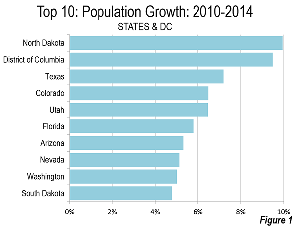
The rapid shrinking of the party’s geographic base is one clear legacy of the Obama years. Energy policy has been key here. Democratic losses have been heavy in those parts of the country that either produce fossil fuels, such as Louisiana, Texas, Colorado, Utah, and Montana, or those, notably in the upper Midwest, that depend on cheap fossil fuels to drive their still critical manufacturing sectors.

The losses of Democrats in states like Ohio, Michigan, and Wisconsin are arguably the most critical since these are traditionally swing states. The Steyer strategy of wiping out fossil fuels and raising energy costs might appeal to the denizens of climatically mild and highly affluent San Francisco. But people in a hardscrabble factory town in less temperate central Ohio or in greater Detroit , or even interior California, are less well-positioned to indulge green purity.

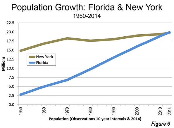
And how about the South? As recently as 2008, Democrats held one-third of the South’s Senate seats. Now it’s down to two, one in Virginia and the other in Florida. Convinced the region is lost permanently, some suggest suggest that Democrats “dump Dixie” so as not to have to appeal to voters in what one progressive writer denounced as a “fetid place.”

But the South accounts for almost 40 percent of the nation’s population, an impossibly large region to simply write off. But even progressives who want to take back the South, such as the New Republic’s Michael Cooper seek to build a coalition of poor whites and minorities in alliance with the growing numbers of graduate-educated professionals. This does not really address the aspirational reasons why so many Americans have been migrating to this region.

In many ways these attitudes reflect the increasingly urban-centric focus of the party. It diverges dramatically from the approach of traditional Democrats, from Roosevelt and Truman to Clinton, himself the former governor of a poor Southern state, who looked favorably on dispersing growth, particularly to the traditionally poor South, intermountain West and Great Plains, as well to the suburban interior.

Hostility to the non-urban regions includes a detestation of suburbia. Progressive theorists, like Salon’s Benjamin Ross, like to pin the detested “suburban sprawl” on Ronald Reagan, ignoring the basic fact that suburban growth was fostered for a half century by a Democratic controlled Congress, and was also favored by Democrats from Truman through Clinton. No surprise then that aside from wealthy coastal suburbs, the Democratic base has shrunk to the urban cores and college towns.

Infrastructure for Growth

Senator Charles Schumer’s retro perspective about the folly of enacting Obamacare in 2009 revealed much. Schumer rightly pointed out that Obamacare, for all the positives associated with expanding health care coverage, helped a relatively small part of the electorate, as well as the insurance companies.

A far better move in the early years of Obama’s first term would have been to implement a updated version of the New Deal’s Works Progress Administration. A new WPA would have helped create jobs and provided some training to underemployed or unemployed youth. It could have left a legacy of improved roads, bridges, expanding port facilities, and affordable (usually bus) mass transit options that would appeal to many Americans.

In contrast to Obamacare, a neo-WPA would have been a difficult target for the GOP. It likely would have appealed to many business people on Main Street, few of whom are free-market fundamentalists. But moves to push such a program elicited opposition from critical parts of the party base, including feminists, who feared that public works would disproportionately help “burly men.”

Greens also were less than enthusiastic about new massive public works. Environmentalists today generally prefer to limit roads and block new water projects, even in parched California. So the Obama stimulus will be forever linked to insider deals with green energy epitomized by the Solyndra fiasco and massive loans to politically allied venture capitalists.

Class Not Race

The growing opposition towards Hillary Clinton’s ascension has one thing right: Democrats should not be seen as the second party of Wall Street. Obama’s recovery and Fed policy have, as Democrats like Elizabeth Warren like to point out, often favored the financial oligarchs, although their support for Democrats makes them far less keen on taking on the Silicon Valley Venture Capitalists, who have also profited under Obama. High valuations—even absurd ones—enrich the insiders who found companies, underwriters, and merger mavens, but those valuations have done precious little for the vast majority of Americans.

Faced with the loss of middle class voters, the administration seems determined to double down on its current coalition. So to whom do they turn to determine their future political direction? Not to a successful elected official from a swing district or a Main Street businessperson but to Google’s Eric Schmidt, an oligopolist of the first order from the party’s new heartland around the San Francisco Bay Area.

Given their cozy ties to Wall Street and oligarchs like Schmidt, the Democrats have failed to push class warfare as an issue, preferring instead to play the racial trump card. They allow issues to be dominated by such flawed emissaries as the detestable Al Sharpton, whose job seems to be the stoking of African-American ire. Similarly, the president’s executive order on undocumented residents follows this approach, by trying to appeal to Latino racial interests.

Yet race politics has limited appeal to whites, and ultimately may not guarantee keeping many minority voters in check. After all, minorities have fared poorly under Obama: a recent Pew study found minority incomes dropped 9 percent between 2010 and 2013, while only 1 percent among whites. Hispanics, notes a recent Pew survey economic issues easily trump immigration. Texas Republicans, for example, got close to half the vote among Latinos in that state, and similar results were found in Kansas. Even in places as blue-leaning as Colorado, Latino support for pro-growth Republicans has been growing. And Asians also showed a shift toward the GOP in the mid-terms.

Embrace Exceptionalism

Historically Democrats, like Republicans, believed in American Exceptionalism. This sometimes spills over into messianic overkill—for example, under Woodrow Wilson and George W. Bush—but overall the ideal of a uniquely American national profile has been embraced by Democrats from Jefferson and Jackson to Roosevelt, Truman and, arguably the last of the breed, Bill Clinton.

President Obama, in contrast, has openly rejected this notion, perhaps reflecting the world view of academics and much of the financial world that sees American Exceptionalism as some sort of patriotic nonsense. In the past the old Democrats saw the country’s broad resources and continental scale as primary sources of national greatness. Early conservationists did not oppose the expansion of industry, mining, or growth as inimical to progressive ideals; instead, they sought to restrain the abuses of the capitalist classes in order to prevent gouging as well as to preserve resources and open space for future generations.

In sharp contrast to their modern “heirs,” both Progressives and New Dealers were builders of dams, roads, and electrical power systems. They embraced the notion of a growing America, whose economy could be expanded for the benefit of the majority.

Is There a Messenger For Dino-Democrats?

Hillary of the many houses, $200,000 speaking gigs, Wall Street linkages, and her aging, wealthy glitterati backers does not exactly appear the ideal messenger for a neo-Jacksonian revival. Rather than the “shot and a beer” Hillary who came back to almost save her 2008 effort, she now reflects gentry views on both economics and climate change in ways that do not significantly diverge from President Obama.

With dissatisfaction with the economic status quo strong among many traditional Democrats, it’s likely populist candidates could emerge. Some imagine Senator Elizabeth Warren as the charismatic leader of a progressive version of the “tea party.” She has been a strong and vocal critic of Wall Street, which is to her credit, but her base lies not in middle class voters but among academia and wealthy Boston suburbs. On environmental issues, she seeks to out-green Hillary, something that might not appeal to voters in Ohio, Indiana, and a host of other key states.

Bernie Sanders, the self-described socialist, represents an emotionally appealing alternative to the endlessly grifting Clintons and the law professor Warren. But Sanders, a representative of the Northeastern vacation state of Vermont, also opposes fossil fuel development. This approach would greatly limit his appeal beyond the Northeast and the west coast. It’s hard to envision him campaigning for votes at Great Lakes factories that depend on coal power, or appealing to construction workers who would love to see the Keystone and other pipelines built.

Right now, former Virginia Senator James Webb may prove the best vehicle for dino-Democratic ideas. A self-conscious inheritor of the Jacksonian tradition, Webb epitomizes the individualist and populist values of his Scotch-Irish forebears. With a strong military background, he also appeals to nationalists who inhabit the South, Appalachia, and the non-coastal parts of the West. Whether his candidacy takes off is still an open question, but the ideas and spirit he embodies could revive a Democratic tradition that, although now submerged, might provide the party with a way out of its current morass. 

This piece first appeared at The Daily Beast.

Joel Kotkin is executive editor of NewGeography.com and Roger Hobbs Distinguished Fellow in Urban Studies at Chapman University, and a member of the editorial board of the Orange County Register. His newest book, The New Class Conflict is now available at Amazon and Telos Press. He is author of The City: A Global History and The Next Hundred Million: America in 2050. His most recent study, The Rise of Postfamilialism, has been widely discussed and distributed internationally. He lives in Los Angeles, CA.

What will our Latino Future Look Like?

$
0
0

President Obama’s amnesty edict, likely to be the first of other such measures, all but guarantees California’s increasingly Latino future. But, sadly, for all the celebration among progressives, the media, Democratic politicans and in the Latino political community, there has been precious little consideration about the future of the newly legalized immigrants, as well as future generations of Latinos, in the state.

Although some publications, notably the New York Times, regard California as something of a model for the integration of the undocumented, the reality on the ground is far less attractive. Even as Latinos, now the state’s largest ethnic group, gain greater influence culturally and politically, many are falling into a kind of racial caste system.

California has roughly one-third of the country’s undocumented immigrants and, in some locales – notably, Los Angeles – they constitute roughly one in 10 residents – or some 1 million people – 85 percent of them from either Mexico or Central America. As of now, these residents, longtimers and recent arrivals, pose, among other things, a potential challenge to local governments trying to serve a new base of largely poor, and generally poorly educated, migrants.

Today, public agencies in Los Angeles County, notes former county supervisor Pete Schabarum, are facing a “an already impossible fiscal dilemma” and now will need to spend an additional $190 million, without hope of federal compensation, on the newly legalized population. The stress on other key institutions, such as schools and hospitals, will also grow, particularly if more foreign nationals, suspecting the likelihood of amnesty, are encouraged to come here.

In the past, we could have looked with confidence at this new population as a net plus. But that may no longer be so much the case, given the current economic direction of California. It has become increasingly difficult in the state for many industries – such as agriculture, manufacturing, construction and logistics – that traditionally have employed Latino immigrants. In contrast, the one industry favored by Sacramento’s political class – the technology firms synonymous with Silicon Valley – has not engendered much progress for Latinos, whose incomes there have dropped while those of whites and Asians have grown.

Perhaps most alarming, few among California’s Latino politicians have a strategy to reverse these trends. Rising Latino figures, such as newly elected Senate President Pro Tem Kevin de Leon, have chosen to link themselves with gentry liberals, such as billionaire environmentalist Tom Steyer. They have embraced the gentry’s regulatory and energy agenda – cap and trade, subsidies for “renewable” energy and hostility toward suburban housing – which conflicts directly with the economic interests of Latino voters, particularly those benefiting from President Obama’s immigration directives.

This stance may make de Leon the toast of the town in San Francisco, Marin County, Malibu and other white gentry havens. He recently celebrated his elevation to the Senate’s top post with an opulent party at the Disney Concert Hall in Downtown Los Angeles, an event derided by the liberal Sacramento Beeas an “ostentatious display” and a “special interests ball.” Not so worthy of celebration are the economic conditions facing many of his constituents. Large swaths of his district, such as East Los Angeles, suffer high rates of unemployment.

One key here has been the decline of manufacturing – down 34 percent statewide the past 15 years – as Latino politicians seem to barely shrug as employers flee ever-higher taxes, regulatory constraints and higher electricity prices. Manufacturing, which accounts for a larger share than any other sector of the region’s economic output, has lost more than 300,000 jobs in the Los Angeles area since 2001.

Another key blue-collar sector, construction, is up 12 percent, but is far from recovering the 40 percent of jobs it lost statewide during the recession.

These losses have taken away many of the traditional avenues for upward mobility. As a result, some predominately Latino communities, from the Central Valley to Compton, suffer double-digit unemployment. Overall, the Latino unemployment in California is above 10 percent while the rate in pro-industry Texas is under 7 percent. Latinos in California are also considerably less likely to own their own business than their Lone Star State counterparts.

Long-term California Latinos’ prospects are most undermined by the ailing state education system, whose reform is generally opposed by the Latino political class. The new state Senate leader, like many other Latino politicians, spent much of their careers working for, and then reaping rich support from, public-sector unions, notably the all-powerful California Teachers Association. Not surprising, de Leon proudly backed the successful CTA candidate in the recent race for state superintendent of schools.

The unions and politicians may have gained by this association, but not so a great many Latino youngsters. A recent article in the National Journalnoted Latinos in the same San Jose neighborhood that produced Cesar Chavez still suffer terrible schools, with one-third of third-graders unable even to read. Amazingly, California’s Latinos are even underperforming their Texas counterparts, despite lower school funding in the Lone Star State.

This belies the common assumption among progressives, here and elsewhere, that the Golden State is an exemplar of social progress while the Lone Star State is a reactionary backwater that is toxic for both immigrants covered by President Obama’s decrees and legal Latino residents. Compared with the Los Angeles Unified School District, the Houston Independent School District, faced with similar demographics, has twice won the Broad Education Prize and, in relative terms, seems a model of flexibility and innovation.

Equally important, the newcomers face daunting challenges entering the property-owning middle class. Due in part to regulatory restraints, less than two in five Latinos in Los Angeles or San Francisco own their home, compared with large majorities of Latino homeowners in places like Phoenix and Houston.

It now takes more than 12 times the median Latino household income to buy a home in the Bay Area and more than nine times in the Los Angeles-Orange County area. In contrast, the multiple is roughly three in metropolitan areas such as Dallas-Fort Worth, Houston, Phoenix and Atlanta.

The rise of housing prices in the state, as well as meager income gains, have managed to reduce the percentage of Latinos getting new mortgages from almost half in 2006 to 22 percent today.

Given these trends, one would assume that politicians representing California Latinos would favor policies that would spur growth in housing as well as other blue-collar industries. Yet, as these industries have faded, identity politics, instead, have ascended, particularly since the passage of Proposition 187 in 1994, which aimed to limit access to public services by illegal immigrants. Stanford political scientist Gary Segura suggests that upwardly California Latino voters were shifting toward the GOP until Republican Gov. Pete Wilson’s immigrant-bashing Prop. 187 campaign all but obliterated this trajectory.

This explains how California increasingly diverges both from the experience of other immigrants over the past century, and what is occurring today in some other states. In Georgia, Kansas and Nevada, as well as Texas, upward of 40 percent of Latino voters this year supported GOP candidates, compared with more than 70 percent lockstep support for Democrats in California.

The problem here is not party per se – traditional Democrats historically combined liberal views with a strong pro-growth economic orientation. But we now see a shift within California Latino politicians away from support for broad-based growth and toward a greater reliance on redistribution and increased dependence on government. This approach may hurt their constituents but conveniently aligns with the preferences of wealthy white liberals in Marin County, San Francisco and other gentry locales, whose interest is to restrain economic growth.

One has to wonder, in my case as a non-Latino Californian here for over four decades, where this will all lead. One consequence could be to increase the state’s already large population living in poverty and boost California’s share of welfare recipients, roughly a third of the national total. The potential long term for a dangerous cocktail of racial and class resentment is not hard to envision.

Latino voters, and all Californians, must demand something better. A good start would be a greater emphasis on broad-based economic growth, which could provide a ladder to the middle class for more Latinos, including the undocumented. But this requires political leaders who are focused less on appealing to San Francisco billionaires and more on the interests of ordinary Californians, many of them Latino. This could turn the presidential directive on immigration into something that builds a better future rather than becoming just another measure to institutionalize further poverty and patterns of dependence.

This piece first appeared at the Orange County Register.

Joel Kotkin is executive editor of NewGeography.com and Roger Hobbs Distinguished Fellow in Urban Studies at Chapman University, and a member of the editorial board of the Orange County Register. His newest book, The New Class Conflict is now available at Amazon and Telos Press. He is author of The City: A Global History and The Next Hundred Million: America in 2050. His most recent study, The Rise of Postfamilialism, has been widely discussed and distributed internationally. He lives in Los Angeles, CA.

Photo by chadlewis76

States Taxes on Internet Commerce

$
0
0

The Internet Tax Freedom Act (ITFA), signed into law by President Clinton in 1998 and extended three times since, was scheduled to expire on November 1, 2014 if Congress did nothing – which they are very good at. ITFA placed a moratorium on new taxes either for Internet access services or for products and services not already taxed in local commerce. A more definitive action, the Marketplace Fairness Act (MFA), has been attached to various versions of the ITFA renewals. The MFA would force all remote vendors (regardless of physical presence) to collect and remit sales taxes for every state where buyers take delivery of goods (and services, if subject to sales taxes).

About seven states had charges on Internet access fees prior to the first ITFA, which included a grandfather clause for them. Eight states passed “Amazon Laws” since 2008. New York was first. Big retailers like Amazon and Overstock terminated agreements with small in-state e-tailers who earned revenue by linking their websites with the big companies’. Amazon sued the state of California over being forced to collect sales tax because they had related businesses in the state. The Direct Marketing Association got a U.S. District court to stop the state of Colorado from requiring remote vendors to notify residents that they are responsible for paying sales taxes and to provide information to the state for them to enforce collections.

I ran a statistical analysis to test whether enacting Internet sales tax laws (“Amazon Laws”) had an impact on total retail sales in the state. When we control for the share of the population that are Internet users – something not taken into account by other data analysts – we found no statistically significant impact on retail trade from enacting Amazon Laws. A sample of our results are presented visually in the chart. Note, especially, that even states with no sales tax saw a decline in retail trade around 2008-2009, the time of the first Amazon Laws. The drop is likely due to the global economic recession.

After sixteen years and four extensions of ITFA, plus numerous lawsuits, Amazon is collecting sales taxes on purchases made by customers from 23 states with one more slated to be added in 2016. Including the five states without sales tax, that covers about 69% of Americans, according to the Wall Street Journal (October 1, 2014). Amazon has a physical presence in just 21 states and only 8 states have “Amazon Laws.”

Most news reports on the subject of Internet sales taxes present only a partial rhetoric, similar to this:

“At issue is a bill that would allow states to collect sales tax revenue from online retailers outside their borders. Right now, states can only collect sales taxes from a business with a physical location in that state.”

But the real point “at issue” is the inability of states to enforce existing tax laws. Forcing e-tailers to collect the tax means they will incur costs well-beyond that of terrestrial retailers because they must collect and remit for 49 more states than local retailers. To be completely fair, local retailers would have to check the identification of buyers and collect and remit state sales taxes to the states where the buyers reside. Imagine the burden on retailers in states with high visitor traffic – like Nevada, California, New York, or Florida.

Every state wants to know the potential income from extending sales tax to out-of-state Internet retailers. Recently, we completed an analysis of this potential in Nevada for the Las Vegas Global Economic Alliance. We found that the increased tax revenue would be quite small and likely to remain so for several more years. At the same time, the cost to the states could be quite high. These costs may diminish in the future as retailers and states with Amazon Laws are forced to work out operational solutions. Given that many states already have working arrangements with Amazon and other large national retailers (including through multi-state agreements), there appears to be little benefit from new state tax legislation on this issue.

In reality, only a small part of internet commerce is taxable. Manufacturers’ e-commerce shipments were more than one-half of all online sales in 2012. Much of these sales are not subject to state sales tax regardless of the location of the buyer or the seller because they are purchased for re-sale. In most of the US, total retail trade is a declining share of private industry. The part of e-commerce that matters from a sales tax perspective is retail consumer sales: just $227 billion in 2012, or about 5.2% of total retail trade in the United States.

Business-to-business (B2B) sales are about 90% of all e-commerce, of which only about 13% is taxable. Of retail sales provided through e-commerce, more than 10% of the value is in motor vehicles where taxes are easily collected because most states require proof that taxes have been paid to register a vehicle. There is wide variation in the estimates of uncollected sales tax. One study from 2014 found significantly smaller estimates than an earlier study because they surveyed the states about compliance and then checked the online order platforms of several large e-tailers for compliance. The earlier study (2010) simply assumed an extremely small tax compliance rate among sellers.

Many online retailers are remote geographically and/or economically from their buyers. This connection of the e-tailer to the state is referred to as “nexus”.  An important difficulty for e-tailers has to do with identifying the state entitled to the sales tax. A simple example illustrates this problem. If a resident of Nevada purchases a bar-b-que grill to be delivered and used at his vacation home in Utah from a retailer in California, who gets the tax? And who bears the cost of compliance which court decisions place on the taxing state?

Some e-commerce businesses claim state taxes on e-commerce are detrimental the states’ ability to compete with surrounding states. This attitude belies some lack of understanding about the issues. If these businesses are selling to residents in the same state, they should already be collecting sales tax. It is only the population of the other states that should be of concern. In fact, Amazon founder Jeff Bezos is reported to have selected Washington as home for his Internet retailer, at least in part, because of the small state population from which he would be obligated to collect sales taxes. Washington’s population ranks 13th among states – that leaves 37 states with fewer people for internet retailers to choose from, including many that have a lower share of internet usage in the population (see the table at the end of this article for a complete list).

More than 10% of e-commerce retail sales are conducted over Ebay, where many small retailers make up most of the sellers’ market. Legislative proposals generally include an exception for small sellers – usually those with between $500,000 and $1,000,000 sales annually delivered to the state. There is some evidence that buyers prefer to purchase from local sellers even when making online purchases: Ebay shoppers are 7% more likely to buy from an in-state vendor. But, research also indicates that states with no sales tax are no more likely than other states to generate in-state purchase preferences among online shoppers. 

E-tail is growing but it has yet to reach the levels predicted in early research. For example, in 1999 the National Governors Association forecast e-commerce would reach $300 billion by 2002. Even ten years further into the future, e-commerce in the US was just $192 billion.

Forcing e-tailers to collect sales taxes for every states is wrought with technical and legal pitfalls and unproven financial payoffs. Many states are finding a fast and reliable way to increase collections without creating new sales tax schemes. States with income taxes provide a space on the form for reporting it and states without an income tax provide convenient online filing – a process already familiar to consumers of e-commerce a. Several states provide look-up tables based on income (compared to saving and calculating actual purchase receipts) to make paying your sales tax on out-of-state purchases more convenient.

One of the main reasons for low compliance with consumer sales tax payments is lack of knowledge: Ask a random person on the street if they know they are liable for sales taxes on out-of-state purchases and chances are they will say “no.” Oklahoma aired a television ad that included a list of the projects that sales tax collections could fund (e.g., education, police, and fire). As a result, the number of income tax returns with sales tax payments leaped by 20%. These options will produce faster results at a lower cost than defending new tax legislation at the state or federal level.

Susanne Trimbath, Ph.D. is CEO and Chief Economist of STP Advisory Services. Dr. Trimbath’s credits include appearances on national television and radio programs and the Emmy® Award nominated Bloomberg report Phantom Shares. She appears in four documentaries on the financial crisis, including Stock Shock: the Rise of Sirius XM and Collapse of Wall Street Ethicsand the newly released Wall Street Conspiracy. Dr. Trimbath was formerly Senior Research Economist at the Milken Institute. She served as Senior Advisor on United States Agency for International Development capital markets projects in Russia, Romania and Ukraine. Dr. Trimbath teaches graduate and undergraduate finance and economics.


State Sales Tax and Internet Usage

State

Sales Tax Rate (%)

Retail (% Private Industries GDP)

Internet Users (% population)

Private Industries GDP ($mil)

Alabama

4.0

8%

65.0

156,917

Alaska

0

4%

84.0

49,414

Arizona

5.6

9%

78.5

233,547

Arkansas

6.5

7%

66.8

103,810

California

7.5

6%

79.7

1,851,147

Colorado

2.9

6%

79.9

243,303

Connecticut

6.35

6%

86.5

218,141

Delaware

0.0

5%

80.4

54,193

Florida

6.0

9%

78.8

668,823

Georgia

4.0

7%

76.5

378,343

Hawaii

4.0

9%

82.6

55,818

Idaho

6.0

9%

82.2

49,840

Illinois

6.25

6%

78.5

630,775

Indiana

7.0

6%

73.5

277,853

Iowa

6.0

6%

77.5

138,367

Kansas

6.15

7%

78.9

118,833

Kentucky

6.0

7%

68.8

151,035

Louisiana

4.0

6%

67.7

223,985

Maine

5.5

10%

82.8

45,636

Maryland

6.0

7%

82.3

265,329

Massachusetts

6.25

5%

86.2

381,249

Michigan

6.0

7%

78.4

367,147

Minnesota

6.875

6%

82.1

267,937

Mississippi

7.0

10%

53.3

83,605

Missouri

4.225

7%

72.4

235,769

Montana

0.0

7%

73.6

35,665

Nebraska

5.5

6%

80.2

89,736

Nevada

6.85

8%

80.0

113,774

New Hampshire

0.0

8%

90.1

57,963

New Jersey

7.0

6%

87.8

470,251

New Mexico

5.125

8%

68.0

68,052

New York

4.0

6%

81.5

1,130,320

North Carolina

4.75

6%

71.8

387,032

North Dakota

5.0

6%

75.9

44,281

Ohio

5.75

7%

76.7

484,156

Oklahoma

4.5

7%

67.9

144,100

Oregon

0.0

5%

86.1

186,325

Pennsylvania

6.0

6%

77.8

563,086

Rhode Island

7.0

6%

81.0

44,003

South Carolina

6.0

9%

67.0

147,884

South Dakota

4.0

7%

72.9

38,572

Tennessee

7.0

8%

72.9

246,840

Texas

6.25

6%

68.6

1,313,557

Utah

5.95

7%

87.6

116,212

Vermont

6.0

9%

81.7

24,170

Virginia

5.3

6%

77.8

359,664

Washington

6.5

8%

85.7

333,994

West Virginia

6.0

8%

70.5

58,325

Wisconsin

5.0

6%

83.0

240,059

Wyoming

4.0

5%

79.4

36,357

US Total

--

7%

84.2

14,058,314

Sources: State sales tax rates 2014 from Federal of Tax Administrators (does not include any municipal or special district sales tax); Internet Usage 2010 from InternetWorldStats.com; GDP 2012 from Bureau of Economic Analysis

Our Father, Who Art In The Apple Store: The Decline Of Christmas And The Looming Tech Nightmare

$
0
0

In the past, this season was marked by a greater interest in divinity, the family hearth and the joy of children. Increasingly our society has been turning away from such simple human pleasures, replacing them with those of technology.

Despite the annual holiday pageantry, in the West religion is on the decline, along with our society’s emphasis on human relationships. Atheism seems to be getting stronger, estimated at around 13 percent worldwide but much higher in such countries as Japan, Germany and China. “The world is going secular,” claims author Nigel Barber. “Nothing short of an ice age can stop it.”

In contrast, the religion of technology is gaining adherents. In a poll in the U.K., about as many said they believe Google to have their best interests at heart as God. Religious disbelief has been rising particularly among U.S. millennials, a group that, according to Pew, largely eschews traditional religion and embraces technology as a primary value. Some 26 percent profess no religious affiliation, twice the level of their boomer parents; they are twice as irreligious at their age as any previous generation.

For millennials, religion is increasingly a matter of personalized “self knowledge” that need not be pursued in church, or as part of their community. Computer scientist Allen Downey has done interesting research that shows that Internet use is a primary driver of declining interest in religion.

Not surprisingly, religious organizations are in a digital panic. In recent months, some have bemoaned how companies like Google or Apple have replaced churches as creators of the ultimate values. Apple, in particular, notes Brett Robinson, author of “Appletopia,” has adherents who back their products with “fanatical fervor.” Tech products feed into “a celebration of the self” that contradicts most religious teachings, he argues. Even the protocols for using our phones or computers emulate those found in religious services, writes Robinson.

Our growing digital fixation has also impacted human relationships. Social media has some great positives, particularly for helping potentially isolated groups such as the mentally ill  and seniors. And it is an effective way to keep in touch with far-flung friends and relatives. However, as social media consultant Jay Baer notes, avid users of social media tend to have lots of “friends” but the fewest personal ties.

As a people, we are becoming digitally detached, argues De Paul professor Paul Booth. Many particularly millennials, increasingly prefer “mediated communication” over face-to-face interaction, also preferring to text than talk on the phone. “Friends,” as defined by Facebook, has little to do with friendship as understood down the centuries: people to talk to and spend time with in a social setting.

Perhaps most disturbing, reliance on social media tends to work against forming intimate ties, which rest on such real-world factors as proximity and shared experiences, says Rachna Jain, a psychologist who specializes in marriage and divorce. Many millennials have delayed marriage and family formation, in part due to the economy, but it’s possible that technology-enabled distancing is also playing a role.

Technology As Religion

Technology’s emergence as a secular religion has been with us since the 19th century. Saint Simon and later Marx identified it as capable of replacing God in creating an earthly paradise. Industrial entrepreneurs like Thomas Edison also believed they were laying the foundation for a new millennium; he prophesied electricity would reduce the need for sleep, help improve the senses and promote the equality of women.

This notion grew after World War II, which launched a period of rapid technological changes — jet aircraft, missile technology and nuclear power. The growing interest in technology, predicted Daniel Bell in his landmark 1973 The Coming of Post-Industrial Society, would foster the “preeminence of the professional and technical class.” This emergent new “priesthood of power” would eventually overturn the traditional hierarchies and industries and, in process, create the rational “ordering of mass society.”

Despite the threat of thermonuclear war, the 1950s and 1960s were suffused with a spirit of technological optimism. In his classic 1967 book “The Technological Society,” French philosopher Jacques Ellul drew a contemporary picture of the world of 2000, complete with regular shuttle service to the moon, synthetic foods and an end to hunger and poverty.

Tech Dreams, Tech Nightmares

Today technological change may be slower, but its effects on society are more profound, and threatening basic social institutions. Like Marx or Saint Simon, the new tech “gods,” epitomized by Steve Jobs, have pointedly dismissed religion and held themselves as the ultimate “disrupters” of the existing civilization. Techno-evangelist Nicholas Negroponte has even suggested that “digital technology” could turn into “a natural force drawing people into greater world harmony.”

So we continue to make the mistake of conflating technology, which does bring many blessings, with the improvement of society. As computer industry pioneer Willis Ware warned almost four decades ago, new communication technology, rather than simply making information more universally available, could also increase the “intensive and personal surveillance” of individuals. This has resulted not so much in the creation of a surveillance state” as whatDavid Lyons has referred to as a “surveillance society,” where those who control information include not only state players but certain well-positioned private ones.

Far from being liberating and diffusing wealth, the emerging information economy serves “a new tiny class of people,” the tech visionary Jaron Lanier argues, particularly at companies like Google, Facebook and Apple that are repeatedly accused of abusing private information. As Google’s Eric Schmidt put it: “We know where you are. We know where you’ve been. We can more or less know what you’re thinking about.”

In the coming years Google and other digital heavyweights hope to involve themselves ever more in our most mundane activities, whether by monitoring our physical functions or figuring out ways to profit from our inner-most thoughts. Yet the vision at places like Google goes well beyond the mundane, aspiring to powers once believed to be the province of divinities.

Entrepreneur and inventor Ray Kurzweil, now the director of engineering at Google, sees information technology developing to the point that our biological intelligence will be merged, even subsumed, into that of intelligent machines. Freed from the constraints of life and death by imprinting our brain patterns on software, he predicts, “the entire universe will become saturated by our intelligence.”

This “transhumanist” vision reflects Kurzweil’s almost obsessive concern with aging – he takes around 150 vitamin supplements a day in hopes of delaying his own demise. This cannot be dismissed as the whimsies of a lone inventor – Kurzweil is an enormously influential figure at the pinnacle of one of the world’s most important technology and media companies, one that is exploring “biological computing,” which seeks to duplicate the brain’s functions in machine language.

Such research could have powerful and positive impacts, but the insistence on seeing information technology as the solution to basic human problems rests on a new vision that we are machines that can be infinitely improved. This suggests the growth of an ever greater chasm, according to Kurzweil, between those who refuse or are incapable of cybernetically augmenting themselves — what he labels MOSHs or Mostly Original Substrate Humans — and those who do. “Humans who do not utilize such implants are unable to meaningfully participate in dialogues with those who do,” writes Kurzweil.

Bill Joy, a founder of Sun Microsystems, warns that some in Silicon Valley envision a society where human labor is largely replaced by automatons operated by Bell’s “ priests of the machine.” The current decline in labor force participation, particularly among the young, could just be the beginning. All one can hope, Joy suggests, is that they serve as “good shepherds to the rest of the human race.” But under any circumstance, he predicts, the mass of humanity “will have been reduced to the status of domestic animals.”

Whatever the advantages that we can derive from technology, this vision of the future violates the basic moral principles of both civil society and religious faith. Before we plug ourselves in for eternity, we might consider, this holiday season, to take a non-digital path to reviving our soils, whether by reading your bible, enjoying Shakespeare, tossing a football with your kids, or simply taking a walk in the woods. Technology might help shape what humanity can do, but it cannot make us any more human. That’s up to us.

This piece first appeared at Forbes.

Joel Kotkin is executive editor of NewGeography.com and Roger Hobbs Distinguished Fellow in Urban Studies at Chapman University, and a member of the editorial board of the Orange County Register. His newest book, The New Class Conflict is now available at Amazon and Telos Press. He is author of The City: A Global History and The Next Hundred Million: America in 2050. His most recent study, The Rise of Postfamilialism, has been widely discussed and distributed internationally. He lives in Los Angeles, CA.

Steve Jobs photo by Justdoit709 (Own work) [CC BY-SA 3.0], via Wikimedia Commons


Russian Rublette

$
0
0

Is the demise of the ruble, together with falling crude oil prices, comeuppance for President Vladimir Putin’s expansionist dreams? That’s certainly the storyline of those holding faith in economic sanctions. In their eyes, he foolishly land grabbed eastern Ukraine and Crimea, and in exchange got back a cratered Russian economy, with a debased currency and little access to Western financial markets. Heck of a job, Vlad.

The victors, presumably, are the sanction wizards of Washington and London who stared down the barrels of Putin’s tanks and fifth columnists. Under the theory that the Russian economy is a kleptocracy that sustains Putin in power, the sanctions were targeted at presidential cronies and their “sectoral” holdings, such as those in the oil business (the rallying cry should have been “Don't fire until you see the whites of their proxy statements”).

Amazingly, even the dysfunctional US Congress found time in its lame-duck session to vote additional sanctions against the Russian oil sector, although hidden in the fine print of the midnight legislation were goodie bags for Washington lobbyists, who are in line for a $60 million windfall to, as the New York Times reported, “promote democracy, independent news media, uncensored Internet access and anticorruption efforts in Russia.”

For the moment, despite the free fall of his currency, President Putin remains defiant. Tired of getting finger-waggled for the benefit of western TV audiences, he ghosted from the G-20 summit in Brisbane. Heading early to the airport, Putin must have made a mental note to repay his Western confessors, someday, with the same currency that they fetched from Russian coffers.

The irony of the allied attacks on the ruble, Russia, and President Putin is that the biggest losers may end up being the high-minded Western countries that would consign Russia and her Kremlin leadership to the dustbin of history.

The Russian ruble—or should I say the new ruble—was reissued after the 1998 credit collapse in Russia. The previous currency was holdover Soviet bitcoin, issued on the full faith and credit of defunct tractor communes, and convertible, at best, into assets that the oligarchs had already claimed for themselves.

In free fall as I write, the ruble is best understood as an oil junk bond, for which par is about $117 a barrel (the break-even point for Russia’s budget).
Below that price, the ruble falls; above it, the currency strengthens. The reason it remains tied to oil is because the Russian economy has yet to stimulate a large enough middle class to free its markets from petroleum dependence.

Sadly, Russia’s economy is like that of a Gulf state: it has oil revenues and anointed princes who share in the state’s wealth. Everyone else is a variation on guest workers from the Philippines.

Despite the structural imbalance of Russia’s economy, the nation’s fundamentals are stronger than you might think. Its foreign currency reserves are $418 billion, placing it sixth in world rankings, way ahead of the US with $132 billion and even ahead of South Korea, which has $364 billion.

Nor has Russia engaged in the same reckless deficit spending that defined the United States during the feel-good years. Despite the chimes of death, the projected budget deficit for Russia in 2014 is still only about 389 billion rubles (roughly $7 billion, depending on the ruble-dollar exchange rate), while the deficit for the US could reach $500 billion.

Gross government debt, as a percentage of gross domestic product (GDP), in Russia remains a relatively healthy 10 percent, unlike that of the United States, which has maxed out its borrowings at more than 100 percent of GDP.

Russia’s external or foreign debt is a manageable $715 billion compared to that of the U.S., which is on the hook for $17 trillion. It might not have a CVS drugstore on every corner or iPhones in every hand, but since emerging from communism in the early 1990s it has, reasonably, lived within its means.

Even in the most solvent nations, circulating national currencies are best understood as company scrip; bonds drawn on faceless central banks that allow citizens to transact their daily business. As storehouses of wealth, national currencies make about as much sense as holding baseball cards or those Raleigh coupons that used to be included with packs of cigarettes.

Not for a long time has any world currency been convertible to gold, silver, or any other commodity. At best they are unsecured loans undertaken by citizens in favor of their central banks. All that backs them is political confidence, something ebbing right now in Russia.

Fortunately for the Russians, their economy is better able to withstand economic isolation than many others. The country can be self-sufficient in food and energy, and one of the few advantages learned in the hothouse years of Soviet communism is how to live apart from Western markets and malls.

One reason the West decided to fight Russian expansion with sanctions as opposed to bayonets is that the encroachments into Ukraine came at a time of oversupply in Western energy markets.

By turning down the taps of Russian oil companies — or by at least limiting their access to Western financial markets — the Obama administration was throwing a subsidy bone to domestic energy producers, which were already choking on glutted markets and depressed stocks.

Nor do the Western allies fear much from Russian retaliation. Moscow laughably imposed travel bans on Obama administration and congressional figures, to keep them from vacationing in Omsk, but it has left open the pipelines that supply Western Europe with natural gas.

In the same vein, while it may have been aggressive in protecting the rights of Russians living in Ukraine, it refrained from imposing its own sanctions when the US launched similar wars of national liberation in Afghanistan, Iraq, Libya, Serbia, and Somalia.

The unspoken risk in the great game of economic sanctions and currency strangulation is that the United States has a lot more to lose should, say, China join Russia someday in playing pin-the-tail-on-the-dollar, or if Russia decides to lash back at the Americans by, for example, stirring the cauldron in the Middle East.

Already Putin’s push-back in favor of Syria’s president Assad turned a civil uprising into a regional war. Russia might also decide to damn the $60 million in press-release torpedoes and take more, if not all, of Ukraine.

Watching the takedown of another country’s currency — I am assuming that the West is gloating over Putin’s misfortunes — has the air of harmless fun. The assumption is that only a few banks, rogue states, or crony capitalists will suffer.

Worth further consideration, however, is that currency collapses and hyperinflation have often ushered in civil war and continental instability. Rarely have the effects been contained to the country of origin and its discontents.

The dissolution of its legal tender, Assignats, in part turned the French Revolution away from the rights of man and into a counting house for disembodied heads. Weimar’s wheelbarrow currencies had disastrous effects beyond Germany’s market squares.

The last Russian tsar abdicated in 1917, at a moment when his currency had collapsed, and the West lived with the consequences of what followed for almost a century.

Matthew Stevenson, a contributing editor of Harper’s Magazine, is the author, most recently, of Remembering the Twentieth Century Limited, a collection of historical travel essays, and Whistle-Stopping America. His next book, Reading the Rails, will be published in 2015. He lives in Switzerland.

Flickr photo by James Malone. The "old" ruble: Russian note for 100 Rubles; 1993.

Exodus of the School Children

$
0
0

The urban cores of the nation's 52 major metropolitan areas (over 1 million population) lost nearly one-fifth of their school age population between 2000 and 2010. This is according an analysis of small area age group data for children aged 5 to 14 from Census Bureau data, using the City Sector Model. Over the period, the share of 5 to 14 age residents living in the functional urban cores declined from 15.0 percent to 12.0 percent (Figure 1).


The City Sector Model

The City Sector Model analysis avoids the exaggeration of urban core data that necessarily occurs from reliance on the municipal boundaries of core cities (which are themselves nearly 60 percent suburban or exurban, ranging from as little as three percent to virtually 100 percent). It also avoids the use of the newer "principal cities" designation of larger employment centers within metropolitan areas, nearly all of which are suburbs, but are inappropriately joined with core municipalities in some analyses. The City Sector Model" small area analysis method is described in greater detail in Note 1 below (previous articles are listed in Note 2). The approach is similar to the groundbreaking work of David Gordon, et al at Queen's University for Canadian metropolitan areas.

School Age Losses

The urban core school-age population dropped from approximately 3.40 million in 2000 to 2.73 million in 2010, for a loss of 670,000 (Figure 2). Much has been made about the affinity of the Millennial generation for the urban cores. Despite this, our small area analysis indicated that the percentage of 20 to 29 year olds living in the functional urban cores declined between 2000 and 2010, with 88 percent of the growth in suburbs and exurbs (see Dispersing Millennials). Coincidentally, over the period, there was a reduction of two school age children in the urban cores for every additional resident aged 20 to 29 (Figure 3).

A loss was also sustained in the earlier suburbs (with median house construction dates between 1946 and 1979). The school-age population declined slightly more than 1 million in the earlier suburban areas. In 2000, 45.3 percent of school age children lived in the earlier suburbs, a figure that declined to 40.5 percent in 2010.

Virtually all of the gain in 5 to 14 age residents was in the later suburban areas (a median house construction dates of 1980 or later) and exurban areas. Overall, these two city sectors added 1.9 million school-age children, while the urban cores and the earlier suburban areas experienced a reduction of 1.7 million, for a reduction of approximately 10 percent.

The largest increase was in the newer suburban areas (median house construction dates of 1980 or later), where 1.47 more school-age children lived in 2010 than in 2000. This represented an increase of approximately 30 percent. Exurban areas have a more modest increase of 310,000 school-age children, up 8.3 percent from 2000.

Losses in the Largest Urban Cores

All of the large urban cores in the metropolitan areas experienced losses in school aged children from 2000 to 2010. Among the 24 urban cores with more than 100,000 residents, Washington (-5.5 percent) and Seattle (-8.4 percent) came the closest to retaining their 2000 school age numbers in 2010.  Seven large urban cores experienced losses of at least 30 percent. Baltimore's loss was approximately 30 percent. Los Angeles joined rust belt cities St. Louis, Rochester and Cleveland at 33 percent to 34 percent and Detroit at 38 percent. New Orleans had the largest loss (-70.2 percent), owing in part to population loss from the disastrous hurricanes (Figure 4).

Finally, in all of the 52 metropolitan areas, the later suburban and exurban areas (combined) retained more of their school age children than the urban cores and earlier suburbs. There were gains in 45 of the later suburban and exurban areas.

Better Schools: The Necessary (But Maybe Not Sufficient) Condition

One of the issues of most interest among urban analysts has been whether urban cores will be able to retain the share of Millennials that they have attracted. The functional urban cores seem likely to maintain their attraction for younger adults, so long as the cores sustain their improved living environment (such as much lower crime rates than before and continued investment by retailers and other commercial business to support the new populations).

However, the continuing exodus of people with school-age children described seems to indicate that young adults tend to move to the suburbs and exurbs around the time their children enroll in school. Suburban and exurban schools often provide better educations than urban core schools. The Editorial Projects in Education found that high school graduation rates were 77.3 percent in suburban school districts, compared to 59.3 percent in "urban" school districts (Note 3). There are other difficulties as well, such as having sufficient defensible outdoor space for children to play and for parents to feel secure. But education seems likely to be the most important consideration.

Of course, in urban areas the highly affluent can enroll their children in private schools. The alternative of private schools can be overly expensive, inducing households to relocate to school districts with higher quality education. According to research by Chief Economist Jed Kolko of Trulia: “Private school enrollment in the lowest-rated school districts is more than four times as high as private school enrollment in the highest-rated school districts after adjusting for neighborhood demographic differences."

A balanced broad age distribution of households, including those with children of school age, is not likely to be achieved in urban cores unless Millennials are retained in substantial numbers. Once having moved, the chances of their returning are slim, because households move less frequently as they move up the age scale.

Note 1: The City Sector Model allows a more representative functional analysis of urban core, suburban and exurban areas, by the use of smaller areas, rather than municipal boundaries. The more than 30,000 zip code tabulation areas (ZCTA) of major metropolitan areas and the rest of the nation are categorized by functional characteristics, including urban form, density and travel behavior. There are four functional classifications, the urban core, earlier suburban areas, later suburban areas and exurban areas. The urban cores have higher densities, older housing and substantially greater reliance on transit, similar to the urban cores that preceded the great automobile oriented suburbanization that followed World War II. Exurban areas are beyond the built up urban areas. The suburban areas constitute the balance of the major metropolitan areas. Earlier suburbs include areas with a median house construction date before 1980. Later suburban areas have later median house construction dates. 

Urban cores are defined as areas (ZCTAs) that have high population densities (7,500 or more per square mile or 2,900 per square kilometer or more) and high transit, walking and cycling work trip market shares (20 percent or more). Urban cores also include non-exurban sectors with median house construction dates of 1945 or before. All of these areas are defined at the zip code tabulation area (ZCTA) level.

Note 2: The City Sector Model articles are:

From Jurisdictional to Functional Analyses of Urban Cores & Suburbs

The Long Term: Metro American Goes from 82 percent to 86 percent Suburban Since 1990

Beyond Polycentricity: 2000s Job Growth (Continues to) Follow Population

Urban Cores, Core Cities and Principal Cities

Large Urban Cores: Products of History

New York, Legacy Cities Dominate Transit Urban Core Gains

Boomers: Moving Farther Out and Away

Seniors Dispersing Away from Urban Cores

Metropolitan Housing: More Space, Large Lots

City Sector Model Small Area Criteria

Note 3: This report (which was prepared with support from the America's Promise Alliance and the Bill and Melinda Gates Foundation) provides graduation rates using the US Department of Education "local codes." This typology generally defines "urban" school districts as those in core cities as well as other principal cities (such as Arlington, Texas and Mesa, Arizona). Most of the population of core cities and principal cities is classified as functionally suburban (see: Urban Cores, Core Cities and Principal Cities). Further, the typology classifies some districts as suburban that have large urban components (such as Las Vegas, Miami, Louisville and Honolulu), which is necessary because of county level school districts that include both urban cores and suburban areas. As a result the functionally suburban component of urban districts is overstated and the functionally suburban component of suburban districts is understated. Because urban graduation rates tend to be less than suburban rates, both of these factors seem likely to overstate the "urban" graduation rates and understate the "suburban" graduation rates.

Wendell Cox is principal of Demographia, an international public policy and demographics firm. He is co-author of the "Demographia International Housing Affordability Survey" and author of "Demographia World Urban Areas" and "War on the Dream: How Anti-Sprawl Policy Threatens the Quality of Life." He was appointed to three terms on the Los Angeles County Transportation Commission, where he served with the leading city and county leadership as the only non-elected member. He was appointed to the Amtrak Reform Council to fill the unexpired term of Governor Christine Todd Whitman and has served as a visiting professor at the Conservatoire National des Arts et Metiers, a national university in Paris.

Photo: School buses in suburban Atlanta (by author)

Measuring Economic Growth, by Degrees

$
0
0

In this information age, brains are supposed to be the most valued economic currency. For California, where the regulatory environment is more difficult for companies and people who make things, this is even more the case. Generally speaking, those areas that have the heaviest concentration of educated people generally do better than those who don’t.

Nothing more illustrates this trend than the supremacy of the Bay Area over Southern California in the past five years. Since the 2007-09 recession, the Bay Area has recovered all of its jobs, as has San Diego, but Los Angeles-Orange and the Inland Empire, although improving, lag behind.

Overall, the San Jose and San Francisco areas boast shares of college graduates at around 45 percent, compared with a 34 percent average for the 52 largest U.S. metropolitan areas. The San Diego area clocks in at 34.6. In comparison, the Los Angeles-Orange County area has roughly 31 percent college graduates while the San Bernardino-Riverside area has the lowest share of four-year degrees – 20 percent – of any large region in the country – this is worse even than backwaters like Memphis, Tenn., and Birmingham, Ala.

Dividing this region by counties shows Orange County well in the lead, with 37.6 percent college-educated, well above Los Angeles County’s 30 percent.

Recent Trends

To see where these metrics are headed, Mark Schill, an analyst with the Praxis Strategy Group (www.praxissg.com), was asked to identify the share growth of bachelor’s degrees in the country’s largest metropolitan areas during 2000-13. The share of the adult population with college educations rose by 6.8 percent in San Jose and 6.4 points in the San Francisco-Oakland region. Some regions did better, including Boston, Pittsburgh, Grand Rapids, Mich., Baltimore, New York and St. Louis. All these were considerably above the national average increase of 5.2 percent.

In contrast, most areas of Southern California have shown more meager growth in their educated workforces. Los Angeles, overall, enjoyed a very average increase of 5.2 percent. San Diego, despite its high-tech reputation, notched a 5 point jump while the Inland Empire increased by 3.8 points, one of the lowest performances in the country. The biggest gainer in the Southland was Orange County, where the share of educated workers grew by a healthy 6.3 percent.

Whither young, educated workers?

The picture, particularly for the Inland Empire, is not totally bleak. In a recent survey conducted by Cleveland State University, there have been some promising developments in the growth of younger educated workers. This key cohort, notes researcher Richey Piiparinen, appears to follow a very different path than do older educated workers, with many seeking out careers in less-expensive locales.

Indeed, looking at educated growth among 25-34-year-olds from 2010-13 finds that the most rapid expansion is taking place in unlikely places, such as the areas around Nashville, Tenn., Orlando, Fla., and Cleveland, all which experienced increases of roughly 20 percent or more. This is better than twice the growth rate in such noted “brain centers” as San Jose and San Francisco, which were around 10 percent, and New York at 9 percent. The Los Angeles-Orange County area saw a similar increase.

The reasons for these surprising, and somewhat encouraging results, particularly for the Inland Empire, may vary. One thing, of course, is the low base from which the area starts. After all, until the past decade, the employment profile of the Inland Empire favored manufacturing, logistics and construction, all fields not dependent on large contingents of highly educated workers.

Another critical factor may well be price, as we saw in our surprising findings on millennials. Simply put, many of the areas attractive in the past to educated workers have become extraordinarily expensive – as demonstrated by San Francisco-based writer Johnny Sanphillippo – while some more affordable locales have become “sweet spots” for younger educated people, particularly as millennials enter their family formation years.

County, city breakdowns

The Southland, of course, is a vast region, and even every county contains hosts of cities that are very different from each other. In terms of counties, the biggest gains – albeit from a smaller base – took place in the Inland Empire, notably Riverside, which saw a 93 percent jump in its educated population since 2000. Orange County saw a 37.6 percent gain, ahead of Los Angeles’ roughly 36 percent gain.

More intriguing, and revealing, is the distribution of college degrees by city areas. Here, the supremacy of a few areas is very clear. In three Southland communities, more than 60 percent of the adult populations have college degrees: Santa Monica, Newport Beach and Irvine. Yorba Linda, Pasadena and Redondo Beach all boast rates close to, or above, 50 percent.

Obviously, these towns are something of outliers in the region. Los Angeles, by far the region’s largest city, has roughly 31 percent of its adults with college degrees. Many communities do far worse, most of all, Compton, where less than 6 percent have four-year degrees. Hesperia, Southgate, Lynwood and Victorville have educated percentages under 10 percent.

Adjacent communities sometimes have radically different rates of education. Santa Ana, for example, abuts Irvine, but has an educated population of barely 12 percent. And while some areas have shown meager growth in their share of educated residents, several areas have seen double-digit percentage increases, including Burbank, Yorba Linda, Rancho Cucamonga and Santa Monica.

Implications

As the Southland economy evolves, it makes sense to look at those areas most likely to have more of the educated workers that high-end industries need. These increasingly are clustered in a few places, such as Irvine, Newport Beach, Rancho Cucamonga and Costa Mesa, that are both suburban in form but tend to have better schools than much of the region. These areas also tend to have lower-than-average unemployment rates. Educated people tend to migrate, for the most part, to areas where others of their ilk are concentrated, and often where their children have the best chance at a decent education.

These statistics and trends suggest that our leaders, in education and politics, need to focus on reality. It is dubious that many communities throughout the Southland will develop large shares of educated people in the immediate future. Indeed, given the quality of public education throughout most of the region, it seems almost inevitable that much of the region will lag in terms of skills well into the next decade.

This means that local leaders cannot expect to duplicate in the near future the success of places like Boston, the Bay Area, or even Pittsburgh. Instead, there needs to be a two-pronged attempt to address this issue. One is to boost preparatory and higher education throughout the region, which will allow for Southern California to better compete at the highest-end of employment.

But the other strategy, not to be discounted, is a full-scale commitment to skills training for those unlikely to earn bachelor’s degrees. This also means taking measures allowing the industries that would employ such workers – largely manufacturing, logistics, medical and business services – to flourish, so this training will have rewards. The Southland’s already large educated population is one key to its future, but finding a decent work environment for those without a four-year degree merits equal, if not greater, emphasis.

This piece first appeared at the Orange County Register.

Joel Kotkin is executive editor of NewGeography.com and Roger Hobbs Distinguished Fellow in Urban Studies at Chapman University, and a member of the editorial board of the Orange County Register. His newest book, The New Class Conflict is now available at Amazon and Telos Press. He is author of The City: A Global History and The Next Hundred Million: America in 2050. His most recent study, The Rise of Postfamilialism, has been widely discussed and distributed internationally. He lives in Los Angeles, CA.

Graduation image by BigStockPhoto.com.

Global City Framework

$
0
0

Global cities are like that famous quip on obscenity: we know one when we see it. But the definitions of global cities are incredibly varied and there doesn’t seem to be a consensus or well-defined way to think about. I looked at the criteria used in various prominent studies back in 2012 and found them highly divergent. Only the Sassen based one appeared to have a robust definition and theoretical basis, but it’s a pretty narrow definition. While it’s very important and useful, I don’t think it fully captures what the average person or urbanist thinks of on the topic.

In wrestling with the global city idea while working on the global city study I did some research for, I put together this framework to help organize our thinking.

Global City Framework

This framework seeks to capture in a structured manner all the ways people talk about global cities that I’m aware of.

There are three basic categories of criteria people use in defining global cities: economic function, non-economic function, and size.

Economic Function

Some, like Sassen, define global cities by economic function. In her case, just being a financial center isn’t enough. You need to be producing financial services products specifically related to the global economy, not just making mortgages domestically. I list “Financial and Producer Services Center” as a shorthand for this. In all of these definitions, when I say a “center” I’m referring to a center of global or regional (e.g., European or Latin American) significance, not simply a domestic center.

If I have a contribution to the global city definition genre, it’s my contention that places like the Bay Area (tech) or Paris (fashion and luxury) that are important global or regional epicenters of an important 21st century macroindustry are also global cities in a powerful sense by virtue of that.

The idea of being a transport hub for goods or services is self-explanatory, though I’ll note that simply being a goods distribution hub (such as a global air freight hub like Memphis) doesn’t necessarily imply a high value, high wage economy.

Lastly, and perhaps this is one I made some contributions to as well, is the idea of a “safe zone” for investing or parking capital. Much of the world is volatile economically and only has a dubious attachment to the rule of law and property rights. Hence wealthy people in those countries like to stash their cash in places where they consider it safe. Where I would distinguish this from a simple offshore account as in the Caymans is that this investment often includes real estate, and the rich folks in question often establish a personal base there. New York and London as the paradigmatic global cities obviously fall into this category, but I’m more thinking of regional hubs like Dubai, Miami, and Singapore. These places have established themselves as premier business (and in some cases cultural) hubs for their regions.

Non-Economic Functions

These are other aspects of a city’s function that I see as not directly economic, though obviously there are economic impacts. Most of these perhaps could be subsumed under being in an industry epicenter, but since global city surveys often call them out separately, I will as well.

The first item is being an important global political capital like Washington, Moscow or Beijing. Enough said.

Another important dimension is being a cultural and media center. Los Angeles profoundly affects the world because of its entertainment machine and the media that goes along with it. (By contrast, Mumbai may be a huge film center, but serves largely a domestic and Indian ethnic audience). Obviously the English language cities have a big advantage here in terms of media, though cities like Paris have a powerful cultural role.

Lastly, being a global tourism center is another dimension. Which places draw foreign visitors? You might want to read Nicole Gelinas’ recent taken on international tourism’s affect on New York. NYC attracts a third of all foreign visitors to the United States.

Size

Lastly, many surveys include measures that are purely about size, such as total GDP. The rhetoric about megacities (those with more than 10 million people) shows a fascination with size as well.

Success and Performance Indicators

Beyond the categories that define what global cities are, I include a horizontal layer talking about how to think about whether they are successful. I think there’s a big debate that can be had about whether these are performance indicators or selection criteria. Obviously more global city surveys want to pick highly performing cities, so these are part of their evaluation matrix. I myself originally included diversity and educational attainment (talent hub) on the non-economic function list.

I won’t go through these as they are pretty self-explanatory. I’d be interested to see where you all would put these, and what you’d add to or drop from the list.

By the way, in that global city survey I worked on, we decided to look purely at economic function, though pulling across media hub and treating that as an industry. We felt that taking this sort of view was a gap in the existing inventory of ratings, and also perhaps the most important way to think about global cities.

This is a concept in development, so please share your thoughts.

Aaron M. Renn is an independent writer on urban affairs and the founder of Telestrian, a data analysis and mapping tool. He writes at The Urbanophile, where this piece originally appeared.

Hong Kong photo by BigStockphoto.com

2014's Top Stories at New Geography

$
0
0

We’ve come to the end of another year at New Geography. Here’s a look back at the most popular pieces from 2013. Happy New Year, and thanks for reading.

12. The Rust Belt Roars Back from the Dead In December, Joel and Richey Piiparinen laid out the case for the rustbelt resurgence based on human capital and a new maker economy. This piece also appeared at The Daily Beast.

11. Best Cities Rankings Our annual Best Cities for Jobs rankings crunched by Michael Shires are based on an index of short-, medium-, and long-range job growth.

10. How Segregated is New York City? Daniel Hertz uses a series of maps to show that New York City is more segregated than many people realize. Be sure to check out Daniel’s blog: City Notes.

9. Affordable Cities are the New Sweet Spots Photographer and keen city observer Johnny Sanphillippo uses a Cincinnati neighborhood to point out that older, affordable urban neighborhoods are great places to be. He concludes that “It’s like moving to the suburbs except you get to live in a great vibrant city instead of a crappy tract house on a cul-de-sac an hour from civilization.” Read more from Johnny at GranolaShotgun.com.

8. Composite Traffic Congestion Index Shows Richmond Best In June, Wendell Cox combined the results of the three major American traffic congestion indexes to show the best and worst metropolitan areas for traffic.

7. Special Report: 2013 Metropolitan Area Population Estimates In April Wendell summarized the results of the latest Metropolitan Area population estimates.

6. Our Father, Who Art in the Apple Store In this Forbes column, Joel ponders the implications of our increasingly techno-centric culture.

5. The U.S. Middle Class is Turning Proletarian Joel argues that the biggest issue facing American society is the gradual decent of the middle class to proletarian status. What to do about it? Encourage growth of blue-collar industries over those profiting from asset inflation, address the costs of education, promote skills training, and work to ensure the benefits of capitalism inure to all. This piece also appeared in Forbes.

4. The Metro Areas with the Most Economic Momentum Going into 2014 One year ago, Joel and I created this economic performance index of the nation’s 52 largest metropolitan areas using 8 short-term indicators, covering jobs, unemployment, income growth, migration, birth rates, and education. This piece was also published by Forbes.

3. America’s Smartest Cities This piece covers our human talent index of all the nation’s metropolitan areas. Places ranking at the top increased their share of residents with a bachelor’s degree the fastest, added the most educated residents, and have the highest current educational attainment rates.

2. The Demographics that Sank the Democrats in the Midterm Elections Joel’s post-mortem from November’s mid-term elections was this year’s second most read piece on the site. It also appeared at Forbes.

1. Largest World Cities: 2014 This year’s most read article is Wendell’s intro to his annual World Urban Areas publication, a comprehensive report listing population, land area, and density data for the world’s urban areas. The report is the only annually published inventory of these data for the world’s urban areas of more than 500,000 population.

2014 State Population: Rise of South and West Continues

$
0
0

The new Census Bureau state and District of Columbia population estimates indicate that North Dakota grew at the fastest rate from the 2010 census, displacing the District of Columbia, which had grown the fastest from 2010 to 2013. Seven of the 10 fastest growing areas were in the South and West between 2010 and 2014. Only one state, West Virginia, suffered a population loss between 2010 and 2014 (-0.1 percent).

Over the year ended July 1, 2014, North Dakota, Nevada, Texas, Colorado, and the District of Columbia had the fastest growth rates (Figure 2), with eight of the fastest growing areas in the South and West (Figure 2). Five states lost population between 2013 and 2014, with the greatest loss in West Virginia (-0.2 percent). Illinois, Alaska, Connecticut and New Mexico also had losses (Table).

Overall, the US population reached 318.9 million in 2014, an increase of 10.1 million since the 2010 census. The annual growth rate in this decade of 0.81 percent is below the 0.90 percent rate from between 2000 and 2010.


State & DC Population:2010, 2013 & 2014
 2010 Census2013: July 12014: July 1% 2000-14Change
Alabama4,779,7364,833,9964,849,3771.5%69,641
Alaska710,231737,259736,7323.7%26,501
Arizona6,392,0176,634,9976,731,4845.3%339,467
Arkansas2,915,9182,958,7652,966,3691.7%50,451
California37,253,95638,431,39338,802,5004.2%1,548,544
Colorado5,029,1965,272,0865,355,8666.5%326,670
Connecticut3,574,0973,599,3413,596,6770.6%22,580
Delaware897,934925,240935,6144.2%37,680
District of Columbia601,723649,111658,8939.5%57,170
Florida18,801,31019,600,31119,893,2975.8%1,091,987
Georgia9,687,6539,994,75910,097,3434.2%409,690
Hawaii1,360,3011,408,9871,419,5614.4%59,260
Idaho1,567,5821,612,8431,634,4644.3%66,882
Illinois12,830,63212,890,55212,880,5800.4%49,948
Indiana6,483,8026,570,7136,596,8551.7%113,053
Iowa3,046,3553,092,3413,107,1262.0%60,771
Kansas2,853,1182,895,8012,904,0211.8%50,903
Kentucky4,339,3674,399,5834,413,4571.7%74,090
Louisiana4,533,3724,629,2844,649,6762.6%116,304
Maine1,328,3611,328,7021,330,0890.1%1,728
Maryland5,773,5525,938,7375,976,4073.5%202,855
Massachusetts6,547,6296,708,8746,745,4083.0%197,779
Michigan9,883,6409,898,1939,909,8770.3%26,237
Minnesota5,303,9255,422,0605,457,1732.9%153,248
Mississippi2,967,2972,992,2062,994,0790.9%26,782
Missouri5,988,9276,044,9176,063,5891.2%74,662
Montana989,4151,014,8641,023,5793.5%34,164
Nebraska1,826,3411,868,9691,881,5033.0%55,162
Nevada2,700,5512,791,4942,839,0995.1%138,548
New Hampshire1,316,4701,322,6161,326,8130.8%10,343
New Jersey8,791,8948,911,5028,938,1751.7%146,281
New Mexico2,059,1792,086,8952,085,5721.3%26,393
New York19,378,10219,695,68019,746,2271.9%368,125
North Carolina9,535,4839,848,9179,943,9644.3%408,481
North Dakota672,591723,857739,4829.9%66,891
Ohio11,536,50411,572,00511,594,1630.5%57,659
Oklahoma3,751,3513,853,1183,878,0513.4%126,700
Oregon3,831,0743,928,0683,970,2393.6%139,165
Pennsylvania12,702,37912,781,29612,787,2090.7%84,830
Rhode Island1,052,5671,053,3541,055,1730.2%2,606
South Carolina4,625,3644,771,9294,832,4824.5%207,118
South Dakota814,180845,510853,1754.8%38,995
Tennessee6,346,1056,497,2696,549,3523.2%203,247
Texas25,145,56126,505,63726,956,9587.2%1,811,397
Utah2,763,8852,902,7872,942,9026.5%179,017
Vermont625,741626,855626,5620.1%821
Virginia8,001,0248,270,3458,326,2894.1%325,265
Washington6,724,5406,973,7427,061,5305.0%336,990
West Virginia1,852,9941,853,5951,850,326-0.1%-2,668
Wisconsin5,686,9865,742,9535,757,5641.2%70,578
Wyoming563,626583,223584,1533.6%20,527
United States 308,745,538  316,497,531  318,857,056 3.3%10,111,518
  
Data from Census Bureau


Domestic Migration by State

Texas and Florida dominated net domestic migration between 2010 and 2014. Texas added a net 563,000 interstate migrants and Florida added 450,000. Third place North Carolina (143,000) attracted less than one-third of Florida's total. Colorado added 140,000 interstate migrants and Arizona 116,000. One other state added more than 100,000 interstate migrants, South Carolina, at 112,000 (Figure 3). All of the top 10 interstate migration states were either in the South (six) and the West (four).

The largest interstate migration losses were in New York (-487,000), Illinois (-319,000), New Jersey (-204,000), California (-189,000) and Michigan (-153,000). The balance of the bottom ten included Ohio, Pennsylvania, Connecticut, Missouri, and Kansas (Figure 4). All of the largest interstate migration losers were in the East (four) or Midwest (five), except for California (which trailed only New York in this category between 2000 and 2010).

Migration by Region

Much of the net domestic migration was to the South, with a net gain of more than 1.4 million from 2010 to 2014. There was a gain of more than 200,000 domestic migrants in the West. All of these domestic migrants were taken from the East and the Midwest, which loss more than 900,000 and 700,000 respectively.

Perhaps more surprising, the largest international migration gains were also in the South, which gained nearly 1,500,000. More than 54 percent of these gains occurred in Florida or Texas. International migration to the East was nearly 1,100,000 and to the West nearly 1,000,000. The lowest international migration was to the Midwest, at over 500,000 (Figure 5). The largest international migration gains were in California, New York, Florida and Texas, all with gains over 300,000.

North Dakota's Fast Growth

Fastest growing North Dakota added 9.9 percent to its population between 2010 and 2014. North Dakota also grew the fastest between 2013 and 2014, with an increase of 2.2 percent. This rate of increase, however, may be challenging to sustain because of North Dakota's reliance on the oil industry for its strong job creation. Sustained low oil prices could reduce growth in the years to come.

Slower Growth in the District of Columbia

The District of Columbia (the city of Washington), which had the fastest growth rate compared to any state between 2010 and 2013, fell to an annual growth rate of 1.5 percent, dropping to 5th position in growth over the last year. Even with the strong population increases early in this decade, Washington remains 240,000 below its population peak (estimated at 900,000 in the middle 1940s by the Census Bureau).

Elsewhere, the early part of the decade has seen important changes in state rankings and population growth rates.

Recovery in Nevada

Nevada regained its position as one of the nation's fastest growing states. Between 1950 and 2010, Nevada experienced by far greatest growth, expanding its population by nearly 16 times. No other state grew remotely as quickly as Nevada. Arizona, which was second fastest growing, had a rate less than half that of Nevada. In 1950, Nevada had only 160,000 residents, fewer people than live in smaller metropolitan areas such as Joplin, Missouri; El Centro, California; and Warner Robbins, Georgia. By 2014, Nevada had grown to 2,839,000 residents.

Nevada also had the fastest growth between 2000 and 2010. However, its growth slowed substantially from the effects of the housing bust induced Great Recession. By the end of the decade was at a near standstill. Between 2009 and 2011, Nevada's growth fell to a ranking of 32nd.

Over the past year, despite claims that the sunbelt boom was over, Nevada has regained its strong growth track, ranking second in growth North Dakota, at 1.7 percent (in a near tie with third ranked Texas). Nevada could recover its leadership in the years to come.

The past year also witnessed an increase in Arizona's population growth, perhaps indicating the end of more restrained growth that resulted from the Great Recession.

Florida Passes New York

Florida passed New York to become the nation's third largest state in 2014 on July 1. Florida added 293,000 residents in 2014, compared to New York's 51,000.

Florida reflects the massive population shifts that have occurred in the United States since World War II. Since that time, the South and West have grown far faster than the East and East, which had dominated population statistics. In more recent decades, the South has grown considerably faster that the West, as California's breakneck growth has slowed considerably.

In the first post-war census, 1950, Florida had a population of 2.8 million. The nation's largest state at that time was New York, with a population of 14.8 million, more than five times that of Florida. In 1950, Florida had a population only 33,000 more than Brooklyn, the largest of the New York City boroughs. Since that time Florida has added a population more than double that of New York City. While Florida was increasing its population by more than six times, New York's population increase in the last 64 years was less than one-third of the national rate (Figure 6).

New York assumed the top population position in the 1810 census and had maintained its preeminence for more than 150 years. In 1962, New York lost the top position to California in 1963, when both states had approximately 17.5 million residents. New York retained second position for another three decades, until 1994, when Texas assumed the second position; both states had approximately 18.5 million residents. New York's next drop in rank happened two decades later. There seems to be little prospect of New York dropping another notch in near future. A theoretical exercise applying the 2010-2014 annual growth rates to the future indicates that New York would still hold a 7 million advantage over the next largest state in 2050 (North Carolina). Pennsylvania, Illinois, and Ohio, currently the closest in population to New York, have grown even more slowly than the Empire state since 2010.

Former Megastate Michigan Tumbles

Michigan, the only state to reach 10 million residents and then fall back below (2002 through 2007) managed to grow 0.3 percent since 2010. This was insufficient to restore its 10 million status (with megacities defined as 10 million or more population, it seems reasonable to suggest a megastate requires the same population). In 2010, Michigan was the 8th largest state. Georgia passed Michigan in 2012. North Carolina jumped ahead of Michigan in 2012. The growth differences are not as great as in the New York and Florida comparisons. However, Michigan had a much larger 1950 population (6.4 million) in 1950 than North Carolina (4.1 million) and Georgia (3.9 million).

Southern and Western Rise Continues

The first four years of the decade show the partial restoration of patterns of growth similar to the 2000s. In both periods, the South has captured 52 percent of national growth and the West, 32 percent. Some states hard hit by the Great Recession seem to be reasserting their growth (Nevada and Arizona), while Southern states are slowly but surely displacing the states in the East and Midwest that formerly dominated the top 10 population rankings.

Wendell Cox is principal of Demographia, an international public policy and demographics firm. He is co-author of the "Demographia International Housing Affordability Survey" and author of "Demographia World Urban Areas" and "War on the Dream: How Anti-Sprawl Policy Threatens the Quality of Life." He was appointed to three terms on the Los Angeles County Transportation Commission, where he served with the leading city and county leadership as the only non-elected member. He was appointed to the Amtrak Reform Council to fill the unexpired term of Governor Christine Todd Whitman and has served as a visiting professor at the Conservatoire National des Arts et Metiers, a national university in Paris.

Photo: Florida state capital buildings (Tallahasse) by Jenn Greiving

Seven Years Ago, Wall Street was the Villain. Now it Gets to Call the Shots

$
0
0

The recent passage by Congress of new legislation favourable to loosening controls on risky Wall Street trading is just the most recent example of the consolidation of plutocratic power in Washington. The new rules, written largely by Citibank lobbyists and embraced by the Obama administration, allow large banks to continue using depositors’ money for high-risk investments, the very pattern that helped create the 2008 financial crisis.

This move was supported largely by the establishment in each party. Opposition came from two very different groups: the Tea Party Republicans, who largely represent the views of Main Street businesses, and a residue of old-line progressive social democrats, led by Massachusetts Senator Elizabeth Warren.

Support for big finance is no surprise from Republicans, who are used to worshipping at the altar of Wall Street. But the suborning of “progressivism” to Wall Street has been a permanent feature of this administration. From the onset of his presidential run, Barack Obama had strong ties to Wall Street grandees. New York Times Wall Street maven Andrew Ross Sorkin noted in 2008 how Obama had “nailed down the hedge fund vote”.

The ultra-rich so backed the president that, at his first inaugural, noted one sympathetic chronicler, the biggest problem for donors was finding parking space for their private jets. Since then, despite occasional flights of populist rhetoric, the president has kept close ties with top financial firms, including the well-connected Jamie Dimon, chairman of JP Morgan, often called Obama’s “favourite banker”. He appears to have been instrumental in getting Democrats to support the recent loosening of financial controls on big banks.

These Wall Street connections have continued to play dividends for the president, in terms of contributions. The financiers benefited from Obama’s choice of financial managers, such as former treasury secretary Tim Geithner, widely known as a reliable ally of the financial sector. (He liked to explain his support by equating its importance to that of the technology and manufacturing industries.) To no sensible person’s surprise, Geithner, when he left the Treasury last winter, found his reward by joining a large private equity firm. (By way of completing the circle, Geithner’s successor, Jacob Lew, used to work for Citibank.)

The Justice Department has also been cosy with the plutocracy. Attorney general Eric Holder allowed Wall Street a kind of “get out of jail free card” by failing to launch tough prosecutions of the grandees. In contrast to the situation under previous administrations, both Republican and Democratic, the financial plutocrats have not been forced to pay for their numerous depredations. Instead, most prosecutions have been aimed at low-level traders, Ponzi schemers or inside traders.

So if you still think 2008 and the financial crisis changed everything, still think of it as a progressive triumph, think again. Instead of the brave new world of reformed finance, what’s been created in the US is something close to a perfect world, policy-wise, for the plutocrats. The biggest rewards have come from an economic policy, backed by the Federal Reserve and the administration, that has maintained ultra-low interest rates. This has forced investors into the market, at the expense of middle-class savers, particularly the elderly. The steady supply of bond purchases has essentially given free money to those least in need and most likely to do damage to everyone else.

The results make a mockery of the Democrats’ attempts to stoke populist sentiments. In this recovery, the top 1% gained 11% in their incomes while the other 99% experienced, at best, stagnant incomes. As one writer at the Huffington Post put it: “The rising tide has lifted fewer boats during the Obama years – and the ones it’s lifted have been mostly yachts.” If this had occurred during a Republican administration, many progressives would have been horrified. But Democrats, led by New York senator Charles Schumer, Wall Street’s consigliere on the Hill, have been as complicit as Republicans in coddling Wall Street. Democrats, for example, despite their rhetoric about inequality and fairness, have refused to challenge the outrageous discount on taxes for capital gains as opposed to income. A successful professional making $300,000 a year is often taxed at rates twice as high as the rate paid by hedge fund investors, venture capitalists, tech entrepreneurs and Wall Street stock jobbers.

At the same time, the Obama years have been something of a disaster for Main Street, where most Americans work. A 2014 Brookings report revealed that small business “dynamism”, measured by the growth of new firms compared with the closing of older ones, has declined significantly over the past decade, with more firms closing than starting for the first time in a quarter of a century.

Small banks, long a critical source of funding for small businesses, have also been pummelled by the very regulatory regime that also allows mega-banks to enjoy both “too big to fail” protections as well as their sacred right to indulge their most cherished risk-oriented strategies. In 1995, the assets of the six largest bank holding companies accounted for 15% of gross domestic product; by 2011, aided by the massive bailout of “ big banks”, this percentage had soared to 64%.

These trends do much to explain what happened in the recent midterm elections, which saw a massive shift of middle- and working-class voters, especially whites, to the Republicans. Increasingly, Americans suspect that the economic system is rigged against them. By a margin of two to one, according to a 2013 Bloomberg poll, adults feel the American Dream is increasingly out of reach. This pessimism is particularly intense among white working-class voters and large sections of the middle class .

The other major cause for the Democratic demise in November was the low turnout among minority voters. They certainly have ample reason to be indifferent. Both African American and Latino incomes have declined during the current administration, in large part because neither group tends to benefit much from the appreciation of stocks and high-end real estate.

In caving in to Wall Street and its economic priorities, members of both parties have demonstrated where their primary loyalties lie. Amid the obscene levels of compensation going to the financial grandees, it seems the ideal time for politicians, right or left, to challenge Wall Street’s control of Washington. High finance has so devastatingly rocked the world of the middle and working classes. Voters, it might be thought, now need leaders who will take these grandees down a notch or two.

This piece first appeared at The Guardian.

Joel Kotkin is executive editor of NewGeography.com and Roger Hobbs Distinguished Fellow in Urban Studies at Chapman University, and a member of the editorial board of the Orange County Register. His newest book, The New Class Conflict is now available at Amazon and Telos Press. He is author of The City: A Global History and The Next Hundred Million: America in 2050. His most recent study, The Rise of Postfamilialism, has been widely discussed and distributed internationally. He lives in Los Angeles, CA.

Wall Street bull photo by Bigstockphoto.com.


Don't Boost Cities by Bashing the 'Burbs

$
0
0

There is nothing like a trip to Washington, D.C., to show how out of touch America’s ruling classes have become. I was in the nation’s capital to appear on a panel for a Politico event that – well after I agreed to come – was titled “Booming Cities, Busting Suburbs.”

The notion of cities rising from the rotting carcass of suburbia is widely accepted today by much of our corporate, academic and media leadership. This notion has been repeatedly embraced as well by the Obama administration, whose own former secretary of Housing and Urban Development declared several years back that the suburbs were dying, and people were “moving back to the central cities.”

Some on Wall Street also embrace this notion. Having played a pivotal role, along with regulators, in the housing crash of the late 2000s, some financiers have been buying up foreclosed homes for rental income and also back many high-density projects, which are built to house, in large part, those who cannot buy a home, particularly the younger generation.

As the Economistrecently pointed out, the suburban house, or a house in less-crowded parts of cities, is an aspiration of upwardly mobile people in the United States and around the world. Surveys, including those conducted by Smart Growth America, demonstrate that the vast majority of Americans prefer single-family houses; most millennials seem to feel that way, too, according to both a Frank Magid Associates survey and a more recent one from Nielsen. As the economy improves, and the people in the millennial generation enter their thirties, it is likely that they – as did other generations – will start buying houses as they start families.

At the very least, suburbia clearly predominates among Americans. Roughly 85 percent of people in our major metropolitan areas, notes demographer Wendell Cox, inhabit suburban neighborhoods, dominated by cars and single-family houses, even though they live within the boundaries of the largest cities. They are definitively not moving en masse into the urban core. In the most recent census, from 2010, the urban core, defined as territory within two miles of city hall, grew by 206,000 people. In contrast, areas 10 or more miles away from an urban center grew by some 15 million people.

Nor has this appreciably changed over time. Since the housing bust, the growth rates of core cities and suburbs are now basically even, but the preponderance of suburban population means that the periphery is adding many more people. From 2010-13, the suburbs added 5.4 million people, while the core cities have added 1.5 million, accounting for less than 30 percent of all major metropolitan population growth.

Other recent analyses, such as from the real estate website Trulia, confirm that this pattern continues. Meanwhile, demand for suburban office space, often seen as dying by urban boosters, now is recovering faster than that of the central core, according to the consultancy CoStar.

The boom in U.S. energy production, and the resulting drop in energy prices, could accelerate the suburban recovery. For years, smart-growth advocates counted on pricey “peak oil” to turn suburbs into “remote slums.” Brookings has estimated that every 10 percent rise in oil prices lowers suburban housing prices by several thousand dollars while raising prices closer in. Not surprisingly, cheaper energy does not sit well with the progressive clerisy, as epitomized by a recent New Yorker article, which likens it to “an industrial form of crack.”

No one buys the mindless embrace of higher housing density and expanding rail transit more than urban mayors. At the Politico event in Washington, Salt Lake City Mayor Ralph Becker insisted gamely that transit is “less expensive” than building and maintaining roads, which is not even remotely the case. Transit’s fully loaded capital and operating expenditures per passenger mile are more than four times that of the automobile and road system. Nor is the Salt Lake City area about to become a region of strap hangers: 3.2 percent of workers in the Salt Lake City region commute by transit, down slightly since 2000.

The real Salt Lake City, Becker’s perception notwithstanding, is very much a sprawled one. The downtown may have been spiffed up a bit, largely due to a massive investment by the Mormon church, but, since 2010, the periphery has grown by 48,000 people, compared with 5,000 in the city. In 1950, Salt Lake City accounted for 66 percent of the region’s population; today that is a mere 17 percent.

Another of my fellow panelists, Atlanta Mayor Kasim Reed, is fantastical in his embrace of transit and the future of metropolitan geography. Reed counts on millennials transforming his city, but, overall, the millennial population share in urban cores has dropped since 2010, with strong percentage declines registered in such varied core counties in New York, San Francisco, St. Louis and Washington, D.C., as well as Atlanta.

Reed, something of a darling of the Davos crowd, presides over something around 8 percent of the Atlanta metro area’s population, down from half in 1950. The most recent estimates from the Census Bureau, suggest that Atlanta may have gained 28,000 people since 2010, compared with 209,000 gained in the suburbs. But even this must be taken with a grain of salt; in the most recent census, it turned out that estimates in many cities, including New York, Chicago and St. Louis, were greatly inflated – in metro Atlanta’s case, by over 100,000.

Although poverty has seeped out of central Atlanta and into the periphery, in part due to the relatively small size of its urban core, the poverty rate in the city is close to twice that of the suburbs, which mirrors the national trend. Its crime rate ranks among the nation’s worst, up there with Detroit, Oakland and St. Louis. An Atlanta resident is roughly more than three times more likely than an average Georgian to become the victim of a violent crime. Although worse than most, Atlanta’s metropolitan core is not unusual; overall, the rate of violent crime in urban cores, although down from 2001, is almost four times higher than that of suburbs, where the rate has also declined.

Nor is Atlanta about to turn into a Southern version of successful transit “legacy” cities like New York or even Washington. Despite a massive investment in rail transit, the regional share of transit commuting today, according to Census Bureau estimates, is a mere 3.1 percent, compared with 3.4 percent in 2000. In reality, transit ridership has risen mostly in a handful of “legacy” cities, notably New York, while overall the share of transit commuters nationally is almost a whole percentage point lower than in 1980. In most U.S. metropolitan areas, including Atlanta, more people telecommute than take transit.

To be sure, Atlanta is, in certain spots, looking better. Upscale districts, like Midtown and Buckhead, have rebounded smartly from the real estate crash, but downtown Atlanta has among the highest vacancy rates in the country. The once-ballyhooed Underground Atlanta downtown shopping and entertainment district is widely seen as something of a disaster. Progressive rhetoric aside, Atlanta, according to the liberal Brookings Institution, has the greatest income inequality of any large city in America, even worse than luxury cities like San Francisco, New York or Boston.

To be sure, one can still make a sounder case for Atlanta’s evolution. There is a sizeable youth demographic, particularly students and childless households, who are attracted to such places, and some companies find the central location better than that of the suburban periphery. It is still a liveable city with many nice, relatively low-density neighborhoods that could accommodate middle-class families. It possesses a canopy of trees – leading some to call it “a city in a forest.”

Cities like Atlanta are important, and it’s great that they are doing better than they were three decades ago. But the urban turnaround, more tentative in places like Atlanta than in Manhattan, does not have to be predicated, as the Politico event seemed to suggest, on the projected ruin of suburban aspirations. Despite the hopes nurtured in places like Washington, D.C., and among parts of financial oligarchy, suburb-dwelling Americans are likely to dominate our housing market, economy and demography for generations to come.

Rather than target suburbia for extinction, cities should focus on the hard work ahead of them. Even as pundits worry about the loss of artists in high-cost cities, the urban future really depends on holding onto middle-class families and millennials as they age. To keep them, mayors need to focus not just on the densest sections of the urban core and rail transit, but on improving the roads, reducing crime, improving both neighborhoods and the broad-based economy. And they must radically reform the schools, critical to luring middle-class families with children. Rather than celebrating the supposed demise of suburbia, city leaders like Mayor Reed should take heed of the biblical injunction: “Physician, heal thyself.”

This piece first appeared at the Orange County Register.

Joel Kotkin is executive editor of NewGeography.com and Roger Hobbs Distinguished Fellow in Urban Studies at Chapman University, and a member of the editorial board of the Orange County Register. His newest book, The New Class Conflict is now available at Amazon and Telos Press. He is author of The City: A Global History and The Next Hundred Million: America in 2050. His most recent study, The Rise of Postfamilialism, has been widely discussed and distributed internationally. He lives in Los Angeles, CA.

Divergent Demographic and Economic Trends in Chicago

$
0
0

The fortunes of the city of Chicago have become clouded in recent years as concerns over its weakening finances and heavy debt obligations have grown. The tally for the unfunded public employee debt obligations of Chicago’s overlapping units of local governments (including those for public schools, parks, and county services) is now approaching $30 billion. Moreover, the city government has been criticized for its practices of funding current public services with proceeds from the issuance of long-term debt and the long-term leases of public assets (such as its parking meter system). However, faith in Chicago’s ability to address its debts has not fallen so far as that in Detroit’s, chiefly because the Windy City’s economic trends display more vibrancy.

Population change is a prominent indicator of the health of an urban economy because it reflects a city’s ability to hold on to its residents (as opposed to losing them to the suburbs or other locales). Over the past few decades, similar to other central cities, Chicago has experienced an erosion in its population share of the broader metropolitan statistical area (MSA);[1] in contrast, the surrounding suburbs have seen their share climb. According to the U.S. Census, Chicago held 38% of the MSA’s population in 1980, with this share falling to 35% by 1990; in the subsequent 20 years, Chicago’s population share of the MSA decreased another 3 percentage points per decade, reaching 29% by 2010 (see table below). During the 1980–2010 period, Chicago lost a total of over 300,000 residents. At the same time, suburban Chicago gained close to 2 million in population. Since 2010, the city of Chicago’s population and population share of the MSA have strengthened somewhat, though the (off-Census year) estimates are probably not as reliable.

While population trends can be telling for a city’s prospects, they can also belie changes in its residents’ wealth and income. Despite the city of Chicago’s population loss over the past few decades, its economic trends have been generally more encouraging.[2] Household income is an important indicator of Chicago’s fortunes relative to those of its suburbs. In 1990, median household income in the city was just 67% of the median household income in suburban Chicago. By 2010, this income ratio had climbed to 73% (see table below). Decomposing household income statistics by (self-reported) racial/ethnic group reveals that this trend was pervasive for the three largest groups: non-Hispanic white, black, and Hispanic. The ratio of city median income to suburban median income among white households experienced the greatest change; it rose from 77% in 1990 to 98% (near parity) in 2010.

These robust trends are echoed by Chicago’s rising share of adults aged 25 and older who have attained at least a bachelor’s degree. In 1990, among adults aged 25 and older, 19% of those residing in the city had attained a four-year college degree versus 28% of those residing in the suburbs (see table below). By 2010, Chicagoans in this age demographic had almost reached the same share in this regard as their suburban counterparts (33% for city residents versus 35% for suburban residents). The non-Hispanic whites again experienced the greatest change among the three largest racial/ethnic groups. In 1990, 29% of the white city population aged 25 and older had a four-year college degree—the same percentage as the white suburban population in this age demographic; however, by 2010, 55% of such white city dwellers had a bachelor’s degree, while 39% of their white suburbanite counterparts did. Between 1990 and 2010, the city’s black population also made substantial gains in education, as evidenced by the share of black adults aged 25 and older with a bachelor’s degree having risen from 11% to 17%.

By “drilling down” through the data to examine specific neighborhoods, we can see how geographically concentrated the city’s gains in college-educated adults aged 25 and older have been. These gains have been highly concentrated in Chicago’s central business district (“the Loop”) and the surrounding areas, as well as the neighborhoods west of Chicago’s northern lakeshore. As shown in the table below, dramatic gains in the college-educated population were seen in the Loop and the neighborhoods just south, west, and north of it. For example, the Near South Side saw an increase in the share of adults with a four-year college degree climb from 9% in 1980 to 68% in 2010. No less dramatic were such gains in Chicago’s neighborhoods west of its northern lakeshore: The shares of the college-educated population there typically doubled or tripled between 1980 and 2010 (in the case of the North Center neighborhood, this share increased sixfold—from 11% in 1980 to 66% in 2010).

As one might expect, many college-educated Chicago residents work in proximity to their residence. Of those living in the Central Area and Mid-North Lakefront, an estimated 57% work in the Central Area of Chicago and 79% work somewhere in the city.[3] Of those who do work in the Central Area, an estimated 19% travel to work by driving alone (as opposed to walking, public transit, bike, and carpooling); this percentage is much smaller than the nearly 70% of metropolitan Chicago workers who travel to work by driving alone.[4] The trends highlighted thus far point to the fact that the city of Chicago draws and retains many jobs. By one count, the city of Chicago’s Central Area is the domicile of over half a million jobs. As seen below, job counts in the Central Area have remained fairly constant over the past 13 years, even while job levels in the remainder of the city and in the remainder of Cook County have been falling.

Meanwhile, compensation levels per job have continued to climb in Chicago’s Central Area, reflecting a work force with greater skills and education. Annual compensation per worker on the payroll in Chicago’s Central Area exceeds that of the overall MSA by 50%.

Many of the trends shown here bode well for the city of Chicago, despite the fiscal challenges it currently faces. To be sure, many large central cities in the Midwest, including Detroit, are experiencing strong growth of both jobs and households centered around their central areas and downtowns. In this, the central Chicago area enjoys a strong start.

William Sander (Ph.D., Cornell University) is professor of economics at DePaul University in Chicago.  He has also taught at the University of Illinois at Urbana-Champaign and the University of the Philippines.

William A. Testa (Ph.D., Ohio State University) is Vice President and Director of Regional Programs, Federal Reserve Bank of Chicago.  He has also taught at Tulane University.

Flickr photo by Chris Smith: Pritzker Pavilion, Millennium Park

________________________________________

[1] Current and historical delineations of MSAs are available atwww.census.gov/population/metro/(Return to text)

[2] This is not to say that all parts of the city have been on the economic upswing. Several Chicago neighborhoods have seen severe deterioration in wealth and income, as well as in living conditions, as evidenced by increasing incidences of homelessness and crime in certain areas in the past few decades; see, e.g., http://danielkayhertz.com/2013/08/05/weve-talked-about-homicide-in-chicago-at-least-one-million-times-but-i-dont-think-this-has-come-up/(Return to text)

[3] This statement covers 113,000 workers living in these areas as of the year 2000. Estimates were pulled from www.rtams.org and are based on the Census Transportation Planning Package (CTPP), “which is a special tabulation of the decennial U.S. Census for transportation planners” and “contains detailed tabulations on the characteristics of workers at their place of residence (‘part 1’), at their place of work (‘part 2’), and on work trip flows between home and work (‘part 3’)” (see www.rtams.org/rtams/ctppHome.jsp). Workers who work at home are excluded. See also http://definingdowntown.org/wp-content/uploads/docs/Defining_DowntownReport.pdf; this report ranks Chicago second among major U.S. cities in terms of the percentage of residents living within one mile of downtown who work downtown (figure 3 in the report), and ranks Chicago first in terms of population growth in the downtown area over the period 2000–10 (figure 4 in the report).(Return to text)

[4] Estimates are from www.rtams.org and are based on the Census Transportation Planning Package (CTPP). (Return to text)

This post originally appeared in Chicago Fed Midwest Economy on December 3, 2014.

Central Florida: Stepping Into Deep Density

$
0
0

Florida is on track to break the 20 million population mark by 2016, or possibly even this year. The Sunshine State will displace New York as the third most populous state in the country, just behind California and Texas. Nationally, rural counties absorb a lot of newcomers of modest income or fixed income seeking affordable places to live. Here in Orlando, however, banks and developers are betting big on a newfound taste for the urban lifestyle, beckoning new arrivals with hip-looking apartments and parking garages, often coupled with shopping plazas full of pricey, name-brand retailers. This is a gamble of huge proportions. Regrettably, it's just another bubble waiting to burst.

North of downtown Orlando, two commercial corridors wind through various towns. Orange Avenue is Orlando’s version of Main Street (below: high density housing with a view of Interstate 4, Orange Avenue, and Highway 50 in Orlando, the three busiest roads in town).

Six new multifamily projects here are open or nearly completed. These are mid-rise buildings, four stories or greater, taking advantage of downtown’s proximity. Of course, each of these structures sports a new parking garage, acknowledging that our love affair with the car is still going strong.

US 17-92 is an even larger, 4-lane commercial strip running from downtown all the way up through Winter Park, Eatonville, Maitland, Altamonte Springs, Longwood, and beyond. It’s an Orlando version of Broadway, linking multiple neighborhoods and districts. It's also a traffic-choked crawl, best to be avoided at certain times of the day. Nevertheless, three mid-rise apartment blocks loom over the cars, a high-rise senior living building is open for retirees, and several more are in the works (see below, at a rare, quiet moment. Still, this mock-historical apartment complex holds the street line).

Each one of these developments ventures deeper and deeper into urban renewal territory, looking for the market’s edge. A recent proposal will displace warehouses along Orange Avenue, but is still firmly entrenched on the more profitable side of the railroad tracks. All of these developments take old or underperforming suburban sites and convert them into new, higher density blocks. The city, it seems, has finally triumphed in the battle for the hip and the cool.

And it is a victory of sorts, at least for the short term. Each lender who funds a suburban infill project saves, for the time being, a greenfield exurban parcel that might otherwise have been chosen for the project. Florida is a state with a remarkably stressed natural environment, and these projects keep people close to the action, reducing the need for future corridors in the wilderness.

Before the closing credits roll, however, the long-term impacts of these developments bear a closer look. While cities clap their hands for urbanism and the tax dollars it brings in, local citizens quite sensibly ask certain pointed questions… like, 'what about traffic'? None of these new residents will do without a car, and at least one local development, approved blithely by municipal officials, now frustrates drivers for blocks around. More of the same is coming.

Symptomatic, perhaps, of the current economy’s consumer weakness, most of these projects displace local producer activities. Instead of protecting home-grown businesses, municipal power has hastened their demise, driven by a real estate market which judged that they were not contributing to the economy at a high enough level. Gone are local commercial artists, two local sawmills and lumberyards, and a local hotel, all of which were net producers in the local economy.

What has come in their place are yet more grocery stores — the adjacent grocery store is always a part of the formula — more hair salons, and name-brand apparel shops. Minimum-wage workers, many working for tips, now stand at cash registers where once business owners and entrepreneurs stood. These local independent businesses close down, or scatter to the more affordable periphery, which is becoming home to a new sprawl of producers. Shipping giant Amazon, for example, just completed a large facility in Florida. Near its customers in a metropolitan area?

Nope: in rural Ruskin, locally famous for its beefsteak tomatoes. Elsewhere, local entrepreneur Carola Seminario, manufactures cosmetics in suburban Plantation, Florida, inland from Ft. Lauderdale. These businesses are far away from the dense urban core that traditionally hosted new business ventures. Like England, lampooned for becoming a “nation of shopkeepers” in the expansionist Victorian era, Florida’s urban population is becoming a reef of retail clerks and restaurant servers laboring for franchise bosses.

In the meantime, Office occupancy rates are at a ghastly low in Central Florida, so urban development of office space is anemic. Instead, our oversupply of retail outlets just seems to keep rising. The multistory apartment stack, perched over a retail/restaurant base, has become a copy and paste routine. None of the tenants are local, independent retailers, either; the triple-net lease is only affordable to big national brands. Density is a game only the big boys can play, it seems.

With Central Florida’s new commuter train rolling through town, the density might make some sense. But land value around rail stops has spiked in anticipation. Instead, development is occurring in the soft pockets of town, places where older, overlooked properties can be assembled with a minimum of fuss and cost. The result is that none of the new multifamily locations are really walkable to a train station. Hence, huge parking garages.

After the applause has died down, a flush of new apartment dwellers may soon find out that a mortgage payment outside of the central city wouldn't have been much higher than the monthly rent in town. Most people with kids, or planning for them, believe that raising them in apartments isn’t much fun. Grass, literally, is always greener. Meanwhile, Orlando cannibalized its local economy in a rush to approve these places, and became just another bland, warm commercial amalgam not much different than anywhere else in the southeast.

By the time the city's changes are fully visible, the transformation will be complete. Central Florida will have lost independent businesses to a miasma of ubiquitous name-brand franchises. A few service jobs will have been created, but the real careers are in corner offices of the chains’ corporate headquarters, way beyond the reach of Orlando's residents. Rental rates will decline as growth stretches the market for a limited number of connoisseurs of the high-density lifestyle, and a gradual, insidious wealth disparity creates a new urban poor.

The only vision, however, may be hindsight. After the bubble has burst, high density housing will remain. City planners have already begun rearranging infrastructure around this supposed densification: school boards, for example, are consolidating K-8 schools in anticipation of this new population. Urban planning, however, has to be measured in decades. School district planning, a long, slow, consensus-driven political process, takes years to implement. By the time a new school might open for the children in these places, the demographics might have shifted once again.

Density is good in principle. It can breed efficiency, intensify business, and make a town throb with life. But in practice today, it seems to hollow out parts of the city. Dad doesn’t work on the ground floor of the apartment block; he drives to work, just like in the suburbs. Mom doesn’t hang around all day watching the kids and baking cookies; she drives to work also. The sidewalks aren’t filled with pedestrians on their way somewhere, cars slip in and out of garages, silently activating gate arms, and the kids are safely ensconced in front of electronics, not playing outside down below.

The pricey tenant space on the ground floor doesn’t house local bakers, tailors, or professionals that live up above. Instead it houses a few minimum-wage store clerks scanning merchandise. The building form resembles this turn-of-the-century dream state — often stylistically, as well as functionally — but it’s a monstrous hybrid of the old and the new. Localism is traded away, and in its place a new feudalism, where remote landlords control vast segments of the urban realm, takes its place. With Florida’s population growth, there will still be places to prosper, but they seem less and less likely to be in the metropolis.

Richard Reep is an architect with VOA Associates, Inc. who has designed award-winning urban mixed-use and hospitality projects. His work has been featured domestically and internationally for the last thirty years. An Adjunct Professor for the Environmental and Growth Studies Department at Rollins College, he teaches urban design and sustainable development; he is also president of the Orlando Foundation for Architecture. Reep resides in Winter Park, Florida with his family.

photos by the author

The Geography of Lower, Middle and Higher Income Households in the United States

$
0
0

Data on incomes of households for US counties allow us to see the geographic patterns of poorer, average and richer households. Covering the numbers of households and shares of households that are relatively poor to rich, we get a fascinating picture of American economic diversity. 

Four maps are used, one each for numbers and shares of lower income: under $40,000, middle income: $40,000 to $100,000, and higher income: over $100,000. These three are the main focus, but I also show a map of mean incomes (aggregate income of the county divided by the number of households), instead of the familiar map of median or typical income, which provides us with some interesting insight into the impact of ultra-affluent households.

In addition, I present a few tables listing the more “extreme” counties: those highest and lowest in mean income, those with the highest share of rich, middle class and poorer households, and counties with the greatest inequality. These numbers, it should be add, do not factor in the cost of living, nor distinguish between families and non-families, which might produce very different results.

Lower income households

Areas with highest shares of lower income households (< $40,000), shown in orange, red and almost black, are quite distinct. Poorest America is concentrated within a massive contiguous zone, punctuated by less poor urban islands, spreading over much of the South and border states, and also encompassing Appalachia and Ozarkia. The northern portion, MO, northern AR, KY, TN, WV, into OH, and western VA and NC, are mainly white and  rural, small town. And there are some mainly white rural low income counties in TX, LA, MS, AL, GA, SC, and NC. But lower income black households dominate in AR, MS, AL, GA, SC, NC into VA, and some American Indian areas in OK.

Outside the southern core region, there are several  distinct areas of poorer households, (1), core metropolitan counties in Megalopolis (Baltimore, Philadelphia, NJ-NY), (2), heavily Hispanic areas in Texas, along the border with Mexico, (3), Indian reservation areas across the West, (4) and most interesting, several clusters of declining resource dependent counties in ME, northern MI, and a relatively unknown stretch of resource dependent communities in the Pacific Northwest and CA. . 

In contrast areas with the lowest shares of low income households include suburban Megalopolis, Minneapolis and Chicago, and the Pacific coastal metropolitan areas in general.

Table 1 lists the very highest share of poorer households for the lower income, < $40,000. The map shows the 30 counties from Table 1 with a higher than 70% share of lower income. These include 11 from Appalachia. Even more counties, 19, are minority dominated. Two are Hispanic and one American Indian. Of the 44 counties with highest share of the poorest category, < $25,000, 14 are in Appalachia, 8 are Hispanic, mostly in TX, 19 are black majority counties in the south,  1 is Indian and 2 are characterized by many poor whites as well as blacks.


Table 1: Highest shares of low income households
CountiesPoor %Mean Income
Owsley County, Kentucky64.4% $         30,654
Brooks County, Texas58.0% $         38,721
Allendale County, South Carolina57.5% $         37,662
Breathitt County, Kentucky57.0% $         36,737
Holmes County, Mississippi57.0% $         31,294
Zavala County, Texas56.7% $         30,994
Hancock County, Georgia56.2% $         30,209
Wolfe County, Kentucky56.2% $         28,594
Clay County, Kentucky55.7% $         33,904
Chicot County, Arkansas55.5% $         37,631
McDowell County, West Virginia55.1% $         31,002
McCreary County, Kentucky55.1% $         31,517
Knox County, Kentucky54.6% $         35,052
Leflore County, Mississippi54.6% $         35,095
Noxubee County, Mississippi54.5% $         34,046
Wilcox County, Alabama54.4% $         34,585
Issaquena County, Mississippi54.3% $         33,698
Willacy County, Texas53.6% $         36,137
Magoffin County, Kentucky53.3% $         36,653
Clinton County, Kentucky53.0% $         33,799
Jackson County, Kentucky53.0% $         32,884
Greene County, Alabama52.7% $         36,678
Lee County, South Carolina52.6% $         36,284
Hancock County, Tennessee52.6% $         31,170
Taliaferro County, Georgia52.4% $         35,122
Galax city, Virginia52.2% $         39,006
East Carroll Parish, Louisiana51.9% $         51,241
Quitman County, Mississippi51.7% $         33,462
Hudspeth County, Texas51.5% $         34,453
Telfair County, Georgia51.4% $         34,131
Shannon County, South Dakota51.3% $         31,875
Kinney County, Texas51.0% $         36,953
Claiborne County, Mississippi51.0% $         33,386
Elliott County, Kentucky51.0% $         34,786
Zapata County, Texas51.0% $         42,526
Williamsburg County, South Carolina51.0% $         36,065
Jefferson County, Mississippi50.9% $         33,777
Starr County, Texas50.9% $         39,871
Costilla County, Colorado50.8% $         38,967
Tallahatchie County, Mississippi50.8% $         34,418
Lake County, Tennessee50.7% $         37,016
Coahoma County, Mississippi50.6% $         42,045
Bell County, Kentucky50.4% $         36,482
Sunflower County, Mississippi50.0% $         37,361


It is fascinating that while the poor black, Hispanic and Indian poorer areas tend to vote Democratic, the northern poor white areas, especially in Appalachia, now generally support Republicans.

Middle income households:  $40,000-$100,000

While it could be argued that my $40 to $100k range is too narrow for middle classes, I don’t think so, at least for most areas, and I feel that the data reveal the income polarization of American society, with middle classes getting squeezed by the rising shares of the poorer and richer.

From the map the most telling feature is how sparse are counties with the highest shares of middle incomes. There is a polarization, reflecting a processes of deindustrialization, and the increasing income disparities between professional and the new service workers.  Shares over 40% are predominantly suburban and exurban in the eastern half of the country. They are well represented across the South, most prominently in TX, OK, TN, and VA, but far more pervasive in the Midwest, most notably in MN (greater Minneapolis), WI, IA, MO, IL, IN, and to some degree around cities that still have an industrial base and/or a productive hinterland. A secondary set of counties with high middle income shares are spread across the Mountain West, but different in character, often rural to small city, and notably in UT, CO, and WY. Note their total absence in mighty CA, where the middle class, as we define it, is clearly shrinking.

In table 2 I list the 45 counties with 46 to 64% middle income shares. Many are quite small and none is very populous. The state with the most such counties is UT, then MN, CO, VA, NE, and IA. It may be significant that Utah has by far the highest share of these high middle income counties. Generally counties with high shares of middle class households have the lowest income inequality.


Table 2: Highest shares of middle income households
CountiesMid-Income HouseholdsLow Income %Mid-Income %High Income %
Skagway Municipality, Alaska             206 16.8%53.4%27.2%
Craig County, Virginia          1,045 32.9%52.5%10.0%
McPherson County, Nebraska             104 27.5%51.0%5.9%
Reagan County, Texas             581 27.7%50.9%14.2%
Bath County, Virginia          1,029 36.6%50.8%5.6%
Rich County, Utah             386 24.7%50.7%12.1%
Tooele County, Utah          8,937 27.5%50.4%18.0%
Storey County, Nevada             912 28.4%49.9%18.0%
Moody County, South Dakota          1,281 33.5%49.4%9.6%
Manassas Park city, Virginia          2,071 17.9%49.2%28.5%
Iowa County, Iowa          3,230 35.0%48.5%12.9%
Grundy County, Iowa          2,442 32.9%48.4%13.5%
Lyon County, Iowa          2,095 38.4%48.0%8.4%
Grand County, Colorado          2,557 28.8%48.0%18.9%
Chisago County, Minnesota          9,267 26.6%47.9%20.8%
Lincoln County, Wyoming          3,094 32.5%47.8%15.7%
Greenlee County, Arizona          1,586 38.5%47.7%6.3%
Box Elder County, Utah          7,436 32.8%47.6%13.9%
King William County, Virginia          2,814 26.7%47.6%20.7%
Lincoln County, South Dakota          7,494 25.2%47.5%23.4%
Teton County, Idaho          1,791 32.8%47.3%14.1%
Routt County, Colorado          4,766 22.6%47.0%21.9%
Paulding County, Georgia       21,807 28.7%47.0%18.9%
Sherburne County, Minnesota       13,684 22.2%46.8%26.7%
Juab County, Utah          1,422 34.8%46.7%13.8%
Calumet County, Wisconsin          8,505 27.7%46.6%20.6%
Wayne County, Utah             418 37.5%46.5%13.3%
Dodge County, Minnesota          3,392 27.3%46.5%21.7%
Sioux County, Iowa          5,351 37.3%46.4%10.0%
Stanton County, Kansas             339 34.6%46.4%8.9%
Iowa County, Wisconsin          4,498 35.3%46.3%14.1%
Cameron Parish, Louisiana          1,233 35.1%46.3%16.4%
Nicollet County, Minnesota          5,624 31.7%46.3%16.1%
Wabaunsee County, Kansas          1,272 39.3%46.3%11.1%
Wasatch County, Utah          3,308 24.5%46.2%23.9%
Pershing County, Nevada             914 37.6%46.2%11.2%
Ouray County, Colorado             783 30.0%46.0%19.0%
Morgan County, Utah          1,247 21.0%45.9%27.0%
Park County, Colorado          3,248 24.1%45.9%24.0%
Logan County, Nebraska             147 42.8%45.9%4.4%
Carson County, Texas          1,109 34.9%45.9%16.1%
Emery County, Utah          1,735 38.4%45.9%9.6%
Cass County, Nebraska          4,408 27.5%45.9%21.2%
Jasper County, Indiana          5,602 33.7%45.8%15.0%
Polk County, Nebraska          1,019 40.1%45.7%8.6%


High Income counties

The geography of higher income counties is again completely different - and rather amazing. Higher shares of richer households are located overwhelmingly in large metropolitan areas in all regions of the country, predictably but most dominant around greater New York City. The few rural small town counties are generally the resort playgrounds of the rich, as found in CO. 

Table 3A lists the counties with the highest shares of higher incomes (>$100,000). Of the 32 higher income counties, 23 are in Megalopolis, including the 3 richest areas, from 53% to 59% high income. Of the 32 richest counties, 11.1% to 19% of the households are above $200,000, again 22 counties are in Megalopolis, then 4 in CA (Bay Area). 


Table 3A: Highest share of rich households
CountiesRich % $100-200,000Rich % Above $200,000Mean Income
Falls Church city, Virginia35.4%19.6% $  134,264
Hunterdon County, New Jersey33.0%17.5% $  130,723
Fairfax County, Virginia35.8%17.4% $  132,662
Loudoun County, Virginia41.7%17.4% $  134,098
Marin County, California28.2%16.8% $  128,544
Somerset County, New Jersey32.6%16.0% $  129,222
Fairfield County, Connecticut25.0%16.0% $  130,074
Westchester County, New York24.7%15.8% $  128,127
New York County, New York19.5%15.8% $  122,620
Morris County, New Jersey32.7%15.6% $  128,371
Howard County, Maryland36.3%15.4% $  123,234
Montgomery County, Maryland31.6%15.3% $  125,557
Pitkin County, Colorado20.0%15.1% $  134,267
Arlington County, Virginia32.4%15.1% $  121,315
Nantucket County, Massachusetts26.3%14.4% $  137,811
Nassau County, New York33.0%13.9% $  121,567
San Mateo County, California29.1%13.8% $  118,774
Santa Clara County, California30.3%13.5% $  113,161
Skagway Municipality, Alaska14.2%13.0% $    93,822
Fairfax city, Virginia35.4%12.6% $  114,007
Goochland County, Virginia27.9%12.5% $  118,743
Los Alamos County, New Mexico40.3%12.3% $  117,400
Williamson County, Tennessee31.1%12.3% $  114,801
Bergen County, New Jersey28.4%12.1% $  111,219
Borden County, Texas16.4%11.9% $    93,417
Chester County, Pennsylvania29.6%11.8% $  110,798
San Francisco County, California24.9%11.7% $  102,267
Monmouth County, New Jersey29.3%11.7% $  109,042
Alexandria city, Virginia28.4%11.2% $  110,671
Norfolk County, Massachusetts28.7%11.2% $  108,887
Douglas County, Colorado38.4%11.1% $  117,692
Rockland County, New York30.1%11.1% $  105,450


Table 3B which lists the 37 counties with the highest MEAN incomes, including 9 around Washington DC, 8 around New York, and 3 around San Francisco, reinforcing the fact of the concentration of wealth.   


Table 3B: Mean Income (highest)
CountyRich % $100-200,000Rich % Above $200,000Mean Income
Nantucket County, Massachusetts26.3%14.4% $  137,811
Pitkin County, Colorado20.0%15.1% $  134,267
Falls Church city, Virginia35.4%19.6% $  134,264
Loudoun County, Virginia41.7%17.4% $  134,098
Fairfax County, Virginia35.8%17.4% $  132,662
Hunterdon County, New Jersey33.0%17.5% $  130,723
Fairfield County, Connecticut25.0%16.0% $  130,074
Somerset County, New Jersey32.6%16.0% $  129,222
Marin County, California28.2%16.8% $  128,544
Morris County, New Jersey32.7%15.6% $  128,371
Westchester County, New York24.7%15.8% $  128,127
Montgomery County, Maryland31.6%15.3% $  125,557
Howard County, Maryland36.3%15.4% $  123,234
New York County, New York19.5%15.8% $  122,620
Nassau County, New York33.0%13.9% $  121,567
Arlington County, Virginia32.4%15.1% $  121,315
San Mateo County, California29.1%13.8% $  118,774
Goochland County, Virginia27.9%12.5% $  118,743
Douglas County, Colorado38.4%11.1% $  117,692
Los Alamos County, New Mexico40.3%12.3% $  117,400
Williamson County, Tennessee31.1%12.3% $  114,801
Fairfax city, Virginia35.4%12.6% $  114,007
Santa Clara County, California30.3%13.5% $  113,161
Bergen County, New Jersey28.4%12.1% $  111,219
Delaware County, Ohio32.3%10.6% $  110,917
Chester County, Pennsylvania29.6%11.8% $  110,798
Alexandria city, Virginia28.4%11.2% $  110,671


Table 3C lists the counties with the most extreme income inequality, characterized by high shares of the poorer and the richer, with lower shares of the middle classes. The list includes both inequality based on high shares of lower income (<$4,000) and higher income (>$100,000), and as estimated from highest shares of the poorest (<$25,000) and richest (>$200,000) households. Many counties are on both lists. New York (Manhattan) and San Francisco top both lists. Other counties prominent on both include Fairfield, CT; Westchester, NY; Norfolk, MA; Monmouth, NY; Contra Costa, CA; Rockland NY; and Goochland, VA – all suburban or exurban. Summit, UT and Pitkin, CO are rural resort areas in the west.  Many of the core counties on the lists are high in minority populations, e.g., New York; Fulton, GA; Washington, DC; and Alameda, Contra Costa, Orange, and Ventura, CA.


Table 3C: Most Unequal Counties
Counties<$40k$40-$100k>$100k
New York County, New York35.0%26.5%35.2%
San Francisco County, California30.9%28.8%36.5%
Pitkin County, Colorado30.0%29.8%35.1%
Fulton County, Georgia36.7%29.9%28.7%
Westchester County, New York25.7%30.1%40.6%
District of Columbia, District of Columbia35.8%30.1%29.6%
Fairfield County, Connecticut25.1%30.5%41.0%
Rappahannock County, Virginia35.3%30.5%31.3%
Goochland County, Virginia25.2%30.8%40.4%
Rockland County, New York24.6%31.2%41.2%
Monmouth County, New Jersey24.2%31.4%41.0%
Kendall County, Texas31.4%32.0%33.2%
Boulder County, Colorado32.4%32.1%31.3%
Alameda County, California29.6%32.5%34.1%
Norfolk County, Massachusetts24.1%32.6%39.9%
Mercer County, New Jersey28.7%32.9%35.0%
Middlesex County, Massachusetts25.6%33.0%37.7%
Contra Costa County, California24.9%33.0%38.4%
Essex County, Massachusetts32.6%33.1%30.6%
Summit County, Utah23.5%33.5%38.9%
Union County, New Jersey30.2%33.7%32.0%
Bristol County, Rhode Island30.7%33.9%31.6%
Santa Cruz County, California31.2%33.9%30.8%
Napa County, California29.4%33.9%32.4%
Richmond County, New York29.1%34.2%33.0%
Ventura County, California25.1%34.6%36.1%
Orange County, California25.3%34.6%36.0%
St. Johns County, Florida30.8%34.9%29.0%
Montgomery County, Pennsylvania24.5%35.2%36.3%
Oakland County, Michigan29.9%35.2%30.8%
Newport County, Rhode Island29.4%35.5%30.3%
King County, Washington28.4%35.6%31.8%
Placer County, California25.6%35.6%34.6%
San Diego County, California31.4%35.6%28.5%
Counties<$25k>$200k
New York County, New York24.5%15.8%
San Francisco County, California20.9%11.7%
Borden County, Texas18.9%11.9%
Fairfield County, Connecticut15.3%16.0%
Westchester County, New York15.2%15.8%
Norfolk County, Massachusetts15.0%11.2%
Pitkin County, Colorado14.6%15.1%
Monmouth County, New Jersey14.4%11.7%
Contra Costa County, California14.3%10.7%
Rockland County, New York14.2%11.1%
Bergen County, New Jersey13.9%12.1%
Santa Clara County, California13.5%13.5%
Nantucket County, Massachusetts13.5%14.4%
Goochland County, Virginia13.3%12.5%
Summit County, Utah13.2%10.8%
Marin County, California13.1%16.8%
Lake County, Illinois12.6%10.9%
Chester County, Pennsylvania12.0%11.8%
Alexandria city, Virginia11.6%11.2%
San Mateo County, California11.6%13.8%
Nassau County, New York11.4%13.9%
Williamson County, Tennessee10.8%12.3%
Delaware County, Ohio10.7%10.6%
Fauquier County, Virginia10.5%10.1%
Arlington County, Virginia10.3%15.1%
Putnam County, New York10.0%10.4%


It doesn’t take much of a cynic to conclude that the way to get rich is to be around Wall Street (the pinnacle of capital) or around the U.S. Congress, the pinnacle of government largess (including lobbyists for Wall Street). Do you doubt? Please see the final map of mean income. Yes, Seattle, Denver, Chicago, Minneapolis, and Atlanta are represented at the table, as is the San Diego to San Francisco corridor, but Megalopolis dwarfs them all.

As if this were not scary enough, consider the relation between these income figures and how Americans voted in for president in 2012. Without showing a map, I can simply state that the areas that provided the extra millions of votes for Obama are precisely the giant metropolitan areas, suburbs and exurbs as well as core counties, with the highest mean income and shares of the rich. While it is also true that Obama carried poorer minority areas, rural as well as metropolitan, he LOST most areas of poor to middle income whites, urban and rural. Weirdly, both the rich (professionals) and the poor (minorities) in the most unequal counties are cores of Democratic strength. The traditional economic basis for Democrat versus Republican partisan difference has essentially disappeared, replaced by distinctions of culture and race, leading to the current screwed up state of not only our political party system, but of governance more widely, and yes, of society itself.

Richard Morrill is Professor Emeritus of Geography and Environmental Studies, University of Washington. His research interests include: political geography (voting behavior, redistricting, local governance), population/demography/settlement/migration, urban geography and planning, urban transportation (i.e., old fashioned generalist).

The “Inner Cleveland” of Trendy Cities

$
0
0

Check out these photos and try to guess where they were taken. If you thought Cleveland, Pittsburgh, Detroit, Buffalo, Cincinnati, or a dozen other Rustbelt towns you’d be mistaken, although your confusion is completely understandable. It’s actually Portland, Oregon – that bastion of liberal, crunchy, hippie, yuppie, hipster, eco-friendliness. Go figure. I’m not putting down Portland. Portland is great. I love Portland. I’m making a point about the reputation of some cities and how we perceive places differently based on a lot of vague stereotypes. If the only images we ever saw of Portland all looked like this it would be hard to persuade people to migrate there – even if the photos don’t portray the complete reality on the ground.

IMG_0087 (800x533) IMG_0100 (800x533) IMG_0093 (800x533) IMG_0126 (800x533)

To be perfectly honest, Portland is a small blue collar city out in the sticks with a fairly recent trendy overlay. Its economy is fair-to-middling. Stable, but nothing to write home about. It’s primary source of dynamism comes from inflows of cash, talent, and people from other more expensive west coast cities who seek out a higher quality of life at a lower price point. That migration is fueled by the popular image many people have about the city more than the reality on the ground. Over time this branding becomes a self-fulfilling prophecy. Now check out these next photos.

Screen Shot 2014-10-27 at 9.19.36 PM Screen Shot 2014-10-27 at 9.17.00 PM unnamed-9 unnamed-8 Screen Shot 2014-11-15 at 9.45.23 AM unnamed

When you look at these pictures what do you think of? Portland? Seattle? Boston? Chicago? It’s actually Cincinnati.

Screen Shot 2014-10-11 at 5.35.40 PM Screen Shot 2014-10-11 at 11.14.59 PM Screen Shot 2014-10-11 at 11.11.00 PM Screen Shot 2014-10-11 at 11.32.50 PM Screen Shot 2014-10-11 at 11.28.35 PM

How about these photos? San Francisco? Maybe a cool part of LA? Nope. It’s Pittsburgh.

buf4
buf7 unnamed buf6 buf5 buf1

How about these photos? Brooklyn? Chicago? Boston? How about Buffalo? Yep. Buffalo.

IMG_0576 (800x533) IMG_0577 (800x533) IMG_0565 (800x533) IMG_0714 (800x533) (2)

Are you looking for a great walkable vibrant neighborhood, but really want a single family home with a patch of garden to go along with all the cool nearby shops and fun stuff on Main Street? Maybe something with a bit of historic charm instead of a cookie cutter tract home? Well, for north of $500,000 you can get one of these great places in Portland. Or…

buf2
buf3 buf1 buf2

For about $200,000 you could get something like this in Buffalo. Don’t have $200,000? If you’re willing to work on a fixer upper in a transitional neighborhood really close to the areas that have already gentrified you can find something for $50,000.

4 unnamed-7 Cincy 34 
Cincy 33
Cincy 51 -1
3 unnamed-2

How about one of these in Cincinnati for between $50,000 and $200,000?

Will you make as much money in Cincinnati, Pittsburgh, or Buffalo as you might in Seattle, Chicago, or Brooklyn? No. But when your housing cost has been radically reduced you really don’t need nearly as much cash. It isn’t how much you earn that matters. It’s how much you have left over at the end of the month that determines how well you live. Personally I spend 90% of my life within a five block radius of my apartment in San Francisco. Do I love having ready access to the rest of an amazing city? Absolutely. Could I afford to enjoy most of what San Francisco has to offer if we hadn’t bought our place a million years ago when the Mission was still a cheap funky neighborhood? Not even close.

Here’s my advice to both young people who are just starting out as well as older people who are struggling to manage in a tough economic environment. Stop fighting expensive housing markets. Stop trying to wedge yourself into an overpriced shoe box apartment in a mediocre neighborhood in a top tier city. Stop driving an hour and a half out to an isolated subdivision just to hold on to your status in a big metroplex. It’s not worth it. The interior of the country is absolutely full of amazing places at a price you can comfortably afford. Give yourself and your family a big raise and leave the coast behind.

John Sanphillippo lives in San Francisco and blogs about urbanism, adaptation, and resilience at granolashotgun.com. He's a member of the Congress for New Urbanism, films videos for faircompanies.com, and is a regular contributor to Strongtowns.org. He earns his living by buying, renovating, and renting undervalued properties in places that have good long term prospects. He is a graduate of Rutgers University.

Viewing all 3790 articles
Browse latest View live


Latest Images