Quantcast
Channel: Newgeography.com - Economic, demographic, and political commentary about places
Viewing all 3790 articles
Browse latest View live

California’s Demographic Dilemma: A Class And Culture Clash

$
0
0

The newly released Census reports reveal that California faces a profound gap between the cities where people are moving to and the cities that hold all the political power. It is a tale that divides the state between its coastal metropolitan regions that dominate the state’s politics — particularly the San Francisco Bay Area, but also Los Angeles — and its still-growing, largely powerless interior regions.

Indeed, the “progressives” of the coast are fundamentally anti-growth, less concerned with promoting broad-based economic growth — despite 12.5% statewide unemployment — than in preserving the privileges of their sponsors among public sector unions and generally affluent environmentalists. This could breed a big conflict between the coastal idealists and the working class and increasingly Latino residents in the more hardscrabble interior, whose economic realities are largely ignored by the state’s government.

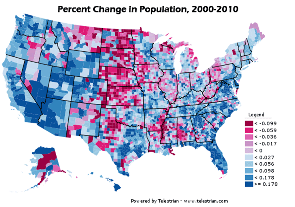
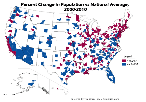
The Census shows that the Bay Area and Los Angeles are growing at their slowest rate in over 160 years under American rule. Between 2000 and 2010 Los Angeles gained less population than in any decade since the 1890s. Its growth rate was slower than metropolitan Chicago, St. Louis and virtually every region that has reported to date, with the exception of New Orleans.

This reflects not only the poor economy of the past few years, but also a widely cited drop-off in foreign immigration and continued massive outmigration of residents to other states. One reason for this mass exodus may be soaring house prices — largely the product of strong regulatory restraints — which appear to have contributed to slowing population growth after 2003.

Yet not all of California is stagnating demographically. The state’s interior region — what I call “The Third California” — is growing steadily. While  Orange County, Los Angeles, San Francisco, San Jose and the Silicon Valley increased their population by only 6% or less over the last decade, inland areas such as Riverside-San Bernardino, Sacramento and the Central Valley saw growth of 20% or more. Overall, the interior counties together gained 2 million residents , roughly twice as many as the combined coastal metropolitan areas.

The reasons for this growth are not difficult to comprehend. In boom times and hard times, housing prices in the coastal regions tend to equal as much as seven or eight times a median family income. The prices in the interior can be three times or less.

In addition, during the past two decades, the interior region enjoyed fairly strong economic growth. Pro-business county governments promoted the expansion not only of housing, which boosted construction, but of basic industries such as food processing, manufacturing and warehousing. According to economist John Husing, the Inland Empire alone accounted for over 40% of the state’s total job growth.

Today, in the wake of the collapsed housing bubble, these interior counties are reeling, with double-digit unemployment (in some cases reaching closer to 20%) and what appear to be diminishing prospects. Five of the nation’s 10 metro areas for foreclosures are located in California’s interior.

Under normal circumstances, lower housing prices and business costs would lead — as in past recessions — to a spate of new economic growth, but this the radical turn in California government could keep these areas permanently poor.

Essentially, the Third California has become hostage to the coastal cities and their increasingly bizarre economic policies. Under first Arnold Schwarzenegger and now Jerry Brown, California has embraced a series of radical environmental edicts that spell disaster for the more blue-collar interior. These include dodgy land use policies designed to combat “climate change” but essentially seek to steer middle- and working-class Californians out of their cherished suburban homes and into densely packed urban apartment complexes.

The last election confirmed the Bay Area’s ascendency in Sacramento. Gov. Jerry Brown was previously mayor of Oakland (a city that actually lost population this decade), while the lieutenant governor, former San Francisco Mayor Gavin Newsom, and the new attorney general, Kamala Harris, are from the city by the Bay.  The San Francisco area’s population may be about the same as the Inland Empire’s, but its political perspective now dominates the state.

Husing describes San Francisco as “a bastion of elitist thinking” due to a large “trustifarian” class who have turned the city into favorite spot for green and fashionably “progressive” think tanks. This thinking is increasingly influential as well in a rapidly changing Silicon Valley. In the past the Valley was a manufacturing powerhouse and had to worry about such things as energy prices, water availability and regulatory relief. But the increasingly dominant information companies such as Apple, Facebook, Twitter, Google and their wannabes are widely unconnected to industrial production in the region. To be sure, they have created a financial bubble in the area that has made some fantastically rich, but according to researcher Tamara Carleton they have contributed very little in new net job creation, particularly for blue-collar or middle-class workers.

There’s a bit of a snob factor here. Fashionable urbanistas extol San Francisco as a role model for the nation. The City, as they call it, has adopted the lead on everything from getting rid of plastic bags and Happy Meals is now considering a ban on circumcision. When it comes to everything from gay rights to bike lanes, no place is more consciously “progressive” than San Francisco. So why should that charmed city care about what happens to farmworkers or construction laborers in not-so-pretty Fresno?

Class and occupational profile also has much to do with this gap between the Californias. Husing notes that the Bay Area has far more people with college degrees  (42%) than either Southern California (30%) or the Central Valley (where the percentage is even lower). Green policies that impact blue-collar workers — restraining the growth of the LA port complex, restricting new single-family home construction or cutting off water supplies to farmers — mean little distress for the heavily white, aging and affluent Bay Area ruling circles.

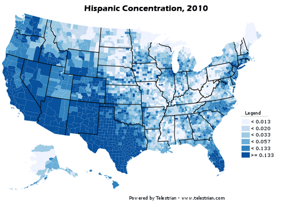
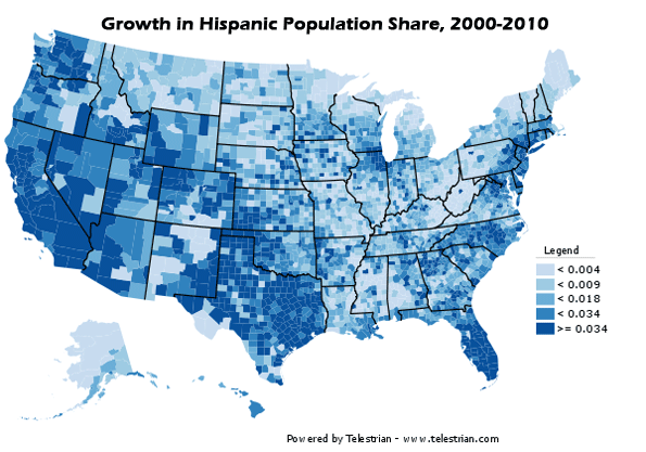
But such moves could have a devastating impact on the increasingly Latino, younger and less well-educated populace of the interior. Outside of the oft-promised green jobs — which Husing calls “more propaganda than economics” — it is these less privileged residents’ employment that is most likely to be exported to other states and countries, places where broad-based economic growth is still considered a worthy thing.  “By our ferocious concentration on the environment, we have created a huge issue of social justice,” Husing points out. “We are telling blue collar workers we don’t want you to have a job.”

This all presages what could be the greatest issue facing California — and much of the country — in the decades to come. In places where San Francisco-like fantasy politics preside, expect to witness a growing class and ethnic divide, with consequences that could prove catastrophic to the future of our increasingly diverse society.

This piece originally appeared at Forbes.com

Joel Kotkin is executive editor of NewGeography.com and is a distinguished presidential fellow in urban futures at Chapman University, and an adjunct fellow of the Legatum Institute in London. He is author of The City: A Global History. His newest book is The Next Hundred Million: America in 2050, released in February, 2010.

Photo by wstera2


Are Chinese Ready to Rent?

$
0
0

In 2010 “House price” ranked third on the list of the top 10 most popular phrases used by Chinese netizens. It came to no one's surprise. In most Chinese cities housing prices have increased significantly over the past decade, with an especially sharp rise over the past three years.

“House Price” is a term used loosely, due to the fact that the vast majority of Chinese real estate is made up of apartments or condominiums, while only a small few are town houses or fully detached homes. However, terminology aside, owning a property is the greatest life-goal for most Chinese citizens.

It is worth mentioning that in China property ownership does not mean land ownership as it does in the West. According to Chinese law, what people are buying is similar to a land-use right, which in the case of residential property, expires after 70 years (40 years for commercial property). The countdown begins on the date that the real estate developer signs for the land, and not on the homeowner’s date of purchase.

So why do Chinese people have such zest for real estate?

Different from the western mentality: “Home is where your heart is” or “home is where you hang your hat;” the traditional Chinese concept is: “home is where your house is.”

Prior to the 1980s, people still followed the custom of living with their parents after getting married. It was not uncommon to see a three-generation family living together in a single home. At that time renting was unheard of, as most apartments, if needed, were provided for free to a person or family by their employer, typically a state-owned entity.

With China's transformation from a strictly planned economy to a market economy, many state-owned companies became limited companies which restricted    free housing provision. However, employees were given the option of buying their current residences at a very low price, and most people did.

Increasingly today, when a young couple gets married , both sets of parents make their utmost effort to help their children purchase a home. For many young people who do not live in their original hometown, it is  essential that they buy a property in the city where they work, as that is the easiest way for them to obtain a local hukou (urban residence permit). Without this, they cannot enjoy the same rights and social benefits as the locals. 

People in China refer to the demand from young couples as “rigid demand,” meaning they must bear the social pressure to purchase a house before they can get married.

For middle-aged Chinese, buying a house is seen as a relatively simple and secure investment, because as indicated in Figure 1, housing prices have increased steadily over the past decade.

This may now be getting out hand and the Chinese government has identified housing prices as a serious national issue. Some macro restrictive policies on home buying were issued in April 2010. Figures issued by the National Statistical Bureau, Figure 2, prove these restrictive policies did relieve somewhat the rate of house price increase.

Immediately following the New Year, the Chinese central government announced that its top priority for 2011 would be controlling inflation. Shortly afterwards, a more stringent policy designed to limit speculation was issued on January 26th, 2011. Subsequently, each city issued its own policies based on this, with Shanghai and Chongqing, two Zhixiashi (provincial level municipalities administrated directly under the central government) taking the lead.

Shanghai issued the following policies on February 1st, 2011.

  1. Any household purchasing a second home must provide a 60% down payment on a mortgage; and the interest rate on the mortgage will be 110% of the benchmark rate.
  2. From the publication date of this policy, households who already own one house will only be allowed to purchase one additional home.
  3. From the publication date of this policy, households who already own two or more houses will not be allowed to purchase any additional homes.
  4. Individuals selling a home less than five years since the date of purchase will be charged an additional sales tax of 5.5% of the full sales price.

Many more cities followed in step, and announced their own sets of policies in the following weeks.

Only one month after these policies came into effect, it is difficult to determine their effectiveness as house prices are still increasing compared with last year, although rate of change has dropped.

The steady price has led to a renewal of interest in rented public housing. Chongqing became the first city to respond to the central government’s call with plans to build 40 million square meters  in public-rent housing units, which will provide accommodation to 1-2 million people within the next three years and to 800,000 families by 2015. In total, Chongqing will invest 120 billion RMB (18.3 billion USD) on public-rent housing construction.

By 2012, Chongqing will also grant the urban hukou to 3 million farmers (10 million by 2020) with rural Hukou. In exchange, these farmers will give up their agricultural land, most of which will be developed into public-rent apartments.

Who will be eligible to apply for public-rent housing?

Chongqing's criteria are as follows:

  1. Applicants must be over 18 years of age.
  2. Applicants must have a job which provides steady income.
  3. Monthly income must be under 2000 RMB (305 USD) for individuals and 3000 RMB (457 USD) for families. (These two numbers will fluctuate according to other economic index changes.)
  4. Families must not already have housing or have housing in which the average space per family member is lower than 13m2.

One thing worth pointing out is that there is no hukou limit for public-rent housing applications, which means that citizens from other cities are equally qualified. All eligible applications will be placed into a lottery and public-rent apartment allocations will go to the lottery winners.

These public-rent apartments range from 39m2 or 420 square feet (1 bedroom, 1 living room) to 53 m2 or 570 square feet (2 bedrooms, 1 living room) with the corresponding monthly rent around 390 to 530 RMB (59 to 81 USD). When you consider that the current average price of residential property per square meter in Chongqing is 5700 RMB (868 USD), that means a person could rent a 53 m2 apartment for 47.5 years before paying the equivalent cost of purchasing an apartment of the same size.

Following suit, many other cities in China have also started to construct public-rent apartments.

Are all the problems solved?

Certainly this can help most lower-income citizens to find a place to live, but there are other problems. Tenants in China are not protected by laws that uphold renter’s rights as in the west. This is largely due to the fact that there are few apartment buildings owned by a single company or person. Citizens can only rent directly from home-owners with virtually no regulatory controls over the personal renting market.  Long-term leasing contracts are nearly impossible to negotiate, and landlords are able to demand large increases in rent, or even eviction at a whim. This means that renters have no stability, and usually have to face the difficulty of moving frequently.

More buildings designed specifically for renting, and regulations protecting both tenants and home-owners are desperately needed.

China has a long way to go when it comes to providing accommodation for its 1.3 billion citizens. Although one clear problem lies with the resources to construct the ”hardware”, this country’s development cannot continue without also upgrading its “software”: people’s way of thinking. In this case, that means convincing people to accept the idea of renting, reversing centuries of preference for ownership.

Lisa Gu is a 26-year old Chinese national. She grew up in Yangzhou (Jiangsu) and lives and works in Nanjing (Jiangsu).

Photo by Charles Ryan

What kind of Cities do we Want, Sustainable, Liveable or Resilient?

$
0
0

A critical issue from the dreadful earthquake that has severely damaged so much of central Christchurch, taken so many lives, and terrified so many residents of the whole urban area, lies in whether the Central Area should be rebuilt. Some believe it should be abandoned for some other location; others see an opportunity to set new standards in sustainability, urban design, energy efficiency, or whatever ideal urban form takes your fancy.

Let's put the issue of “sustainable cities” to one side because the can words means anything, and hence mean nothing.  It has become one of the most overused phrases in the English language.

Not surprisingly, Many of Auckand's leaders are thrilled by the recent official ranking of Auckland as the tenth most livable city in the world, and have announced their determination to make Auckland even more “liveable” than it is now. This target of livability is also surfacing in Christchurch, normally to bolster demands for urban rail, transit-oriented gentrification, promoting cycling and walking, and making the city attractive to the “creative class”.

However this quote from a US urban blog should give the livability boosters pause:

Much of the highly touted livability of Portland has come at the expense of making it unlivable, that is, unaffordable, to anyone without a six figure income. The creative and professional classes thrive in Portland because they are the only ones who can afford it, and they are the ones who appreciate the development style the city has tried to mandate.

I first raised this issue of ‘rich folk’s livability’ in How Can Cities With Unaffordable Housing Be Ranked Among The Most Livable Cities In The World? here on NewGeography. Then Wendel Cox further quantified such city’s “unlivable reality" in Unlivable Vancouver, in NewGeography.

Cities designed to be sustainable or livable are likely to be unaffordable for all but a few.

The Case for Resilient Cities

Many of us watched the devastation caused by the floods in Queensland, Australia, driven by major rainstorms inland, and Pacific Typhoons devastating the West Coast and the hinterlands. The combination of a strong El Nina with the Pacific Decadal Oscillation means such events will be more common and more extreme in this part of the world than we have become used to since the similar combination of 1917/18.

However, Phil McDermott, on his blog Cities Matter was quick to comprehend the lessons to be learned by our political leaders and urban planners.

He opens his blog comment Cities in Search of Resilience with:

An age of extreme events?

Without debating whether an increase in the frequency of extreme events reflects climate warming, such events can be catastrophic when they impact on densely populated areas. Natural disturbances, whether geophysical (tsunami, earthquakes, mudslides) or climatic (flooding, hurricane strength winds, tidal surges), become disasters if they strike heavily populated centres. 

So do human acts of aggression. The tactic of terrorising civilian populations taken to new heights in the bombing raids of the Second World War and adopted by today’s extremists is most effective – and destructive – when directed at the heart of major cities.

Later in the post Phil sets out the following vulnerabilities generated by the current "compact city" planning paradigm:

It relies on sophisticated, centralised interdependent systems of services. This creates greater capacity for disruption when any one part fails. Economies of scale in utilities may come with increased risk of failure under duress.  This applies to sewage treatment infrastructure, communications, water, energy distribution, and power supplies. It also applies to public transport systems.

Poorly designed intensification reduces permeable surfaces, intensifying flood impacts.

Converting brownfield and even greenfield sites (such as undeveloped urban space) to housing or mixed use reduces the safety valve of open space and increases vulnerability associated with the concentration of buildings and populations.

Crowding more people into smaller spaces around constrained road capacity reduces prospects for rapid evacuation from the city or into safe structures and areas.
Lifting the density of buildings increases the consequential impacts of severe events by such things as the collapse of structures, the spread of fire, and the transmission of disease.

Read the whole post here. You might think Phil was setting out a list of lessons to be learned from Christchurch – but that "extreme event" was still in the future. A few days later, Phil responded to this tragedy with a second blog post, that picked up the same theme, titled "A Cruel Blow to a Beautiful City" which offers this timely warning:

We cannot resist the power of earthquakes, hurricanes, tsunami, and the like. But we can perhaps limit the devastation that accompanies them.

The implosion of many of Christchurch’s beautiful heritage buildings is a tragedy on its own, the wiping from the landscape of much of the City’s and nation’s history. But seeing the collapse of more modern buildings is sobering. 

What are the lessons of architecture and engineering that might be drawn from this?

How much resistance can we realistically build into our structures?  Or should we be thinking less rigidly, and explore designs that deflect or reduce the impacts when buildings are faced with irresistible forces? Should we think more about the survival of the people in and around buildings and less about the survival of the structures? Are there innovations in design that offer refuge, protection, and escape even if walls crumble and floors collapse?

This event in Christchurch must surely erode planners’ resistance to the decentralisation that is the mark of a prosperous, modern city, that makes it that little bit more liveable, and so much more resilient in the face of disaster?

Surely, Hurricane Katrina, and these events in Australia and New Zealand suggest that planners should stop worrying about sea level rises that MIGHT, or might not, happen in 100 years – with plenty of warning – and start thinking more about making our cities resilient in the face of catastrophic events which we know can happen tomorrow – hurricanes, cyclones, blizzards, volcanoes, earthquakes and tsunami.

However, the proper debate should not be as simple-minded as "high rise vs. low rise" or "old vs. modern". In Christchurch, liquefaction contributed to the collapse of some of the modern buildings. In the Kyoto earthquake some robust high-rise blocks simply fell over, because of the total collapse of the ground under the building, but remained in one piece.

Such problems and issues are not solved by sets of simple rules but by the application of skill, experience and wisdom. 

Owen McShane is Director of the Centre for Resource Management Studies, New Zealand.

Photo by Kym Rohman

Perspectives on Urban Cores and Suburbs

$
0
0

Our virtually instant analysis of 2000 census trends in metropolitan areas has the generated wide interest. The principal purpose is to chronicle the change in metropolitan area population and the extent to which that change occurred in the urban core as opposed to suburban areas.

From a policy perspective, this is especially timely because of the recurring report that suburbanites have been moving to the urban core over the last decade. We have dealt with this issue extensively, noting the lack of data for any such interpretation. As of this writing, with data for more than half of the major metropolitan areas (over 1,000,000 population) in, there remains virtually no evidence that people are "moving back to the city" (actually, most suburban growth came from outside metropolitan areas, not from the "cities").

The Policy Context: Urban Cores and Suburbs

This discussion is not new, and generally pits anti-automobile interests – including much of the urban planning community – who favor the urban development patterns of prewar America (generally the urban planning community) against those who would prefer allowing people to make their own choices about where they live or work..

Over the past 60 or more years, the data indicates that consumers have nearly exclusively chosen less dense and more suburban areas. This is not to suggest, however that many of us, including this author, automatically favor suburbs over urban cores. Indeed, I have enjoyed years of alternating between living in suburban America and the urban core of the (inner) ville de Paris (arrondissements I, II, V, VII and XI). But if you have a taste for urban living, that does not mean high-density cities are inherently superior to suburban living. People, after all, have different preferences.

Urban areas include both urban cores and suburbs. The delineation of urban cores and suburbs is subjective. There was for example a time – say around 1820 – when development to the north of New York’s Houston Street would have been considered suburban. More than two thirds of the present ville de Paris was suburban before the city limits were expanded in the 1860s. Now, no one would consider, for example, Washington Square or Herald Square to be suburban and the suburbs of Paris now extended to more than 80 times the land area of the 1860s ville de Paris.

One overlooked way to approach the current debate would be to look not at municipal boundaries but forms of development. Around 1950 we began the breakneck expansion of automobile oriented suburbanization which had proceeded more modestly for two or more decades before.

The Urban Core:

This analysis defines the urban core consistent with the criteria of the US Bureau of the Census in 1950. Metropolitan areas are organized around urban areas (urbanized areas). We use the "central cities" of the core urban areas in 1950 as the urban core in the analysis. Those portions outside the 1950 urban core are thus considered suburban. Where an urban area did not exist in 1950 (such as in Las Vegas and Tucson), the urban core is the central city of the urban area when it was first established.

No existing specification of the urban core is ideal, though the present one is appropriate for the policy purpose stated above. Clearly, the urban core would be far better defined at the census tract or even census block level based upon the characteristics of an urban core. This would include factors such as high residential population density, high transit usage, walkability and a high percentage of multiple unit residential buildings.

Such an ideal definition of the urban core cannot be measured with municipal boundaries. Yet, municipal boundaries have routinely been used by researchers to delineate the urban core, not least because the data is readily available. However there three notable difficulties with the use of municipal boundaries to define the urban core.

First; some areas with urban core characteristics are outside the core municipalities. As The Infrastructurist notes, municipalities like Jersey City or Hoboken have the characteristics of urban cores. However, since they are not a part of the core municipality (city of New York), they are classified as suburbs in our analysis. It is well to remember that both Hoboken and Jersey City represented suburban development, during their period of greatest growth, before 1930.

Second, other areas with postwar suburban characteristics are inside the core municipalities. For example, Richmond County (Staten Island), a part of the city of New York is principally suburban. Much of it was developed well after 1950 and consists largely of single family homes. The median construction date of owner occupied housing in Staten Island is 1970, which compares to 1965 in adjacent Middlesex County, New Jersey. It is newer than in Morris County New Jersey (1965), much of which is outside the urban area (all median house construction years from the 2000 census). Major portions of core municipalities such as Los Angeles, Houston, Dallas, Portland, Seattle, Denver and others are also postwar suburban.

Third, in a number of core municipalities, there is little, if any urban core, at least from a residential perspective. For example, one would be hard-pressed to identify an urban core in municipalities such as Phoenix or San Jose (despite the fact that the San Jose urban area is more dense than New York urban area). In metropolitan areas such as these, it might be preferable to define virtually all growth as suburban, though our analysis still defines these municipalities as the urban core.

Based upon the early results from the census it seems that if the more ideal census tract-based urban core definition were used, the urban cores would be shown to be capturing an even smaller share of growth, while suburban areas would be capturing more. But this analysis will have to wait until all the numbers are in.

Historical Core Municipality

The term "historical core municipality" is used to denote the urban cores using municipal boundaries.  The term "city" is avoided because of its multiple definitions. Cities can be municipalities (such as in the city of New York), urban areas (such as the New York urban area), metropolitan areas (such as the New York metropolitan area) or multi-county regions or prefectures of countries like China (such as Wuhan or Shenyang).

This lack of clarity can be routinely seen in media reports that indiscriminately (and without comprehension) make comparisons between cities, using differing definitions. This can even extend even to more technical literature (see pages 12-14 of Urban Transportation Policy Requires Factual Foundations).

Principal Cities: Starting in 2003, the Census Bureau substituted the term "principal city" for the previous "central city" term. The use of principal city designations and the largest municipality as the principal name of a metropolitan area are appropriate for the purposes intended by the Census Bureau.

In its State of Metropolitan America, the Brookings Institution uses up to the three largest principal cities (which it calls "primary cities") and consider other parts of metropolitan areas as suburbs.

Neither approach, however, is appropriate in analyzing postwar suburbanization. Any municipality in a metropolitan area with more than 250,000 population is considered a principal city, regardless of its urban form. Any municipality with more than 50,000 population but which also has more jobs than resident workers is also a principal city, regardless of its actual on the ground reality.

This leads to a situation in which, for example, Los Angeles has 26 principal cities. Any postwar urban form definition would classify nearly all as suburban (and much of the historical core municipality of Los Angeles, notably the San Fernando Valley, itself is suburban). For example, the suburban city of Cerritos is a principal city, yet was largely filled by dairy farms well into the 1950s and was called Dairy Valley.

Other principal cities hardly existed in 1950. Virginia Beach has become the largest municipality in its metropolitan area, having displaced Norfolk. Yet, in 1950 Virginia Beach had a population of only 5,400, well below the 50,000 threshold that was required of central cities (smaller than Ponchatoula, Louisiana, doubtless an unfamiliar municipality to most readers). Arlington, Texas, the third municipality in the Dallas-Fort Worth-Arlington metropolitan area, had a population of 7,700 in 1950, again well below the central city threshold. Arlington is not an urban core, it is a suburban jurisdiction.

Virginia Beach is a good example of a suburban area that has become the largest municipality in a metropolitan area. Its greater size, however, does not make Virginia Beach the urban core. Otherwise, Contra Costa County in California could, by consolidating with its constituent municipalities (God forbid), replace San Francisco as the metropolitan area's urban core.

Perhaps the ultimate example of the problem of principal cities being confused with urban cores is Hemet, California, a principal city of the Riverside-San Bernardino metropolitan area that is, in fact an exurb and not in the primary urban area.

Toward the Future

An eventual more precise analysis of urban cores and suburban trends will be welcome. Yet, as our analysis of trends in New Jersey indicated, even the growth in more urban core oriented municipalities was minuscule compared to the state's suburban growth. Further, much of the urban core growth in the nation came from areas that, although formally located within “city limits” actually were on the suburban fringe. This was true, for example, in Kansas City, Oklahoma City and even Portland.  This suggests that the small share of growth reported in urban cores would be even less if it were based on census tract data; and suburbanization, as a way of life, may indeed be even more prevalent than this year’s numbers suggest. 

Wendell Cox is a Visiting Professor, Conservatoire National des Arts et Metiers, Paris and the author of “War on the Dream: How Anti-Sprawl Policy Threatens the Quality of Life

Photo by urbanfeel

Why North Dakota Is Booming

$
0
0

Living on the harsh, wind-swept northern Great Plains, North Dakotans lean towards the practical in economic development. Finding themselves sitting on prodigious pools of oil—estimated by the state's Department of Mineral Resources at least 4.3 billion barrels—they are out drilling like mad. And the state is booming.

Unemployment is 3.8%, and according to a Gallup survey last month, North Dakota has the best job market in the country. Its economy "sticks out like a diamond in a bowl of cherry pits," says Ron Wirtz, editor of the Minneapolis Fed's newspaper, fedgazette. The state's population, slightly more than 672,000, is up nearly 5% since 2000.

The biggest impetus for the good times lies with energy development. Around 650 wells were drilled last year in North Dakota, and the state Department of Mineral Resources envisions another 5,500 new wells over the next two decades. Between 2005 and 2009, oil industry revenues have tripled to $12.7 billion from $4.2 billion, creating more than 13,000 jobs.

Already fourth in oil production behind Texas, Alaska and California, the state is positioned to advance on its competitors. Drilling in both Alaska and the Gulf, for example, is currently being restrained by Washington-imposed regulations. And progressives in California—which sits on its own prodigious oil supplies—abhor drilling, promising green jobs while suffering double-digit unemployment, higher utility rates and the prospect of mind-numbing new regulations that are designed to combat global warming and are all but certain to depress future growth. In North Dakota, by contrast, even the state's Democrats—such as Sen. Kent Conrad and former Sen. Byron Dorgan—tend to be pro-oil. The industry services the old-fashioned liberal goal of making middle-class constituents wealthier.

Oil also is the principal reason North Dakota enjoys arguably the best fiscal situation in all the states. With a severance tax on locally produced oil, there's a growing state surplus. Recent estimates put an extra $1 billion in the state's coffers this year, and that's based on a now-low price of $70 a barrel.

North Dakota, however, is no one-note Prairie sheikdom. The state enjoys prodigious coal supplies and has—yes—even moved heavily into wind-generated electricity, now ranking ninth in the country. Thanks to global demand, North Dakota's crop sales are strong, but they are no longer the dominant economic driver—agriculture employs only 7.2% of the state's work force.

Perhaps more surprising, North Dakota is also attracting high-tech. For years many of the state's talented graduates left home, but that brain drain is beginning to reverse. This has been critical to the success of many companies, such as Great Plains Software, which was founded in the 1980s and sold to Microsoft in 2001 for $1.1 billion. The firm has well over 1,000 employees.

The corridor between Grand Forks and Fargo along the Red River (the border between North Dakota and Minnesota) has grown rapidly in the past decade. It now boasts the headquarters of Microsoft Business Systems and firms such as PacketDigital, which makes microelectronics for portable electronic devices and systems. There are also biotech firms such as Aldevron, which manufactures proteins for biomedical research. Between 2002 and 2009, state employment in science, technology, engineering and math-related professions grew over 30%, according to EMSI, an economic modeling firm. This is five times the national average.

While the overall numbers are still small compared to those of bigger states, North Dakota now outperforms the nation in everything from the percentage of college graduates under the age of 45 to per-capita numbers of engineering and science graduates. Median household income in 2009 was $49,450, up from $42,235 in 2000. That 17% increase over the last decade was three times the rate of Massachussetts and more than 10 times that of California.

Some cities, notably Fargo (population 95,000), have emerged as magnets. "Our parking lot has 20 license plates in it," notes Niles Hushka, co-founder of Kadrmas, Lee and Jackson, an engineering firm active in Great Plains energy development. Broadway Drive in Fargo's downtown boasts art galleries, good restaurants and young urban professionals hanging out in an array of bars. This urban revival is a source of great pride in Fargo.

What accounts for the state's success? Dakotans didn't bet the farm, so to speak, on solar cells, high-density housing or high-speed rail. Taxes are moderate—the state ranks near the middle in terms of tax per capita, according to the Tax Foundation—and North Dakota is a right-to-work state, which makes it attractive to new employers, especially in manufacturing. But the state's real key to success is doing the first things first—such as producing energy, food and specialized manufactured goods for which there is a growing, world-wide market. This is what creates the employment and wealth that can support environmental protection and higher education.

Thankfully, this kind of sensible thinking is making a comeback in some other states, such as Ohio and Pennsylvania. These hard-pressed states realize that attending to basic needs—in their case, shale natural gas—could be just the elixir to resuscitate their economies.

This piece originally appeared in the Wall Street Journal.

Joel Kotkin is executive editor of NewGeography.com and is a distinguished presidential fellow in urban futures at Chapman University, and an adjunct fellow of the Legatum Institute in London. He is author of The City: A Global History. His newest book is The Next Hundred Million: America in 2050, released in February, 2010.

Photo by SnoShuu

Asthma: The Geography of Wheezing

$
0
0

Are you familiar with the Hygiene Hypothesis? The HH — or, as some of us call it, the “pound of dirt theory” — is grabbing attention again. A minor medical press feeding frenzy followed the publication in the New England Journal of Medicine of a study based on data from Europe. The summary?

“Children living on farms were exposed to a wider range of microbes than were children in the reference group, and this exposure explains a substantial fraction of the inverse relation between asthma and growing up on a farm.”

This is the Hygiene Hypothesis incarnate. The HH posits that part of our immune system produces an antigen called IgE, which evolved to fight parasites in unhygienic conditions that have prevailed for most of human history, and since we are now cleaner, these antigens attack otherwise harmless proteins in some of us, making us sick, in the form of allergies. Instead of attacking, say, hookworms, the antigen goes after that just-chomped peanut butter sandwich.

Proponents of the HH compare the prevalence of allergies in East and West Germany before and after unification. East Germany had more children growing up on farms and in larger families than West Germany, and much lower rates of allergies and asthma. Now, with its more westernized culture, East German rates of allergies and asthma have nearly caught up with West Germany.

It makes a great story. The whole farm-city thing resonates deep in the American mind. It evokes the mythic hold that farm life has over our national psyche. Farms good; cities bad. Wholesome Jeffersonian America is good for our children not only morally, but physically. The implication is that if we all grew up on farms, asthma wouldn’t be at the epidemic levels we now have. The trouble is that in medical science there are too many variables to draw sweeping conclusions from one set of data, and anyone who would do so is not a serious scientist, or is driven by an agenda (or both).

A case in point is a Forbes blogger who took a pot shot at mold-inspired litigation against landlords, interpreting the study to mean that mold is good for us. The Forbes blogger mentioned the case of Bianca Jagger, who sued her landlord about mold growing in her Park Avenue apartment. Erin Brockovich, Michael Jordan, and Ed McMahon are other celebrities who have coped with mold contamination, along with countless sufferers whose names are not familiar to us.

Some mold is, undoubtedly, good. Without it, we wouldn’t have penicillin or blue cheese. But some mold can kill, particularly stachybotrys chartarum – a toxic black mold – which is often found in buildings with water damage. Other molds, while not immediately life threatening, are still potent allergens, including the ones you find in the woods behind the back 40, in Central Park, and in virtually any basement anywhere. In fairness, it’s not as easy for landlords to decide which molds to allow in their properties as it is, say, to choose between Stilton or Roquefort. As for that wet laundry you left in the washing machine for two days, it may not make you sneeze, let alone kill you, but it does stink.

As objectionable as I find enlisting a specious inference in service of an ideological argument against the American tort bar, there are medical considerations to look at before we let the kids run barefoot through the barnyard as immunotherapy against asthma.

First, these were European farms under study. The European farm population may or may not be a fairly homogeneous group compared to city dwellers, and genetics make a large difference in who develops asthma. It stands to reason that generations of working the family farm may have bred a hearty cohort of kids who can breathe the local air without wheezing.

Second, there may be something about European farming practices that makes their farm/city dynamic different from ours. European farms are regulated very differently from our own, in part because of the health fears of the European commissioners. For example, genetically modified food is much more tightly restricted in Europe, if it is legal at all. This means that Europeans use different fertilizers and pesticides than the ones we use here, which undoubtedly affects the rural health picture.

And European farm asthma may just be lagging behind ours. Typical farms are rampant with chemicals. Add to that the effects of weather on the pollen count and the aromatic plumes from manure lagoons, and no wonder rural America is suffering from an asthma epidemic that rivals the one we're seeing in urban America.

CDC researcher Dr. Teresa Morrison, medical epidemiologist in the Air Pollution and Respiratory Health Branch, was lead author of an article in the Journal of Asthma which concluded that “Asthma prevalence is as high in rural as in urban areas.” The goal of their research is "… to document patterns of asthma symptoms among rural residents in Midwestern states, and learn more about possible environmental exposures that potentially lead to asthma attacks."

David Van Sickle, who has worked with Morrison, holds a doctorate from the University of Wisconsin, and is founder of a Madison-based company called Reciprocal Sciences. In a guest editorial for www.asthmaallergieschildren.com in November, he wrote that studies of farm workers in California showed that exposures to agricultural dusts were associated with the development of persistent wheeze, exposure to pesticides was associated with the development of asthma in women, and that community exposures to airborne waste from large scale animal agriculture might also be associated with exacerbations of asthma. As he also pointed out, this may have remained hidden because it’s hard to study, but that is changing, in no small part because Van Sickle has developed an iPhone app called Asthmopolis, which can transmit information to doctors every time the patient—say a farmer—toots on his inhaler.

No one who has studied immunology, as I have, can ignore the contribution farms have made to the treatment of the human immune system. As every biology student should know, vaccination began because Edward Jenner noticed that milk maids exposed to cow pox gained immunity from small pox. I have my doubts that a similar benefit can be derived with asthma.

The country — where the air is full of all kinds of pollen and chemicals — is probably not the ideal choice for a Fresh Air Fund-style migration of wheezing children. But who knows? Maybe some of those farm microbes do have a salutary effect on kids’ immune systems. I wouldn't recommend sending the kids to the city, either (check out some of the reasons a Bronx neighborhood has the nation's highest asthma rates). If I sound equivocal, it’s because I am. Maybe sneezing, wheezing, and itching are the price we — that's an urban and rural "us" — pay for “progress.”

Dr. Paul Ehrlich is co-author with Dr. Larry Chiaramonte and Henry Ehrlich of Asthma Allergies Children: A Parent's Guide (Third Avenue Books), available only from Amazon.com and from Barnes & Noble. He is co-founder of asthmaallergieschildren. He is a fellow of the American Academy of Pediatrics, the American Academy of Allergy, Asthma & Immunology, and the American College of Allergy, Asthma & Immunology, as well as a clinical assistant professor of pediatrics at New York University School of Medicine, and an attending physician at Beth Israel Medical Center and at the New York Eye & Ear Infirmary. He has been featured as one of the top pediatric allergy and immunology specialists in New York Magazine for the last 10 years and counting.

Photo by Nathan T. Baker: "I might have to get a cooler style for this asthma inhaler."

Why We Can’t Shun Manufacturing for the Service Sector

$
0
0

There’s been a lot of talk lately about the shift in the US economy away from production and increasingly into services. Consider the employment data from the US: In 1950, 30% of all US jobs were in manufacturing while 63% were in services. In 2011, 9% of total employment remains in manufacturing, 86% in services.

So does this signify a shift in consumers’ tastes from manufactured goods to services? The short answer is no; if anything, we consume more “things.” The difference is that things are manufactured with far less labor, and they are increasingly made somewhere else. The manufacturing industries still remaining in the US have seen tremendous improvements in productivity. Less-skilled work continues to flow out of the US, but the work that remains is higher-skilled, and more productive. Accordingly, the manufacturing jobs that remain in the US pay well.

Some look to the loss of US manufacturing jobs without concern: the future (they argue) is in service industries. As jobs disappear in manufacturing, others open in services like health care and retail. The problem is that as more manufacturing jobs leave, more productivity leaves as well.

Consider this: Classical economists saw productivity as the key in determining relative wages — the more productive the laborer, the higher his/her wages. Unlike manufacturing, service-sector jobs have strict limits in terms of productivity. For example, a live performance of Beethoven’s 5th requires the same amount of performers/employees as when it was performed in the 17th century. Compare that with the production of almost anything manufactured — the number of workers now required to produce a bolt of fabric, for example.

So how is it that workers in service sectors, where productivity has relatively little growth, maintain wages competitive with workers in manufacturing, where productivity has done nothing but increase?

At least part of the answer lies in what modern economists have dubbed the “Baumol Effect,” after influential economist William Baumol. The Baumol Effect states that lower productivity notwithstanding, service industries have to pay wages comparable to manufacturing in order to get the workers it needs: it’s a simple matter of labor market competition.

So let’s put a little data behind this. The following table lists the 2010 national sales and employment numbers for 2-digit NAICS industry sectors, ranked in terms of total sales.


Industry
Name
Sales (Millions)
Jobs 
Employment Rank
31-33
Manufacturing $4,444,349 12,116,153
4
90
Government $3,055,594 23,931,184
1
52
Finance and Insurance $2,335,933 9,276,170
8
62
Health Care and Social Assistance $1,671,158 18,983,244
2
54
Professional, Scientific, and Technical Services $1,482,841 11,711,344
6
53
Real Estate and Rental and Leasing $1,391,188 7,374,135
11
44-45
Retail Trade $1,194,951 17,369,914
3
51
Information $1,135,475 3,252,198
18
23
Construction $1,123,601 8,886,854
9
42
Wholesale Trade $993,673 6,071,136
13
48-49
Transportation and Warehousing $770,350 6,084,630
12
72
Accommodation and Food Services $691,475 11,872,079
5
56
Administrative and Support and Waste Management and Remediation Services $601,900 10,138,827
7
81
Other Services (except Public Administration) $502,463 8,872,041
10
22
Utilities $377,695 595,031
21
55
Management of Companies and Enterprises $376,055 1,935,179
19
11
Agriculture, Forestry, Fishing and Hunting $360,521 3,456,096
17
21
Mining, Quarrying, and Oil and Gas Extraction $355,246 1,410,588
20
61
Educational Services $260,555 4,080,407
14
71
Arts, Entertainment, and Recreation $208,984 3,780,900
16
Total $23,334,007 171,198,110
Source: EMSI Complete Employment, 4th Quarter 2010


When considering what industry sectors to prioritize for workforce and economic development efforts it is important to look beyond basic employment numbers. This is because, while a sector might have a lot of jobs, it might not actually be producing a lot of income for the region, which is also very important for overall economic health and vitality.

Sectors that generate more income per worker tend to have much bigger ripple effects, which means that a lot more people are impacted as a result of direct and indirect spending. The following table is organized by sales per worker, derived by dividing the total sales for an industry by total employment for a particular year.


Industry Sector
Sales Per Worker
Utilities
630K
Manufacturing
370K
Information
350K
Finance and Insurance
250K
Mining, Quarrying, and Oil and Gas Extraction
250K
Real Estate and Rental and Leasing
190K
Management of Companies and Enterprises
190K
Wholesale Trade
160K
Government
130K
Professional, Scientific, and Technical Services
130K
Construction
130K
Transportation and Warehousing
130K
Agriculture, Forestry, Fishing and Hunting
100K
Health Care and Social Assistance
90K
Retail Trade
70K
Accommodation and Food Services
60K
Administrative and Support and Waste Management and Remediation Services
60K
Other Services (except Public Administration)
60K
Educational Services
60K
Arts, Entertainment, and Recreation
60K
Source: EMSI Complete Employment, 4th Quarter 2010


Here’s our take on manufacturing and a few other basic observations that help to illustrate the difference between production and service sectors.

When it Comes to Income Manufacturing is Still King

At $4.4 trillion in total sales, manufacturing is by far the biggest income generator in our nation, despite a fairly rapid decline in employment (manufacturing has slipped to fourth in overall employment). Despite these trends, manufacturing still manages to far outperform all other industries in terms of pure income creation. Each individual that works in manufacturing generates roughly $370,000 per year. This is a very important fact to consider in a day and age when many folks advocate for improving the service sectors. 

Again, here’s the thing to note: sectors like manufacturing that generate more income per worker have much bigger ripple effects, creating much more impact in a region while helping to raise wages in lower-productivity service sectors. 

Government Services: High on Employment but Low on Productivity

The government sector is twice the size of the manufacturing sector (in terms of employment) but only produces $3 trillion in earnings or $130K in income per worker. Government is a bit trickier to analyze using the sales per worker criteria because the government is essentially capturing tax dollars and spending them on various services (education, military, infrastructure). Government can provide a lot of stability to regional economies, but it’s not really a growth industry (unless you’re in DC!).

Utilities and Finance – Low Employment but High Sales/Job Ratios

The utility and finance sectors have lower employment (ranked 8th and 21st, respectively) but rather large sales to job ratios (250K per worker and 650K per worker, respectively). Keep in mind, the utility sector has a lot of overhead and equipment that factor into the equation. There is a huge amount of capital in play in this sector that requires a relatively small workforce. Finance and insurance can generate very large amounts of capital, and they have much less overhead.

Health Care is Not a ‘Growth Industry’

Health care, the ultimate service sector, has become the second-largest employment sector in the country, yet it produces only $90K in sales per worker, which is pretty low compared to manufacturing, information, or finance. Basically, the health care sector is important for obvious reasons and it can be a source of good jobs for a local region, but it’s not really an “economic driver” that is going to propel our nation into greater prosperity.

Retail Trade vs. Information

The retail trade and information industry sectors have similar income generation ($1.19 trillion and $1.13 trillion, respectively), however, retail trade is five times the size of information in terms of employment. This is why every economic developer is looking for “the next Facebook” and not “the next Napa Auto Parts.” Retail trade only generates $70K per worker while information generates $350K per worker.

So what’s wrong with a service-based economy? It shrinks manufacturing employment as well as the manufacturing sector’s ability to prop up wages. A labor market that loses wage pressures of high-productivity manufacturing industries will settle at wage rates lower than markets where this wage-boosting effect is present. Economic development policy makers should be careful about shunning manufacturing or other production sectors in favor of service sectors.

Dr. Robison is EMSI’s co-founder and senior economist with 30 years of international and domestic experience. He is recognized for theoretical work blending regional input-output and spatial trade theory and for development of community-level input-output modeling. Dr. Robison specializes in economic impact analysis, regional data development, and custom crafted community and broader area input-output models. Contact Rob Sentz with questions about this analysis.

Illustration by Mark Beauchamp

Energy Policy Reset: Forget Nuclear Reactors and Mideast Oil

$
0
0

The two largest crises today — the Japanese nuclear disaster and the widening unrest in the Middle East — prove it’s time to de-fetishize energy policy. These serious problems also demonstrate why we must expand the nation’s ample oil and gas supplies — urgently.

The worsening Japanese nuclear crisis means, for all intents and purposes, that atomic power is, if not dead, certainly on a respirator.

Some experts may still make the case that nuclear power remains relatively safe. Some green advocates still tout its virtues for emitting virtually no greenhouse gases.

But the strongest case against nuclear power is now rooted in grave public fears about radiation. Imagine trying to site or revamp a nuclear plant today anywhere remotely close to an earthquake fault or a major city.

Germany has already begun shutting down some reactors. Opposition throughout Europe and in the United States is likely to grow exponentially as Japan’s tragedy unfolds.

At the best of times, nukes were a hard sell. Even with support from Energy Secretary Steven Chu, a Nobel Prize-winning physicist who talks tough about fossil fuels, the obstacles to new nuclear construction were steep. Now, no amount of Obama administration green or corporate lobbying can overcome images of horrific fires and the terror, even if exaggerated, of radiation leaks.

The other shoe dropping relates to the growing chaos in the Middle East, from North Africa to the Gulf. The price of oil is likely to continue climbing, unless the world economy slides back into recession — and perhaps even then. The governments that emerge from the current Mideast upheavals are likely to be far less pliable to Western interests than the authoritarian potentates that Washington long supported. Disruptions in supply, higher energy taxes and emergent environmental movements could constrain markets for months, even years, to come.

These realities upset all the “best” obsessions of our rival political classes. Much of the progressive community, for example, had embraced nuclear fuel as key to ultimately replacing fossil fuels as a source of electricity — including the long-awaited electric cars. Green advocates often overestimated the readiness of renewable fuels — still far more expensive than fossil fuels and highly dependent on subsidies.

Wind power, for example, produces, at best, some 2.3 percent of the nation’s electricity. But in addition to wiping out whole flocks of birds, it receives subsidies many times higher per megawatt hour than fossil fuels. In contrast, the dirtiest fuel, coal, still produces close to 50 percent of the nation’s electricity.

Meanwhile, solar panel production, touted as a wellspring of job creation, seems to be shifting inexorably to China. Algae-based biofuels and other types look promising — but could take decades to become practical.

Many conservatives, on the other hand, have espoused the nuclear option — in part, because the industry has powerful corporate backing, which is always an influential factor to Republicans. But even red-state denizens are probably looking at the scenes of Fukushima with understandable horror.

So if the “best” agendas of both parties are flawed, it may be time to look at the “good.” The pragmatic way out of this emerging energy mess means focusing on our increasingly abundant supplies of oil and gas.

“Peak oil” enthusiasts may not have noticed, but recent discoveries and improvements in technology have greatly expanded the scope of U.S. energy resources. New finds are occurring around the world, but some of the biggest are in the United States.

Shale oil deposits in the northern Great Plains, Texas, California and Colorado could yield more oil annually by 2015 than the Gulf of Mexico. Within 10 years, these finds have the potential to reduce U.S. oil imports by more than half.

Even more promising, from the environmental standpoint, are huge natural gas finds. Discoveries in Texas, Arkansas and Pennsylvania could satisfy 100 years of use at current demand levels.

Natural gas is already muscling out coal as the primary source for new power plants. It can also be converted into transportation fuel, particularly for buses, trucks and taxis. In terms of pollutants and greenhouse gases, natural gas is much cleaner to burn than oil and significantly more so than coal.

Exploring these resources is, of course, still likely to pose considerable environmental risks. But compared with the existential threat of nuclear radiation, even potential oil spills and damage to water supplies from fracking shale might be regarded as tolerable risks for which we have considerable experience and technology managing with enhanced regulation.

In contrast, a nuclear meltdown, such as could be happening in Japan, poses a far more immediate threat than the scenarios proposed about climate change. Similarly, ceding even more power to an increasingly unstable Middle East represents a clear threat to both our economic and military security.

Focusing on near- and medium-term fossil fuel development also has the virtue of fitting into the here-and-now realities of global economic conditions — largely the growing demand for energy in developing countries — and all but guarantees long-term high prices that encourage private investors to assume the risk. The likely demise of “clean” nuclear energy, sadly, makes such bets even more appealing.

Producing domestic energy also creates the potential for hundreds of thousands of new U.S. jobs — everything from engineering to high-paying blue-collar work in the fields.

A new gas-led energy boom would also spark increases in demand for manufactured goods like oil rig equipment, tractors, pipelines and refineries. And those are sectors that the United States still dominates.

Would we rather this economic growth take place in Iran, Saudi Arabia or, for that matter, Vladimir Putin’s Russia?

The time has come for both political parties to give up their “best” energy options for the good. A green economy that produces millions of new jobs is a laudable goal. But the renewable sector cannot develop rapidly without massive expenditures of scarce public dollars. To fully develop these technologies, we need lots of money and time.

Republicans, too, need to give up their “bests” — including the notion that no policy is always the best, usually a convenient cover for the narrow interests of large energy corporations. Allowing private corporations to unilaterally determine our energy policy makes little sense. After all, most of our key competitors — China, Brazil and India — approach energy not as an ideological hobby horse but as a national priority.

This new energy policy can be accomplished at far lower cost than either increasing dependence or waiting for the green Godot. It could also be far less expensive in terms of our soldiers’ lives — which would otherwise be spent protecting oil rights of corrupt Middle East regimes.

It’s time to demand that our deluded, and self-interested, political class develops an energy policy based not ideology but on how to best guarantee prosperity for future generations of Americans.

This piece originally appeared in Politico.

Joel Kotkin is executive editor of NewGeography.com and is a distinguished presidential fellow in urban futures at Chapman University, and an adjunct fellow of the Legatum Institute in London. He is author of The City: A Global History. His newest book is The Next Hundred Million: America in 2050, released in February, 2010.

Photo by gfpeck


Actually, Cities are Part of the Economy

$
0
0

“The prosperity of our economy and communities is dependent on the political structures and mechanisms used to manage and coordinate our economic systems.”

No politician expecting to be taken seriously would say that today. State intervention was discredited long before it collapsed in the 1980s. Even our prime minister in Australia pays lip-service to “flexible markets with the right incentives and price signals to maximise the value of our people and capital resources.” But how does that square with her government's quiet push for a more intrusive urban policy agenda?

Over the last twelve months, Infrastructure Minister Anthony Albanese has been laying the ground work for a grand National Urban Policy, to be announced later in the year. To this end, he released three dense documents. Last March we got State of Australian Cities 2010 (“Cities 2010”), a compilation of statistics confirming, amongst other things, that cities account for 80 per cent of our Gross Domestic Product. Then in December came a discussion paper and a background paper, both called Our Cities.

Their general drift can be gauged from a line in the latter's final chapter. It's the sentence quoted at the top of this article, with the words “cities” and “urban” replacing “economy” and “economic.”

Embarrassed to champion intervention at the macro level, progressives resort to carving chunks out of the national economy and relabeling them “the environment”, “social capital” or “urban planning” before turning reality upside down. As he moves urban policy to the environment ledger, Mr. Albanese promises to transform the “productivity, sustainability and liveability” of our cities. Intervention is bad for the national economy, it seems, but good for the 80 per cent of GDP generated by cities.

Urban Myths

The authors of Mr. Albanese's documents are anonymous, but aficionados will recognize the handiwork of Curtin University's Sustainable Policy Institute, Griffith University's Urban Research Program, the Faculty of the Built Environment at NSW University, and other focal-points of green orthodoxy. The reference lists are full of their output. Their technique of persuasion, recycled by Mr. Albanese's Department, is to evoke plausible images while perpetuating three myths: suburban growth worsens carbon emissions and traffic congestion, people are being forced to live far from jobs concentrated in CBDs, and denser development will make housing cheaper.

The discussion paper says: “Australian cities generate very high carbon emissions and air pollution from our heavy reliance on carbon fuels for energy and transport. Carbon emissions from transport are principally due to the lengths of trips necessitated by our dispersed cities and our extensive use of private motor vehicles.” Variations of this passage recur throughout the documents. It sounds plausible enough. So many vehicles cris-crossing our wide open cities must be spewing out heaps of carbon dioxide. But the documents ignore evidence painting a different picture.

There is the Australian Conservation Foundation's Consumption Atlas, which found that dense, affluent, inner-suburbs account for more carbon than the dispersed fringe, suggesting that, as a factor in emissions, general consumption trumps settlement patterns; there is a 2007 study by Randolph and Troy confirming earlier findings that energy consumption per capita in high-density developments, like high-rise apartments, is notably higher than in detached housing; there is a recent report by Allen Consulting for the Victorian Building Commission, noting the absence of conclusive evidence that vertical living is more 'sustainable' than conventional homes; and there is more.

None of these rate a mention in the documents. Chapter 5 of the background paper does reference a couple of studies by Alford and Whteman (2009) and Trubka, Newman and Bisborough (2010), but these focus on “transport energy consumption” and “transport greenhouse gases.” They don't investigate the impact of urban form on general consumption, the real determinant of emission levels. And a study by Perkins et al (2009), cited in Cities 2010, actually contradicts the approved message: “overall, it cannot be assumed that centralised, higher density living will deliver per capita emission reductions for residents … ”

There is no reliable evidence that suburban growth is worse for emissions. Even Griffith's Brendan Gleeson, a very green urbanist, had to concede that “the faith ... in residential density as a simple lever that can be used to manipulate urban sustainability appears to be misplaced. New Australian scientific analysis points to the consumptive lifestyle, not the nature of one's dwelling, as the root of environmental woes.”

In any event, transport accounts for 14 per cent of Australia's 1.4 per cent share of global emissions, or a minuscule 0.197 per cent of the world's carbon. We should retain a sense of perspective, even if the documents obsess about our high per capita emissions. If the climate is being affected (a big if), it's absolute volumes that matter.

Allied to the myth of carbon-spewing suburbs is the myth of centrally-located jobs. We read in Cities 2010 that “the impacts of outward expansion and low density residential development have been a greater separation between residential areas and locations of employment ...” The discussion paper asserts, more directly, that “the trend to inner-city living reflects changing preferences for dwellings and location – living closer to employment that is concentrated in central areas.” Again, similar statements crop up throughout the documents. People shouldn't have to drive or commute long distances to a “centre” where the jobs are.

Evidence to the contrary is easy to find. According to the NSW Department of Transport, only 12 per cent of Sydney's jobs are in the CBD, and second tier centres like North Sydney, Chatswood, Parramatta, Hustville and Penrith have no more than 1.8 per cent each. The rest are distributed throughout the metropolitan region. In the case of Melbourne, McCloskey, Birrell and Yip (2009) say it's absurd to concentrate housing near transit lines since only 19 per cent of jobs within the Melbourne Statistical Division (MSD – Greater Melbourne) were located in the Melbourne Local Government Area (the CBD), while 81 per cent “are scattered throughout the rest of the MSD”.

In fact, the background paper points out that a majority of the employed in Sydney, Melbourne and Perth live within 10 kilometres of their workplace, while around 15 per cent live more than 20 kilometres away. This is hardly a disaster in the making. Consistently, Cities 2010 refers to “evidence that commuting distances have been stable or even declining since the 1990s in a number of capital cities.”

For green urbanists, these myths are indispensible. Their agenda hasn't a hope unless the public accepts that suburban growth will spoil the climate, and hike congestion and transport costs. As for housing affordability, the documents take a leave-pass (social housing is another story). They promote the term “living affordability”, adding petrol prices and mortgage rates to the equation.

Evidence linking costly housing to supply restrictions on the fringe, like the annual Demographia survey, is too inconvenient. When the background paper does get around to the subject, it says “multiple factors [impede] the delivery of an efficient supply of suitable and affordable housing.”
These include “land zoning and building code regulations and other standards related to building quality.” A few pages later, however, canvassing some solutions to the problem, the paper proposes “reforming planning systems to … position a variety of residential development in close proximity to centres and transport infrastructure”. Doesn't this mean a lot more inefficient “land zoning”?

This is just one instance of disjointed logic and economic illiteracy; many others are scattered throughout the documents.

The Invisible Hand and Land

Actually, cities are part of the economy, and are subject to the same principles. The operations of demand, supply and prices are equally applicable to land and structures. They can't be erased by regulation, even if it's called planning and zoning. The inflationary effect of coercive zoning on land values is the elephant in the room. Nowhere is it acknowledged in the documents.

Consider two recent press items. Retail tenants in Pitt Street Mall, the heart of Sydney's CBD, are paying rents as high as $13,000 a square meter, while industrial tenants on the north-west outskirts pay around $237. These rent differentials are, of course, a function of distance, and influence the viability, not just the location, of various types of activities.

Restricting expansion and other forms of coercive zoning place an escalating floor under peripheral rents and values. Mr. Albanese's authors fail to appreciate the implications of this, not least for “urban productivity.” There is little call to dwell on economic mechanisms if you believe, as the discussion paper puts it, “the private sector, through a myriad of individual decisions and investments, guided and constrained by government investments, regulations or charges, is a powerful shaper of cities [emphasis added]”.

In the documents, lifting productivity boils down to cutting the costs of traffic congestion, estimated to reach $20 billion a year by 2020, principally by reducing “car dependency” (another loaded term, echoing drug dependency).

Ignoring the reality of high job dispersal, the background paper says “a key challenge is to reduce dependence on motor vehicles while maintaining access between and within locations ... the Australian Government recognises that it has a role … in investing in major mass transit systems, identifying and protecting new transport corridors and supporting means to shift from private vehicles to public transport”. But as McCloskey, Birrell and Yip explain, “the high level of job dispersal around Melbourne [and other cities] cannot be easily unwound.” In those conditions, Mr. Albanese's strategy is doomed to failure.

Alternatively, when diseconomies from congestion start to outweigh economies from centrality, firms and commuters will move to other, less congested sites, easing congestion all-round. This is the only effective, long-term solution to congestion. However by mandating concentration rather than enabling dispersion, evidenced by a dim view of road-building, green planning stymies this process. The documents want to end it altogether.

According to the background paper, “connectivity within cities can also be achieved by placing people closer to the jobs, facilities, goods and services they desire – or putting these closer to where people live. This highlights the important role of integrated land-use and infrastructure planning in managing the need for physical travel”. But this notion, that firms and residences can be “placed” by a central authority, is logically flawed. It suffers from something akin to a “coordination problem” (a concept from game theory).

Suppose household A has, in existing circumstances, chosen its optimal location relative to (1) affordable housing, (2) employment and (3) services. How can the government arrange things so that A ends up in a more optimal location? Moving A closer to work may push it further from affordable housing and services. Moved closer to services, A may end up further from other factors, and so on. It's unlikely that the government can ever place A in a better location relative to all three factors.

Then suppose household B has chosen its own optimal location relative to the three factors, some distance away from the point chosen by A. How does the government improve the outcome for both households? Action benefiting A may hurt B and vice versa.

The same problem can be framed for businesses locating relative to (1) competitive rents, (2) transport routes, (3) suppliers, (4) suitable labour and (5) customers (market). Our cities host hundreds of thousands of households and businesses. There is no way that a planning hierarchy can engineer a more efficient outcome than the people themselves, interacting freely in the marketplace. Official meddling is more likely to induce problems than solve them.

Instances of disjointed logic abound. One paper talks about “micro-reforms to reduce costs to businesses and consumers”, but another urges “access to a range of [more expensive and less efficient] high-quality renewable energy sources”; a paper commends “the principle of subsidiarity, ensuring that the most local level of government is used ...”, but then calls for “improving alignment and integration of planning and investment across all three levels of government to support the nationally agreed … objective”; a paper demands action to “reduce red tape”, but all three documents offer heaps more instruments and regulations.

Ultimately, Mr. Albanese's documents are the pretext for a new wave of intrusion into economic life. As such, they represent a glaring case of bureaucratic overreach. However much he may spruik flats, smaller houses, public transport and higher utility bills as an enhancement of urban “liveability”, most Australians will disdain them as anything but liveable.

John Muscat is a co-editor of The New City, where this piece originally appeared. 

Photo by Joseph Younis.

The High Speed Rail Battle of Britain

$
0
0

A high speed rail battle is brewing in Great Britain, not unlike the controversies that have lit up the political switchboard in the United States over the past six months.

The Department for Transport has announced a plan to build a "Y" shaped high speed rail route that would connect Leeds and Manchester, to Birmingham, with a shared line on to London and London's Heathrow Airport.

The government places the construction cost at £32 billion and makes familiar claims that the economic benefits would be 2.6 times the cost.

These apparently impressive benefits relative to costs are not convincing to George Monbiot, the well-known environmental columnist for The Guardian. He points out that much of the purported benefit is a mere conversion of time savings into currency, which hardly produces "investment grade" projections.

Monbiot further observes that these monetized time savings benefits largely will not be returned to the taxpayers who pay for the system. This raises a fundamental question. If the time savings benefits are so great to the users, why shouldn't they pay for the whole system instead of the projected (and perhaps unreliable) 60 percent? Why should taxpayers be required to pay 40 percent (or probably more)?

As in the United States, the critics get little respect. The Financial Times refers to the Taxpayers Alliance, which opposes the high speed rail program as an "anti-public spending group." In fact, like taxpayers organizations around the world, the Taxpayers Alliance does not oppose public spending but rather opposes wasteful public spending. The Transport Secretary himself, Philip Hammond employs a form of populist character assassination, calling opponents of the high speed rail line "truck importers and climate change deniers," echoing similar sentiments from this side of the Atlantic where promoters would have you believe that anyone who questions high speed rail is best described as an enemy of the people. Demonization should not be used as a substitute for debate.

In the above referenced article, the Financial Times notes that 69 business people signed a letter favoring the project. FT refers specifically to executives of three companies, including Seimens, without mentioning that the firm is among the world’s biggest builders and promoters of high speed trains.

Meanwhile, as in the United States, the government and much of the British media have accepted cost, ridership and revenue projections as produced by the consultants as if they were holy writ. Given the experience of Britain on this very corridor, this makes "child-like faith" look like ultimate truth.

Much of the proposed high speed rail line would be built parallel to the West Coast Main Line (which runs from London, through Birmingham and Manchester to Glasgow). Nothing short of a dog's breakfast has been made of West Coast Main Line projects. In the 1980s, the tilting Advanced Passenger Train was developed to increase speeds to 155 miles per hour along the West Coast Main Line. The project was scrapped and all of the expenditure lost. Then there was the West Coast Main Line upgrade in the late 1990s and 2000s, to increase speeds to 140 miles per hour, which was to have cost £2 billion. The trains never exceeded 125 miles per hour, but the costs exceeded projections approached £10 billion instead, a world record cost blowout of Big Dig proportions (Figure).

This should not be a surprise. The international record of high-speed rail projections is nothing short of horrific.Not only have costs proven far higher, but ridership and revenue have been less than projected. All of this means that taxpayers end up paying more.

Again, Britain is a prime example. The Eurostar London to Brussels and Paris continues to attract at least 50 percent less ridership originally projected. High speed rail systems in Taiwan and Korea have had similar ridership shortfalls.

As in Britain, costs have been higher as well. In Korea, the high speed rail line costs rose three times projections. Costs in California have increased 50 percent in two years and doubled over a decade even before the first shovel has been turned (inflation adjusted).  The cost escalation has already equaled the high end of the range predicted by Joe Vranich and me in our Reason Foundation Due Diligence Report on the California system in 2008.  

If the proposed high speed rail project were simply to miss its cost and revenue targets by the international average (which is far better than the British experience), the benefits to users would fall below £1.00 for each £1.00 of cost. Both the strategic case and the business case for high speed rail would be blown apart. The spectre of cost overruns was a major factor in Governor Scott's cancellation of the Florida high speed rail project.

Not surprisingly, there is rising concern about high speed rail in Britain.A group of 21 officials, including former Chancellor of the Exchequer (minister of the treasury, finance and economics) Nigel Lawson, signed a letter to the Daily Telegraph calling the project "an extremely expensive white elephant isn't what the economy needs. If the government wants to encourage growth there are better ways to get Britain growing and make us more competitive than getting each family to pay over £1,000 for a vanity project we cannot afford." The signatories also included Mark J. Littlewood, Director-General of the Institute of Economic Affairs, one of Great Britain's leading free-market think tanks.

Further, as in the United States there is also strong opposition from neighborhood groups concerned about the impact of trains operating at more than 200 miles per hour or faster through their neighborhoods. Eventually, up to 18 trains per hour are projected in each direction. This means that a 1,300 foot long train will pass houses and other adjacent development every one minute and forty seconds.

There are the usual claims that the high speed rail line will reduce greenhouse gas emissions. However, as in California, the reality dissipates quickly, like steam into the air. Areport prepared for the Department for Transport by Booz Allen Hamilton concluded that the busiest section of the line, from London to Manchester would result in a net increase in greenhouse gas emissions when construction emissions are included (over a 60 year time analysis). Perhaps the intention is to begin reducing greenhouse gas emissions sometime after 2075?

Monbiot further dismantles the environmental case, looking into the government reports to find that 92% of the passengers would switch to high-speed rail from alternatives that produce lower levels of greenhouse gas emissions (including conventional train, new travel and air).

In Britain, as opposed to the United States, the proposed high speed rail system would relieve congestion on a passenger rail line. In contrast, US high speed rail lines would be built in corridors where there are few, if any rail passengers, much less passenger rail congestion.

Even so, there are disagreements in Britain over whether high speed rail is the least costly way to address the problem, or indeed, whether there is a "problem" of sufficient magnitude to justify the public expenditure.

The huge ridership increases projected may well be "over the top" given Britain's less than population replacement fertility rate. As in the United States, some question the wisdom of high speed rail subsidies at a time that the government is (or in the case of the United States, should be) committed to an unprecedented austerity program that is falling heavily on middle income people who will not be the principal beneficiaries of high speed rail.

In the final analysis, the questions will come down to who rides, how far and how fast. Will riders, in this third iteration, ride as fast as promised?  More likely it’s Britain’s beleaguered taxpayers who will be taken for a ride, with costs low-balled and ridership exaggerated as before.

Revised on 3/22/2011. The original version had inappropritately refered to George Monbiot in the sentence about Transport Secretary Hammond. This was due to an editing error.

Wendell Cox is a Visiting Professor, Conservatoire National des Arts et Metiers, Paris and the author of “War on the Dream: How Anti-Sprawl Policy Threatens the Quality of Life

Photo by Jon Curnow

Appalatin: A Perfect Rhythm Falling Into Place

$
0
0

Nesting in Louisville since 2006, slowly taking its time to form and blossom, Appalatin is six working professionals who haven't quit their day jobs -- two native Kentuckians and four immigrant Kentuckians from Latin America, who do lot of professional-quality music in their spare time.

If one were to introduce Appalatin to the world in one longish sentence, it might be something like this: “Appalatin is sunny, high-spirited, fun music, technically a cross-pollination of Appalachian-Kentucky Hillbilly and various Latin American Sounds (primarily Andes & Coastal Central American) -- specifically Rumba, Andean, Central American Folk, American Folk, Cuban, Cha Cha, trova movement from the Sixtes and Seventies, Cumbia, and Bluegrass -- with some of their influences being Silvio Rodriquez of Cuba, Mercedes Sosa of Argentina, Victor Jara of Chile, Nineties Spanish pop band Jarabe de Palo and jam bands like the Allman Brothers.”

Meet this time from foreign shores not Paul, John, George, and Ringo, but rather Obanodo “Marlon” Solano, Steve Sizemore, Yani Vozos, (who has emerged as the group's unofficial/official spokesperson), Fernando Moya, Luis de Leon and the amicable Mario Cardenas, who speaks mostly in Spanish.

The first time I see them was at the Americana Festival this past summer -- and they caught my ear. Right away there was something extra-special and highly individual about Appalatin -- not just the fact that the music they performed is unusual (i.e., “Shady Grove” with Andean Pan Pipes and Central American Spanish guitar rhythms) -- but also the fact that they made it cohesive, natural and relaxed.

As people, they are very, very much like the music they perform. They have a notably warm, genial, and relaxed air about them, similar to the Carolina Chocolate Drops, that gives them the potential to be a real crowd-pleaser and a favorite.

Yani Vozos recaps their genesis this way: “In August 2006, Steve and Marlon jammed once, then I came in and we did a show at [the] Jazz Factory. A year later Fernando joined the band, a year later Mario started playing off and on, and a year after that Luis joined the band, and here we are.”

Steve and Yani both hail from small towns in Kentucky -- Hazard County, and Richmond plus Estill County, respectively. Marlon grew up on a farm in a tiny community, only in San Lorenzo, Nicaragua. Fernando, surprisingly the most urban of the bunch given his tribal heritage, hails from just outside of Quito. Mario hails from Loja -- the “Nashville or New Orleans of Ecuador” (his words), and Luis is from the State of Chiapas and lived in Guatemala for twelve years before coming here.

The music that emerges from this divergent mix is remarkable in the degree to which it both melds seamlessly together and preserves the essence of each of its ingredients.

Appalatin began with a long-running set of gigs at various of the locations of Heine Brothers Coffee that lasted from 2006 until Spring/Summer of this year, an affiliation which gave them excellent exposure to some of the most literarily and artistically acute people in the city and one which they might therefore resume sometime in the near future. They have also appeared earlier this year at the Tequila Factory and have an annual gig at the Kentucky Museum of Art & Craft - appropriately enough for the Day of the Dead celebration - in addition to other sporadic gigs around town over the past four years. On the out-of-town front so far, they have put in appearances in Lexington, Frankfort, and London, Kentucky (an event that got rained out, but they played for the organizers, anyway) and Corydon, Indiana. Basically they have taken their time since 2006 in bringing the particular and challenging synthesis of their eclectic sound together, forming it based on the common-denominator influences shared by each of the members.

Yani summarizes their seminal period, throughout which they were mentored by Louisville music-development legend John Gage, this way: “We started out playing cover tunes of mostly Latin folk music, and as musicians, we were comfortable playing together from the beginning. But Heine Bros. gave us the opportunity to develop the sound and get more comfortable playing with each other. For a long time, we rehearsed very little and only played together at Heine Bros., it was our rehearsal spot.. . . Everyone has unique but vaguely similar backgrounds, and the format that we use is very open, i.e., play a song and everyone adds their flavor and we see what happens. This was definitely cultivated at the Heine Bros., because we would just play and have fun and experiment with cover songs. So, when Marlon and myself began to introduce original songs it was easy to cultivate the original sound because of the open format and everyone being comfortable with each other.”

Getting There

This past summer, they felt they had enough original material together to record an album and put the finishing touches on it in the middle of December -- it should be released just a few weeks after this article hits the stands. As a comparison, Justin Bieber had been discovered, released an album, and garnered world-wide recognition in half the time Appalatin has spent in R&D -- but Beiber isn't as original and wouldn't appear to have that long shelf life that I project can be expected from Appalatin.

The great thing about Appalatin is that their sound hits you like early blues or Sainkho Namtchylak's surreal throat singing -- when you first hear it, what you (or at least it was true for me) get is this irrational but exciting feeling of “This is such a great sound, but is so new to me -- so clearly it is still so unknown -- I must be the only person who's heard it; otherwise everyone would be listening to it, and I would have heard it long ago.”

This experience of feeling like you're discovering something totally new to everyone is still possible for new listeners to Appalatin -- but, if I am right about their trajectory in the future, that should change.

Appalatin's own feeling of recent discovery has to do with acquiring that necessity to create something permanent that all artists feel when they realize that at last they are “there”; as Steve puts it, “When we recorded the album this summer, that was the first time we felt like, OK, we have to do this. You know, the rest of the time we're just like, all right, let's play, let's have fun.”

The good-feeling, upbeat music that has emerged as their signature has been the result of a cross-cultural experience for all the members; they didn't just play together, they visited each other's areas as a precursor to composing together, and immersed themselves independently in each other's folk music. Both Kentuckians, independently, spent time in Central and South America -- Yani in Nueva Morolica, Honduras from mid-2000 to late 2002, during a stint in the Peace Corps. Steve lived in Santiago, Chile for a year and a half, and in Buenos Aries, Argentina for almost a year, where he taught English as a second language. This is where they both really got into their mutual love of Latin American and Spanish music.

The situation was the reverse for the Hispanic members, who were immersed in their own local traditions as well as in Latin American commercial pop, and who got into Bluegrass and Appalachian Hillbilly music, again independently, upon coming into the U.S. The key difference is that the Latin Americans already had a little bit of a leg-up, since they didn't have to leave their respective countries to discover the commercial American stuff.

But here they are now, all together, with primarily much the same influences – Steve, a planner at U of L, who is drummer/percussionist-of-all-trades (congas, bongos, cajons, etc.); Marlon, who is self-employed with his homemade jewelry business Naturaleza al Descubierto (plus being an archaeologist), on guitar & vocals; Fernando, on Bamboo Flutes and Chagrango, makes Andean flutes and sells them along with native crafts at art fairs and festivals around the region; Luis, a journalist and photographer for Al Dia En America, the local Spanish-language paper, also submits to papers in Mexico and Guatemala, and is the one on harmonica and Maracas (who, according to Fernando, brings the “blues-y flavor”); Mario, a retired industrial engineer, dubbed by the other members 'the Godfather,' a.k.a. the group's oldest member, providing bass and background vocals; and spokesperson Yani, a U of L Graduate Student Advisor, on vocal, guitar and mandolin, who, according to Fernando, accounts, with Steve, for the group’s “gringo flavor.'”

Appalatin: The Music You Can’t Ignore


There is an old cough medication somewhere out there with the slogan, “Tastes Awful But It Works.” On the surface, one might think that combining Applachian with a variety of Latin American styles might be more like a case of “sounds awful but it doesn't work,” or even possibly ending up like a Hasil Adkins song – “sounds awful but it somehow manages to work.” But the ears don't lie -- and, if you think about it, of course, the folk traditions in both the Americas, rooted in European, African, and Native American customs and styles, would have to blend together smoothly and harmoniously -- a perfect fit.

There could be some influences from their past that have affected their music that the members themselves are unaware of – I asked them this and they responded with a joke at their own expense, that possibly music they didn't necessarily like, but that happened to be in the background of their individual childhoods, would account for what I was hearing.

However, that isn't what I meant at all. Personally, the unreported influences I think I might be hearing are not unlikable in any way -- some Caribbean rhythms, which might have sneaked in undetected via the Nicaraguan and Honduran streams. Possibly for Marlon, it might be Nicaraguan ranchera and Latin American music; for Steve it might be top 40; for Yani it could be the Greek roots music of his heritage; or for Fernando it might be the heavy metal to which he says he used to pick up girls as a teenager.

Appalatin still has to make the mark they deserve in Louisville, let alone in the rest of the world, but from this point on they should “get known” very quickly, especially with their new CD coming out. They make music one really cannot ignore, and their own peculiarly inviting and stage-warming presence should clinch it, especially among those who tend toward the traditional in music. So, while they have enjoyed the success of having played for the U.S. Ambassador to Sweden, I would have to say I cannot imagine any panties ever being thrown onstage at an Appalatin concert. On the other hand, they do report having once played for dogs. Yes, dogs: “We played a dog party, yes its true, a party in a gymnasium where dogs were running around with their owners, they all seemed to enjoy it.” And as for panty paucity and party-pooper factor, I wouldn’t want to go so far as to give the wrong impression: “Last Cinco de Mayo at the Tequila Factory [we had] people dancing on table at the end of the night.” So, OK, not panties -- but close enough.

In what they refer to as “a narrow brush with fame,” Appalatin was invited to play (though in the end Yani was the only one who could attend) an EPA rally on the expansion of a coal- fired energy plant in Southwest Jefferson County, in company with Jim James and Daniel Martin Moore.

Appalatin's playlist so far consists of originals, traditional American Folk -- both North and South American, that is -- and covers of some Latin American commercial music. They've also done renditions of Andean music, such as covers (“Alturas” among them) of Inti-Illimani songs. Here's their take on some of their own favorites so far: “I [Yani] think that all of the songs are special and have the power to speak to and move people both here and abroad. For me though, I am a fan of "Canta mi Gente," "Spread the Love Around," "Luna Llena," "Pine Mountain Top," and "Shady Grove.. . . Oh, and "Carro Loco," too, is a foot stompin', knee slappin' jam that will get even the most timid in the mood to move. Definitely has potential to catch on.”

Regarding the future the group members envision for themselves, Yani has this to say: “I think that we will continue to grow as musicians and as a band, always paying tribute to past folk traditions from Latin America and here in Kentucky. I also see us experimenting with different styles and perhaps other instruments as well. Flamenco is something that we are all very fond of as well as Brazilian music as well as more rock and blues. We have talked about incorporating the violin/fiddle, saxophone (Luis plays this) and electric lead guitar (Yani plays this) and perhaps a drum kit.”

For the future, a quote from Steve Sizemore on Appalatin's Facebook page -- “2011 should be a big year for Appalatin!”

I think that is a safe prophecy to make.

This piece originally appeared at Louisville Music News.

Photo by Paul Moffett, Louisville Music News.

Appalachia-based Alexander Clark Campbell has done critical pieces on film, C&W music, local and regional travel, and food. He currently covers the worldbeat music scene for Louisville Music News.

Pollution: An Off – Road Guide to Environmental Hot Spots

$
0
0

Not all pollutants are created equal, nor do they necessarily hang out in the same hot spots. Rankings of the most polluted cities — you know who you are — have become depressingly familiar. But those standings almost always represent a statistical stew of assorted toxins in the air and water, averaged together. The list that follows may surprise you: A quick look at a handful of cities, each with the unfortunate distinction of being the worst in the U.S. for a specific environmental health hazard.

Bakersfield, California
While the Los Angeles metro area is synonymous with dangerous smog – and LA is, in fact, the leader in ozone pollution – it is actually Bakersfield, California that has the nation's worst overall air quality, according to the American Lung Association's State of the Air report. An inland city between LA and Fresno, this "gateway to the Central Valley" defies the stereotype of dirty, urban air; rural Bakersfield is a major agricultural center.

A combination of factors pushed Bakersfield into the #1 spot. Like LA, it, too, suffers from ozone pollution. Ozone is a necessary component of the Earth’s upper atmosphere, where it shields the planet from the sun’s more harmful rays. However, when ozone collects at ground level, it can interrupt photosynthesis in plants and cause detrimental health effects in humans. When breathed in, ozone and other components of smog irritate the respiratory system, and can cause asthma, bronchitis, heart attacks, and other cardiopulmonary problems that may result in premature death.

Air pollution has long been a problem in California because of geographical and weather conditions that allow the pollution to hang over the regions, rather than dispersing. The Golden State’s much-renowned sunshine actually exacerbates the problem, reacting with car exhaust and other pollutants to create ozone molecules, helping to make California home to the six worst U.S. cities for ozone pollution.

Of course, ozone is not the only environmental problem Bakersfield faces. It also ranks second in year-round particle pollution and first in periodic short-term spikes of particle pollution.

Libby, Montana
Another pollution frontrunner that is not located in a large city. Libby, Montana, a town of 3,000 residents, is home to the nation's deadliest environmental dangers and the most expensive Superfund clean-up site monitored by the Environmental Protection Agency. The dangers stem from a nearby vermiculite mine which provided employment for many of the residents. Vermiculite, a component in some types of insulation, is not hazardous in itself, but it is often found in ore deposits along with another mineral – asbestos. Miners who extracted and broke up the rocks containing vermiculite also released tiny asbestos fibers into the air and breathed them into their lungs. Over time, these fibers caused lung scarring, asbestosis, and symptoms of mesothelioma, a deadly cancer that affects the lining of the chest or abdomen.

More than 400 Libby-area residents have died of asbestos-related illnesses, and another 1,500 show lung scarring, which can be a precursor to other serious diseases. The miners were not the only ones at risk. Those who unwittingly brought fibers home on their clothes exposed their families. Some children even played in the soft piles of mining waste, breathing in asbestos dust as they did. Despite the fact that the mine’s owners, the W.R. Grace corporation, knew of the dangers as early as 1964, the mine remained open until 1990. Because mesothelioma symptoms can take between 20 and 50 years after exposure to surface, the residents of Libby may have yet to see the full impact of the mine on the town. Mesothelioma life expectancy is tragically low, with most patients surviving only 9 to 12 months after diagnosis, making asbestos a serious environmental health threat.

Pensacola, Florida
America's worst drinking water, according to a compilation of results from a five-year Environmental Working Group report. The EWG looked at percentage of chemicals in the water, the total number of contaminants, and the most dangerous average level of a single pollutant. Topping their list was this panhandle city. Analysts found 45 of the 101 chemicals the study tested for in Pensacola’s water, and 21 of those chemicals exceeded health standards. For comparison, the city with the second worst drinking water – Riverside, California – contained 30 chemicals, 15 of them at unhealthy levels.

Among the worst contaminants in Pensacola’s water were radium-228, trichloroethylene, tetrachloroethylene, alpha particles, benzene, and lead. Radium-228 and alpha particles are both dangerous because of their radioactivity. Trichloroethylene is used as an industrial solvent, and tetrachloroethylene is more commonly known as dry cleaning fluid. In addition to these contaminants, the Pensacola drinking water also contained cyanide and chloroform — obvious health hazards — and lead, which can be a natural contaminant, but more often works its way into drinking water through old pipes. Also problematic for Pensacola: benzene, once a gasoline additive, is now used in the making of plastics, rubber, and dyes, and linked to the development of certain types of leukemia.

Jeorse Park Beach, Indiana
The most polluted beach in America in 2010. Few would think of Indiana as a beach state, but where its borders meet Lake Michigan there are several beachfronts that locals take advantage of in the summer. One of these, Jeorse Park Beach I near East Chicago, ranked as #1. Of 78 water quality tests conducted by the National Resource Defense Council, this beach exceeded pollution standards for human and animal waste 76 percent of the time, more often than any other beach. Not surprisingly, it had to be closed several times in 2010 due to bacterial contamination.

Lake Michigan has long been plagued with pollution problems. Nearby steel mills from several states dump waste in the lake, and a BP oil refinery in Whiting, Indiana, reportedly discharges raw sludge into the lake on a regular basis. Though protesters in 2007 managed to extract a promise from BP that it would not expand and hence dump more waste, as of 2010, expansion was proceeding as originally planned. Though the company still insists it will keep its promise, the pledge is unenforceable, since BP has a permit to increase waste production and get rid of it in the lake.

Photo of the highly toxic Berkeley Pit, Butte, Montana by grabadonut

Krista Peterson is a recent graduate of the University of Central Florida and an aspiring writer. As a health and safety advocate, she shares her passion for the wellness of our communities.

The Deconstruction of Barack Obama

$
0
0

The first two years of the Obama Administration have been historic and eventful. The first openly liberal president in a generation has dramatically increased government spending and intervention in the nation’s economy. The federal deficit soared to $1.65 trillion dollars and 35% of Americans now receive some type of government assistance.

The President seems to view the American economy through the prism of an academician. His vision of America held that his New Economy would be supported by the troika of plentiful Green jobs, new federal employment, and a revitalized and robust union based economy.

Give him credit. President Obama has held true to his vision even if the economy, and the American people, did not.

The “Green Jobs” of Mr. Obama’s new economy have not materialized despite huge government incentives. The president's New Energy for America plan called for a federal investment of $150 billion over the next decade to catalyze the private sector to build a clean energy future.

Obama’s plan is to:

  • Provide short-term relief to American families facing pain at the pump
  • Help create five million new jobs by strategically investing $150 billion over the next ten years to catalyze private efforts to build a clean energy future.          
  • Within 10 years save more oil than we currently import from the Middle East and Venezuela combined    
  • Put 1 million Plug-In Hybrid cars – cars that can get up to 150 miles per gallon – on the road by 2015, cars that we will work to make sure are built here in America
  • Ensure 10 percent of our electricity comes from renewable sources by 2012, and 25 percent by 2025
  • Implement an economy-wide cap‐and‐trade program to reduce greenhouse gas emissions 80 percent by 2050

The President’s plan called for renewable energy to supply 10% of the nation's electricity by 2012, rising to 25% by 2025. The problem with his vision was that America was already generating 11.4% of its electricity from renewable sources when he delivered his speech. Ironically, most renewable energy comes from hydro-power, a source disdained by many greens. (US Energy Information Administration, Electric Power Monthly, June 2010.). T. Boone Pickens’s plan to build wind farms across the Great Plains was the most publicized private response to Obama’s vision never materialized. The U.S. Chamber of Commerce reported on March 10th that 351 “shovel ready” energy projects were stalled nationally due to “a tangle of state and local regulations”. These 351 projects were to create 1.9 million jobs and infuse the economy with “a $1.1 trillion short-term shot in the arm”. William Kovacs, senior vice-president of the chamber said, “In fact, there weren’t any shovel ready projects.”

In the end, the outpouring of new technologies and jobs in the new “green” economy simply never materialized. 

Indeed, despite the grand vision of a Green economy, America remains deeply dependent on others for its energy.

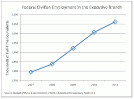
The second leg of Obama’s troika was new government employment. He was successful in signing his health care reform into law but delayed implementation to 2014. The 2010 election that changed 63 House seats to the Republicans, has acted to unwind much of this legislation. If not repealed outright, Obamacare will likely face starvation from Republican cuts in funding necessary to implement the 2,900 page law with its hundreds of new federal regulations. Federal civilian employment in the president’s 2012 budget, will be 15 percent higher in 2011 than it was in 2007. This effort is also likely to be stymied.

Union workers, the third leg of Obama’s troika, were well served in the first two years of the Obama Administration. The United Auto Workers inherited ownership in General Motors and Chrysler, and obtained federal protection of their relatively high wages and Cadillac health care benefits.  Had GM and Chrysler been allowed to enter Chapter 11 bankruptcy, it’s likely both would have been drastically reduced. Under the health reform act, union workers received exemptions from taxation for their Cadillac health care plans – unlike those of private companies.

According to the most recent Employer Costs for Employee Compensation survey from the U.S. Bureau of Labor Statistics, as of December 2009, state and local government employees earned total compensation of $39.60 an hour, compared to $27.42 an hour for private industry workers - a difference of over 44 percent. This includes 35 percent higher wages and nearly 69 percent greater benefits. (Adam Summers Reason Foundation - Comparing Private Sector and Government Worker Salaries May 10, 2010).

Will union members be able to hold their ground or be forced into major concessions during the coming deconstruction? State governors like Christie (NJ), Daniels (IN), Kasich (OH), and now Governor Walker of Wisconsin are taking on the unions head-on for the first time in generations. New conservative majorities in state house around the country are deconstructing collective bargaining agreements, above market wage gains, and Cadillac fringe benefits. Labor’s gains, and political clout, may have peaked in 2008. 

Will President Obama adhere to his academician’s vision of the New Economy or will he be forced to succumb to the realities of the coming Great Deconstruction? Congress is arguing whether it can afford $4 billion in cuts to a $3 trillion budget in order to avoid an imminent government shutdown.

Overlooked and more momentous is that for the first time since World War II, both houses of Congress – and some in both parties – are debating how to enact massive cuts in government spending. This is the beginning of the Great Deconstruction. Like the proverbial snowball rolling downhill, the $4 billion cuts of March 2011 could eventually canonball into hundreds of billions of actual spending reductions as the federal government deconstructs.

The Government Accounting Office released a report on March 1st entitled 'Opportunities to Reduce Potential Duplication in Government Programs, Save Tax Dollars, and Enhance Revenue.' The report identified $200 billion in annual waste from duplicative federal programs. The agency found 82 federal programs to improve teacher quality; 80 to help disadvantaged people with transportation; 47 for job training and employment; and 56 to help people understand finances. Finding ways to cut billions in federal spending is not be the problem. Finding politicians with the political will to withstand the barrage of criticism from impacted constituents is another matter.

The Great Deconstruction has already begun. Will President Obama, clearly a savvy politician, recognize this inexorable reality of this gathering force, leap in front of it, and claim ownership? Or will he stick to his academician’s vision and allow the snowball of deconstruction to roll over him? 

Robert J Cristiano PhD is the Real Estate Professional in Residence at Chapman University in Orange, CA and Head of Real Estate for the international investment firm, L88 Investments LLC. He has been a successful real estate developer in Newport Beach California for thirty years.

Other works in The Great Deconstruction series for New Geography
Deconstruction: The Fate of America? – March 2010
The Great Deconstruction – First in a New Series - April 11, 2010
An Awakening: The Beginning of the Great Deconstruction – June 12, 2010
The Great Deconstruction :An American History Post 2010 – June 1, 2010
A Tsunami Approaches - Beginning of the Great Deconstruction - August 2010
The Tea Party and the Great Deconstruction – September 2010
The Great Deconstruction - Competing Visions of the Future – October 2010
The Post Election Deconstructors - Mid-term Election Accelerates Federal Deconstruction – November 2010
The State Government Deconstructors – November 2010

NY Borough to Borough Commute? Fuhgeddaboudit

$
0
0

As the country’s largest and densest metropolis, New York City has been able to offer a level of public transit service that most other cities can only dream about. Commuting to Downtown or Midtown Manhattan has been—and still is to a large degree—a remarkably easy affair for hundreds of thousands of residents, whose travel options include commuter train, subway, ferry and bus. However, like a lot of older American cities, New York has changed dramatically since most of those services were put into place, and more and more residents, particularly among lower-income workers, no longer travel to Manhattan for work.

Census data show that between 1990 and 2008 the number of residents who traveled to work in their own borough or a neighboring borough or county increased much faster than the number who made the more traditional commute to Manhattan. For instance, the number of Bronx residents who traveled to Queens or Westchester County for work increased by 38 percent, and the number who traveled inside the borough jumped by 25 percent, while the number commuting to Manhattan increased by only 13 percent in the same period.

The discrepancies on Staten Island are even starker: During the same period, the number of Staten Island residents traveling to work inside their own borough increased by 32 percent, and those going to Brooklyn or New Jersey increased by 22 percent, while the number heading into Manhattan barely changed at all—a four percent increase in those 18 years. Although not as dramatic, Brooklyn and Queens both saw significant gains in non-traditional commutes as well. In fact, the number of Brooklyn residents traveling to Queens grew by 32 percent, compared to a 13 percent increase in the number going to Manhattan. In 2008 despite being a notoriously difficult trip for public transit riders, nearly 160,000 people crossed the Brooklyn/Queens border for work everyday.

One big reason for this shift in commuter patterns is New York’s changing economic landscape. For decades Manhattan has been steadily losing its share of jobs to the other four boroughs, but over the last ten years that process has sped up considerably. From 2000 to 2009, New York City lost a net 41,833 jobs, but that was because of the huge concentration of losses in Manhattan during 2008 (over 100,000 in that single year). Every other borough saw a net increase in jobs during that period. Queens saw 2.4 percent growth, Staten Island 4.6 percent growth and the Bronx and Brooklyn 7.7 and 7.9 percent growth, respectively.

It won’t come as surprise to those who have been paying close attention to the economy that robust job gains in the health care and education sectors are what lie behind sustained growth in the outer boroughs. Between 2000 and 2009, New York City gained nearly 120,000 jobs in those two sectors alone. And although Midtown Manhattan has several prominent hospitals and universities, collectively, the hundreds of hospitals, nursing homes, community health clinics, colleges and professional schools in the other four boroughs—from Montefiore Hospital in the Bronx and SUNY Downstate Medical Center in Brooklyn to Queensborough Community College in Bayside—accounted for the lion’s share of jobs in those sectors.

New York City’s transit system wasn’t designed for commuter trips to jobs within and between boroughs outside of Manhattan, and as a result the city’s median commute times have been rising steadily for decades. According to American Community Survey data released last December, New York’s four outer boroughs all have median commute times that are north of 40 minutes, which puts them among the longest in the country. And among public transit riders they are significantly longer, ranging from 52 minutes each way in Brooklyn to a barely comprehensible 69 minutes each way in Staten Island.

In our study, we interviewed a number of outer borough employers who felt that a lack of dependable rapid transit service has exacted a toll on their businesses. A lack of transit effectively shrinks their labor pool, they said, and causes more turnover as disgruntled employees decide to leave rather than suffer through two hour commutes every day. The chief operating officer at SUNY Downstate Medical Center in East Flatbush Brooklyn even said that it could cause the hospital to rethink its plans for expansion. “I’ve been here 24 years,” he said, “and I still haven’t seen any improvements in mass transit.”

New York’s biggest investments in transit are still almost entirely focused on Manhattan commuters. Tens of billions of dollars are being invested in what amounts to an extension of the Q train along Second Avenue, a new Long Island Railroad tunnel to Grand Central, a one stop extension of the number 7 train on the west side, and a Santiago Calatrava-designed Fulton Street Station in lower Manhattan. A new Moynihan Station on 34th Street is apparently next on the agenda. These projects may spawn billions more in lucrative real estate deals, but they don’t reflect the city’s true economic geography.

A lack of transit investments in the outer boroughs might be understandable if these new outer borough jobs were spread out evenly over a large territory, but a huge percentage are located in relatively dense clusters. Over 20,000 commuters descend on the SUNY Downstate and Kings County Medical Campuses — right across the street from each other —every morning, for example. But very little has been done to facilitate commutes to that area, and many employees and patients depend on a dizzying array of livery cabs and dollar vans to get them where they’re going. Similarly, JFK airport in Queens is home to over 55,000 jobs; Hunts Point in the Bronx 20,000; the Sunset Park waterfront in Brooklyn 32,000, and so on.

Making much needed investments in service and upgrades to the bus system may not be as sexy as a new train terminal in Midtown. But if New York is going to sustain job growth and retain a truly world-class transit system, then it will have to start looking beyond Manhattan and invest in solutions that make commutes to job centers in the outer boroughs easier for residents.

David Giles is a research associate at the Center for an Urban Future, a Manhattan-based think tank. He is the author of Behind the Curb, a Center for an Urban Future report about the gaps in transit service in the four boroughs of New York City outside of Manhattan, from which this article was adapted. For the whole report, please visit BehindtheCurb or www.nycfuture.org.

Photo: The Brooklyn Bridge by S J Pinkey

Census 2010 Offers Portrait of America in Transition

$
0
0

The Census Bureau just finished releasing all of the state redistricting file information from the 2010 Census, giving us a now complete portrait of population change for the entire country.  Population growth continued to be heavily concentrated in suburban metropolitan counties while many rural areas, particularly in the Great Plains, continue to shrink.


Percentage change in population, 2000-2010. Counties that grew in population in blue, decliners in red. Note: Legend values not multiplied by 100.

Dividing counties by those growing faster or slower than the US average paints the picture even more starkly:


Percentage change in population, 2000-2010.  Counties growing faster than the US average in blue, slower than the US average in red.  Note: Legend values not multiplied by 100.

The release of all county data means it is also possible to take an unofficial, preliminary look at metropolitan area growth.  The biggest gainers were Sunbelt cities in the South, Texas, and the Midwest, while the Midwest and Northeast continued to lag, particularly the old heavy manufacturing axis stretching from Detroit to Pittsburgh. But this picture was not monolithic. Many Southern cities with Rust Belt profiles like Birmingham failed to grow much compared to neighbors, nor did coastal California with its development restrictions.


Percentage change in population, 2000-2010. MSAs that grew in population in blue, decliners in red. Note: Legend values not multiplied by 100.


Percentage change in population, 2000-2010.  Counties growing faster than the US average in blue, slower than the US average in red.  Note: Legend values not multiplied by 100.

A full table of population change for large metro areas (greater than one million people) is available at the bottom of this post.

Basic race information is also available in this data release, since it is used to ensure redistricting complies with the requirements of the Voting Rights Act.  Here's a map showing the concentration of Hispanic population the US:


Population of Hispanic Origin, as a percentage of total population. Note: Legend values not multipled by 100.

Hispanic population remains heavily concentrated in the Southwest, but the interior, and especially parts of the South one would not expect, such as Alabama, posted significant gains in Hispanic population share.


Hispanic population as change in percentage of total population, 2000-2010.  Note: Legend values not multiplied by 100.

As the highest concentrations of Hispanics remain in the Southwest, similarly the Black population is at its heaviest concentrations in the South:

Black Alone population as a percentage of total population, 2010.  Note: Legend percentages not multiplied by 100.

A lot has been written about the so-called reverse Great Migration of blacks from the North to the South.  These results show something of that effect, but less of a general than a specific migration. Some cities both North and South are becoming magnets for Blacks, while other traditional Black hubs like Chicago are no longer favored. Note that some northern cities that showed a larger increase in concentration started off on a low base, like Minneapolis-St. Paul:


Black Alone population as change in percentage of total population, 2000-2010.  Note: Legend values not multiplied by 100.

As noted above, here are all US metro areas with a population greater than one million people in 2010, ranked by percentage change in population:


2000-2010 Population Growth, MSAs of 1 Million or More
Rank Metropolitan Area 2000 2010 Total Change Pct Change
1 Las Vegas-Paradise, NV 1,375,765 1,951,269 575,504 41.8%
2 Raleigh-Cary, NC 797,071 1,130,490 333,419 41.8%
3 Austin-Round Rock-San Marcos, TX 1,249,763 1,716,289 466,526 37.3%
4 Charlotte-Gastonia-Rock Hill, NC-SC 1,330,448 1,758,038 427,590 32.1%
5 Riverside-San Bernardino-Ontario, CA 3,254,821 4,224,851 970,030 29.8%
6 Orlando-Kissimmee-Sanford, FL 1,644,561 2,134,411 489,850 29.8%
7 Phoenix-Mesa-Glendale, AZ 3,251,876 4,192,887 941,011 28.9%
8 Houston-Sugar Land-Baytown, TX 4,715,407 5,946,800 1,231,393 26.1%
9 San Antonio-New Braunfels, TX 1,711,703 2,142,508 430,805 25.2%
10 Atlanta-Sandy Springs-Marietta, GA 4,247,981 5,268,860 1,020,879 24.0%
11 Dallas-Fort Worth-Arlington, TX 5,161,544 6,371,773 1,210,229 23.4%
12 Nashville-Davidson--Murfreesboro--Franklin, TN 1,311,789 1,589,934 278,145 21.2%
13 Jacksonville, FL 1,122,750 1,345,596 222,846 19.8%
14 Sacramento--Arden-Arcade--Roseville, CA 1,796,857 2,149,127 352,270 19.6%
15 Denver-Aurora-Broomfield, CO 2,157,756 2,543,482 385,726 17.9%
16 Washington-Arlington-Alexandria, DC-VA-MD-WV 4,796,183 5,582,170 785,987 16.4%
17 Tampa-St. Petersburg-Clearwater, FL 2,395,997 2,783,243 387,246 16.2%
18 Salt Lake City, UT 968,858 1,124,197 155,339 16.0%
19 Portland-Vancouver-Hillsboro, OR-WA 1,927,881 2,226,009 298,128 15.5%
20 Indianapolis-Carmel, IN 1,525,104 1,756,241 231,137 15.2%
21 Richmond, VA 1,096,957 1,258,251 161,294 14.7%
22 Oklahoma City, OK 1,095,421 1,252,987 157,566 14.4%
23 Columbus, OH 1,612,694 1,836,536 223,842 13.9%
24 Seattle-Tacoma-Bellevue, WA 3,043,878 3,439,809 395,931 13.0%
25 Miami-Fort Lauderdale-Pompano Beach, FL 5,007,564 5,564,635 557,071 11.1%
26 Kansas City, MO-KS 1,836,038 2,035,334 199,296 10.9%
27 Minneapolis-St. Paul-Bloomington, MN-WI 2,968,806 3,279,833 311,027 10.5%
28 Louisville/Jefferson County, KY-IN 1,161,975 1,283,566 121,591 10.5%
29 San Diego-Carlsbad-San Marcos, CA 2,813,833 3,095,313 281,480 10.0%
30 Memphis, TN-MS-AR 1,205,204 1,316,100 110,896 9.2%
31 Birmingham-Hoover, AL 1,052,238 1,128,047 75,809 7.2%
32 Baltimore-Towson, MD 2,552,994 2,710,489 157,495 6.2%
33 Virginia Beach-Norfolk-Newport News, VA-NC 1,576,370 1,671,683 95,313 6.0%
34 Cincinnati-Middletown, OH-KY-IN 2,009,632 2,130,151 120,519 6.0%
35 San Jose-Sunnyvale-Santa Clara, CA 1,735,819 1,836,911 101,092 5.8%
36 Hartford-West Hartford-East Hartford, CT 1,148,618 1,212,381 63,763 5.6%
37 San Francisco-Oakland-Fremont, CA 4,123,740 4,335,391 211,651 5.1%
38 Philadelphia-Camden-Wilmington, PA-NJ-DE-MD 5,687,147 5,965,343 278,196 4.9%
39 St. Louis, MO-IL 2,698,687 2,812,896 114,209 4.2%
40 Chicago-Joliet-Naperville, IL-IN-WI 9,098,316 9,461,105 362,789 4.0%
41 Los Angeles-Long Beach-Santa Ana, CA 12,365,627 12,828,837 463,210 3.7%
42 Milwaukee-Waukesha-West Allis, WI 1,500,741 1,555,908 55,167 3.7%
43 Boston-Cambridge-Quincy, MA-NH 4,391,344 4,552,402 161,058 3.7%
44 New York-Northern New Jersey-Long Island, NY-NJ-PA 18,323,002 18,897,109 574,107 3.1%
45 Rochester, NY 1,037,831 1,054,323 16,492 1.6%
46 Providence-New Bedford-Fall River, RI-MA 1,582,997 1,600,852 17,855 1.1%
47 Buffalo-Niagara Falls, NY 1,170,111 1,135,509 -34,602 -3.0%
48 Pittsburgh, PA 2,431,087 2,356,285 -74,802 -3.1%
49 Cleveland-Elyria-Mentor, OH 2,148,143 2,077,240 -70,903 -3.3%
50 Detroit-Warren-Livonia, MI 4,452,557 4,296,250 -156,307 -3.5%
51 New Orleans-Metairie-Kenner, LA 1,316,510 1,167,764 -148,746 -11.3%


Aaron M. Renn is an independent writer on urban affairs based in the Midwest. His writings appear at The Urbanophile. Maps and analysis done using Telestrian.


Vietnam, No Longer an Underdeveloped Country

$
0
0

The most recent estimates for 2010 indicate that Vietnam is no longer among the underdeveloped countries of the world and has moved onto the ranks of middle-income countries.  Financial remittances – better known as money being sent back to the home country – have lent a critical hand in accomplishing this major triumph in the country’s formerly depressed economy.

The influx of money by overseas Vietnamese, many of whom fled as political refugees, has dramatically changed the economic landscape of the country in terms of poverty levels and development.

Development Since the War

The aftermath of the war had left Vietnam among the five poorest countries in the world with 75 percent of the population living in poverty in 1984. Since then, the poverty level had dramatically decreased to 37 percent in 1998 and later to 29 percent in 2002, according to the World Bank.

The CIA World Factbook more recently estimated Vietnam as having only 10.6 percent of the population living below the poverty line in 2010, a far cry from the 75 percent just 26 years earlier. In terms of economic output, a brief on Vietnam by the World Bank reported that the real GDP increased by 7.3 percent per year during 1995-2005 and per capita income by 6.2 percent per year.

Vietnam was expected to enter the ranks of other middle-income countries by reaching the $1,000 GDP per capita marker by 2010, which it did according to the International Monetary Fund (IMF). The IMF estimated Vietnam’s GDP per capita as $1,155 for the 2010 fiscal year. Since then, the country’s Ministry of Planning and Investment (MPI) has set a new target that nearly doubles Vietnam’s current GDP per capita over the next four years. An expected GDP per capita of $2,100 by 2015 will allow Vietnam to surpass India’s GDP per capita in the global economy and be among the ranks of the Philippines.

The target GDP per capita, however, is still well below its communist competitor, China, which now boasts an average GDP per capita of $4,520. Even though China presently holds the title as the “Red Dragon of the East,” Vietnam, with its enormous potential for economic growth, has recently been referred to as the “Rising Dragon” and the “New Asian Dragon” by various scholars.

The World Bank avowed, “Vietnam is one of the best performing economies in the world over the last decade.” It further stated, “Vietnam’s poverty reduction and economic growth achievement in the last 15 years are one of the most spectacular success stories in economic development.”

Remittances Over the Years

Financial remittances have had a notable influence on the improved economic conditions in Vietnam over the years. This has been especially evident since the U.S. rescinded the embargo against Vietnam in 1995, which allowed for greater opportunities to remit money through formalized channels.

In the years immediately following the Vietnam War, it was close to impossible for Vietnamese-Americans to send money directly to their home country. The majority of remittances that were successfully sent back to the home country were primarily conducted through informal money transfers.

The gradual increase in official remittances over the past few decades, however, has been attributed to a combination of key events, which include but are not limited to: the Vietnamese government launch of a renovation process (Doi Moi) in 1986, the U.S. lifting of the embargo against Vietnam in 1995, and Vietnam’s membership into the World Trade Organization in 2007.

In 2008, Vietnam emerged as the tenth leading recipient of migrant remittances among developing countries with $7.2 billion received during that year alone. The U.S. neighbor to the south, Mexico, with $26.3 billion, was third behind India and China.

Later in 2009, Vietnam’s financial remittances fell slightly to $6.8 billion despite predictions of a greater drop among all developing countries. The slight decline during the considerable global economic downturn illustrated the resilience of money being sent to Vietnam from abroad, particularly from troubled economies such as the United States, France and in Eastern Europe.

In addition, remittances appear again on an upswing.  By the end of the 2010 fiscal year, Vietnam set a new total inward remittance record of more than $8 billion through official channels. This $8 billion represented about 8 percent of the overall GDP for the country that year.

The Role of remittances on development

Although there have been no notable studies that directly connect migrant remittances and development specifically in Vietnam,  the effects of financial remittances on the Vietnamese economy are likely to be profound.

Existing studies on other countries in the world have already illustrated the significant relationship between migrant remittances and development in the home country in terms of balance of payments, saving and investment, structural changes in the economy, and other channels influencing development and growth. In recent decades, these links between mother country and expatriates have played a critical role in the rise of both China and India.

Such ties are particularly critical for developing countries which see remittances as a reliable long-term source of foreign capital. In 2000, the United Nations reported that financial remittances had increased the GDPs of El Salvador, Jamaica, Jordan, and Nicaragua by 10 percent. The World Bank in 2004 further revealed that financial remittances accounted for 31 percent, 25 percent, and 12 percent of the GDP in Tonga, Haiti, and Nicaragua, respectively.

More recent data from the Migration Policy Institute (MPI) in 2009 astonishingly showed that remittances constituted 49.6 percent, 37.7 percent, and 31.4 percent of the overall GDP for Tajikistan, Tonga, and Moldova, respectively. Although Vietnam’s inward formal remittances comprise less than 10 percent of the country’s overall GDP, it was still ranked 16th among the top 30 remittance receiving countries by the World Bank in 2010.

The existing potential of remittances on development has been notable in Vietnam and continues to grow exponentially – even despite the slowing of the economy in the rest of the world.

Whether or not these effects are positive or negative may be a matter of ideology and politics. The Vietnamese government clearly wants to maximize the benefits of remittances. But there is concern about such issues as “dollarization” of the economy and the role such transfer may play in worsening the growing inequality between the rich and poor widely decried in Vietnam. Yet overall remittances should be seen as a net positive, helping to spark entrepreneurial ventures critical to the country’s movement from a third world to a solidly second world status.

Jane Le Skaife is a doctoral candidate in the Department of Sociology at the University of California, Davis. She is currently conducting her dissertation research involving a cross-national comparison of Vietnamese refugees in France and the United States.

Photo by Yen H Nguyen

The Accelerating Suburbanization of New York

$
0
0

Some of the best evidence that the tide has not turned against dispersion and suburbanization comes from an unlikely source:  New York’s 2010 census results. If dense urbanism works anywhere in America, it does within this greatest of US traditional urban areas.

Before the actual count, the Census Bureau estimated, in large part as a result of a successful historical core municipality (city of New York) challenges, that as of Census Day (April 1, 2010), the city would have added 413,000 residents since 2000 and would have accounted for more than one-half of the metropolitan area growth. But the numbers turned out startlingly different. In fact, the city’s census count came in nearly 250,000 below projections and accounted for the lowest share of New York metropolitan area growth since the 1970s.

Overall the 2010 census figures paint a picture of continuing dispersion in the nation’s largest metropolitan area, New York. The metropolitan area stretches from Manhattan, with the world’s second largest business district (after Tokyo) to the four outer boroughs of the city of New York, more than 100 miles to the eastern end of Long Island, north to Putnam and Rockland counties, completely across northern New Jersey, jumping the Delaware River to include Pike County, Pennsylvania and south to Ocean County (New Jersey), nearly all the way to Atlantic City. In all, this 23 county metropolitan area has the nation’s largest population and actually extended its margin over second place Los Angeles, which has been converted from a growth leader to a laggard giant growing slower than most Midwestern metropolitan areas. New York added 574,000 residents, while Los Angeles added 473,000. If New York continues to add more people than Los Angeles in future censuses, its position as the nation’s largest metropolitan area be secure.

Major metropolitan areas in general did poorly in terms of growth in the new cesusus. This was particularly true in New York. Between 2000 and 2010, the New York metropolitan area population rose from 18,323,000 to 18,897,000, a modest growth rate of 3.1 percent, one of the slowest among major metropolitan areas in the country. The national growth rate was three times as high

Suburbanization Accelerating Again: If you had read the New York Times and other Manhattan-based media over the last decade you would have assumed the suburbs were in decline and cities ascendant, particularly in the New York area. Yet in reality over the past decade, the suburban counties captured their largest share of New York metropolitan area growth in three decades. During the 2000s, the suburbs accounted for 71 percent of growth, up from 54 percent during the 1990s and 48 percent in the 1980s. The outer suburbs grew the fastest, while the inner suburbs – some of which are denser than historical core municipalities in other metropolitan areas – grew faster than the historical core municipality, the city of New York (Figure 1 and Table)


NEW YORK METROPOLITAN AREA
POPULATION TREND BY COUNTY: 2000 TO 2010
2000 2010 Change %
HISTORIC CORE MUNICIPALITY (New York)
Bronx County, NY       1,332,650       1,385,108        52,458 3.9%
Kings County, NY       2,465,326       2,504,700        39,374 1.6%
New York County, NY       1,537,195       1,585,873        48,678 3.2%
Queens County, NY       2,229,379       2,230,722          1,343 0.1%
Richmond County, NY         443,728         468,730        25,002 5.6%
Subtotal       8,008,278       8,175,133       166,855 2.1%
INNER SUBURBAN
Bergen County, NJ         884,118         905,116        20,998 2.4%
Essex County, NJ         793,633         783,969         (9,664) -1.2%
Hudson County, NJ         608,975         634,266        25,291 4.2%
Middlesex County, NJ         750,162         809,858        59,696 8.0%
Nassau County, NY       1,334,544       1,339,532          4,988 0.4%
Passaic County, NJ         489,049         501,226        12,177 2.5%
Union County, NJ         522,541         536,499        13,958 2.7%
Westchester County, NY         923,459         949,113        25,654 2.8%
Subtotal       6,306,481       6,459,579       153,098 2.4%
OUTER SUBURBAN
Hunterdon County, NJ         121,989         128,349          6,360 5.2%
Monmouth County, NJ         615,301         630,380        15,079 2.5%
Morris County, NJ         470,212         492,276        22,064 4.7%
Ocean County, NJ         510,916         576,567        65,651 12.8%
Pike County, PA           46,302           57,369        11,067 23.9%
Putnam County, NY           95,745           99,710          3,965 4.1%
Rockland County, NY         286,753         311,687        24,934 8.7%
Somerset County, NJ         297,490         323,444        25,954 8.7%
Suffolk County, NY       1,419,369       1,493,350        73,981 5.2%
Sussex County, NJ         144,166         149,265          5,099 3.5%
Subtotal       4,008,243       4,262,397       254,154 6.3%
SUBTOTAL: SUBURBAN     10,314,724     10,721,976       407,252 3.9%
TOTAL     18,323,002     18,897,109       574,107 3.1%


Critically, the city of New York did worse than at any time since the 800,000 population loss that was sustained in the 1970s, representing all of the loss since 1950. Between 1950 and 1980 the suburbs added 3.9 million residents. The city’s fortunes had improved measurably in the 1980s and 1990s, with approximately one-half of the metropolitan area’s growth. The last decade’s share of metropolitan area growth – only 29 percent – in the historical core municipality indicates a startling acceleration of dispersion, although fortunately not a return to the population decline of the 1970s (Figure 2).

City of New York: The city of New York grew from 8,008,000 to 8,175,000 between 2000 and 2010, a rate of 2.1 percent.

Staten Island (Richmond County), which is largely suburban in form, was the fastest growing of New York’s boroughs, with a growth rate of 5.6 percent. The Bronx grew the second fastest, at a rate of 3.9 percent. Only Staten Island and Queens (below) reached their population peaks in the 2010 census (Figure 3).

The Bronx has experienced perhaps the nation’s most successful urban turn-arounds, after a disastrous period in the 1970s and 1980s, when large swaths of the South Bronx were literally leveled. The population fell from 1,472,000 in 1970 to 1,204,000 in 1990. By 2010, the population had recovered nearly two-thirds of the loss, to 1,385,000.

Manhattan (New York County) added 3.2 percent to its population (49,000) and reached 1,586,000. This is approximately one-third below its population peak of 2,232,000 in 1910.   Manhattan’s population, however, remained approximately 45,000 below the Census Bureau estimates.

Brooklyn (Kings County) continues to be the largest borough in New York, with 2,505,000 residents, an increase of 39,000 (1.6 percent) between 2000 and 2010. Brooklyn reached its population peak of 2,738,000 in 1950. Brooklyn’s population proved approximately 75,000 below the Census Bureau’s estimates.

The slowest growing borough was Queens, which added only 2,000 residents (a 0.1 percent population increase), yet reached its population peak of 2,231,000. Queens had added more residents than any other borough since 1950 and added approximately 275,000 residents in the 1990 to 2000 census period.

Inner Ring Suburbs: The inner ring counties (Nassau, Westchester, Bergen, Passaic, Essex, Hudson, Union and Middlesex) grew 2.4 percent from 6,306,000 to 6,460,000. Growth rates varied significantly, from a loss of 1.2 percent in Essex County (where Newark is located) to 8.0 percent in Middlesex County. Middlesex County includes newer suburban areas further away from the core than in any other inner ring county. Much of the Middlesex County growth occurred in these areas. The inner ring suburbs captured 26.7 percent of the metropolitan area growth.

Outer Ring Suburbs: By far the e fastest growth was in the outer ring counties, with a population increase of 6.3 percent, from 4,008,000 to 4,262,000. Monmouth County was the slowest growing outer ring county, adding 2.5 percent to its population. Pike County, Pennsylvania, which is the farthest to the west of any county in the metropolitan area, had by far the highest growth rate, at 23.8 percent. Ocean County, New Jersey, had the second fastest growth rate, at 12.8 percent. Ocean County lies at the extreme southern end of the metropolitan area. The outer ring counties captured 44.3 percent of the metropolitan area growth.

Suburban Growth and Projections: Overall suburban growth was from 10,314,000 to 10,712,000, for a gain of 407,000 (4.0 percent). This was above the Census Bureau estimate of 392,000. The suburbs now contain 57 percent of the metropolitan area population.

New York’s Continuing Dispersion: The dispersion of the 2000s is an extension of the overall metropolitan area trend since 1950 (Note). The historical core municipality, New York, has added less than 300,000 residents, or 3.6 percent. The suburbs have added 5.3 million residents, nearly doubling their population. Approximately 95 percent of the metropolitan area’s growth was in the suburbs between 1950 and 2010 (Figure 4).

The dispersion is apparent even in the city of New York. Since 1950, Queens, the outermost of the inner four boroughs, added nearly 700,000 residents, while the more inner boroughs of Manhattan, Brooklyn and the Bronx, lost nearly as many residents. Overall these four inner boroughs gained only 6,000 residents since 1950. Staten Island, which is largely post-war suburban, grew 277,000, while the city overall was growing by 283,000, leaving only a net gain of 6,000 for the four inner boroughs of New York.

A recent newgeography.com article documents similar patterns in employment dispersion and commuting during the 1990 to 2008 period.

Consistency with the National Trend: The accelerating suburbanization of New York is consistent with the national trends in major metropolitan areas in the new census data. Between 1990 and 2000, historical core municipalities accounted for 15 percent of metropolitan area growth. Between 2000 and 2010, the share of historical core municipality growth had fallen to 9 percent.

Note: This analysis is based upon the metropolitan area boundaries as currently defined.

Wendell Cox is a Visiting Professor, Conservatoire National des Arts et Metiers, Paris and the author of “War on the Dream: How Anti-Sprawl Policy Threatens the Quality of Life

Photo by Mike Lee

Hanoi’s Underground Capitalism

$
0
0

Along the pitted elegance of Pho Ngo Quyen, a bustling street in Hanoi, Vietnam, you will, predictably, find uniformed men in Soviet-style uniforms, banners with Communist Party slogans, and grandfatherly pictures of Ho Chi Minh. Yet, capitalism thrives everywhere else in this community — in the tiny food stalls, countless mobile phone stores and clothing shops  offering everything from faux European fashion to reduced-price children’s wear,  sandals and sneakers.

Outside a ministry office, someone is cutting hair on the street. Nearby a woman is drying squid to sell to customers. Internet cafes proliferate, filled with young people.  Virtually every nook and cranny has a small shop or workplace for making consumer goods.

In some ways, Hanoi seems very much a third-world city in terms of its infrastructure and cracking sidewalks, and it shares some characteristics with the slums featured in this Megacities project, such as underground economies and a growing population migrating from rural areas. But its poverty pales compared to places like Mumbai or Rio. The poor sections are rundown and crowded, but you don’t see people sleeping on the streets. This is a city clearly on the way up — in a country with nearly 95% literacy and a countryside that not only feeds itself but remains the largest source of export earnings.

Of course, many rural residents — still roughly 70% of the population — continue to pour into Hanoi and other cities, but without the same desperation that characterizes, for example, people moving from Bihar to New Dehli or Mumbai. There is nothing of the kind of criminal elements that fester in the favelas of Brazil or Mexico City colonias.

In Hanou, even for the poor, it’s not just about survival. There’s a sense of Wild West in the East. With very un-socialistic frenzy, motorcyclists barrel down the streets like possessed demons, with little regard to walking lanes or lights. Everyone not on the government payroll seems to have hustle, or is looking for one.

Modern-day Hanoi reminds me most of China in the 1980s, when I first started going there. But there are crucial differences. State-owned companies in Vietnam lack the depth and critical mass of their Chinese counterparts, for example.  Still, as in China, foreign firms are moving in: Panasonic plants dot the outskirts, and Nokia is planning to build a $200 million factory on the city’s edge.

Hanoi is not Singapore either, where an enlightened state has allowed flashes of street capitalism, particularly in the hawker’s stalls that make the city a foodie’s delight. In Singapore business remains highly deliberate and world-class, enabled by a much envied and skilled Mandarinate. As you walk around Hanoi, peak inside a cavernous building and you’ll see not a sleek Singapore-style mall, but a cluttered collection of small boutiques. It reminds one of nothing more than the Vietnamese outposts in Orange County, Calif., or in Los Angeles’ Chinatown, which is now largely dominated by Chinese from Vietnam.

Le Dang Doanh, one of the architects of Vietnam’s economic reforms, which were  known as (Doi Moi) and launched in 1986, estimates the private sector now accounts for 40% of the country’s GDP, up from virtually zero. But Le Dang estimated as much as 20% more occurs in the “underground” economy where cash — particularly U.S.  dollars — reigns as king.

“You see firms with as many as 300 workers that are not registered,” the sprightly, bespectacled 69-year-old economist explains. “The motive force is underground. You walk along the street. I followed an electrical cable once and it led me to a factory with 27 workers making Honda parts and it was totally off the system.”

After years as a Communist apparatchik, Le Dang now has more faith in markets than is commonly found in the American media or U.S. college campuses. Trained in the Soviet Union and the former East Germany, Le Dang saw up close the “future” of a state-guided economy and concluded it doesn’t work. He noted that in agriculture farmers produce 50% of the cash income on the 5% of land that they can call their own. He also mentions proudly that his son, born in 1979, works for a private Hanoi-based software firm.

Other Vietnamese also have developed a taste for self-interest — and display considerable ingenuity finding their way. One clear inspiration, and source of capital, for the rapid acceleration toward capitalism comes from the over 3.7 million overseas Vietnamese. Ironically many of these are former stalwart opponents to the nominally capitalist rulers who fled the Communist takeover in 1975.

Today you see these ties at Vietnamese banks and trading companies nestled in various U.S. communities, including the largest in Orange County.  Overall, the U.S. community — also strong in Houston, Northern Virginia and San Jose –  accounts for roughly 40% of the total diaspora.

These communities have prospered, after a shaky start following the end of the Vietnam War. They are particularly prominent in fields such as information technology, science and engineering, with percentage representation in the workforce in those fields higher than most other immigrant groups.

For years the Communist homeland had little contact and shared no common purpose with this  largely successful, intensely capitalist diaspora. Strengthening ties between these upwardly mobile communities and the mother country are changing both. As UC Davis researcher Jane Le Skaife has found,Vietnam now ranks sixteenth in the world in remittances from abroad, with over $8 billion in 2010, nearly three-fifths come from the U.S.  This amounts to roughly 8% of the country’s GDP and is a larger amount than investment from international aid donors.  Skaife and others believe this number may be much too small given the Vietnamese penchant for  running beneath the official radar — a skill honed over the centuries.

Although hardly fans of the official Marxist-Lenninist regime, many Vietnamese , notes Le Skaife, now take great pride — and see great opportunity — in Vietnam’s rapid growth and growing affluence.  According to the  CIA World Factbook, the country’s poverty rate has dropped from 75% in the 1980s to  10.6% of the population in 2010 . In terms of economic output, a brief on Vietnam by the World Bank reported that between the years 1995 and 2005 real GDP increased by 7.3% per year and per capita income by 6.2% per year.

The growing symbiosis of   Vietnam with its diaspora, particularly in the U.S., will shape the rapid development of the country, notes Le Dang. This parallels the roles played earlier by the Indian and Chinese diaspora in the development of their home countries over the past two decades.

Nowhere will this impact be felt more than in major cities such as Hanoi, Danang and especially Ho Chi Minh City (the former Saigon). “We are seeing more of the expatriates here, and they are bringing management skill and capital through their family networks,” Le Dang says. “They are a key part of the changes here.”

For Americans, these changes should be welcomed both for economic and geopolitical reasons. Although much of our intelligentsia welcomes the onset of a “post-American” world, the perspective in Hanoi could not be more different. To Vietnam’s leaders, the United States, for all memories of the devastating war there, remains a critical counterweight to the country that has been their historic rival, China. Americans are more welcomed in Hanoi these days than in Berlin or Paris, or maybe even Toronto.

Even in the ramshackle working class wards along the Red River, you see signs in English and the dollar is welcome. It’s not that these fiercely independent people want to become Americans, but that they are acting like Americans — or at least those who still favor grassroots capitalism as the best way to secure the urban future.

This piece originally appeared in Forbes.

Joel Kotkin is executive editor of NewGeography.com and is a distinguished presidential fellow in urban futures at Chapman University, and an adjunct fellow of the Legatum Institute in London. He is author of The City: A Global History. His newest book is The Next Hundred Million: America in 2050, released in February, 2010.

Photo by Gerry Popplestone

Fifty Years of Population Change in the US: 1960-2010

$
0
0

A new census leads us to ask how population has changed, but usually discussion is focused on changes since the last census. But even more interesting is to appreciate the vaster changes over a greater sweep of time, for example: the fifty years since 1960, when the United States had 179 million people, toward the end of the post-war Baby Boom.

Over this fifty year period, the country experienced a tremendous economic expansion and metropolitan growth. The attatched maps and charts display these changes, both in the greatest absolute and relative (percentage) losses and gains. We can then assess areas and regions that changed the most – or the least – and how this pattern differs from the most recent decade.

Looking at both the maps and the tables, high absolute losses are in large northeastern metropolitan counties, plus, because of Katrina, Orleans (New Orleans).  Next most prominent in terms of losses are mining and small industrial counties in Appalachia as well as the largely rural Black majority counties in the Mississippi delta (Arkansas and Mississippi). Far more widespread in terms of space are small absolutely but often high percentage losses across the Great Plains, the rural small town heartland of the country. Losses do extend to the west, in a few mining and farming counties, as in MT, ID, OR and WA, as well as a few Native American reservation areas. 

From Table 1 (below), 12 counties lost more than 100,000 people since 1960, most in the northeastern historic urban industrial core, including two New York City boroughs. The bigger loser by far, however, was Wayne (Detroit) . Next were Philadelphia, which lost 477,000 and St. Louis, falling 57 percent from 750,000 to 319,000.   Among non-metropolitan counties, the largest absolute losses were in West Virginia, Kentucky and Pennsylvania (mining), and Arkansas and Mississippi (high Black population).

High relative losses (table 2) of over 50 percent beset 69 counties, all non-metropolitan   except one: St Louis. States with the greatest number of declining counties included North Dakota, 19; Texas, 16; South Dakota, 6, Kansas, Montana and Nebraska, 4; Arkansas, 3; and Missouri, 2. Most were in the Plains states. It is also clear that a high proportion of counties – both metropolitan and non metropolitan – with high Black populations have experienced losses, a sad commentary on disinvestment in areas with high African-American shares.

In contrast, the pattern of gains is more complex.  Overwhelmingly, the highest absolute amounts (table 3) – and often percentage gains (table 4) – are in mostly larger metropolitan complexes. For the largest areas, the core counties often had lesser rates of growth, even if the absolute amounts were very large (e.g., Los Angeles, Cook, Dallas-Fort Worth, Houston). In contrast the highest rates of growth, often over 400 percent, took place in their satellite or suburban counties. Most obvious are greater Los Angeles and San Francisco, Denver, the large Texas metropolitan areas, Minneapolis, Chicago-Milwaukee, Atlanta, Indianapolis, Seattle, Portland and Washington, DC.  More recent, less suburban (at least in terms of jurisdiction) dominated areas, often in the Sunbelt, include especially Maricopa (Phoenix), Las Vegas, Salt Lake, Nashville, Charlotte, Raleigh, and Richmond.

This leaves perhaps the two most spectacular (along with California, obviously: the northeastern Megalopolis and Florida. Florida clearly has the highest overall rate of change over this period. The northeastern Megalopolis is highly varied, but overall now spreading from Richmond, Virginia to Portland, Maine. It has developed into an astounding agglomeration of growth, with the locus of fastest absolute as well as percentage growth in its suburban and exurban portions.

Growth was also often substantial in non-metropolitan or now small metropolitan areas in many parts of the country. An especially remarkable belt of growth – including small towns – extends from Memphis across Tennessee and North Carolina. Another span of significant growth – despite decline or slower growth in the recent past – lies in the Midwest (Indiana, Ohio, Michigan, Wisconsin and Minnesota). Belts of growth follow the I-5 corridor from California to Canada, the corridor from Tulsa through Fayetteville and Springfield to St Louis, and the I95 coastal south Atlantic strip.

Sixteen counties gained a million or more: Los Angeles, Orange, San Diego, Riverside and San Bernardino, a southwestern megalopolis; Santa Clara (San Jose); Harris (Houston); Dallas and Fort Worth (Tarrant) and Bexar (San Antonio) in Texas; Miami, Ft. Lauderdale (Broward) and Palm Beach, Florida; Clark (Las Vegas); King (Seattle); and Maricopa (Phoenix).

Finally the counties which grew at the fastest rate over the 50 years include some 118 that grew by 400 percent or more, and 27 that expanded more than ten-fold. States with the most such counties (400 to 1000 % ) include Florida, 15; Georgia, 11; Colorado, 8; Texas, 6; Virginia 6; California, 4; AZ,MN, MO, NC, and NV, 3 each; MD, NM, OR, TN, WY, 2 each; with 1 each in AL, AR, AK, IL, IN, KY, LA, MS, NE, OK, PA,  SC, UT and WA. Among the over 1000 percent growth, AK and AZ, 1; CO, 3; FL, 8; GA, 4; NV, 2; TX, 6; UT, 1; and VA, 1. 

Types of counties with over 400 percent growth include 3 core metropolitan, 69 suburban, 44 environmental, and 2 others, often resource development. The fastest growth county was Douglas in suburban Denver, followed by environmentally attractive Mohave, AZ, and Flagler and Collier, FL, followed by Dallas suburb, Collin, and Atlanta suburb Gwinnett.

Conclusion
People continue to come to the US in large numbers, and people move from place to place in remarkable numbers.  Don’t count on the current pattern of population to remain very stable, just as the last fifty years have not been.  For example, while the northeastern “Rustbelt” seems in trouble, it is a region of vast plant capacity, superior universities, and a high quality labor force. A reaction to the high cost of excessive outsourcing, and even  some shifts from the “new South” could bring about a surprising restoration.


Table 1: Largest Absolute Losses, 1960-2010
Name
1900
1960
2000
2010
Change 1960-2010
Percent Change, 1960-2010
MI Wayne County 348,793 2,666,297 2,061,162 1,820,584 -845,713 -31.7%
PA Philadelphia County 1,293,697 2,002,512 1,517,550 1,526,006 -476,506 -23.8%
MO St. Louis city 575,238 750,026 348,189 319,294 -430,732 -57.4%
PA Allegheny County 775,058 1,628,587 1,281,666 1,223,348 -405,239 -24.9%
OH Cuyahoga County 439,120 1,647,895 1,393,978 1,280,122 -367,773 -22.3%
MD Baltimore city 508,957 939,024 651,154 620,961 -318,063 -33.9%
LA Orleans Parish 287,104 627,525 484,674 343,829 -283,696 -45.2%
DC District of Columbia 278,718 763,956 572,059 601,723 -162,233 -21.2%
NY Erie County 433,686 1,064,688 950,265 919,040 -145,648 -13.7%
NJ Essex County 359,053 923,545 793,633 783,969 -139,576 -15.1%
NY Kings County 1,166,582 2,627,319 2,465,326 2,504,700 -122,619 -4.7%
NY New York County 2,050,600 1,698,281 1,537,195 1,585,873 -112,408 -6.6%
WI Milwaukee County 330,017 1,036,041 940,164 947,735 -88,306 -8.5%
MA Suffolk County 611,417 791,329 689,807 722,023 -69,306 -8.8%
VA Norfolk city 46,624 305,872 234,403 242,803 -63,069 -20.6%
OH Hamilton County 409,479 864,121 845,303 802,374 -61,747 -7.1%
OH Mahoning County 70,134 300,480 257,555 238,823 -61,657 -20.5%
WV Kanawha County 54,696 252,925 200,073 193,063 -59,862 -23.7%
PA Cambria County 104,837 203,283 152,598 143,679 -59,604 -29.3%
Table 2: Greatest Relative Losses 1960-2010
Name
1900
1960
2000
2010
Change 1960-2010
Percent Change, 1960-2010
ND Sheridan County - 4,350 1,710 1,321 -3,029 -69.6%
WV McDowell County 18,747 71,359 27,329 22,113 -49,246 -69.0%
HI Kalawao County 1,177 279 147 90 -189 -67.7%
ND Burke County - 5,886 2,242 1,968 -3,918 -66.6%
TX Cottle County 1,002 4,207 1,904 1,505 -2,702 -64.2%
TX Loving County 33 226 67 82 -144 -63.7%
ND Logan County 1,625 5,369 2,308 1,990 -3,379 -62.9%
NM Harding County - 1,874 810 695 -1,179 -62.9%
ND Divide County - 5,566 2,283 2,071 -3,495 -62.8%
TX Terrell County - 2,600 1,081 984 -1,616 -62.2%
CO La Plata County 7,016 19,225 43,941 7,310 -11,915 -62.0%
ND Grant County - 6,248 2,841 2,394 -3,854 -61.7%
ND Slope County - 1,893 767 727 -1,166 -61.6%
MS Quitman County 5,435 21,019 10,117 8,223 -12,796 -60.9%
ND Hettinger County - 6,317 2,715 2,477 -3,840 -60.8%
MS Issaquena County 10,400 3,576 2,274 1,406 -2,170 -60.7%
ND Cavalier County 12,580 10,064 4,831 3,993 -6,071 -60.3%
ND Towner County 6,491 5,624 2,876 2,246 -3,378 -60.1%
SD Campbell County 4,527 3,531 1,782 1,466 -2,065 -58.5%
ND Steele County 5,888 4,719 2,258 1,975 -2,744 -58.1%
ND McIntosh County 4,818 6,702 3,390 2,809 -3,893 -58.1%
ND Emmons County 4,349 8,462 4,331 3,550 -4,912 -58.0%
TX Motley County 1,257 2,870 1,426 1,210 -1,660 -57.8%
SD McPherson County 6,327 5,821 2,904 2,459 -3,362 -57.8%
MO St. Louis city 575,238 750,026 348,189 319,294 -430,732 -57.4%
Table 3: Largest Absolute Gains, 1960-2010
Name
1900
1960
2000
2010
Change 1960-2010
Percent Change, 1960-2010
CA Los Angeles County 170,298 6,038,771 9,519,338 9,818,605 3,779,834 63%
AZ Maricopa County 20,457 663,510 3,072,149 3,817,117 3,153,607 475%
TX Harris County 63,786 1,243,158 3,400,578 4,092,459 2,849,301 229%
CA Orange County 19,696 703,925 2,846,289 3,010,232 2,306,307 328%
CA San Diego County 35,090 1,033,011 2,813,833 3,095,313 2,062,302 200%
CA Riverside County 17,897 306,191 1,545,387 2,189,641 1,883,450 615%
NV Clark County - 127,016 1,375,765 1,951,269 1,824,253 1436%
FL Dade County 4,955 935,047 2,253,362 2,496,435 1,561,388 167%
CA San Bernardino County 27,929 503,591 1,709,434 2,035,210 1,531,619 304%
TX Dallas County 82,726 951,527 2,218,899 2,368,139 1,416,612 149%
FL Broward County - 333,946 1,623,018 1,748,066 1,414,120 423%
TX Tarrant County 52,376 538,495 1,446,219 1,809,034 1,270,539 236%
CA Santa Clara County 60,216 642,315 1,682,585 1,781,642 1,139,327 177%
FL Palm Beach County - 228,106 1,131,184 1,320,134 1,092,028 479%
TX Bexar County 69,422 687,151 1,392,931 1,714,773 1,027,622 150%
WA King County 110,053 935,014 1,737,034 1,931,249 996,235 107%
CA Sacramento County 45,915 502,778 1,223,499 1,418,788 916,010 182%
FL Orange County 11,374 263,540 896,344 1,145,956 882,416 335%
FL Hillsborough County 36,013 397,788 998,948 1,229,226 831,438 209%
NY Suffolk County 77,582 666,784 1,419,369 1,493,350 826,566 124%
TX Travis County 47,386 212,136 812,280 1,024,266 812,130 383%
VA Fairfax County 18,580 275,002 969,749 1,081,726 806,724 293%
GA Gwinnett County 25,585 43,541 588,448 805,321 761,780 1750%
TX Collin County 50,087 41,247 491,675 782,341 741,094 1797%
NC Wake County 54,626 169,082 627,846 900,993 731,911 433%
AZ Pima County 14,689 265,660 843,746 980,263 714,603 269%
NC Mecklenburg County 55,268 272,111 695,454 919,628 647,517 238%
UT Salt Lake County 77,725 383,035 898,387 1,029,655 646,620 169%
Table 4: Largest Relative Gains, 1960-2010
Name
1900
1960
2000
2010
Change 1960-2010
Percent Change, 1960-2010
CO Douglas County 3,120 4,816 175,766 285,465 280,649 5827%
AZ Mohave County 3,426 7,736 155,032 200,186 192,450 2488%
FL Flagler County - 4,566 49,832 95,696 91,130 1996%
FL Collier County - 15,753 251,377 321,520 305,767 1941%
TX Collin County 50,087 41,247 491,675 782,341 741,094 1797%
GA Gwinnett County 25,585 43,541 588,448 805,321 761,780 1750%
AK Matanuska-Susitna Borough - 5,188 59,322 88,995 83,807 1615%
TX Montgomery County 17,067 26,839 293,768 455,746 428,907 1598%
FL Hernando County 3,638 11,205 130,802 172,778 161,573 1442%
NV Clark County - 127,016 1,375,765 1,951,269 1,824,253 1436%
FL Citrus County 5,391 9,268 118,085 141,236 131,968 1424%
TX Fort Bend County 16,538 40,527 354,452 585,375 544,848 1344%
GA Forsyth County 11,550 12,170 98,407 175,511 163,341 1342%
FL Osceola County 3,444 19,029 172,493 268,685 249,656 1312%
TX Denton County 28,318 47,432 432,976 662,614 615,182 1297%
CO Summit County 2,744 2,073 23,548 27,994 25,921 1250%
NV Douglas County 1,534 3,481 41,259 46,997 43,516 1250%
UT Washington County 4,612 10,271 90,354 138,115 127,844 1245%
TX Rockwall County 8,531 5,878 43,080 78,337 72,459 1233%
GA Fayette County 10,114 8,199 91,263 106,567 98,368 1200%
VA Loudoun County 21,948 24,549 169,599 312,311 287,762 1172%
FL Charlotte County - 12,594 141,627 159,978 147,384 1170%
FL Pasco County 6,054 36,785 344,765 464,697 427,912 1163%
TX Williamson County 38,072 35,044 249,967 422,679 387,635 1106%
GA Henry County 18,602 17,619 119,341 203,922 186,303 1057%
FL Lee County 3,071 54,539 440,888 618,754 564,215 1035%

Richard Morrill is Professor Emeritus of Geography and Environmental Studies, University of Washington. His research interests include: political geography (voting behavior, redistricting, local governance), population/demography/settlement/migration, urban geography and planning, urban transportation (i.e., old fashioned generalist).

Are We Unraveling?

$
0
0

Is the fabric of society unraveling? That’s been a fear expressed throughout our history, and sometimes it has even been true (the Civil War comes to mind ). But our divisions have always healed over time. I would go so far as to say that nothing defines America more than its ability to absorb minority views, cultures, practices and peoples (a two-way street of acculturation by which outsiders are absorbed while the mainstream expands). 

But I sense there is something else going on right now. I confess that after spending 30 years of debunking fears of unraveling in my writings and speeches, today I am not so sanguine. What’s different? What’s changed?

Are we “one shock away from a full-blown crisis?” I dare say we are already there. But have we not overcome many grand crises over our history? What’s different this time? I fear we are losing three of our national characteristics: resiliency, dynamism, and social/cultural cohesion.

Declining Resiliency

Our economy and society are both based on the ability, proven time and again, to overcome hardships and bounce back from misfortune. Resiliency turns out to be a better approach to economic and social well-being than trying to avoid all risks. But that ethic is declining. Part of the problem is we are prevented from practicing it by legislators, regulators, lawyers, environmentalists, activists of all kinds – the entire edifice of nanny state , busybody America.

Declining Dynamism

Historically, the nation’s dynamism – its ability and proclivity to innovate – has brought economic inclusion by creating numerous jobs. It has also brought real prosperity – engaging, challenging jobs and careers of self-realization and self-discovery. But dynamism has been in decline for a decade. So write Edmund Phelps and Leo Tilman in the Harvard Business Review.

There are several culprits for this decline: a stifling patent system; a focus among public companies on quarterly results, rather than long-term value creation; and a financial system that for a generation has focused its talent and resources not on funding business innovation but on proprietary trading, regulatory arbitrage and arcane financial engineering.

Declining Social Cohesion

In a recent lecture at the American Enterprise Institute, Charles Murray gave a preview of his forthcoming book, “Coming Apart at the Seams.” His thesis: America has never been a classless society, but over the last half century the United States has developed new lower and upper classes that diverge on core behaviors and values to an unprecedented degree. The divergence of America into these separate classes is different in kind from anything America has ever known, maintains Murray, and if it continues, will end “the American way of life.”

What has Murray so troubled are disconcerting trends in the white working class, for if things are bad in the lower middle class, things can’t be good in the country as a whole. Looking at America’s four essential Founding virtues (Industriousness, Honesty, Marriage, and Religiosity), Murray finds widening gaps between the upper-middle and working classes:

Marriage: In 1960, 88% of the upper-middle class was married, versus 83% of the working class, a negligible 5% gap. Today, 83% of the upper-middle class is married, but among the working class, marriage has collapsed: only 48% are married. That’s a revolutionary change, as is the percentage of children born to working class single women (from 6% to nearly 50% in the last 50 years).

Industriousness: The percentage of working class males not in the workforce went from 5% in 1968 to 12% in 2008. Among those with jobs, the percentage working less than 40 hours a week increased from 13% in 1960 to 21% in 2008.

Religiosity: The percentage of Americans saying they have no religion increased from 4% in 1972 to 21% in 2010. A substantial majority of the upper-middle class (58%) retains some meaningful form of religious involvement, whereas a substantial majority of the working class (61%) does not.

Honesty: The great increases in crime and incarceration over the past decades have overwhelmingly victimized working class communities, while hardly touching upper-middle class communities.

A New Lower Class

In addition to the decay of the Founding virtues in the working class, Murray finds a new lower class emerging: people who are becoming increasingly detached from society. He measures the magnitude of the problem by considering three sets of people that cause difficulties for a free society: men who can’t make even a minimal living, single women raising minor children, and social isolates, people with no connections to family, church or any local activities. Such people are very rare in upper-middle class populations (around 5%), but are becoming very common in the working class, having grown from 10% of that group in 1960 to fully 35% today, representing a difference in degree so large as to constitute a difference in kind from anything the nation has ever seen.

How do these numbers translate into real life in real communities? They translate into an unraveling of daily life in small ways and large.

A New Upper Class

In The Bell Curve (1994), Murray made the case that the nation was experiencing a fundamental change in the nature of its elites. All of the trends identified there have proven out:

  • The increasing market value for brains
  • A college system that gets almost all talented youth into college and sorts the very smartest into a handful of elite colleges
  • The increasing degree to which the most able marry the most able, and pass on not only their financial success to their children but their abilities as well

This has led to an increasing isolation of the upper class from the rest of the country as it develops a distinctive culture of its own.

So, are we unraveling?

Everyone knows the movie Caddyshack. Indeed, for millions of us guys between the ages of 30 to 75, it’s considered a classic. Caddyshack was filmed in 1979, and released in 1980. Why did it resonate, and why does it still? Maybe because we all know the feeling that was expressed in the film’s marketing tag: “Some people just don’t belong.” And we have all worked lousy, low-paying jobs in which we had to suck up to people with money. I caddied every summer of my high school years in the 1960s. It was not unusual in those days, just as it is unheard of now, for teenagers to have such jobs (I also, at one time or another, delivered papers, drove a delivery truck, distributed telephone directories, painted outdoors, worked on a farm, and  a factory assembly line, as well as  other jobs I can’t even remember.) But here’s the thing: we did not resent, envy or hate the rich people – hell, we hoped to be rich some day ourselves. Instead, we actually found some  absurd humor in the American condition. Of course we didn’t belong among the priviledged – yet – but we resolved to act differently when and if we got there!

We rubbed shoulders with the rich and privileged all the time everywhere: in school ( the public schools), in town, at the playground for pick-up games (!), at the frozen pond, at Little League games, at places of worship, at the shops, stores and markets, at the movies, etc. It was natural (and by the way, we would walk, run, or ride our beat-up bicycles). We used to consider ourselves as different parts of one American society. We respected the authority of adults, whatever their station. There were many points I could have gone wrong in life when young, but there was always a responsible adult standing in the way, and pointing in the other direction: a parent, teacher, coach, cop, rabbi, priest, or neighbor. They weren’t afraid to get involved, unlike today, where the fear of lawsuits or of being seen as judgmental has stunted this wholly voluntary communal behavior.

Are there countervailing factors? Sure. Perhaps the biggest is that we have overcome threats to social cohesion before. But if our current situation is truly unprecedented, then as the warning goes, past performance is no guarantee of future success. Where might these trends go? I think we may be separating into two economies, societies, and cultures  into one that is highly productive and functional and one that is less so.

Dr. Roger Selbert is a trend analyst, researcher, writer and speaker. Growth Strategies is his newsletter on economic, social and demographic trends. Roger is economic analyst, North American representative and Principal for the US Consumer Demand Index, a monthly survey of American households’ buying intentions.

Photo by BerlinMoritz

Viewing all 3790 articles
Browse latest View live


Latest Images