Quantcast
Channel: Newgeography.com - Economic, demographic, and political commentary about places
Viewing all 3795 articles
Browse latest View live

Rethinking Brand Chicago

$
0
0

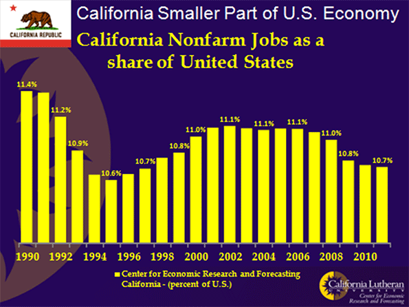
So many Midwest places flail around looking for a brand image or identity. Not Chicago. In fact, the identity and stories of Chicago overflow the page. They are too numerous to be written in a mere blog posting.

Yet Chicago has in effect decided to jettison that powerful, historic brand identity in favor of a type of global city genericism. This, I believe, is a mistake.

One trend you can’t help but notice if you travel is the increasing homogenization of the urban culture and standard of urban development. Global markets demand standardized commodities that can be graded and traded. This includes cities. This forces cities increasingly into a standard model of what one expects.

I’ve written in the past about the example of the Wallpaper guides to world cities. These travel guides, ostensibly a guide for the modern, sophisticated urban traveler to the best of each globally elite locale, often seem identical except for the name on the spine. One modern boutique hotel, one swank restaurant or bar, one fashion outlet, one bike share program, one piece of starchitecture is much the same as another in any city you visit around the world. The frosting might be different, but the cake is the same. And once you’re commoditized, you’re done.

So it is too with Chicago. I noted in my review of the city’s street lighting what appears to be a deliberate downplaying of the city’s rough-edged, masculine past in favor of a feminized, generic, even suburban motif. You see this repeated throughout.

It’s truly incredible. Travel anywhere in the world in mention that you’re from Chicago, and immediately the other person will mime a couple of pistols with their fingers and say, “Bang! Bang!” This is a sore spot with many local leaders, who hate the notion that it is still known more for gangsters than glitter. The city over the years has so tried to suppress its Al Capone heritage that it has obliterated many historic sites related to the mob. It’s like the city that wants to pretend it doesn’t exist.

This sadly makes Chicago like all too many smaller cities that suppress their strongest brand assets out of embarrassment and a desire to be taken seriously by members of the cool kids club. Go talk to urban boosters in Indianapolis, and you probably won’t hear much about the Indy 500, for example. So too it is with Chicago. It’s as if to prove it’s a member of the club – i.e., is exactly like every other cool city – Chicago has to ignore its gritty past and essential culture.

A friend of mine likes to say that “Chicago is a city that runs on testosterone.” It’s a rugged, manly city, a place where it was said high culture was just the ransom rich men paid to their waves. A place where people wore their shoe leather out trying to make a buck. The land of the hustler. A place of bellowing blast furnaces and brawny immigrants. A place where pedigree didn’t matter and crazy newcomers, dreamers, schemers, and gamblers could win or lose big. A place with audacious ambition and a relentless determination to demolish rivals, whether that be Cincinnati, St. Louis, or Milwaukee. A place that once dreamed to dethroning New York. A place of limitless imagination and inventiveness that brought us everything from the skyscraper to the futures market. A place with music like the blues made for and by the hard luck working man. And yes, a place of gangsters and crooked politicians.

None of that is part of new Chicago, at least not the image the city wants to portray. The iconic architecture remains, but it has been drained of its cultural content. Listen to what the city tries to project of itself and see what it says. It says that Chicago has become just another way-station along the global city parade. Starchitecture (no longer architecture made in Chicago for the most part), microbrews and microroasts, culinary delights, high culture, boutique hotels, great shopping, bike infrastructure, digital startups (the exact same type every other “hub” is bragging about), music festivals by and for the high end educated hipster, global conferences, etc. Almost every box is checked, with a few exceptions like fashion and media as I highlighted earlier.

All of this is good in a way and proof of a transformation in Chicago that is in many ways for the better. But something has been lost along the way. These items are all disconnected from the city in which they happen to reside. It’s as if they descended on the place out of the heavens like that flying saucer on top of Soldier Field. Drawing Room mixologist Charles Joly may have a Chicago flag tattooed on his arm, but his bar could be located anywhere.

Saskia Sassen has written that the economies of global cities are not generic but are inherently linked to their histories. Chicago in the past was a great center of manufacturing, for example, and today is expert at providing global services to manufacturers. But where in underlying economic reality there may be distinctiveness, on the surface there is more homogenization. This may explain why people tend to assume all global cities are alike. To a visitor staying in the central core, the experience may well be quite similar in many ways.

What’s more, the aspiration seems to be generic. The idea, again, is to demonstrate that you are part of the club by focusing on replicating all the same stuff everybody else is already doing and talking about yourself in much the same way. I’ve seen little in Chicago’s branding or global city rhetoric that is much different from anywhere else.

Yet the differences remain, especially outside the rarefied precincts of the global elite. And much of that continues to inspire embarrassment to this day. Corruption and cronyism seem to continue unabated, for example.

Yet there is good as well. Ask yourself what more than anything epitomizes Chicago. To me, it is none other than former Mayor Richard M. Daley. Listen to him speak. Barack Obama he is not. But character he had, lots of it, and what’s more, a fanatical dedication to making Chicago the best city it could possibly be. Was there a lot of corruption in Daley’s Chicago? No doubt. Did he desire to have maximum power over politics in his city? Of course. But nevertheless I get the impression of, as I said in my last piece, a guy who every morning wakes up and asked himself, “What can we do today to make Chicago a greater city?” This is a quality of leadership all too lacking in most Midwestern cities. The character of Chicago and the character of Mayor Daley himself seem to me to have so much in common.

Ironically, under Mayor Daley, the city pursued that policy I mentioned of abandoning its past, of abandoning the image of the city as evidenced by the mayor himself. You walk down Michigan Ave., through Millennium Park, around the newly thriving neighborhoods, and you expect that city to be led by a Dr. Smooth type character, not a blunt, plainspoken man like the Mayor. But if only he had seen the value in a city that presented a face like his own. A city not ashamed but proud of its rough and tumble edge, of the fact that it was where generations of ne’er-do-wells and hustlers came to wear out their shoe leather trying to make it big, a city that both Al Capone and Paddy Bauler thought not ready for reform, a city that drew generations of farm boys off to its earthly delights, a city from Bridgeport not the Gold Coast. That’s Chicago. Not a genteel, refined metropolis, not a swank, sophisticated type of town, not a city on a hill. No, but a city of dreams nevertheless, where people came to get rich, to reinvent themselves, to change the course of world history. That’s Chicago.

No, Chicago will never be the Chicago of Cyrus McCormick and Philip Amour and Aaron Montgomery Ward and all the rest. You can’t live off the past. That’s nostalgia and there’s no more corrosive force known to mankind. But you can know who you are, what you stand for, what your heritage is, and how it fits into the future. Not a clinging to the past, but letting your essential character be a guidepost to the future.

The fifth Frank Gehry titanium Bilbao clone, the n-th swank restaurant or shop, the latest in Italian furniture – ultimately none of them will make Chicago Chicago. It’s going to take the real city, an expression of its own terroir and primal identity to do that.

I happen to think Chicago can do it. If it changes course and gets way from following the trends to creating its own future. If it steps up and makes sure the world knows that Chicago, and not just yet another generic world city, is here, and determined to claim its rightful place.

Chicago will only realize its potential for greatness if it is willing to let go of its insecurity and desire to be a member of the club, and dares once again to think of itself as it did back in the days of the Burnham Plan as a city destined to be the greatest in the world, a city proud of itself and not afraid to boldly chart its own course into the great unknown of the future.

Is Rahm Emanuel is the person who can pull this off? He’s from the North Shore. He was a ballet dancer. He’s a man clearly most comfortable dealing with the elite. Yet he’s also got a rougher side. He’s supposedly Captain F-Bomb. He hates to lose. He mailed some dead fish to a someone once to show his displeasure with some polling. I’d say there’s more than a streak of authentic Chicago in there.

Maybe the bigger question is whether he wants any change of course. The NATO Summit play suggests not. But it’s still early.

I would strongly urge the city to rethink its brand and what it wants to be in the marketplace. Bottle up some that classic Chicago heritage and apply it liberally. This is a huge opportunity in the marketplace. With the vast bulk of cities trying to convince you they are all the same, this is in opportunity for Chicago to seize the advantage and stride forth with classic boldness and braggadocio, making other cities take real notice for a change. Want to actually put Chicago on the brand consciousness map? That’s the way to do it.

In short, it’s time to stop aspiring to global city goo and instead give the world a punch in the face with a little old school Chicago.

This is the fourth installment in my “State of Chicago” series. Read part one here, part two here, and part three here.

Aaron M. Renn is an independent writer on urban affairs and the founder of Telestrian, a data analysis and mapping tool. He writes at The Urbanophile, where this piece originally appeared.


What to Look For in the Nordic Model

$
0
0

The Nordic nations, and Sweden in particular, are seen by many as the proof that it is possible to combine innovative and entrepreneurial economies with high tax rates. It is often argued that nations such as the US can gain the attractive social features of Denmark, Sweden, Norway and Finland — such as low crime rates, high life expectancy, and a high degree of social cohesion — simply by expanding the welfare state. An in depth analysis, however, shows that this line of reasoning is flawed.

To begin with, one should remember that free-markets have been at the core of the Nordic success stories. Sweden, for example, was an impoverished nation before the 1870s; one indication of that was massive emigration to the United States. As a capitalist system evolved out of the agrarian society, the country grew richer. Property rights, free markets, and the rule of law, in combination with large numbers of well-educated engineers and entrepreneurs, created an environment in which Sweden enjoyed an unprecedented period of sustained and rapid economic development. Globally famous companies such as IKEA, Volvo and Tetra Pak were founded during a period when Sweden was characterized by business-friendly economic reforms and relatively low taxes.

However, during the late 1960s, policies steered sharply to the left and the overall tax burden rose significantly. The Swedish economist Magnus Henrekson has shown that the effective marginal tax rate (marginal tax plus the effect of inflation) that was levied on Swedish businesses could be more than 100 percent of the profits. The sharp left turn in Swedish economic policy did indeed affect entrepreneurship. Sten Axelsson, another Swedish economist, has shown that the period between the end of the 19th century and the beginning of the First World War was a golden age for the founding of successful entrepreneurial firms in Sweden. After 1970, the establishment of new successful firms almost stopped. The experiment of following a middle way between socialism and capitalism was not only unsuccessful, but also short-lived. In the 1990s and onward, a range of market reforms were implemented, paving the way for new entrepreneurial firms.

Taxes still remain high in the Nordic nations, particularly in Denmark and Sweden. The high tax pressures create high costs for the societies. A report recently published by the European Central Bank finds that both Denmark and Sweden are on the tip of the Laffer curve when it comes to both taxes on income and on capital. This means that capital taxes are so damaging that reducing them by one Kronor would stimulate the economy to grow, so that more than one Kronor in additional taxation could be levied (at the lower tax level). Many entrepreneurs relocate their businesses to other countries in order to avoid Sweden's high taxes. Skype, for example, was founded by a Dane and a Swede, but they chose to startup in free-market oriented Estonia, and later move the ownership to another free-market oriented nation, Luxembourg.

So how come the Nordic nations are so prosperous? A key reason is that they, particularly since the 1980s, have compensated for high tax regimes by implementing a range of market reforms. These reforms range from Flexicurity — a combination of strategies to provide flexibility for employers and security for workers — in the Danish labor market, to partial abolition of rent-control in Finland, to school vouchers and partial privatization of the pension system in Sweden. Indeed, the Nordic nations have risen sharply in both the Heritage/WSJ and the Frasier Institute indexes of economic freedom over the years.

It is also important to realize exactly why the Nordic nations have been able to implement large welfare states, and what the benefits have been. The cultural and economic systems in the Protestant Nordic nations have historically given rise to very strong norms related to work and responsibility. Coupled with uniquely homogeneous societies, these norms made it possible to implement larger welfare states in the Nordic nations than those in other industrialized countries. Since the norms relating to work and responsibility were so firmly rooted, Nordic citizens were not as likely as other Europeans or Americans to try to avoid taxes or misuse generous public support systems. Also, the "one-solution-fits-all" systems of the welfare state are typically less disruptive in a strongly homogeneous social environment, since most of the population has similar norms, preferences, and income levels.

However, with time the norms have evolved. In the World Value Survey of 1981-84, almost 82 percent of Swedes responded that "claiming government benefits to which you are not entitled is never justifiable", but in the survey of 1999-2004, only 55 percent held the same belief. It is no coincidence that much of the public policy debate in Norway, Sweden, Denmark and Finland has focused on curbing overutilization of welfare systems.

Many of the favorable social outcomes in the Nordic nations relate to our unique culture, and the policies cannot simply be copied. In1950, long before the high-tax welfare state, Swedes lived 2.6 years longer than Americans. Today the difference is 2.7 years. The two researchers Jesper Roine and Daniel Waldenström have similarly shown in a new study that "most of the decrease [in economic inequality in Sweden] takes place before the expansion of the welfare state", occurring during the period when the nation was characterized by low taxes, a small state and a flexible labor market.

Clearly, the social success in the Nordic countries is not simply a result of welfare policies, but related to cultural and demographic factors. Therefore it would be difficult, if even possible, to achieve these results in nations such as the US simply by introducing a high tax regime. Why not instead be inspired by the fiscal conservatism and the free-market reforms that make the Nordic nations prosper today?

Flickr Photo by 'creating in the dark' (Helen Harrop): Gate to the Mazetti Chocolate Factory, Malmö, Sweden

Nima Sanandaji has published several books in Sweden relating to subjects such as entrepreneurship, integration and women's career opportunities. He is the author of the study, "The surprising ingredients of Swedish success – free markets and social cohesion", which has recently been published by the Institute of Economic Affairs.

America’s Last Politically Contested Territory: The Suburbs

$
0
0

Within the handful of swing states, the presidential election will come down to a handful of swing counties: namely the suburban voters who reside in about the last contested places in American politics.

Even in solid-red states, big cities tilt overwhelmingly toward President Obama and the Democrats, and even in solid-blue ones, the countryside tends to be solidly Republican.

What remains contested are the suburbs, which—despite the breathless talk in recent years of an urban revival—have accounted for 90 percent of metropolitan growth over the past decade.

But as the suburbs have grown—in large part by collecting families priced out of cities or seeking more space or better schools—they’ve shifted from reliably Republican territory to contested turf. Barack Obama won 50 percent of the suburban vote in 2008, a better performance than either Bill Clinton or John Kerry.

Obama’s success resulted from demographic changes sweeping the periphery of most major cities. Long derided by blue-state intellectuals as stultifying breeders of homogeneous white bread, the suburbs increasingly reflect and shape the country’s ethnic diversification. The majority of foreign-born Americans now live in suburbs, and many suburban towns—like Plano, Texas, outside Dallas; Cerritos, south of Los Angeles; and Bellevue, near Seattle—have become more ethnically diverse than their corresponding core cities. Among the metropolitan areas with the highest percentage of suburban minority growth are swing state regions Des Moines, Iowa; Milwaukee; and Allentown and Scranton, Pa.

Minorities, according to a recent Brookings study now represent 35 percent of suburban residents, similar to their share of overall U.S. population.

The suburbs of Las Vegas in hotly contested Nevada are now minority-majority, as the number of Latinos living there has shot up. Nationwide, well over 5 million Latinos moved to the suburbs during the past decade—and many more Latinos now live in suburbs than core cities. In the past, Hispanic suburbanites tended to vote somewhat more Republican than their urban counterparts. But this year, they appear to be solidly Democratic—as Latinos have been repelled by the GOP’s ugly embrace of nativism ,and drawn to Obama’s clever election-year move to offer effective amnesty to young illegal immigrants.

Asians—another group that’s strongly favored Obama—have moved even more quickly into the suburbs. While many immigrants hail from some of the world’s densest cities, few immigrants come to America dreaming of a small apartment near a transit stop.

“Many Asian immigrants today are bypassing the city entirely and going straight to suburban neighborhoods first to fulfill their version of the American dream,” says Thomas Tseng, a founding principal at New American Dimensions, a Los Angeles–based ethnic marketing and research firm.

Over the past decade the Asian population in suburbs has grown at nearly four times the rate of that in cities, with 2.7 million more Asians in suburbia compared to 770,000 in the core cities. In the northern Virginia suburbs around Richmond, the number of Asian suburbanites has doubled, as it has in the suburbs around Columbus and Cincinnati. The Asian suburban population nearly tripled in the Raleigh area and doubled around Charlotte. Even in Florida, there are now well more than 100,000 more Asians in the suburbs of the Sunshine State’s four major cities—Miami, Jacksonville, Orlando, and Tampa—than there were a decade ago.

Obama also will likely receive significant backing from white professionals, who tend to cluster in the suburbs of cities such as Columbus or around Washington, D.C. Virtually all the 10-best educated counties in America are suburban; seven are in the greater Washington area. The fact that many of these professionals work directly or indirectly for the federal government that Obama has expanded dramatically will only help him in his bid to remain in the White House.

So what about Romney? He’s clearly a product of the suburbs, growing up in the tony periphery of Detroit and now living in leafy Belmont, Mass., a comfy close-in commuter suburb that has seen little population growth since 1950.

In the primaries, Romney did well in suburbs, particularly upper-class ones, and those voters played a critical role in putting him over the top against Rick Santorum.

Romney continues to score roughly 50 percent support in polls with voters making at least $100,000, a group that tends to live in affluent commuter towns ringing cities. But to win, the Republican needs to reproduce his party’s wave of 2010, when they captured roughly 55 percent of the suburban vote on their way to retaking the House. But can Romney reach beyond his classic country-club GOP base to the middle- and working-class swing state suburban voters?

On paper, he should do well in lower density suburban areas, in large part because they tend to have far larger concentrations of married families with children, a group that tilts Republican. But despite his own family, he’s been overshadowed by Obama’s better-marketed, albeit far smaller, domestic unit.

Romney also may be missing a chance to appeal to suburbanites on the contentious issue of “smart growth.” Opposition to suburban housing has become a favorite cause among Democratic politicians, and widely praised by the Manhattan-centric national media.

But Romney, in his term as governor of Massachusetts, was a classic patrician corporate modernizer, showing a penchant for the kind of planning that uses strict growth controls to constrain suburban expansion.

In this sense Romney resembles other politicians from the gentry class—such as Al Gore, Arnold Schwarzenegger, and John Kerry—who, in the name of “rational” societal objectives, make it harder for middling-class people to achieve the suburban dream they’ve taken for themselves.

So while they represent the majority of the nation, suburban voters have no real champion in this election. Taken for granted by conservatives and betrayed by Wall Street, they have few friends in high places—except at election time. They are also increasingly detested by progressives, a long way from the days when Bill Clinton keyed in on “soccer moms.” Instead the suburbs have evolved into a shapeless political lump, divided by income and race, cultural conflict, and regional rivalries.

On balance, this all works to the president’s favor. If Obama can manage anything close to a split in suburbia, as he did in 2008, he will surely win a second term. Such a loss, at a time of economic hardship, may be enough to force even the dullards of the GOP back to the drawing board to confront their inability to win over enough of the suburban voters (homeowners, small businesspeople, parents of any races)—who should provide the GOP an electoral majority, but so far are not.

Joel Kotkin is executive editor of NewGeography.com and is a distinguished presidential fellow in urban futures at Chapman University, and contributing editor to the City Journal in New York. He is author of The City: A Global History. His newest book is The Next Hundred Million: America in 2050, released in February, 2010.

This piece originally appeared in The Daily Beast.

Suburbs photo by Bigstock.

The Road Less Understood

$
0
0

The Economist confuses ends (objectives) and means in its current number examining the peaking of per capita automobile use in the West in two articles ("The http://www.economist.com/node/21563327" and "Seeing the Back of the Car"). In congratulating metropolitan areas for trying "to change the way people move around," The Economist reminds that Portland (Oregon) has developed light rail and that policy supports transit in Los Angeles. So much for the means, but what about the ends?

In Portland: Transit Loses Ground and a Skeptical Public: Portland, for example, has had anything but stellar performance. Transit has not kept up with growth, having lost 25 percent of its commuting (work trip) share since before the first light rail line was opened in 1986 (Note 1). With five new light rail lines, transit in Portland not only fell short of attracting its previous bus only share of commutes, but also sustained losses greater than the national rate (Figure 1).

The people of the Portland area may not share The Economist's ardor. Just last week, The Oregonian headlined "Clackamas County anti-rail measure passes comfortably; effect could resonate for decades," reporting on a 60-40 vote to require referenda for future rail expenditures. As if that were not enough, a similar measure passed by a similar margin in King City, a municipality in Washington County and Tigard, one of the area's largest municipalities, has placed the matter on the November ballot.

But Portland does have a substantial success missed by The Economist. Working at home is growing rapidly. From 1980 to 2011, working at home (mostly telecommuting) increased by 55,000. This is more than three times the growth in rail transit commuting (17,500). During the last decade, working at home passed transit as a work access mode in Portland, and with virtually no public expenditures (as opposed to the billions for new rail lines). There has been a 375,000 increase in car use by one-way commuters since 1980, and, not surprisingly, a quadrupling of excess travel time in peak period traffic (based upon Texas Transportation Institute data). In the end, Portland built an extensive rail system and the riders have not come. Portland didn't expand its highway system, and they came anyway (National 2010-2011 journey to work data is summarized here.).

In Los Angeles: Long on Rail Lines, Short on Passengers: The Economist rightly points out that Los Angeles has implemented policies to get people out of cars. Indeed, Los Angeles has been the poster child for transit development. In little more than two decades, 11 metro, light rail, and suburban rail lines have been opened. Probably no metropolitan area in the world has opened more miles of new rail service in that period. Matthew Yglesias, writing in Slate was so impressed that he called Los Angeles "America's next great mass transit city."

The results are less convincing. The total daily one-way commutes on the 11 rail lines is only 32,000, smaller than the number of people carried daily on a single lane of the San Diego Freeway (I-405) where it crosses over Wilshire Boulevard. Meanwhile, working at home has risen more than four times that of rail commuting since 1990 (Figure 2). Los Angeles may be better described as “America's next great telecommuting city." However, the auto is still king. From 1990 to 2011, solo automobile commuting increased 340,000, two percentage point gain, three times that of transit.

Younger People: Driving More to Work and Telecommuting More

The Economist also jumps on the "young people forsaking driving" bandwagon, a subject that has attracted the attention of others. But, young people are driving more, at least to work. Since 2000, the increase in driving alone to work by people aged 15 to 24 was nearly 260,000, compared to a 4,000 loss in transit commuting. Working at home was up almost as much as driving, at 200,000. Even so, with the declining size of the younger work force, transit's share was up. From 2000 to 2011, the share of 15-24 year old workers rose from 5.4 percent to 5.8 percent (Figure 3), virtually the same as the overall increase in transit market share of from 4.6 percent to 5.0 percent (Note 2). As with Portland and Los Angeles, the last 11 years saw a much larger increase in working at home, from 3.3 percent to 4.3 percent.

Further, to the extent working at home, social media and online shopping replace the need for driving among younger adults (and everyone), all the better.

The Fantastical Claim: 50,000 Passengers Per Hour

The Economist repeats the specious claim that rail lines can carry 50,000 passengers per hour in each direction. If your world is limited to Paris between Chatelet and Gare de Lyon and the handful of similar places, maybe so. But in most of the rest of the world, it is the stuff of fairy tales.

The 2011 data shows the extent of the illusion.  The fantastical rail line carrying 50,000 per hour would carry the equal of all the daily rail commuters in Dallas or Miami in less than 20 minutes. It would take only about five minutes to handle the daily rail transit commuting volume in Minneapolis or Salt Lake City.

Further, some of the new systems have been manifestly unsuccessful in attracting commuters. For example, in Charlotte, there was a strong increase in transit commuting between 2000 and 2011, with transit's market share rising 64 percent. Yet, more than 60 percent of the new commuters were on buses, rather than on light rail, reflecting a long overdue increase in artificially low service levels. In Phoenix, 85 percent of the transit commuting increase was on buses, rather than the light rail line. The fantastical 50,000 per hour line would take only handle this load in about two minutes.

Where Rail Works and Why

None of this is to suggest that rail transit does not have its place. As I pointed out in a Hong Kong Apple Daily commentary, rail transit makes all the sense in the world where appropriate (see: "Hong Kong's Rail Expansion: Avoiding Western Pitfalls"). Appropriate circumstances include huge central business districts with high employment density and radial rail transit service from throughout the metropolitan area. American Community Survey data indicates that just six municipalities (not metropolitan areas) account for 93 percent of the nation's rail commuting destinations. The city of New York, alone is the destination of 65 percent of national rail commuters. Another 28 percent commute to the cities of Chicago, Philadelphia, Washington, Boston and San Francisco. Within these six cities, the overwhelming share of transit commuting is to the downtowns (central business districts), which, combined, cover a land area less than half the size of Orlando's Disney World.

Why Driving Has Peaked

Alan Pisarski told us in 1999 "(Cars, Women and Minorities: The Democratization of Mobility in America") that the demand for driving would soon peak. Women were driving nearly as much as men and cars were becoming the dominant mode of transport for low income people. Cars already carry the overwhelming majority of low-income commuters. A "love affair with the automobile" mentality misled many who should have known better into believing that people would eventually drive 24 hours per day. In fact, the huge increase in driving to the 2000s was more about democratizing mobility and access, and as the Washington Times recently put it, prosperity (see "A world without cars:
The internal-combustion engine has freed mankind"). If home-based access can take up the slack, it would do more for the environment and people’s lives than all the expensive, largely ineffective rail system imagined by the media and the well-financed rail lobby.

------

Note 1: The data in this article is largely taken from the journey to work reports of the US Census (1980, 1990 and 2000) and the American Community Survey (one year data 2011).

Note 2: The overall 5.0 percent transit market share figure may be high. The USDOT National Household Travel  Survey (NHTS) indicates that people who commute by transit tend to use other modes (such as automobiles) often. NHTS data indicates that, overall transit accounted for 3.7 percent of commuters and an even lower 2.7% of commuting miles in 2009.

Photo: Harbor Freeway (I-110), Los Angeles (by author)

A Look at Commuting Using the Latest Census Data

$
0
0

Continuing my exploration of the 2011 data from the American Community Survey, I want to look now at some aspects of commuting.

Public Transit

Public transit commuting remains overwhelmingly dominated by New York City, with a metro commute mode share for transit of 31.1%. There are an estimated 2,686,406 transit commuters in New York City. All other large metro areas (1M+ population) put together add up to 3,530,932 transit commuters. New York City metro accounts for 39% of all transit commuters in the United States.

If one were to guess the #2 city for transit commuting, another older, pre-auto, centralized city on the lines of New York (say Chicago) might be the obvious guess. It would also be wrong. It’s actually Washington, DC that has the second highest transit commute share among large metros at 14.8%. Here’s the complete top ten:

Rank

Metro Area

2011

1

New York-Northern New Jersey-Long Island, NY-NJ-PA

2,686,406 (31.1%)

2

Washington-Arlington-Alexandria, DC-VA-MD-WV

439,194 (14.8%)

3

San Francisco-Oakland-Fremont, CA

299,204 (14.6%)

4

Chicago-Joliet-Naperville, IL-IN-WI

503,535 (11.6%)

5

Boston-Cambridge-Quincy, MA-NH

267,568 (11.6%)

6

Philadelphia-Camden-Wilmington, PA-NJ-DE-MD

251,285 (9.3%)

7

Seattle-Tacoma-Bellevue, WA

137,858 (8.1%)

8

Portland-Vancouver-Hillsboro, OR-WA

66,619 (6.3%)

9

Los Angeles-Long Beach-Santa Ana, CA

355,811 (6.2%)

10

Baltimore-Towson, MD

80,472 (6.1%)


Not only are New York and Washington top two cities for public transit commuting, they are also the two cities that have been dominant in increasing transit’s market share. Both cities showed material share gains since 2000, over three and a half percentage points each, for transit. Among large cities, Seattle was the only one that managed to post a share gain of even one percent.

Rank

Metro Area

2000

2011

Change in % of Workers Age 16 and Over

1

New York-Northern New Jersey-Long Island, NY-NJ-PA

2,181,093 (27.4%)

2,686,406 (31.1%)

3.74%

2

Washington-Arlington-Alexandria, DC-VA-MD-WV

278,842 (11.2%)

439,194 (14.8%)

3.61%

3

Seattle-Tacoma-Bellevue, WA

106,784 (7.0%)

137,858 (8.1%)

1.17%

4

Orlando-Kissimmee-Sanford, FL

12,601 (1.6%)

24,901 (2.5%)

0.91%

5

Hartford-West Hartford-East Hartford, CT

15,755 (2.8%)

21,794 (3.7%)

0.91%

6

Charlotte-Gastonia-Rock Hill, NC-SC

9,532 (1.4%)

19,227 (2.3%)

0.91%

7

San Francisco-Oakland-Fremont, CA

278,207 (13.8%)

299,204 (14.6%)

0.81%

8

Los Angeles-Long Beach-Santa Ana, CA

287,392 (5.6%)

355,811 (6.2%)

0.67%

9

Miami-Fort Lauderdale-Pompano Beach, FL

67,685 (3.2%)

95,536 (3.8%)

0.61%

10

Nashville-Davidson–Murfreesboro–Franklin, TN

5,574 (0.8%)

10,705 (1.4%)

0.55%


Vaunted Portland only managed to eke out a share gain of 0.07%, which could be entirely statistical noise. Its performance lagged even auto-centric cities like Charlotte and Nashville.

Bicycling

Every city out there seems to be vying to be the bike friendliest city in the world. Yet bicycling has yet to make much of an impact on commuting. Only 7 out of 51 large metros even post 1% mode share for cycling:

Row

Geography

2011

1

Portland-Vancouver-Hillsboro, OR-WA

23,941 (2.3%)

2

San Francisco-Oakland-Fremont, CA

38,419 (1.9%)

3

San Jose-Sunnyvale-Santa Clara, CA

16,013 (1.9%)

4

Sacramento–Arden-Arcade–Roseville, CA

15,804 (1.8%)

5

Austin-Round Rock-San Marcos, TX

8,847 (1.0%)

6

New Orleans-Metairie-Kenner, LA

5,307 (1.0%)

7

Phoenix-Mesa-Glendale, AZ

18,007 (1.0%)

8

Seattle-Tacoma-Bellevue, WA

15,949 (0.9%)

9

Denver-Aurora-Broomfield, CO

12,052 (0.9%)

10

Los Angeles-Long Beach-Santa Ana, CA

50,080 (0.9%)


Portland grew bicycle mode share by 1.51% Perhaps this explains its poor transit performance. Cycling is canabalizing transit growth.

Walking

The low level of bicycling can perhaps best be illustrated by comparing it to walking. Even in Portland more people walk to work than ride bikes.


Rank

Metro Area

2011

1

New York-Northern New Jersey-Long Island, NY-NJ-PA

540,733 (6.3%)

2

Boston-Cambridge-Quincy, MA-NH

121,537 (5.3%)

3

San Francisco-Oakland-Fremont, CA

87,409 (4.3%)

4

Philadelphia-Camden-Wilmington, PA-NJ-DE-MD

101,107 (3.7%)

5

Seattle-Tacoma-Bellevue, WA

62,238 (3.7%)

6

Pittsburgh, PA

36,857 (3.4%)

7

Portland-Vancouver-Hillsboro, OR-WA

35,242 (3.4%)

8

Rochester, NY

15,573 (3.2%)

9

Washington-Arlington-Alexandria, DC-VA-MD-WV

94,698 (3.2%)

10

Chicago-Joliet-Naperville, IL-IN-WI

134,399 (3.1%)


Working from Home

Looking at telecommuting gives a much different list of top cities, this one dominated by “wired” metros like Austin and Raleigh. The share of telecommuters in these cities is bigger than walking or biking, or even transit in many cities. This is an oft-overlooked part of the green transport agenda. The most green commute possible is the one you never have to make.

Rank

Metro Area

2011

1

Austin-Round Rock-San Marcos, TX

62,593 (7.1%)

2

Raleigh-Cary, NC

37,030 (6.6%)

3

Portland-Vancouver-Hillsboro, OR-WA

67,223 (6.4%)

4

San Francisco-Oakland-Fremont, CA

131,029 (6.4%)

5

San Diego-Carlsbad-San Marcos, CA

89,547 (6.3%)

6

Denver-Aurora-Broomfield, CO

76,025 (5.9%)

7

Phoenix-Mesa-Glendale, AZ

105,570 (5.8%)

8

Sacramento–Arden-Arcade–Roseville, CA

52,143 (5.8%)

9

Atlanta-Sandy Springs-Marietta, GA

132,979 (5.5%)

10

Seattle-Tacoma-Bellevue, WA

87,839 (5.2%)


Commute Times

Unsurprisingly, large cities – including New York and Washington again at the top – feature the longest average commute times. Larger cities tend to have worse congestion and feature longer commutes. As transit commutes are generally longer than driving, the high transit mode share helps to drive up commute times in those cities.

Rank

Metro Area

2011

1

New York-Northern New Jersey-Long Island, NY-NJ-PA

34.9

2

Washington-Arlington-Alexandria, DC-VA-MD-WV

34.5

3

Riverside-San Bernardino-Ontario, CA

31.0

4

Chicago-Joliet-Naperville, IL-IN-WI

30.9

5

Atlanta-Sandy Springs-Marietta, GA

30.6

6

Baltimore-Towson, MD

30.3

7

Boston-Cambridge-Quincy, MA-NH

29.2

8

San Francisco-Oakland-Fremont, CA

29.2

9

Los Angeles-Long Beach-Santa Ana, CA

28.6

10

Philadelphia-Camden-Wilmington, PA-NJ-DE-MD

28.5


Whether New York might prefer a more auto-oriented layout in order to reduce commute times is a different matter. There’s no precedent for such a huge region having anything less than terrible congestion and commute times. And clearly New York would not be New York with such a radical change. The same forces that drive up commute times in places like New York and Washington are some of the same forces that sustain them as centers of elite economic production.

Note: An early version of this piece contained an incorrect version of "Working from Home" table.

Aaron M. Renn is an independent writer on urban affairs and the creator of Telestrian, a data analysis and mapping tool. He writes at The Urbanophile.

Light trails photo by Bigstock.

The Hollow Boom Of Brooklyn: Behind Veneer Of Gentrification, Life Gets Worse For Many

$
0
0

After a decade of increasingly celebrated gentrification, many believe Brooklyn — the native borough of both my parents — finally has risen from the shadows that were cast when it became part of New York City over a century ago.  Brooklyn has gotten “its groove back” as a “post-industrial hotspot,” the well-informed conservative writer Kay Hymowitz writes, a perception that is echoed regularly by elements of a Manhattan media that for decades would not have sullied their fingers writing about the place.

And to be sure, few parts of urban America have enjoyed a greater public facelift — at least in prominent places — than New York’s County of Kings, home to some 2.5 million people. The borough is home to four of the nation’s 25 most rapidly gentrifying ZIP codes, notes a recent Fordham study. When you get a call from the 718 area code these days, it’s as likely to be from your editor’s or investment bankers’ cell as from your grandmother.

Yet there’s a darker side to the story. This became clear to me not long ago when driving with my wife and youngest daughter to a friend’s house in the Ditmas Park section of Flatbush, one of the finest exemplars of urban renaissance in the country. We encountered a huge traffic jam on the Belt Parkway, so we exited on Linden Boulevard. For the next half hour we drove through an expanse of poverty, public housing and general destitution that hardly jibes with the “hip, cool” image Brooklyn now projects around the world.

A look at the numbers shows this was not an isolated experience. Despite the influx of hipsters and high-income sophisto professionals, Brooklyn is home to one of New York State’s poorest populations, with over one in five residents under the official poverty line, roughly 50 percent above the state average. This likely understates the problem since the cost of living in the borough is now the second-highest in the nation to Manhattan, surpassing even high-tone San Francisco.

Overall, despite some job gains, the borough’s unemployment rate stood at 11 percent this summer, up from 9.7 percent a year ago and well above the national average. Much of recent job growth has been in lower-wage industries, notes Martin Kohli, chief regional economist with the Bureau of Labor Statistics in New York City. Despite a much celebrated start-up scene, some 30,000 of the 50,000 jobs created since the recession have been in the generally low-wage health care and social assistance sector, with another 9,000 in the hospitality industry.

Poverty citywide, meanwhile, has been rising for three years running and the real Brooklyn, roughly half non-white, remains surprisingly poor. Brooklyn’s median per capita income in 2009 was just under $23,000, almost $10,000 below the national average.

So what’s going on here? Urban historian Fred Siegel, a longtime Brooklyn resident, sees a classic tale of two cities. “Brownstone and Victorian Brooklyn is booming,” he says, due in part to uncle Ben Bernanke‘s inflationary policies, which have bailed out the Wall Street banks whose profits are the bedrock of New York City’s prosperity. This money has now spread to those parts of “Manhattanized” Brooklyn closest to the core of the Big Apple, with bankers, lawyers and the like opting to settle in more human-scale neighborhoods.

But lower middle-class Brooklyn “is pockmarked with empty stores,” Siegel notes. With its once robust industrial- and port-based economy shrunken to vestigial levels, opportunities for Brooklynites who lack high-end skills or nice inheritances are shrinking. Some other areas, like Bensonhurst and Sheepshead Bay, have been revived through immigration.

Jonathan Bowles, president of the New York-based Center for an Urban Future, sees a divide between, on the one hand, “the creative class” and some immigrant neighborhoods, and on the other, “the concentrated poverty” in many other struggling areas like Brownsville (where my mother grew up) and East New York. “There are clearly huge swaths of Brooklyn where you don’t see gentrification and there won’t be anytime soon,” Bowles observes.

Part of the problem is structural. Many of Brooklyn’s working-class commuters — particularly in the eastern end of the borough — depend on a transit system designed to funnel people into the giant office clusters of Manhattan. Those left looking for work in the borough, often in low-paid service jobs, face long commutes or have to get a car, a big expense in a city with ultra-high rents, taxes and insurance costs.

Mayor Michael Bloomberg’s administration identifies itself closely with Manhattan’s “luxury city” economy. Focused on finance, media and high-end business services, this approach does not offer much to blue-collar Brooklyn. New York over the past decade has suffered among the worst erosions of its industrial base of any major metropolitan area. Brooklyn alone has lost 23,000 manufacturing jobs during that time.

Inequality in the Bloombergian “luxury city” is growing even faster than in the nation as whole. In fact, the gap between rich and poor is now the worst in a decade. New York’s wealthiest one percent earn a third of the entire city’s personal income — almost twice the proportion for the rest of the country.

So while artisanal cheese shops serve the hipsters and high-end shops thrive, one in four Brooklynites receives food stamps.

We see similar patterns across even the most vibrant of the nation’s urban regions. San Francisco gets richer with trustifarians, hedge fund managers and, for now at least, social media firms. Yet Oakland, just across the bay, suffers severe unemployment, rising crime and high vacancies. The cool bars and restaurants frequented by the creatives get the media attention, but as demographer Wendell Cox notes, roughly 80 percent of the population growth in the nation’s largest cities over the past decade consisted of people living below the poverty line.

High costs and regulatory burdens make changing this reality ever more difficult; what can be borne by Manhattan or an upscale Brooklyn neighborhood like Park Slope can devastate a grittier locale like East New York. A well-heeled banker or trust-funder may find the costs of higher taxes and regulation burdensome but still relatively trivial; such factors more strongly impact a struggling immigrant entrepreneur, or a small manufacturer, construction firm or warehouse operation. Upzonings and subsidies for real estate developers — such as those around the new Nets arena — tend to work to the benefit of high-end chains, rather than smaller, often minority-owned businesses.

Finally for all the talk, in Brooklyn and elsewhere, of a “great inversion” sending the well-to-do to cities, and what my mother would call shleppers to the suburbs, this is not the reality. Immigration and new births have supported Brooklyn’s population numbers, up 40,000 over the past decade, but as rapid outflow of Brooklynites has continued: over 460,000 more residents left than other New Yorkers or Americans moved in between 2001 and 2009, the largest loss of any borough.

These phenomena can be seen in almost every American city; anyone traveling from west Los Angeles to the east side can see the divide between the posh shops and restaurants nearer the beach and greater commercial vacancies, abandoned factories and empty offices further inland. That this is happening as well in “booming” Brooklyn is rarely acknowledged, but worth confronting. We need to learn not only how to hype “hip” cities, but think about how to restore them as aspirational places for those who aren’t members of the privileged and cool set.

Joel Kotkin is executive editor of NewGeography.com and is a distinguished presidential fellow in urban futures at Chapman University, and contributing editor to the City Journal in New York. He is author of The City: A Global History. His newest book is The Next Hundred Million: America in 2050, released in February, 2010.

This piece originally appeared in Forbes.

Brooklyn row houses photo by Bigstock.

Here's Why People Don't Think We're in a Recovery

$
0
0

The most recent jobs report was again below consensus.  With fewer than 100,000 new jobs, unemployment fell only because people continue to leave the labor force in huge numbers.  People are discouraged, and many don't believe we are in a recovery.  Why would they think that we aren't in a recovery?  After all, GDP is above its pre-recession high, and we hear all the time about how many jobs have been created over the past couple of years.

People think we're still in a recession because fewer of them have jobs than prior to the recession.  Below is a chart showing total non-farm U.S. jobs since 2000.  Today, we have millions fewer working than we did in 2007:

People think that we are in a recession because they are poorer than they were prior to the recession.  As the following chart shows, Americans' wealth is down a lot.  The average American's wealth is down $39,000 or about 16 percent from its pre-recession high in 2005 dollars.  That is on average every man, woman, and child is $39,000 poorer than they were at the beginning of the recession.  An average family of four is $156,000 poorer than it was just a few years ago.

Not only are Americans poorer than they were at the beginning of the recession, their income is down too.  Real (inflation adjusted) GDP may be climbing, but all of those gains are a result of increased population.  Real-per-capita GDP (the source of income) is still down more than $1,000 in 2005 dollars.

Americans are poorer than they were, and their income is lower, and they are out of work or they know someone who is out of work.  Of course they don't believe we are in a recovery.  The real question is that why, when things are this bad, does the chattering class spend its time debating trivial topics, such as which of the presidential candidates mistreats dogs the most?

I think the answer is that the chattering class isn't out of work, and they don't know anyone who is out of work.  Maybe they know a banker who lost her job, but being a banker, she was probably evil.  So, no worries.

This recession has hit sectors like construction and manufacturing disproportionally hard, and people who work in these sectors are not well represented in the chattering class.  Small businesses have also been badly hurt, and they too are poorly represented in the chattering class. 

Other sectors have been hurt far less.  Education, healthcare, government, and professional services have each faced challenges, but these sectors' job losses have been small compared to the most hard-hit sectors.

One result of the different patterns of job losses across sectors is that we've seen an increase in income inequality.  Even worse, the increased inequality may be accompanied by declining upward mobility.  Income inequality without upward mobility is prescription for social trouble and slower economic growth.  Calls for income redistribution are only the beginning.

Huge numbers of young people have failed to find jobs.  Many are living with their parents at ages far beyond what was normal just a few years ago.  Unemployed and disillusioned young people are another prescription for social trouble.

What are our leaders doing?  Not much.  Congress is gridlocked and the President is campaigning.  The republicans call for tax cuts and spending cuts.  The democrats call for increased spending and tax increases.  Neither plan will work.

The FED is trying to help.  It has instituted QE3, promising to purchase $40 billion in mortgage backed securities every month until economic conditions improve, whatever that means.  This will not do anything.  The FED has run out of bullets.  Policy now is all about convincing themselves and everyone else that they are doing something.

Our deficit is huge.  It's so large that if we were to cut all defense spending and cut all social security spending, we would just about eliminate the deficit.  But at what a cost!  We'd get rid of every soldier, gun, ship, and airplane.  We'd cut Granny off from her monthly check.

We're not going to do that.  We're not going to cut the budget enough to get rid of the deficit.  So, give it up.  Budget battles on this scale are disastrous for democracies.  Best not to do it.

Government spending is a problem.  That's for sure, but you can't fix it by cutting the spending.  That sounds wrong, I know, but the dynamics of democracy won't let it work.

Tax policy won't do it either.  You can't tax yourself to prosperity, and cutting taxes won't help without a whole slew of complementary policies.  Increased spending won't help.  The problem is that government is already too big relative to the economy. 

Government at all levels is now about 37 percent of the economy.  This is higher than it was during World War Two.  It needs to become smaller as a percentage of the economy, but not by cutting.

What we have to do is cap government spending on a real-per-capita basis.  We just keep spending what we're spending per person, even after adjustment for inflation.  That way, there are no losers.  It should be relatively easy to gain support for a simple cap.

Then, you grow your economy.  How to do that is another big topic.  But, we know the outlines:  Increase immigration.  Evaluate regulations for efficiency and economic impact.  Restructure the tax code to maintain productive incentives.  Restructure the safety net to improve incentives.  Restore incentives to education.  Remove barriers to trade.

That is a big task, but it is a lot easier than cutting the budget as much as would be required.  It's also a lot easier than suffering through a decade of anemic growth.  The benefits would be big too.  We'd be setting the stage for persistent prosperity.

Bill Watkins is a professor at California Lutheran University and runs the Center for Economic Research and Forecasting, which can be found at clucerf.org.

Unemployment photo by BigStockPhoto.com.

Housing: How Capitalism and Planning Can Co-Habit

$
0
0

Did Britain’s New Labour party conspire against land development? Is it responsible for outdated, “socialist” land planning policies?

The British Conservative Party’s favourite think tank, Policy Exchange, would have us think so. Its latest report aims to demonstrate that the British planning system is socialist rather than capitalist. Why Aren’t We Building Enough Attractive Homes? - Myths, misunderstandings and solutions, by Alex Morton takes on the British planning system that dates from the 1947 Town and Country Planning Act.

That law was enacted in 1948, when farmers gave up their right to build on their own land in exchange for a continuation of guaranteed food prices. In a genuine legal innovation, government cancelled the right of landowners to build freely on their own property, without nationalising the property itself. By 1954, Prime Minister Winston Churchill had made sure that the owners of land given permission to build by the State, through the agency of a Local Planning Authority, would be able to profit from the “betterment” or planning gain in land value. While land limited to agricultural uses was of low value, the artificial scarcity of land that was granted permission for development was then worth many times that value. Local Planning Authorities negotiated a share of that gain.

It is significant that this post-war measure survives today. The negotiation over planning gain between landowner, developer, and Local Planning Authority is big business still. Farmland in proximity to urban areas can be turned from £4,047 an acre (£10,000 a hectare) to be worth 100 times that in a development deal. Much land within the planning-approved area of Britain is worth over 1000 times the value of land without any planning approval prospect.

Nevertheless, for Alex Morton, the Senior Research Fellow for Housing and Planning at Policy Exchange, '... the 1940s system is "socialist" as it requires councils create a "socially optimal" plan then impose it on everyone. But we know in reality such changes impose clear costs and benefits on specific individual existing residents.' Seeing this as a misunderstanding of Churchill’s creation of an artificial scarcity of land that could be selectively inflated in value for profitable development after a negiotiation over the share of the gain, I wrote to Morton and suggested the obvious: that the existing planning system was capitalist rather than socialist. He wrote back, a bit huffed:

‘The current system is nothing to do with capitalism. Possibly corporatism (the use of state power to enrich a small business elite through involuntary confiscation of property rights), definitely socialism (at least in original intent given how land uplift was originally to be taken by the state).'

“Nothing to do with capitalism” … This is a myth from the self-proclaimed "myth-buster" think-tank. The 1947 Act made an entirely new beginning for post-war capitalism by repealing all previous town planning legislation, re-enacting some important provisions salvaged from previous law, and innovating significant legal principles.

His is a propagandist's mistake, made before in his 2011 report, Cities for Growth - Solutions to our Planning Problems. At no point does Morton on behalf of Policy Exchange call for the repeal of the 1947 planning law. He knows that no British Planning Minister in any government will argue for repeal of the 1947 law. The Treasury could never allow it, and the members of the Council of Mortgage Lenders would probably have such a Minister hung over the Thames under Westminster Bridge for even thinking about it. To repeal the Churchillian planning law would mean financial disturbance on a scale far more disturbing than events in 2008.

Fresh-faced Nicholas Edward Coleridge Boles was appointed Planning Minister on September 6th, 2012, and was expected to tear up the planning law. Nick Boles knows the planning system through his time with and close links to Policy Exchange, but he will no doubt conclude that the 1947 planning law must be sustained. He has the Planning Minister’s job now. In contrast, Morton’s inspiration and predecessor, Oliver Marc Hartwich, has imagined a New Labour conspiracy against development:

‘The planning system in the UK has been intended to restrict physical development, reducing economic growth as a result. In particular, Labour have made it a matter of policy that 60% of any new housing should be built on so-called “brown field sites”. This policy depends on, and results in, both high house prices and higher land prices.’

New Labour did not conspire against development. Yes they rejected “sprawl” and planned to contain development. Urban compaction reinforces the effect of the planning law. However, it is the law that planning relies upon that is having unintended consequences since it was innovated in 1947.

Planning facilitated the New Labour expansion of the fund of mortgage lending up to 2008, so that even in 2012 there is £1,200,000,000,000 of live mortgage debt generating interest. This is a volume of lending made possible by, rather than causing, house price inflation. Inflation caused by the fact that the planning system explicitly prevents people from buying a field cheaply and building a house on it, with a rate of planned new house building lower than at any time since the First World War, not the Second. The effect, by Morton’s own measure, is that in England a median priced home now costs seven times the median salary. Averages conceal other realities, but the general trend is clear. House price inflation, highest in the South and deflating unevenly in parts of the North, is inextricably linked to the planning law. Planning equals mortgage security in housing equity. For that £1.2 trillion of debt there is at least £2.4 trillion of equity variously distributed among households.

Rather than question how the planning system intersects with the contemporary character of the desperate attempt to augment low household income, or look closely at the capitalist activities of a development sector consolidated around Local Planning Authorities, Morton sees only “socialism”. In our view, the British predicament is a triangulation, characterised as:

A) Social dependence on substantial house price inflation in Britain’s political economy
B) Securitisation of mortgage lending by government through the planning system
C) Public acceptance of the low quality of an ageing and dilapidated housing stock

Capitalism in Britain depends on this being a stable triangulation, what we have called the Housing Trilemma. It is not a socialist conspiracy, as Policy Exchange imagines. It is a predicament for British capitalism that is having serious consequences for the population.

Ian Abley is a Project Manager for audacity, an experienced site Architect. He has produced a discussion paper for the 250 New Towns Club to argue the obvious: that planning is capitalist. It can be downloaded from www.audacity.org/IA-20-09-12.htm. He is also co-author of Why is construction so backward? (2004) and co-editor of Manmade Modular Megastructures (2006). He is planning 250 new British towns.

Flickr Photo by Green Alliance: Nick Boles, Conservative Party MP and brand new Planning Minister


Baseball Vs Basemall: Goodbye to the Games of Summer

$
0
0

Even if the best-seller Fifty Shades of Grey did draw more fans than the Olympics (both sports involve “play parties” and metallic neckwear), the nominal American summer game is baseball. But that celebration of agrarian mythology and fields of dreams has descended to the level of a cable infomercial: white noise blended with car sales promotions, insurance deals, and breakfast cereals.

As conceived and refined on nineteenth century sandlots, baseball was the symbol of the settled frontier, rules and regulations brought to a chaotic landscape populated with prehistoric giants (the Babe, Cobb, Teddy Ballgame, etc.). Now, in the twenty-first, it’s a video billboard; a familiar backdrop of sights and sounds orchestrated with the idea of selling something. The scores are incidental. The game has been lost to the vendors, and players are best understood less as pitchers, more as pitchmen.

Fans used to watch baseball in a kind of meditative silent reflection, trying to put themselves into the mindsets of the manager or the players. Now they go to games as cash cows, to be milked in corporate barns.

I came to these conclusions while sitting behind third base with my father at an AA minor league game between the Altoona Curve (a Pittsburgh Pirates franchise) and the Trenton Thunder (of the New York Yankees). The Curve were ahead 4-0, but the Thunder had the bases loaded and one of their sluggers, the larger-than-life Luke Murton, was at bat. The count was full, and this was the chance for Trenton to make the game close. A double would clear the bases.

At such a moment of high drama, I expected from the fans either wild cheering for Luke or silent tension, as the pitcher looked in for the payoff pitch. Instead, Waterfront Stadium never skipped a beat of its consumerism.

From the sound speakers around the stadium came the familiar game Muzak, a medley of charge bugles and recycled Top 40 hits. Around the stands fans stood in small clusters, holding beers, eating and chatting, as if at a barbecue. Luke’s at-bat felt little different from the transient images in a sports bar—something that you glance at while getting something to drink. No wonder Mighty Luke struck out. He was a footnote to the occasion.

The reason that baseball is now little more than mall television has to do with the national passion for oligopoly. When the game was a sport, freely conceived and played across the country, every village, town, and city had a local team, and above them were the professional leagues. Stadiums were fields or parks, in the best sense of the words. Crowds watched the game from folding chairs, cheap bleachers, or grassy hillsides. There was an endless nationwide demand and supply for baseball, the American pastime.

The problem with grassroots baseball, at least to the owners, was that there was too much supply of the product. Who needed to drive seventy miles to watch a dreadful team play in Kansas City, when Topeka had a good local team, with a few recognized stars and lots of bunting, sliding, and inside-the-park home runs.

Beginning with the grant to professional baseball of an anti-trust exemption in the 1920s, the inside pitch of the owners has been to restrict the game to a handful of large American cities. Baseball as a club sport among towns and smaller cities has been snuffed out.

Once baseball was in the hands of monopolists, players were no longer in it for the love of the game, and the winners were those who could dictate the prices of stadium box seats, cable subscriptions, and jersey sales. Think of Major League Baseball as a medieval guild, with the trade devoted to squeezing the fans on the rack.

Because baseball became such a scarce commodity (doled out and protected by the commissioner, according to congressional fiat), team owners could threaten to move teams away from their home cities, unless given multi-million dollar stadiums, funded by taxpayers. Who would care about this carpetbagging if other baseball teams were nearby?

Into the modern era, municipalities from New York to Altoona meekly complied with these ransom notes, and in the process have run up billions in debts and subsidies for a nominally privately-owned business that only provides jobs for ushers and shortstops.

No edifice better illustrates the folly of baseball economics than the “new” Yankee Stadium, built adjacent to the old one for about $1.5 billion. The new one is a field of corporate and political schemes—for contractors, sky-box lessors, local politicos, season-ticket holders, and concessionaires. For fans interested just in watching a baseball game, the old and new stadiums are a wash.

Although I am a Yankees fan, I find the new stadium to be a cross between former owner George Steinbrenner’s mausoleum and the sporting equivalent of Nuremberg’s rally fields. Pretentious columns of light now illuminate the façade, and around the interior are kitsch photographs of Yankee greats. The new stadium’s success can be measured in that it can cost a family of four $600 (parking is extra) to take in a game.

Even at Yankee Stadium, the actual baseball game feels like a sideshow. There are giant video screens on the scoreboard, MTV commercials everywhere, the lure of $9 beer, and vast souvenir emporiums. No wonder fans at baseball games wander the stadiums as if they were at the mall.

Another example of baseball’s descent into the service of online catalogues and corporate sponsorship can be seen, on a sports channel near you, in Williamsport, PA at the Little League World Series.

Little Leaguers used to look like the kids playing baseball in the street, who would jump for joy when they scored a winning run and wear odd-fitting uniforms that they had snatched from their brothers' closets.

Now Little League is a Major League Baseball clone, and its World Series is a tournament of Mini-Me-isms. Batters stride grimly to the plate wearing hundreds of dollars of endorsed gear, from elbow pads and batting gloves to expensive helmets and space-age metal bats. Nearby are the disapproving scowls of enraged coaches and reproving parents. Whatever the score, joy has struck out.

Contrast the morose business of Little League—chasing the same television revenue as the Red Sox and Dodgers—with the decline and fall of sandlot baseball, the felicitous schoolyard game that gave us the national pastime.

In my travels around America, usually by car but often by train and bike, I despair at the absence of boys and girls playing informal baseball on local fields. Most baseball diamonds around the United States are as idle as Ohio steel mills. On Long Island, I recently passed dozens of fields with weeds growing up in the infield. Never once did I see kids choosing up sides or shagging fly balls.

One reason so few American kids play baseball, I am sure, is because they associate it with the rigid hierarchy of parent-trapped Little League, not the pick-up games of summer I knew as a child. Those games began in the afternoon and only ended at darkness, when mothers rang the dinner bell, or we lost the ball in the woods.

During the course of a pickup game, everyone got to pitch, catch, switch-hit, bunt, and field. Winning mattered less than playing hard and sliding across home plate. Nor were there coaches, parents, television announcers, sponsors, beer commercials, or umpires. As I recall those eternal games of summer, the only spectators were the fireflies that showed up at dusk.

Flickr photo by LA Wad, 'Giant Coke Bottle and Baseball Glove', AT&T Park, San Francisco.

Matthew Stevenson, a contributing editor of Harper's Magazine, is the author of Remembering the Twentieth Century Limited, a collection of historical travel essays. His next book is Whistle-Stopping America.

Flocking Elsewhere: The Downtown Growth Story

$
0
0

The United States Census Bureau has released a report (Patterns of Metropolitan and Micropolitan Population Change: 2000 to 2010.) on metropolitan area growth between 2000 and 2010. The Census Bureau's the news release highlighted population growth in downtown areas, which it defines as within two miles of the city hall of the largest municipality in each metropolitan area. Predictably, media sources that interpret any improvement in core city fortunes as evidence of people returning to the cities (from which they never came), referred to people "flocking" back to the "city" (See here and here, for example).

Downtown Population Trends: Make no mistake about it, the central cores of the nation's largest cities are doing better than at any time in recent history. Much of the credit has to go to successful efforts to make crime infested urban cores suitable for habitation, which started with the strong law enforcement policies of former New York Mayor Rudy Giuliani.

However, to characterize the trend since 2000 as reflective of any "flocking" to the cities is to exaggerate the trend of downtown improvement beyond recognition. Among the 51 major metropolitan areas (those with more than 1 million population), nearly 99 percent of all population growth between 2000 and 2010 was outside the downtown areas (Figure 1).

There was population growth in 33 downtown areas out of the 51 major metropolitan areas. As is typical for core urban measures, nearly 80 percent of this population growth was concentrated in the six most vibrant downtown areas, New York, Chicago, Philadelphia, Washington, Boston and San Francisco.

If the next six fastest-growing downtown areas are added to the list (Dallas-Fort Worth, Houston, Los Angeles, Portland, San Diego and Seattle), downtown growth exceeds the national total of 205,000 people, because the other 39 downtown areas had a net population loss. Overall, the average downtown area in the major metropolitan areas grew by 4000 people between 2000 and 2010. That may be a lot of people for a college lacrosse game, but not for a city. While in some cases these increases were substantial in percentage terms, the population base was generally small, which was the result of huge population losses in previous decades as well as the conversion of old disused office buildings, warehouses and factories into residential units.

Trends in the Larger Urban Cores: The downtown population gains, however, were not sufficient to stem the continuing decline in urban core populations. Among the 51 major metropolitan areas, the aggregate data indicates a loss of population within six miles of city hall. In essence, the oasis of modest downtown growth was more than negated by losses surrounding the downtown areas. Virtually all the population growth in the major metropolitan areas lay outside the six mile radius core, as areas within the historical urban core, including downtown, lost 0.4 percent.

Even when the radius is expanded to 10 miles, the overwhelming majority of growth remains outside. Approximately 94 percent of the aggregate population growth of the major metropolitan areas occurred more than 10 miles from downtown (Figure 2). Figure 3 shows that more than one-half of the growth occurred 20 miles and further from city hall. Further, the population growth beyond 10 miles (10-15 mile radius, 15-20 miles radius and 20 mile and greater radius) from the core exceeded the (2000) share of population, showing the continuing dispersal of American metropolitan areas (Figure 4).

Chicago: The Champion? The Census Bureau press release highlights the fact that downtown Chicago experienced the largest gain in the nation. Downtown Chicago accounted for 13 percent of the metropolitan area's growth with an impressive 48,000 new residents. However, while downtown Chicago was prospering, people were flocking away from the rest of the city. Within a five mile radius of the Loop, there was a net population loss of 12,000 and a net loss of more than 200,000 within 20 miles (Figure 5). Only within the 36th mile radius from city hall is there a net population gain.

Cleveland: Comeback City and Always Will Be? In view of Cleveland’s demographic decline (down from 915,000 in 1950 to 397,000 in 2010), any progress in downtown Cleveland is welcome. But despite the frequently recurring reports, downtown Cleveland's population growth was barely 3,000. Despite this gain, the loss within a 6 mile radius was 70,000 and 125,000 within a 12 mile radius. Beyond the 12- mile radius, there was a population increase of nearly 55,000, which insufficient to avoid a metropolitan area population loss.

Other Metropolitan Areas: A total of 30 major metropolitan areas suffered core population losses, despite the fact that many had downtown population increases.

  • Five major metropolitan areas suffered overall population losses (Buffalo, Cleveland, Detroit, Pittsburgh and Katrina ravaged New Orleans).
  • St. Louis, with a core city that holds the modern international record for population loss (from 857,000 in 1950 to 319,000 in 2010), experienced a population decline within a 27 mile radius of city hall. Approximately 150 percent of the growth in the St. Louis metropolitan area was outside the 27 mile radius. Even so, there was an increase of nearly 6,000 in the population of downtown St. Louis.
  • There were population losses all the way out to a considerable distance from city halls in Memphis (16 mile radius), Cincinnati (15 mile radius) and Birmingham (14 mile radius). The three corresponding downtown areas also lost population.
  • Despite having one of the strongest downtown population increases (12,000), population declined within a 10 mile radius of the Dallas city hall. This contrasts with nearby Houston, which also experienced a strong downtown increase (10,000) but no losses at any radius of the urban core.
  • Milwaukee experienced a small downtown population increase (2,000), but had a population loss within an11 mile radius.

The other 21 major metropolitan areas experienced population gains throughout. Even so, most of the growth (77 percent) was outside the 10 mile radius. San Jose had the most concentrated growth, with only 24 percent outside a 10 miles radius from city hall. All of the other metropolitan areas had 60 percent or more of their growth outside a 10 mile radius from city hall.

As we have observed before, 2000 to 2010 was, unlike the 1970s and other decades, more friendly to the nation's core cities, although less so than the previous decade. Due to the repurposing of old offices and other structures, sometimes aided by subsidies, small downtown slivers may have done better than at any time since before World War II. But the data is clear. Suburban growth was stronger in the 2000s than in the 1990s. The one percent flocked to downtown and the 99 percent flocked to outside downtown.


Population Loss Radius: Major Metropolitan Areas
Miles from City Hall of Historical Core Municipality*
Major Metropolitan Areas (Over 1,000,000 Population Share of Metropolitan Growth Population Loss Radius (Miles)
"Outside Downtown" (2- Mile Radius) Outside 5-Mile Radius Outside 10-Mile Radius
MAJOR METROPOLITAN AREAS: TOTAL 98.7% 100.4% 93.5% 6
Atlanta, GA 99.6% 101.1% 99.9% 9
Austin, TX 98.1% 96.7% 81.9% 0
Baltimore, MD 106.5% 118.7% 99.5% 9
Birmingham, AL 104.2% 132.5% 124.9% 14
Boston, MA-NH 90.8% 76.9% 67.3% 0
Buffalo, NY Entire Metropolitan Area Loss
Charlotte, NC-SC 99.1% 97.4% 75.0% 3
Chicago, IL-IN-WI 86.7% 103.3% 144.6% 35
Cincinnati, OH-KY-IN 105.1% 126.8% 135.2% 15
Cleveland, OH Entire Metropolitan Area Loss
Columbus, OH 100.5% 104.3% 86.9% 7
Dallas-Fort Worth, TX 99.0% 101.0% 100.7% 10
Denver, CO 98.0% 100.3% 89.8% 5
Detroit,  MI Entire Metropolitan Area Loss
Hartford, CT 99.2% 92.7% 67.2% 0
Houston, TX 99.2% 99.5% 98.0% 0
Indianapolis. IN 102.1% 112.1% 89.6% 8
Jacksonville, FL 100.2% 106.3% 85.3% 8
Kansas City, MO-KS 99.5% 109.0% 113.3% 12
Las Vegas, NV 101.4% 98.0% 63.6% 4
Los Angeles, CA 97.3% 102.2% 97.6% 8
Louisville, KY-IN 102.5% 108.5% 90.9% 8
Memphis, TN-MS-AR 101.2% 118.5% 143.5% 16
Miami, FL 99.4% 93.0% 91.3% 0
Milwaukee,WI 95.9% 109.0% 107.5% 11
Minneapolis-St. Paul, MN-WI 97.4% 99.2% 100.1% 7
Nashville, TN 100.0% 101.4% 92.4% 7
New Orleans. LA Entire Metropolitan Area Loss
New York, NY-NJ-PA 93.5% 81.7% 68.9% 0
Oklahoma City, OK 100.1% 96.8% 83.5% 2
Orlando, FL 99.7% 99.4% 84.2% 0
Philadelphia, PA-NJ-DE-MD 92.6% 98.8% 96.3% 7
Phoenix, AZ 100.7% 101.8% 93.6% 6
Pittsburgh, PA Entire Metropolitan Area Loss
Portland, OR-WA 95.0% 91.5% 62.7% 0
Providence, RI-MA 96.2% 91.7% 70.1% 0
Raleigh, NC 99.6% 93.0% 67.7% 0
Richmond, VA 95.7% 91.7% 70.2% 0
Riverside-San Bernardino, CA 99.5% 97.2% 85.8% 0
Rochester, NY 146.9% 149.3% 82.5% 9
Sacramento, CA 99.9% 94.4% 79.5% 0
Salt Lake City, UT 98.9% 95.1% 84.1% 0
San Antonio, TX 101.1% 102.5% 86.7% 7
San Diego, CA 96.3% 94.1% 90.1% 0
San Francisco-Oakland, CA 90.7% 87.6% 82.2% 0
San Jose, CA 95.1% 79.1% 24.3% 0
Seattle, WA 96.5% 91.9% 81.4% 0
St. Louis,, MO-IL 94.8% 119.7% 148.9% 27
Tampa-St. Petersburg, FL 98.6% 97.8% 83.7% 0
Virginia Beach-Norfolk, VA-NC 93.1% 90.1% 82.3% 0
Washington, DC-VA-MD-WV 97.5% 94.5% 87.9% 0
Calculated from Census Bureau data
*Except in Virginia Beach-Norfolk, Where Virginia Beach is used


-------

Notes:

Population Weighted Density: In its report, the Census Bureau uses "population-weighted density," rather than average population density to compare metropolitan areas. The Census Bureau justified this use as follows:

"Overall densities of CBSAs can be heavily affected by the size of the geographic units for which they are calculated. Metropolitan and micropolitan statistical areas are delimited using counties as their basic building blocks, and counties vary greatly across the country in terms of their geographic size. With this in mind, one way of measuring actual residential density is to examine the ratio of population to land area at the scale of the census tract, which—of all the geographic units for which decennial census data are tabulated—is typi­cally the closest in scale to urban and subur­ban neighborhoods".

The Census Bureau rightly points out the problem with comparing metropolitan area density. However, it is a problem of the federal government's making, by virtue of using metropolitan area building blocks (counties) that are sometimes too large for designation of genuine metropolitan areas. These difficulties have been overcome by the national census authorities in Japan in Canada, for example, where smaller building blocks are used (such as municipalities or local government authorities).

Further, the Census Bureau already has a means for measuring population density at the census tract level, which is "the closest in scale to urban and suburban neighborhoods." This is the urban area.

"Population-weighted density" is an interesting concept that can provide an impression of the density that is perceived by the average resident of the metropolitan area. Unfortunately, in its report, the Census Bureau is less than precise with its terminology and repeatedly fails to modify the term density with the important "population-weighted" qualification. This could lead to considerable misunderstanding.

The Census Bureau did not provide average population densities based for the mileage radii. Because of large bodies of water (such as Lake Michigan in Chicago can reduce land areas, it was not possible to estimate population densities by radius.

Census Bureau Revision of Incorrect Report: We notified the Census Bureau of errors in its press release and report on September 27. The problems included substitution of San Francisco population data for Salt Lake City as well as metropolitan population in the supporting spreadsheet file. On September 28, the Census Bureau issued a revised press release and report to rectify the errors. Later the erroneous spreadsheet was withdrawn and had not been re-posted as of October 1. We have made corrections to the spreadsheet for this analysis.

Note: Larger "Downtown" Populations in Smaller Metropolitan Areas: Because of the broad 2-mile radius measure used by the Census Bureau, most of the population increase characterized as relating to downtown occurred outside the major metropolitan areas. This is simply because in smaller metropolitan areas, such an area (12.6 square miles) will necessarily contain a larger share of the metropolitan area. Further, many smaller metropolitan areas are virtually all suburban and had experienced little or no core population losses over the decades that have been so devastating to many large core municipalities. On average, 2.7 percent of the population of major metropolitan areas was within a two-mile radius of city hall in 2010. By comparison, in smaller metropolitan areas, approximately 12.7 percent of the population was within a two mile radius.

Photograph: Chicago Suburbs: (where nearly all the growth occurred), by author

Cooling Off: Why Creative California Could Look to Western New York

$
0
0

Sometimes the stakes are bogus, sometimes the fast lane hits a fork.
Sometimes southern California wants to be western New York
–Lyrics from Dar Williams’ song “Sometimes California Wants to Be Western New York”.

For long, making cultures and making people have been deemed outmoded. It is largely a knowledge economy. And since knowledge has been diverging into “spiky locales” known to be hotbeds of innovation, consider it a double whammy, as most of the relevant geographies are on the coast. The middle of the country is thus irrelevant if you care to survive. It is a man with a pitchfork in a sea of MacBook’s and iLife’s.

For instance, in Edward Glaeser’s 2007 City Journal article he asks: “Can Buffalo Ever Come Back?” Glaeser answers quickly, “Probably not—and government should stop bribing people to stay there”.

It’s true that many cities in the Rust Belt, Appalachia, Iron Range, Great Plains and the like have declined. Many people left. We all know why: jobs mostly, the weather a bit, or too damn depressing—the vacancy and all. We also know that the “flyover country’s” crème de la cream migrated to those gathering pools of talent like San Francisco, Boston, New York, Portland, and the Midwest’s own: Chicago. The reasons this was occurring was because (1) these places were “cool”, and (2) the cluster of talent created for innovation milieus because all the big brains colliding made big ideas, which made products not near the death of their life cycle like, for instance, iron or ovens.

But suppose we are on the cusp of this divergence changing into a convergence of talent spreading back out into the heartland. In short, maybe these spiky locales are overheating, thus releasing “cool” elsewhere, not to mention the freedom to create. The following explains how and why this scenario could unfold.

Allow me to digress for a moment to talk about the Second Law of Thermodynamics, and how it figuratively relates to the flow of capital. Consider it a working metaphor. Components of the Second Law state that whenever energy is out of equilibrium with its surroundings a natural potential exists to return a setting to equilibrium. For instance, if you bring a hot cup of coffee into a cold room, eventually the energetic tension between the cup and the room will dissipate as the heat leaves the coffee until there is thermodynamic equilibrium between the cup and the room. In many respects, I see the same energetic tension existing precariously between the spiky “have’s” of America and the Buffalo-like “have not’s”, with a subsequent resetting coming as talent and capital leak back into a convergent, equilibratory state.

Now, what’s creating this tension, other than feeling sorry for Buffalo, Sioux City, etc.? Well, it’s part cultural, part social, and part economic. But all wholly real.

First, the economic: as the GDP of spikiness goes up so does worker expense. For example, New York City’s cost of living is becoming unsustainable, even for knowledge laborers. From a recent Philadelphia Magazine article discussing a growing trend of New Yorkers moving (to) and commuting (from) Philly, the author notes:

Those of us with young families, in the so-called creative class…were now high-status, poorly paid culture workers who could no longer afford to live in New York, especially with children. Things no longer seemed possible because they weren’t.

This exodus is not a blip. For instance, the borough of Brooklyn has lost nearly a half-million people from 2001 to 2009. To that end, the “spikiness” in this case is the unsustainable nature of global city price points, with fewer and fewer folks able to hang on as expenses skyrocket toward the needle-head of the elite.

What will this mean for the future of jobs? Blogger Jim Russell believes that demand for labor will follow the out-migrating labor supply, even for tech companies. The reasons for this are simple: an increasingly available talent pool in geographies lauded for hard work, and cost. From a Silicon Valley exec who headed to a beer and sausage city:

“I was very skeptical five years ago that I would do a meaningful expansion in Milwaukee…But what I have found is the majority of talent we need in our company, we are able to acquire in that area.”

Space is less expensive, it takes less time to find qualified employees in Milwaukee, and they stay with the company for longer than they would in California, [Edward] Jackson said.

Tied closely to the economic pressures of spiky locales are the social costs. For example, Chicago, once a City of Broad Shoulders, had long ago ditched its industrial ethos and swagger to become the City of Slim Hips. In short, under Mayor Daley, Chicago went all in with global city development, which meant using public funds and incurring public debt to build a place to serve its growing global city clientele. The cost was high, though: crippling municipal debt, a situation no doubt aided by the fact that luring the elite did nothing for jobs, with the city having fewer total jobs in 2009 than it did in its blighted heyday of 1989. Said Richard Longworth:

In other words, Chicago — the only old industrial city in the Midwest to transform itself into a global city, a big success story in the global rankings — still can’t provide as many jobs for its residents as the old sooty City of the Big Shoulders.

And that social cost? It has to do with the effect of creating cities within cities, for as Chicago pumped money into its various beautification endeavors, disparity and poverty festered on its West and South sides. The consequence for the city—for anyone who has been paying attention—is one of the most violent summers in Chicago history, with 56 people shot in a recent three-day period alone. Naturally, violence does nothing to attract talent, with one study showing that for every homicide that occurs in a city, total population declines by 70 people. And while many cities do not rival Chicago’s spike in crime, disparity-driven tensions are deepening fast in spiky locales, thus fermenting the possibility of unrest and subsequent flight.

But at least there are oodles of creativity in “hot and spiky” locales, right? Here, things get interesting.

There exists a subtle yet growing tension in various creative-laden camps regarding the globalization of creativity which—when implemented as a product—is marketed as “cool”. It’s an old tension really, one between selling yourself and being yourself, and the predicament was spelled out nicely in a recent article by Justin Moyer entitled “Our Band Could Be Your Band–How the Brooklynization of culture killed regional music scenes”.

In it, the author laments the dissolving regional sound of music in America that has arisen from a decades-long divergence of musical talent into Brooklyn. For Moyer, vanning to “regional music scenes” allowed for a distinct back and forth between one’s own sound and the sound of the other, with the ping pong in musical differentiation allowing for a betterment of one’s own sound as well as the sound of the other. You know, how creative escalation and interplay is supposed to work.

But somewhere along the way this stopped. As was recently proved in a study detailed in Scientific Reports, everybody started to sound like everybody else. How does Brooklyn do this? What is Brooklyn exactly? Moyer explains, before venting:

Brooklyn has a downside. Those who abandon their [regional music scene] to come to Brooklyn risk co-option by an aesthetic Borg. Things get mushy. There’s too much input, and there’s not a lot that’s not known…There aren’t many secrets. There are no mountains to go over.

…There are many Brooklyns. Los Angeles is Brooklyn. Chicago is Brooklyn. Berlin and London are Brooklyn. Babylon was the Brooklyn of the ancient world. In the 1990s, Seattle was Brooklyn…

Some Brooklyns aren’t even places. MySpace is Brooklyn. YouTube is Brooklyn. Facebook is Brooklyn. Spotify and iTunes are perversely, horribly, unapologetically, maddeningly Brooklyn.

I’m against it.

Moyer is on to something, and he has got good theory behind him; that is: diversity and differentiation drive creativity, be it in the political, social, cultural, or economic realm, whereas homogeneity cloaked in popularity does not. What’s more, creative destruction rarely occurs in places perceptibly intact—be it in Park Slope or posh Naples. It occurs where there is urgency, or where it is needed most. It occurs in places very broken, like Detroit. And so eventually the next wave of a new system can very likely be rippled out from places that have been saturating in the pieces. Said Atlantic writer Alexis Madrigal, who just finished touring the Rust Belt: “[T]here are a lot of places where the apocalypse has already happened”.

Of course this is all very speculative at the moment. The winners are still seen as the winners and the losers still the losers. But the writing is on the wall: the future is in the seams, between the lights and monotone, loud-ass beats.

Even Twitter creator Jack Dorsey thinks so. The Rust Belt native was in Detroit recently discussing how he gets his creative fix. Is it soaking in Silicon Valley with other visionaries? Not exactly. Rather, by taking the bus to work. Why? Dorsey states:

“I actually see real things… That encourages me and gives me a stronger purpose, sense of purpose about what I want to change and how my work might apply to that change

Hear that Buffalo? Don’t listen to your death sentence. You are becoming. Just like Dar Williams predicted.

Richey Piiparinen is a writer and policy researcher based in Cleveland. He is co-editor of Rust Belt Chic: The Cleveland Anthology. This piece originally appeared at his blog.

American Gothic statue in Chicago photo by flickr user GYLo.

Where Do You Live?

$
0
0

I recently moved to Providence, Rhode Island, where I live in the town of West Warwick. I’ve been learning the place more and soaking in New England culture (and seafood). This area has a Rust Belt type profile: declining population, post-industrial economic landscape, high unemployment, etc. So I’ve been trying to get a handle on conditions and think a bit about what the opportunities are.

I have been really struck by the way people here seem to think about their geographic identity. All of us have various layers of identity. Some of these are more primary than others. But let’s consider three possibilities in trying to answer the basic question “Where do you live?” Those are your state, your metro, or your town. Which of these forms the most important basis of identity?

My observation so far is that most people here think of themselves first as Rhode Islanders, and secondly as residents of their town. Providence, possibly because at 178,000 people it’s fairly small, is sort of seen as just another town. (Southern Massachusetts is maybe seen as a type of Canadian province with its own collection of towns).

So what? you might ask. Unit recently I probably would have said that it doesn’t matter that much. But now I see that it has a profound effect on creating the lens through which people process the world. Here are some local implications.

First, it leads people to exaggerate the uniqueness here. Rhode Island is geographically the smallest state, and also quite small in population. I heard people say that only in Rhode Island can you get pretty much every leader in the place to show up for a conference on the state’s economic future. If your worldview is the state, that may be true. But if your worldview is metro area, I think there are many similar sized regions that could pull this off. There are many things that appear unique if your lens is Rhode Island that are not if your lens is Metro Providence. It may be that there’s uniqueness in the small geography of Rhode Island from the standpoint of state policy, but if I may be so bold, this is hardly its strong suit. (But for a positive example of how this can work in a place like Rhode Island where it’s more difficult elsewhere, see the example of pension reform).

Second, the economic geography of the new economy is metro regions. When you look state first, you are missing the bigger picture. If you doubt that the metro area is the primary economic unit, I suggest spending some time perusing material over at the Brookings Institution. States are more or less irrelevant economically, except that they can screw things up for the metro and non-metro regions they contain.

Third, Providence is a bi-state metro area that includes Southern Massachusetts. You can also see Providence as an extended node in the Greater Boston economy. If you look primarily at the state, you miss this, or even see Massachusetts as the competition. You also lose about 60% of the population scale you have to work with.

Fourth, when you look state first, your natural inclination is to compare yourself against other states. In Rhode Island’s case, there really aren’t many similar places, so the default is other New England states. On the other hand, one can imagine many similar Rust Belt type metros to compare Providence too. Places like Buffalo, Pittsburgh, and Cleveland come to mind. Of course these aren’t exactly the same, but they’ve been grappling with the legacy of de-industrialization seriously for a really long time. There have got to be many things that could be learned by studying and networking with these areas. There’s a lot of pan-Rust Belt discussion going on these days, but Providence isn’t part of it. This is part of that new economic geography of cities I was talking about.

In short, I think treating state identity as primary has problems. Rhode Island is most certainly not the only place where this crops up, but it is noticeable here and perhaps more important here since the state is a subset of a metro geography instead of a superset.

Aaron M. Renn is an independent writer on urban affairs and the founder of Telestrian, a data analysis and mapping tool. He writes at The Urbanophile, where this piece originally appeared.

Downtown Providence photo by Bigstock.

Top Cities for Engineers Based on Actual vs. Expected Wages

$
0
0

EMSI recently developed a methodology for calculating expected wages for occupations by region. The analysis is aimed at helping us better understand what regional earnings should be given the performance of a set of standardized occupations that are ubiquitous, stable, and diverse across the US economy. It’s a bit like the consumer price index, just for occupations.

Read more about that here.

To illustrate how enlightening this can be, we produced a high-level summary for architecture and engineering occupations (SOC 17) to see what cities rank above and below where you might expect. In this case, we limited our analysis to metros with greater than 190,000 jobs. Also note, we are using 2011 wages in this model, and most of the occupations in the group are related to engineering.

Looking for a job?

The top six MSAs on our list are the cities (190,000+ jobs) with the highest actual-to-expected ratios in that nation. They are therefore good regions for jobseekers and employees because of the higher-than-expected wages. Also notice how these are cities you might not expect (e.g., San Francisco and Seattle aren’t on the list). Why? Well, the wages in those cities are good, but there is more competition (in the form of talent), the cost of living is quite high, and the other occupations in the region are also pretty high-paying. The regions we have listed here have architecture and engineering jobs that are paid substantially higher than what we would predict given the local economy.

1. Augusta-Richmond MSA

Right off the bat, the model gives us some data that we might not have expected. The Augusta-Richmond MSA, which is spread between the Georgia-South Carolina border, has the highest actual-to-expected ratio (1.15). Based upon our analysis of a set of standardized occupations, we expect that architecture and engineering occupations would make $34.29 per hour (average earnings for all occupations in this category) in this MSA. In reality, wages are just about $5.00 per hour more ($39.36), which is significant.

This means that the Augusta-Richmond MSA has the highest national earnings for architecture and engineering given the conditions in the local economy. This also makes Augusta-Richmond the second-highest paying region for these jobs among cities where wages are higher than we would expect. This MSA also has the highest percent job growth since 2009, which might be a prime factor contributing to the higher-than-expected wages. High local demand means that companies have to pay more to get the workers they want. This region also has a concentration of architecture and engineering workers above the national average.

Oddly enough, the labor market in this area has actually declined by 1% since 2009, which equals a loss of more than 3,000 jobs. Sectors like construction and education are still not doing very well.

So what companies might we be talking about in Augusta-Richmond? After all, if you are considering a job as an engineer or architect, this seems like a good region to focus on. We searched through Equifax data, which is now part of our tools, and found that URS has a strong presence in the region. If you are not familiar, URS is on the list of top 500 largest companies in America. CH2M Hill, Ingersoll Rand, and John Deere also employ engineers in this area.

2. Knoxville, Tenn.

With an actual-to-expected ratio of 1.14, Knoxville is No. 2 on the list. Actual wages ($37.35 per hour) are $4.69 more than we would expect and, like Augusta-Richmond, we see good job growth since 2009. Also note that there are 2,000 more jobs in this region than Augusta-Richmond. In general, Knoxville’s economy is healthier than the top city in our list. Since 2009, the region has expanded by 4%, adding some 14,000 new jobs.

A high demand for engineers in the region is also likely driving the wages up to levels higher than we would expect. A big factor here is Oak Ridge National Laboratory. URS also has a presence in Knoxville, as does Navarro Research, a big government contracting firm, and ABSG Consulting, a company that designs products and services for risk management.

Obviously, people who focus on engineering and architecture would have many other employment opportunities with different types of companies, but these are just good examples of groups that employ engineers.


3. Oklahoma City, Okla.

The third city with better-than-expected wages for architecture and engineering occupations is Oklahoma City. Wages are $4.50 above where we would expect and job growth is strong (more than 10% since 2009). Also, with nearly 14,000 current jobs, OKC is a good spot for engineers to be looking.

OKC is also demonstrating very healthy growth. Architecture and engineering gained 1,300 new jobs since 2009 and the overall economy grew by over 14,000 jobs. This is even better than our previous two cities.

With companies like Interim Solutions for Government, OKC is a big city for government contracting. Firms like Northrop Grumman, CH2M Hill, Chesapeake Energy, Wyle, and Boeing also have a strong presence there.


4. Baton Rogue, La.

Unlike our previous three cities, Baton Rogue has experienced overall decline since 2009. Despite this, the actual-to-expected ratio is quite high (1.13) and wages are $4.32 per hour higher than we would expect.

A more stagnant economy combined with a dip in total employment should result in a drop in wages in the coming years. It should also be noted that the region has more than 9,000 jobs in this sector and a relatively high concentration (when compared to the state and nation) for architecture and engineering jobs. However, the regional concentration is slipping more toward the national average and away from specialization. Basic summary: Wages are still pretty high, but the job market isn’t as good as Knoxville or Augusta-Richmond.

Jacobs Engineering, Richard Design Services, and Stebbins Engineering have a presence in this region.


5. Huntsville, Ala.

Huntsville, which is fifth on our list, is the highest-paying metro region on the list. Despite that good news, architecture and engineering jobs have contracted by a surprising 8% since 2009, making it the second-worst city in terms of decline on this list. The regional labor market in general has contracted by 2% in that same period. The only occupation category to lose more jobs than architecture and engineering is production. Pretty much every engineering occupation — from aerospace, which is the largest engineering sector, to mechanical — lost jobs.

As it stands, hourly wages for architecture and engineering occupations are still $5.00 higher than we would predict and even $5.00 higher than a place like the New York City MSA. So, if you can find an architecture or engineering job here, it’s likely going to be well-paying for the economy. Again, wages are high, but the labor market is pretty shaky.

Huntsville is pretty well known for aerospace and defense (companies like Northrop Grumman, Raytheon and Lockheed Martin) and the Cummings Research Park.


6. Ogden-Clearfield, Utah

Ogden, Utah, is ranked sixth for cities where actual architecture and engineering wages are higher than expected and is the only non-Southern city in the top six. Current pay stands at $36.48 per hour, which is $4.00 greater than we would expect ($32.54).

Ogden is also the smallest city in our top six. Despite its size, architecture and engineering jobs play a big role in the regional economy. We can say this because, next to military occupations, architecture and engineering jobs have the second-highest concentration in Ogden relative to the national average.

Since 2009, there really hasn’t been any job growth, however. And the local economy has only increased by 2%, so it might be a tough area to find a job right now. As far as employers go, the Air Force has a strong presence as well as Northrop Grumman, General Dynamics, and General Atomics.

Where Actual < Expected

So now we reverse the perspective a bit. In our previous analysis, we looked at the top six cities where architecture and engineering occupations make more than we would expect. Now we will look at the top six (or bottom six, depending on how you want to think about it) cities where pay for architecture and engineering is below what you would expect. These might be good targets for employers who are looking for lower-wage areas.

1. Milwaukee-Waukesha-West Allis, Wisc.

Expected wages for architecture and engineering occupations in Milwaukee are $36.69 per hour. In reality, the average is more like $32.81, which is $3.88 below what we would expect. There also hasn’t been much job growth (in percent terms) for either engineering or the general economy.

There are 16,000 jobs in the region, and if you are employer looking to hire or relocate, Milwaukee might be a good target. Wages are a bit lower than we would expect, so workers might move jobs for slightly higher offers, and there is a fairly large pool of workers. Milwaukee is the second largest city on this list.

In terms of employment, Siemens and Johnson Controls have a presence in the region.


2. Columbus, Ohio

Architecture and engineering jobs in Columbus have contracted by 3% while the rest of the economy has actually increased by 3.4%. Actual hourly wages ($32.26) are similar to Milwaukee and are $4.00 below what we would expect.

The basic story: Columbus appears to have a rapidly decreasing share of engineering jobs. In three short years, the region’s location quotient — a measure of concentration — for architecture and engineering jobs dropped from .93 to .85 (1.0 is the national average). So what is driving this region’s growth? The healthy sectors appear to be health care and computer-related jobs.

If you’re an engineer looking for work in Columbus or you’re thinking of setting up a shop there, note that the region seems to be de-specializing in the architecture and engineering occupation sector. One notable engineering group in the Columbus area is the Honda R&D group. Again, if you are an employer looking for underpaid engineers, Columbus could be a good target.


3. New York-Northern New Jersey-Long Island

The expansive New York City MSA, which covers half of New Jersey, is third on our list of metros where wages are below what we would expect. The NYC MSA has 92,500 architecture and engineering jobs, with average pay about $5.00 per hour below what we would expect given the economy. There hasn’t been job growth either. Since 2009, architecture and engineering jobs have contracted by 1% in an economy that grew by 2%.

Another important statistic: The NYC MSA is pretty far below the national average when it comes to the concentration of engineering jobs. This means that even though the region has nearly 100,000 jobs, it is actually below what we would expect for a region of its size.

Finally, the NYC MSA has the highest expected wage (nearly $45 per hour) on our list, which isn’t surprising (note: Huntsville’s actual wage is in this range). In reality, the actual wage for the NYC metro area is much closer to what is seen in metros like Augusta-Richmond or Oklahoma City.

The number of well-known companies in this region are more numerous than we can include. For now, here are three to consider: Foster Wheeler, Hazen and Sawyer, and Syska Hennessy.

4. Lakeland-Winter Haven, Fla.

Next we jump from the largest city to the smallest in terms of architecture and engineering employment. The economy of Lakeland-Winter Haven has about 210,000 jobs total and only 1,900 jobs related to architecture and engineering. In addition, since 2009, the economy has increased by 1% while architecture and engineering jobs have contracted by 9%. This means that the metro area, which has a very low concentration of engineering jobs, is quickly losing the architecture and engineering base it has. Not surprisingly, wages are $3.50 per hour below what we would expect.

Furthermore, the average wage for architects and engineers in Lakeland-Winter Haven is the lowest on our list. Wages in Hunstville are a whopping $17.71 greater than Lakeland-Winter Haven. If you are an employer looking for underpaid engineers, this region is a good target. Lockheed Martin, DCR Services, and AMEC have a presence in the region.

5. Trenton-Ewing, NJ

When it comes to cities with actual-to-expected wages lower than we would expect, Trenton, N.J., is second-to-last on the list. Actual wages are $38.61 per hour, which is $5.19 below the expected level of $43.80.

There are 4,000 architecture and engineering jobs in this economy, which, given its total workforce of 247,000, means it has a architecture and engineering workforce similar to the national average for its size. This is another region where the economy has had 1% growth, but fairly significant decline (-5%) in architecture and engineering occupations since 2009. If you are an employer looking for engineers who might be a bit footloose, the Trenton area could be worth checking out.

RMJM, URS, and Raytheon are located in this region.


6. Fayetteville-Springdale-Rogers, AR-MO

So now we reach the bottom. The city with the lowest actual-to-expected ratio (.85) in the nation for engineering and architecture jobs is Fayetteville-Springdale-Rogers, a MSA in northwest Arkansas and southwest Missouri. This region has the unique distinction of having architecture and engineering wages that are nearly $6.00 per hour below what we would expect for the economy. Fayetteville is also about $12 an hour below places like Oklahoma City, Augusta-Richmond, and New York City — and $17 below Huntsville.

Furthermore, this metro has the second-fewest jobs on our list. As of 2012, there are about 223,000 jobs in the economy and just 2,475 are related to architecture and engineering. This means that the Fayetteville area has a concentration very similar to Lakeland-Winter Haven and the New York MSA — far below the national average.

Oddly enough, this is also the only region with an actual-to-expected ratio below 1.0 that had some growth (a modest 1.2%). The rest of the regional economy grew by 5% since 2009, making it the fastest-growing region for our lower-cost cities. Wages should jump a bit if these trends continue. Again, this would be a good region for employers to target workers because of the relatively low wages.

Some of the top regional employers are Walmart, the Benchmark Group, Cisco, and Oracle.

Further Information & Observations

So, if you’re curious, here is a look at architecture and engineering occupations. Most of them are engineering jobs that have grown at a rate consistent with the national economy (2% growth since 2009).

SOC Code Description 2009 Jobs 2012 Jobs Change % Change Median Hourly Wage
Source: QCEW Employees, Non-QCEW Employees & Self-Employed - EMSI 2012.3 Class of Worker BETA
17-1010 Architects, Except Naval 140,119 130,859 (9,260) (7%) $32.20
17-1020 Surveyors, Cartographers, and Photogrammetrists 56,884 55,873 (1,011) (2%) $27.02
17-2010 Aerospace Engineers 84,304 86,455 2,151 3% $49.54
17-2020 Agricultural Engineers 3,429 3,551 122 4% $37.04
17-2030 Biomedical Engineers 16,062 19,387 3,325 21% $40.43
17-2040 Chemical Engineers 28,311 29,003 692 2% $44.86
17-2050 Civil Engineers 270,999 269,908 (1,091) 0% $37.18
17-2060 Computer Hardware Engineers 75,483 78,174 2,691 4% $46.76
17-2070 Electrical and Electronics Engineers 300,133 302,289 2,156 1% $42.85
17-2080 Environmental Engineers 49,868 51,953 2,085 4% $38.07
17-2110 Industrial Engineers, Including Health and Safety 234,314 245,694 11,380 5% $37.38
17-2120 Marine Engineers and Naval Architects 6,849 7,158 309 5% $41.17
17-2130 Materials Engineers 22,979 24,540 1,561 7% $40.78
17-2140 Mechanical Engineers 239,935 253,033 13,098 5% $38.28
17-2150 Mining and Geological Engineers, Including Mining Safety Engineers 7,662 8,087 425 6% $40.11
17-2160 Nuclear Engineers 21,776 22,847 1,071 5% $48.44
17-2170 Petroleum Engineers 32,187 37,513 5,326 17% $59.25
17-2190 Miscellaneous Engineers 139,248 145,169 5,921 4% $43.29
17-3010 Drafters 218,065 207,185 (10,880) (5%) $23.72
17-3020 Engineering Technicians, Except Drafters 449,601 459,529 9,928 2% $25.72
17-3030 Surveying and Mapping Technicians 54,551 51,896 (2,655) (5%) $19.39
Total 2,452,759 2,490,105 37,346 0.02 35.56


Drafters and architects have taken the biggest hit nationally. Surveyors and surveying/mapping tech haven’t fared too well either. Otherwise, engineers are doing pretty well. Biomedical engineers have grown by 21% and petroleum engineers have grown by 17% since 2009.

If you are interested in finding a good spot to be an engineer, we suggest taking a look at the Augusta-Richmond area, the metro region with the highest actual-to-expected ratio in the nation. Architecture and engineering occupations in Augusta-Georgia make nearly $40 per hour, which is the third highest on this list and on par with the wages seen in the NYC MSA. To put that in perspective, if you want to work as an engineer in the NYC MSA and live in a place like Long Island, where the average home price is $815,000, the dollar isn’t going to stretch quite as far as it would in a place like Augusta, Ga., where the average home price is $163,000.

Other top cities to consider based on the actual-to-expected ratio are Knoxville and Oklahoma City. Both have strong labor markets, a decent amount of jobs, and wages quite a bit above what we would expect.

In general, cities in the South seem to be pretty competitive for architecture and engineering wages. Ogden was our only non-Southern city to have wages higher than we would expect. This could indicate that there is more of a scarcity of good talent in these regions, which should drive the price up. Baton Rouge and Huntsville have shakier labor markets, but the pay tends to be good if you have a job there.

Cities that tend to demonstrate underpay for engineering are spread about a bit more. Two are in the New York/New Jersey area (NYC MSA and Trenton MSA), two are more Southern (Lakeland-Winter Haven and the Fayetteville-Springdale-Rogers MSA), and two are in the Rust Belt (Columbus and Milwaukee). This could be due to labor markets that are more unstable and therefore slightly saturated with engineers.

Finally, if employers are complaining about skills shortage in cities where the actual pay is far below the expected, chances are they are not willing to pay enough. To put it in perspective: If you are an employer in Milwaukee that is looking for engineers and are only willing to pay $32 per hour, you will likely find a limited pool of candidates. This might prompt you think there’s a skills shortage. Before you jump to that conclusion, try raising the hourly wage to $36 or higher and you will likely see a lot more interested engineers flocking in your direction.

Data and analysis from this report came from Analyst, EMSI’s web-based labor market tool. Please contact Rob Sentz (rob@economicmodeling.com) if you have questions or comments. Follow us @desktopecon. Read more about our wage estimating process here.

Illustration by Mark Beauchamp.

As Partisan Rancor Rises, States That Back a Loser Will Be Punished

$
0
0

Never mind the big-tent debate talk from both Barack Obama and Mitt Romney about how their respective politics will benefit all Americans. There’s a broader, ugly truth that as the last traces of purple fade from the electoral map, whoever wins will have little reason to take care of much of the country that rejected them.

 At least since the dissolving of the “solid South” in the late ’50s and early ’60s, both parties have competed to extend their reach to virtually every region. As recently as 1996, Democrat Bill Clinton could compete in the South, winning several states in the mid-South and even in the heart of Dixie, including Louisiana, Arkansas, Kentucky, and Tennessee. President Obama has about as much chance of winning these states this year as Abraham Lincoln did in 1860—giving him little reason to consider them in a second term.

In the Clinton years, powerful Democrats hailed from what we now call red states not only in the South but also in the Great Plains. South Dakota’s Tom Daschle served as both Senate majority and minority leader, and Louisiana’s John Breaux and North Dakota’s Kent Conrad and Byron Dorgan were also players.

After his 2008 win, Obama dismissed Republican objections to his stimulus with a two-word rejoinder: “I won.” But it’s become clear since that neither party is willing to accept the other’s claim of a popular mandate for its agenda. And the log jam  probably won’t be broken in November—especially if, as seems like the most likely outcome, Obama wins a second term while Republicans hold the House and edge closer to retaking the Senate.

The 2010 Republican landslide was the rare election that radicalized both parties. The new GOP House majority was attained by adding Tea Partiers who have pushed the House—and to a lesser extent the Senate—rightward. At the same time, Democrats lost many of their remaining members who’d held on in Republican-leaning districts, leaving the party with a smaller but more ideologically pure cast of true believers in office.

The right-leaning Blue Dog Democrats who once dominated the party’s ranks in the Plains and the Southeast are virtually extinct (as are Northeastern Republicans). In 2008 there were more than 50 Blue Dogs; the 2010 election sliced their ranks by half. After November there could be fewer than a dozen remaining. More and more Democrats, as Michael Barone has noted, come from overwhelmingly Democratic districts.

A reelected President Obama may well find himself with almost no Plains or Southern Democrats in Congress outside of a few House members in Dixie’s handful of overwhelmingly African-American districts. With little reason to make compromise or common cause with solid red-state Republicans, the administration could leave the denizens of these states to bitterly cling to their guns and religion, while the president expands on his first-term practice of bypassing Congress to legislate by decree on everything from environmental policy to immigration and the implementation of health-care reform.  

Already, notes National Journal’s Ron Brownstein, Democrats hold congressional majorities in only three noncoastal states—Iowa, New Mexico, and Vermont. Much of the country inside the coasts may find themselves with little sympathy from or access to a president whose reelection they will have rejected, often by lopsided double-digit margins.

This could impact, in particular, energy policy since American fossil-fuel production is increasingly concentrated on the Plains, the rural Intermountain west and the Texas-Louisiana coast. Virtually all the mineral-rich economies excepting green-dominated California now lies well outside the electoral base of the president and his party. In a second Obama term, these states could well propel the national economy but could have little say on energy policies. Farming and ranching concerns will also have little political leverage with the White House. And traditional social concerns, most deeply felt in the Southern and more rural states, would lose all currency in a second-term administration whose worldview stems from that in big-city-dominated, deep-blue coastal states.

The dissenting states with large fossil-fuel-driven economies—West Virginia, Texas, Oklahoma and North Dakota—would likely go to court to battle regulatory steps that they see as threatening large parts of their economies. In the Great Plains, expect a reprise of the 1970s Sagebrush Rebellion that bedeviled Jimmy Carter, as states fight back against green-oriented Washington regulators cracking down on users of federal land and water.

Of course, if Romney finds a way to win, the coastal states would likely come in for some similarly rough treatment. The former Massachusetts governor has saved his harshest remarks for closed-door private events with big backers, dismissing 47 percent of the electorate as spongers at one such event, and telling backers at another that the Department of Education would become a “heck of a lot smaller” under his presidency and that the Department of Housing and Urban Development, which his father led during Richard Nixon’s first term in office, would face substantial cuts and “might not be around later.” The most devastating policy move he shared behind closed doors, though, was telling donors that he might eliminate the deductibility of state and local income and property taxes on federal returns—a move that would amount to a significant tax hike to many people living in high-tax and high-cost-of-living deep-blue states like New York and California.

But since those states are solidly Democratic, Romney has little to lose politically by punishing or alienating their citizens.

Deep-blue business interests could also lose their influence in a Romney administration, particularly if Republicans hold on to their strong majority in the House. The green-energy tax and subsidy farmers that have staked their future on the continued favor of the Democratic Party could find themselves cut off, and transit developers would also take a hit as the vast majority of train and bus riders come from a handful of dense and Democratic states (almost 40 percent of all national riders are in the New York area alone).

But with Romney, the blue states would at least have a kind of patrician insurance, much as Clinton brought Southern sensibilities to the Democrats. The former Massachusetts governor is tied by a cultural and financial umbilical cord to his old comrades in the financial world of New York and Boston, making him less of a threat to the coastal ruling structures than Obama is to those of the interior states or the South.

Whoever takes the White House, the nation’s best hope may be the regional mavericks who defy the trend toward geographical polarization. Democrats such as Sen. Jon Tester in Montana and Senate candidate Heidi Heitkamp in North Dakota are running hard against the anti-Obama tide in their states. Should they win, the party’s need to protect their seats would help press the White House to modify the party’s drift to an increasingly leftish social and environmental agenda.

On the Republican side, the need to protect a middle-of-the-road politician like Massachusetts Sen. Scott Brown would push other party members into moderating their more extreme positions on social issues and regulation. Republican victories by Tommy Thompson in Wisconsin and Linda McMahon in Connecticut might also help moderate the party by adding to the numbers of “blue states” in the GOP caucus.

For the federal union to work effectively, there has to be a sense that we are all, in different ways, linked to each other and share common interests that mean we’re willing to make compromises to live together. It’s time to bridge our partisan regional divides and avoid an ever more nasty, and divisive war between the states.

Joel Kotkin is executive editor of NewGeography.com and is a distinguished presidential fellow in urban futures at Chapman University, and contributing editor to the City Journal in New York. He is author of The City: A Global History. His newest book is The Next Hundred Million: America in 2050, released in February, 2010.

This piece originally appeared in The Daily Beast.

State text map by Bigstock.

The Braking Of The BRICs

$
0
0

For over a decade, conventional wisdom has held that the future of the world economy rests on the rise of the so-called BRIC countries: Brazil, Russia, India, China (and, in some cases, with the addition of an ‘S’ for South Africa). A concept coined by Goldman Sachs economist Jim O’Neill, the BRICs were widely touted as the building blocks of the “post-American world.”

Such notions are particularly popular among intellectuals like India’s Brankaj Mishra, who sees world power shifting inexorably to “ascendant nations and peoples” — i.e. the BRICs — while “America’s retrenchment is inevitable.” Yet in reality, it is increasingly clear that the BRICs upward trajectory is slowing and many long-term trends suggest that their growth rates will continue to fall in the coming decades. Like other former “America-killers” such as Europe (1960s), Japan (1970s and 1980s) and the Asian Tigers (1990s), the BRIC countries appear to be unable to sustain the steady, inevitable progress projected by enthusiasts both at home and abroad.

One sign can be seen in the equity markets. Between 2001 and 2007, BRIC stocks soared, more than doubling in China and rising 369% in Brazil and 499% in India. Faith in the destiny of the BRICs grew even more after the world financial crisis, which these economies seemed to shrug off.

Yet more recently the edifice appears to have begun to erode, and in some cases, could well crumble. After rising almost fourfold from 2000 until the financial crisis, the BRICs’ stock-market value is at a three-year low.

This decline has impacted numerous key BRIC companies such as Petroleo Brasileiro SA, Brazil’s state-controlled oil company. This year it fell to the world’s 39th-largest company by market value from the 10th-biggest in July 2011. China Construction Bank Corp. dropped to 20th from 12th while Rosneft, Russia’s largest oil producer, sank to 106th from 70th. Shares of ICICI Bank Ltd., India’s second-biggest lender, have lost 17% during the past year, compared with an average gain of 9% for global peers.

Mutual funds that invest in BRIC equities, which recorded about $70 billion of inflows in the past decade, also have posted 16 straight weeks of withdrawals, losing a net $5.3 billion, EPFR Global data show.

This reflects serious, deep-seated problems in these economies. Brazilian consumer defaults increased to a 30-month high in May, while prices for Russia’s oil exports have dropped about 10% this year. In India, the central bank unexpectedly left interest rates unchanged last month after inflation accelerated. A gauge of Chinese manufacturing compiled by the government fell to a seven-month low in June.

The BRICS are learning — as the Japanese did before them — the meaning of gravity. With the dollar gaining value against the Brazilian real, Brazil could slip from the world’s sixth largest economy to seventh, overtaken again by the United Kingdom.

BRIC countries are suffering, in part, because of the slowdown in the European Union and North America. Depressed levels of spending in these export markets devastates these economies, in part because their domestic markets are not yet wealthy enough to support strong growth on their own.

Brazil has experienced a rampant property boom in recent years, with house prices in Rio trebling since 2008, and mortgage borrowing soaring. Reduced consumer demand could help drive the country’s economic growth rate to 2.2%, a pace more familiar in developed Western economies, and less than half the rate predicted by official government economists.

India seems to be drifting into a political crisis and remains handicapped by its deep-seated culture of corruption and favoritism. Malnutrition has increased — and is higher than in most African countries — while the political system creaks and blocks reform.

This is one reason why credit default swaps suggest India is already a bigger investment risk than emerging markets such as Vietnam and more than double the risk of Brazil, Russia, China and South Africa. India may also lose its investment-grade credit rating as Prime Minister Manmohan Singh’s administration struggles to curb a record trade deficit, a budget shortfall that exceeded targets and fighting within the ruling coalition, Standard & Poor’s and Fitch Ratings said last month.

In the short run, things are likely to get worse in India; S&P recently cut its forecast for growth in 2012 to 5.5% from 6.5%. Inflation running at 10% is sending investors fleeing from the rupee in favor of the dollar’s safety. Growth in industrial production fell from 9.7% in 2010 to 4.8% in 2011. The pace has slowed further in 2012.

BRIC member Russia, as Rodney Dangerfield would have put it, is no bargain either. The crippling problem Russia faces is an economy dependent on oil for 75% of its export income. In 2008 oil was 5% of Russia’s GDP; now it’s 12.5%.

As in India, corruption is pervasive, sparking political unrest against Vladimir Putin’s neo-czarist regime. Investment and retail has slowed down. At the same time Russia faces one of the steepest demographic declines on the planet, spurred by unusually low lifespans among males, with excessive drinking a prime contributor. Russia has lost nearly 10 million people since the collapse of the former Soviet Union. By 2050, the population could fall to as low as 126 million from 142 million in 2010. President Vladimir Putin has identified the demographic crisis as Russia’s “most urgent problem.”

Due to its one-child policy, China, too, faces the prospect of demographic decline. The U.S. Census Bureau estimates that China’s population will peak in 2026, and will then age faster than any country in the world besides Japan. Its rapid urbanization, expansion of education, and rising housing costs all will contribute to this process. Most of the world’s decline in children and young workers between 15 and 19 will take place in China during the balance of the century.

But China’s most pressing problems are more immediate. With exports slowing, China’s GDP growth has decelerated from 10.9% in 2010 to 9.5% in 2011. It is estimated by S&P to be 7.5% in 2012. China’s economic growth is set to slow for the ninth consecutive quarter. Schisms within the Communist Party, and growing labor and other unrest, make the Middle Kingdom somewhat less the inevitable replacement power to the U.S. that many have assumed.

South Africa is also pressed by political and economic problems.The economy is slowing down to a very un-BRIC like 2.7% growth rate. This is well below the heady 4% plus of 2011. And, as in China and India, instability, as seen in the recent, violent work stoppage of 26,000 workers at platinum mines, could further hurt growth.

With unemployment roughly at 25%, South Africa will hard pressed to remain an investment star in the years ahead.

So what now? Well, we can expect financial speculators, like Goldman Sachs, to keep trolling for the next thing. Wall Street’s most influential player recently coined a new term — MIST — to cover their new favorites: Mexico, Indonesia, South Korea and Turkey. One can only imagine how long this fixation will last, given the problems these countries face with either political violence and demographic decline, and in the case of Turkey both.

Of course, brokers hawking investments will continue to look for new places of opportunity. But as we are learning from the experience with the BRICS, not all emerging economies maintain their upward trajectory. Sometimes it might make more sense ,even given our inept political parties, to look at opportunities closer to home, where constitutional protections, a large domestic market and a diversified economy may provide better long-run prospects.

Joel Kotkin is executive editor of NewGeography.com and is a distinguished presidential fellow in urban futures at Chapman University, and contributing editor to the City Journal in New York. He is author of The City: A Global History. His newest book is The Next Hundred Million: America in 2050, released in February, 2010.

This piece originally appeared in Forbes.

BRIC country map by Filipe Menegaz.


The Evolving Urban Form: Barcelona

$
0
0

Among those for whom Paris is not their favorite European city, Barcelona often fills the void. Barcelona is the capital of Spain's Catalonia region. Catalonia has been in the news in recent weeks because of the rising a settlement for independence from Spain, or at a minimum, considerably expanded autonomy. In part, the discontent is driven by a concern about the extent to which more affluent Catalonia subsidizes the rest of Spain. Another driving factor is the interest in separating Catalonian language and culture from that of Spain.

Barcelona is nestled on the Mediterranean coast with mountains and valleys immediately behind. It would be easy to visit Barcelona without being aware of the huge expanse of suburbanization that has developed especially over the last 50 years.

The Core City

Like virtually all European core cities that have not annexed or combined with other jurisdictions, Barcelona's population had peaked well before the turn of the 21st century. In 1960, the city of Barcelona had a population of just below 1.6 million people. Today, after having risen to 1.75 million in 1981, Barcelona's population has dropped to approximately 1.62 million. Nonetheless, like other European core cities, Barcelona experienced strong growth before 1970, rising to nearly 7 times its 1890 population of 250,000.

At the same time, like some other European and North American core cities, the city of Barcelona has begun to grow again. Having reached a modern low point of 1.5 million in 2001, the city grew by approximately 7 percent by the 2011 census.

The city itself covers a land area of approximately 55 square miles/143 square kilometers, slightly less than that of Washington, DC. Barcelona's density is much higher, at approximately 40,700 per square mile/15,700 per square kilometer, as opposed to the approximately 10,000 per square mile/4,000 per square kilometer of Washington. Yet, other core areas are considerably more dense, such as the ville de Paris, which is at least 30 percent more dense and Manhattan, which is approximately 50 percent more dense.

The Metropolitan Area and the Urban Area

The metropolitan area is generally considered to be the province of Barcelona, which is a part of the region of Catalonia (Figure 1). Since 1950, the metropolitan area has expanded from 2.2 million to 5.6 million people. Since 1960, nearly all of the population growth has been outside the city of Barcelona. The city has added approximately 60,000 people, while the balance of Barcelona province has added approximately 2.7 million people (Figure 2).


The province of Barcelona is divided into comarques, which are the equivalent of counties. The core comarca (the singular form) is also called Barcelona and includes the city as well as other municipalities (or local government authorities), the largest of which is Hospitalet de Llobregat, with a population of 250,000.

Barcelona's urban area (area of continuous urban development) continues along the Mediterranean coast to the southwest into the comarca of Baix Llobregat, which includes the international airport. To the northwest the urbanization continues along the coast for some distance into the comarca of Maresme.

The urbanization then surrounds Tibidabo Mountain behind the city along freeway routes on either side. These roadways connect with the AP-7 autopista (toll motorway), which provides direct access between Madrid, Valencia, Andalusia and France. The large valley through which the AP-7 runs contains the largest suburbs of Barcelona, which are divided into two comarques, the Valles Oriental (East Valley) and the Valles Occidental (West Valley).

The Barcelona urban area covers approximately 415 square miles/1,075 square kilometers (Figure 3) and has a population of 4.6 million. At approximately 11,000 persons per square mile/4200 per square kilometer, Barcelona is one of Western Europe's most dense urban areas. It is approximately 15 percent more dense than Paris and among the larger urban areas trails only Madrid (11,800 per square mile/4,500 per square kilometer) and London (15,100 per square mile/5,800 per square kilometer).

The Barcelona urban area's high density is also illustrated by comparison to the Zürich urban area, with its reputation for high density. As defined by the Federal Statistical Office of Switzerland, Zürich covers virtually the same land area as Barcelona, yet has less than one quarter of its population.

Between the 2001 and the 2011 censuses, there was seven percent growth in the inner suburbs surrounding the city of Barcelona within the comarca of Barcelona. Much greater growth, however, was experienced in the more peripheral parts of the urban area. The coastal suburbs of Baix Llobregat and Maresme grew approximately 17 percent and now have a population of more than 1,000,000.

Growth was even stronger in the interior valley, with the Valles Occidental growing at 19 percent and the Valles Oriental, which and with much more vacant land for development, grew 22 percent (Figure 4). Now the population of the Valles approaches 1.2 million.

However the largest growth was outside the urban area entirely, in the balance of the metropolitan area, where the population increased 27 percent (Figure 5), and now approaches 1,000,000.

Newer Development

Much of the most recent growth has been relatively unusual for large Spanish urban areas, which have largely experienced high density expansion, with multi-family buildings (often high rise), even in the suburbs (see top photo). However, considerable detached housing has been built in the Barcelona metropolitan area over the past decade.

Barcelona’s Dispersion

Thus, the Barcelona metropolitan area is generally following the trend of greater growth in the urban periphery and the strongest growth in the rural and smaller urban areas that are outside the continuous urbanization.

Wendell Cox is a Visiting Professor, Conservatoire National des Arts et Metiers, Paris and the author of “War on the Dream: How Anti-Sprawl Policy Threatens the Quality of Life.”

Photo: Residential area in Valles Occidentale (Barcelona suburbs), by author.

How California Lost its Mojo

$
0
0

The preferred story for California's economy runs like this:

In the beginning there was prosperity.  It started with gold.  Then, agriculture thrived in California's climate.  Movies and entertainment came along in the early 20th Century.  In the 1930s there was migration from the Dust Bowl.  California became an industrial powerhouse in World War II.  Defense, aerospace, the world's best higher education system, theme parks, entertainment, and tech combined to drive California's post-war expansion.

Then, in the evening of November 9th, 1989, the Berlin Wall came down.  On December 25, 1991, the Soviet Union was dissolved.  The Cold War was over.  America responded by cutting defense spending and called the savings the Peace Dividend.

California paid that peace dividend.  A huge portion of California's military industrial complex was destroyed.  The aerospace industry was downsized, never to come back.  Hundreds of thousands of well-paying manufacturing and engineering jobs were lost.

The ever-resilient California bounced back though.  Tech, driven by an entrepreneurial culture and fed by California's great universities drove California's economy to new heights.

Then, there was the dot.com bust.  A mild national recession was much more painful for a California dependent on its tech sector.  Eventually California recovered.  California's tech sector and climate, aided by a housing boom, restored California's prosperity.

The housing boom was followed by a housing bust.  Again, California paid a high price, and unemployment skyrocketed to 30 percent above the national average.

Today, California is recovering.  Its tech sector is once again bringing prosperity to the state.  Furthermore, California's green legislation is providing the motivation for a brave new future of economic growth and environmental virtue.

The story is true through the Peace Dividend.  California did pay a high price for the collapse of the Soviet Union.  California's defense sector did begin a decline, and it never recovered.  But, defense recovered in other places, as the country expanded defense spending by 21 percent in the 2000s.  The United States has constantly been engaged in wars and conflicts for over a decade.  On a real-per-person basis, the United States is spending as much on defense as it has at any time since 1960. 

But when it comes to the present, the narrative falls down.  Defense has rebounded, but not in California.  California's defense sector is small and declining, not because of a permanently smaller U.S. defense sector, but because of something about California.

California's tech sector did boom after the collapse of California's defense sector, but that doesn't mean that California recovered.  In fact, much of California never recovered.  It's the aggregation problem. 

The 1990s' recovery was largely a Bay Area recovery.  Los Angeles hardly saw any uptick in employment.  Here is a chart comparing Los Angeles County's jobs growth rate with the San Jose Metropolitan Statistical Area (MSA): 

San Jose probably had California's fastest growing job market in the 1990s.  Los Angeles was not the states slowest.  Still, the differences are striking.

A few years ago, a couple of my graduate students looked at California data from 1990 through 1999.  They divided California into two regions, the Bay Area and everywhere else.  The Bay Area was defined as Sonoma, Marin, Napa, Solano, Contra Costa, Alameda, Santa Clara, Santa Cruz, San Mateo, and San Francisco counties.  Using seven indicators of economic growth, they performed relatively simple statistical tests to see if the two geographies experienced similar economies.  The indicators were employment, wages, home prices, bank deposits, population growth, construction permits, and household income.

By every measure except population growth, the Bay Area outperformed the rest of the state.  The exception was probably due to commuters to the Bay Area, given that region’s exceptionally high housing prices. 

Some economists will tell you that California saw faster-than-national job growth from the mid 1990s until the great recession.  This is another aggregation problem.  The claim is technically true, but only in the sense that California had a higher proportion of the nation's jobs in 2007 than it did in 1995.  If you look at annual data, you will see that California's share of the nation's jobs only grew from 1995 through 2002.  Since then, California's share of United States jobs resumed its decline:

In reality, California never recovered from the dot.com bust.  California, perhaps the best place on the planet to live, couldn't keep up in a housing boom.  Something was wrong.

California had lost its mojo. 

Opportunity is now greater outside California than inside California.  For almost 150 years, California was as widely known for its opportunity as it was for its sunshine.  The combination was like a drug.  George Stoneman, an army officer destined to become California's 15th governor, spoke for millions when he said "I will embrace the first opportunity to get to California and it is altogether probable that when once there I shall never again leave it." 

They did come to California, and they made an amazing place.  Opportunity-driven migrants are different than other people.  They take big risks to leave everything they know for an uncertain future in a new place.  They are confident, bold, and brash.   California became just as confident, bold, and brash.  The Anglo-American novelist Taylor Caldwell spoke the truth when she said "If they can't do it in California, it can't be done anywhere."

That was then.  Today, California can't even rebuild an old Hotel.

The Miramar Hotel is a partially-demolished eyesore beside the 101 Freeway in Montecito, just south of Santa Barbara.  The Hotel's initial structure was built in 1889.  Over the years, it was expanded to a 29 structure luxury hotel and resort.  In September 2000 it was closed for renovations which were expected to take 18 months.  That was when the fighting started.  Community groups, neighbors, and governments all had their own idea of what the Miramar should be.  Two owners later, and after millions of dollars, the future to the Miramar is still uncertain.

The Miramar Hotel is a case study of what is wrong with post-industrial California, precisely because it should have been easy, and because it is not unique.  Everything is hard to do in California.  The state that once moved rivers of water hundreds of miles across deserts and over or through mountain ranges can't rebuild a hotel.

The situation will get worse.  California has become the place people are leaving.  The following chart shows that for 20 years more people have left California for other states than came to California from other states:

California's population is still increasing because of births and international immigration. 

Two decades of negative domestic migration has taken its toll.  Millions of risk-taking, confident, bold, and brash people have left California.  They took California's mojo with them.

That seems pretty clear when you look at some statistics:  California's unemployment is way above the national average.  With only about 12 percent of the nation's population, California has over 30 percent of the nation's welfare recipients.  San Bernardino has the nation's second highest poverty rate among cities over 200,000.

Sometimes though, aggregated data can hide California's weakness, and some, representing the always-present constituency for the status quo, use these data to deny that California's future is any less golden. 

Most recently, those representing the constituency for the status quo have used California's aggregated jobs data to argue that all is well in California.  They argue that California's tech sector is leading California to a new golden future.

Year-over-year data confirm that, through August 2012, California gained jobs at a faster pace than the United States.  Once again, though, that growth is largely confined to one industry and one geography.  California's tech sector is recovering, and amidst a generally weak recovery, it appears strong enough to generate pretty impressive aggregated results.  If we disaggregate California's data, we will find that there is not just one California.  There is a rich and mostly coastal California, with a few smaller inland counties on the San Francisco-Lake Tahoe corridor.  Another California is very poor and mostly inland.

Here's a list of California's poorest counties by poverty rate:

County

Poverty Rate

Child Poverty Rate

Rank

Del Norte

23.5

30.6

3

Fresno

26.8

38.2

1

Imperial

22.3

31.8

6

Kern

21.4

30.3

10

Kings

22.5

29.7

5

Madera

21.7

31.7

8

Merced

23.1

31.4

4

Modoc

21.9

32.5

7

Siskiyou

21.5

30.7

9

Tulare

33.6

33.6

2

Here's a list of California richest counties by poverty rate:

County

Poverty Rate

Child Poverty Rate

Rank

Calaveras

11.1

18.3

10

Contra Costa

9.3

12.7

4

El Dorado

9.4

11.6

5

Marin

9.2

10.9

3

Mono

10.8

15

8

Napa

10.7

14.7

7

Placer

9.1

10.7

2

San Mateo

7

8.5

1

Santa Clara

10.6

13.3

6

Ventura

11

15.3

9

There are some big differences here.  The percentage of Fresno's children living in poverty is four and half times the percentage of San Mateo children living in poverty.  In fact, the data for California's poorest counties looks like third-world data.

When disaggregated, the job-growth data shows the same story.  Through 2012's second quarter, jobs in the San Jose MSA were up 3.6 percent on a year-over-year basis.  In Los Angeles, jobs were up only 1.1 percent, while in Sacramento they were up only 0.6 percent.  For comparison, U.S. jobs were up about 1.3 percent for the same time period.

You can perform this analysis for all types of data.  When the data are disaggregated, the story is always the same.  It's telling us that California needs to get its mojo back, and the current tech boom is likely not to be enough for its recovery.

Bill Watkins is a professor at California Lutheran University and runs the Center for Economic Research and Forecasting, which can be found at clucerf.org.

Unemployment photo by BigStockPhoto.com.

The Rise of Post-Familialism: Humanity's Future?

$
0
0

This piece is the introduction to a new report on post-familialism from Civil Service College in Singapore, Chapman University, and Fieldstead and Company and authored by Joel Kotkin.

For most of human history, the family — defined by parents, children and extended kin — has stood as the central unit of society. In Europe, Asia, Africa and, later, the Americas and Oceania, people lived, and frequently worked, as family units.

Today, in the high-income world1 and even in some developing countries, we are witnessing a shift to a new social model. Increasingly, family no longer serves as the central organizing feature of society. An unprecedented number of individuals — approaching upwards of 30% in some Asian countries — are choosing to eschew child bearing altogether and, often, marriage as well.

The post-familial phenomena has been most evident in the high income world, notably in Europe, North America and, most particularly, wealthier parts of East Asia. Yet it has bloomed as well in many key emerging countries, including Brazil, Iran and a host of other Islamic countries.

The reasons for this shift are complex, and vary significantly in different countries and cultures. In some countries, particularly in East Asia, the nature of modern competitive capitalism often forces individuals to choose between career advancement and family formation. As a result, these economies are unwittingly setting into motion forces destructive to their future workforce, consumer base and long-term prosperity.

The widespread movement away from traditional values — Hindu, Muslim, Judeo-Christian, Buddhist or Confucian — has also undermined familialism. Traditional values have almost without exception been rooted in kinship relations. The new emerging social ethos endorses more secular values that prioritise individual personal socioeconomic success as well as the personal quest for greater fulfilment.

To be sure, many of the changes driving post-familialism also reflect positive aspects of human progress. The change in the role of women beyond sharply defined maternal roles represents one of the great accomplishments of modern times. Yet this trend also generates new pressures that have led some women to reject both child-bearing and marriage. Men are also adopting new attitudes that increasingly preclude marriage or fatherhood.

The great trek of people to cities represents one of the great triumphs of human progress, as fewer people are necessary to produce the basic necessities of food, fibre and energy. Yet the growth of urban density also tends to depress both fertility and marriage rates. The world’s emerging postfamilial culture has been largely spawned in the crowded pool of the large urban centres of North America, Europe and, most particularly, East Asia. It is also increasingly evident in the fast growing cities of developing countries in south Asia, North Africa, Iran and parts of the Middle East.

The current weak global economy, now in its fifth year, also threatens to further slow family formation. Child-rearing requires a strong hope that life will be better for the next generation. The rising cost of urban living, the declining number of well-paying jobs, and the onset of the global financial crisis has engendered growing pessimism in most countries, particularly in Europe and Japan, but also in the United States and some developing countries.

This report will look into both the roots and the future implications of the post-familial trend. As Austrian demographer Wolfgang Lutz has pointed out, the shift to an increasingly childless society creates “self-reinforcing mechanisms” that make childlessness, singleness, or one-child families increasingly predominant.2

Societal norms, which once almost mandated family formation, have begun to morph. The new norms are reinforced by cultural influences that tend to be concentrated in the very areas — dense urban centres — with the lowest percentages of married people and children. A majority of residences in Manhattan are for singles, while Washington D.C. has one of the highest percentages of women who do not live with children, some 70%. Similar trends can be seen in London, Paris, Tokyo and other cultural capitals.3

A society that is increasingly single and childless is likely to be more concerned with serving current needs than addressing the future oriented requirements of children. Since older people vote more than younger ones, and children have no say at all, political power could shift towards nonchildbearing people, at least in the short and medium term. We could tilt more into a ‘now’ society, geared towards consuming or recreating today, as opposed to nurturing and sacrificing for tomorrow.

The most obvious impact from post-familialism lies with demographic decline. It is already having a profound impact on fiscal stability in, for example, Japan and across southern Europe. With fewer workers contributing to cover pension costs,4 even successful places like Singapore will face this same crisis in the coming decade.5

A diminished labour force — and consumer base — also suggest slow economic growth and limit opportunities for business expansion. For one thing, younger people tend to drive technological change, and their absence from the workforce will slow innovation. And for many people, the basic motivation for hard work is underpinned by the need to support and nurture a family. Without a family to support, the very basis for the work ethos will have changed, perhaps irrevocably.

The team that composed this report — made up of people of various faiths, cultures, and outlooks — has concerns about the sustainability of a post-familial future. But we do not believe we can “turn back the clock” to the 1950s, as some social conservatives wish, or to some other imagined, idealised, time. Globalisation, urbanisation, the ascendancy of women, and changes in traditional sexual relations are with us, probably for the long run.

Seeking to secure a place for families requires us to move beyond nostalgia for a bygone era and focus on what is possible. Yet, in the end, we do not consider familialism to be doomed. Even in the midst of decreased fertility, we also see surprising, contradictory and hopeful trends. In Europe, Asia and America, most younger people still express the desire to have families, and often with more than one child. Amidst all the social change discussed above, there remains a basic desire for family that needs to be nurtured and supported by the wider society.

Our purpose here is not to judge people about their personal decision to forego marriage and children. Instead we seek to launch a discussion about how to carve out or maintain a place for families in the modern metropolis. In the process we must ask — with full comprehension of today’s prevailing trends — tough questions about our basic values and the nature of the cities we are now creating.

Anuradha Shroff, Ali Modarres, Wendell Cox, and Zina Klapper contributed to this report.

Joel Kotkin is executive editor of NewGeography.com and is a distinguished presidential fellow in urban futures at Chapman University, and contributing editor to the City Journal in New York. He is author of The City: A Global History. His newest book is The Next Hundred Million: America in 2050, released in February, 2010.

This report was organized by Civil Service College in Singapore with research support from Chapman University and Fieldstead and Company.

Even After the Housing Bust, Americans Still Love the Suburbs

$
0
0

For decades, Americans have chosen to live in suburbs rather than in cities. Suburban growth has outpaced urban growth, and many big cities have even lost population. But in recent years, some experts have said it’s time for cities to make a comeback. Why? Urban crime rates have fallen; many baby boomers want to live near restaurants, shops, and all the other good things that cities offer; and the housing bust has caused more people to rent instead of buy – sometimes by choice and sometimes out of necessity. Moreover, cities offer shorter commutes, a big draw given today’s higher gas prices and growing concerns about the environment.

So is there evidence that cities are really making a comeback? Earlier this year, a widely-reported Brookings analysis using 2011 Census estimates suggested that they were, reversing the long-term trend of faster suburban growth. However, it later became clear that those 2011 Census estimates should not be used for areas smaller than counties, which includes most cities and suburbs (see “the fine print” at the end of this post).

Knowing that we couldn’t use these Census data, we decided to tackle this question another way. Using U.S. Postal Service data on occupied addresses receiving mail, we calculated household growth in every ZIP code from September 2011 to September 2012. (A previous Trulia Trends post explains in more detail how these data are collected.) Consistent with earlier studies of city versus suburb growth, we compared the growth in a metro area’s biggest city with the growth in the rest of the metropolitan area, across America’s 50 largest metros.

By this measure, there was essentially no difference between city and suburban growth. When we looked at all 50 metros together, household growth was 0.536% in the metros’ biggest cities and 0.546% in the rest of the metro area over the past year – which means that suburbs grew ever so slightly faster than big cities. The biggest city grew faster than the suburbs in 24 of those metros, including New York, Los Angeles, Chicago, Miami and Philadelphia; the suburbs grew faster than the biggest city in the other 26 metros, including Dallas, Houston, Atlanta, Detroit and Phoenix.

But comparing the biggest city with the rest of the metro area misses some of the action. In most metros, there are neighborhoods outside the biggest city that are more urban than some neighborhoods in the biggest city (as measured by density). For example, Hoboken NJ, just across the river from New York City, is denser and feels more urban than much of Staten Island, which is part of New York City. Central Square in Cambridge, next to Boston, feels more urban than West Roxbury and Hyde Park, two quiet neighborhoods within the City of Boston. In southern California, Santa Monica and Pasadena – which are outside the Los Angeles city boundary – feel more urban than Sylmar, Chatsworth and other outlying neighborhoods in the San Fernando Valley that are technically part of the City of Los Angeles.

Therefore, we took a new approach. We compared growth in neighborhoods based on whether they actually are more urban or suburban based on their density, regardless of whether those neighborhoods happen to be inside or outside the boundary of a metro area’s biggest city. Within each metro area, we ranked every neighborhood – as defined by ZIP codes — by household density. Neighborhoods with higher density than the metro area average are “more urban”; neighborhoods with lower density than the metro area average are “more suburban.” (See “the fine print” at end of this post.)

By defining “urban” and “suburban” in this way, suburban growth is clearly outpacing urban growth. Growth in the “more suburban” neighborhoods was 0.73% in the past year, more than twice as high as in the “more urban” neighborhoods, where growth was just 0.35%. In fact, urban neighborhoods grew faster than suburban neighborhoods in only 5 of the 50 largest metros: Memphis, New York, Chicago, San Jose and Pittsburgh – and often by a really small margin. In the other 45 large metros, the suburbs grew faster than the more urban neighborhoods.

Top 5 Metros Where Urban Growth Outpaced Suburban Growth
U.S. Metro

Urban Growth

Suburban Growth

Difference: Urban minus Suburban

Memphis, TN

0.92%

0.42%

0.50%

New York, NY

0.58%

0.27%

0.31%

Chicago, IL

0.31%

0.26%

0.06%

San Jose, CA

0.73%

0.71%

0.02%

Pittsburgh, PA

0.44%

0.43%

0.01%

Note: among largest 50 metros.

Top 5 Metros Where Suburban Growth Most Outpaced Urban Growth
U.S. Metro

Urban Growth

Suburban Growth

Difference: Urban minus Suburban

San Antonio, TX

0.40%

2.46%

-2.07%

Oklahoma City, OK

0.38%

1.87%

-1.49%

Houston, TX

0.44%

1.91%

-1.48%

Austin, TX

0.88%

2.13%

-1.25%

Detroit, MI

-0.94%

0.20%

-1.14%

Note: among largest 50 metros.

Looking more closely: what happened to growth in not just in the “more urban” neighborhoods, but in the MOST urban? Within each metro, we split neighborhoods into ten categories, based on their density. The highest-density category covers just the “most urban” parts of big cities (much of Manhattan, for instance, but none of Brooklyn) including a few neighborhoods that are technically outside the metro’s biggest city (parts of Cambridge MA, Arlington VA and Scottsdale AZ, for instance). On the other end of the spectrum, the lowest-density neighborhoods are the “most suburban” (in fact, in some metros, the lowest-density neighborhoods feel downright rural). Now the pattern gets interesting:

Trulia City vs. Suburban Growth Bar Chart

In general, the “more suburban” neighborhoods grew faster than the “more urban” neighborhoods. But the “most urban” neighborhoods actually had solid growth, as the leftmost bar in the graph shows. Household growth was 0.54% in these “most urban” neighborhoods,” which matched the overall growth rate for the metro areas examined. Furthermore, among only the largest 10 metros, household growth was 0.65% in the “most urban” neighborhoods, compared with 0.48% growth in these metros overall.

That’s the punchline: America’s suburban areas are continuing to grow faster than America’s urban areas. Despite falling homeownership, rising gas prices, downsizing baby boomers and improvements to city living, American suburbanization hasn’t reversed. Even though the highest-density neighborhoods, particularly in the largest metros, have grown in the past year, the suburbanization of America marches on.

We’ve provided the full data set of urban and suburban growth in the 50 largest U.S. metro areas below.


The fine print:

  • This Brookings analysis showed cities growing faster than their suburbs between 2010 and 2011, based on 2011 Census estimates. Posts at newgeography.com here and here criticized the 2011 Census estimates and questioned research based on those estimates, including the Brookings analysis. The problem with the 2011 Census estimates is that the 2010-2011 growth rates for subcounty areas – which includes most cities and suburbs — were assumed to be the same as the growth rate for the whole county (with the exception of population in “group quarters”).
  • We used the largest 50 metro areas. In this report, the “San Francisco” metro area includes Oakland; “Dallas” includes Fort Worth; “Washington DC” includes the Bethesda metro division; “New York” includes Long Island; and so on. (Most Trulia Trends posts use the smaller “metropolitan division” where they exist for consistency with other housing data reports.)
  • The U.S. Postal Service reports delivery statistics by ZIP codes. We calculated density using 2010 Census data for ZCTA’s, a Census approximation of ZIP codes. 

Jed Kolko is Trulia's Chief Economist, leading the company's housing research and providing insight on market trends and public policy to major media outlets including TIME magazine, CNN, and numerous others. Read more of his work at Trulia Trends blog.

This piece originally appeared at the Trulia blog.

Suburban neighborhood photo by Bigstock.

Florida: When Your Best (Place) Just Ain't Good Enough

$
0
0

Real estate broker Coldwell Banker handles corporate relocations for a large portion of our middle class. It recently released a survey of Suburbanite Best Places to Live. While it's easy to dismiss as a sales tool for their realtors, the survey provides a fascinating glimpse of middle class, suburban preferences, influenced by our current economy. Coldwell Banker’s top honors go to Cherry Hills Village, Colorado, a suburb of Denver. Suburbs of Seattle, New York City, Washington, DC, and other prominent cities feature strongly on Coldwell Banker’s list, which highlights places that are sprinkled evenly throughout the United States. Notably missing are any communities in Florida.

For a state with sunshine, beaches, and low taxes, Florida just doesn’t have the chops to get even one community onto the top 100 list.

Weather, evidently, has little to do with our middle class’s desirable locations. Frigid Whitefish Bay, just south of Milwaukee, captured spot #100. Situated along the shore of Lake Michigan, this suburb of 14,000 doesn’t exactly have the kind of weather that makes people flock to the beach. Instead, it offers residents a strong sense of community, heritage, and a culture that values education and family. If you move here, you’ll find yourself within a suburban community with a high homeownership ratio, an educated population, and a quality of life that includes short commutes, low crime rates, close conveniences, and a tendency to eat at home.

Suburban living has maintained a strong appeal for middle-class Americans due to the popularity of many of the factors on which Coldwell Banker based its rankings. While socialites prefer more urban, dense lifestyles (which is another list that Banker recently produced), suburbanites prefer backyards and quieter neighborhoods away from the hustle and bustle of the city; they don't need to be near the action. Florida has all these things in abundance, except when compared to… almost everywhere else.

Windermere, Florida’s top ranked suburb, came closest, ranking just below Whitefish Bay and a couple of others. Like most suburbs on the list, Windermere is on the periphery of a large metropolitan area (Orlando), and contains conveniences, good schools, parks, and recreation facilities.

For much of its history, Florida represented the suburban American dream. The net benefits included an affordable cost of living and upward mobility, and Florida’s growth has consisted almost entirely of suburban densities. No one can accuse Florida developers of building communities that people didn’t want – the product was carefully researched to fit the market.

In the late period of the boom, urban options were also developed, in the belief that a new demand for socialite “downtown” style living would emerge. Townhomes and condominiums rose in Florida’s primary and secondary urban markets. Even tertiary cities like Sanford, a historic agricultural town north of Orlando, begot a six-story condo. Those who migrated from Chicago and the dense Northeast now had a diverse set of choices, from rural to urban, with something to please everybody.

It is perhaps this dilution of the market that has made Florida’s star fade a bit in relation to the national constellation of suburbs. If East Grand Rapids, Michigan (Coldwell Banker’s #8) can outrank the hundreds of suburbs around Tampa, Miami, Jacksonville, Tallahassee, and Orlando, there’s something else going on besides beauty.

One thing that many of the top 100 have in common is a strong public education system. Florida, which has refused to invest in education, may now be harvesting the bitter fruit of this stubborn negligence. The state’s primary growth today continues to be in retirees who are uninterested in supporting education, and who control a large part of the state’s political power.

Another aspect that the top 100 suburbs offer is safety. “Safety is a priority,” states the opening page of this survey, but it simply isn’t something that most people associate with the Sunshine State. A state that doesn't offer a strong sense of personal safety isn’t going to rank highly, no matter what else is being offered. With two out of the ten most dangerous cities in the country, Florida seems more like the wild West than a suburbanite’s dream come true.

Increasing public safety and public education are two efforts that government can do best, most people agree. Florida has spiraled downward on both fronts. The state’s leadership, by cutting taxes during the worst part of the recession, haven’t exactly helped the situation. With Florida’s new home sales up, the state’s economists are whistling a happy tune, convinced that the worst is over. But what Coldwell Banker is telling Florida is a different, darker story.

Florida’s best offerings are attracting a population less interested in the core values stated in the Coldwell Banker survey – safety, good education, a sense of community – and so we continue to get more of the same. More population that reinforces Florida’s lack of investment in community, more population reluctant to put money into education, and more population that is quick to move somewhere else at the earliest opportunity seem to be Florida’s fate. This represents a lost opportunity to those who wish to see Florida make gains in these spheres – education, community, and safety. And it represents a lost opportunity to match up a truly beautiful place with truly involved people.

Corporations seeking to relocate and recruit good people pay attention to these surveys. Florida’s low taxes may lure a few more down south, but if corporations need to attract and retain top talent, this survey points to where they are likely to go, regardless of the incentives our state has to offer.

Places like Whitefish Bay, Wisconsin; Rossmoor, California; and Haworth, New Jersey will continue to gain in the type of population that share these same values. The middle class, fighting its way back from a threatened extinction, isn’t likely to take a chance on a place that has a rapidly degrading quality of life. Until Florida’s culture starts caring about the quality of its community, safety, and education, our state will continue to grow without flourishing as a place where people desire to be.

Richard Reep is an architect and artist who lives in Winter Park, Florida. His practice has centered around hospitality-driven mixed use, and he has contributed in various capacities to urban mixed-use projects, both nationally and internationally, for the last 25 years.

Bigstock photo: Florida Housing

Viewing all 3795 articles
Browse latest View live


Latest Images