Quantcast
Channel: Newgeography.com - Economic, demographic, and political commentary about places
Viewing all 3786 articles
Browse latest View live

Trumpism: America’s Berlusconi Moment

$
0
0

Trump envisioned and created today’s city of white boxes for rootless new money types, who dominate the city even as they leave little mark here.

An old joke—that in heaven, the Italians do the cooking; in hell, they run the government—feels a lot darker now that American politics are taking an Italian turn.

Since the fall of Il Duce, Italy has had a staggering 62 governments, and while American doesn’t have that problem yet, our political system is showing all the signs of decline—an inability to come to any consensus, the increased vulgarity of discourse, the utter incompetence of an impenetrable bureaucracy and the growth of extra-constitutional fascist and Mob-like “familial” —run modes of governance—with which Italians have long and unhappy familiarity.

Let’s start with Donald Trump, who the American left now routinely deems an American fascist in the mold of Benito Mussolini. Like Trump, Mussolini (a former journalist) rose rapidly to power as his country was disintegrating from within. Then, too, nationalist resentments were reaching a fever pitch as a large part of the populace—and especially the middle and working classes—lost its remaining faith in the system as economic conditions decayed.

In 1919, for example, there were “cost of living” riots throughout the peninsula as the old governing class lost its grip on the state. Fascism, as Mussolini himself suggested, was predicated on strength—on the use and threat of violence. The disruptive hooliganism of Trump supporters at his rallies evokes the frenzied, violent environment in which Il Duce claimed power in the 1922 “March on Rome,” and held it he was finally ousted and arrested in 1943.

As the Financial Times’  Martin Wolff wrote, Trump follows a pattern that “embodies how great republics meet their end.”

But past results, as the fine print says, are no indicator of future ones and the comparisons between Trump and Mussolini seem overdrawn. Take a breath and recall that Ronald Reagan and George W. Bush, too, were widely dismissed as “fascists” or even Nazis in their time.

Trump clearly has an authoritarian personality , and he appeals to those with that bent, but he’s hardly a true heir to Mussolini. For one thing, Mussolini, like Hitler, was not born into money; they emerged from the life-or-death struggles of the Great War. Unlike those two, Trump does not boast an organized paramilitary black or brown shirt movement.  

It is in the nature of his appeal where Trump does resemble the fascist leaders. His followers, like theirs, are people who feel left out of the calculations of the political class in both parties.

In this sense, he shares much with the nationalist parties on the rise across Europe, drawing support from the middle class disgusted by politicians kowtowing to identity and radical green politics, from voters who feel the ruling parties serve not their interests but their donors and well-heeled interests, and who, despite their protestations of comity with their concerns, actually hold their electorate in various shades of contempt.tired of being told that changes they can feel hurting them, are actually helping them, tired of electing politicians who then ask them: “Who are you going to be believe: Me or your lying eyes?”

Members of America’s white working and middle classes, argues Michael Lind, have become an outsiders, even pariahs in their own county: “Lacking any establishment advocates and sympathetic intellectuals, on left, right or center, many white working class Americans have therefore turned to demagogic outsiders like Trump. Where else are they to go?”

The Donald speaks not only to the their fears haunting the middle class, but also their pride: he wants them to be proud of the country’s past. Some insist the real Italian model may not Mussolini but a more contemporary figure, former Prime Minister Silvio Berlusconi. Like Trump Berlusconi was a successful entrepreneur and  also  a loudmouth.   who appealed to Italians by denouncing “political correctness” as well as the weakness and corruption endemic to the Italian state.   

If so, there’s some room for hope. Unlike Mussolini, Berlusconi never succeeded in overturning the constitutional order.

Whichever comparison is more apt, there’s little doubt that iIn the run-up to the seemingly inevitable, horribly depressing face-off with Trump, we can count on Hillary Clinton and her reliable press minions to keep raising these Italianesque models. Trump will be dressed as a fascist, or even a Nazi, for breaking with the politically correct consensus. Like Berlusconi, he will be investigated for his numerous moral lapses—both personal and business—and, by November, will be about as attractive to much of the electorate as Mitt Romney without his noblesse oblige or respectability.

American Donna

If Trump is tarnished, that’s a good thing. But ihis political demise would sadly t’s one that opens the door to another ugly Italian model, the less public but arguably more effective one followed by Hillary Clinton and much of the Democratic Party.

Clinton, notes journalist Jamelle Bouie  reflects  a machine model, with  control of the party itself as a goal.  Rather than an ideological figure, she “appeals to stalwarts and interest groups (like banks and industry) far more than voters who choose on ideology and belief.”

This approach approximates, more than anything, the structure—though not the actual violence—of the Mafia, with “families.” .These groups that represent distinct, sometimes interlocking, interests, each functioning with almost total dominion over its respective turf but able to process competing demands through a central “commission” like the New York based one founded in 1931—when organized crime, incidentally, was under assault by fascist Italy.

Under a second President Clinton, the Democrats will operate under a similar system, with Wall Street, tech oligarchs, greens, feminists, gays, African-Americans, public sector unions, universities, Latinos,  urban land speculators sitting around the table and her as il capo di tutti capi.

She won’t have much patience for legal niceties, having already pledged to circumvent Congress if they won’t do her bidding. What drives progressives crazy.  about the former Secretary of State is not centralism – they generally supported Barack Obama’s rule by decree – but the very pragmatism that grows naturally  out of this kind of familial structure.

These “families” have already played a critical role in helping bankroll the Clinton machine, both in the form of the family Foundation, whose donations have reached close to $3 billion,  and her campaign. Raising money from the oligarchy, as Bernie Sanders has noted,  makes it much less likely she will challenge their vital interests in a concertedfashion.go after their influence.

Under a Hillary Clinton Administration, the Commission will be far more important than either under her husband or Barack Obama. Unlike these two articulate and charismatic leaders, Clinton inspires little loyalty outside of the “families.” She will not, for example, tackle entrenched interests like the teachers’ unions, which, to his credit, President Obama has been willing to do.   

To be sure, a Commission-style government may not seem as scary as one run by an unpredictable and vulgar billionaire. Yet it could prove, in its own way, even more effectively authoritarian. Already critical Democratic “families” such as the universities, the tech world  and even the media have become centers of  censorship and ideological conformity.  Their cultural influence, already pervasive, is likely to become even greater.

And in choosing a Mafia model, Clinton is adopting a system that lasted longer than thefascisti and thrived through  systematic intimidation of its rivals.  A Clinton Commission  may not cause sleepless nights, as a prospective Trump Administration might , but it hardly represents an edifying future for this most, at least to date, successful of republics.

This piece first appeared in The Daily Beast.

Joel Kotkin is executive editor of NewGeography.com. He is the Roger Hobbs Distinguished Fellow in Urban Studies at Chapman University and executive director of the Houston-based Center for Opportunity Urbanism. His newest book, The Human City: Urbanism for the rest of us, will be published in April by Agate. He is also author of The New Class ConflictThe City: A Global History, and The Next Hundred Million: America in 2050. He lives in Orange County, CA.

Berluscony photo by alessio85 (flickr) [CC BY 2.0], via Wikimedia Commons


Why You Should Think Twice Before Building a Rail Transit System

$
0
0

The Washington Metro system was shut down completely for a day recently to allow crews to inspect all of the power cables in the system. They found 26 cables and connectors in need of immediate repair.

This is just the latest in a series of safety problems and breakdowns that have plagued the system.

Metro has a large unfunded maintenance liability. This doesn’t surprise us because we expect American transit systems to have a backlog.

The difference is that unlike NYC, Chicago, Boston, etc., which have systems a century old, the Washington Metro system is actually new.

The oldest part of the Metro opened in 1976. That means Metro is 40 years old – max. Much of it is actually newer than that.

Forty years after opening, Metro already faces a maintenance crisis.

This should give other regions pause when it comes to building a rail transit system. My colleague Alex Armlovich points out that NYC has more or less been on a 40 year refresh cycle, with two rounds of major system investment since the subways opened. This doesn’t seem out of line as a capital life heuristic to me.

So cities need to keep in mind that if they build a rail system, they not only have to pay to build it, they pretty much have to pay to rebuild it every 40 years. This is a challenge because as we see it’s easier to muster the will to build something new than to maintain something you already have.

Given the huge permanent capital outlays implied by rail transit, you only want to build it where there’s sufficient value to justify it. Washington unquestionably achieves this. It simply hasn’t been able to capture the value into a maintenance revenue stream, plus Metro (like many systems) has been badly mismanaged.

The problem comes in for cities that aren’t NYC, Chicago, Boston, Philly, DC, and San Francisco. Once you get below that group, the value starts becoming more debatable.

Exhibit A is Los Angeles, which has spent untold billions on a huge rail system as ridership actually declined.  LA is continuing to build more and more rail.

But what happens when this system is old?

LA’s Red Line opened in 1993, so is 23 years old.  By the time LA finishes its current rail build out, it’s likely that the original parts of the system will be coming into the zone for a major capital refresh.

Thus shortly LA will find itself in a perpetual capital catchup cycle starting in only a couple decades. This possibly may not happen, but it has happened everywhere else, so why should LA be different?

Given the ridership levels we’ve seen so far, will the value added from rail vs. the old bus approach be there? It’s not looking good. And if the case in LA is looking weak, certainly smaller and less dense places are even more speculative.

All these smaller cities investing billions into rail had better hope their projections of massive benefits come true, because all too soon the rebuild bill will start coming due.

If you don’t believe me, just ask Washington.

Aaron M. Renn is a senior fellow at the Manhattan Institute, a contributing editor of City Journal, and an economic development columnist for Governing magazine. He focuses on ways to help America’s cities thrive in an ever more complex, competitive, globalized, and diverse twenty-first century. During Renn’s 15-year career in management and technology consulting, he was a partner at Accenture and held several technology strategy roles and directed multimillion-dollar global technology implementations. He has contributed to The Guardian, Forbes.com, and numerous other publications. Renn holds a B.S. from Indiana University, where he coauthored an early social-networking platform in 1991.

Photo Credit: Ben Schumin – CC BY-SA 3.0

“Texas Keeps Getting Bigger” The New Metropolitan Area Estimates

$
0
0

The United States Census Bureau has just released its 2015 population estimates for metropolitan areas and counties. Again, the story is Texas, with the Bureau’s news release headline reading: Four Texas Metro Areas Collectively Add More Than 400,000 People in the Last Year. The Census Bureau heralded the accomplishment with a ”Texas Keeps Getting Bigger” poster, which is shown below. The detailed data is in the table at the bottom of the article.

Fastest Growing

Texas has four of the nation’s major metropolitan areas (over 1,000,000 population), and all of them ranked in the top 20 (out of 53) in population gain between 2014 and 2015. Houston again was number one, with a gain of 159,000, Dallas-Fort Worth followed in second place, gaining 145,000. The gap between Dallas-Fort Worth and Houston was small, only 10 percent. However, the gap between the third largest city (Atlanta) and Dallas-Fort Worth was more than 50 percent

Austin and San Antonio were also in the top 20. Austin gained 57,000 residents, and again was the fastest growing major metropolitan area in the nation (3.0 percent). San Antonio added 51,000.

This represents something of a return to pre-Great Recession normalcy, with Atlanta adding the third most population (95,000) and Phoenix adding 88,000. These two metropolitan areas were hard hit in the housing bust, but are seeing a return of substantial growth. New York, which is far larger than any of the top four, took fifth place, adding 87,000 (Figure 2).

On a percentage gain basis, all four Texas metropolitan areas were in the top 10. Austin was again the fastest growing. Houston was 4th, San Antonio 6th and Dallas-Fort Worth 8th. Two other of the national best performers in percentage population growth were also high on the list, including #3 Raleigh and #5 Las Vegas. Las Vegas was the fastest growing major metropolitan area through most of the 2000s. When Las Vegas stumbled late in the 2000s, Raleigh assumed the top position. Denver ranked 7th, the only non-southern metropolitan area in the top 10 (Figure 3).

Slowest Growing (or Losing)

The Chicago metropolitan area had the largest population loss, at 6,000. This was the second straight year of losses for Chicago, though last year’s was much smaller. Chicago, at 9.55 million residents will need to reverse this performance it is ever to add the 450,000 people necessary to make it a megacity of over 10 million. Chicago’s weather is not the most inviting and the state of Illinois’ dismal fiscal position (rated by one source as the second worst run in the nation) is not likely to attract the job creating investment necessary to population growth.

Five other metropolitan areas experienced losses, including Pittsburgh, Cleveland, Hartford, Rochester and Buffalo. Not all of the South is growing either with both Memphis and Birmingham residing in the bottom 10 (Figure 4).

Pittsburgh lost the largest percentage of its population, followed by Rochester, Cleveland, Hartford, Buffalo and Chicago (Figure 5).

Domestic Migration: Top 10

The four Texas cities all showed up on the top 10 in numeric net domestic migration gain as well. Houston added 62,000 net domestic migrants, followed by Dallas-Fort Worth and 58,000. Phoenix ranked third, Tampa St. Petersburg ranked fourth and Atlanta ranked fifth. Austin was sixth in net domestic migration and the other Texas City, San Antonio, ranked 10th (Figure 6).

Austin led the nation in the percentage of population growth from net domestic migration, at approximately 1.7 percent. Tampa St. Petersburg ranked second, followed by Raleigh, Orlando and Jacksonville (Figure 7).

Domestic Migration: Bottom 10

By far the largest net domestic migration loser was New York, which lost 164,000. Chicago lost 80,000, and Los Angeles lost 71,000. It was a substantial drop to the fourth largest loser, Washington at 28,000,   closely followed by Philadelphia at 24,000 and Detroit at 22,000 (Figure 8).

Chicago had the largest percentage loss of any major metropolitan area from net domestic migration, at 0.83 percent, slightly more than New York's 0.82 percent. Hartford, Rochester and Memphis ranks from 3rd to 5th, all losing 0.6 percent from net domestic migration or more. Milwaukee, Los Angeles, Virginia Beach, San Jose, Detroit and Cleveland all lost between 0.5 percent and 0.6 percent to net domestic migration (Figure 9).

Ranking Changes

There were a few changes in the rankings this year. Washington passed Philadelphia to assume the sixth largest position. Philadelphia, which was the fourth largest metropolitan area in the nation in the early 2000's has fallen to seventh, having also been passed by both Dallas-Fort Worth and Houston. Denver overtook St. Louis, to assume the 19th position. Orlando passed both San Antonio and Pittsburgh to become the 24th largest metropolitan area. Even while falling behind Orlando, San Antonio past Pittsburgh. Las Vegas overtook Kansas City and became the 29th largest metropolitan area. Austin passed both Indianapolis and San Jose.

Milestones were also set by Miami, which rose to above 6 million population, while Columbus and Austin grew to more than 2 million. Perhaps the bigger surprise was a milestone not reached. Had recent trends continued, Honolulu would have become the 54th metropolitan area to reach 1 million population. However, Honolulu fell short by 1300 residents.

Migration data is not available below the county level/ Pittsburgh lost the largest percentage of its population, followed by Rochester, Cleveland, Hartford, Buffalo and Chicago (Figure 5).

Return to the City: The Elusive Illusion

Despite the popular lore one hears at a Starbucks in Manhattan or reads in some ever-hopeful core city-centric news outlets, people are still moving to the suburbs. There is no doubt that urban cores, especially close to downtown areas (central business districts) are doing better than before, in no small measure because crime rates have fallen so much (Thank you, Rudi Giuliani).

In all, 22 core counties out of 53 added net domestic migrants. But only y seven added more domestic migrants than the corresponding suburbs. Of these, only one is dominated by high density urbanization, the District of Columbia (Washington). Another, New Orleans, continues its recovery from the huge hurricane population losses. The other five core counties are functionally more suburban than urban (Phoenix, Raleigh, Richmond, Sacramento and San Antonio).

But, overall, domestic migration continues from the core cities to the suburbs. That has been the case even in the worst year for suburban growth (2010-2011) and continued in 2014-2015. Core counties last year lost a net 185,000 domestic migrants, while the suburban counties gained 187,000.

Conclusion

With the release of 2015 population estimate data, halfway between the 2010 and 2010 census, the nation is settling back into a pattern of suburban southern and western growth.


Major Metropolitan Area Population Estimates: 2015
Population2014-2015
RankMetropolitan Area201020142015% Change 2014-2015Net Domestic MigrationRank: Domestic Migration
1New York, NY-NJ-PA    19,601     20,095     20,182 0.43%-0.82%          52
2Los Angeles, CA    12,844     13,254     13,340 0.65%-0.54%          47
3Chicago, IL-IN-WI      9,471       9,557       9,551 -0.07%-0.84%          53
4Dallas-Fort Worth, TX      6,453       6,958       7,103 2.08%0.83%          14
5Houston, TX      5,948       6,498       6,657 2.45%0.95%          12
6Washington, DC-VA-MD-WV      5,667       6,034       6,098 1.06%-0.46%          42
7Philadelphia, PA-NJ-DE-MD      5,971       6,054       6,070 0.27%-0.40%          40
8Miami, FL      5,586       5,937       6,012 1.27%-0.28%          36
9Atlanta, GA      5,304       5,615       5,711 1.70%0.66%          16
10Boston, MA-NH      4,565       4,739       4,774 0.74%-0.31%          38
11San Francisco-Oakland, CA      4,345       4,596       4,656 1.31%0.19%          22
12Phoenix, AZ      4,205       4,487       4,575 1.96%1.01%          11
13Riverside-San Bernardino, CA      4,244       4,439       4,489 1.14%0.16%          23
14Detroit,  MI      4,291       4,301       4,302 0.01%-0.51%          44
15Seattle, WA      3,449       3,673       3,734 1.65%0.43%          17
16Minneapolis-St. Paul, MN-WI      3,356       3,496       3,525 0.83%-0.23%          32
17San Diego, CA      3,104       3,266       3,300 1.04%-0.29%          37
18Tampa-St. Petersburg, FL      2,789       2,918       2,975 1.97%1.41%            2
19Denver, CO      2,554       2,756       2,814 2.12%1.16%            8
20St. Louis,, MO-IL      2,790       2,806       2,812 0.19%-0.27%          33
21Baltimore, MD      2,716       2,787       2,797 0.38%-0.31%          39
22Charlotte, NC-SC      2,224       2,379       2,426 1.98%1.15%            9
23Portland, OR-WA      2,232       2,349       2,389 1.73%0.91%          13
24Orlando, FL      2,140       2,327       2,387 2.60%1.28%            4
25San Antonio, TX      2,153       2,333       2,384 2.20%1.14%          10
26Pittsburgh, PA      2,357       2,358       2,353 -0.21%-0.28%          35
27Sacramento, CA      2,155       2,245       2,274 1.31%0.41%          18
28Cincinnati, OH-KY-IN      2,118       2,148       2,158 0.43%-0.12%          31
29Las Vegas, NV      1,953       2,069       2,115 2.21%1.20%            6
30Kansas City, MO-KS      2,014       2,071       2,087 0.78%0.04%          26
31Cleveland, OH      2,076       2,064       2,061 -0.16%-0.51%          43
32Columbus, OH      1,906       1,997       2,022 1.22%0.26%          19
33Austin, TX      1,728       1,943       2,001 2.95%1.71%            1
34Indianapolis. IN      1,893       1,972       1,989 0.86%0.05%          25
35San Jose, CA      1,842       1,954       1,977 1.15%-0.52%          45
36Nashville, TN      1,676       1,794       1,830 2.03%1.18%            7
37Virginia Beach-Norfolk, VA-NC      1,680       1,718       1,725 0.41%-0.52%          46
38Providence, RI-MA      1,602       1,610       1,613 0.22%-0.28%          34
39Milwaukee,WI      1,557       1,574       1,576 0.10%-0.54%          48
40Jacksonville, FL      1,349       1,421       1,449 2.00%1.22%            5
41Oklahoma City, OK      1,258       1,338       1,358 1.56%0.66%          15
42Memphis, TN-MS-AR      1,326       1,343       1,344 0.09%-0.60%          49
43Louisville, KY-IN      1,238       1,271       1,278 0.57%0.02%          28
44Raleigh, NC      1,137       1,243       1,274 2.46%1.32%            3
45Richmond, VA      1,210       1,260       1,271 0.92%0.19%          21
46New Orleans. LA      1,196       1,252       1,263 0.87%0.19%          20
47Hartford, CT      1,214       1,213       1,211 -0.16%-0.74%          51
48Salt Lake City, UT      1,092       1,155       1,170 1.36%-0.04%          29
49Birmingham, AL      1,129       1,143       1,146 0.25%-0.09%          30
50Buffalo, NY      1,136       1,137       1,135 -0.12%-0.46%          41
51Rochester, NY      1,080       1,084       1,082 -0.16%-0.70%          50
52Grand Rapids, MI         990       1,029       1,039 0.94%0.09%          24
53Tucson, AZ         982       1,004       1,010 0.58%0.02%          27
Total  170,895   178,063   179,875 1.02%-0.52%
In 000s
Data from Census Bureau


Wendell Cox is principal of Demographia, an international pubilc policy and demographics firm. He is a Senior Fellow of the Center for Opportunity Urbanism (US), Senior Fellow for Housing Affordability and Municipal Policy for the Frontier Centre for Public Policy (Canada), and a member of the Board of Advisors of the Center for Demographics and Policy at Chapman University (California). He is co-author of the "Demographia International Housing Affordability Survey" and author of "Demographia World Urban Areas" and "War on the Dream: How Anti-Sprawl Policy Threatens the Quality of Life." He was appointed to three terms on the Los Angeles County Transportation Commission, where he served with the leading city and county leadership as the only non-elected member. He served as a visiting professor at the Conservatoire National des Arts et Metiers, a national university in Paris.

Cover picture: Census Bureau ”Texas Keeps Getting Bigger” poster (poster is used at the top and also as the first figure)

The Relationship Between Fertility and National Income

$
0
0

We all heard that “demography is destiny”. But how many of us truly believe it? If demography was destiny, the world would look very different today. The two demographic giants China and India would be uncontested economic and military powers. The United States would be a regional power struggling to keep up. Larger European nations such as Britain, France and Germany would barely register on the economic map, while smaller ones such as Switzerland and Finland would be invisible. Nigeria and DR Congo would be African powerhouses. Brazil, Indonesia and the Philippines would be the shining stars of their continents.

None of this is true because demography is not destiny. Population size alone does not set a country on a predictable course. Still, demography is, among other factors, an important determinant of destiny. While the rate of demographic growth (or decline) is important, what is more important is the age distribution of the population. Too many old people means an elevated dependency ratio and less income available for spending and investing. Too many young people means an overburdened education system and high unemployment.

The chart below shows for each country the percentage of the population that is aged 0-29 vs. per capita GDP based on purchasing power parity (PPP). The correlation is undeniable.

Screen Shot 2016-02-02 at 4.56.14 PM

Countries with a smaller percentage of young people have higher GDP per capita. Many of these countries and regions, including the United States, Europe and China, have benefited from a demographic dividend while their birth rates declined in recent decades.

Conversely, countries with more young people have lower GDP per capita. Most of them are in Asia and Africa.

We can argue about causality. Are countries poorer because they have more children? Or do they have more children because they are poorer? Or are they both poorer and have more children because of a third factor?

Nothing is simple and all three are true. Countries are poorer because they have too many children, mothers have no time to educate themselves, and there is little or no disposable income to save or invest. But countries also have more children in part because they are poorer, have inadequate health services and suffer from high child mortality. And many countries are poorer and more fertile because female literacy is low and gender inequality is high.

What is known is that countries that experience a decline in their birth rate sometimes realize a demographic dividend, an economic boost that can last years or even decades. Improving health care and boosting literacy have been shown to break the cycle of extreme poverty and extreme fertility.

Meanwhile, this is the world that we face in the next few decades: rich countries that are getting older and poor countries that are very young. Working-age populations are shrinking in the rich countries while in poor countries, they are booming beyond those countries’ abilities to educate them, shelter them and employ them.

The chart above shows that there are many outliers, countries that are either poor despite being relatively older, or richer despite being relatively younger. When we looked to see if the outliers have anything in common, it turned out that they do.

The first group (old and poor) are shown in red and are the countries that are former or current communist states. The second group (rich and young) are shown in black and are the leading oil and gas-producing nations. The yellow data points are the nations that are (or were) both communist and wealthy from energy resources.

Communism may be considered an “unusual” way of managing an economy since it conflicts with strong human instincts for creativity and innovation. Likewise, the huge accidental wealth that comes from finding oneself living on top of vast underground resources may also be deemed “unusual” (or certainly lucky) since it is probably rare, or perhaps even unprecedented, in several millennia of human experience.

If we remove the outlying red and black data points, we end up with the chart below with a much better regression and trend line and an r-squared of 0.78, a large improvement from 0.37 when all the data is included. The trend line is curved because the y-axis is on a log scale.

This reinforces the idea that in a large majority of countries, young populations tend to be far poorer. At first, this statement may ring intuitively true and uncontroversial, because young people have had less time to accumulate wealth, until one examines the magnitude of the wealth gap. The GDP per capita of the very youngest nations is less than 5% that of the oldest. The Central African Republic’s is 1% of Switzerland’s.

Screen Shot 2016-02-02 at 5.02.29 PM

This is a constantly changing dynamic. And it remains to be seen whether the rich countries of the West can weather the aging of their populations and maintain their GDP per capita at current levels.

They may struggle to do so and we may find that over the long term, demography reasserts itself every so often, even if temporarily, as the leading driver of our destiny.

Sami Karam is the founder and editor of populyst.net and the creator of the populyst index™. populyst is about innovation, demography and society. Before populyst, he was the founder and manager of the Seven Global funds and a fund manager at leading asset managers in Boston and New York. In addition to a finance MBA from the Wharton School, he holds a Master's in Civil Engineering from Cornell and a Bachelor of Architecture from UT Austin.

Baby photo by Bigstock.

Even as They Retire, it's Still About the Boomers

$
0
0

America’s baby boomers, even as they increasingly enter retirement, continue to dominate our political economy in ways no previous group of elderly has done. Sadly, their impact has also proven toxic, presenting our beleaguered electorate a likely Hobbesian presidential choice between a disliked, and distrusted, political veteran and a billionaire agitator most Americans find scary.

Throughout the campaign, boomers have provided the bedrock of support for both Hillary Clinton and Donald Trump. Bernie Sanders may have devastated Clinton among millennial voters, by almost 3-1, but she has more than offset that gap by winning overwhelming support from older voters.

In the South, it was older African Americans, particularly women, who sealed Clinton’s big wins. But older voters of all races have supercharged her campaign elsewhere; she won older voters by 39 percentage points in Missouri and 54 points in Ohio. She also captured upward of 73 percent of their votes in critical states like Virginia.

No surprise that she also did well in Arizona and Florida, states that are major retirement havens. Four of the five areas with the most retirees per capita are located in these two states.

But it’s Donald Trump who arguably was the biggest winner in the boomer wars. He has thrived most in states with aging white populations, notably Nevada, Arizona, Florida, Massachusetts, New Hampshire and South Carolina. He has consistently run five to 15 points better with the boomer generation than among younger GOP primary voters.

Some of this preference is attributable to racist and xenophobic sentiments among older people, who are, for example, typically far less favorable toward inter-racial dating than younger cohorts. Similarly, boomers are far more likely than millennials to harbor patriotic sentiments; only a third of them believe America is the greatest country in the world, compared with half of boomers. Trump’s appeal to “Make America great again” may connect with boomers, but not so much with their offspring.

Read the entire piece at The Orange County Register.

Joel Kotkin is executive editor of NewGeography.com. He is the Roger Hobbs Distinguished Fellow in Urban Studies at Chapman University and executive director of the Houston-based Center for Opportunity Urbanism. His newest book, The Human City: Urbanism for the rest of us, will be published in April by Agate. He is also author of The New Class ConflictThe City: A Global History, and The Next Hundred Million: America in 2050. He lives in Orange County, CA.

The Sun Belt Is Rising Again, New Census Numbers Show

$
0
0

From 2009-11, Americans seemed to be clustering again in dense cities, to the great excitement urban boosters. The recently released 2015 Census population estimates confirm that was an anomaly. Americans have strongly returned to their decades long pattern of greater suburbanization and migration to lower-density, lower-cost metropolitan areas, largely in the South, Intermountain West and, most of all, in Texas.

Among the nation’s 53 largest metropolitan statistical areas, the two biggest population gainers between July 1, 2014, and July 1, 2015, were Houston and Dallas-Ft. Worth, together adding roughly 300,000 people. Their growth, in absolute terms, was larger than that of both Los Angeles and New York, which, respectively, are nearly two and three times as populous, notes demographer Wendell Cox. Two other Sun Belt metropolitan areas, Atlanta and Phoenix, also added more people over the year to July 2015 than L.A. and New York.

The divergence in growth is even greater when expressed in percentage terms. Of the 10 fastest-growing metro areas in the country, all but two were located in the old Confederacy. Austin ranks first, with 3.0%  growth, followed by Orlando, Fla. (2.6%), and Raleigh (2.5%). Other fast-growing southern metro areas included San Antonio, Texas (2.2%); Nashville, Tenn.; and Jacksonville, Fla. (both 2.0%). The fastest growers outside the South are Denver (2.1%) and Las Vegas (2.2%), the latter of which is now clearly back from the dead.

The old big cities aren’t all losing people. New York and Los Angeles’ populations grew as well, 0.43%  and 0.65%, respectively, but that’s well below the overall U.S. population growth rate of 0.79% over the same span. Some metro areas, notably Chicago, Pittsburgh, Rochester, Hartford, Cleveland and Buffalo suffered slight losses, while many others, such as St. Louis, Memphis, Milwaukee and Detroit remained essentially stagnant.

Critically, the most recent patterns confirm longer-term trends. Most of the cities at the top of the list are also the ones that have been growing fastest since 2000, led by Raleigh, Austin, and Las Vegas. Also in the top 10 since 2000 are the other three big Texas cities, Phoenix, Charlotte, Orlando and one California metro, largely exurban San Bernardino-Riverside. The slowest growth also follow a similar pattern, with Chicago, several Rust Belt cities, as well as Los Angeles and New York, all in the bottom quintile in percentage terms.

Where Americans Are Moving

To look ahead to where America will be growing in the future, perhaps the best indicator is net domestic migration. This measures where people are moving, essentially taking their skills, purchasing power and capital with them. Houston and Dallas-Fort Worth enjoyed the largest net gains from domestic migration, roughly 60,000 each, from July 1, 2014, to July 1, 2015, followed by Phoenix, Tampa-St. Petersburg, Atlanta and Austin. The Sun Belt, once written off as doomed by the urbanist punditry, is clearly back.

In percentage terms, Austin led the nation, with a population expansion of 1.7% from net domestic migration. The top 10 cities in percentage terms are all in the Sun Belt (Tampa-St. Petersburg ranked second, followed by Raleigh, Orlando and Jacksonville) or the Intermountain West (Denver and Las Vegas).

The biggest losers in overall domestic migration are New York (-164,000), Chicago (-80,000) and Los Angeles (-71,000). In percentage terms, Chicago suffered the biggest losses, followed by New York, Hartford, Memphis and Milwaukee. Despite the explosive growth in Silicon Valley,   San Jose ranked 9th in percentage loss, just behind 10th place Detroit.

In looking at these trends, the Atlantic’s Derek Thompson, one of the more savvy Census watchers, recently suggested that “it’s 2006 again” as people head out to the Sun Belt metros. When international migration is added to the mix along with the domestic migration numbers, the top five gainers remain in the Sun Belt, led by Houston and Dallas-Fort Worth, which are also becoming meccas for immigrants.

These trends predate the recession. Since 2000, the biggest migration winners in percentage terms are Raleigh, Austin, Las Vegas, Charlotte, Phoenix, and Orlando. In total numbers since 2000 it’s also a familiar list, led by places like Phoenix (net gain: 705,000), Dallas-Ft. Worth (569,000), Atlanta (547,000), Riverside-San Bernardino (513,000) and Houston (496,000).

The biggest losers are also familiar, led by the New York metropolitan area, which has lost 2.65 million net migrants since 2000, followed by Los Angeles (negative 1.65 million) and Chicago (down 880,000). Remarkably the two metro areas that have benefited the most from the digitization of the economy are in the loser’s column; between them San Jose and San Francisco lost over 550,000 domestic migrants since 2000.

The Suburban Revival Continues

The other big finding from the new estimates: suburbs are back. In the wake of the housing bust it was widely predicted that the ‘burbs were doomed by high gas prices, millennial preferences and a profound shift of employment to the core cities. The New York Times NYT -0.08% evenpublished fantasies on how the suburban carcass could be carved up, envisioning suburban three-car garages “subdivided into rental units with street front cafés, shops and other local businesses” while abandoned pools would become skateboard parks.

As  economist Jed Kolko has noted, the much celebrated era when core cities grew faster than suburbs — the immediate 2009-2011 aftermath of the recession — turned out to be remarkably short-lived. From July 2014-July 2015, only seven out of 53 core cities added more domestic migrants than their suburbs. Of these, the District of Columbia (Washington) could be considered high density urban; the other five core counties are functionally more suburban than urban (Phoenix, Raleigh, Richmond, Sacramento and San Antonio).

Overall domestic migration continues from the core cities to the suburbs. Over the last year core counties lost a net 185,000 domestic migrants, while the suburban counties gained 187,000.

Looking Ahead

These trends are likely to continue as long as the economy achieves even modest growth.  One big factor will be the migration of millennials, now headed increasingly to Sun Belt cities and suburbs. Since 2010,  among educated millennials, the fastest growth in migration has been to such lower-cost regions as Atlanta, Orlando, New Orleans, Houston, Dallas-Fort Worth, Pittsburgh, Columbus, and even Cleveland.

This is largely a product of high housing prices. According to Zillow, rents claim upward of 45% of income in Los Angeles, San Francisco, New York, and Miami compared to less than 30% of income in places like Dallas-Fort Worth and Houston.  The costs of purchasing a house are even more lopsided: in Los Angeles and the Bay Area, a monthly mortgage takes, on average, close to 40% of income, compared to 15% nationally.

Millennials are also headed increasingly to the suburbs. According to the National Association of Realtors, 80% of the homes purchased by millennials between 2013 and 2014 were detached houses, and 8% had chosen attached housing. This trend will accelerate in the next few years, suggests Kolko, as the peak of the millennial wave turns 30.

Similarly immigrants — the other big driver shaping our future geography — are also moving increasingly to Sun Belt cities such as Houston, Dallas-Ft, Worth and Atlanta, as newcomers seek out both economic opportunities and lower housing prices. New York remains the immigrant leader, with the foreign-born population increasing by 600,000 since 2000, but second place Houston, a relatively newcomer magnet for immigrants, gained 400,000, more than Chicago and the Bay Area combined. The regions experiencing the highest growth in newcomers in percentage terms were Charlotte and Nashville, which each have seen their foreign-born populations double.

In the coming decade, immigrants and millennials will produce the vast majority of the country’s children — and they increasingly sending them to school in the suburbs of Sun Belt cities. Central (urban core) areas lost substantial numbers of schoolchildren between 2000 and 2010, while school populations rose in newer suburbs and exurbs. Overall the child populations in cities such as Austin, Houston, San Antonio, Raleigh, Orlando and Nashville are on the rise while dropping in places like Los Angeles and Chicago, as well as some Rust Belt cities.

America’s geography will be increasingly dominated by Sun Belt cities as well as suburbs. This challenges the preferred narrative among most planners and the mainstream media, as well as some developers who  believe more Americans desire to live in high cost, high density locales. Some day perhaps the facts — as seen both in this year’s numbers and longer term trends — will intrude on the narrative. Dispersion is back, and getting stronger. It’s time that developers, planners and the media adjust to the facts, rather than just reflect their prejudices.


Population Change in the Nation's Largest Metropolitan Areas, 2014-2015
Change RankRegion2014 Population2015 Population14-15 Change% Change
1Houston-The Woodlands-Sugar Land, TX 6,497,8646,656,947159,0832.4
2Dallas-Fort Worth-Arlington, TX 6,958,0927,102,796144,7042.1
3Atlanta-Sandy Springs-Roswell, GA5,615,3645,710,79595,4311.7
4Phoenix-Mesa-Scottsdale, AZ 4,486,5434,574,53187,9882
5New York-Newark-Jersey City, NY-NJ-PA 20,095,11920,182,30587,1860.4
6Los Angeles-Long Beach-Anaheim, CA 13,254,39713,340,06885,6710.6
7Miami-Fort Lauderdale-West Palm Beach, FL 5,937,1006,012,33175,2311.3
8Washington-Arlington-Alexandria, DC-VA-MD-WV 6,033,8916,097,68463,7931.1
9Seattle-Tacoma-Bellevue, WA 3,672,8663,733,58060,7141.7
10Orlando-Kissimmee-Sanford, FL 2,326,7292,387,13860,4092.6
11San Francisco-Oakland-Hayward, CA 4,595,9804,656,13260,1521.3
12Denver-Aurora-Lakewood, CO 2,755,8562,814,33058,4742.1
13Tampa-St. Petersburg-Clearwater, FL 2,917,8132,975,22557,4122
14Austin-Round Rock, TX 1,943,4652,000,86057,3953
15San Antonio-New Braunfels, TX 2,332,7902,384,07551,2852.2
16Riverside-San Bernardino-Ontario, CA 4,438,7154,489,15950,4441.1
17Charlotte-Concord-Gastonia, NC-SC 2,379,1772,426,36347,1862
18Las Vegas-Henderson-Paradise, NV 2,069,1462,114,80145,6552.2
19Portland-Vancouver-Hillsboro, OR-WA 2,348,6072,389,22840,6211.7
20Nashville-Davidson--Murfreesboro--Franklin, TN 1,793,9101,830,34536,4352
21Boston-Cambridge-Newton, MA-NH 4,739,3854,774,32134,9360.7
22San Diego-Carlsbad, CA 3,265,7003,299,52133,8211
23Raleigh, NC 1,243,0351,273,56830,5332.5
24Sacramento--Roseville--Arden-Arcade, CA 2,244,8792,274,19429,3151.3
25Minneapolis-St. Paul-Bloomington, MN-WI 3,495,6563,524,58328,9270.8
26Jacksonville, FL 1,421,0041,449,48128,4772
27Columbus, OH 1,997,3082,021,63224,3241.2
28San Jose-Sunnyvale-Santa Clara, CA 1,954,3481,976,83622,4881.2
29Oklahoma City, OK 1,337,6191,358,45220,8331.6
30Indianapolis-Carmel-Anderson, IN 1,971,8611,988,81716,9560.9
31Kansas City, MO-KS 2,071,2832,087,47116,1880.8
32Philadelphia-Camden-Wilmington, PA-NJ-DE-MD 6,053,7206,069,87516,1550.3
33Salt Lake City, UT 1,154,5131,170,26615,7531.4
34Richmond, VA 1,259,6851,271,33411,6490.9
35New Orleans-Metairie, LA 1,251,9621,262,88810,9260.9
36Baltimore-Columbia-Towson, MD 2,786,8532,797,40710,5540.4
37Grand Rapids-Wyoming, MI 1,028,9621,038,5839,6210.9
38Cincinnati, OH-KY-IN 2,148,4502,157,7199,2690.4
39Louisville/Jefferson County, KY-IN 1,271,1721,278,4137,2410.6
40Virginia Beach-Norfolk-Newport News, VA-NC 1,717,8531,724,8767,0230.4
41Tucson, AZ 1,004,2441,010,0255,7810.6
42St. Louis, MO-IL 2,806,1912,811,5885,3970.2
43Providence-Warwick, RI-MA 1,609,5331,613,0703,5370.2
44Birmingham-Hoover, AL 1,142,8231,145,6472,8240.2
45Milwaukee-Waukesha-West Allis, WI 1,574,1151,575,7471,6320.1
46Memphis, TN-MS-AR 1,342,9141,344,1271,2130.1
47Detroit-Warren-Dearborn, MI 4,301,4804,302,0435630
48Buffalo-Cheektowaga-Niagara Falls, NY 1,136,6421,135,230-1,412-0.1
49Rochester, NY 1,083,6781,081,954-1,724-0.2
50Hartford-West Hartford-East Hartford, CT 1,213,2251,211,324-1,901-0.2
51Cleveland-Elyria, OH 2,064,0792,060,810-3,269-0.2
52Pittsburgh, PA 2,358,0962,353,045-5,051-0.2
53Chicago-Naperville-Elgin, IL-IN-WI 9,557,2949,551,031-6,263-0.1

This piece originally appeared in Forbes.

Joel Kotkin is executive editor of NewGeography.com. He is the Roger Hobbs Distinguished Fellow in Urban Studies at Chapman University and executive director of the Houston-based Center for Opportunity Urbanism. His newest book, The Human City: Urbanism for the rest of us, will be published in April by Agate. He is also author of The New Class ConflictThe City: A Global History, and The Next Hundred Million: America in 2050. He lives in Orange County, CA.

Photo by telwink.

Population Growth in the Largest Counties: Texas, Florida and the South

$
0
0

As last week's US Census Bureau population estimates indicated, the story of population growth between 2014 and 2015 was largely about Texas, as it has been for the decade starting 2010 (See: “Texas Keeps Getting Bigger” The New Metropolitan Area Estimates).  The same is largely true with respect to population trends in the nation's largest counties, with The Lone Star state dominating both in the population growth and domestic migration among 135 counties with more than 500,000 population. Florida also did very well, especially in view of the population and migration reversals that occurred around the Great Recession. Strong showings in other Southern states ensured that 80 percent of the fastest-growing large counties and those with the fastest domestic migration rates were in the South. The few remaining positions were taken up by metropolitan areas in the West (Table).

Large County Growth in Texas

Houston, which is the fastest growing major metropolitan area (over 1 million population) in the nation includes the two fastest growing large counties. Fort Bend County added 4.29 percent to its population between 2014 and 2015 and now has 716,000 residents. Montgomery County grew 3.57 percent to 538,000. In addition to these two suburban Houston counties, Harris County, the core County ranked 16th in growth, adding 2.03 percent to its population and exceeding 4.5 million population.

Dallas-Fort Worth, the second fastest-growing major metropolitan area has two counties among the top 20. The third fastest-growing county is Denton (located north of Dallas-Fort Worth International Airport), which added 3.42 percent to its population over the past year and now has 781,000 residents. Collin County, to the north of Dallas County, grew 3.17 percent and now stands at 914,000 residents. Its current growth rate would put Collin County over 1 million population by the 2020 census.

Travis County, with its county seat of Austin, grew 2.22 percent to 1,177,000 and ranked 12th. Bexar County, centered on San Antonio grew 2.01 percent and ranks 17th.

The I-4 & Middle Florida Corridor

But there is another impressive growth story in the "I-4 & Middle Florida" corridor (the term “Central Florida“ is not used, because that usually just denotes the Orlando area).  This includes counties along the Interstate 4 corridor, which runs from Tampa-St. Petersburg through Orlando to Daytona Beach as well as one county along Interstate 95 just south of Daytona Beach and adjacent to the Orlando metropolitan area.

Five of the fastest growing 20 counties with more than 500,000 population are located in this corridor. Orange County, the core of highly suburban Orlando grew at a rate of 2.49 percent between 2014 and 2015 and ranked seventh. Polk County (Lakeland metropolitan area), located midway between Orlando and Tampa-St. Petersburg grew 2.33 percent and ranked 10th. The south western terminus of Interstate 4 in   Hillsborough County, which includes Tampa, Hillsborough County, grew 2.33 percent, though slightly slower than adjacent Polk County and ranked 11th. The other, north eastern terminus of Interstate 4 is located in Daytona Beach, in Volusia County. Volusia County grew at a rate of 2.00 percent and ranks 19th in population growth. Just to the south of is Brevard County, straddling Interstate 95. Brevard County (Palm Bay-Melbourne metropolitan area) grew 2.01 percent and ranked 18th in growth.

But Florida's fastest-growing large county was Lee, centered on Cape Coral and Fort Myers. Lee County added 3.35 percent to its population and now has 702,000 residents.

Other Fast Growing Counties

Denver County continued its strong growth (2.80 percent) and ranked sixth. Wake County, core of the Raleigh metropolitan area, grew at 2.49 percent and ranked eighth. Utah County, in the Provo metropolitan area grew 2.43 percent and ranked ninth.

Other counties in the top 20 included Clark (Las Vegas) in Nevada, Mecklenburg (Charlotte) in North Carolina, Gwinnett, a suburban county of Atlanta and Washington, a suburban county of Portland.

Overall, sixteen of the 20 fastest growing large counties were in the South and four in the West (Figure 1).

Largest Domestic Migration

As with population growth, the top 20 in domestic migration was dominated by the South with 16 entries. Four of the migration magnets were located in  metropolitan areas from the West (Figure 2).

Not surprisingly, the counties with the largest net domestic migration were often near the top of the list in population growth. Lee County, Florida (Cape Coral and Fort Myers) had the greatest net domestic migration between 2014 and 2015, at 3.10 percent. This is a particularly important reversal for Lee County, which experienced some of the most catastrophic house price declines during the housing bust.

Houston’s Fort Bend and Montgomery counties (Texas), the fastest growing large counties had the second and third largest domestic migration respectively. Denton County and Collin County, in the Dallas-Fort Worth metropolitan area ranked 5th and 7th respectively. Bexar County (San Antonio) ranked 18th, while Travis County (Austin) ranked 20th.

The I-4 & Middle Florida corridor also did well. Volusia County (Daytona Beach) ranked 4th in domestic migration, followed by its neighbor to the south, Brevard County. Polk County (Lakeland) ranked 9th, Hillsborough County (Tampa) ranked 13th and Orange County (Orlando) ranked 16th. In addition, Pinellas County (St. Petersburg), just across the bridge from Tampa ranked 12th. Palm Beach County, which is outside the I-4 & Middle Florida corridor ranked 14th.

Denver County, at 8th, was the highest ranking in domestic migration outside Texas and Florida. Other high ranking counties included #10 Wake County (Raleigh), #11 Clark County (Las Vegas), #15 Maricopa County (Phoenix), Mecklenburg County (Charlotte) and #19 Washington County (suburban Portland).

Slowest Growing Counties

Seventeen of the 135 largest counties lost population. The 20 large counties with the least percentage population growth (or loss) were fairly evenly distributed outside the West. Eight were in the Northeast, seven in the Midwest and five in the South (Figure 3). The largest losses occurred in the counties containing core cities with some of the largest population losses in the last seven decades. These include Wayne County (Detroit), Cuyahoga County (Cleveland) Baltimore city, Cook County (Chicago) and Allegheny County (Pittsburgh), Hartford County, Monroe County (Rochester) and Erie County (Buffalo). The bottom 10 also included New Haven County, Connecticut and Summit County, Ohio (Akron).

Largest Domestic Migration Losses: A New York Story

Among the 20 largest domestic migration losses, 10 were in the Northeast, four in the Midwest, and six in the South (Figure 4)

The largest domestic migration losses are taking place  in the New York metropolitan area, which accounted for eight of the 13 largest counties in terms of domestic migration losses. This includes Hudson County New Jersey, which had the largest loss. It also included Kings County (Brooklyn), which had the fourth largest domestic migration loss. Bronx County had the seventh largest loss, Queens County the eighth largest loss and Manhattan County the 11th largest loss. In addition, other New Jersey suburban counties had substantial domestic migration losses, including Passaic County, Middlesex County and Essex County (Newark).

The South rated best in population growth and net domestic migration, but some large southern counties had among the largest domestic migration losses. These include Fairfax County (Washington suburb), El Paso County in Texas, Miami-Dade County in Florida and Baltimore city. Cook County (Chicago) was also among the top 10 domestic migration losers.

Moreover, the 13 large counties with the greatest losses excluded   Wayne County, with its core city (Detroit) that has lost more of its population (percentagewise) than any other large municipality in the world. Yet, all of the counties listed above, including the eight in the New York metropolitan area lost a greater share of their population by domestic migrants than Wayne County.

Dominance by the South and the West

Overall, the largest counties added approximately 1.53 million residents over the past year. More than one half of that net domestic migration was in 19 counties of the South, 11 in the West, none in the Midwest and none in the Northeast. Three quarters of the net domestic migration was in just 52 of the 135 counties, with the South accounting for 30 counties. There were also 20 counties in the West, two in the Midwest and none in the Northeast. The two Midwestern counties were Franklin, Ohio (Columbus) and Dane, Wisconsin (Madison).


US Counties Over 500,000 Population: Ranked By Population Growth 2014-2015 %
2014-2015 & 2010-2015
PopulationChangeDom. Migra.
RankCounty, State4/20107/20147/2015Fr2010Fr2014Fr2010Fr2014Fr2010Fr2014
1Fort Bend, Texas     585        687        716      131        29 22.4%4.29%13.1%2.69%
2Montgomery, Texas     456        519        538        82        19 17.9%3.57%11.8%2.48%
3Denton, Texas     663        755        781      118        26 17.8%3.42%10.4%2.14%
4Lee, Florida     619        679        702        83        23 13.5%3.35%10.8%3.10%
5Collin, Texas     782        886        914      132        28 16.8%3.17%9.3%1.86%
6Denver, Colorado     600        664        683        83        19 13.8%2.80%7.2%1.59%
7Orange, Florida  1,146     1,256     1,288      142        32 12.4%2.52%3.6%0.84%
8Wake, North Carolina     901        999     1,024      123        25 13.7%2.49%6.6%1.22%
9Utah, Utah     517        562        575        59        14 11.3%2.43%0.3%0.45%
10Polk, Florida     602        635        650        48        15 8.0%2.33%4.2%1.53%
11Hillsborough, Florida  1,229     1,318     1,349      120        31 9.7%2.33%3.4%1.11%
12Travis, Texas  1,024     1,151     1,177      152        26 14.9%2.22%6.5%0.77%
13Clark, Nevada  1,951     2,069     2,115      164        46 8.4%2.21%3.1%1.20%
14Mecklenburg, North Carolina     920     1,012     1,034      114        22 12.4%2.19%4.9%0.84%
15Gwinnett, Georgia     805        878        896        90        18 11.2%2.06%3.6%0.69%
16Harris, Texas  4,093     4,448     4,538      445        90 10.9%2.03%2.0%0.38%
17Bexar, Texas  1,715     1,860     1,898      183        37 10.7%2.01%4.4%0.82%
18Brevard, Florida     543        557        568        25        11 4.5%2.01%4.5%1.97%
19Volusia, Florida     495        508        518        23        10 4.7%2.00%5.3%2.14%
20Washington, Oregon     530        563        574        44        11 8.4%1.96%2.3%0.80%
21Maricopa, Arizona  3,817     4,090     4,168      351        78 9.2%1.91%3.9%0.92%
22Washington, District of Columbia     602        660        672        70        12 11.7%1.88%4.3%0.57%
23Tarrant, Texas  1,810     1,946     1,982      173        36 9.6%1.86%3.0%0.61%
24Arapahoe, Colorado     572        620        631        59        11 10.3%1.85%4.0%0.72%
25El Paso, Colorado     622        663        674        52        12 8.4%1.75%2.2%0.55%
26Palm Beach, Florida  1,320     1,399     1,423      103        24 7.8%1.74%4.2%1.00%
27Snohomish, Washington     713        759        773        59        13 8.3%1.72%3.0%0.67%
28King, Washington  1,931     2,082     2,117      186        35 9.6%1.67%2.4%0.29%
29Multnomah, Oregon     735        778        790        55        12 7.5%1.60%2.8%0.68%
30Alameda, California  1,510     1,613     1,638      128        25 8.5%1.57%1.2%0.22%
31Pierce, Washington     795        831        844        49        13 6.1%1.54%1.1%0.58%
32San Joaquin, California     685        715        726        41        11 6.0%1.54%0.6%0.52%
33Duval, Florida     864        899        913        49        14 5.6%1.52%0.5%0.47%
34DeKalb, Georgia     692        724        735        43        11 6.2%1.47%-2.5%-0.10%
35Davidson, Tennessee     627        669        679        52        10 8.3%1.46%2.0%0.30%
36San Francisco, California     805        853        865        60        12 7.4%1.44%0.6%0.20%
37Broward, Florida  1,748     1,870     1,896      148        27 8.5%1.43%1.7%0.11%
38Franklin, Ohio  1,164     1,234     1,252        88        18 7.6%1.43%1.0%0.17%
39Fulton, Georgia     921        996     1,011        90        14 9.8%1.41%3.4%0.28%
40Cobb, Georgia     688        731        741        53        10 7.7%1.41%1.4%0.24%
41Riverside, California  2,190     2,328     2,361      171        33 7.8%1.40%3.0%0.51%
42Tulsa, Oklahoma     603        630        639        36          9 5.9%1.40%1.5%0.53%
43Contra Costa, California  1,049     1,112     1,127        78        15 7.4%1.35%2.8%0.49%
44Sacramento, California  1,419     1,481     1,501        83        20 5.8%1.34%0.4%0.28%
45Dallas, Texas  2,368     2,520     2,553      186        34 7.8%1.34%0.0%-0.10%
46Salt Lake, Utah  1,030     1,093     1,107        78        14 7.5%1.32%-0.1%-0.09%
47Oklahoma, Oklahoma     719        767        777        58        10 8.1%1.31%2.5%0.23%
48Dane, Wisconsin     488        517        524        36          7 7.3%1.30%1.9%0.25%
49Hidalgo, Texas     775        832        842        68        11 8.7%1.29%-1.1%-0.52%
50Pinellas, Florida     917        938        950        33        12 3.6%1.25%3.7%1.18%
51Stanislaus, California     514        532        538        24          6 4.7%1.21%-0.7%0.12%
52Santa Clara, California  1,782     1,896     1,918      136        22 7.7%1.16%-1.5%-0.53%
53Jefferson, Colorado     535        559        566        31          6 5.8%1.16%3.4%0.69%
54Douglas, Nebraska     517        544        550        33          6 6.4%1.12%0.2%-0.07%
55Suffolk, Massachusetts     722        770        778        56          8 7.8%1.08%-2.1%-0.75%
56Johnson, Kansas     544        574        580        36          6 6.6%1.08%1.6%0.12%
57San Diego, California  3,095     3,266     3,300      204        34 6.6%1.04%-0.2%-0.29%
58Fresno, California     930        965        975        44        10 4.8%1.02%-1.7%-0.21%
59Kent, Michigan     603        630        636        34          6 5.6%0.97%0.6%0.02%
60Bronx, New York  1,385     1,442     1,455        70        14 5.1%0.95%-6.0%-1.10%
61Montgomery, Maryland     972     1,030     1,040        68        10 7.0%0.94%-2.2%-0.80%
62Kern, California     840        874        882        43          8 5.1%0.91%-1.5%-0.31%
63Hennepin, Minnesota  1,152     1,212     1,223        71        11 6.1%0.91%-0.1%-0.29%
64Miami-Dade, Florida  2,498     2,669     2,693      195        24 7.8%0.91%-3.3%-1.23%
65Guilford, North Carolina     488        513        518        29          5 6.0%0.90%1.9%0.15%
66San Mateo, California     718        758        765        47          7 6.5%0.90%0.2%-0.21%
67Ramsey, Minnesota     509        534        538        29          4 5.8%0.84%-1.5%-0.60%
68San Bernardino, California  2,035     2,110     2,128        93        18 4.6%0.84%-1.1%-0.23%
69Middlesex, Massachusetts  1,503     1,573     1,585        82        13 5.5%0.80%-0.8%-0.42%
70Hudson, New Jersey     634        670        675        41          5 6.4%0.80%-6.6%-1.65%
71Orange, California  3,010     3,145     3,170      160        25 5.3%0.79%-0.4%-0.32%
72Essex, Massachusetts     743        770        776        33          6 4.4%0.72%0.1%-0.18%
73Queens, New York  2,231     2,322     2,339      109        17 4.9%0.72%-5.1%-1.09%
74Anne Arundel, Maryland     538        560        564        27          4 4.9%0.70%1.0%-0.04%
75Prince George's, Maryland     864        903        910        46          6 5.3%0.68%-2.4%-0.72%
76Honolulu, Hawaii     953        992        999        46          7 4.8%0.67%-2.4%-0.75%
77Plymouth, Massachusetts     495        507        510        15          3 3.1%0.66%0.7%0.14%
78Kane, Illinois     515        528        531        16          3 3.0%0.63%-1.8%-0.23%
79New Castle, Delaware     538        553        557        18          3 3.4%0.62%-0.6%-0.18%
80Kings, New York  2,505     2,621     2,637      132        16 5.3%0.61%-5.0%-1.25%
81Bergen, New Jersey     905        933        939        33          6 3.7%0.61%-0.8%-0.28%
82Los Angeles, California  9,819   10,109   10,170      352        61 3.6%0.60%-2.7%-0.60%
83Jackson, Missouri     674        684        688        13          4 2.0%0.58%-1.4%-0.06%
84Pima, Arizona     980     1,004     1,010        30          6 3.0%0.58%0.1%0.02%
85Lancaster, Pennsylvania     519        534        537        17          3 3.3%0.56%-0.6%-0.28%
86Ventura, California     823        846        851        27          4 3.3%0.52%-1.3%-0.34%
87Chester, Pennsylvania     499        513        516        17          3 3.4%0.52%0.1%-0.16%
88Union, New Jersey     536        553        556        19          3 3.6%0.49%-3.0%-0.70%
89Worcester, Massachusetts     799        815        819        20          4 2.6%0.49%-1.1%-0.27%
90Norfolk, Massachusetts     671        693        696        25          3 3.8%0.48%0.0%-0.29%
91Marion, Indiana     903        935        939        36          4 3.9%0.48%-1.6%-0.55%
92Ocean, New Jersey     577        586        589        12          3 2.1%0.48%0.6%0.07%
93New York, New York  1,586     1,637     1,645        59          8 3.7%0.46%-4.4%-0.99%
94Sedgwick, Kansas     498        509        512        13          2 2.7%0.45%-2.3%-0.48%
95Middlesex, New Jersey     810        837        841        31          4 3.8%0.43%-3.8%-1.02%
96Baltimore, Maryland     805        828        831        26          3 3.3%0.40%-0.4%-0.31%
97Westchester, New York     949        973        976        27          4 2.9%0.40%-1.9%-0.46%
98Jefferson, Kentucky     741        761        764        23          3 3.0%0.39%-0.3%-0.27%
99Bristol, Massachusetts     548        555        557          8          2 1.5%0.39%0.0%0.04%
100Philadelphia, Pennsylvania  1,526     1,562     1,567        41          6 2.7%0.38%-3.1%-0.68%
101Macomb, Michigan     841        862        865        24          3 2.8%0.37%0.6%-0.12%
102Montgomery, Pennsylvania     800        817        819        19          3 2.4%0.33%-0.2%-0.24%
103Essex, New Jersey     784        795        797        13          2 1.7%0.31%-4.9%-0.89%
104Fairfax, Virginia  1,082     1,139     1,142        61          3 5.6%0.28%-4.3%-1.47%
105Will, Illinois     678        686        687        10          2 1.4%0.24%-2.4%-0.47%
106Fairfield, Connecticut     917        946        948        31          2 3.4%0.24%-1.9%-0.74%
107Providence, Rhode Island     627        632        633          7          1 1.1%0.23%-3.4%-0.67%
108Nassau, New York  1,340     1,359     1,361        22          3 1.6%0.20%-1.2%-0.33%
109Passaic, New Jersey     502        510        511          9          1 1.9%0.20%-5.6%-1.20%
110Oakland, Michigan  1,202     1,240     1,242        40          2 3.3%0.19%-0.3%-0.53%
111Delaware, Pennsylvania     559        563        564          5          1 0.9%0.17%-1.8%-0.43%
112Hamilton, Ohio     802        806        808          5          1 0.7%0.16%-2.4%-0.40%
113Bernalillo, New Mexico     663        676        677        14          1 2.1%0.15%-1.2%-0.47%
114Bucks, Pennsylvania     625        627        627          2          1 0.3%0.12%-0.8%-0.14%
115St. Louis, Missouri     999     1,002     1,003          4          1 0.4%0.12%-1.8%-0.35%
116El Paso, Texas     801        836        836        35          0 4.4%0.01%-3.3%-1.44%
117Jefferson, Alabama     658        660        660          2        (0)0.3%0.00%-1.6%-0.33%
118DuPage, Illinois     917        934        934        17        (0)1.8%0.00%-2.5%-0.80%
119Camden, New Jersey     514        511        511        (3)       (0)-0.5%-0.01%-4.0%-0.68%
120Milwaukee, Wisconsin     948        958        958        10        (0)1.1%-0.02%-3.4%-0.86%
121Lake, Illinois     703        704        704          1        (0)0.1%-0.03%-4.1%-0.80%
122Shelby, Tennessee     928        938        938        10        (0)1.1%-0.04%-3.2%-0.83%
123Monmouth, New Jersey     630        629        629        (2)       (0)-0.3%-0.05%-2.0%-0.37%
124Montgomery, Ohio     535        533        532        (3)       (0)-0.5%-0.05%-2.4%-0.45%
125Suffolk, New York  1,493     1,502     1,502          8        (1)0.6%-0.05%-2.5%-0.63%
126Erie, New York     919        923        923          4        (1)0.4%-0.07%-1.4%-0.47%
127Monroe, New York     744        750        750          5        (1)0.7%-0.10%-2.6%-0.80%
128Hartford, Connecticut     894        897        896          2        (1)0.2%-0.11%-3.4%-0.81%
129Summit, Ohio     542        543        542          0        (1)0.0%-0.12%-1.4%-0.41%
130Allegheny, Pennsylvania  1,223     1,233     1,230          7        (2)0.6%-0.20%-0.4%-0.46%
131Cook, Illinois  5,195     5,249     5,238        43      (10)0.8%-0.20%-4.0%-1.06%
132New Haven, Connecticut     862        861        859        (3)       (2)-0.3%-0.21%-3.4%-0.84%
133Baltimore city, Maryland     621        624        622          1        (2)0.1%-0.30%-3.8%-0.92%
134Cuyahoga, Ohio  1,280     1,261     1,256      (24)       (5)-1.9%-0.37%-3.7%-0.76%
135Wayne, Michigan  1,821     1,766     1,759      (61)       (7)-3.4%-0.38%-6.2%-0.87%
In 000s
Data from Census Bureau


Wendell Cox is principal of Demographia, an international pubilc policy and demographics firm. He is a Senior Fellow of the Center for Opportunity Urbanism (US), Senior Fellow for Housing Affordability and Municipal Policy for the Frontier Centre for Public Policy (Canada), and a member of the Board of Advisors of the Center for Demographics and Policy at Chapman University (California). He is co-author of the "Demographia International Housing Affordability Survey" and author of "Demographia World Urban Areas" and "War on the Dream: How Anti-Sprawl Policy Threatens the Quality of Life." He was appointed to three terms on the Los Angeles County Transportation Commission, where he served with the leading city and county leadership as the only non-elected member. He served as a visiting professor at the Conservatoire National des Arts et Metiers, a national university in Paris.

Photograph: Lee County, Florida (Cape Coral-Fort Myers), Top domestic migration gainer (by author)

In Praise of Plain Old Bus Service

$
0
0

My recent post on counting the long term costs of building rail transit got a lot of hits – and as expected a lot of pushback.

There are a lot of people out there that are simply committed to the idea of rail transit, no matter how unwarranted a particular line or system might be.

I find it interesting that the place with the most people applying serious skepticism to transit projects seems to be New York – the place with the biggest slam dunk of a case for it of any city.

Lots of people, for example, have critiqued the proposed Brooklyn-Queens light rail line. In a city where there’s a desperate need for more transit, advocates are very focused on making sure the limited capital we have gets spent on useful projects. Not everyone agrees with each other, but there’s a robust debate, focused on the actual merits.

In cities without much experience of transit, there appears to be a huge bias in favor of very expensive rail projects regardless of their merits.

Some have asked me whether I support Bus Rapid Transit. I can, in some circumstances. Though Alon Levy has convinced me that the economics of South American style BRT don’t necessarily transfer to high income countries.

What I do very much support is significantly improved Plain Old Bus Service (POBS).

Most cities in America have pretty awful bus service, with meandering, radial routes that run infrequently and are basically deployed as a social service.

Contrast that with Chicago or LA (or even New York, despite its subway dominance), where we see bus grid networks that run with reasonable frequency.

I define “reasonable frequency” as meaning I can show up at the stop without consulting a schedule or tracker app, confident that my max burn on wait time is at least semi-humane. Ten minute or less headways would be best, but I can live with 15.

Jarrett Walker has highlighted the role of Portland’s high frequency bus grid, launched in 1982, as changing the game there and making the city’s subsequent light rail system actually functional.

Thirty years ago next week, on Labor Day Weekend 1982, the role of public transit in Portland was utterly transformed in ways that everyone today takes for granted.  It was an epic struggle, one worth remembering and honoring.

I’m not talking about the MAX light rail (LRT) system, whose first line opened in 1986. I’m talking about the grid of frequent bus lines, without which MAX would have been inaccessible, and without which you would still be going into downtown Portland to travel between two points on the eastside.

Pretty much any city could benefit from a better POBS network and higher frequencies.  This is where there is vast opportunity to invest in American transit without breaking the bank.

Yes, buses cost money. I’m not saying its free. This is where I say we should spend more. A solid POBS system is just the basics to be in the game for any city looking to retrofit transit culture.

Even Portland, the city held up as the exemplar for light rail investment, started by getting its bus system right.

Aaron M. Renn is a senior fellow at the Manhattan Institute, a contributing editor of City Journal, and an economic development columnist for Governing magazine. He focuses on ways to help America’s cities thrive in an ever more complex, competitive, globalized, and diverse twenty-first century. During Renn’s 15-year career in management and technology consulting, he was a partner at Accenture and held several technology strategy roles and directed multimillion-dollar global technology implementations. He has contributed to The Guardian, Forbes.com, and numerous other publications. Renn holds a B.S. from Indiana University, where he coauthored an early social-networking platform in 1991.

Portland Bus Grid. Image via Human Transit


Singapore’s Midlife Crisis

$
0
0

Lee Kwan Yew, one of the great political architects of our time, died a year ago, but the regime he established in Singapore remains entrenched in power. In fact, the parliamentary elections last year—to the surprise and consternation of Lee’s critics—enlarged his People’s Action Party (PAP) majority in Parliament from a record low of 60 percent to close to 70 percent. Despite talk of a “new normal” defined by more competitive politics, the city-state’s norms remain very much as they have been for the better part of a half century. Voters have their reasons for remaining in thrall to the PAP. The party’s cadre of well-educated civil servants has turned the Republic of Singapore into arguably the best-run city on the planet, a place of almost surreal efficiency. Thanks to its reputation for cleanliness, safety, and prosperity, Singapore is attracting growing numbers of immigrants from around the world. In 2013, the International Monetary Fund estimated Singapore’s per-capita GDP to be $78,000, making the average Singaporean wealthier than the average American.

Yet, despite clear support for the regime among the electorate, many thoughtful Singaporeans look to the future with foreboding. One major worry is that the city-state has reached maximum capacity, with 5.3 million people crammed onto a flood-prone island of just 225 square miles. The newcomers have driven up home prices and displaced natives. Talk among the city’s planning and business elites about luring even more immigrants—raising Singapore’s population to roughly 7 million by 2030—has generated a growing sense of unease among the usually well-behaved local residents in this most orderly of places. Even amid their prosperity, Singaporeans are now among the most pessimistic people in the world, alongside the understandably dour residents of Greece, Cyprus, Slovenia, and Haiti. Some have voted with their feet—almost one in ten Singapore citizens now lives abroad, and according to a recent survey, half of Singaporeans would leave if they could.

Since the city broke off from its short-lived federal union with Malaysia in 1965, the PAP has exercised an iron grip on Singaporeans’ political loyalties, but there are growing concerns—including high up in the ranks of business, government, and academia—that this prosperous nation faces a new and more uncertain era, one for which the government’s top-down planning model may no longer be well suited.

At the time of its independence from Great Britain in 1959, Singapore was a poor, isolated, and overcrowded Asian metropolis, with high levels of unemployment and illiteracy. Western observers questioned whether the city could survive on its own—the Times of London, for example, predicted that the Singaporean economy “might collapse” without the presence of the British military. The 1963 union with Malaysia fell apart over racial and ideological tensions. China is the mother country of most Singaporeans; ethnic Chinese form 74 percent of Singapore’s population, with Malays constituting just 13 percent and Indians most of the rest.

In 1965, the quasi-socialist PAP, led by 41-year-old Cambridge-educated lawyer Lee Kuan Yew, took power and sought to diversify the Singaporean economy. A scion of an old Hakka Chinese trading family, Lee created an “authoritarian constitutional democracy,” as British historian C. M. Turnbull described it. Determined to avoid both the corruption afflicting most of Asia’s nonaligned countries and the crushing rigidities of Communism, Lee served in effect as an elected dictator. In a 1980 biography, author Alex Josey compared Lee’s leadership of the PAP with Mao Tse-tung’s role in the Chinese Communist Party. But Lee played things very differently. As much a product of British political ideology as of Chinese culture, Lee came to Fabian socialism directly from the source: he was, as Josey put it, “a patient revolutionary,” and the PAP’s philosophy of governance was rooted in the British socialist tradition of gradual reform. Speaking in 1965 at an Asian socialist conference in India, Lee embraced the notion that “the socialist has got to be realistic and practical in his approach.” Under Lee, the PAP nurtured the economy much like greenhouse agronomists nurture crops, implementing policies only after intense study and input from experts, local and global.

Bustling street in Singapore, 1962. (Photo by John Pratt/Keystone Features/Getty Images)Bustling street in Singapore, 1962. (Photo by John Pratt/Keystone Features/Getty Images)

In his bid to modernize Singapore—celebrated last year in the production there of The LKY Musical—Lee embraced a commitment to trade and the rule of law. During the 1970s, due largely to new investments and better use of personnel, productivity in Singapore’s trade sector grew by roughly 40 percent. Under Lee, the PAP invested heavily in the island’s great natural advantage: the 16-kilometer-wide Singapore Strait, connecting East Asia with the Indian Ocean. One of the party’s early accomplishments was a labor deal with the port’s labor unions, allowing for relaxed work rules and an updating of the facility. By 1980, the majority of Singaporeans worked in the trade sector, which led much of the city’s productivity growth.

The PAP administrators weren’t content to see Singapore become a mere trading post, however. In contrast to other developing Asian economies, which emphasized local entrepreneurship and state-owned or -directed companies, Lee’s planners set about enticing American, European, and Japanese multinationals to relocate by touting Singapore’s English-speaking workforce, low-tax environment, and by-now first-class infrastructure. The country’s big break, Lee later suggested, came in 1968, when Texas Instruments—then one of the world’s largest manufacturers of semiconductors—opened a factory employing 1,000 people at the Kallang Basin industrial estate. “We had to create a new kind of economy, try new methods and schemes never tried before anywhere else in the world, because there was no other country like Singapore,” Lee reminisced in his 2000 memoir, From Third World to First.

Continuing to look ahead, Lee and his mandarins understood that Singapore couldn’t thrive solely as a manufacturing hub, either. They correctly anticipated the evolution of an economy more reliant on technology and high-end services—for which education would be crucial. “Education must serve a purpose,” the PAP declared in 1965, and schooling was tailored to meet development goals, including instruction in English. It worked: Singaporean students do far better on tests than either their American counterparts or the average of OECD countries, and the Center on International Education Benchmarking describes Singapore’s workforce as “among the most technically competent in the world.” The national educational formula—especially the Singaporean approach toteaching math, based on intensive instruction and a focus on problem solving—has been widely adopted, including in the United States and Canada.

Singapore’s development model also influenced its neighbors, especially China. Deng Xiaoping visited in 1978, and the famously pragmatic Communist autocrat saw an ideal formula for lifting his country out of poverty. Yet as China moved forward, Singapore ascended even higher.

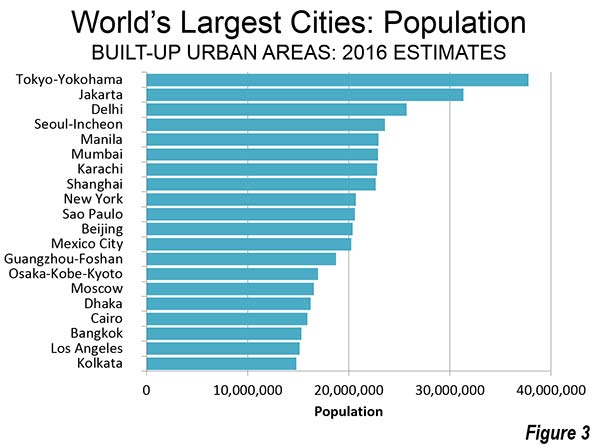
In a recent study that I conducted with the Manhattan Institute’s Aaron Renn and demographer Wendell Cox for Chapman University and the Singapore Civil Service College, we ranked global cities on factors including connectivity to the world economy, demographic diversity, cultural influence, technical workforce, foreign investment, and financial power. Singapore placed fourth, just behind London, New York, and Paris, but ahead of Tokyo and Hong Kong, and far ahead of much larger Beijing or Shanghai. Singapore has earned similar scores in other studies: ninth in the A. T. Kearney 2014 Global Cities index and fifth in the London-based Globalization and World Cities Network. These rankings are remarkable, considering that Singapore is much smaller than its prime competitors. Thirteen cities in China alone have larger populations.

Lee Kwan Yew in 2013. (Photo by Chris McGrath/Getty Images)Lee Kwan Yew in 2013. (Photo by Chris McGrath/Getty Images)

But Singapore’s appeal to foreign investors and migrants is easy to understand. The city has developed arguably the world’s best urban infrastructure, and its streets are rarely congested. Subways and buses, though crowded, are clean and generally well-functioning. The PAP regime’s intelligent planning also extended to housing. Before the PAP came to power, Singapore’s housing stock was dominated by run-down slums. By establishing the Housing Development Board, the state created decent, if small, residences for its citizens. This helped keep housing prices well below those in other Asian cities. Wendell Coxestimates that the city’s housing costs relative to income are roughly one-third to one-half those in Hong Kong, Shenzen, Beijing, and Shanghai. Its homeownership rates are well above those in the United States.

Singapore also offers a stable legal and business climate. Like Hong Kong, the city-state benefits from a tradition of British governance and law. According to the World Justice Project’s ranking of civil justice systems—assessing the ability of ordinary citizens “to resolve their grievances and obtain remedies through formal institutions of justice”—Singapore ranks sixth, behind Norway, the Netherlands, Germany, Denmark, and Sweden, but ahead of Canada (13th) and the U.S. (27th). By comparison, China ranks 79th. Along with Hong Kong, Singapore also appears regularly at the top of global rankings for business climate. A combination of legal norms and transparency has lifted Singapore to become the world’s fourth global financial center, behind only New York, London, and Hong Kong. Singapore is home to twice as many regional headquarters for multinationals as much larger Tokyo. A 2011 Roland Berger study named Singapore the leading location for European companies to establish headquarters in the Asia-Pacific.

To the extent that Singapore has a current economic weakness, it is tied to the PAP’s top-down planning model: key economic decisions are made not by entrepreneurs but by government-led agencies and large conglomerates like Singapore Airlines, GIC, and Temasek Holdings. In Hong Kong, Taiwan, and South Korea, by contrast, privately owned firms generate wealth while also wielding power. Singapore has no equivalents of Hong Kong’s Li Ka Shing, whose net worth is estimated by Forbes at over $30 billion; his Cheung Ho conglomerate employs 280,000 people in 52 countries. Nor does the city-state boast any companies like Taiwan’s Foxcomm, a dominant global power in manufacturing; South Korea’s Samsung, among the world’s leading tech and telecommunications firms; or even China’s Ali Baba, a start-up that has grown into one of the world’s top Internet firms.

Singapore has avoided a common trap for governments throughout Asia: corruption. Lee and the PAP kept Singapore’s government clean by paying top bureaucrats high salaries. Freed from temptation, these bureaucrats, as one history of the civil service put it, could focus on ways “to mould people’s behaviors.” If Singaporeans did as they were told, they would benefit: this was the PAP’s essential promise.

For a long time, it seemed to work. Most Singaporeans continued to back the PAP, in large part because the party delivered the material goods. “In Singapore, we’ve been very looked after. The social contract was if we vote for you, we the government will look after you,” says Singapore-born entrepreneur Calvin Soh. This “patriarchal system of governing,” as he calls it, was ideally suited for a manufacturing economy, where people were “efficient, obedient, and followers.” The bureaucracy carefully built the city’s economy, expanding opportunity for the city’s middle and working classes. Unemployment, 14 percent at the time of independence, became rare, and it remains so today, at around 2 percent.

But “moulding people’s behaviors” has proved more difficult than building new transit lines or improving port facilities. Even in the early days, the PAP’s approach prompted some opposition and grumbling about the regime’s authoritarian bent. David Marshall, a former Singaporean ambassador to France, suggested in 1994 that the PAP was possessed of “a computer brain and a plastic heart.” He chastised the ruling party’s “suffocation of dissent,” which many observers believe continues, though to a lesser degree than in the past.

Today’s Singaporeans, notes Soh, have less faith in the PAP than their forefathers did, partly because of economic factors. As recently as 2011, annual GDP growth chugged along at 6 percent, but last year it grew by just 2 percent, a rate similar to that of the United States and other high-income countries. Meanwhile, mirroring another problem in the affluent world, real wages for ordinary Singaporeans have stagnated. From 1998 to 2008, the income of the bottom 20 percent of households dropped an average of 2.7 percent, while the salaries of the richest 20 percent rose by more than half. Singapore’s educated population also faces growing competition from China and India, which are as hungry for success as Singapore was a half-century ago. “We went from wild animals forging a new country to tamed, well-fed animals in a zoo,” Soh jokes. “We kind of got contented and lost that hunger, that desperation, that edge for the hunt. We are a victim of our success.”

Once, the bureaucracy thought that it could “create” a new culture. But many young Singaporeans don’t want their culture manufactured for them any more. Singaporeans, notes graduate student Arthur Chia, are “proud of what we have built, but many Singaporeans are also concerned with what we may be losing.”

In a sense, there are two Singapores: one seen by multinationals and business travelers; and the other serving the local population. A trip down Orchard Road, the city’s historic shopping boulevard, reminds one of Hong Kong’s Causeway Bay, New York’s Fifth Avenue, or London’s Regent Street. Much of this Singapore—so anxious to appeal to the global rich and corporations—has become uniform and predictable. A once-unique urban environment has been transformed into what architect Rem Koolhaus calls “the generic city,” “a city without qualities,” and a “Potemkin metropolis.”

The young are drawn to the other Singapore. In areas such as Geylang, restaurants, bars, and ill-disguised houses of prostitution coexist with a heavy concentration of Buddhist temples and Islamic mosques. Also popular is Tiong Bahru, an old art-deco district of open-air restaurants, hip bars, and charming apartments. But even here, independent restaurants and shops, which once proliferated, struggle with high rents, as they do in other prosperous global cities.

These districts satisfy native Singaporeans’ nostalgia for an earlier version of the city, imagined as more romantic and less relentlessly hygienic. Eager to rediscover what they see as a grittier and more human past, younger Singaporeans have pushed to save what’s left of Singapore’s architectural heritage. They express a desire to return to the values of community they associate, interestingly enough, not with old China but with communal Malay culture. This “kampong spirit” reflects a deep disconnect between the goals of the bureaucracy and those of many citizens. “The starting point for the government is not values, and that’s part of the problem,” notes Alfred Wu, a professor at the Singapore Management University. “It’s all about utilitarianism. The government sets the path and people are not that involved. This makes it hard to change.”

Singapore's Orchard Road (Photo by wikubaskoro)Singapore's Orchard Road (Photo by wikubaskoro)

The movement of foreign capital and workers into Singapore has intensified the feeling of cultural drift and worries about the future. As the labor supply has dwindled, partly because of a plunging birthrate and consistent out-migration, the city-state has become ever more dependent on foreign labor. As recently as 1980, over 90 percent of residents were Singaporean citizens. Today, that number has fallen to 63 percent; by 2030, if the government plans hold up, foreigners will actually outnumber the natives.

Many Singaporeans feel that the foreign influx is making them strangers in their own land. Most students at the Civil Service College are of Chinese descent. Yet even they view the city’s Chinatown district, now largely populated by people from mainland China, as foreign territory. “We don’t relate to it. We don’t see it as Singaporean,” one student confided to me. These tensions can be seen in other global cities, of course, such as New York, London, and Toronto, but these are large, sprawling metropolitan regions. The impact of population growth and immigration is more intensely felt in space-constrained Singapore.

Like other successful global cities, Singapore is also becoming an abode of the rich; its millionaire households now number 188,000. As in other global cities, rising levels of real-estate investment from China, the Indian diaspora, and the Middle East have driven up prices, particularly in the private housing market. Many see the influx of foreign wealth as undermining the egalitarian nature of traditional Singaporean society. Some Singaporeans of Chinese descent take a particularly dim view of newly arrived Indians, whether professionals or lower-wage workers. Local playwright Alfian Sa’at’s 2013 play, Cook a Pot of Curry, was inspired by a well-publicized incident involving a Chinese migrant family’s objections to the pungent aroma coming from a neighboring Indian family’s kitchen. The play touched off a heated media debate about the purpose of immigration, the need for assimilation, and the preservation of national identity. Some government officials were troubled by the controversy, which undermined their vision of engineered social harmony.

The presence of so many skilled foreign workers from China and India is unquestionably threatening social cohesion. Increased competition for low-wage jobs has stoked tension among the city’s south Indian and Sri Lankan immigrants, who occupy much of the lower employment tier. Last year, for the first time since 1969, a riot took place in the city—in Little India, after police rousted some inebriated workers. These disturbances have led the government to tighten its immigration policies.

Photo by Peter Kirkeskov RasmussenPhoto by Peter Kirkeskov Rasmussen

Singapore’s challenges go beyond its changing population. A diminishing portion of Singaporeans say that they are interested in marriage. Singapore’s birthrate is now one of the world’s lowest. Since 1990, the number of births to Singapore residents has dropped from almost 50,000 annually to barely 37,000. The government has sought to reverse this pattern with well-funded incentives to encourage families—such as subsidies for housing—but the fertility rate still stands at 1.3 per woman, well below replacement level.

“Demographically, there’s really no way out, no way to stop the decline,” suggests longtime University of Singapore demographer Gavin Jones, over a dim-sum lunch in Holland Village, an old Singaporean neighborhood popular with expats. “The government has tried to address this with incentives, but it doesn’t work. The culture of not having children is now very much internalized. It is seen as something that limits your options.” To some extent, this view reflects trends throughout East Asia, where family bonds are weakening. The low-birth pattern is also evident in Singapore’s competitors, notably Hong Kong, where nearly half of young couples believe that they can’t afford to have children. Shanghai, notes Jones, now has one of the lowest peacetime fertility rates ever recorded.

Young Singaporeans say that the decision not to have children is pragmatic. “Having kids was important to our parents,” noted one thirtyish civil servant, “but now we tend to have a cost and benefit analysis about family. The cost is tangible, but the benefits are not knowable or tangible.” Many Singaporeans suspect that, however good things may be now, they won’t be better for the next generation.

“Delivering babies is not such a good business now,” suggests Fong Yoke Fai, a prominent local gynecologist. “There’s a change in perception. Personal goals are more important than social or religious ones. People don’t think they can afford the housing for children, so they opt not to have them.”

Singaporean planners, who in the 1960s and 1970s fretted about overpopulation, now must confront what their Japanese peers face—an aging population that can only be sustained by immigration. By 2030, Singapore could have many more people over 65 than under 25. If this trend continues, the main question facing the city-state may not be how to remake itself but how to get rich enough, fast enough, to support millions of elderly citizens.

Going forward, it seems clear that Singapore must change its model, and perhaps jettison the idea of mold making entirely. The city-state needs less planning and more spontaneity. Government attempts to promote creativity or start new cutting-edge industries are bound to fail in a society where bloggers can lose their jobs or get arrested for offending the sensibilities of the bureaucratic elite. Singaporean authorities have also banned films, such as local director Ken Kweck’s 2012 feature, Sex.Violence.FamilyValues, which they found racially controversial. “Even Chinese citizens who take up Singapore citizenship wouldn’t want [censorship],” suggests Soh, whose new company produces archival photos of various locations in the city, many of which have long since been destroyed. “They didn’t leave China to be in China.”

Singapore’s planners will be tempted to meet the new challenges by doing what they do best—designing, implementing, and managing vast new projects, especially physical infrastructure, that promise to keep the city competitive. In recent years, these efforts have included a remarkable “greening” of the city, with many small parks and a network of nature trails as well as Gardens by the Bay, a large indoor collection of trees, recently completed near the central core. The Gardens represent a broader effort to grow Singapore’s service and tourism sectors, notably through the construction of a massive casino—a remarkable development, as gambling was long considered a curse in Chinese culture. Lee Kwan Yew promised that casinos would appear in his country only “over my dead body,” but even before his death, gambling had become big business: Singapore has vaulted ahead of Las Vegas to boast the world’s second-largest casino revenue. Only Macau takes in more.

But turning Singapore into an Asian Las Vegas won’t solve the city’s fundamental problems. The real crisis is not in how Singapore is regarded in New York and London, or even in Beijing and Shanghai, but how it meets the needs and aspirations of its own people. Singapore’s leaders must revamp their approach to governance, becoming more responsive to local needs and less focused on defined goals.

“No amount of analysis and forward planning,” says longtime government advisor Peter Ho, “will eliminate volatility and uncertainty in a complex world.” The old managerial model, he concedes, has become outdated. To thrive in the future, Singapore will have to find its way without a predrawn map. As Asia modernizes and develops a modern infrastructure, Singaporeans cannot remain competitive merely by being more efficient or better educated. The city-state will have to rediscover the boldness of its founding generation, even while discarding many of its methods. “We will have to be pioneers again,” notes Calvin Soh, “and recognize that we don’t have the same strategic advantages that we used to have. We have to start planning for the next ten years from that viewpoint. And that plan has to come from the grassroots, not from above.”

Singapore's Gardens by the Bay (Photo by M!cka)Singapore's Gardens by the Bay (Photo by M!cka)

This piece originally appeared in The City Journal.

Joel Kotkin is executive editor of NewGeography.com. He is the Roger Hobbs Distinguished Fellow in Urban Studies at Chapman University and executive director of the Houston-based Center for Opportunity Urbanism. His newest book, The Human City: Urbanism for the rest of us, will be published in April by Agate. He is also author of The New Class ConflictThe City: A Global History, and The Next Hundred Million: America in 2050. He lives in Orange County, CA.

Singapore skyline photo by Bigstockphoto.com.

Aristocracy of Talent: Social Mobility Is the Silver Lining to America’s Inequality Crisis

$
0
0

Yes, wealth concentration is insane. But the ways in which wealth is shifting are surprising—and give reason for a little optimism.

In an age of oligarchy, one should try to know one’s overlords—how they made their money, and where they want to take the country. By looking at the progress of the super-rich --- in contrast with most of us --- one can see the emerging and changing dynamics of American wealth.

To get a sense of these trends, researcher Alicia Kurimska and I  tapped varying analyses from the Forbes 400 list of richest Americans. No list, of course, captures all the relevant data, but the Forbes list (I am a regular contributor to that magazine’s website) allows us to look not only at who has money now, but how the dynamics of wealth have changed over the past decade or more.

The bad news here is that our oligarchs are getting richer, and, unlike in the decades following World War II, they are primarily not taking us on the ride. Indeed at a time when middle-class earnings have stagnated for at least a decade and a half,   the oligarch class is making out like bandits. This, of course, extends to much of the infamous “top 1 percent.” The share of income of the top 1 percent of households in the US increased from 10 percent in 1979 to upwards of 20 percent in 2010, as famously found by economist Thomas Piketty and Emmanuel Saez. 

But if the highly affluent are thriving, the super-rich are enjoying one of the brightest epochs since the days of the robber barons. These people , according toa study by economists Steven N. Kaplan and Joshua D. Rauh, the top 0.0001 percent of 311.5 million US individuals. In constant 2011 dollars, their wealth has grown seven-fold since 1992 --- from $214 billion in 1982 to $1.525 trillion in 2011. This at a time when most Americans have endured little or no real income growth.

 What we are talking about is a concentration of wealth and power unprecedented since the turn of the last century. According to an analysis by the left-leaning Institute for Policy studies, America’s 20 wealthiest people own more wealth than the entire bottom half of the population—152 million people in 57 million households. The top 100 own as much wealth as the entire 44.5 million-strong African-American population  (there are only two African Americans on the list), and the top 200 have more than the entire 55 million-strong Latino population (there are 15 Latinos on the list). To make an international comparison, the 400 have more wealth than the GDP of India, arguably the most up and coming big economy on the planet. 

The Rise of the self-made

Not all the news is bad, however. The proportion of the 400 who inherited their money has been steadily decreasing. There are more self-made billionaires than existed in the 1980s. Kaplan and Rauh report that since the 1980s the share who grew up wealthy fell from 60 percent to 32 percent. 

This does not mean so much the return of Horatio Alger --- the share who grew up poor remained constant at 20 percent --- but that most super-wealthy came from affluent but not rich families, which gave them some head start, notably in education.They did not hand the keys to the kingdom to their offspring. Rather than country clubbers clipping coupons, the rich since the 1980s have become largely, if not entirely, self-made.  

But origins are not the only thing that has changed in this era of oligarchy. So too have the industries that create the wealth --- largely represented by the shift toward technology and finance --- and, not surprisingly, where that wealth tends to concentrate. These shifts are already changing not only our economy, but also the outlines of political power, as industries friendlier to Democrats, notably tech and finance, supplant those, notably energy, that have long been associated, particulary in the last decade,  with the Republicans.

The shift in the fortunes of the super-rich reflect changes in our industrial structure over the past third of a century. The big winners have been in scalable businesses  where capital is king and rapid accumulation possible. Rauh and Kaplan, for example, report that the big winners have emerged  not only in tech, but also include owners of retail and restaurant chains, tech firms and private finance, including hedge funds  Over the period between 1982 and 2012, finance’s share grew the most, followed by technology and mass-retailing.

Who’s losing ground? The big losers are a bit counter-intuitive. Despite all the attacks on “big oil,” energy has actually suffered the biggest decline in terms of presence on the Forbes list. Energy, for example, used to account for about 21 percent of the 400,  but that has shrunk to about 11 percent. Equally puzzling, amidst a high-end building boom (not so much for the hoi polloi), real estate’s share has dropped about as much. Perhaps less surprising are the losses among non-tech based consumer industrial companies. 

Since 2012, the year the Rauh study was completed, the tech billionaires have, if anything, expanded their presence, while it’s likely that, with the drop in energy prices, the oil barons will slip even further. On the 2014 list, for example, in terms of dollar gains, five of the top six were from the tech sector, led by Mark Zuckerberg, whose fortunes increased by a remarkable $15 billion (Warren Buffett was the lone exception). Mark Zuckerberg’s gains were larger than the $12 billion increase between Charles and David Koch, even at the peak of the energy boom.

Fully half of the top 10 on the list came from the tech community, with the balance made up of Wall Street/finance people (Buffett and Michael Bloomberg) along with the Kochs and David Walton, the youngest son of Wal-Mart founder Sam Walton.

The New Geography of Wealth

Perhaps more surprising has been the shift in the location of the rich. Despite the rise of the tech oligarchs, the biggest gainers over the past decade have not occurred in California but in New York, Florida and Texas. This reflects not only the power of Wall Street and the investment class (some of whom have decamped to Florida), but the growing diversification of the Texas economy. 

Oil, of course, still plays a critical role among the Texas rich, but it’s much more than that now. The richest people in the Lone Star Stateinclude Alice Walton, the Ft. Worth-based heir to the retail fortune, but also Austin tech mogul Michael Dell, Dallas financier Andy Beal, and San Antonio supermarket mogul Charles Butt. The first energy billionaire, pipeline entrepreneur Richard Kinder, clocks in as fifth richest Texan. Even if energy remains weak for the next decade, Texas seems likely to keep producing gushers of billionaires.

If we break the rich list by region, it’s no surprise that New York, long the nation’s premier financial center, would rank first, with 82 billionaires. In second place is the San Francisco area, with 54 billionaires, most of them tied to technology. The Bay Area, with about one-third of the population, surpasses third-place Los Angeles, with 34. Miami ranks fourth with 27, Dallas fifth with 19; each is ahead of the traditional second business capital, Chicago, which ranks sixth with 15, just a few paces ahead of  Houston with 12.

The Future of Oligarchy  

What is the future trajectory of wealth in America? One thing seems certain: the twin tech capitals of Bay Area and Seattle, now home to nine of the 400, are likely to expand their reach. One clear piece of evidence is age; people generally do not get richer when they retire. In contrast, virtually all self-made billionaires under 40 are techies

Of course, the biggest growth can be expected in the Bay Area, particularly as tech people think of new ways to “disrupt” our lives – for our own good, of course. Whole industries such as music, movies, taxis, real estate are increasingly controlled from the Valley; as these companies wax, many of the old fortunes made in these fields will begin to wane. This is also true across the board in retail, where Seattle’s Jeff Bezos now looms as a colossus greater than any individual chain of traditional stores.

Ultimately what will make “the sovereigns of cyberspace,” to quote author Rebecca MacKinnon, so dominant is precisely what made John D. Rockefeller so rich: control of markets. Google, for example, accounts for over 60 per cent of Internet searches. It and Apple control almost 90 percent of the operating systems for smartphones. Similarly, over half of American and Canadian computer users use Facebook, making it easily the world’s dominant social-media site. 

And soon, they, like the old Wall Street elites or the energy barons, may be able to regard the government as yet another subsidiary. They will benefit greatly from the likely electoral victory of the Democrats, who are increasingly dependent on tech contributions, while the old economy oligarchs already in retreat, in energy, manufacturing and real estate, fade before them. 

The prognosis for the future of American wealth, then, is for an ever-expanding role for both tech and private investors, and a gradual shift away from basic industries that are geared to our diminishing middle class. This may not be good for America but will be wondrous indeed for the ever more powerful, and outrageously wealthy, new ruling class.

This piece originally appeared at The Daily Beast.

Joel Kotkin is executive editor of NewGeography.com. He is the Roger Hobbs Distinguished Fellow in Urban Studies at Chapman University and executive director of the Houston-based Center for Opportunity Urbanism. His newest book, The Human City: Urbanism for the rest of us, will be published in April by Agate. He is also author of The New Class ConflictThe City: A Global History, and The Next Hundred Million: America in 2050. He lives in Orange County, CA.

Future of Suburbia: Report from Cambridge

$
0
0

In the United States, over 69 percent of all residents live in suburban areas. Across the globe many other developed countries are primarily suburban, while developing countries are increasingly suburbanizing. By 2050, an additional 2.7 billion people are anticipated to live in metropolitan regions around the world, and suburbs are a significant portion of this urban expansion. Over the past two years, 150 experts from numerous, diverse disciplines contributed research that explores this contemporary global phenomenon – and on April 1st their work was showcased at the MIT Media Lab for the Future of Suburbia conference.

The “Future of Suburbia” was chosen as MIT’s Center for Advanced Urbanism biennial theme in order to shed light on the growing role suburbs play in our lives and how they may be improved for the future.   Suburbia is an often polarizing issue that should no longer be ignored by the fields of Planning and Design.

The conference is just one of three products the Center for Advanced Urbanism created for its biennial research theme. An exhibition, located on the ground floor of the MIT Media Lab included infographic mappings, a 22ft x 8ft dynamic model of a 3 million population polycentric region in the year 2100, and aerial footage of global suburbs. The third product, a publication entitled Infinite Suburbia (Fall 2017), brings together 50+ authors and about 700 references, providing groundbreaking research on our low-density future.

Each of MIT’s five schools were represented at the conference, spanning twelve key fields. Attendees also included students from Harvard and Chapman University, and speakers in demographics, entrepreneurship, history, urban design and media production. The findings were presented within four design frameworks, including heterogeneous, productive, autonomous and experimental, which were explored through a variety of fields; including design, architecture, urban planning, history and demographics, policy, energy, mobility, health, environment, economics, and applied and future technologies.

The conference centered on the question, how might suburbia be upgraded to better suit our needs? Can new suburban models be created for developed, but also developing, countries? What challenges will suburbs face in the future? Despite such a large and complex topic, enlightening data, opinions and predictions were given regarding suburbs and their role in a sustainable future.

Forgetting the Urban-Suburban Divide

The urban-suburban dichotomy is highly debated (in fact, urbanists and planners themselves use 200 different terms to describe suburbia), but the Future of Suburbia conference tried to stay above the fray, instead describing the two camps as one evolving continuum. Throughout the day points were made that the suburb and urban can and should learn from one another. Traditionally, we have failed to recognize just how important suburbia is in this country and globally. By polarizing the suburb and the city we ignore how the making of peripheries can greatly contribute to urban centers, and vice-versa. However, this conference did not focus on trying to define suburbia, but on how we should think of urbanization’s holistic impact.

Historian Robert Bruegmann kicked off the conference by outlining its history and persistence worldwide despite economic and political differences. Bruegmann finished his introduction by advocating that we be “more modest in what we think we know and what we plan for our future.”

The Suburbs as a Heterogeneous and Productive Form

The conference’s first panel of the day, on heterogeneity, dealt largely with numbers and trends. One statistic that stood out – 90 percent of Americans live in suburban areas, while only 10 percent live in urban cores. Also, 80 percent of Americans wish to live in a detached home. As millennials get older, more will be married and begin having children, making suburban living all the more desirable. In the United States, the denser the community, the fewer children there are. Just take a look at San Francisco, where there are more dogs than children and families are increasingly moving out of the city, or Manhattan, which has the lowest percentage of children in the country.

It is also the highly educated and majority white that are moving to city centers, while two thirds of millennials do not have college degrees. It seems that what people truly want in their hearts, is being mixed up with costs, in both the city and suburbs. Economist Jed Kolko described the process as circular – where do people want to go, what is the economic situation, and where are the externalities. Kolko admitted it’s hard to quantify how much demand for suburbia is an impact of policy, or consumers’ hearts.  

Ali Modarres, director of Urban Studies at University of Washington Tacoma, presented on the suburbanization of immigrants, stating, “Immigration is redefining and complicating the word suburb”. He explained, “…suburbs, old and new, are more likely to become super diverse.” Why are immigrants moving increasing to suburbs and not city centers? Because suburbs are home to a growing working class population, seeking affordable housing close to emerging job centers. For example, Orange County and northern LA County have seen significant foreign born population growth. And David Rudlin, winner of the prestigious Wolfson Prize, has high hopes for the future of the polycentric city. He emphasized the importance of a strong economy in suburban settings, asserting, “If you don’t have the economic driver of a city, you end up with a dormitory.” He called for the open sourced suburb as a way for creating a bio-system that allows diversity to develop.

How can we design suburbs in a more productive, environmentally friendly way? The next panel explored this question beginning with Susannah Hagan, professor of Architecture at the University of Westminster, who emphasized that the suburban and urban are different, but should not be thought of as separate entities. The suburb can benefit the city, while the city, in turn, can benefit the suburb. Hagan also discussed strategies for post-industrial cities, to “manage degraded industrial spaces.” She talked about different types of seeds – actual plant seeds, investment seeds, and the concept of idea seeds for regenerating cities and suburbs.

Joan Nassauer, professor of Landscape Architecture in the School of Natural Resources and Environment at the University of Michigan, showed that suburbs can be environmentally productive places, making the point that by area, as much carbon is stored in Michigan’s southeast exurban residential landscapes as in the managed forests of North Country.

Mitchell Joachim, co-founder of Terreform ONE and associate professor at NYU, proposed that agriculture should be brought back into the suburbs which would create a “new kind of nature” that can shrink our ecological footprint. Innovative ecological designs such as living houses, urban farm pods, and cricket shelters were explored. The question then becomes, are suburban residents ready to break the model?


An Autonomous and Experimental Future

The main challenges of autonomy in the suburbs are regulatory, technical, and complicated by the user experience. But with the right tools, autonomy has the ability to transform the way people live and travel outside the city. Joseph Coughlin, professor and Director of the MIT Age Lab moderated the panel that included Knut Sauer of Hyperloop Technologies, Eran Ben-Joseph of MIT’s Urban Studies and Planning department, and Nick Roy of the Department of Aeronautics & Astronautics at MIT.

New technologies will change our lives, allowing us to travel from LA to San Francisco in 25 minutes, or purchase something in the middle of the night and have it delivered by drone within the hour. The ideas presented look promising – in just a couple years the Hyperloop will be a reality for human passengers. But the innovations may still need tweaking, since people tend to reach out to drones and dangerously interfere with their motors.

If these weren’t experimental enough, the next panel consisted of conceptual housing models and the creation of an entire city dedicated to testing. The experimental panel was moderated by ex-suburbanite and writer for the New York Times, Allison Arieff, who explained how she wanted to see cities and suburbs learn from each other rather than fight.

Paul Fieler laid out upcoming plans for CITE City, a New Mexico based model city that will be built to test, evaluate, and certify new urban technologies. The development will look and function as a real city, and thousands of people will move into the houses and apartments to conduct real-life experiments. David Neustein of Other Architects proposed another urban concept for Australia, the most suburbanized nation in the world. As the population ages and preferences shift towards sustainability, Neustein’s model would facilitate the downsizing of Australia’s many “McMansions” so that the elderly could rent out their second stories. It would also boost Australia’s housing stock and redesign facades to become more integrated into nature.

Meanwhile, Bob Geolas of the Research Triangle Foundation in North Carolina cities must understand what to embrace in terms of their brand, culture, and urban form. He outlined how the Research Triangle is overcoming its outdated research park form and building upon its values and strengths to become relevant in the economy and contribute to a sustainable future. Physical and programmatic collaboration, unique and relevant design, events and programs, and public spaces will all be key components for making the Triangle an attractive place to work in the suburbs.

Takeaways

Topics included innovation in cities, and economic and cultural trends, including immigration, demographics and lifestyle preferences, and how these forces interact in the urban, or suburban milieu. As population grows and technology improves, the researchers predict that the urban-suburban divide will disintegrate, resulting in a continuum of urbanity, one that takes form as a poly-nodal fabric of different hubs of innovation, living and sustainability.

Also, we learned how important it is for urban designers to collaborate with business leaders, economists, and city officials, and the community residents themselves to design and implement the most appropriate and beneficial suburban structures. These fields traditionally function in silos, but the future requires that these disciplines co-mingle in the creation of sustainable, productive, and creative places to live. If we focus less on the semantics of the urban-suburban divide, and channel our energies on creating better places to live for all types of people, more will benefit.

Alicia Kurimska is a researcher at the Chapman University Center for Demographics and Policy. She is a first generation American with a Slovakian background who graduated from Chapman University with a degree in history, writing her thesis on Czech President Edvard Benes’s struggle to preserve the Czechoslovak nation, inspired by her year-long studies at the Anglo-American University in Prague.

Charlie Stephens is a researcher at the Chapman University Center for Demographics and Policy, and an MBA candidate at the Argyros School of Business and Economics at Chapman University. He is also a regular contributor to the creative business site PSFK.com and the founder of substrand.com, a hub for sharing and discussing the creative, intellectual and emotional aspects of cities.

Photos by Justin Knight.

A $15 Minimum Wage Is A Booby Prize For American Workers

$
0
0

In principle, there is solid moral ground for the recent drive to boost the minimum wage to $15, with California and New York State taking dramatic steps Monday toward that goal. Low-wage workers have been losing ground for decades, as stagnant incomes have been eroded by higher living costs.

This has been particularly tragic for workers in high-priced cities like San Francisco, Seattle, Los Angeles and New York, where the movement has achieved irresistible momentum. If the Democrats manage to win a sweeping victory in the fall, the $15 minimum could also be imposed nationwide, with huge impacts on “laggard” regions like the South.

Yet if the campaign to boost the minimum wage reflects progressive ideals, the underlying rationale also exposes the failure of these high-priced cities to serve as launching pads for upward mobility for the vast majority of their residents. In effect, the fight for $15 is a by-product of giving up – capitulating on the idea that better opportunities can be created than the menial service jobs that increasingly are the only opportunities for the urban poor. Higher wages will make these jobs moderately more tolerable, while further cementing the wide gulf between the haves and have knots.

It is not a coincidence that inequality — the issue most closely tied to the minimum wage drive — is consistently worst in larger, denser, deep blue cities such as New York, Los Angeles, San Francisco. Manhattan, the densest and most influential urban area in North America, exhibits the most profound level of inequality and bifurcated class structure in the United States. If it were a country, New York City would rank 15th worst out of 134 nations, according to James Parrott of the Fiscal Policy Institute, landing between Chile and Honduras.

New York, San Francisco, L.A. and Seattle are at the forefront of a new urban economy, based on industries such as finance, technology and media, that generally creates jobs for the highly educated only. Virtually every region at the cutting edge of the minimum wage movement has seen a rapid decline in traditional blue-collar jobs — notably in manufacturing — which often paid well above the minimum wage, and offered potential for further individual advancement.

In these and other core cities, we are seeing something reminiscent of the Victorian era, where a larger proportion of workers are earning their living serving the wealthy and their needs as nannies, restaurant workers, dog-walkers and the like. In New York City, as of 2012, over a third of workers were employed in low-wage service jobs, a percentage that rose through the recovery from the Great Recession, according to a study by the Center for an Urban Future. The largest growth in new jobs in NYC between 2009 and 2014 came primarily in low-wage fields. Of the 401,800 net jobs the city gained over that span, 76,400 were in food services and drinking establishments, with an average annual wage of $26,200. The sector that added the second largest number of jobs: ambulatory health care, at 55,400, with an average wage of $46,200. Meanwhile at the high-wage end of the spectrum, Wall Street employment was flat, and the glitzy fields of information services and movies and sound recording added 26,000 jobs.

Given shrinking opportunities for middle and working class people, it’s not surprising that many seek a more direct redress from the government. If the odds of working your way up are limited, and a working-class job cannot pay for your basic necessities, people have to resort to political solutions, much as occurred in the early decades of the last century. If you have been relegated to the expanding precariat –those essentially living check to check — raising the wage floor might seem very appealing.

Essentially the minimum wage campaign rests on the notion that traditional middle class uplift cannot be achieved. The problem is, a $15 an hour income represents hardly enough to pay the rent for a small apartment anywhere near the blue cities where the new minimum will hit first. It does allow, however, a way of allowing the dominant wealthy wings of the Democratic Party — financial, real estate, media and tech interests — to hand out a convenient sop to their erstwhile labor allies.

In some places, the hike may not have an immediate discernible economic impact. Higher wages and prices can likely be absorbed in high-cost areas with lots of wealth, such as Seattle, Manhattan and San Francisco. Some recent research shows that Seattle, which was the first big city to pass a wide-scale, phased in increase, with some wages now hitting $13 an hour, has seen slower growth in restaurant employment than its periphery. However, its economy has hardly collapsed.

The impacts may be less positive in places like the Bronx and ungentrified Brooklyn. It is in these areas where the likely shrinking of lower-wage opportunities in response to higher salaries may be felt the strongest; the flow of jobs that can move to lower-wage states will likely accelerate.

The  impact in California will, if anything be larger, as the wage hike will be imposed in a wider fashion on a hugely diverse state. Some 25 percent of workers would get a raise through the kindness of Sacramento. By 2022, by some estimates, the California minimum wage would represent 69 percent of the median hourly wage in the state, assuming 2.2 percent annual growth from the current median of roughly $19 per hour. This compares with a current federal minimum that is 38 percent of the median. Economic modeling suggests the precipitous rise on such a mass scale will slow the state’s employment growth, particularly at the lower end.

To be sure, higher wages could be a blip in wealthy and thoroughly de-industrialized places like San Francisco – if higher labor costs boost the price of beet-filled ravioli, it doesn’t undermine the market in a place where hipsters and elite workers still have dollars to spend. But it could mean the loss of employment in the lower ends of construction, manufacturing and logistics, and a broader impact in the state’s interior and more heavily minority cities, where much of the state’s poverty is concentrated. The $15 dollar minimum represents only 40 percent of median wages in San Jose/Silicon Valley and 44 percent in San Francisco, but 61 percent for Los Angeles and 74 percent in Fresno.

Ultimately local workers in poorer areas may see higher wages, but less opportunity. One possible harbinger may be the decision by Wal-Mart to leave Oakland.

Who Wins: Reviving the Blue Model

Of course, not all jobs can be moved — but they can be automated. This is already occurring in parts of the restaurant industry, where chains have been introducing touch screen devices to take orders in lieu of waiters and waitresses. The mass automation of industries such as fast food will accelerate, eliminating all but necessary jobs. Some of this would occur naturally; it’s interesting that some of the most cutting-edge developments in the low-labor content restaurant model have occurred in high cost, progressive San Francisco, where the new restaurant Eatsa has almost entirely automated service, and the startup Momentum Machines is developing a mechanized system to cook and assemble burgers, and other meals. Those who will find their way to a new minimum will sing its praises, and rightly so, but many others –notably entry level workers and teenagers — may find themselves forced out of the labor market, or joining the growing ranks of contingent workers.

Perhaps the greatest beneficiaries of the minimum wage hike will not be the bulk of lower wage workers in blue states, but the people who increasingly dominate their economies. For one thing, a higher minimum removes the stigma of extreme inequality that gives a bad reputation to an economic system that has little need for broad categories of workers. They can feel better about themselves, and avoid the kind of redistribution promised by the likes of Bernie Sanders.

And as the American Interest recently predicted, those most likely to benefit down the line from the higher wages will be the tech companies that will come up with the software and automated systems that replace the service jobs now made less economically competitive by the wage hikes. It’s not a loony fringe concept: the President’s Council of Economic Advisers recently estimated that lower-wage service jobs have an 80% probability of being automated.

So in the end, a $15 minimum wage, set in the low growth economy of our times, may end up boosting the very class-based hierarchies that are already increasingly evident. Ultimately it may represent a case of a well-intentioned measure that, while sounding radical, only accelerates our road back to feudalism: a society dominated by the few where many depend on the generosity of their betters and the middle class, already shrinking, fades into the dustbin of history.

This piece originally appeared at Forbes.

Joel Kotkin is executive editor of NewGeography.com. He is the Roger Hobbs Distinguished Fellow in Urban Studies at Chapman University and executive director of the Houston-based Center for Opportunity Urbanism. His newest book, The Human City: Urbanism for the rest of us, will be published in April by Agate. He is also author of The New Class ConflictThe City: A Global History, and The Next Hundred Million: America in 2050. He lives in Orange County, CA.

Unemployed woman photo by BigStockPhoto.com.

Moving to the Middle: Domestic Migration by Metropolitan Area Size

$
0
0

Americans are moving to middle-sized metropolitan areas, according to the latest Census Bureau population estimates. Between 2010 and 2015, all of the domestic migration gain was in a broadly defined middle of metropolitan areas between 250,000 and 5,000,000. Both above and below that range there were huge domestic migration losses.

Middle Sized Metropolitan Areas (250,000 to 5,000,000 Population)

Between 2010 and 2015, more than 1.4 million people moved to the metropolitan areas that had between 250,000 and 5,000,000 population in 2010. These movers came from larger metropolitan areas, as well as smaller metropolitan areas, micropolitan areas and areas that are not within these core-based statistical areas (Note). The larger metropolitan areas lost nearly 800,000 domestic migrants, while the smaller areas lost more than 600,000.

Moreover, the trend is getting stronger. In each year since 2010, the middle sized metropolitan areas have increased their net domestic migration. In 2011, the middle sized metropolitan areas gained 184,000 net domestic migrants. This has gradually moved up to the 2015 figure of 341,000 net domestic migrants (Figure 1). In percentage terms, the middle sized metropolitan areas strongly increased their net domestic migration growth as a percentage of their population, from 0.12 percent to 0.21 percent (Figure 2).

Larger Metropolitan Areas (5,000,000 Population and Over)

At the same time, the nine larger metropolitan areas with over 5,000,000 residents and more have lost net domestic migrants in every year. In 2011, the loss was 80,000. It has increased every year since, to 228,000 in 2015. The percentage losses have grown dramatically. In 2011, the larger metropolitan areas lost 0.10 percent of their population to net domestic migration. By 2015, this had nearly tripled, to a loss of 0.28 percent.

Over time, the position of our largest metropolitan regions has deteriorated, even in comparison with micropolitian areas. In 2011, the largest metropolitan areas, though losing, did better than the smaller areas (those with under 250,000 residents). The smaller areas lost 105,000 net domestic migrants in 2011, compared to the smaller loss of 80,000 net domestic migrants in the larger metropolitan areas.

The largest metropolitan areas continued to do better than the smaller areas in 2012, as the gap was about the same. All of that changed in 2013, as the larger metropolitan areas began to sustain larger domestic migration losses than the smaller areas. By 2014, the losses in the smaller areas were less than one-half that of the metropolitan areas with more than 5 million residents. The smaller areas, including those outside the metropolitan areas, lost 113,000 net domestic migrants in 2015, while the larger metropolitan areas lost 228,000.

These losses are all the more remarkable given that some large metros, notably   Houston and Dallas-Fort Worth have been gaining net migrants, up 255,000 and 241,000 respectively. Two other metropolitan areas in the above 5,000,000 category also gained. Atlanta added 116,000 domestic migrants, albeit at a much slower rate than during the 2000s. Miami also gained, but only modestly (3,000).

The shift away from the largest metropolitan area group was driven by huge losses in the largest of the metropolitan areas in that category.  New York  lost 701,000 domestic migrants during the decade. Chicago lost 319,000 and Los Angeles was close behind at 280,000. Philadelphia lost 100,000, while Washington lost 13,000.

Smaller Areas (Under 250,000 Population)

Among the smaller areas, the peak loss was reached in 2012, at 136,000 net domestic migrants. Since that time, the smaller areas have improved on their net domestic migration losses modestly each year, dropping to the 113,000 in 2015. The annual domestic migration rates have been more constant in the smaller areas, starting at a loss of 0.14 percent in 2011 and fluctuating up and down to a maximum of 0.18 percent and a minimum of 0.15 percent in 2015.

More Detailed Analysis

Figures 3 and 4 show the domestic migration trends in more detailed population categories. By far the largest losses have been sustained by the megacities, New York and Los Angeles, with more than 10,000,000 residents. The metropolitan areas with between 5,000,000 and 10,000,000 population had done relatively well in the early part of the decade, but have dropped substantially. If the same trend continues to next year, net domestic migration losses would occur across this category.

By far the strongest gains were in the 1,000,000 to 2,500,000 category, where net domestic migration more than doubled from 2011 to 2015. There was also strong growth in the 500,000 to 1,000,000 category and in the 250,000 to 500,000 category. There was a more mixed record among the metropolitan areas with between 2,500,000 and 5,000,000 population, with a rise to 2014, but a reduction in 2015.

The smallest categories, from 50,000 to 250,000 population and under 50,000 population lost in each year, though there were not large fluctuations.

A Trend?

The trend that favors the migration from the largest and smallest areas to the broad middle of metropolitan areas may be an aberration. But we may likely see an even larger share of future domestic migration to middle-sized metropolitan areas, together with two or three larger areas (Houston, Dallas-Fort Worth and maybe Atlanta. That’s probably our best guess for the future of our metropolitan regions.

Note: Core based statistical area is a term that includes metropolitan areas and micropolitan areas, which are larger and smaller labor market areas, with slightly different definitions. Additional information can be obtained from the Office of Management and Budget.

Wendell Cox is principal of Demographia, an international pubilc policy and demographics firm. He is a Senior Fellow of the Center for Opportunity Urbanism (US), Senior Fellow for Housing Affordability and Municipal Policy for the Frontier Centre for Public Policy (Canada), and a member of the Board of Advisors of the Center for Demographics and Policy at Chapman University (California). He is co-author of the "Demographia International Housing Affordability Survey" and author of "Demographia World Urban Areas" and "War on the Dream: How Anti-Sprawl Policy Threatens the Quality of Life." He was appointed to three terms on the Los Angeles County Transportation Commission, where he served with the leading city and county leadership as the only non-elected member. He served as a visiting professor at the Conservatoire National des Arts et Metiers, a national university in Paris.

Evolving California High Speed Rail Now Degraded To Only A Commuter Train

$
0
0

When voters passed in the November 2008 election, Prop 1A, they approved partially funding a 800 mile High Speed Rail project, that was to run from San Francisco to San Diego. The project was to be constructed quickly and be up and running by 2020.

Approved Business plans in 2012 and 2014, then projected construction to start from the Central Valley, near Fresno, and proceeding south through the Tehachapi Mountains to Los Angeles Union Station.

Now we see the High Speed Rail Authority is promoting a draft 2016 Business plan that abandons building south and instead promotes building north from near Bakersfield, but only to San Jose. The reason for this dramatic shift is lack of funding to complete the previously proposed segment to Southern California.

The Authority claims they have the funding to complete an Initial Operating Segment (IOS), which would run from about 20 miles north of Bakersfield to San Jose Diridon Station.  From Diridon Station, riders could use Caltrain to proceed further north to other destinations. The IOS segment is expected to be completed and usable around 2025.

The projected funding for this IOS, would come from Prop 1A bonds, Cap and Trade projected  pay as you go revenues as well as bonded revenues (thru 2050), and Federal funds that have been already allocated.  Constructing this segment would consume all currently available funds.

The key foundation for promoting this new plan, is that ridership will be greatly enhanced with commuters using this High Speed Rail section to commute from the Central Valley to Silicon Valley. The Authority and others are promoting this projection as a major improvement to the jobs / housing imbalance that currently prevails in Silicon Valley. The claim is cheap housing in Fresno or Bakersfield will induce workers from Silicon Valley to buy or rent in the Central Valley.  They promote a quite reasonable trip time of only 40 minutes on the train, making such a commute attractive.

But further scrutiny belies these assertions. The trip time on HSR will indeed be around 40 minutes, but that takes the commuter only to San Jose Diridon Station.  Diridon station is not where these commuters will work.  Indeed they will have to then transfer to another service at least once to get to their employers.  Analysis of the true trip time doubles the real commute time to around 80 minutes.  This was amplified by Palo Alto Mayor, Pat Burt at the recent Local Policy Makers group meeting March 24th.

The premise that workers will be enticed to move to the Central Valley because the cost of housing is much lower also needs examination.  Here one has to consider in this equation, the cost of commuting.

HSR transportation is a premium service.  By law the HSR trains must operate without a subsidy, a restriction which BART or Caltrain do not have to meet.  The projected HSR fare from Fresno or Bakersfield is $68 each way. For a daily commuter that is $136 per day, or about $34000 per year to pay for the HSR train ride. This does not include other charges like parking or transportation from Diridon to a final working destination.

Also working against the myth that the bottom line is cheaper for a commuter to live in the Central Valley, yet work in Silicon Valley, is the treatment of expenses on ones tax return. Home mortgage interest is a tax deductible expense on ones tax return.  Commuting train fares, are not a tax deductible item on a tax return.

All and all it just doesn’t add up that it is cheaper for a commuter to live in the Central Valley, and take HSR to Silicon Valley. There will be, despite Authority claims otherwise, very few commuters living in the Central Valley and commuting to Silicon Valley.

Finally, residents in Southern California are really being excluded by this new plan.  They will be paying in taxes to service the Prop 1A bond service.  They will be paying in higher gasoline costs to support Cap and Trade revenues. For Southern California residents, there is no benefit. They are simply being left out.

There is a shortfall in funding to later complete Phase I of the HSR project, that is the corridor from San Francisco to Anaheim; this short fall in funding is over $40 billion.  Such funding is nowhere to be found.  The un-certainty in even funding this new IOS is huge.  View the input from the Legislative Analyst’s report just presented at an oversight hearing on March 28th.

https://youtu.be/lEzkSGTkQgs

Let’s quit fooling ourselves. Former State Senator Joe Simitian in 2012 had it right when he stated on the Senate floor:

“This is the wrong plan in the wrong place in the wrong time,”.

Now is the right time to stop the project.

This piece first appeared at Fox and Hounds Daily.

California Leaders Double Down on Dry

$
0
0

“What do we do with this worthless area, the region of savages and wild beasts, of shifting sands and whirlwinds of dust, of cactus and prairie dogs? To what use could we ever hope to put these great deserts and these endless mountain ranges?”

– U.S. Secretary of State Daniel Webster, on the American West, 1852

The drought, if somewhat ameliorated by a passably wet winter in Northern California, reminds us that aridity defines the West. Our vulnerability is particularly marked here in Southern California, where the local rivers and springs could barely support a few hundred thousand residents, as opposed to the 20 million or so who live here. Bay Area, we’re talking about you, too, since about two-thirds of your drinking water is imported.

The prospect of continued water shortfalls – perhaps made worse by climate change – poses something of an existential question for this state. In the past, California met the challenge of persistent dryness much as the Romans did in their heyday, by constructing massive waterworks that connected mountain runoff with the thirsty urban masses. Everything that made California the harbinger of the future, from rich farmland to semiconductors and our great cities, was predicated on water transfer.

Now there is a sense that California’s expansion, its ability to create new communities and industries – outside of a few fields, like media and software – faces insurmountable constraints on water and other resources. This perspective has been favored by greens, anti-development NIMBYs and those who seek to corral all California growth into ever-denser, family-unfriendly environments.

This mindset has been predominant over the past decade, as the state has invested little in new water storage or delivery systems, essentially doing nothing since the late 1970s, when the population was 16 million less. Like the Roman Empire in its dotage, we seem to have decided to live off the blessings of the past, a sure way, it seems, to guarantee a diminished future.

Read the entire piece at The Orange County Register.

Joel Kotkin is executive editor of NewGeography.com. He is the Roger Hobbs Distinguished Fellow in Urban Studies at Chapman University and executive director of the Houston-based Center for Opportunity Urbanism. His newest book, The Human City: Urbanism for the rest of us, will be published in April by Agate. He is also author of The New Class ConflictThe City: A Global History, and The Next Hundred Million: America in 2050. He lives in Orange County, CA.

Photo of Lake Palmdale California Water Project by Kfasimpaur (Own work) [Public domain],via Wikimedia Commons


A Commentary on the Notion of Extreme Commutes

$
0
0

A recent piece by Joe Cortright in the City Observatory touched on the often discussed issue of extreme commutes, a favored topic among reporters complaining about sprawl and traffic congestion. The notion of extreme commutes is obviously a fun topic. But it is one that is ripe for analysis based on  travel time data that has been available through the Census since 1980 .

Reporters like to focus on the longest commutes, generally anything more than an hour.  In early census data many of the travel time tabulations presented an upper limit category of “45 minutes or more”.   The 1980 census showed an average travel time of 21.7 minutes, rising to 22.4 minutes in 1990, a rather trivial increase of about 40 seconds in a decade in which we added 22 million commuters driving alone.  Not surprisingly such consumption of our road capacity couldn’t continue and in 2000 average travel times rose by more than three minutes despite an increase on the order of only 13 million solo drivers.  

What’s behind it all? Is it as catastrophic as the average reporter will try to make it?  (They always manage to find someone who gets up at 4 am and travels three hours on a bus from Pennsylvania to Manhattan).  Examining the current trends reintroduced the substantial concern that all analysts must recognize – you have to keep asking: “is this a new trend I am seeing or just another part of the long, slow recovery from an extreme economic event?”  The passage of time suggests the latter, often to the disappointment of those who saw a new dawn of the behaviors they tend to endorse. The figure below shows that between 2000 and 2012 travel times were effectively constant at 25.5 minutes. After that, as employment began to improve travel times inched forward to 26 minutes in the 2014 ACS data. 

Looking at the longer term patterns, back in 1990 just about half of the workers in America got to work in under 20 minutes.  That dropped to 45% in 2000 and now is trending further down to about 43% in 2014.   Much of the Midwest is still in that range, and if you add in the dramatic increases in those who work at home then we are still in the 50% range in much of America. 

In comparaison the over 60 minutes category  is remarkably small. In 1990 we were at about 6% and at 8% in 2000. It has been rising slowly and at the present rate of change we still won’t reach 9% in this decade.  Having said that, we must recognize that we are now talking about over 11 million workers in the 60 minute plus category.

Looking in greater detail at the disaggregate patterns we see that the trend in 60 to 89 minutes continued to rise, while the over 90 minute element dropped off.  What happened is that both categories rose through 2008 or so and then with the recession dropped off and now have gone through a slow resumption of expansion in the new decade.  

Some of the trends that define travel

One would expect that when jobs are scarce, as during the recent recession and long limited recovery, the average distance people would be willing to travel to find work would increase.   Not finding a  job in a preferred 30 minute travel time labor market shed around one’s home makes expansion to 45 minutes or an hour more feasible after being unemployed for months.  I am sure much of that happened, but the broad statistics tell a varying story.  The share of commuters over 90 minutes dropped; two important factors were in play that overwhelmed the statistics:

#1 there’s nothing like 10% unemployment to improve congestion. When the number of workers declined road speeds improved, or at least didn’t continue to get worse.  So a previous 90+ minute trip might have improved to 85 minutes.   When your travel mate lost his job your solo commute got to be shorter.

#2  The more important factor was that the kinds of jobs lost in the recession were exactly those that tended to be long distance.  A large share of the job losses were in construction and factory work.  Home construction, of course, mostly occurs at the edges of the region where workers often arrive by carpool.  And large factories today are often located in rural areas for logistical purposes – with workers traveling immense distances – for example  the car plants and refineries of the south. Note also that there were parallel very severe declines in carpooling in the period.  This was at least one of the many factors in that decline.  As the economy slowly improved we have seen the return to greater travel times as construction, manufacturing and other activities return and roads congest again. 

The significant long term factors we need to recognize in our assessments of future prospects are these:

The key driver of future commuting will be the need to find replacements for the retiring baby-boomers, particularly skilled workers.  In general that suggests large metro areas where the access to a variety of workers will be greatest. The larger areas have the best answer to the question “how many people with the skills I need can I reach in a half hour’s travel commuter shed from this location?” 

One of the fundamental patterns of American commuting today is massive flows between counties.   In 1960 a bit more than nine million workers left their residence county to work, today it is over 37 million and the share of work travel is over 27% almost double the 60’s percentage.

Planners have a dream of better “balance” in jobs and workers in communities that will promote walking/biking to work.  Some of that will happen as both suburban and central city Job/Worker ratios approach 1.0  from opposite directions. But  the realities of work travel are sharply different.  First of all about two-thirds of workers live in a household with other workers – whose job will they live near?  Workers, particularly the young, change jobs often. Will they move, incurring costs and further disruption in their lives every time they change jobs?  Not likely! 

My own county of Fairfax County, Virginia illustrates the national pattern.  In 1980 it was a standard bedroom suburb with roughly 400,000 workers and 300,000 jobs for those workers, a J/W ratio of .73, the very definition of a suburb .  Flash forward to 2010 and the J/W ratio was at balance, .99, so that if all the workers who could, stayed in the county to work only 8,000 would have to leave to reach available jobs. But, in fact the county exported 280,000 workers and imported 272,000 with an overall flow of over 550,000 crossing its borders every day rather than 8,000. That’s what commuting is really all about.  Today, Fairfax County fits the definition of a central city with more jobs than workers yet still  the border crossings have reached over 570,000 every day.  The key point is that having a numeric balance in jobs and workers has little value, it is the match in the skills needed by employers and the skills possessed by resident workers that is crucial.

Some closing thoughts

These changes in a long term trend of people traveling significant distances to work with an interruption brought on by national employment trends.  The current penchant of rail transit proposals to reach farther and farther into the hinterlands to support the central city does not address the dynamic of ever more dispersed employment.  Transit has its highest share in trips over 60 minute and are a very significant part of intercounty and interstate travel.  The fact that they are a great deal slower than alternatives adds to the shares over 60 minutes. Many of our “metro” systems are closer to being commuter rail lines than city subways, BART, for example, the new Silver line in DC, for another, are excellent example.  Think if the entire subway investment in the Washington area had occurred inside the District borders, or at least inside the Beltway, there would have been a very real difference in being inside or not. 

We can expect to see longer distance travel as more specialized skills are demanded by employers.  I recall in the eighties in China where the workers at the number one bicycle factory lived in apartments across the road and walked across the street every day to work.  Even where the government owned the factories, the housing, and the people that still didn’t work. When we are hiring systems engineers or any other highly skilled workforce element it will be even more impossible.     

The dominant flow today is circumferential from suburb to suburb from far lower density housing to smaller work places than the number one plant in Shanghai. We don’t live outside the factory gate anymore. About 5% of those who move are seeking a better commute.  Most moving focuses on a better place with the amenities the household’s prefer and their commute is often the residual. As hard as we might try, minimizing the commute will not define people’s housing or job patterns in the future. Did I hear someone say autonomous vehicles.

Alan E. Pisarski is the author of the long running Commuting in America series. A consultant in travel behavior issues and public policy, he frequently testifies before the Houses of the Congress and advises States on their investment and policy requirements.

Photo by Nathan Harper, Bottleleaf

Liberals — Except When it Comes Home

$
0
0

My old boss, Bruce Brugmann, who ran the Bay Guardian, told me early on in my career that you could tell the real politics of a big-city newspaper by the person they endorse for mayor.

Nice liberal outfits like the New York Times support Democrats for president and (typically) governor and US Senate. The SF Chronicle doesn’t endorse many Republicans any more. But when it comes to the local stuff, the decisions on who should run the city where they live and operate and connect with the power structure, the truth comes out.

The Times loved Ed Koch and backed Michael Bloomberg. The paper didn’t endorse Bill DeBlasio in the Democratic primary. The Chron backed Dianne Feinstein, John Molinari, Willie Brown, Gavin Newsom, and Ed Lee.

There’s a perception that cities like SF, because they tend to vote overwhelmingly for Democrats, and send Democrats to the state Legislature and Congress, are by nature progressive communities. And that all breaks down when it comes to local issues, particularly when they involve real estate.

The biggest Democratic Party donors in SF in the 1980 and 1990s were the members of the Shorenstein family, who hosted Bill Clinton at their home. They were also big downtown developers who spent that same Democratic money blocking any attempts to development limits.

Our Democratic member of Congress, Nancy Pelosi, is either missing or on the wrong side on pretty much every land-use and development issue back at home.

Gavin Newsom, who wants to be the next governor of California, got his start in local politics attacking homeless people.

In other words, the gentrification and displacement in San Francisco is happening despite, and I could argue with the concurrence of, some of those “liberal” Democrats who, from a distance, seem much more progressive than they are when you look at their records right here at home.

So we get what I call the David Chiu phenomenon – a person who pushed and promoted legislation backed by and in part written by Airbnb, which has driven thousands of housing units off the market, gets seen as a San Francisco progressive when he’s away in Sacramento.

You can tell what a newspaper really thinks by its endorsement for mayor. And you can tell what a politician really thinks by what they do on the local issues that pit the power structure (in this case, tech, real estate, and the mayor) against the rest of the community.

Which brings me, more or less, to Paul Krugman, the great liberal economist of the New York Times.

Krugman is great on a lot of big national economic issues. He’s terrible when it comes to cities.

The guy famously came out against rent control years ago, when any urban economist with any sense knows that rent control is one of the most powerful tools agaist displacement. It’s what makes an urban middle class possible in a city like San Francisco.

And now he’s saying that cities need to reduce zoning rules and allow more housing, or any height, pretty much anywhere. He praises the idea that NY Mayor DeBlasio is pushing, which is similar to what SF Mayor Lee is pushing, which in essence cedes to the private market the responsibility to provide affordable housing and assumes that some modest percentage of “affordable” units in luxury towers that are geared to the same crooks and despots now in the news will be a real solution to the urban housing crisis.

I shouldn’t have to keep saying this, but I will: You need to build at least 30 percent affordable housing in every luxury project just to stay even, and not make things worse. Which means if you want to add to the stock of affordable housing, you have to force developers to build 40, 50, 60 percent of the units for people of more modest means.

That’s not even on the agenda in SF or NYC.

If we took Krugman’s national approach – the rich ought to pay more taxes to pay for investment in the nation’s service and infrastructure – and applied it to cities, you’d get a very different approach. Urban developer profits have created great fortunes (Shorenstein, Trump); to a great extent, local governments have failed to tax those profits at a level that’s necessary to mitigate the impacts of their projects.

Krugman ought to know that the middle class in an American city is not a natural consequence of capitalism. It requires strict regulations and controls. It means, sometimes, slowing down the booms that make a few rich so that the rest of us have a chance, too.

That’s perfect liberalism, in the old school. Except that these great scholars and writers (and politicians) don’t seem to want to bring those policies back home.

This piece originally appeared at 48hills.org.

By Prolineserver (Own work) [GFDL 1.2], via Wikimedia Commons

Geography and the Minimum Wage

$
0
0

Most commentary on California’s decision to increase the state minimum wage to $15 over time is either along the lines of it being a boon to minimum-wage workers and their families or a disaster for California’s economy.  Neither is accurate.  Different regions sill see different outcomes.  Central California, the great valley that runs from Bakersfield to Redding, once again, will bear a disproportionate burden. 

Some workers’ income will increase, but hardly enough to afford a standard of living that most readers would find acceptable.  At 40 hours a week and working 52 weeks a year, the minimum-wage worker will earn $31,200 a year before taxes.  Try living on that in San Francisco or Santa Barbara.

Then, there are the workers who will lose their job, or never get one in the first place.

A $15 an hour wage would devastate some economies, but California is different.  Individuals and families may be devastated.  Regions may be devastated.  Coastal California, with the possible exception of Los Angeles and the far northern counties, will do just fine.  You will probably not be able to see an effect in their data.

Central California is another story.

California is in transition from a tradable goods and services producing economy to a consumption and non-tradable services producing economy.  Tradable goods and services are goods and services that can be consumed far from where they are produced.  Manufacturing is the classic example of tradable products, but thanks to the internet, services are also increasingly tradable. 

These days, many services that were once non-tradable are tradable.  Tax preparation, legal research, accounting, and term-paper writing are examples of tradable services that were once non-tradable.  As a friend of mine says, anything done at a computer can be done anywhere in the world.

Non-tradable services are those that must be consumed where they are produced.  Lawn care, haircuts, and home maintenance are some examples.

The distinction is important because a minimum wage increase affects each differently.

The initial impact of a minimum wage increase is to increase the cost of the goods or services, tradable or non-tradable.  It’s what happens after the increase in cost that makes the difference.

Consider a minimum wage increase on one side of a street and not the other side.  You might consider walking across the street for a burrito, cup of coffee, or haircut, if the price is cheaper there.  This is the substitution effect.  It will be almost non-existent for non-tradable services with a statewide minimum wage increase.  No one will drive to Arizona for a haircut or cup of coffee. 

Non-tradable services are left with only a price effect, to be discussed in a bit.

Tradable producers, though, face a formidable substitution effect.  They are competing with producers worldwide.  If they raise their prices, it is likely that enough customers will switch to other producers that tradable producers will be forced to relocate for lower-wage workers of go out of business.  If they lack monopoly power, they are unlikely to be able to absorb the cost increase.

One impact of California’s minimum-wage increase, then, will be an acceleration of California’s transformation to non-tradable services production and the permanent loss of tradable sector jobs, outside of fields like software.

It is fundamental to economics that the higher the cost of any good or service, the less that will be consumed.  This is the price effect, and it affects tradable producers differently than non-tradable producers.

Unless they have monopoly power, tradable producers will not see a price effect.  The world price will remain the same.  Total world consumption will stay the same.  The distribution of sellers, however, will change.  Agriculture is an excellent example of competitive world markets.  California will likely provide a smaller share of the world’s agricultural output.

If the tradable producer has monopoly power, the price effect may be large or small.  If it is small, they will see a small decline in sales.  If it is large, they may have to absorb the increase, sacrificing some of their monopoly profits.

Non-tradable producers will face a price effect.  How big that price effect is depends on the wealth of their customers and how essential the service is to the consumer.  A wealthy person will probably not change their behavior because of, say, a ten percent increase in the cost of haircuts.  A poor person may reduce the frequency of haircuts.

Tradable sector and non-tradable sector businesses will attempt to minimize the cost increase of a minimum wage hike.  This is most easily achieved by replacing some labor with capital.  This is the production function effect.  Assembly line workers may be replaced with robots.  Waiters may be replaced with tablets at the table, as we’ve already seen in some restaurants.

Some would argue that there is another effect, an income effect.  The idea is that the increased income, and spending of minimum-wage workers will more than offset the price and substitution effects.  This violates another fundamental economic principle, the one that asserts that there are no free lunches.  The minimum wage earner’s new income is not new wealth miraculously provided by the minimum-wage fairy.  For every new dollar the minimum-wage worker has to spend, someone else has one less dollar to spend. In fact, due to inefficiencies (distortions in product mix and markets resulting from non-market prices) created by the transfer, someone else must forego more than one dollar in order to create the dollar provided by wage increase.

Analysis of price and substitution effects implies that different California regions will be affected differently by the minimum wage increase.

Because wages are generally lower in Central California than in Coastal California, the minimum wage increase will be more impactful in Central California, amplifying both price and substitution effects relative to Coastal California.  Central California’s economy is also more dependent on tradable-goods production than is Coastal California, it will, therefore, be hurt more by the decline in tradable-goods producers.  Similarly, because Central California’s income is less than Coastal California’s, it will also see a greater price effect on its non-tradable producers.

Central California is seemingly in perpetual recession.  Even in good times, many Central California counties see double-digit unemployment.  Colusa County’s unemployment rate was over 20 percent in the most recent data release.  The region also sees disparate impacts from California’s high energy costs, water policies, and regulatory infrastructure, all of which hit them much harder.

Coastal Californians underestimate the economic differences between California’s regions.  They are huge.  California simultaneously has some of America’s wealthiest communities and some of its poorest.  It’s important that we remember that California, with about 12 percent of America’s population, has 35 percent of the nation’s welfare recipients.

Most of California’s wealthy coastal citizens never see California’s poor inland communities.  Yet, wealthy Coastal Californians --- particularly from San Francisco --- dominate state policy.  They implement policy as if the entire state were as wealthy as the communities they live in.  The minimum wage increase is just the latest example.

Decency would seem to require that California find ways to accommodate the circumstances and needs of our least advantaged citizens and regions.  We don’t though.  Instead we create policy that hurts our least advantaged and makes their challenging lives even more so.

Bill Watkins is a professor at California Lutheran University and runs the Center for Economic Research and Forecasting, which can be found at clucerf.org.

Unemployed woman photo by BigStockPhoto.com.

America's Software And Tech Hotspots

$
0
0

Where is America’s tech and software industry thriving? In a new study conducted for the San Diego Regional Economic Development Corp., researchers took an interesting stab at that question, assessing which metro areas have the strongest concentrations of software developers, spread across a broad array of industries, as well as the best compensation and job growth, and access to venture capital funding.

What they found is a geography dominated by traditional tech centers, particularly those with strong universities. The San Jose, Calif., metro area and Seattle led the way, followed by San Francisco and Boston. The back half of the top 10 is a bit more surprising, featuring Baltimore, Atlanta and Washington, D.C.

All these metro areas have outsized concentrations of software developers compared to the national average. San Jose boasts an unparalleled concentration of talent, with 69.7 software developers per 1,000 employees, five times the average among the nation’s 50 largest metro areas. Seattle runs second with a concentration of 38.3 per 1,000 workers.

These areas tend to have different areas of expertise. Software is now critical to many industries; not just computers, but also manufacturing, finance and services. In places like Washington and Baltimore, much of the work is related to the federal government, as is also true for seventh-ranked San Diego, which has long had a major military presence. The Bay Area, of course, dominates fields such as new media, search and computer systems design. In San Diego they tend to work in scientific research much more than their counterparts elsewhere in California.

These ratings matter not so much in terms of the number of jobs — software publishers have added a net of 50,000 jobs since 2001, up 19%. Yet as software use has grown, there has been impressive growth across the board in the number of programmers: According to EMSI, the profession has added 350,000 jobs since 2003, 27 percent growth. Jobs in this category also carry a decent paycheck, with a median hourly wage of $44. In 2015, notes the San Diego report, software firms received $23.8 billion in venture capital—a 400% increase in investment since 2010.

Greater Concentration Or Decentralization?

Clearly metro areas like San Diego have good reason to sell themselves as software hotspots; the industry has grown three times faster in employment than the overall economy and expects 18.1 percent growth this year.

But not all hotspots are equal, which is also true of tech in general. Indeed, according to EMSI data, the share of high-tech employment in the Silicon Valley/San Jose area’s economy  is more than six times the national average. Others that rank more than twice the national average include Washington D.C., San Francisco, Seattle, Boston, Raleigh and Austin, who are also our leaders in software. Others on the software list, such as San Diego, are above the national average, but only slightly – San Diego’s overall share of tech jobs relative to the national average has actually declined since 2001.

Clearly metro areas that have had long-established tech communities do well, but perhaps this may prove not so much the wave of the future but the resonance of the past. In fact, if we look at which areas are having the most tech growth, many are not what would be widely considered tech hubs. Indianapolis, for example, has seen a 102 percent growth since 2001 in tech jobs while Las Vegas, Jacksonville and Nashville have seen strong growth of over 80 percent or more, and each has boosted its share of jobs in tech dramatically.

But perhaps the most critical advantage is to those areas which have both high concentrations of tech jobs and also rapid growth. These areas would seem best positioned to advance in the coming years and include some of the study’s software superstars. Austin for example has expanded tech employment since 2001 by 89% and boosted its location quotient (the ratio of local share to national share of jobs in a sector) for tech employment from 2.14 to 2.32. Raleigh, San Francisco and Seattle have also expanded both in relative and absolute tech employment.

Essentially we may be witnessing two parallel, and notionally conflicting developments, notes analyst Mark Schill of the Praxis Strategy Group. There are clearly a series of regions, as identified by the report, that have achieved critical mass in software and across many other tech fields. Yet at the same time, the most rapid growth is taking place largely in non-traditional tech hubs, including places like Salt Lake City, San Antonio, and Phoenix, all seeing rapid growth in tech jobs as well as a growing concentration.

Big City Tech Bust

The software study also reveals something that might not please many advocates for an urban-centered tech world. Despite their strident efforts to promote themselves as tech and software centers, our three largest cities — New York, Los Angeles and Chicago — have not fared terribly well. The one dense urban center that has seen rapid growth in terms of tech jobs and share has been the San Francisco-Oakland area, which has the advantage of being located next to Silicon Valley and the dominant centers of venture capital. The region also includes parts of the Peninsula, like San Mateo, that have emerged as important suburban tech hubs.

In Los Angeles, the decline of the aerospace industry has stripped away its primary tech anchor. L.A., Chicago and NYC have posted average tech growth. If all the hype ascribed to “Silicon Alley” or “Silicon Beach” were matched by their performance, the numbers would look very different.

This can be seen by comparing growth in software jobs, an area where dense urban areas are widely held to have big advantages. Between 2010 and 2014 software employment expanded only 13.6 percent in New York, and 11.7 percent in Los Angeles, compared to the median growth of 13.4 percent.

This parallels their less than spectacular performance in our analysis of EMSI tech employment. Despite the almost endless discussion of Gotham as tech job hub, New York’s tech growth since 2001 has been a below average 27% while its tech locational quotient has dropped from 1.15 to 1.06, roughly the national average. Chicago did even worse, growing just 24% and actually seeing its locational quotient drop to 0.98, below the national average. But the big loser has been Los Angeles, once a premier tech hub, but clearly losing its edge. Since 2001 L.A. has managed only 9 percent tech growth and its relative concentration in tech jobs has fallen to 0.74, well below the national average.

Looking Ahead

The San Diego study, as well as our own analysis, suggests a diverse future for software and other tech related fields. First, there are the clear winners — places like San Francisco, Silicon Valley, Raleigh, Seattle, Austin — which continue to add both new jobs and boost their share of tech and software employment. Areas like these enjoy both momentum and critical mass, which all but guarantees a prosperous future for these metro areas as software comes to dominate more of our lives, and other industries.

The second group, which includes key players like San Diego and Boston, will be fighting to hold onto their positions. They have experienced some growth, but their share of tech jobs has been falling and they may not have the momentum to make up for other disadvantages such as high housing prices and taxes. Such things may not slow superstar cities like San Francisco, but they seem to take some of the wind out of the sales of these less dynamic tech centers.

Third, and most troubling, will be those places like New York and Los Angeles where the tech economy is often hailed as a savior, but does not seem, in relative terms, to be living up to the feverish advertising. Here high housing prices may be exacting a strong toll on the workforce. NYC and L.A. are both among the bottom six in terms new jobs in STEM (science, technology, engineering and mathematics-related positions); both actually have lost such workers since 2001, and now have workforces considerably less skilled in tech fields than the national average.

Finally, and this is not something widely acknowledged, has been the strong gains of less expensive, less heralded cities. They do not always have above average concentrations of tech and software workers, but are experiencing impressive gains. Take Phoenix, where tech employment has expanded 78 percent since 2000, while software employment has grown 28.8 percent since 2010. Phoenix’s tech location index is, remarkably, now higher than that of Los Angeles. Other, not widely appreciated big gainers in software include Nashville (43.5 percent gain), Atlanta (48.6 percent) and Charlotte (up 42 percent).

Given the ability of software firms to locate where they wish due to the intrinsic nature of their industry, we should expect not just consolidation to continue in certain markets, but also a simultaneous rapid dispersion of tech jobs. Yet neither the agglomeration nor the dispersion is likely to be evenly distributed. Among the nation’s 53 largest metropolitan areas, just 20 saw their relative concentrations of high-tech employment increase since 2001. Mapping the future of tech and software employment will need to consider both factors and those regions which fit neither the low-cost model or that of the hyper-concentrated area may need to sit and reconsider how they can get back into the digital game.

This piece first appeared in Forbes.

Full List: America’s Top 10 Software Hotspots (Forbes slideshow)

Joel Kotkin is executive editor of NewGeography.com. He is the Roger Hobbs Distinguished Fellow in Urban Studies at Chapman University and executive director of the Houston-based Center for Opportunity Urbanism. His newest book, The Human City: Urbanism for the rest of us, will be published in April by Agate. He is also author of The New Class ConflictThe City: A Global History, and The Next Hundred Million: America in 2050. He lives in Orange County, CA.

Largest Cities in the World: 2016

$
0
0

Tokyo-Yokohama continues to be the largest city in the world, with nearly 38 million residents, according to the just released Demographia World Urban Areas (12th Annual Edition). Demographia World Urban Areas (Built-Up Urban Areas or Urban Agglomerations) provides annual estimates of the population, urban land area and urban population density of all identified built-up urban areas in the world. This year's edition includes 1,022 large urban areas (with 500,000 or more residents), with a total population of 2.12 billion, representing 53 percent of the world urban population.

Demographia World Urban Areas uses base population figures, derived from official census and estimates data, to develop basic year population estimates within the confines of built-up urban areas. These figures are then adjusted to account for population change forecasts, principally from the United Nations or national statistics bureaus for a 2016 estimate.

Built-up urban areas are continuously built-up development that excludes rural lands. Built-Up urban areas are the city in its physical form, as opposed to metropolitan areas, which are the city in its economic or functional form. Metropolitan areas include rural areas and secondary built-up urban areas that are outside the primary built-up urban area. These concepts are illustrated in Figure 1, which uses the Paris built-up urban area (unité urbaine) and metropolitan area ("aire urbaine") as an example.

The Largest Cities

The world’s eight largest cities are located in Asia. Tokyo-Yokohama became the largest urban area, according to the United Nations, in 1955, more than 60 years ago. However, Japan’s capital may not old onto the top position for long. With Japan now losing population, it seems likely that Tokyo-Yokohama --- which has been about the only place in Japan gaining population --- will begin shrinking in the next decade, while facing a strong challenge from Jakarta.

Jakarta has closed the gap to about 6.4 million. This may seem like a lot, but this is the closest a number two urban area has been since 1965, when New York trailed Tokyo-Yokohama by 5.1 million. The gap between number one and number two New York amounted to 16.5 million in 1995.

Jakarta has grown very quickly, and now stands at a population of 31.3 million. Between 2000 and 2010, Jakarta added more than 7,000,000 residents, one of the largest population gains of any city in history. Should this growth continue, and the population of Tokyo-Yokohama begin to decline, the largest city in the world could be Jakarta by 2030. Jakarta is also the largest city in size in the southern hemisphere, stretching beyond its city limits, into the regencies of Tangerang, Bogor, Bekasi and Karawang to  the large independent cities of Tangerang, South Tangerang, Depok, Bekasi and Bogor.

Delhi, India’s capital, is not only the third largest city in the world, but is also the largest in India (25.7 million). That may be surprising, since Mumbai (Bombay) was the largest in India for decades and had been widely touted to become the world’s largest city. Delhi spreads from the National Capital Territory of Delhi into the states of Haryana and Uttar Pradesh. These areas include the modern edge city technology hubs of Gargaon and Noida (Figure 2).

Seoul-Incheon is the fourth largest city in the world, with 23.6 million residents, Seoul-Incheon spreads from the core municipality of Seoul into suburban Gyeonggi and the independent municipality of Incheon. The core city of Seoul has stopped growing, and approximately 60 percent of the population is in the suburbs.

Manila is the fifth largest city, with 22.9 million residents. Manila slipped from the fourth position according to recently obtained Philippine national statistics authority population projections. However, Manila continues to be one of the world's fastest growing megacities and can be expected to pass Seoul-Incheon in the next few years. Manila spreads from the National Capital Territory into the adjoining provinces of Cavite, Laguna, Rizal and Bulacan.

Sixth ranked Mumbai is a new entry to the top 10, with 22.9 million residents. The Mumbai urban area has been redefined to incorporate adjacent urban areas, which explains its larger population relative to last year. Mumbai extends from the municipality of Mumbai into the districts of Thane and Raighar.

The sixth largest city is Karachi in Pakistan's with 22.8 million residents. This population estimate is the least reliable among the largest cities. Pakistan's last population census was nearly 20 years ago, and had been scheduled for March 2016. As of publication, the census has been postponed and no new date set.

Shanghai dropped to the number eight position from sixth place last year. Shanghai's population is estimated at 22.7 million residents. Like many cities across China, population growth has dropped substantially during this decade. Recently, the Shanghai city government announced that the population had fallen slightly over the last year, ending three decades of dramatic population growth in the last three decades. The Shanghai urban area is almost completely confined to the municipality of Shanghai, but has minor extensions into the provinces of Jiangsu and Zhenjiang.

New York is the ninth largest city, with a population of 20.7 million. New York is the largest built-up urban area outside Asia and covers the largest land area of any urban area. New York extends into Long Island and the Hudson Valley in the state of New York, Connecticut and New Jersey. New York had been the world's largest city before Tokyo, a distinction that it had held since 1925, when it surpassed London (now 33rd largest).

The 10th largest city of Sao Paulo, with a population of 20.6 million. Sao Paulo is a new addition to the top 10, Latin America's largest city and the core municipality. Sao Paulo stretches from its large core city in all directions, with approximately half of the population in the suburbs.

Two cities fell out of the top 10, Beijing and Guangzhou-Foshan. Like Shanghai and some other cities of China, newer population estimates indicated a substantial decline in growth rates. Beijing is now the 11th largest city in the world, while Guangzhou-Foshan is 13th largest.

Mexico City is ranked 12th largest in the world. Mexico's capital has experienced a roller coaster ride in urban area rankings since the middle of the last century. In 1950, Mexico City ranked 17th in the world, according to United Nations estimates. By 2000, Mexico City was second in the world to only Tokyo Yokohama. During the period of its greatest growth, in the late 20th century, it was common to hear that Mexico City would eventually be the largest in the world (as was the case with Mumbai, above) but its once frenetic growth has cooled considerably.

Los Angeles has also had its ups and downs. It is substantial growth in the first half of the 20th century brought Los Angeles from virtually nowhere to 12th largest in the world by 1950. As in Mumbai and Mexico City, there were those who expected Los Angeles to become the largest city in the world. By 1965, Los Angeles was the sixth largest city, trailing only Tokyo Yokohama, New York, Paris, London and Osaka Kobe Kyoto. Now, Los Angeles has fallen to 19th position and not only is unlikely to ever be the largest city in the world or even in the United States.` The 5 million population gap compared to New York in 2016 is little different from 1990.

Distribution of Population

Much has been made of the fact that the world now has more than one half of its population living in urban areas. More than one analyst has misunderstood this as meaning that the norm for world residents looks like Fifth Avenue in New York, central London or Paris or the huge shantytowns of Mumbai or Dhaka. In fact, however, most urban residents live in nothing like such environments (See: What is a Half Urban World?).

Only 8.2 percent of the world population lives in megacities (built-up urban areas with more than 10 million population. In contrast nearly a quarter lives in cities of more than 1 million population, including the megacities. A larger 30 percent of the world population lives in urban areas under 1 million population, which includes the smallest towns. Rural areas still have nearly 46 percent of the world population (Figure 3).

Most of the large built-up urban area population lives at densities between 4,000 and 10,000 per square kilometer, or approximately 10,000 to 25,000 per square mile. These population densities are typical in parts of Asia, Africa and South America. Another one quarter of the population lives at densities of below 4,000 per square kilometer or approximately 10,000 per square mile. These densities are principally found in Europe, North America and Oceania (principally Australia and New Zealand). Slightly less than one quarter of the population lives at higher densities, above 10,000 per square kilometer or 25,000 per square mile. These densities are largely limited to certain Asian and African nations, such as Bangladesh, the Democratic Republic of the Congo and Pakistan (Figure 4).

The Future

As has been noted before, much of the population growth in the world will be in Africa over the next century. However, in the next few decades the greatest urban population growth seems likely to be in Asia, where 57 percent of the large urban area population lives. Even with declining growth rates, such as in China, many millions more  rural residents are expected to continue moving into China’s  cities .

Note on Availability

The full Demographia World Urban Areas and its components can be downloaded as follows:

Full Report:

Demographia World Urban Areas

By Component:

Demographia World Urban Areas- Index

Photograph: Cover of Demographia World Urban Areas: 12th Annual Edition

Wendell Cox is principal of Demographia, an international pubilc policy and demographics firm. He is a Senior Fellow of the Center for Opportunity Urbanism (US), Senior Fellow for Housing Affordability and Municipal Policy for the Frontier Centre for Public Policy (Canada), and a member of the Board of Advisors of the Center for Demographics and Policy at Chapman University (California). He is co-author of the "Demographia International Housing Affordability Survey" and author of "Demographia World Urban Areas" and "War on the Dream: How Anti-Sprawl Policy Threatens the Quality of Life." He was appointed to three terms on the Los Angeles County Transportation Commission, where he served with the leading city and county leadership as the only non-elected member. He served as a visiting professor at the Conservatoire National des Arts et Metiers, a national university in Paris.

Viewing all 3786 articles
Browse latest View live


Latest Images