Quantcast
Channel: Newgeography.com - Economic, demographic, and political commentary about places
Viewing all 3788 articles
Browse latest View live

The New World Order: A Report on the World's Emerging Spheres of Influence

$
0
0

This is the introduction to a new report, "The New World Order" authored by Joel Kotkin in partnership with the Legatum Institute. Read the full report and view the maps at the project website.

The fall of the Soviet Union nearly a quarter of a century ago forced geographers and policy makes to rip up their maps. No longer divided into “west” and “east”, the world order lost many of its longtime certainties.

In our attempt to look at the emerging world order, we have followed the great Arab historian Ibn Khaldun’s notion that ethnic and cultural ties are more important than geographic patterns or levels of economic development. In history, shared values have been critical to the rise of spheres of influence across the world. Those that have projected power broadly – the Greek, Roman, Arab, Chinese, Mongol and British empires – shared intense ties of kinship and common cultural origins. As Ibn Khaldun observed: “Only tribes held together by a group feeling can survive in a desert.”

Of course, much has been written about the rising class of largely cosmopolitan “neo nomads”, who traipse from one global capital to another. But, for the most part, these people largely serve more powerful interests based on what we may call tribal groupings: the Indian sphere of influence, the Sinosphere and the Anglosphere.

Our approach departs from the conventional wisdom developed after the Cold War. At that time it was widely assumed that, as military power gave way to economic influence and regional alliances, the world would evolve into broad geographic groups. A classic example was presented in Jacques Attali’s Millennium: Winners and Losers in the Coming World Order. Attali, a longtime advisor to French President Francois Mitterrand, envisioned the world divided into three main blocs: a European one centered around France and Germany, a Japan-dominated Asian zone, and a weaker United States-dominated North America.

Time has not been kind to this vision, which was adopted by groups like the Trilateral Commission. The European Union proved less united and much weaker economically and politically than Attali and his ilk might have hoped. The notion of Japan, now rapidly aging and in a twodecades long slump, at the head of Asia, seems frankly risible. Although also suffering from the recession, North America over the past quarter century has done better in terms of growth and technology development, and has more vibrant demographics than either the EU or Japan.

More recently, attention has turned to the rise of the so-called BRIC countries – Brazil, Russia, India and China. Yet it turns out that these countries have even less in common than the squabbling members of the European Union. For one thing, they represent opposing political systems. Brazil and India are chaotic but entrenched democracies, for example; Russia and especially China remain authoritarian, one-party dictatorships.

These economies also are not particularly intertwined. Brazil is a major food exporter; Russia's economy revolves around energy and minerals; China dominates in manufacturing; and India is vaulting ahead based largely on services. Brazil’s leading export markets, for example, are the United States and Argentina; Russia and China constituted together take barely 8 percent of the country’s exports. China’s largest trading partners by far are the United States, Hong Kong, Taiwan, South Korea and Japan. India ranks only ninth and Brazil tenth.

More important still, no common “tribal” link, as expressed by a shared history, language, or culture unites these countries and peoples. This link is fundamental to any powerful and long-lasting power grouping.

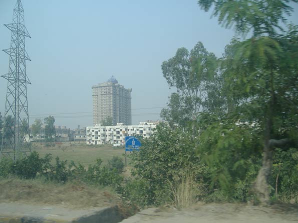
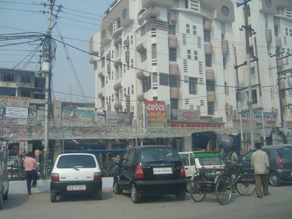
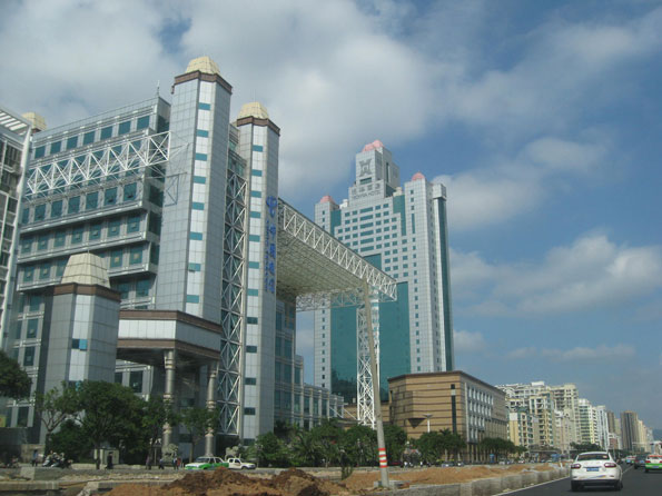
In contrast, the Indian and Chinese spheres, for example, are united by deep-seated commonalities: food, language, historical legacy and national culture. A Taiwanese technologist who works in Chengdu while tapping his network across east Asia, America, and Europe does so largely as a Chinese; an Indian trader in Hong Kong does business with others of his “tribe” in Africa, Great Britain and the former Soviet Republics in east Asia. Beyond national borders, these spheres extend from their home countries to a host of global cities, such as Hong Kong, Singapore, London, New York, Dubai, San Francisco, and Los Angeles, where they have established significant colonies.

The prospects for the last great global grouping, the Anglosphere, are far stronger than many expect. Born out of the British Empire, and then the late 20th Century, the Anglosphere may be losing its claim to global hegemony, but it remains the first among the world’s ethnic networks in terms of everything from language and global culture to technology. More than the Indian Sphere and Sinosphere, the Anglosphere has shown a remarkable ability to incorporate other cultures and people.

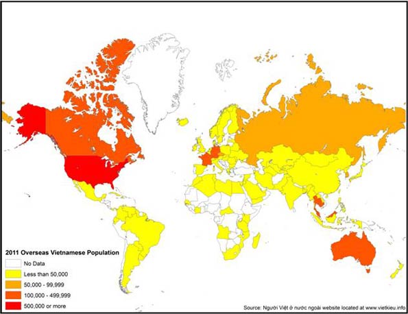
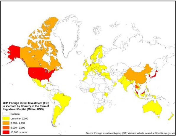
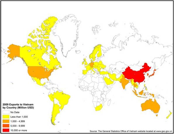
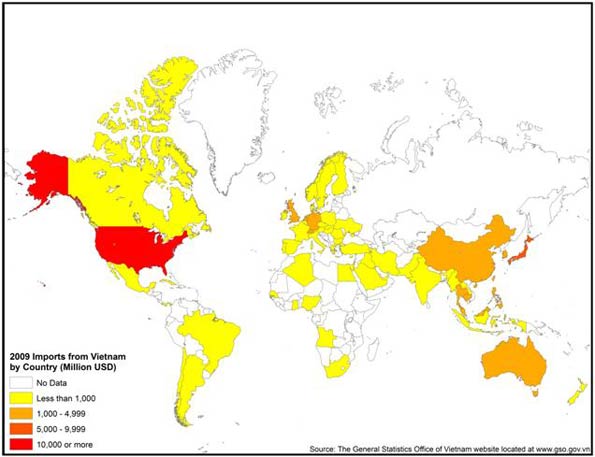
In the future, we will see the rise of other networks, as well. An example would be the Vietnamese sphere of influence, which reflects both the rise of that particular Asian country, and the influence of its scattered diaspora across the world. Culture is key to understanding the Vietnamese sphere: the country’s history includes long periods of Chinese domination that made it resistant to being absorbed into the Sinosphere. Instead, as we argue, Vietnam is likely to be more closely allied, first and foremost, with the United States and its allies.

Finally, our maps deal with basic demographic issues that will dominate the future. We trace the global rise of women to prominence in business, education and politics. Although Western nations still lead in female empowerment, we argue that the most significant changes are taking place in developing countries, notably in Latin America. It will be these women – in Sao Paolo, Mumbai, and Maseru – who increasingly will shape the future female influence on the world.

Yet this positive development also contains the seed of dangers. Female empowerment, along with urbanization, has had a depressing effect on fertility rates, seen first in the highly developed countries, and now increasingly in developing ones. Looking out to 2030, many countries, including the United States and China, will be facing massive problems posed by too many seniors and not enough working age people.

As has always been the case, the emerging world order will face its own crises in the future, with, no doubt, unexpected, unpredictable results. But our bet is solidly on the three spheres of influence which constitute the bulk of this report.

For the full report, visit The New World Order website at the Legatum Institute.

Report authors:

Joel Kotkin is executive editor of NewGeography.com and is a distinguished presidential fellow in urban futures at Chapman University, and an adjunct fellow of the Legatum Institute in London. He is author of The City: A Global History. His newest book is The Next Hundred Million: America in 2050, released in February, 2010.

Sim Hee Juat is currently a research associate with the Centre for Governance and Leadership at the Civil Service College of Singapore.

Shashi Parulekar is an engineer by training. He holds a master’s in finance and an M.B.A. He has worked as a high-tech marketer in Asia for several decades.

Jane Le Skaife is a doctoral candidate in the Department of Sociology at the University of California, Davis. She is currently conducting her dissertation research involving a cross-national comparison of Vietnamese refugees in France and the United States.

Wendell Cox is a consultant specialising in demographics and urban issues, principal of Demographia and a visiting professor at the Conservatoire National des Arts et Metiers in Paris.

Emma Chen is a senior strategist at the Centre for Strategic Futures, Singapore. The views expressed within this article are solely her own. Publication does not constitute an endorsement by the Centre for Strategic Futures, Singapore.

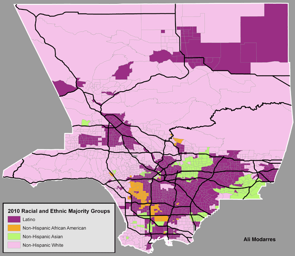
Zina Klapper is Deputy Editor of www.newgeography.com. A Los Angeles-based writer/editor/consultant with a background in journalism, she works in multiple aspects of report presentation. The maps were prepared by Ali Modarres, Professor of Urban Geography at California State University, Los Angeles.

We also owe a debt to our largely volunteer research staff, headed by Zina Klapper, Editor and Director of Research. This includes Gary Girod and Kirsten Moore from Chapman University, to whom we owe a special debt for directed study focused on the maps. We also wish to thank Sheela Bronghir from California State University at Northridge; Malcolm Yiong and Jasmin Lau at the Centre for Strategic Futures, Singapore, and Chor Pharn Lee at the Ministry of Trade and Industry and researcher Erika Ozuna, based in Dallas, Texas. Special thanks to Nathan Gamester at Legatum Institute in London for helping put this project together and seeing it to fruition.


Toyota: How Mississippi Engineered the Blue Springs Deal

$
0
0

A big crowd gathered earlier today to welcome the first Corolla that rolled off the assembly line at Toyota’s tenth U.S. plant in the tiny hamlet of Blue Springs, Mississippi. Situated in Union County, just 17 miles from Elvis’ hometown of Tupelo, the new plant is the latest new automobile manufacturing facility to fly the flag of a foreign manufacturer in the Deep South.

The opening culminates a year of project announcements in the area. Mercedes-Benz will invest $350 million to add capacity to its plant just outside of Tuscaloosa, joining Navistar, the nation’s top manufacturer of school buses and medium-duty trucks, which also announced plans to expand in Alabama. In neighboring Tennessee, eleven automotive related projects totaling $300 million have been announced since June. A commissioner from the state’s economic development office recently said that one third of the manufacturing jobs in the Volunteer State now relate to the automotive sector.

But the growth of the auto industry in the area is not a stroke of fate. “It was a deliberate strategy, a regional strategy,” said David Rumbarger, President and CEO of the Community Development Foundation for Tupelo/Lee County. In 2001, three northeast Mississippi counties, Pontotoc, Union, and Lee, formed the PUL Alliance with the goal of luring a major automobile manufacturer to the area. Two years later, they identified the Blue Springs site, began looking for a tenant, and named the endeavor the Wellspring Project.

“At the time, North Mississippi said, ‘We’ve got to diversity our economy here’ and we narrowed it down to automotive,’” said Josh West, Economic Developer for Pontotoc and Union counties. Nissan’s announcement in 2000 that it would open the state’s first assembly line plant in Canton proved it could be done.

Furniture manufacturers, anchored by Ashley Furniture, Lane Furniture and Southern Motion, had long provided the region’s economic backbone (as recently as the 2007 Economic Census, more workers were employed in the state manufacturing furniture than automobiles). But, as with the textile industry, the industry slowly declined through downsizing and outsourcing, forcing locals to explore how to best capitalize on the area’s skilled labor force. The members of the PUL Alliance also probably couldn’t help but notice that the annual compensation cost for workers making automobiles is three times higher nationwide than for those manufacturing furniture.

Furniture manufacturing provided a good labor basis for the region, West said, “but the computer technology and robotics needed to be taught.” To that end, the PUL Alliance formed a consortium of four area community colleges to offer the skills needed at the Blue Springs facility.

“Each (college) couldn’t teach all the needed courses by themselves,” Rumbarger said, referring to courses on working with sheet metal, tool and dye technology and robotics, among others. “When we put the four institutions together, it helped spread the education of the workforce. It allowed the whole region to upgrade their skills.”

After approaching Ford and other domestic manufacturers (“I spent a lot of time in Detroit," Rumbarger said), Toyota announced in 2007 that it would break ground in Blue Springs, originally to make the Prius; Toyota later announced the plant will make only Corollas. Automakers have generally avoided opening up new plants in states where the United Auto Workers have a long history, choosing instead sites in the South with right-to-work laws that prohibit workers from being forced to join unions if their co-workers do so.

“It’s definitely a benefit to us to be a right-to-work state,” West said, estimating that less than two percent of private employees in the northern Mississippi area belong to unions.

The plant received 35,000 applications for 1,300 available spots, hiring mostly locals, with plans to hire more next year. Of course, a spin-off of every new auto plant is the wealth of suppliers who move into the area, producing seat bumpers, plastics, metals and other auto parts that add an estimated 1,000 jobs to the area. With Nissan’s Canton plant a four-hour drive south, suppliers have additional incentive to set up shop.

According to Rumbarger, economic development officials in the area had a wage target of 15 to 28 dollars an hour for the jobs at the Blue Springs plant, an increase from the average hourly manufacturing wage in the area of $13.50. With the median home value in Union County at $79,200 and a per capita average under $18,000, the wages paid by Toyota should make home ownership easily attainable to its plant employees. The area has also seen an increase of 200 home starts this year compared to last.

“I would speak to community groups and ask if anyone knew somebody who worked for Toyota. A couple of hands would go up,” Rumbarger said. “Now when I pose the question, nearly half of people know somebody who worked for Toyota. That’s the difference over the last 18 months.”

Andy Sywak is the former publisher of the Castro Courier newspaper in San Francisco. He now lives in Los Angeles.

Photo: Toyota Corolla by Paulo Keller

The Best Cities For Technology Jobs

$
0
0

During tough economic times, technology is often seen as the one bright spot. In the U.S. this past year technology jobs outpaced the overall rate of new employment nearly four times. But if you’re looking for a tech job, you may want to consider searching outside of Silicon Valley. Though the Valley may still be the big enchilada in terms of venture capital and innovation, it hasn’t consistently generated new tech employment.

Take, for example, Seattle. Out of the 51 largest metro areas in the U.S., the Valley’s longtime tech rival has emerged as our No. 1 region for high-tech growth, based on long- and short-term job numbers. Built on a base of such tech powerhouses as Microsoft, Amazon and Boeing, Seattle has enjoyed the steadiest and most sustained tech growth over the past decade. It is followed by Baltimore (No. 2), Columbus, Ohio (No. 3), Raleigh, N.C. (No. 4) and Salt Lake City, Utah (No. 5).

To determine the best cities for high-tech jobs, we looked at the latest high-tech employment data collected by EMSI, an economic modeling firm. The Praxis Strategy Group‘s Mark Schill charted those areas that have gained the most high-tech manufacturing, software and services jobs over the past 10 years, equally weighting the last five years and the last two. We also included measures of concentration of tech employment in order to make sure we were not giving too much credence to relatively insignificant tech regions. Our definition of high tech industries is based on the one used by TechAmerica, the industry’s largest trade association.

Despite the Valley’s remarkable concentration of tech jobs — roughly six times the national average — it ranked a modest No. 17 in our survey. This relatively low ranking reflects the little known fact that, even with the recent last dot-com craze sparking over 5% growth over the past two years, the Valley remains the “biggest loser” among the nation’s tech regions, surrendering roughly one quarter of its high -tech jobs — about 80,000 — in the past decade. Only New York City (No. 44) lost more tech jobs during that time.

In contrast to this pattern of volatility, our top performers have managed to gain jobs steadily in the past decade — and have continued to add new ones in the last two years. In addition to our top five, the only other regions to claim overall tech gains in the last 10 years are Jacksonville, Fla. (No. 6), Washington, D.C. (No. 7), San Bernardino-Riverside, Calif. (No. 9), San Diego, Calif. (No. 9), Indianapolis (No. 11) and Orlando, Fla. (No. 24).

So what accounts for high-tech success, and where will jobs most likely grow in the next decade? Certainly being home to a major research university makes a big difference. Seattle, Columbus, Raleigh and Salt Lake City all boast major educational and research assets.

But it’s one thing to produce scientists and engineers; it’s another to generate employment for them over the long term. Clearly for the San Jose metropolitan region (which is home to Stanford) and the much-hyped No. 29 San Francisco area (home to the University of California Medical Center) academic excellence has not translated into steady growth in tech jobs. Over the past decade the Bay Area has given up 40,000 jobs, or 19% of its tech workforce, including a loss of nearly 6,000 in software publishing.

Or look at the Boston region (ranked No. 22), which arguably boasts the most impressive concentration of research universities in the country. The region did add jobs in research and computer programming, but these were not enough to counter huge losses in telecommunications and electronic component manufacturing. Over the past decade, greater Beantown has given up 18% of its tech jobs, or more than 45,000 positions.

One possible explanation may lie in costs, including very high housing prices, onerous taxes and a draconian regulatory environment. In tech, company headquarters may remain in the Valley, close to other headquarters and venture firms, but new jobs are often sent either out of the country or to more business friendly regions.

Just look at the flow of jobs from Bay Area-based companies to places like the Salt Lake area. In the past two years Valley companies such as Twitter, Adobe, eBay, Electronic Arts and Oracle have all expanded into Utah. This region has many appealing assets for Bay Area companies and workers. Salt Lake City is easily accessible by air from California, possesses a well- educated workforce, has reasonable housing costs and offers world-class skiing and other outdoor activities.

Another huge advantage appears to be closeness to the federal government, which expends hundreds of billions on tech products both hardware and software. This explains why Baltimore, primarily its suburbs, and the D.C. metro area have enjoyed steady tech growth and, under most foreseeable scenarios, likely will continue to do so in the coming years. Both regions have seen large gains in technology services industries, particularly programming, systems design, research, and engineering.

Yet even business climate, while important, may not be enough to drive tech job growth. Texas ranks highly in most business surveys, including our own, but it did not fare so well in this one. Indeed No. 32 Austin, often thought as the most likely candidate for the next Silicon Valley, lost over 19% of its high-tech jobs over the past decade, including more than 17,000 jobs in semiconductor, computer and circuit board manufacturing. No. 18 Houston did far better, although it has also lost 6% of its tech jobs over the same period due to the cutbacks in the engineering service, a big sector there. Even more shocking: No. 46 Dallas, generally a job-creating dynamo, has seen roughly a quarter of its high-tech jobs go away, due primarily to losses in telecommunications carriers and in manufacturing of communications equipment and electronics.

How about other potential up and comers for the coming decade? Two potentially big and somewhat surprising winners. The first: Detroit. Though the Motor City area lost 20% of its tech jobs in the past decade (ranking 40th on our list), it still boasts one of the nation’s largest concentrations of tech workers, nearly 50% above the national average. In the past two years, the region has experienced a solid 7.7% increase in technology jobs, the second highest rate of any metro area.

The Motor City region seems to have some real high-tech mojo. According to the website Dice.com, Detroit has led the nation with the fastest growth in technology job offerings since February — at 101%. This can be traced to the rejuvenated auto industry, which is increasingly dependent on high-tech skills. Manufacturing is increasingly prodigious driver of tech jobs; games and dot-coms are not the only path to technical employment growth. This could mean good news for other Rust Belt cities, such as No. 28 Cincinatti or No. 38 Cleveland, as well as our Midwest standout, Columbus, which could benefit from growth sparked by the local natural gas boom.

Another potential standout is No. 8 New Orleans, whose tech base remains relatively small but has expanded its tech workforce nearly 10% since 2009 — the highest rate of any of the regions studied. With low costs, a friendly business climate and world-class urban amenities, the Crescent City could emerge as a real player, aided by the growing prominence of research and development around Tulane University. There has also been a recent growing presence of the video game industry in the city.

Looking forward, however, it makes sense to be cautious about where tech is heading. By its nature, this is a protean industry; the mix of jobs and favored locales tend to change. If the current boom in social media continues, for example, the Bay Area could recover more of its lost jobs and further extend its primacy. Similarly a surge in manufacturing and energy-related technology could be a boon to tech in Houston, Dallas as well as New Orleans. But based on both historic and recent trends, the surest best for future growth still stands with our top five winners, led by the rain-drenched, but prospering Seattle region.


Best Places for High Tech Growth
Ranking of 2, 5, and 10 year growth, industry concentration, and 5 and 10 year growth momentum
Rank Metropolitan Area Rank Score
1 Seattle  82.2
2 Baltimore 75.7
3 Columbus 67.9
4 Raleigh 63.2
5 Salt Lake City 60.0
6 Jacksonville 59.2
7 Washington, DC 58.9
8 New Orleans 58.8
9 Riverside-San Bernardino 58.2
10 San Diego 56.1
11 Indianapolis 55.9
12 Buffalo 55.8
13 San Antonio 54.0
14 Charlotte 53.5
15 St. Louis 51.6
16 Pittsburgh 50.8
17 San Jose 50.5
18 Houston 50.2
19 Hartford 50.0
20 Nashville 49.6
21 Providence 49.2
22 Boston 48.3
23 Minneapolis-St. Paul 48.3
24 Orlando 48.1
25 Portland 48.1
26 Philadelphia 47.4
27 Louisville 47.2
28 Cincinnati 46.6
29 San Francisco 46.6
30 Denver 46.4
31 Richmond 45.6
32 Austin 45.1
33 Atlanta 44.6
34 Virginia Beach-Norfolk-Newport News 42.4
35 Memphis 42.2
36 Milwaukee 41.5
37 Rochester 41.2
38 Cleveland 40.9
39 Phoenix 38.5
40 Detroit 37.7
41 Tampa 37.5
42 Miami 33.2
43 Sacramento 32.1
44 New York 31.4
45 Las Vegas 31.2
46 Dallas-Fort Worth 31.0
47 Chicago 30.2
48 Los Angeles 29.5
49 Oklahoma City 26.7
50 Birmingham 23.5
51 Kansas City 21.6
Rankings measure employment in 45 high technology manufacturing, services, and software industry sectors.


This piece first appeared at Forbes.com.

Joel Kotkin is executive editor of NewGeography.com and is a distinguished presidential fellow in urban futures at Chapman University, and an adjunct fellow of the Legatum Institute in London. He is author of The City: A Global History. His newest book is The Next Hundred Million: America in 2050, released in February, 2010.

Mark Schill of Praxis Strategy Group perfomed the economic analysis for this piece.

Seattle photo courtesy of BigStockPhoto.com.

Urbanizing India: The 2011 Census Shows Slowing Growth

$
0
0

Provisional results from the 2011 census of India show a diminishing population, the lowest since independence in 1947. From 2001 to 2007, India's population grew 17.6%, compared to a 20% to 25% growth rate in previous periods since the 1951 census. Even so, India is expected to virtually catch up with China in population by 2020, with United Nations forecasts showing a less than 1 million advantage for China. By 2025, the UN forecasts that India will lead China by more than 50 million people. Nonetheless, like many other developing nations, falling birth rates are substantially reducing population growth in India.

Moving to the Cities

India’s still strong growth reflects the fact that it remains a principally rural nation. According to the 2011 census, only 31% of the population of India lives in urban areas. Urban migration, of course, is continuing but at a considerably slower rate than in China. According to the United Nations, the urban population of India will be less than 35% in 2020 and approximately 40% in 2030.  Yet despite this, the number of new urban residents will be substantial. By 2030, another 225 million people will be added to the Indian urban areas, more than the population of Japan and Germany combined.

The Largest Urban Areas

During the last decade, the number of urban areas (areas of continuous urban development) in India rose by one half, from 34 to 51 (Table). However, growth was somewhat less than forecast in the largest urban areas, a phenomena that appears elsewhere, such as in now slower growing Mexico City, Sao Paulo, New York and Los Angeles. This pattern seems to be found all around the world, according to a report by the McKinsey Global Institute.


India: Urban Areas Over 1,000,000 Population: 2011
Rank
Urban Area
2001
2011
% Change
1 Delhi, NCT-UP-HAR   15,358,000   21,622,000 41%
2 Mumbai, MAH   16,554,000   18,790,000 14%
3 Kolkata, WB   13,217,000   14,113,000 7%
4 Chennai, TN     6,425,000     8,696,000 35%
5 Bangalore, KAR     5,687,000     8,499,000 49%
6 Hyderabad, AP       5,534,000     7,749,000 40%
7 Ahmadabad, GUJ     4,519,000     6,352,000 41%
8 Pune, MAH     3,756,000     5,050,000 34%
9 Surat, GUJ      2,811,000     4,585,000 63%
10 Jaipur, RAJ      2,324,000     3,073,000 32%
11 Kanpur, UP     2,690,000     2,920,000 9%
12 Lucknow, UP      2,267,000     2,901,000 28%
13 Nagpur, MAH     2,123,000     2,498,000 18%
14 Indore, MP      1,639,000     2,167,000 32%
15 Coimbatore, TN      1,446,000     2,151,000 49%
16 Kochi, KER     1,355,000     2,118,000 56%
17 Patna, BH     1,707,000     2,047,000 20%
18 Kozhikode, KER        880,000     2,031,000 131%
19 Bhopal, MP     1,455,000     1,883,000 29%
20 Thrissur, KER        330,000     1,855,000 462%
21 Vadodara, GUJ     1,492,000     1,817,000 22%
22 Agra, UP      1,321,000     1,746,000 32%
23 Visakhapatnam, AP     1,329,000     1,730,000 30%
24 Malappuram, KER        170,000     1,699,000 899%
25 Thiruvananthapuram, KER        889,000     1,687,000 90%
26 Kannur, KER        498,000     1,643,000 230%
27 Ludhiana, PJ     1,395,000     1,614,000 16%
28 Nashik, MAH      1,152,000     1,563,000 36%
29 Vijayawada , AP     1,011,000     1,491,000 47%
30 Madurai, TN     1,195,000     1,462,000 22%
31 Varanasi, UP     1,212,000     1,435,000 18%
32 Meerut, UP      1,167,000     1,425,000 22%
33 Rajkot, GUJ     1,002,000     1,391,000 39%
34 Jamshedpur, JH     1,102,000     1,337,000 21%
35 Srinagar, JK        971,000     1,273,000 31%
36 Jabalpur, MP      1,117,000     1,268,000 14%
37 Asansol, WB     1,090,000     1,243,000 14%
38 Vasai Virar, MAH        293,000     1,221,000 317%
39 Allahabad, UP     1,050,000     1,217,000 16%
40 Dhanbad. JH      1,064,000     1,195,000 12%
41 Aurangabad, MAH        892,000     1,189,000 33%
42 Amritsar, PJ     1,011,000     1,184,000 17%
43 Jodhpur, RAJ        856,000     1,138,000 33%
44 Ranchi, JH        863,000     1,127,000 31%
45 Raipur , CHH        699,000     1,123,000 61%
46 Kollam, KER        380,000     1,110,000 192%
47 Gwalior, MP        866,000     1,102,000 27%
48 Durg-Bhilainagar, CHH        924,000     1,064,000 15%
49 Chandigarh, CH        809,000     1,026,000 27%
50 Tiruchirappalli, TN        847,000     1,022,000 21%
51 Kota, RAJ        705,000     1,001,000 42%
Data derived from Census of India


Delhi: Delhi (National Capital Territory, Uttar Pradesh and Haryana) was reported by the United Nations to have become the second largest urban area in the world, following Tokyo in 2010. However, the Delhi urban area was nearly 1,000,000 people short of the population than projected by the United Nations. However, over the decade, Delhi managed to become the nation's largest urban area with a population of 21.6 million people, an increase of 41% over its 15.5 million people in 2001 (Note 1). This is an impressive accomplishment, since some demographers have long maintained that Mumbai could be destined to become the largest urban area in the world in future decades.

Mumbai: Mumbai (formerly Bombay), in Maharashtra, placed second with a population of 18.8 million. This compares to a population of 16.6 million in 2001. The Mumbai urban area grow only 14% between 2001 and 2011, a much slower rate than before, driven by declines in the urban core of central Mumbai – another general global phenomena –  and only modest growth in the suburban Mumbai portion of the central city, with explosive growth in the suburban areas outside the central city (Note 2). Mumbai‘s 2011 population is approximately 1.5 million below the level that would have been indicated by the 2010 United Nations projection.

Kolkata: India's third largest urban area, Kolkata (formerly Calcutta), in West Bengal, registered a population of 14.1 million, an increase of only 7% from its 13.4 million population in 2001. Like the two larger urban areas, the current population of Kolkata is less than project by the UN. As in the case of Mumbai the shortfall is by approximately 1.5 million.

Chennai: Chennai (formerly Madras), in Tamil Nadu, ranked fourth among India's urban areas with a population of 8.7 million, up from 6.5 million in 2001. This 35% growth rate propelled Chennai to a population more than 1 million above expectation.

Bangalore: Information technology center Bangalore (Karnataka) was the fastest growing of the urban areas over 5 million people, with a population of 8.5 million, an increase of 49% over its 2001 population of 5.7 million. Should Bangalore's population growth rate continue, it is likely to pass Chennai over the next decade to become the fourth largest urban area. Like Chennai, Bangalore registered a population at least 1 million higher than anticipated.

Hyderabad: Hyderabad (Andra Pradesh), another of the nation's leading information technology areas, rose to a population of 7.7 million people, from 5.5 million in 2001. With a 40% growth rate, Hyderabad exceeded its population estimate by at least1 million people.

Ahmadabad: Ahmadabad, in Gujarat, is the last of the seven urban areas with more than 5 million population had 6.4 million people, which is an increase from 4.5 million in 2001. Ahmadabad grew 41% and achieve the population at least one half million higher than was expected.

Surat: The fastest growing urban area of the 16 Indian urban areas with more than 2 million people was Surat, in Gujarat. Surat grew from 2.8 million people to 4.6 million, for an increase rate of 63%.

The Largest State or Province

The state of Uttar Pradesh registered a population of just under 200 million people in the 2011 census. This makes Uttar Pradesh the largest sovereign national jurisdiction (state or province) in the world. Nonetheless, the largest urban area in Uttar Pradesh has a population of under 3 million: Kanpur. However the Delhi suburbs in Uttar Pradesh, Ghaziabad and Noida are slightly larger than Kanpur.

Soon the Largest Nation

As India edges toward becoming the most populous nation, it is clear that its growing urban areas will occupy more of the top positions among the world's largest urban areas in the years to come. But the pattern here indicates, as elsewhere in the world, that most growth, and the most rapid growth, is occurring not in the largest megacities but in smaller, and perhaps more manageable, ones.

-------

Note 1: This urban area definition includes adjacent urban areas in the state of Uttar Pradesh (Ghaziabad and Noida) and Haryana (Faridabad and Gurgaon, which borders Indira Gandhi International Airport opposite Delhi), which are not considered to be in the Delhi urban area by the census of India but are included in the United Nations definition.

Note 2: This urban area definition includes the adjacent Panvel and the Navi Mumbai-Panvel urban areas. The latter is between Panvel and Navi Mumbai (proper) which is included in the Mumbai urban area by the census of India.

Photographs by Author (Delhi, Mumbai, Kolkata)

Wendell Cox is a Visiting Professor, Conservatoire National des Arts et Metiers, Paris and the author of “War on the Dream: How Anti-Sprawl Policy Threatens the Quality of Life

Is Industrial Strife a Sign of Housing Stress?

$
0
0

Industrial disputes – including a spate of on and off again strikes at national carrier Qantas – are becoming once again a frequent feature of the Australian media. Unions are pushing for wage rises in the face of the falling buying power of the fixed wage (as costs of living rise). Those wage push pressures are being resisted by businesses trying to stay afloat in a very ordinary domestic economy and amidst rising global competition.  

But instead of a conflict between labor and business, perhaps we may consider   lower living costs as a solution which benefits both? Fundamentally, this boils down to addressing our biggest cost burden: housing. 

The rapid escalation of housing costs have occurred under the aegis of Labor dominated state governments. Whether in Queensland, New South Wales or Victoria – Australia’s three largest states – their imposition of artificial growth boundaries that limited land supply, the introduction of upfront taxes on new development, and ever more complex planning and development regulation have driven housing prices to unsustainable levels.

This is ironic since the worst impacts of those policies have been most felt by the very working class constituency which Labor traditionally sought to represent. Having presided over and championed policy mechanisms which have driven up housing costs for workers, these same governments then resist attempts to recover that standard of living through wage growth.

Now before you think I’ve gone all Marxian militant on you all (trust me, I haven’t), here’s an example of what I’m driving at.

Much has been said about housing affordability and what it will mean to lock an entire generation out of the housing market.   Recently this story documents yet another report attesting to falling home ownership and the rise of a renting class.   Particularly hard hit are the people who are trying to buy a first home in which to raise a family. They could typically be around their mid to late 20s, biologically in their prime for having and raising children. At this stage of life, you are probably below the average income for your career or profession so the reality of the affordability problem is most acute.

In Queensland, this might be a teacher in their mid 20s, with two or three years of training, married to a constable who together earn after tax income around $87,500 per annum. (This combined income would be much less of course if, for example, one of our young couple was a child care or retail worker).

Now, take a modest new family home in an outer suburb like North Lakes or Springfield. Let’s assume they’ve saved a small deposit, and with a loan of $400,000, they buy something for around $450,000. That’s hardly McMansion territory. But that loan, over 30 years at 7.8%, will cost them close to $35,000 per annum in repayments, or 40% of their combined after tax incomes.

This, of course, is before they even think about children, and the prospect (despite generous maternity and paternity pay and leave provisions) of enduring a significant household income reduction while one of them isn’t working. Even on returning to work, there would then be child care fees, which quickly erode their pre-child household budget.

Buying a home and starting a family have become a huge financial consideration, instead of a fairly normal and unremarkable pattern of generational and social growth. And it is now absolutely dependent on a dual income family, with both of them preferably good incomes.

This is a profound change over the last decade. As a result, fewer people are buying homes, people are postponing children (until they can afford them) and when they do, they’re having fewer children. A countless stream of statistical and demographic reports are now underlining this change on an all too frequent basis. Although some greens may celebrate it, this is very bad news long-term for the economy, for society and the community as a whole. 

So is it any wonder we’re seeing wage push pressures?

Consider the cost of the $450,000 modest home they’ve bought. Within that price is roughly a $50,000 up-front ‘developer levy’ (better called a new home buyer tax). There’s probably a similar cost of in inflated land costs, brought on by artificial land supply constraints in a country of abundant land. There would also be a raft of minor additional building costs introduced under the guise of ‘green’ or ‘sustainable’ building guidelines, in order   ‘to prevent the sea from rising’. Plus there’s a hard-to-quantify compliance cost because getting the approval to develop the land for new homes now takes 10 years instead of a few months, engaging teams of town planners, lawyers, and other hangers on.

The total cost of all of these additions to the price paid by our young couple could easily be well over $100,000. If you don’t believe me, check out this old report which I commissioned some years ago.

A quick bit of math’s now follows. That extra $100,000 (conservatively) has been funded via our young couple’s mortgage. That’s an extra hundred large they’ve borrowed, to cover the costs of additional taxes, fees and compliance introduced under the watch of a State Labor Government. That $100,000 is worth an extra $8,640 per annum out of their pockets. If their repayments fell by that amount, their mortgage costs would be around $26,000 per annum in total, or just under 30% of their combined household income – not 40% of it.

There you have it. At 30% of household income, not only the home becomes more affordable, but so do children. But at 40%, it’s proving to be touch and go.

There are two ways, simply put, to improve the cost of living equation faced by younger workers on largely fixed incomes. You can increase their wages (which the unions want and which businesses and governments resist), or you can reduce their costs of living.

This has somehow eluded people working in state treasuries and planning departments. I haven’t even commented on the insanity of the carbon tax, which is only going to exacerbate basic costs for energy further and likely weaken Australian exports.

The simple economics of what we’re talking about was summed up beautifully over 160 years ago, in Charles Dickens’ novel David Copperfield, when Mr Micawber lectured the young Copperfield on the perils of exceeding budgets:

"Annual income twenty pounds, annual expenditure nineteen nineteen six, result happiness. Annual income twenty pounds, annual expenditure twenty pounds ought and six, result misery."

Mr Micawber, you’ll note, wasn’t implying the need for more income, he was highlighting the important role played by expenses.

In the Australia (and Queensland) of 2011, the same still applies. Rather than push for more income, unions could do better to lobby their Labor Parties to reduce their living costs. Reducing the housing infrastructure levies, relaxing the rigidity and ideology of urban growth boundaries, reducing compliance costs, cutting green taxes would drive down the costs of housing.   

In this era of globalization, fighting pitched industrial battles with employers for a few extra dollars a week in income seems futile compared to pressuring   governments over the induced inflation associated with the providing a family home you can afford and raise a new generation of Australians.

Ross Elliott has more than 20 years experience in property and public policy. His past roles have included stints in urban economics, national and state roles with the Property Council, and in destination marketing. He has written extensively on a range of public policy issues centering around urban issues, and continues to maintain his recreational interest in public policy through ongoing contributions such as this or via his monthly blog The Pulse.

Photo courtesy of BigStockPhoto.com.

Social Market Housing for the USA: Dream or Nightmare?

$
0
0

Imagine a future America where the home ownership rate climbs from the current 65%1 to 87%2.  Libertarians as well as many social democrats would be cheering.  Imagine that this rate was achieved by the state itself acting as the builder of 88%3 of the housing.  Imagine also that the state imposes rules on home purchases to favor first time buyers and young families. “Progressives”, increasingly tilted towards the unmarried and childless, would bristile.  Imagine racial diversity rules that restrict who you can sell your home to. Time for libertarians to shudder.   

Most Americans would probably say such a concept is “Utopian” but serious policy makers should reflect that the word “Utopia” literally means “nowhere”. But Social Market Housing is alive and well in Singapore. 

For Americans living in the hottest real estate markets, the USA is very far from the ideal of a Property Owning Democracy.  At the time of the 2010 census three of New York City’s five boroughs had home ownership rates under 30% and in the Bronx it was under 20%4.   Though many US politicians support the concept of home ownership it has been declining since 1980 when it reached a peak of 68%5

How have the Singaporeans achieved such high ownership rates despite having the richest economy in South East Asia?  Many factors come into play.  Singapore has an aggressive building program achieved through a public body - the Housing Development Board (HDB).   HDB apartments can only be sold to Singapore citizens and those with permanent resident status, so their prices cannot be inflated by foreign speculators. 

The HDB also has eminent domain powers to claim land if it needs to.  Singapore’s version of social security is not inter-generational (unlike the USA where the current generation of workers pays for the last generation of retirees) but rather an elaborate system of forced saving by both workers and their employers.  Part of the compulsory savings can be used for a deposit on an HDB flat. Finally there is an elaborate system of price discounts on new HDB flats which is not only designed to favor first time buyers, but also young families and newlyweds. 

There is even a category of ‘Executive Homes’ to retain managers in Singapore.  These may be larger apartments or semi-detached homes with gardens. 
There is no problem with runaway maintenance fees.  HDB owners do not pay associations dues.  Their elevators are maintained through local real estate taxes so monthly costs are very predictable.  In the year 2010 the average Singaporean household paid $145 USD a month in property tax6
.  This is less than the $216 average USD American Condo owners paid in condo fees at the time of the 2000 census.

Some Americans might argue that this can only work because Asians are conformist and are culturally more receptive to rule-based systems.  I do find that South East Asians are reluctant to draw attention to themselves in public.  When I talk in a Starbucks with my normal New York speaking voice I sometimes look up and find myself orating to a group of open-mouthed onlookers (“I’m so sorry it’s the Tourette’s Syndrome – my shrink keeps forgetting to up my dosage.”)

Many US politicians recoil against the state as a real estate developer largely because tenanted housing projects have been such a magnet for social problems.  The St. Louis public housing scheme, Pruitt-Igoe, was eventually dynamited (see photo right7).  The author of “The Death and Life of Great American Cities”, Jane Jacobs, famously complained that the public housing projects took some mixed income neighborhoods which could have been viable and sealed their doom by concentrating too many low income and unemployed people in the same buildings. 

Singapore’s HDB does act as a direct landlord for a very small number of people who meet a strict income ceiling (about $1160 USD a month8), however the low income tenants are spread thinly among owner occupiers. Income ghettoization is limited. My realtor tells me that one of the blocks in my own HDB estate is for tenants rather than owners but from the outside I cannot tell which building it is.  Another form of deliberate social mixing takes the form of racial quotas intended to prevent the formation of ethnic enclaves.  If the percentage of people in a given racial group has already met the national quota you can be blocked from selling or renting to a person in that category. Access to the more attractive and less attractive neighborhoods is thus shared out more equally.  This looks like a policy American cities should consider given that the 14th amendment, busing and affirmative action have yet to produce full integration. 

One aspect of America’s public housing projects that particularly angered Jane Jacobs was the wholesale removal of small retailers.   In theory “The Projects” could have included small commercial spaces at the ground floor but generally public rental buildings in most of the US are considered to be danger zones where retailers fear to tread. 

Typically the ground floor of HDB buildings is a void space where retailers can create businesses. Often they are left empty but sometimes the policy works well.  Near Singapore’s Clementi MRT train station many dozens of “mom and pop” stores are now sheltering under the HDB apartments; late night street life is vibrant.  When I ask Singaporeans to name a neighborhood that would be dangerous to go at night, nobody can think of one.  The country’s homicide rate would pose an absolute disaster for TV script writers.  You could not have a CSI series or Law and Order because Singapore would not be able to supply the requirement of one murder per week.  The homicide rate is currently about one tenth of the USA’s9.

If she were alive today Jacobs might also criticize the HDB apartment blocks for excessive architectural uniformity.  She loved communities to have buildings with different age profiles.  But most of Singapore’s buildings are so new the option of preserving the old simply does not exist. Greater architectural variety is an attractive goal.  One Singaporean architect commented that they will really have the styles right with you can build an HDB block next to a private condominium and you cannot tell which is which (a sort of urban planning version of the Turing Test).  Local architects are point to a new HDB building, the Pinnacle at Duxton, as an example of a new look more comparable with private designs (pictured right).

But would greater variety cause costs to escalate?  Observing new HDB construction it is possible to discern a very advanced form of modular building; entire concrete rooms are hoisted into the air at the end of a crane.  Certainly a wider range of designs could be achieved using the same building blocks.  Kids can make a huge variety of things with Lego.  The same cuboids could also make homes with gardens which are America’s preferred form of housing--- a gift of an expansiveness impossible to achieve, except in dreams or by immigration, in Singapore.

Is Social Market Housing a good model for the USA? Certainly there would be many objections but the ideal of home ownership is too often an American Dream that disappears into a distant future. Are we doing enough to create a Commonwealth with “Liberty and Justice for All?” When they say the Pledge of Allegiance we force or children to use the words “Indivisible” and “One Nation”.  Are we enough to make those words a reality?

Philip Truscott is a Senior Lecturer at Singapore University of Technology and Design
Notes:

Lead photo of HDB flats courtesy of BigStockPhoto.com. Other photo image files from  http://commons.wikimedia.org

---------------------------------

 1 US Census Bureau, (2011), “Housing Characteristics: 2010”, Washington DC: Bureau of the Census. Accessed on 19/11/2011 from http://www.census.gov/prod/cen2010/briefs/c2010br-07.pdf

2 SINGSTAT, (2011), “Statistics Singapore: Key Annual Indicators”, Singapore: Department of Statistics. Accessed on 19/11/2011 from <http://www.singstat.gov.sg/stats/keyind.html#hhld>.

3 SINGSTAT, (2008), “Key Indicators of Residential Households”, Singapore: Department of Statistics, Accessed on 19/11/2011 from <http://www.singstat.gov.sg/stats/themes/people/hhldindicators.pdf>.

4 US Census Bureau, (2011), “Housing Characteristics: 2010”, Washington DC: Bureau of the Census. Accessed on 19/11/2011 from <http://www.census.gov/prod/cen2010/briefs/c2010br-07.pdf>

5 This is based on a cross-tabulation of the variables “ownership” and “year” from the IPUMS online data analysis system at this URL http://sda.usa.ipums.org/cgi-bin/sdaweb/hsda?harcsda+1850-2009

6 Singapore Gross Property Tax Revenue from SINGSTAT, “Public Finance” at http://www.singstat.gov.sg/pubn/reference/yos11/statsT-publicfinance.pdf  The number of resident households has been taken from the Census of Population 2010 at <http://www.singstat.gov.sg/pubn/popn/c2010sr2/t20-25.pdf>

8 HDB, (2011), “Homes for All”, Singapore: Housing Development Board.  Accessed on 19/11/2011 from < http://www.hdb.gov.sg/fi10/fi10221p.nsf/Attachment/AR0405/$file/home5_frameset.html>.

9 UNODC, (2011), “Homicide level for 2010, or latest available year”, Vienna: UN Office on Drugs and Crime, accessed on 17/11/2011 from < www.unodc.org/documents/data-and-analysis/statistics/Homicide/Homicide_level.xlsx >.

Mass Transit: Could Raising Fares Increase Ridership?

$
0
0

Conventional wisdom dictates that keeping transit fares as low as possible will promote high ridership levels. That isn't entirely incorrect. Holding all else constant, raising fares would have a negative impact on ridership. But allowing the market to set transit fares, when coupled with a number of key reforms could actually increase transit ridership, even if prices increase. In order to implement these reforms, we would need to purge from our minds the idea that public transit is a welfare service that ought to be virtually free in order to accommodate the poor. Concern about poverty should drive welfare policy, not transit policy. Persistent efforts to keep public transit fares as low as possible are a big part of the reason that public transit ridership in North America has hit record lows. To increase ridership, transit agencies have to convince people who can afford to drive that transit is a better option. Convenience, and not lower prices, is the key.

There are three basic reasons that private automobiles have virtually crowded out transit. First, private automobiles are inherently more convenient for a large segment of the population. Transit routes are naturally limited to well-traveled corridors, which are often slower because of wait and stop times. On the other hand, you can get into your car and immediately take the most efficient route to your destination.

The second factor is free roads. While people do pay for roads, they don't pay for using specific roads at specific times. Gas taxes go into general revenues, and road construction and repair isn't directly connected to usage. As a result, a large percentage of roads are subsidized by travelers who use a small percentage of highly traveled routes. Similarly, drivers don't pay more during peak times than non-peak times. They instead pay with their time, by waiting in traffic.

The third factor is that the market dictates private automobile sales. This is important because automobile companies and dealerships have an incentive to keep prices competitive while selling a high quality product. It also ensures that there are a multitude of different types of automobiles, and differing finance schemes and secondary markets tailored to a range of needs. The private sector is great at marketing things to people; government isn't.

While public transit can never be as flexible as private automobiles, some of the automobile's advantages can be reduced. Road tolls and congestion pricing ought to be implemented where practical. Ironically, offsetting these new fees by reducing the gas tax would actually also be beneficial for transit services. After all, the only reason many impractical roads are built is that they are financed out of general revenue. If roads were primarily financed by those who used them, more funding would go to highly traveled urban roads, and less would go toward subsidizing sprawl.

Here's the controversial aspect of the solution: Transit should operate on a for profit basis and its prices should closely reflect market forces — even if it means that transit fares increase.

Mass transit has one major advantage: where there is sufficient demand, transit is inherently cheaper than private automobile usage because the costs are spread over many people, making the per person cost lower. That's why most people fly with commercial airlines instead of chartering private jets, for example. But keeping the price too low reduces the ability of transit service to provide more routes. And this is important. While there is a segment of the population who are stuck with public transit no matter how inconvenient it is, most people won't ditch their cars unless they can get to their destinations relatively quickly. And it may not be economical for a transit system to get them to many of those places for $2.25.

A flat price structure subsidizes inefficient routes with efficient ones. But what if transit services charged the full cost for less efficient routes? While charging more for less popular routes may seem like it would reduce ridership, it wouldn't. If people knew that there were many additional routes going to out-of-the-way locations that they don't ordinarily frequent, they would still positively factor it into their calculation of whether or not they need a car. After all, paying $5 to get to an out of the way destination occasionally is still cheaper than getting a cab, and can often be cheaper than the cost of driving. Transit systems have higher ridership in major centres than in small centres, even when the fares are high. Transit is not only cheaper than driving in dense cities, it's also equally or more convenient.

But just allowing prices to fluctuate isn't enough. For a price system to function properly there needs to be an incentive to keep prices as low as possible. Public monopolies don't have this incentive. Furthermore, there needs to be competition to ensure high levels of service. The reason that air travel service is so high quality and cheap is because it is private, not public.

The thought of privately delivered public transit will no doubt turn some people off, especially public sector employees. And simply removing government from the transit business isn't necessarily the best solution. Instead, municipal transit services should be turned into transit commissions that coordinate and contract for transit from competing companies. Transit companies would bid on routes, and pay the city a fixed cost for the right to service each route based on a competitive auction.

For less cost efficient routes, a city could even offer a small subsidy per rider, should no transit company enter a bid. Whichever company would be willing to service that route at the lowest subsidy level would win. This would maintain downward pressure on costs. But it would be important that the transit commission use this as a last resort. Otherwise it could undermine the competitive market process by creating the incentive for companies not to bid on many marginal routes until a subsidy was offered.

Collecting variable rates for trains is simple, but it would be more difficult for buses. One method would be to have buses classified as local, express, or commuter, for instance. Each would charge a different rate. An automated payment system could be installed where riders swiped their cards on the way in and out, as they do on the Washington DC Metro, to calculate the rate.

Changing the operating and pricing structure wouldn't alter the way that people use transit services. Transit vehicles would still work on a coordinated schedule, and collect fees from riders as they always have. What would change is that the competing companies would have an incentive to keep operating costs lower, and to provide more routes. They also would have to meet performance guidelines monitored by the city, or face fines. What would change is the philosophy of transit companies. They would be out to make a profit.

This may seem like a radical departure, but consider that London, England, contracts out its bus service. If one of the world's busiest cities can co-ordinate a public-private partnership of this magnitude, there is no reason smaller cities couldn't do the same. The key is to create the right incentives and institutions. The current model of treating transit as a welfare service has failed. It is time to make transit the first choice for commuters, not the last.

Steve Lafleur is a Policy Analyst with the Frontier Centre for Public Policy.

Image from BigStockPhoto.com: A metro bus in Madison, Wisconsin.

Good Morning, Vietnam

$
0
0

While many experts are pronouncing the demise of the American era and the rise of China, other East Asian nations complicate the picture. As America continues to participate and extend its influence in the dynamic Asian market, there may be no more suitable ally than its old antagonist, Vietnam.

In some senses, Vietnam has emerged as the un-China, a large, fast-growing country that provides an alternative for American companies seeking to tap the dynamism of East Asia but without enhancing the power of a potentially devastating global competitor. With 86 million people, Vietnam may not offer as large a market, but it has strong historical, cultural, and strategic reasons to lean towards America.

Why an un-China?

Vietnam has deep historical reasons for wanting to link closely with the United States and its other allies, such as Singapore, Thailand, South Korea, and Japan. Some of this has to do with the country’s unique history. While France, Japan, and the United States were at times deeply and bloodily entangled with the country, by far the biggest threat to Vietnam has always been its looming neighbor to the north.

France, Japan, and the United States intervened in Vietnam for comparatively short periods of time. In contrast, China has had an unrelenting interest in Vietnam and its 2,140-mile coastline ever since its nearly thousand-year rule over the country from 111 BC to 938 AD. The two countries have been embroiled in numerous territorial disputes over the years, with the most recent one involving the South China Sea, which has important shipping routes and is believed to contain rich oil and gas deposits.

Many Vietnamese see some of their former colonialist or “imperialist” powers as necessary allies in protecting themselves from escalating territorial threats from China. Opening Cam Ranh Bay naval base to foreign warships, notably to those from the United States, is an illustrative example of Vietnam’s defensive strategy during the unfolding geopolitical competition.

Amid the maritime tension between China and Vietnam regarding the oil-rich Spratly and Paracel islands in the South China Sea, the United States in 2010 successfully negotiated with Vietnam to reopen Cam Ranh Bay to foreign warships besides Russia. The bay will take approximately three years to rebuild and the primary foreign visitor is expected to be the United States.  “The regular presence of U.S. warships at Cam Ranh Bay might make China think twice about using coercive military diplomacy against Vietnam,” noted Ian Storey, a fellow at the Institute of Southeast Asian Studies in Singapore.

The rise of the diaspora

Perhaps the greatest thing tying America to Vietnam is people. When the Communist government overran the former South Vietnam in 1975, several million Vietnamese fled the country. The Vietnamese eventually settled in 101 different countries and territories throughout the world, with the majority of them heading to the United States, France, Canada, and Australia. There are currently about 4 million Vietnamese living outside of Vietnam. Some settled in the former colonial ruler, France, and others in Australia, Canada, and Singapore. But the bulk—roughly 40 percent—moved to the United States, which is now by far the largest settlement of overseas Vietnamese. About 2 million Vietnamese are estimated to live in the United States (see map of “Overseas Vietnamese”).

Overseas Vietnamese Population

Hostile to the Communist regime, the overseas Vietnamese population turned away from their homeland , focusing instead on building new lives in their host countries. They flourished particularly in the United States, clustering in places such as Orange County and San Jose, California, as well as Houston and New Orleans. In 2009, they were enjoying levels of prosperity comparable to the national average, with a median family income of $59,129 and 64.6 percent owning homes. Vietnamese are also three times more likely to be in such fields as information technology, science, and engineering than other immigrants, and have one of the highest rates of naturalization—72.8 percent.

Contact between this dynamic diaspora and the homeland was constrained by the two governments for decades. After the Vietnam War, the United States had placed a strict embargo against Vietnam and prohibited any political or economic relations between the two countries. The Vietnamese refugees who sought to reconnect with their relatives in Vietnam had to rely on neutral third-party countries to act as an intermediary in sending various goods and money back to needy family members.

For their part, the Communist regime conducted stringent inspections of packages and letters sent to Vietnam. The Vietnamese government also imposed heavy taxation on financial remittances, which discouraged money transfers through official channels.

Desperate to help close relatives left behind in their impoverished homeland, many Vietnamese Americans were forced to invent creative alternatives to formal remittances. According to Yen Do, the creator of Nguoi Viet, the most prominent Vietnamese newspaper in the United States, overseas Vietnamese would hide American dollars inside pill bottles sent through either French or Canadian shipping companies.

With tens of millions of Vietnamese starving in Vietnam despite the clandestine remittances, the Vietnamese government eventually realized that they had to either change their economic strategy or suffer the debilitating consequences of a continually declining economy.

Remittances have played a critical role in reviving the economy. Last year alone the diaspora sent an estimated $7.2 billion into the country, according to the World Bank. This comprised about 7 percent of Vietnam’s overall GDP in 2010. A 2010 study conducted by Wade Donald Pfau and Giang Thanh Long revealed that 57.7 percent of all international remittances being sent to Vietnam in 1997-1998 came from the United States.

The growing symbiosis of Vietnam with its diaspora, particularly in the United States, will shape the rapid development of the country. Nowhere will this impact be felt more than in major cities such as Hanoi, Danang, and especially Ho Chi Minh City (the former Saigon). “We are seeing more of the expatriates here, and they are bringing management skill and capital through their family networks,” notes economist Le Dang. “They are a key part of the changes here.”

The rise of a new dragon

Aware of the enormous progress being made in China with its liberalization, in 1986 the Vietnamese government made the crucial decision to begin the Renovation Process—also known as Doi Moi—and reform the closed communist economy. It was the first official step that Vietnam had made towards opening its economic doors to the rest of the world.

With the collapse of the Berlin Wall in 1989 and the subsequent fall of other communist powers in the world, the United States eventually responded to the improved political relations with Vietnam by lifting the 20-year-old embargo against its former foe in 1995. This put Vietnam on the fast track toward economic liberalization and ultimately helped it transition from a developing country to a middle-income country with a GDP per capita of more than $1,000. The International Monetary Fund estimated Vietnam’s GDP per capita as $1,155 for the 2010 fiscal year.

Yet, in sharp contrast to China—where the largest sources of capital came from Chinese diaspora havens such Hong Kong, Taiwan, and Singapore—most of the money that revived the economy came from outside Southeast Asia. In particular, the biggest investor turned out to be the old arch-enemy, the United States, followed by another former “imperialist” power, Japan. China, now the world’s fourth-largest foreign investor, lagged behind much smaller regional economies, including South Korea, Thailand, and Malaysia, as well as the Netherlands (see map of “FDI by Registered Capital”).

FDI in Vietnam by Country

This is all the more remarkable given China’s huge expansion of investment with other developing countries. Over the past decade, China has expanded its capital flows both into other parts of Southeast Asia, including Laos and other Mekong Delta nations, as well as resource rich regions of the Middle East, Latin America, and Australia. Yet Vietnam, with its rich agriculture, fisheries, and developing energy industry, has stayed largely outside the emerging Sinosphere.

Trade winds

The tilt in investment is also borne out by trade patterns. Vietnam has seen, like most countries, a flood of Chinese goods, but it has also developed a strong appetite for exports from other countries, notably Japan, South Korea, and the United States (see map of “Exports to Vietnam”).

Exports to Vietnam by Country

But perhaps the best measure of Vietnam’s emergence as an un-China can be seen in its own burgeoning exports, which increased from about $5 billion to over $70 billion over the past three decades. The United States has emerged as by far Vietnam’s largest market, with more than $10 billion in annual trade. Japan ranked a strong second, with China lagging behind.

This is all the more remarkable given that Vietnam possesses many things China needs and the two countries share both a border and obedience, at least nominally, to the same ideology. Vietnam seems to be making a choice to diversify itself away from China and avoid the semi-colonial status that many of China’s neighbors—notably Cambodia, Laos, and Myanmar—seem to have tacitly accepted (see map of “Vietnamese Exports”).

Imports from Vietnam by Country

This rising engagement with the global economy has brought great benefits. According to the CIA World Factbook, the country’s poverty rate has dropped from 75 percent in the 1980s to 10.6 percent in 2010. In terms of economic output, a brief on Vietnam by the World Bank reported that between 1995 and 2005 real GDP increased by 7.3 percent annually and per capita income by 6.2 percent annually.

Why Vietnam matters to America

Hanoi today—and even more so Ho Chi Minh City, the former Saigon—recalls China in the 1980s. But there are crucial differences. State-owned companies in Vietnam lack the depth and critical mass of their Chinese counterparts and are thus less likely to pose an immediate competitive threat to the United States and other foreign countries.

Still, this is clearly a country on the way up. Many rural residents—still roughly 70 percent of the population—continue to pour into Hanoi and other cities, but without the same desperation that characterizes, for example, people moving from Bihar to New Delhi or Mumbai. There is nothing of the kind of criminal elements that fester in the favelas of Brazil or Mexico City’s colonias.

More important still are the “animal spirits” of the place. Adam Smith—or Jane Jacobs for that matter—would enjoy the  very un-socialistic frenzy as motorcyclists barrel down the streets like possessed demons, with little regard to walking lanes or lights. Everyone not on the government payroll seems to be hustling something, or looking to. It reminds one of the Vietnamese outposts in Orange County, California, or in Los Angeles’ Chinatown, which is now largely dominated by Chinese from Vietnam.

Le Dang Doanh, one of the architects of Doi Moi, estimates that the private sector now accounts for 40 percent of the country’s GDP, up from virtually zero. But Le Dang also estimated that as much as 20 percent more occurs in the “underground” economy where cash—particularly U.S. dollars—is king.

“You see firms with as many as 300 workers that are not registered,” the sprightly, bespectacled 69-year-old economist explains. “The motive force is underground. You walk along the street. I followed an electrical cable once and it led me to a factory with 27 workers making Honda parts and it was totally off the system.”

This energy is in part a product of demographics. Most of the people you see in these unofficial workshops are in their 20s and 30s. And unlike what you see in China, these workers also have children. Vietnam may be modernizing and getting richer, but it also enjoys a growing population.

These trends have enormous long-term consequences. According to the CIA World Factbook, 69 percent of the approximately 86 million people in Vietnam are currently between the working ages of 15 and 64. In the next four decades the Vietnamese workforce is expected to expand rapidly; at the same time, it will contract dramatically in Japan, Taiwan, Singapore, South Korea, and China. As these countries amble into what demographer Nick Eberstadt has called a “fertility implosion” that will lead to a rapid aging of the workforce, Vietnam will remain relatively young.

Already this enormous source of cheap labor has compelled investors around the world to look toward Vietnam as a way to simultaneously cut costs and increase profits. But more important still is the rapid growth of education. The country enjoys nearly 95 percent literacy.

This combination of a growing and skilled workforce represents the same combination of factors that previously led to rapid growth in other Asian countries, from Japan in the 1960s to South Korea and Taiwan in the 1980s, and China more recently. One local investment house, Indochina Capital, estimates that by 2050 Vietnam’s economy will be the world’s 14th-largest—ahead of Canada, Italy, South Korea, and Spain.

Combined with the strong human ties and its aversion to domineering neighbors, these factors suggest that Vietnam may well prove itself as valuable an ally and trade partner to the United States as it was once an irrepressible enemy.

This piece originally appeared at The American.

Joel Kotkin is executive editor of NewGeography.com and is a distinguished presidential fellow in urban futures at Chapman University, and an adjunct fellow of the Legatum Institute in London. He is author of The City: A Global History. His newest book is The Next Hundred Million: America in 2050, released in February, 2010.

Jane Le Skaife is a doctoral candidate at the University of California, Davis. She is currently conducting her dissertation research involving a cross-national comparison of Vietnamese refugees in France and the United States.

Accompanying maps were prepared for Legatum Institute by Ali Modarres, chairman of the Geography Department, California State University at Los Angeles.

Photo courtesy of BigStockPhoto.com

.


The Evolving Urban Form: Delhi

$
0
0

It has been a time of ups and downs for Delhi, which has emerged as the largest urban area (area of continuous urban development) in India. By a quirk in the Census of India definitions, an urban area (urban agglomeration) may not cross a state or territorial boundary. As a result, Delhi continues to be the second largest urban area in India according to the Census of India.

However, as a Population Reference Bureau reported, the population of the urban expanse of Delhi had exceeded that of Mumbai by 2007 to become the largest urban area. In 2007, the Population Reference Bureau noted that the continuous urbanization of Delhi extended into the adjacent states of Haryana and Uttar Pradesh (which has largest population of any sub-national jurisdiction in the world).

In 2010, the United Nations placed the Delhi urban area population above that of all other urban areas in the world with the exception of Tokyo. This second ranking position was only temporary, since new census data showed stronger growth in Jakarta (Jabotabek) and Seoul. These developments, along with a smaller than anticipated population in the interstate Delhi urban area dropped Delhi to fourth position after the 2011 census. Even so, with its stronger growth, and given the plummeting birth rates in Korea, it can be expected that Delhi will exceed the population of Seoul within one or two years.

Delhi has experienced some of the quickest and most substantial urban growth in the history of the world. Since the 1951 census, Delhi has grown from under 1.5 million people to a population of 22.6 million in 2011 (Figure 1). Delhi has been one of the fastest growing urban areas in history and (along with Jakarta, Seoul and Manila) has added approximately 20 million people over the past 60 years. Only Tokyo has added more new residents than these four urban areas, (25 million population).

The national capital of India is the city of New Delhi (Note 1), which is a district of the National Capital Territory of Delhi. New Delhi is a fully planned national capital that is among the most impressive in the world, with broad expanses of green space not unlike that of Washington, DC. New Delhi became the capital in 1911, replacing Kolkata and much of the planned capital area was completed by the 1930s.

An Interstate Urban Area

This interstate urban area includes all of the urbanization of the National Capital Territory, which includes the urban core, as well as the adjacent Gahziabad and the Noida urban areas in the state of Uttar Pradesh and the Faridibad and Gurgaon urban areas in the state of Haryana.

Between 2001 and 2011 (Figure 2):

  • The population of the inner area, which includes New Delhi and the Central, North, Northeast and East districts of the National Capital Territory grew 15 percent. This area accounted for 10 percent of the urban area growth.  Consistent with the experience of other inner areas (such as Mumbai, Shanghai, Chicago and Kolkata), inner core of this area (New Delhi and the Central District) lost population between 2001 and 2001 (14 percent).
  • The balance of the urban area inside the National Capital Territory grew by 2.8 million people, an increase of 33%. This area captured 47% of the interstate urban area population growth.
  • The urban areas outside the National Capital Territory grew slightly less, at 2.7 million and accounted for 44% of the interstate urban area population growth. These outer areas grew by far the fastest, from 2.6 million to 5.3 million, an increase of .


Map of Dehli districts courtesy of wikipedia user Deeptrivia

Between 2000 and 2011, the strongest growth was in the urbanization in Uttar Pradesh and to the southwest in Haryana.

Gurgaon (photograph below), in Haryana, abuts Indira Gandhi International Airport on the south side, has emerged as an important corporate and information technology center. Gurgaon grew from 250,000 people in 2001 to 900,000 in 2011.

Ghaziabad (photograph below), in Uttar Pradesh, is located adjacent to Delhi's Northeast district and is the largest of the urban expanses beyond the National Capital Territory, having grown from approximately 975,000 people 2001 to more than 2,350,000 people in 2011.

Noida (photograph below), in Uttar Pradesh, is another business center, is a special econonomic zone and includes a software technology park). Noida is located in Delhi and grew from approximately 300,000 in 2001 to nearly 650,000 in 2011.

Faridabad (photograph below), in Haryana, is located directly to the south of the National Capital Territory and had the slowest percentage growth among the urban expanses beyond the National Capital Territory, growing from 1,050,000 people in 2001 two 1,400,000 people in 2011.

The preponderance of growth in the suburban areas mirrors the trend in the previous census. Between 1991 and 200l, 26% of the growth was in the inner area and 74% of the growth in the outer areas of the National Capital Territory.

Common Threads

Even with its somewhat less than expected growth over the past decade, the Delhi continues to be among the fastest growing metropolitan regions in the world. Including adjacent rural areas, the Delhi metropolitan region (Note 2) added approximately 6.0 million people between 2001 and 2010 (growing from 20.4 million to 26.4 million). This compares to the 10 year gain of 7.4 million in Jakarta, 6.6 million in Manila and Shanghai and 6.1 million in Beijing.

The Delhi urban area illustrates the same pervasive urban growth trend evident around the world. As urban areas become larger, they tend to grow most rapidly on their periphery as opposed in the core. As a result, contrary to popular misconception, they are overall becoming become less dense. In Delhi, as well as in all of the other urban areas or metropolitan regions examined in the Evolving Urban Form series, growth is concentrated in the suburbs and further out on the periphery.

----

Note 1: The city of New Delhi is officially the capital of India. It is, however, only a small part of the National Capital Territory of Delhi. The city of New Delhi had a population of 134,000 in 2011, down one-quarter from 169,000 in 2001. While the term "New Delhi" has often been used to denote the urban agglomeration, both the government of India and the United Nations refer to the urban agglomeration as Delhi.

Note 2: This metropolitan region definition includes the National Capital Territory and the Ghaziabad and Gatam Buddha Nagar (Noida) districts of Uttar Pradesh and the Gurgaon and Faridabad districts of Haryana (districts are analagous to counties in the United States).

Top Photograph: India Gate in New Delhi. All photos by author

Wendell Cox is a Visiting Professor, Conservatoire National des Arts et Metiers, Paris and the author of “War on the Dream: How Anti-Sprawl Policy Threatens the Quality of Life

Will You Still House Me When I'm 64?

$
0
0

In the song by the Beatles, the worry was about being fed and needed at 64. Things have changed. If the Beatles wrote those lyrics today, the worry instead might be about housing.

Australia’s aging population is an inevitability. As our replacement rate falls (we’re having fewer children per family) and life expectancy extends, the proportion of over 65s will double in 40 years. In raw numbers, there were 2.5 million over 65s in 2002, and this will rise by 6.2 million in 2042. That’s an extra 4 million in this demographic. Have we given enough thought to where they’re going to live, and what styles of housing they might prefer?

There have been a number of developers who have understood the looming significance of Australia’s aging population, and who have sought to supply the ‘retirement living’ market with product that suits. At one end have been the glitzy apartment style residences in inner city locations, while at the other have been the aged care ‘homes’ provided for those in need of access to nursing care or medical assistance, or at least the reassurance of it being present.

Running parallel with the provision of retirement living or seniors living projects has been an assumption that, once ready to abandon the family home of many years, seniors will be happy to move across town and relocate to the facilities that are available. Perhaps this is hangover from the days when retirement or aged care living was provided on Stalinist lines: our oldies were forcibly shuffled off to some retirement centre well away from the rest of the community they grew up in. A sort of gulag for grumpies?

But what if seniors simply want a change of housing style within their community? What if they don’t want to move across town to the only available accommodation because they would prefer to continue to live in the neighbourhood and community they have spent a large part of their lives living in? They may want to continue to shop with ‘their’ local butcher, visit their local supermarket, newsagent, bank branch (if it still exists) and generally remain connected to the people and places that they’re familiar with – including (quite possibly) members of their family, children and grandchildren.

Meeting that need in the future is going to be close to impossible unless planning schemes (old fashioned zoning laws) adopt a more flexible approach. Flexibility will be needed because most of the existing suburbs of our major population centres are largely built out and will require retrofits and redevelopment of existing stock to accommodate senior’s housing preferences. Generally, the only tracts of undeveloped land capable of meeting seniors housing needs tend to be on the outskirts and while there’s nothing wrong with fringe development, it seems unfair to expect seniors to relocate across town to regions they’re unfamiliar with and to alienate themselves from their community simply because supply side mechanisms (controlled by planning schemes) don’t permit choice.

Further, the built out status of our ‘established’ suburbs – as they now stand – is something that much planning law seems to want to preserve for time immemorial. It’s a little bit like imagining that someone has declared the existing housing mix and styles a fixture of permanency: let’s put a giant glass dome over it all and call the city a museum – because we don’t (it seems) want anything to change.

But if we are to allow Australia’s seniors to ‘age in place’ and to ensure our markets provide choice, it’s going to mean some things will need to change, given the likely levels of future demand. The fastest growth of aging populations will be around our ‘middle ring’ suburbs and given the overwhelming preference to ‘age in place’, it is these suburbs that are going to have to change if those needs are to be met.

What will that change look like? The psychology of seniors in years to come – even today – is going to be different to those of previous generations. They’ll likely be more active rather than sedentary. The family home that’s served them to this point may now be simply too big for their needs, or contain too many stairs (the artificial hip or knee doesn’t like too many stairs). Their future housing needs will vary widely - some will be happy with apartments in high to medium density developments (elevators to their level of living means no stairs) while others (generally the majority) will prefer smaller, detached or semi-detached, single level dwellings. Many may want a small yard or garden (or at least a large balcony or terrace if in a unit), and perhaps want to keep a small pet dog or cat. They may want a spare bedroom for visitors or for babysitting grandchildren. They will probably prefer to be close to shops and near to public transport. And the majority will want to find something of that nature generally within the same community they’ve been living in. It is unlikely they’ll be searching for the ‘retirement home’ style of assisted care living until they’re well into their later years when their choices will be more limited.

Their problem will be that developers will struggle under current planning schemes to get approval for semi-detached housing designed with seniors in mind, if it means amalgamating some detached residential dwellings near local shops, because that land use is highly protected. They will struggle to gain approval to convert a large single site into medium or high rise in areas near local shops or transport, because the community will likely object – particularly if it’s in a neighbourhood where low density prevails (typical of most of suburban Brisbane). Advocates of Transit Oriented Development (TOD) style development might now be shouting at this article that ‘TODs are the answer.’ That might be so, if only one single TOD had been delivered during the past 15 years we’ve been talking about them.

Plus, the majority of proposed ‘TOD’ style development areas largely surround inner city transport nodes. Not much use if you’re in Aspley and want to stay there. And of course there’s the reality that multi level apartments are much more costly to develop and construct than the cottage building industry’s approach to single level, small detached housing.

The changes needed need not be dramatic, and subtle changes to land use surrounding existing retail or service centres in middle ring suburbs ought to be able to be achieved with minimal planning fuss. It is still possible to imagine something being done with minimal planning fuss, but very difficult to point to any actual examples. Still, hope springs eternal.

The changes could allow (for example) for some amalgamations of larger lot, detached post war homes into higher density cottage-style dwellings on a group title, still single level and with low construction costs. A 2000 square metre amalgamation could in theory provide 10 such cottages, with private garden space and minimal likelihood of community objection. The key would be to keep regulatory costs down, so punitive development levies would be out of order. After all, the infrastructure already exists and seniors tend to be much less demanding on utilities or services than young households. (Have a think about how little garbage they generate, or how little water they use as an illustration. It would surely be unfair to tax seniors in this type of housing for infrastructure upgrades under the circumstances?).

The traditional ‘retirement home’ or ‘aged care’ model of seniors housing is still going to be needed, especially as people require more frequent or acute care in their later years, and become less and less independent. But there will be a good 10 to 15 year period for people for whom the family home no longer suits, and who aren’t yet ready for ‘God’s waiting room.’ How we accommodate this coming bubble of seniors who want to age in place and continue to live independently, and how planning schemes will allow markets to provide choice and diversity, is something that perhaps should be a policy focus now.

Ross Elliott has more than 20 years experience in property and public policy. His past roles have included stints in urban economics, national and state roles with the Property Council, and in destination marketing. He has written extensively on a range of public policy issues centering around urban issues, and continues to maintain his recreational interest in public policy through ongoing contributions such as this or via his monthly blog The Pulse.

Photo by BigStockPhoto.com

Is Suburbia Doomed? Not So Fast.

$
0
0

This past weekend the New York Times devoted two big op-eds to the decline of the suburb. In one, new urban theorist Chris Leinberger said that Americans were increasingly abandoning “fringe suburbs” for dense, transit-oriented urban areas. In the other, UC Berkeley professor Louise Mozingo called for the demise of the “suburban office building” and the adoption of policies that will drive jobs away from the fringe and back to the urban core.

Perhaps no theology more grips the nation’s mainstream media — and the planning community — more than the notion of inevitable suburban decline. The Obama administration’s housing secretary, Shaun Donavan, recently claimed, “We’ve reached the limits of suburban development: People are beginning to vote with their feet and come back to the central cities.”

Yet repeating a mantra incessantly does not make it true. Indeed, any analysis of the 2010 U.S. Census would make perfectly clear that rather than heading for density, Americans are voting with their feet in the opposite direction: toward the outer sections of the metropolis and to smaller, less dense cities. During the 2000s, the Census shows, just 8.6% of the population growth in metropolitan areas with more than 1 million people took place in the core cities; the rest took place in the suburbs. That 8.6% represents a decline from the 1990s, when the figure was 15.4%.

Nor are Americans abandoning their basic attraction for single-family dwellings or automobile commuting. Over the past decade, single-family houses grew far more than either multifamily or attached homes, accounting for nearly 80% of all the new households in the 51 largest cities. And — contrary to the image of suburban desolation — detached housing retains a significantly lower vacancy rate than the multi-unit sector, which has also suffered a higher growth in vacancies even the crash.

Similarly, notes demographer Wendell Cox, despite a 45% boost in gas prices, the country gained almost 8 million lone auto commuters in the past 10 years. Transit ridership, while up slightly, is still stuck at the 1990 figure of 5%, while the number of home commuters grew roughly six times as quickly.

In the past decade, suburbia extended its reach, even around the greatest, densest and most celebrated cities. New York grew faster than most older cities, with 29% of its growth taking place in five boroughs, but that’s still a lot lower than the 46% of growth they accounted for in the 1990s. In Chicago, the suburban trend was even greater. The outer suburbs and exurbs gained over a half million people while the inner suburbs stagnated and the urban core, the Windy City, lost some 200, 000 people.

Rather than flee to density, the Census showed a population shift from more dense to less dense places. The top ten population gainers among metropolitan areas — growing by 20%, twice the national average, or more — are the low-density Las Vegas, Raleigh, Austin, Charlotte, Riverside–San Bernardino, Orlando, Phoenix, Houston, San Antonio and Atlanta. By contrast, many of the densest metropolitan areas — including San Francisco, Los Angeles, Philadelphia, Boston and New York — grew at rates half the national average or less.

It turns out that while urban land owners, planners and pundits love density, people for the most part continue to prefer space, if they can afford it. No amount of spinmeistering can change that basic fact, at least according to trends of past decade.

But what about the future? Some more reasoned new urbanists, like Leinberger, hope that the market will change the dynamic and spur the long-awaited shift into dense, more urban cores.

Density fans point to the very real high foreclosure rates in some peripheral communities such as those that surround Los Angeles or Las Vegas. Yet these areas also have been hard-hit by recession — in large part they consist of aspiring, working class people who bought late in the cycle. Yet, after every recession in the past, often after being written off for dead, areas like Riverside-San Bernardino, Calif., have tended to recover with the economy.

Less friendly to the meme of density’s manifest destiny has been a simultaneous meltdown in the urban condo market. Massive reductions in condo prices of as much as 50% or more have particularly hurt the areas around Miami, Portland, Chicago and Atlanta. There are open holes, empty storefronts, and abandoned projects in downtowns across the country that, if laid flat, would appear as desperate as the foreclosure ravaged fringe areas.

In many other cases, the prices never dropped because the owners gave up selling condos and started renting them, often to a far lower demographic (such as students) than the much anticipated “down-shifting” boomers. Contrary to one of the most oft-cited urban legends by Leinberger and his cohorts, demographics do not necessarily favor density. Most empty-nesters and retirees, notes former Del Webb Vice President of Development Peter Verdoon, prefer not just outer suburbs but increasingly “small towns and rural areas” Dense cities, he notes, are a relatively rare choice for those seeking a new locale for their golden years.

Verdoon’s assertion is borne out by our own analysis of the 2010 Census. Generally speaking, aging boomers tended to move out of dense urban cores, and to a lesser extent, even the suburbs. If they moved anywhere, they were headed further out in metropolis towards the more rural area. Among cities the biggest beneficiaries have been low-density cities in the Southwest and southern locales such as Charlotte, Raleigh and Austin.

What about the other big demographic, the millennials? Like previous generations of urbanists, the current crop mistake a totally understandable interest in cities among post-adolescents. Yet when the research firm Frank Magid asked millennials what made up their “ideal” locale, a strong plurality opted for suburbs — far more than was the case in earlier generations.

Generational analysts Morley Winograd and Mike Hais note that older millennials — those now entering their 30s — are as interested in homeownership as previous generations. This works strongly in favor of suburbs since they tend to be more affordable and, for the most part, offer safer streets, better parks and schools.

In the short run, suburbia’s future, like that of much of real estate market, depends on the economy. But even here trends may be different than the density lobby suggests. As housing prices fall, the much ballyhooed trend toward a “rentership” society may weaken. Already in many markets such as Atlanta, Las Vegas and Minneapolis and Phoenix it is cheaper to own than rent, something that favors lower-density suburban neighborhoods.

Longer term, of course, suburbs, even on the fringe, will change as growth restarts. Cities here and around the world tend to expand outward, and over time the definition of the fringe changes. To be sure, some fringe communities, particularly in highly regulated and economically regressive areas, could indeed disappear; but many others, particularly in the faster growing parts of the country, will reboot themselves.

They will become, as the inner suburbs already have, more diverse with many working at home or taking shorter trips to their place of work They will become less bedrooms of the core city but more self-contained and “village like,” with shopping streets and cultural amenities near what will still be a landscape dominated primarily by single-family houses.

In fact the media reports about the “death” of fringe suburbs seem to be more a matter of wishful thinking than fact. If the new urbanists want to do something useful, they might apply themselves by helping these peripheral places of aspiration evolve successfully. That’s far more constructive than endlessly insisting on — or trying to legislate — their inevitable demise.

This piece first appeared at Forbes.com.

Joel Kotkin is executive editor of NewGeography.com and is a distinguished presidential fellow in urban futures at Chapman University, and an adjunct fellow of the Legatum Institute in London. He is author of The City: A Global History. His newest book is The Next Hundred Million: America in 2050, released in February, 2010.

Photo courtesy of BigStockPhoto.com.

The Evolving Urban Form: Quanzhou

$
0
0

Quanzhou? Quanzhou (pronounced "CHWEN-JOE"), despite its urban population that is approaching 5 million this urban area is so unfamiliar to Westerners and the rest of the world as to require an introduction. Quanzhou is a prefecture ("shi") in China's Fujian province. Fujian is just to the north of Guangdong, home of Guangzhou, Shenzhen and Hong Kong's former province (before the British) and just to the south of Zhejiang, the large rich province at the south flank of the Yangtze Delta (which abuts Shanghai). Quanzhou is also adjacent to Xiamen, one of the original special economic zones established by the legendary reformer Deng Xiao Ping.

Quanzhou has more than 8 million people in an area similar in size to that of Los Angeles County (4,400 square miles or 11,200 square kilometers). Continuous urbanization spreads through 8 of Quanzhou's 11 political subdivisions.  

In Situ Urbanization: Quanzhou has experienced an unusual urban development pattern. Yu Zhu, Xinhua Qi, Huaiyou Shao and Kaijing He at Fujian Normal University have documented an "in situ" urbanization (or urbanization in place, rather than by expansion from a core) that involves conversion of rural areas in place to urban areas, with agricultural employment being replaced by non-agricultural employment. A similar process has been identified in the Indian state of Kerala and some other prefectures in south China. These could be the first natural examples that defy the expansion of urban areas from a core to the periphery that has been the rule since human kind gathered in settlements.

Quanzhou: The Ultimate: Quanzhou appears to be the most extensive case of in situ urbanization in the world. The older multistoried and single family detached farm houses have become integrated into an urban fabric, though many are falling victim to demolition. Like the economic dynamos of Shenzhen, Dongguan and Guangzhou in Guangdong to the south, Quanzhou has become a major manufacturing center for exports and urbanization is intensifying.

A Low Density Urban Area for China: The result of in situ urbanization has been a very low density urban area by Chinese standards- something more akin to what some Western planners decry as “sprawl”. Currently, the continuous urbanization of Quanzhou covers an area of more than 500 square miles (1,300 square kilometers) with an estimated population of more than 4.5 million people. At more than 9000 persons per square mile (3,500 per square kilometer), Quanzhou is a quarter more dense than Los Angeles, similar in density to Paris but slightly more than half as dense as Shanghai. Even at its   core, Quanzhou has comparatively low density compared to other Chinese urban areas. For example, the highest density local jurisdiction (Licheng) has a population density similar to that of the city of San Francisco (approximately 18,000 per square mile or 7000 per square kilometer). The three central jurisdictions of Shanghai are 8 times as dense.

This low density pattern does not extend to nearby urban areas. For example, the core areas of Fuzhou, (Fujian's capital), just 100 miles up the 8-lane freeway are four times as dense as the core of Quanzhou and the urban area more than double the density.

Balanced Population Growth: Because it is urbanizing in place, Quanzhou’s population density is increasing throughout the large urban divisions. There is plenty of vacant land throughout the urban area for development, while redevelopment is also taking place at the usually hectic Chinese pace.

The historic core jurisdictions of Licheng and Fengze grew approximately 30% between the 2000 and 2010 censuses. The largest nearby urban jurisdictions, Jin Jiang and Shi Shi combined for a population increase of approximately 34%, while the outer metropolitan jurisdictions grew only 3%. The outer jurisdictions have far more rural land and are less attractive to residents since low automobile ownership makes them less accessible (see table). There was a population loss of 6 percent in the rural jurisdictions, which is typical for China, as people move for better lives to the urban areas.


Quanzhou (Fujian) Population Trend by Sector
Sector 2000 2010 Change % Change
Jurisdictions with Substantial Urbanization
Historic Core: Licheng & Fengze      690,000      898,000    208,000 30%
Near Urban (Jin Jiang & Shi Shi)   1,978,000   2,660,000    682,000 34%
Outer Urban & Exurban   2,785,000   2,864,000      79,000 3%
Balance of Prefecture (Principally Rural)   1,830,000   1,719,000  (111,000) -6%
Total   7,283,000   8,141,000    858,000 12%
Note: Urban extent estimated at over 4.5 million in 2010


A Multi-Centric Urban Area: As would be expected in such a low density urban area, Quanzhou is multi-centered, following the pattern of urban areas like Los Angeles, Houston, and Mexico City. The largest center is the historic core, which is divided between Licheng and Fengze (Photograph: Historic core). This core is genuinely historic, with the Kaiyuan Temple (Buddhist) complex dating from 686 AD. Two similar towers (one shown above) were built during the Song Dynasty.


Historic Core

But the historic core has substantial modern development. There is extensive new residential high rise and mid-rise development on an island in the Jin river, which is the southern border of Fengze, just north of Jin Jiang. The new high speed rail station is located far from this core and more remote than the major airport, which is located in Jin Jiang.

There is another strong center in Shi Shi, which is 12 miles (20 kilometers) southeast of the historic core. Shi Shi has a large stock of medium rise buildings and has a small, though dense core (Photograph: Shi Shi core). There are also a number of large residential developments under construction in Shi Shi and major parts of the old core are under redevelopment.


Shi Shi Core

Jin Jiang is the largest of the jurisdictions in the metropolitan area, with nearly one quarter of the population. It is located just across the Jin River from Fengze. Jin Jiang also has a commercial core (Photograph: Jin Jiang core), though it is less concentrated than the historic core and the core of Shi Shi. Jin Jiang is also home to the airport serving Quanzhou. New, large multi-building high-rise residential development are under construction in many areas of Jin Jiang.


Jin Jiang Core

Vanishing Old China: Quanzhou may be the best place to see remnants of China's urbanization that preceded the rise of places like Shanghai, Beijing, Wuhan and Chengdu. All three of the largest urban jurisdictions are modern, but each has areas with the dusty roads one would expect to see in a lower income nation. At the same time, Quanzhou is on its way to becoming one of the large, prosperous urban areas of China. Already its gross domestic product and the population of its urban extent exceeds that of Fuzhou, the provincial capital. Most typical throughout urban Quanzhou are the multiple building high rise residential developments typical of all large Chinese urban areas. At the same time, there are wide expanses of demolition, where the remnants of the older buildings remain, as sites are readied for more modern projects.

Replicability? The process of in situ urbanization requires very high rural densities that can equal or exceed the 1000 per square mile or 400 per square kilometer standard used to delineate urban areas by census authorities in Canada, France, the United Kingdom, the United States and some other nations. There would simply be too much space between villages and houses in the rural areas of places like Kansas, Saskatchewan or the Ukraine. As a result, it situ urbanization is likely to remain the rare exception. However, if the world, especially Europe, were to follow the integrative urban-rural model suggested by Thomas Sieverts at the University of Darmstadt (Cities without Cities), something like in situ urbanization would be the result.

Lead Photo:
Zenguo Tower at Kaiyuan Temple, Licheng district of Quanzhou (all photos by author)

See the attached file for 100 more photos of the region.

Wendell Cox is a Visiting Professor, Conservatoire National des Arts et Metiers, Paris and the author of “War on the Dream: How Anti-Sprawl Policy Threatens the Quality of Life

It's Not the 1980s in Britain Anymore

$
0
0

Britain’s public sector workers came out on a one day strike last week over government plans to raid their pension funds. Government ministers did the rounds of television studios denouncing the strikers as mindless militants. Both sides are echoing the class struggles of the Thatcher-era, but the truth is that it’s not the 1980s.

My children were off school, and like many children, glad of it. Schools are among the more solid parts of the public sector action today, and in London were struck out, though in the country the teachers’ unions have not achieved the 90 per cent shut down they were aiming for. Unlike the last great wave of union opposition to Conservative spending cuts, back in the 1980s, the teachers’ unions were supported by the National Association of Head Teachers.

At the college where I teach, the lecturers in my department were solidly behind the strike, and boldly leafleted and informed students of their decisions in lectures and circulars. Administrative staff, by contrast, crossed the picket lines.

Overall the strike is well-supported, but not quite the quantum leap of opposition to the Conservative-Liberal coalition that seemed to be in the air. Those joining the marches were 30,000 in London, and a few thousand in the other major cities, which is many more people than the deracinated petit bourgeois mobilised by the #Occupy camps, but does not compare to the bigger union mobilisations of the 1980s.

Union activists have tried to paint the coalition (which they call the ‘Con-Dem’ government) as Margaret Thatcher’s Conservative government of the 1980s reborn.  As they see it, some ‘anti-Thatcher’ spirit would give the rank and file more fire in their bellies.

Prime Minister Cameron and his ministers have been trying to spark up a Thatcherite spirit, too. It is their only blueprint for handling the challenge of the public sector union revolt. They have been going around the studios denouncing mindless trade union militants in the same way that Thatcher’s ministers Cecil Parkinson and Norman Fowler did back then. But they have not done it very convincingly. Most of all they have failed to get the public to blame the state sector for the budget deficit, as Mrs Thatcher by and large did. The public is just not in the mood to turn on any group of workers with that much anger. It is people in power that are distrusted, newspaper editors and politicians. The specific plan to cut pensions and raise the pension age is not accepted, but widely seen as the chancellor robbing from people’s rightfully earned savings. Chancellor Osborne has failed to persuade many people that they need to take his harsh medicine.

It is perhaps typical of the strident Mrs Thatcher that her ghost is haunting the country even though she is still with us, if a little frail. It is a generational thing – anyone over forty either hated or loved Thatcher and by and large it is the ones who hated her who went on to be opinion formers, whether in TV studios, newspapers or teaching in colleges and schools. The under thirties take their idea of the Thatcher era from those teachers, or from the novels of Jonathan Coe, or most recently from the Meryl Streep film. There is a touch of nostalgia for an age that was a bit more black and white, where the choices were starker.

Today’s class struggle is by no means as clear. As much as the unions talk up the coalition as a return to Thatcherism there is nothing like the determination to lead an offensive against trade union power in Cameron’s cabinet, which, remember, is a coalition with some sceptical Liberal Democratic partners. What is more, the party he leads got elected on the express promise that it had left the ‘nasty party’ image of the Thatcherite 1980s behind. This was the nice Tory party.

Cameron’s one distinctive policy, the Big Society, if it were to work, would surely be carried along by the kind of people who are on strike today – who struck me as people with a social conscience, and an interest in their communities. It cannot be comfortable for him that this is the very constituency that he most offends.

Mrs Thatcher was not so bothered about the Social Workers and Community Activists, generally painting them as a big nuisance. What she was good at was rallying the establishment – the newspaper editors, City financiers, industry managers, senior police chiefs and judges were a formidable establishment ready to face down any rebellious mood among the scruff trade unionists or rioting youth. Mr Cameron, though, does not have any such united establishment on his side. They have all been attacking each other for some time now. Right now, Lord Leveson is enquiring into the scurrilous phone tapping done by Rupert Murdoch’s News International. It is a ghoulish picture of the newspaper magnate that emerges, and not the kind of thing that is likely to persuade him to get behind the Cameron government in the way he was behind Mrs Thatcher’s.

The left, too, is in a weaker state than it looks. There is a kind of trajectory to events, from the student demonstrations of a year ago, through the summer riots and this autumn’s version of #Occupy Wall Street – a tent city in the gardens of St Paul’s cathedral. The rhythm of these protests – and protest is legitimated emotionally by the events in the Middle East, however different those protests are – give the impression of a rising crescendo. But that is deceptive. The anti-capitalist mood is not deeply rooted. Last week they had an opportunity to make their organisation a bit stronger. But without a concerted assault from the government, the opposition is also a little tentative.

Overall the country is much more exercised by the throwaway line from TV presenter Jeremy Clarkson, that the strikers ought to be shot – for which he has been roundly condemned – than it has been by the strikes.

On the night Cameron went around the television studios saying that the strikes proved to be a bit of a damp squib. It is a smart spin to put on things. It conveys that he is not rattled, and that it is all a bit of a fuss about nothing. But it is not true enough for him to get away with it. The unions did not land a big punch, but they had a respectable day. Worse still for Cameron is that it sounds like his own strategy is a bit of a damp squib so far.

James Heartfield’s latest book The Aborigines' Protection Society: Humanitarian Imperialism in Australia, New Zealand, Fiji, Canada, South Africa, and the Congo, 1836-1909 is published by Columbia University Press, and Hurst Books in the UK.

Photo by Flickr user Ben Sutherland

Wall Street Plays Occupy White House

$
0
0

Wall Street is disdained in the court of public opinion — detested by the tea party on the right and the Occupy movement on the left. The public blames financial plutocrats for America’s economic plight more than either President Barack Obama or former President George W. Bush. Less than a quarter of all Americans, according to Gallup, have confidence in the banks, which vie for the lowest spot with Big Business and Congress.

But these angry voters are unlikely to get satisfaction in next year’s presidential election. In fact, things are looking up for the financial elite — which donated more to Washington politicians than almost any other sector of the economy over the past two decades. Wall Street can look forward to a bank-friendly administration if Obama is reelected — and perhaps even better conditions if either of the two leading GOP contenders, Newt Gingrich and Mitt Romney, wins the White House.

Despite his occasional remarks that decry “fat cat”’ bankers, Obama has effectively serviced the financial bigwigs. Bank prosecutions have declined markedly under Obama — to levels not seen for more than 25 years. Obama has even tried to derail aggressive bank prosecutions pursued by state attorneys general, most of them liberal Democrats.

This is remarkable since a considerable number of people on Wall Street should likely be in the dock — or in jail — for systematically ruining the national, and even global, economy. Instead, financial powers have enjoyed several big bonus years and have been on a spending binge at overpriced New York restaurants and tony boutiques. Struggling homeowners of middle America may be happy to know that the Manhattan luxury apartment market is running low on inventory.

Even while trying to exploit the Occupy Wall Street movement for political purposes, Obama still leads in financial sector donations, according to the Center for Responsive Politics. He has secured more cash from the financial elite, at this point, than all the GOP candidates combined. He has even raised twice as much as they have from Bain Capital, the venture firm co-founded by Romney. Why not give up on the white working class when you can sew up the Harvard and Wharton business school constituency?

Nor can we expect this pro-Wall Street tilt to shift in a second term. Obama’s virtual toadying to Wall Street is long-standing. He was the finance industry’s favorite against Hillary Clinton and then-GOP nominee Sen. John McCain (R-Ariz.). He may call them “fat cat” bankers, but Obama has been a kitten when dealing with financiers.

The president might not have much interest in conventional energy, manufacturing and industry — economic sectors that really create wealth and high-paying blue-collar jobs — but he has performed wonders to make sure the financial elite does well.

With his enablers, Treasury Secretary Timothy Geithner and Federal Reserve Chairman Ben Bernanke, Obama has pursued low interest rates and easy money, policies favorable to large financial institutions. They get essentially free cash, which they then lend to the government and others at substantially higher rates. Now, to save the European banks, we hand out more money — not so much to save the old continent or our industries but our banks’ exposure to them.

Yet even Obama’s record of largely obsequious behavior is not enough for some Wall Street powers. Many financiers are now signing on with Romney. No doubt, the former investment banker seems a safe choice. He is, if you will, to the manor born and is expected to view things as the ultra-rich prefer. To him, the Occupy Wall Street movement has been largely looking for “scapegoats.”

Romney is a strong defender of the Troubled Asset Relief Program and the financial bailouts. He has even talked about lowering capital gains — though for only the smaller investor. Wall Street would likely be safe with Romney in the White House.

Gingrich is, as usual, harder to categorize — having said and done so many often contradictory things over the past few decades. Typically, after decrying the TARP bailout as “socialism,” Gingrich supported the bailout legislation. He also received compensation of more than $1.6 million in consulting fees from Freddie Mac, one of the big Washington institutions at the core of the financial crisis.

As a congressman, Gingrich consistently supported another key source of the meltdown — the wholesale deregulation of the financial industry. He has continued to play to Wall Street’s tune, opposing more stringent regulations. Gingrich symbolizes, as much as anyone, the interplay of the financial elite, Washington lobbying and politics.

More radical Republican challengers — those perhaps more likely to break the Wall Street consensus — seem to have self-destructed. The shifting tea party favorites — Rep. Michele Bachmann (R-Minn.) and Texas Gov. Rick Perry — have been undermined by their own demonstrated ignorance and a fatal attraction to the far-right social conservative agenda.

On the left, no one is likely to run against Obama. Politicians are perhaps unwilling to challenge the first African-American president — though many Democrats have grave misgivings about his gentry-friendly economic policy.

Next November, populists on both the left and the right are unlikely to get satisfaction from whoever wins the White House. In contrast, one faction or another of Wall Street is likely to win big.

The more traditionalist financial wing favors the GOP policies of greater deregulation, which allow for ever increasing risk-taking and agglomeration of assets. The “progressive faction” — which includes many Silicon Valley venture capitalists — tends toward Obama, who has favored its members with more than $14 billion in subsidies for green ventures and supports their status as arbiters of the future economy.

Yet those who seek a radical shift in economic policy, whether on the right or left, should not give up. Eighty-one percent of Americans are dissatisfied with the status quo, according to Gallup. Their trust in large economic and political institutions stands at the lowest ebb in a generation.

This anger could fuel a prairie fire that would force the restoration of competition to capitalism and reduce the power of the bipartisan patrician caste.

What is needed is some sort of tacit agreement among Americans — independents, tea partiers or Occupy Wall Street — for a break with the Wall Street-first policies of the political leaders of both parties. One crucial component could be a reform of the tax system — with flatter rates and capital gains equalized with income taxes, a policy that now overwhelmingly benefits the top 0.1 percent.

This does not necessarily mean more regulations — which the financial industry can easily game, in any case. We must instead make bankers more accountable for their failures. Let them feel the pain, and not allow them to prevail with the help of bailouts or to slip into their golden parachutes.

The whole concept of “too big to fail” — which puts smaller community-oriented banks at a severe disadvantage — should be eliminated. We also need to curb all the cozy special deals concocted for banks, energy companies, green ventures and other well-connected businesses.

Sadly, such reformist impulses won’t get any more support from a President Romney or Gingrich than from Obama. A break with the bipartisan Wall Street consensus will have to be forced on the unwilling financial plutocrats by a public fed up with the financial hegemon’s overweening power and destructive influence.

This piece first appeared at Politico.com.

Joel Kotkin is executive editor of NewGeography.com and is a distinguished presidential fellow in urban futures at Chapman University, and an adjunct fellow of the Legatum Institute in London. He is author of The City: A Global History. His newest book is The Next Hundred Million: America in 2050, released in February, 2010.

Photo by BigStockPhoto.com.

Illinois: State Of Embarrassment

$
0
0

Most critics of Barack Obama’s desultory performance the past three years trace it to his supposedly leftist ideology, lack of experience and even his personality quirks. But it would perhaps be more useful to look at the geography — of Chicago and the state of Illinois — that nurtured his career and shaped his approach to politics. Like with George W. Bush and Texas, this is a case where you can’t separate the man from the place.

The Chicago imprint on Obama is unmistakable. His closest advisors are almost all products of the Windy City’s machine politic: ConsigliereValerie Jarrett; his first chief of staff, now Chicago Mayor, Rahm Emanuel; and his current chief of staff, longtime Chicago hackster William Daley, scion of the Windy City’s longtime ruling family.

All these figures arose from a Chicago where corruption is so commonplace that it elicits winks, nods and even a kind of admiration. Since 1973, for example, 27 Chicago Aldermen have been convicted by U.S. Attorney of the Northern District of Illinois.

That culture of corruption affects the rest of the state as well. Both Gov. George Ryan (who served from 1999 to 2003 and  and his successor Ron Blagojevich have been convicted a major crimes. So have four of the state’s last eight governors. Blagojevich’s felonies are part and parcel of a political climate that also includes the also newly convicted  Antonin “Tony” Rezko, a real estate speculator and early key Obama backer, sentenced late last month to a ten-year prison sentence.

Crony capitalism constitutes the essential element of what the legendary columnist John Kass of the Chicago Tribune has labeled both the “Chicago way” and the “Illinois Combine”, not primarily an ideology-driven movement. The political system, he notes, “knows no party, only appetites.”

Just look at the special favors granted to vested interests while the state has imposed a 65% boost in income taxes for middle class citizens. Companies like Boeing and United, which have head offices in Chicago, get tax breaks and incentives, while everyone else pays the full fare. This game is still afoot.  Even as the state deficit persists, other big players such as the CME group, which operates the Chicago Mercantile Exchange, the Chicago Board of Options and Sears are threatening to leave unless their taxes are also lowered.

Thus it’s not surprising then that cronyism has become a hallmark of the Obama administration. Wall Street grandees, a key source of Obama campaign funders in 2008 and again now, have been treated to bailouts as well as monetary policies that have assured massive profits to the “too big to fail” crowed while devastating consumers and smaller banks.

The evolving scandal over “green jobs” — with huge loans handed out to faithful campaign contributors — epitomizes the special dealing that has become an art form in the system of Chicago and Illinois politics.  Beneficiaries include longtime Obama backers such as Goldman Sachs, Morgan Stanley and Google. Another scandal is building up around the telecom company LightSquared. This company, financed largely by key Obama donors, appears to have gained a leg up for a huge Pentagon contract due to White House pressure.

If the Chicago system had proven an economic success, perhaps we could excuse Obama for bringing it to the rest of us. Most of us would put up with a bit of corruption and special dealing if the results were strong economic and employment growth.

But the bare demographic and economic facts for both Chicago and Illinois reveal a stunning legacy of failure. Over the past decade, Illinois suffered the third highest loss of STEM (science, technology, engineering and math-related) jobs in the nation, barely beating out Delaware and Michigan. The rest of the job picture is also dismal: Over the past ten years, Illinois suffered the third largest loss of jobs of any state, losing over six percent of its employment.

The state’s demographic picture also is dismal. In the last decade, Illinois lost population not only to sunbelt states such as Texas and Florida but actually managed to have negative migration even with places like California and New York, net losers to virtually everywhere else. In fact, Illinois had a positive net migration with only one major state, Michigan.

Chicago and its Daley dictatorship has been much celebrated in the media – particularly after Obama’s election in everything from the liberal New Yorker to Fast Company, which named Chicago “city of the year” in 2008. The following year, the Windy City was deemed the best city for men by Askmen.com, for offering what it claimed was “the perfect balance between cosmopolitan and comfortable, combining all of the culture, entertainment and sophistication of an internationally renowned destination with an affordable lifestyle and down-to-earth work hard/play hard character.”

Well, you can make that case, unless you happen to be searching for a job. Over the past decade, “the Chicago way” has proven more adept at getting good coverage than creating employment for its residents. In NewGeography's last cities rankings greater Chicago ranked 41st out of the 51 largest metropolitan areas. Between 2001 and 2011 it actually lost jobs. Since 2007 the region has lost more jobs than Detroit, and more than twice as many as New York. It has lost about as many jobs – 250,000 – as up and comer Houston has gained.  In NewGeography's recent survey of high-tech growth, the Chicago region stood at a dismal 47th among the nation’s 51 largest metropolitan areas.

Overall, Chicago Loop Alliance reports that private sector employment in the Loop, the core of the Chicago downtown area, fell from 338,000 to 275,000 between 2000 and 2010. Chicago’s core has fallen further behind, in capturing high end employment than its traditional rival, New York.

This weak hand is also evident in the region’s strongly negative migration. According to the last Census, Chicago lost more than 200,000 people during the last decade. People are leaving the Chicago area not only for Sun Belt havens but to rising Midwest competitors like Indianapolis and Minneapolis, which offer better business climates, lower housing prices and cleaner governments, says local urban analyst Aaron Renn. Even perennial losers like Los Angeles and New York are net gainers with Chicago.

Given this economic and demographic track record, it’s no big surprise that the City of Chicago and the State of Illinois face enormous fiscal pressures. The city is facing a deficit of about $650 million and the state’s unfunded future liabilities are upwards of $160 billion. The  new taxes are on tap for state residents, according to Illinois Public Policy Institute, will cost the average Illinoisan a whole week’s earnings.

One might hope this disastrous record might make President Obama consider taking a different path to governing our country.  Yet sadly it appears that acknowledgement of failure is not part of the “Chicago way” — a denial that may cost us dearly in the years ahead.

This piece first appeared at Forbes.com.

Joel Kotkin is executive editor of NewGeography.com and is a distinguished presidential fellow in urban futures at Chapman University, and an adjunct fellow of the Legatum Institute in London. He is author of The City: A Global History. His newest book is The Next Hundred Million: America in 2050, released in February, 2010.

Official White House Photo by Pete Souza.


Which States Are Growing More Competitive?

$
0
0

By Hank Robison and Rob Sentz. Illustration by Mark Beauchamp.

In many ways, individual U.S. states are like 50 laboratories where differing public policy, industry focus, and economic development strategies are tried and tested. Different approaches yield different results and some states become more competitive – gaining a larger share of total job creation — while others struggle and lose share. This phenomenon has been evident over the past few years as our nation struggles to recover. Some states have been doing quite well while others are still limping along.

In this post we have produced a side-by-side analysis of every state to show how they stack up against each other. The goal is to see which states are becoming more competitive (that is, gaining a larger share of the total job creation), and which are losing their share of the jobs being created. The table and graphic each rank the states based on the overall competitive effect and what percentage of jobs (from 2007-2011) are based on competitive effects.

HOW WE DID IT

To produce this analysis we used “shift share,” a standard economic analysis method that reveals if overall job growth is explained primarily by national economic trends and industry growth or unique regional factors. Shift share analysis, which can also be referred to as “regional competitiveness analysis,” helps us distinguish between growth that is primarily based on big national forces (the proverbial “rising tide lifts all boats” analogy) vs. local competitive advantages.

Read more on shift share in this article: Understanding Shift Share.

ABOUT THE DATA

The chart (see the full version here) and table display aggregate industry data (2-digit NAICS) for every state plus Washington, D.C. from 2007-2011. To generate our ranking, we summed the overall competitive effect for each broad 2-digit industry sector (e.g., agriculture, manufacturing, health care, construction, etc.) and added them together to yield a single statewide number that indicates the overall competitiveness of the economy as compared to total economy. We calculate the competitive effect by subtracting the expected jobs (the number of jobs expected for each state based on national economic trends) from the total jobs. The difference between the total and expected is the competitive effect. If the competitive effect is positive, then the state has exceeded expectations and created more jobs than national trends would have suggested. It is therefore gaining a greater share of the total jobs being created. If the competitive effect is negative, then the state is below what we would expect given national trends. In this case the state is losing a greater share of the total jobs being created.

Click here or on the image to the right to see full infographic.

State Total Jobs, 2011 Expected Jobs, 2011 Competitive Effect % of Jobs Due To Comp. Effect
Source: EMSI Complete Employment, 2011.4
North Dakota
516,605
469,857
46,748
9.05%
Texas
14,399,398
13,518,812
880,586
6.12%
Alaska
452,115
433,687
18,428
4.08%
Louisiana
2,504,020
2,407,581
96,439
3.85%
South Dakota
546,100
525,117
20,983
3.84%
Nebraska
1,212,275
1,172,633
39,642
3.27%
District of Columbia
815,948
792,259
23,689
2.90%
Oklahoma
2,130,093
2,082,728
47,365
2.22%
Vermont
422,070
412,696
9,374
2.22%
Utah
1,616,991
1,583,067
33,924
2.10%
Iowa
1,931,567
1,893,018
38,549
2.00%
Arkansas
1,534,714
1,506,531
28,183
1.84%
Massachusetts
4,135,549
4,072,323
63,226
1.53%
Washington
3,790,572
3,739,147
51,425
1.36%
Pennsylvania
7,092,698
6,999,188
93,510
1.32%
New York
10,838,410
10,695,567
142,843
1.32%
Colorado
3,095,540
3,055,919
39,621
1.28%
Virginia
4,716,133
4,657,857
58,276
1.24%
Wyoming
388,092
383,853
4,239
1.09%
Kentucky
2,320,844
2,305,702
15,142
0.65%
West Virginia
906,644
902,716
3,928
0.43%
Wisconsin
3,426,638
3,415,893
10,745
0.31%
New Hampshire
825,620
823,626
1,994
0.24%
Montana
618,754
617,477
1,277
0.21%
Maryland
3,313,904
3,307,612
6,292
0.19%
Kansas
1,773,058
1,769,699
3,359
0.19%
Mississippi
1,477,695
1,476,543
1,152
0.08%
Connecticut
2,158,390
2,157,345
1,045
0.05%
Maine
796,843
798,431
-1,588
-0.20%
South Carolina
2,437,347
2,443,486
-6,139
-0.25%
Minnesota
3,388,760
3,397,958
-9,198
-0.27%
Illinois
7,202,487
7,237,065
-34,578
-0.48%
North Carolina
5,129,787
5,156,952
-27,165
-0.53%
New Jersey
4,862,884
4,904,000
-41,116
-0.85%
Oregon
2,190,416
2,209,867
-19,451
-0.89%
Missouri
3,451,992
3,484,707
-32,715
-0.95%
Tennessee
3,518,654
3,553,409
-34,755
-0.99%
Indiana
3,490,060
3,533,252
-43,192
-1.24%
Hawaii
833,901
844,613
-10,712
-1.28%
Ohio
6,426,057
6,516,379
-90,322
-1.41%
New Mexico
1,049,578
1,066,008
-16,430
-1.57%
Delaware
521,838
530,012
-8,174
-1.57%
Georgia
5,152,260
5,246,899
-94,639
-1.84%
Alabama
2,463,047
2,508,686
-45,639
-1.85%
Idaho
871,814
888,471
-16,657
-1.91%
California
19,906,130
20,292,975
-386,845
-1.94%
Rhode Island
580,271
593,811
-13,540
-2.33%
Michigan
5,068,282
5,250,678
-182,396
-3.60%
Florida
9,632,855
10,042,000
-409,145
-4.25%
Arizona
3,144,238
3,290,959
-146,721
-4.67%
Nevada
1,473,322
1,584,189
-110,867
-7.52%


OBSERVATIONS

There’s no surprise at the top: North Dakota is the clear leader. If North Dakota grew at the rate of the national economy, we would have expected about 470,000 total jobs in the state for 2011. Instead, there are an estimated 520,000 jobs in the state. The difference between the two is the competitive effect. In other words, North Dakota is ahead of what we would expect by 47,000 jobs, or nearly 10% greater than it should be.

Second on our list is Texas, which is 6% (or 880,000 jobs) ahead of where we would predict given national trends. Alaska, Louisiana, and South Dakota are about 4% above their expected jobs totals. Better-than-expected performances in construction — and in some cases, oil and gas extraction and government — are major driving factors for this growth. More importantly, oil is driving lots of other economic activity within some of these states and they are pulling a greater share of jobs to support the resultant industry growth.

Bolstered by significant government spending, Washington, D.C, also gained a greater share of jobs since the recession. The region is nearly 3% ahead of where we would expect.

Other states with solid competitive effects (about 1%) are Nebraska, Oklahoma, Vermont, Utah, Iowa, Arkansas, Massachusetts, Washington, Pennsylvania, New York, Colorado, Virginia, and Wyoming.

Nevada is last on our list. The difference between total jobs and expected jobs is -110,000 or nearly -8%. For Nevada and Arizona, second-last in competitiveness, the construction sector is the major culprit.

In terms of total job expectations, Florida and California are losing the greatest share of the jobs. They are both about 400,000 below what would be expected. For Florida, that is a much more significant figure (4.25% below expected growth).

Michigan is nearly 200,000 jobs below where they should be.

Other states that are losing a significant share of jobs are Tennessee (-1%), Indiana (-1.24%), Hawaii (-1.28%), Ohio (-1.41%), New Mexico (-1.57%), Georgia (-1.84%), Alabama (-1.85%), Idaho (1.91%), California (-1.94%), and Rhode Island (-2.33%).

CONCLUSION

The big lesson: states that gained a greater share of the total job creation from 2007-2011 have characteristics that make them more competitive and healthy from a job creation point of view. If a state is losing, then it stands to reason that there are factors within the state that make it less competitive. As the economy recovers, the states with higher competitive effects could have an advantage over states that haven’t been able to create or pull their fair share of the jobs. If a state is hemorrhaging jobs faster than the national economy, there should be cause for concern. There are likely toxic conditions within industry sectors and economic policies that make it very difficult for employment and economic activity to flourish. As the nation recovers these states will likely recover much slower, and other states might just keep pulling more jobs away from them.

Rob Sentz is the marketing director at EMSI, an Idaho-based economics firm that provides data and analysis to workforce boards, economic development agencies, higher education institutions and the private sector. He is the author of a series of green jobs white papers. For more, contact Rob Sentz (rob@economicmodeling.com). You can also reach us via Twitter @DesktopEcon.

Dr. Robison is EMSI’s co-founder and senior economist with 30 years of international and domestic experience. He is recognized for theoretical work blending regional input-output and spatial trade theory and for development of community-level input-output modeling. Dr. Robison specializes in economic impact analysis, regional data development, and custom crafted community and broader area input-output models.

Illustration by Mark Beauchamp.

Tilting at (Transit) Windmills in Nashville

$
0
0

As in other major metropolitan areas in the United States, Nashville public officials are concerned about traffic congestion and the time it takes to get around. There is good reason for this, given the research that demonstrates the strong association between improved economic productivity and shorter travel times to work. As Prudhomme and Lee at the University of Paris and Hartgen and Fields at the University of North Carolina Charlotte have shown, metropolitan areas tend to produce more jobs where employees are able to access a larger share of the jobs in 30 minutes.

Ahead in Identifying the Problem: Moreover, Nashville officials are somewhat "ahead of the curve," since traffic congestion is far less severe there than in many other metropolitan areas. Among the 100 largest metropolitan areas in the United States, Nashville ranks 39th in the intensity of its traffic congestion, according to data compiled by INRIX, a traffic information firm. Nashville's traffic congestion is even better compared to large Western European metropolitan areas .

This favorable traffic situation is despite the fact that Nashville has among the lowest overall transit market shares in the United States or Western Europe (less than 0.5 percent of travel in the metropolitan area). The key to this success, like that of other American metropolitan areas in relation to their international peers is low density and decentralization of employment and other commercial locations.

Missing the Point on Solutions: Yet, it is clear from an editorial in the Nashville Ledger that officials are inclined to embark on an expensive program of transit expansion. Judging from past experience, this   offers virtually no hope for reducing traffic congestion or for improving economic productivity in the Nashville metropolitan area.

There are significant misperceptions among local officials about the potential outcomes of proposed commuter rail and bus rapid transit lanes. Perhaps the most important is the assumption that commuter rail and bus rapid transit will reduce travel times. In fact, at the national level, commuting by transit takes approximately twice as long as commuting by single occupant automobile, according to the Census Bureau's American Community Survey for 2008 to 2010. Rail systems, such as subways (metros) and light rail do little better than transit in general, taking 95% longer than driving alone and two thirds longer than travel by car pools. There is thus virtually no hope that building new transit lines will reduce travel times.

As often happens when costly new transportation programs are proposed, boosters often resort to erroneous information. The Nashville Ledger cites sources that indicate, for example, that suburban Franklin (in Williamson County, to the south of the Nashville-Davidson County core) has one of the longest work trip travel times in the nation. The reality is quite different. Franklin has an average work trip travel time (23.2 minutes), which is less than national average (25.3 minutes) and little more than Nashville-Davidson County (23.0 minutes).

Nashville officials need look no further than their own eastern suburbs for evidence of the inability of new rail systems to reduce work trip travel times. In 2006, Nashville began commuter rail service from Lebanon, in Wilson County to downtown Nashville (the Music City Star). Currently, the Music City Star is locked in an intensive (and successful, according to the latest data) competition for last place in the number of riders among the nation's commuter rail systems, just edging out Austin's new lightly used system. Despite being the only first ring county with commuter rail service, Wilson County work trip travel times are longer than in the other first ring counties. Door-to-door travel times, which are the only travel times that count, have not been reduced by the rail line.

Transit is About Downtown: Transit cannot be a comprehensive metropolitan transportation solution remotely competitive with automobile travel times, except to downtown. This is because the quicker, direct transit services from throughout the metropolitan area that are necessary to attract automobile drivers must focus on the most dense and largest employment center, which is downtown. The radial routes that may be capable of serving downtown effectively simply cannot be afforded for other areas of employment. Our research has indicated, the annual cost to provide automobile competitive transit service throughout an urban area in the United States would consume a huge share of the gross domestic product of any such area.

In Nashville, downtown represents little more than 10% of the metropolitan area employment. Moreover, downtown Nashville represents a declining share of private sector employment in the metropolitan area. According to the Census Bureau's County Business Patterns, the core Nashville ZIP codes that are served by shuttle buses from the commuter rail station lost 11% of their private sector jobs between 2000 and 2009 (latest data available). At the same time, private sector employment grew 4% in the balance of the Nashville metropolitan area (Note 1).

Transit to Suburban Destinations: A Non-Starter: There have been proposals to require new suburban office development to be near transit stops. This would accomplish little, because transit access in areas other than downtown is so sparse. Among major metropolitan areas, nearly 65% of major metropolitan area workers are within walking distance of a transit stop, according to research by the Brookings Institution. But being near a transit stop does not mean that transit provides practical mobility to anything like 65% of jobs. The reality, according to the Brookings Institution data,  is that only 6% of jobs in the average metropolitan area of more than 1 million population can be reached by transit  by the average resident  in 45 minutes, a travel time nearly double that of the average commuter in the Nashville metropolitan area (Note 2). It seems likely that 30 minute transit access for commuters would be as low as 3% at the national level. This demonstrates the so frequently repeated fallacy equating access to a transit stop with usable access to the metropolitan area.

Transit's Large Downtown Niche Market: There is no question about the effectiveness (though not the cost efficiency) of transit in providing mobility along the most congested corridors to the nation's largest downtown areas. This transit niche market accounts for nearly 75% of commuting to the Manhattan business core south of 59th Street, and more than 40% to the downtown areas of Brooklyn, Chicago, San Francisco, Boston and Philadelphia. Yet even in these metropolitan areas, where transit mobility is so important to downtown, transit work trip market shares to areas outside downtown are more akin to the national average of 5% (Figure), except in New York.

Of course, Nashville's downtown is not among these large transit-oriented cores. In 2000, census data indicated that 4% of employees commuted to downtown by transit. Even if all of the ridership on the Music City Star is made up of new downtown transit commuters, that figure would be little changed.

The Need for Stewardship: Before Nashville commits hundreds of millions or billions of tax dollars to expensive transit projects transit in hopes of reducing traffic congestion or travel times, local officials should consider reality. Reducing traffic congestion and travel times are objectives generally beyond transit's capability. Further, new lines can attract only a small share of commuters, because such a small share of jobs are downtown.

----

Note 1: County Business Patterns provides employment information that largely excludes government employment. According to Bureau of Labor Statistics data, 53 percent of metropolitan Nashville's increase in employment was government jobs between 2000 and 2009.

Note 2: Calculated from Brookings Institution data.

Photograph: Downtown Nashville from BigStockPhoto.com

Wendell Cox is a Visiting Professor, Conservatoire National des Arts et Metiers, Paris and the author of “War on the Dream: How Anti-Sprawl Policy Threatens the Quality of Life

Wanted: Blue-Collar Workers

$
0
0

To many, America’s industrial heartland may look like a place mired in the economic past—a place that, outcompeted by manufacturing countries around the world, has too little work to offer its residents. But things look very different to Karen Wright, the CEO of Ariel Corporation in Mount Vernon, Ohio. Wright’s biggest problem isn’t a lack of work; it’s a lack of skilled workers. “We have a very skilled workforce, but they are getting older,” says Wright, who employs 1,200 people at three Ohio factories. “I don’t know where we are going to find replacements.”

That may sound odd, given that the region has suffered from unemployment for a generation and is just emerging from the worst recession in decades. Yet across the heartland, even in high-unemployment areas, one hears the same concern: a shortage of skilled workers capable of running increasingly sophisticated, globally competitive factories. That shortage is surely a problem for manufacturers like Wright. But it also represents an opportunity, should Americans be wise enough to embrace it, to reduce the nation’s stubbornly high unemployment rate.

Driving the skilled-labor shortage is a remarkable resurgence in American manufacturing. Since 2009, the number of job openings in manufacturing has been rising, with average annual earnings of $73,000, well above the average earnings in education, health services, and many other fields, according to Bureau of Labor Statistics data. Production has been on the upswing for over 20 months, thanks to productivity improvements, the growth of export markets (especially China and Brazil), and the lower dollar, which makes American goods cheaper for foreign customers. Also, as wages have risen in developing countries, notably China, the production of goods for export to the United States has become less profitable, creating an opening for American firms. The American Chamber of Commerce in Beijing expects China’s “low-wage advantage” to be all but gone within five years.

It’s also true that American industry hasn’t faded as much as you might think. Though industrial employment has certainly plummeted over the long term, economist Mark Perry notes that the U.S. share of the world’s manufacturing output, as measured in dollars, has remained fairly stable over the last 20 years, at about one-fifth. Indeed, U.S. factories produce twice what they did back in the 1970s, though productivity improvements mean that they do it with fewer employees. Recent export growth has particularly helped companies producing capital equipment, such as John Deere and Caterpillar, and many industrial firms are even hiring more people for their plants, especially in the Midwest, the Southeast, and Texas.

One area in which industry is positively roaring: firms that service the thriving oil and natural-gas industries, from Montana and the Dakotas to Pennsylvania. In Ohio alone, there are already 65,000 wells, with more on the way, says Rhonda Reda, executive director of the Ohio Oil and Gas Energy Education Foundation—while a new finding, the Utica shale formation in eastern Ohio, could hold more than $20 billion worth of natural gas. As a result, Karen Wright’s business—selling compressors for natural-gas wells—has been soaring, leading her to add more than 300 positions over the past two years. “There’s a huge amount of drilling throughout the Midwest,” Wright says. “This is a game changer.”

Wright isn’t alone. Firms throughout the Midwest are moving aggressively to meet the demand for natural-gas-related products. Take the $650 million expansion of the V&M Star steel mill in Youngstown, Ohio, which builds pipes for transporting gas. The expansion will add 350 permanent jobs to the factory after it’s completed next year.

As the natural-gas boom continues, it could have another effect beneficial to industry: keeping energy prices low, which will give American manufacturers a leg up on their global rivals. Companies in the business-friendly midwestern and Plains states will profit the most, while New York and California—though each has ample fossil-fuel resources—will probably be too concerned with potential environmental problems to cash in.

The industrial resurgence comes with a price: a soaring demand for skilled workers. Even as overall manufacturing employment has dropped, employment in high-skill manufacturing professions has soared 37 percent since the early 1980s, according to a New York Federal Reserve study. These jobs can pay handsomely. An experienced machinist at Ariel Corporation earns over $75,000, a very good wage in an area where you can buy a nice single-family house for less than $150,000.

A big reason for the demand is changes on the factory floor. At Ariel, Wright points out, the operator of a modern CNC (computer numerical control) machine, which programs repetitive tasks such as drilling, is running equipment that can cost over $5 million. A new hire in this position must have knowledge of programming, metallurgy, cutting-tool technology, geometry, drafting, and engineering. Today’s factory worker is less Joe Six-Pack and more Renaissance man.

So perhaps it isn’t surprising that American employers are hard-pressed to find the skilled workers they need. Delore Zimmerman, the CEO of Praxis Strategy Group (for which I consult), observes that this shortage extends to virtually any industrial operation. In his hometown of Wishek, North Dakota, whose population is just 800, one company making farm machinery has 17 openings that it can’t fill. Skilled-labor shortages grip the whole of this energy-rich state. Demand for skilled workers in the North Dakota oilfields—from petroleum engineers to roustabouts—exceeds supply by nearly 30 percent. The shortage of machinists is 10 percent. “The HELP WANTED signs in North Dakota are as common as FOR SALE signs in much of the rest of the country,” Zimmerman reports.

“There are very few unskilled jobs any more,” says Wright. “You can’t make it any more just pushing a button. These jobs require thinking and ability to act autonomously. But such people are not very thick on the ground.” Among the affected industries will be the auto companies, which lost some 230,000 jobs in the recession. David Cole, chairman of the Center for Automotive Research, predicts that as the industry tries to hire more than 100,000 workers by 2013, it will start running out of people with the proper skills as early as next year. “The ability to make things in America is at risk,” says Jeannine Kunz, director of professional development for the Society of Manufacturing Engineers in Dearborn, Michigan. If the skilled-labor shortage persists, she fears, “hundreds of thousands of jobs will go unfilled by 2021.”

The shortage of industrial skills points to a wide gap between the American education system and the demands of the world economy. For decades, Americans have been told that the future lies in high-end services, such as law, and “creative” professions, such as software-writing and systems design. This has led many pundits to think that the only real way to improve opportunities for the country’s middle class is to increase its access to higher education.

That attitude is a relic of the post–World War II era, a time when a college education almost guaranteed you a good job. These days, the returns on higher education, particularly on higher education gained outside the elite schools, are declining, as they have been for about a decade. Earnings for holders of four-year degrees have actually dropped over the past decade, according to the left-of-center Economic Policy Institute, which also predicts that the pattern will persist for the foreseeable future. In 2008, more than one-third of college graduates worked at occupations such as waiting tables and manning cash registers, traditionally held by non–college graduates. Mid-career salaries for social work, graphic design, and art history majors are less than $60,000 annually.

The reason for the low rewards is that many of the skills learned in college are now in oversupply. A recent study by the economic forecasting firm EMSI found that fewer computer programmers have jobs now than in 2008. Through 2016, EMSI estimates, the number of new graduates in the information field will be three times the number of job openings.

There’s a similar excess of many postgraduate skills. Take law, which flourished in a society that had easy access to credit. Now, with the economy tepid, law schools are churning out many more graduates than the market wants. Roughly 30 percent of those passing the bar exam aren’t even working in the profession, according to a survey by the National Association for Law Placement. Another EMSI study indicates that last year, in New York State alone, the difference between the number of students graduating from law school and the number of jobs waiting for them was a whopping 7,000.

The oversupply of college-educated workers is especially striking when you contrast it with the growing shortage of skilled manufacturing workers. A 2005 study by Deloitte Consulting found that 80 percent of manufacturers expected a shortage of skilled production workers, more than twice the percentage that expected a lack of scientists and engineers and five times the percentage that expected a lack of managerial and administration workers. “We don’t just need people—we need people who can meet our standards,” worries Patrick Gibson, a senior manufacturing executive at Boeing’s plant in Heath, Ohio.

Some of Gibson’s fellow manufacturers blame the shortage of skilled workers on the decline of vocational education, which has been taking place for two decades now. Such training is unpopular for several reasons. For one thing, many working-class and minority children were once steered into vocational programs even if they had aptitude for other things, an unfair practice that many people haven’t forgotten. Today’s young people, moreover, tend to regard craft work—plumbing, masonry, and carpentry, for instance—as unfashionable and dead-end, no doubt because they’ve been instructed to aspire to college. “People go to college not because they want to but because their parents tell them that’s the thing to do,” says Jeff Kirk, manager of human relations at Kaiser Aluminum’s plant in Heath, Ohio. “Kids need to become aware of the reality that much of what they learn in school is not really needed in the workplace. They don’t realize a pipe fitter makes three times as much as a social worker.”

Fortunately, there are signs that some schools are getting that message and passing it along to their students. Funded by industry sources, the Houston Independent School District’s Academy for Petroleum Exploration and Production Technology trains working-class, mostly minority high school students in the skills they’ll need to perform high-wage industrial jobs. Tennessee—like Texas, a growth-oriented state—has developed 27 publicly funded “technical centers” that teach skills in just months and carry a far lower price tag than a conventional college does.

Two-year colleges will be crucial to the effort to train skilled workers. One of these schools, Central Ohio Technical College, has recently expanded by 70 welding students and 50 aspiring machinists per year. Many of the college’s certificate programs are designed and partly funded by companies, which figure that they’re making a wise investment. “You have a lot of people sitting in the city doing nothing. They did not succeed in college. But this way, they can find a way up,” says Kelly Wallace, who runs the college’s Career and Technology Education Center.

Such shorter educational alternatives will become ever more important as industrial workers retire. The average skilled worker in the industries supplying the gas boom is in his mid-fifties. “At our plant, you have lots of people with 20 to 30 years’ experience,” says Kirk, who has three high-skill openings that he can’t fill. “But there’s no apprenticeship program—no way to fill the future growth. We are simply running out of people.”

New programs may not produce enough graduates to fill all these openings. But Karen Wright, at least, suspects that more young people will start looking for careers that offer them the prospect of a decent living and less debt. This may not be the postindustrial future envisioned by Ivy League economists and Information Age enthusiasts. But it could spell better times for a country in sore need of jobs.

This piece first appeared at The City Journal.

Joel Kotkin is executive editor of NewGeography.com and is a distinguished presidential fellow in urban futures at Chapman University, and an adjunct fellow of the Legatum Institute in London. He is author of The City: A Global History. His newest book is The Next Hundred Million: America in 2050, released in February, 2010.

Photograph from BigStockPhoto.com

Durban, Reducing Emissions and the Dimensions of Sustainability

$
0
0

The Durban climate change conference has come to an end, with the nations of the world approving the "Durban Platform," (Note 1) an agreement to agree later on binding greenhouse gas (GHG) reduction targets by 2020. The New York Times reported: "Observers and delegates said that the actions taken at the meeting, while sufficient to keep the negotiating process alive, would not have a significant impact on climate change."

Not surprisingly, not all are pleased by the largely toothless agreement. Nnimmo Bassey, chair of Friends of the Earth international, told The Guardian:"Delaying real action till 2020 is a crime of global proportions." Todd Stern, the United States representative, signed on to the deal but noted that "there is plenty the US is not thrilled about."

There is general agreement that any program to reduce GHG emissions must do so in the most efficient (least expensive) manner. The United Nations Intergovernmental Panel on Climate Change (IPCC) has concluded that sufficient emissions reductions can be achieved for between $20 and $50 per ton. Any cost above that must be considered wasteful and likely to reduce economic growth, while increasing poverty.

Yet, researchers often leap from identifying a strategy to reduce GHG emissions to recommending its implementation, without ever examining the cost.

Often  missed for instance, is that reductions in some sectors may prove less expensive than in others. The European Conference of Ministers of Transport has noted that "It is important to achieve the required emissions reductions at the lowest overall cost to avoid damaging welfare and economic growth." Across-the-board targets would misallocate resources, unnecessarily reducing economic growth and increasing poverty. This is particularly important in transport, because IPCC data indicates the potential for cost effectively reducing GHG emissions from this sector is considerably less than its contribution to emissions.

GHG Emissions from Automobiles: In the United States and other high income nations, however, mandates are being pursued that would impose far higher costs. Our new report, published by the Reason Foundation, Reducing Greenhouse Gas Emissions from Automobiles reviews two general approaches. The first is behavioral approaches, the favorite of policymakers, that would force people to leave the suburbs to live in higher densities ("compact city" or "smart growth" policies) and discourage personal mobility. The second is facilitative approaches, which would reduce GHG emissions through technological advances, minimizing the necessity for command and control mandates over people's lives.

Behavioral Approaches: In what passes for the conventional wisdom, current thinking would require densification for virtually all new development, while trying to force people out of cars to travel by transit, bicycle or walking, all characterized as "sustainable" transport modes. Further, these strategies would seriously impede personal mobility by increasing travel times and reducing access to employment. This reduction in accessibility to jobs would be a backward step for any nation interesting in longer term economic growth (Note 2).

The behavioral strategies are described in two principal US reports: Driving and the Built Environment which was produced by the National Research Council and Moving Cooler, by a consortium of organizations led by the Urban Land Institute and Cambridge Systematics. Each of these reports provides detailed estimates of the GHG emission reductions to be expected from land-use and mass transit strategies by 2050 in the United States.

The reductions are relatively modest, averaging less than 5% from the early 2000s to 2050 .  Driving and the Built Environment indicates that the drafters did not agree its most aggressive scenario was achievable. Moving Cooler was soundly criticized by the American Association of State Highway and Transportation Officials and on these pages by leading transport consultant Alan E. Pisarski (see: ULI Moving Cooler Report: Greenhouse Gases, Exaggerations and Misdirections).

These proscriptive policies focus on housing and land use even thought nearly all of the improvement in GHG emissions would result from automobile fuel economy improvements, not compact city policies. Depending upon the scenario, between 89% and 99% of the reduction in GHG emissions from cars by 2050 (Figure 1) would be the result of fuel economy improvements, rather than from compact city policies (based on comparison base year, early 2000s, fuel economy).

Moreover, even the modest 1% to 11% reduction (5% average) in GHG emissions due to compact city policies are likely high because of greater traffic congestion, which neither report considers. Higher density urban areas, such as compact city policies would require, would spark greater traffic congestion. This means that cars travel slower and in more erratic traffic conditions. This, ironically, increases fuel consumption and GHG emissions per mile or kilometer. Thus, as noted here before, under these policies, GHG emissions from cars could actually increase.

Neither Driving and the Built Environment nor Moving Cooler report considers the economic impact of compact city land rationing, which drives up housing prices and could thus be expected to impose higher costs on households. The economic literature is virtually unanimous in associating higher land and thus house prices with smart growth type land rationing policies. The increased costs could be many times the IPCC $20 to $50 per ton of GHG emissions removed.

Even the popular assumption that suburban housing produces materially greater GHG emissions is questionable. Most US research fails to capture the common GHG emissions from elevators, heating, air conditioning, lighting, etc. in larger multi-unit housing, which are costs attributed to the building itself (landlord or condominium building) as opposed to  household energy bills (simply because there are no data). Yet, research in Australia indicates that common GHG emissions render higher density multifamily housing more GHG intensive than either townhouses or detached housing. Also escaping many researchers is the fact that carbon neutral housing is being developed, which could remove any GHG emissions differences between housing types.

Compact city or smart growth policies have little potential to reduce GHG emissions and would do so at exorbitant costs that are well beyond those identified by the IPCC. This is not surprising, since compact city and smart growth policies have been widely touted long before the general concern over climate change. Denser cities have been pushed as a means to improve “community,” spur economic efficiency,   reduce air pollution and deal with such ephemeral – given recent massive energy finds – notions of “peak oil”.

Facilitative Approaches: Any achievable program to reduce GHG emissions must be multi-dimensional and focus primarily on achieving that goal in the most economically and socially beneficial manner and not be based upon tired policies designed long ago to serve other agendas. There is no need for expensive and draconian compact city approaches. A report by McKinsey and the Conference Board concluded that substantial and cost effective GHG emission reductions were possible, “while maintaining comparable levels of consumer utility,” which was defined as “no change in thermostat settings or appliance use, no downsizing of vehicles, home or commercial space and traveling the same mileage.” In other words, there is no need to interfere with people's lives or preferences (Note 3).

The most promising approaches involve improvements in fuel economy. For example, Volkswagen has developed a two-seater car that achieves 235 miles per gallon (US) of gasoline or petrol (1 liter per 100 kilometers). With current fuel economy averaging little over 20 miles per gallon (12 liters per 100 kilometers) in the United States, the frontiers of fuel economy improvement have barely been approached.

Moreover, substantial GHG emissions reductions can be achieved at levels far below 235 miles per gallon. The United States Department of Energy, Energy Information Administration (EIA) forecasts that even if driving increases 29% from 2005 to 2025, GHG emissions from cars would be reduced by 7% (Note 4). If, as is demonstrably possible, the EIA forecast fuel efficiency improvements were to continue to 2050, the reduction would be 19%, despite an increase in driving of more than 60%. At a slower driving growth rate more consistent with more recent trends, the reduction could be 33% (Figure 2).

Further, if the US light vehicle fleet (cars and sport utility vehicles) were to achieve the current fuel economy performance of the best hybrid vehicles, the reduction in GHG emissions would be between 55% and 64% by 2050. Matching European performance forecasts would reduce GHG emissions even more.

A substantial increase in the fastest growing sector of commuting, working at home (often telecommuting), could also help. Nothing can cut emissions more thoroughly than working at home, which produces zero GHG emissions. Yet, this innovation – which already surpasses transit use in most American metropolitan areas – inexplicably receives little or no attention from planners intent on herding people into higher densities and travel modes that take longer.

The great advantage of facilitative approaches is that, as the McKinsey-Conference Board report indicates, people are permitted to live their lives as they prefer even as emissions are reduced.

The Dimensions of Sustainability: Perhaps the greatest problem with behavioral approaches is that they may not be sustainable at all. Sustainability is multi-dimensional. Compact city and smart growth policies lack financial sustainability because they spend far too much per ton of GHG emissions. They lack economic sustainability because they would impose substantially higher costs, especially on housing prices. Ultimately, unless humans radically change their demonstrated preferences, compact city and smart growth policies may not be politically sustainable because people are likely to resist them either at the ballot box, or by moving – as demonstrated in the latest census – even further out from the urban core or to smaller, less regulated and less dense regions. All three dimensions of sustainability, financial, economic and political, must be prerequisites to material GHG emissions reductions.

Notes:

(1) Reuters provides an early summary of the Durban Platform.

(2) The strong connection between economic growth and minimizing urban travel times is identified in research such as by Prud'homme and Lee at the University of Paris and Hartgen and Fields at the University of North Carolina, Charlotte.

(3) The McKinsey-Conference Board report was co-sponsored by Shell, National Grid, DTE Energy and Honeywell, as well as environmental advocacy organizations, the Environmental Defense Fund, the Natural Resources Defense Council (NRDC),

(4) Proponents of compact city policies sometimes claim that fuel efficiency improvements cannot reduce GHG emissions because the increase in driving neutralizes their impact. EIA projections indicate otherwise, as is shown here.

Wendell Cox is a Visiting Professor, Conservatoire National des Arts et Metiers, Paris and the author of “War on the Dream: How Anti-Sprawl Policy Threatens the Quality of Life

Photograph from BigStockPhoto.com

Los Angeles Gets Old

$
0
0

During the last decade, Los Angeles County grew by about 300,000, an insignificant figure for a region of 9.8 million people. As in the previous decade, the slight increase in population was made possible by an increase in the number of Latinos (10.5%) and non-Hispanic Asians (18%). But overall growth was slowed by a sharp    decline in non-Hispanic white (7.4%) and non-Hispanic African American (8.5%) populations (see Table 1).

Less recognized, immigration, the demographic fuel that previously fed LA’s economic engine also has slowed down. With little in-migration from other states, we are beginning a new phase in our trajectory: aging together, native and foreign born.

This is a crucial moment in our history. We could be at the end of the period where Los Angeles thrived as a destination of choice for the working-age population and may simply begin to age, much like our counterparts in the Northeast. Is LA finally out of its “sunbelt” phase and entering its graying era?

Demographic Changes – An Overview

As Figure 1 illustrates, the geography of race and ethnicity has changed little over the course of the last few decades. Latinos have retained or expanded their majority status in a significant number of neighborhoods. Asian and Asian-American neighborhoods are highly concentrated in an area known as the San Gabriel Valley, while the non-Hispanic white population continues to dominate in areas outside the central city, with the exception of a few tracts in and around the Figueroa corridor (in downtown LA) connected with recent downtown development. Non-Hispanic African Americans have lost their majority status in some South LA neighborhoods where Latinos have come to outnumber them.


Immigration

California’s declining immigration can be attributed to a tarnished economic image of the state and its anti-immigrant sociopolitical environment.  This might seem puzzling to many residents of Los Angeles, who live a very immigrant-rich environment.

First, are immigrants still coming to Los Angeles at the same rate as before)?  

Figure 2 helps provide the answer to this question, by illustrating the annual immigration patterns to the county. The 2007–2009 period has seen less annual immigration, but the nearly 80,000 immigrants per year is as many or more than those from 1994 to 2000. Comparing the period of 1990–1999 with 2000–2009 illustrates that, during the last ten years, a larger number of immigrants have arrived in the county (718,166 versus 841,325).

But what seems clear is that if they are arriving in LA, fewer are staying for the long term. This secondary migration can be made visible by comparing the number of immigrants arriving in Los Angeles County with a tabulation of LA’s foreign-born population by year of U.S. entry.

The 2009 American Community Survey shows that, among the nearly 3.5 million foreign-born residents of the county, 909,692 arrived between 1990 and 1999 and 811,808 between 2000 and 2009 (see Table 2). Comparing these figures with the number of immigrants who arrived in Los Angeles during the same periods from their countries of origin (718,166 in the 1990s and 841,325 in the 2000s) indicates that we attracted more immigrants from the 1990–1999 cohort (a net gain of close to 192,000) and lost members of the 2000–2009 cohort (about 30,000).

Clearly the county lost its foreign-born population to other regions of the state and the nation. This is somewhat troubling since it reveals that the allure of the region may be waning among the working-age immigrant population. In fact, as Table 2 portrays, Los Angeles has gradually become home to an old-stock immigrant population, where the foreign-born population hails from earlier eras (i.e., the 1980s and the 1990s).

Does this mean that the foreign-born population is also getting older? The answer to this question is complicated. Based on 2009 American Community Survey (ACS) data, the average age of the foreign-born population in the country is slightly over 44, with 70% of the population falling between the ages of 27 and 62. This suggests that the immigrant population is a bit older than commonly expected.   Also, with fewer than 6% of the foreign-born population being younger than age 18, it is clear that the number of children arriving is significantly less than often assumed.   

Therefore, it may be crucial to ask a pointed question. Does Los Angeles have the appropriate economic infrastructure to attract new immigrant while keeping more of our working age immigrants?  Considering the economic circumstance of the recent immigrants, the cost of living in Los Angeles, and the current economic and job environment, it should not come as a shock that many are leaving Los Angeles. After all, this is exactly what the native-born population has done throughout the history of the United States: leaving harsh economic conditions for better opportunities in other cities and states.

Native born

What about the native born population? 

Surprisingly, with an average age of slightly over 30 years, the native-born population is younger than its foreign-born counterpart. This becomes clear as we compare the age structure of both groups. Among the working-age population, the foreign-born outnumber the native-born. However, among young and old residents, the native-born population is a larger group. Before jumping to any particular conclusion, we should be reminded that the native-born population includes a large number of individuals whose parents are immigrants. This means that the younger population is multi-racial and multi-ethnic in character. To illustrate this, I provide a detailed analysis of the native-born population in the following paragraphs.

As Table 3 illustrates, among those 0–19 years old (the first two columns), Latinos outnumber other racial and ethnic groups. This is more pronounced among those 0–9 years old. However, in every age category older than 19, the non-Hispanic white population outnumbers others. Interestingly, it is only among the age 60+ residents that non-Hispanic African Americans outnumber Latinos (124,587 versus 119,676). This information, combined with what appears on Figure 3, suggests our foreign-born population is aging and new immigrants are not arriving fast enough to keep their average age low. But at the same time their children (particularly among Latinos) are clearly a significant portion of the younger and the working-age population. This illustrates that our economy and social structure operate largely based on the dividends from past decades of high immigration. Without a renewed immigration pattern that expands the working-age population, our economic prospects are somewhat dubious.  

LA’s Demographic Future

Table 4 provides a brief glimpse to our demographic future. Here we have the average age for the native-born population by race and ethnicity. With an average age of 20.6, native-born Latinos are younger than the non-Hispanic native- born population (at an average of 37.4). In fact, a significant majority of native-born Latinos are under age 40. This is in stark contrast to foreign-born Latinos who are, on an average, in their early 40s. Compared with an average age of 20.6 among native-born Latinos, the age gap between the two groups becomes clear, further highlighting the decline of younger Latino immigrants in Los Angeles.  

Clearly the demographic path of Los Angeles County has been altered. We are becoming older and more native born. Blaming immigrants, the easy game of the last two decades, can no longer explain our social and economic ills. We need to embrace who we are and what our economy, politics, and collective decision making have brought to our doorsteps. It may be difficult to accept that we are getting older, but our region is losing young people as well. Table 5 contains the last bit of information we need to understand about how we became a region with a graying population.

Between 2000 and 2010, we lost residents in five age categories: 0–4, 5–9, 10–14, 25–34, and 35–44. This suggests that – as we have seen in other high-cost urban regions – young families are leaving! Among the working-age population, we were able to hang on to those 15–24 and age 45 and older. These individuals are from older families whose young adults (15–24) may or may not choose to stay in the region. With declining immigration and departing younger families, the Los Angeles region is on its way to becoming a much grayer place.

A Brief Note on Policy Options

To be sure, there is nothing wrong with aging. It happens to the best of us. However, one needs to plan for it. Los Angeles County can develop policies that benefit a working-age population and its pending retirement needs (or rethink why it has lost its luster to immigrants and the native-born population.

Unless conditions change, the ambitious children of immigrants will surely behave like other native-born citizens and look to regions where economic prosperity is most likely. High cost of housing, a less than satisfactory educational system, inadequate health services, and an inefficient transportation system might drive the second generation young families to other region.   

The solution to the growing loss of our productive population does not lie in building more condos and subsidizing iconic places, such as downtown LA.   We need more jobs a burgeoning economy to keep productive people here. This needs to be tied to the integration of immigrants and their children.  Immigrants are not different from those who were born here. They also want the best quality of life they can get: for themselves and their children. If Los Angeles cannot provide that, perhaps other cities and regions can.


Table 1 - Racial and Ethnic Structure of Los Angeles County, 2000-2010
Population by Race and Ethnicity 2000 2010 Change 2000-2010 % Changes 2000-2010
  Population Percent Population Percent
Total 9,519,338 100.0 9,818,605 100.0 299,267 3.1
Not Hispanic or Latino 5,275,851 55.4 5,130,716 52.3 -145,135 -2.8
Not Hispanic or Latino; White alone 2,946,145 30.9 2,728,321 27.8 -217,824 -7.4
Not Hispanic or Latino; Black or African American alone 891,194 9.4 815,086 8.3 -76,108 -8.5
Not Hispanic or Latino; American Indian and Alaska Native alone 26,141 0.3 18,886 0.2 -7,255 -27.8
Not Hispanic or Latino; Asian alone 1,123,964 11.8 1,325,671 13.5 201,707 17.9
Not Hispanic or Latino; Native Hawaiian and Other Pacific Islander alone 24,376 0.3 22,464 0.2 -1,912 -7.8
Not Hispanic or Latino; Some other race alone 18,859 0.2 25,367 0.3 6,508 34.5
Not Hispanic or Latino; Two or more races 245,172 2.6 194,921 2.0 -50,251 -20.5
Hispanic or Latino 4,243,487 44.6 4,687,889 47.7 444,402 10.5
Hispanic or Latino; White alone 1,676,614 17.6 2,208,178 22.5 531,564 31.7
Hispanic or Latino; Black or African American alone 25,713 0.3 41,788 0.4 16,075 62.5
Hispanic or Latino; American Indian and Alaska Native alone 42,330 0.4 53,942 0.5 11,612 27.4
Hispanic or Latino; Asian alone 10,299 0.1 21,194 0.2 10,895 105.8
Hispanic or Latino; Native Hawaiian and Other Pacific Islander alone 2,845 0.0 3,630 0.0 785 27.6
Hispanic or Latino; Some other race alone 2,244,066 23.6 2,115,265 21.5 -128,801 -5.7
Hispanic or Latino; Two or more races 241,620 2.5 243,792 2.5 2,172 0.9
Source: U.S. Census Bureau, 2000 and 2010


Table 2 - Foreign Born Population in Los Angeles County by Decade of Entry in the U.S.
Decade of entry Population Percent
Before 1950 24,568 0.7
1950-1959 67,127 1.9
1960-1969 182,618 5.2
1970-1979 569,689 16.3
1980-1989 934,034 26.7
1990-1999 909,692 26.0
2000-2009 811,808 23.2
Total 3,499,536 100
Source: U.S. Census Bureau, American Community Survey, 2009 
Note: Selected Data is from PUMAs 4500 to 6126


Table 3 - Race and Ethnicity among Native Born Population, by Age - Los Angeles County
Race and Ethnicity 0 - 9 10-19 20-29
Non-Hispanic Latino Non-Hispanic Latino Non-Hispanic Latino
White alone 235,638 433,253 245,522 374,450 299,123 233,629
African Americans 97,213 4,494 115,954 3,908 116,017 4,569
Native Americans 2,010 5,093 1,930 5,102 4,179 3,720
Asian 106,150 2,007 98,866 2,413 76,293 2,094
Pacific Islander 2,806 150 4,262 479 3,141 155
Other 3,989 360,581 4,908 317,786 2,830 203,948
Two ore more  races 44,079 33,447 31,733 30,319 28,443 19,189
Total 491,885 839,025 503,175 734,457 530,026 467,304
Race and Ethnicity 30-39 40-49 50-59
Non-Hispanic Latino Non-Hispanic Latino Non-Hispanic Latino
White alone 293,983 138,832 348,042 90,154 346,481 57,596
African Americans 97,312 2,297 116,845 1,065 99,881 816
Native Americans 2,180 2,557 2,371 1,872 4,205 2,249
Asian 39,582 1,992 22,476 772 20,151 515
Pacific Islander 3,740 354 2,149 157 1,556 57
Other 2,182 103,856 958 53,540 742 36,311
Two ore more  races 20,435 11,770 13,319 7,022 10,131 4,695
Total 459,414 261,658 506,160 154,582 483,147 102,239
Race and Ethnicity 60+ Total Total
Non-Hispanic Latino Non-Hispanic Latino  
White alone 522,510 80,945 2,291,299 1,408,859 1,821,615
African Americans 124,587 1,011 767,809 18,160 342,155
Native Americans 1,883 1,483 18,758 22,076 22,034
Asian 32,665 845 396,183 10,638 287,823
Pacific Islander 2,395 147 20,049 1,499 10,993
Other 1,029 30,085 16,638 1,106,107 894,042
Two ore more  races 10,254 5,160 158,394 111,602 187,210
Total 695,323 119,676 3,669,130 2,678,941 3,565,872
Source: U.S. Census Bureau, ACS 2009


Table 4 - Average Age by Race and Ethnicity, Los Angeles County
Race Latino Non-Hispanic All
Average Age Population Std. Deviation Average Age Population Std. Deviation Average Age Population Std. Deviation
White 21.7 1,408,859 18.9 41.2 2,291,299 23.0 33.7 3,700,158 23.5
African American 23.2 18,160 18.0 36.2 767,809 22.1 35.9 785,969 22.1
Native American 26.6 22,076 20.0 36.3 18,758 20.1 31.1 40,834 20.6
Asian 26.9 10,638 19.0 24.2 396,183 20.8 24.2 406,821 20.8
Pacific Islander 28.5 1,499 18.7 31.2 20,049 19.8 31.0 21,548 19.7
Other 19.0 1,106,107 16.0 23.5 16,638 18.3 19.1 1,122,745 16.1
Two or more races 21.2 111,602 17.7 24.7 158,394 19.7 23.2 269,996 19.0
All 20.6 2,678,941 17.8 37.4 3,669,130 23.2 30.3 6,348,071 22.6
Source: U.S. Census Bureau, ACS 2009


Table 5 - Age Composition and Changes from 2000 to 2010, Los Angeles County
Age 2000 2010 Change % Change
Under 5 years 737,631 645,793 -91,838 -12.5
5 to 9 years 802,047 633,690 -168,357 -21.0
10 to 14 years 723,652 678,845 -44,807 -6.2
15 to 19 years 683,466 753,630 70,164 10.3
20 to 24 years 701,837 752,788 50,951 7.3
25 to 34 years 1,581,722 1,475,731 -105,991 -6.7
35 to 44 years 1,517,478 1,430,326 -87,152 -5.7
45 to 54 years 1,148,612 1,368,947 220,335 19.2
55 to 59 years 389,457 560,920 171,463 44.0
60 to 64 years 306,763 452,236 145,473 47.4
65 to 74 years 492,833 568,470 75,637 15.3
75 to 84 years 324,693 345,603 20,910 6.4
85 years and over 109,147 151,626 42,479 38.9
Total 9,519,338 9,818,605 299,267 3.1
Source: U.S. Census Bureau, 2000 and 2010


Ali Modarres is an urban geographer at California State University, Los Angeles. This report is based on a longer article appearing in the 2011 edition of the journal of California Politics and Policy.

Photo by Bigstockphoto.com

Viewing all 3788 articles
Browse latest View live


Latest Images