Quantcast
Channel: Newgeography.com - Economic, demographic, and political commentary about places
Viewing all 3789 articles
Browse latest View live

Urban Divergence in Ohio

$
0
0

One trend we’ve seen in many domains is the bifurcation of society into two tiers, the successful and unsuccessful. One way we see this divergence playing out is between cities in the same state. This NBC article looks at divergence in Ohio between Dayton and Columbus.

"Columbus, home of the state capital and Ohio State University, is riding a knowledge economy into prosperity. Buildings are going up and being renovated as new businesses arrive chasing a growing population.

Just an hour west, Dayton is trying to shake the rust off its manufacturing roots and find a place in the new world. Blocks of downtown Dayton are empty and local leaders are working and wondering how to refill them.

Since 2010, Columbus has grown by more than 11 percent, adding nearly 100,000 residents. And it’s not just how many are coming to the city, it’s who is coming.

The state capital and Ohio State draw people from across the state, filling the city with a young, educated labor pool. The median age in Columbus, 32.7, is seven years younger than the rest of the state. And the percentage of people with college degrees, 34.8, is eight points higher than the state as a whole.

Those problems are visible in the data. Since 2010, Montgomery County has actually seen its population decline by a percentage point. That’s as the nation as a whole has grown by more than 5 percent. And the county has also gotten grayer in that time as well. With a median age of 39.4 years, it is older than both the national and Ohio medians.

If those numbers sound like a good fit for Donald Trump and his populist message, the 2016 election showed they were, marking a change from the past.

In 2000, even as Ohio voted for Republican George W. Bush, Montgomery County voted for Democrat Al Gore. And Montgomery County voted for Barack Obama twice.

But in 2016, Montgomery narrowly went for Trump, the first time it had gone for a Republican since 1988. This is a place where the promise of “fixing the economy” carries weight."

Click through to read the whole thing.

ProPublic also just ran a long piece on divergence, focusing on the struggles of Dayton.

There have always been more and less wealthy cities, but nothing like what is on display today, as a select group of hyper-prosperous cities put ever-greater distance between themselves and their counterparts. Consider this. In 1980, even after the first wave of deindustrialization, Middle American cities such as Dayton were remarkably close to par with their coastal peers. Per capita income in the Seattle area was only 16 percent greater than in the Dayton area. In metro Boston, the edge was only 6 percent. In New York, 14 percent. In Washington, 31 percent. And in the San Francisco Bay Area, 33 percent.

All those cities have since left Dayton in the dust. Seattle’s per capita income is now 48 percent greater. Boston’s edge has jumped all the way to 61 percent — a tenfold increase. New York and Washington are both over 50 percent greater. And in the Bay Area, per capita income is 94 percent greater than in the Dayton area—that is, almost double. (And these stats are for the whole Dayton area, not just the diminished city proper, which has lost nearly half its population since 1960, to about 140,000 today, and where more than a third of the population now lives in poverty.) You’ll find similarly widening gaps if you substitute Dayton with St. Louis or Milwaukee or Fresno or Buffalo.

Click through to read the whole thing.

In a diverging world, your town had better be doing everything in its power to make sure it lands on the right side of the dividing line.

This piece originally appeared on Urbanophile.

Aaron M. Renn is a senior fellow at the Manhattan Institute, a contributing editor of City Journal, and an economic development columnist for Governing magazine. He focuses on ways to help America’s cities thrive in an ever more complex, competitive, globalized, and diverse twenty-first century. During Renn’s 15-year career in management and technology consulting, he was a partner at Accenture and held several technology strategy roles and directed multimillion-dollar global technology implementations. He has contributed to The Guardian, Forbes.com, and numerous other publications. Renn holds a B.S. from Indiana University, where he coauthored an early social-networking platform in 1991.

Photo: Dayton, Ohio by Mark Donna, CC BY-SA 3.0


More Work at Home than Take Transit, Transit Retreats into Niche Markets

$
0
0

The new American Community Survey data indicates at least two significant narratives with respect to work access trends (commuting and working at home). One is transit work is becoming even more concentrated in only six of the nation’s 20,000 municipalities, the six transit legacy cities. The second is that working at home has passed transit in access to jobs, it now trails only driving alone and car pools.

Concentration of Transit Commuting Destinations

The new data shows that the extreme concentration of transit work trip destinations in the six “transit legacy cities” continues to intensify. The transit legacy cities are the municipalities of New York, Chicago, Philadelphia, San Francisco, Boston and Washington. These municipalities are not to be confused with the larger metropolitan areas. These municipalities represent from about 10% to 40% of the population in their respective metropolitan areas.

In 2017, 57.5% of transit work trip destinations were within the city limits of the six municipalities (Figure 1). Large core cities, notably the older legacy cities, usually have many more jobs than resident workers, and many of them work in the downtowns. For example, in 2017 more than 1.5 million people had jobs in the city of Chicago, while the number of people living in Chicago with jobs was about 200,000 less, according to ACS.

The concentration of commuting destinations in the transit legacy cities was nearly 10 times that of their employment share --- 6.1% of the national total. Within these municipalities, the transit destinations is even more concentrated in the six largest concentrated employment centers, all downtowns or central business districts that are housed in the transit legacy cities. Their transit destination market shares range from nearly 45% to more than 75%, well above the nationwide average of five percent. The average outside these six municipalities is a paltry 2.3%.

The concentration is also indicated by comparing the share of transit commuting in 2010 and increase since that time (Figure 2). The city of New York, which by itself represents 37% of transit commuting destinations cornered 45% of the transit commuting increase since 2010. The other five legacy cities accounted for 21% in 2017, while capturing 31% of the growth. The balance of the nation falls far short, with 43% of transit destinations, while attracting only 25 percent of the increase since 2010. While there have been recent, pervasive declines in transit use around the United States, transit is still increasing its work trip ridership to legacy city destinations, principally their downtowns. This is not surprising, since each of the downtowns developed its present form before the auto became the dominant mode of transport.

Overall, the transit legacy cities have experienced a seven percent increase in transit destination market share from 2010, when they had 53.8% of the transit work trip destinations.

Working at Home Overtakes Transit

It has been predicted for some time that working at home would exceed transit commuting, as I did in a 2010 column on 2009 ACS data. It finally happened in 2017. Now, working at home leads transit in work access in 43 of the nation’s 53 major metropolitan areas. The 10 in which transit leads working at home includes the six transit legacy cities, Baltimore, Buffalo, Pittsburgh, and Seattle.

Many fast growing areas, many with strong tech economies, dominate the list. This year, Raleigh leads the nation in work access from home, with a 9.1% share. Austin and Denver are at 8.7% and 8.5% respectively. Portland is fourth, at 7.7%, while Tampa-St. Petersburg ranks fifth at 7.4%.

Among the top ten work at home metropolitan areas, all but two have at least nearly twice as great work access from home as by transit. San Francisco is the only metropolitan area with a transit legacy city in the top ten in working at home, ranked 9th (Figure 3).

Conclusion

As Americans look to reduce travel times and energy use, it is clear other options --- such as home based work --- make a far more fertile target than the oft-repeated, and largely failed, attempt to get people on transit. American travel is being radically reshaped by new telecommunications technology, including ride hailing services and, in the future, autonomous vehicles. Transit has an important role to play in getting commuters in and out of the largest downtowns, but cannot compete with the car even in the closer in suburbs. It is time for urban transportation policy to leave the 19th century behind. At the same time, working at home, which requires no subsidies, is likely to continue to increase not because of government preferences, but rather because the market is increasingly demanding it.

Trends Likely to Continue

These two trends that are well underway seem likely to continue. Transit is likely to see its dominance concentrate in just a few downtown areas and stagnate outside, from the suburbs just miles away to the rest of the nation. At the same time, working at home, which requires no subsidies, is likely to continue to increase not because of any government programs, but rather because that’s a better solution for millions of workers, and even employers.

Wendell Cox is principal of Demographia, an international public policy and demographics firm. He is a Senior Fellow of the Center for Opportunity Urbanism (US), Senior Fellow for Housing Affordability and Municipal Policy for the Frontier Centre for Public Policy (Canada), and a member of the Board of Advisors of the Center for Demographics and Policy at Chapman University (California). He is co-author of the "Demographia International Housing Affordability Survey" and author of "Demographia World Urban Areas" and "War on the Dream: How Anti-Sprawl Policy Threatens the Quality of Life." He was appointed to three terms on the Los Angeles County Transportation Commission, where he served with the leading city and county leadership as the only non-elected member. He served as a visiting professor at the Conservatoire National des Arts et Metiers, a national university in Paris.

Photo: Satellite providing internet service by USAF (Los Angeles AFB) [Public domain], via Wikimedia Commons

Reconciling a Love for Trains with an Opposition to Subsidies

$
0
0

As a life-long railfan, I love passenger trains. But as a transportation economist, I hate subsidies for the way they dilute productivity and transfer wealth from the many to the few. Thus, I am a reluctant opponent of subsidies to Amtrak and urban rail transit.

Romance of the Rails, a new book that the Cato Institute will publish in October, is my attempt to reconcile these views by looking deep into the history of passenger rail transportation. Rail lovers look back with nostalgia at the Golden Age of passenger trains, roughly 1895 to 1925, when thousands of passenger trains connected every part of America and streetcars rumbled through every city of more than 15,000 people.

What few see is that streetcars and trains were and are so expensive that they were mainly used by the elites and offered little mobility for the average American. In 1920, at the height of the Golden Age, Americans traveled an average of 1,200 miles a year in streetcars and trains, compared with 17,000 miles a year today by automobiles and planes. But while automobiles are relatively egalitarian, most Americans in 1920 rarely, if ever, rode streetcars or trains.

The Golden Age was made possible only by a unique confluence of events that will never be repeated. Many of the key technologies that enabled the Golden Age were invented by one man, Frank Sprague, who deserves to be called the Tesla of transportation.

In the late nineteenth century, most urban jobs were in factories and most factories were in downtowns. But getting people to the jobs was a problem. In 1888, Sprague developed the first workable electric streetcar, and within 15 years more than a thousand American cities had installed such streetcars.

In 1892, Sprague developed the first high-speed electric elevator, enabling high-rise construction that packed even more jobs into major downtowns. In 1898, Sprague developed the first electric rapid transit lines capable of bringing large numbers of workers into those high-rise downtowns. In 1918, Sprague also invented positive train control.

Thus, Sprague is largely responsible for the growth of the monocentric city in which most jobs were located at the hub of a number of rail transit spokes. But even in the early twentieth century, most factory workers were unable to afford to ride rail transit, so they and their families lived in tenements within walking distance of their jobs.

Everything changed in 1913 when Henry Ford developed the moving assembly line for making Model Ts. As is well known, the efficiency of the moving assembly line enabled Ford and other manufacturers who followed him to increase worker pay and reduce the price of their products, thus granting to even unskilled workers the mobility once enjoyed only by the very wealthy. Less well known, and more important to rail transit, is the fact that moving assembly lines required lots of land, so factories moved the suburbs, bringing about the end of the monocentric city and rail transit’s preeminence.

Early buses, such as the 1923 Safety Bus developed by a family of brothers named Fageol, cost less than streetcars, so as transit companies extended lines into the suburbs after 1920, they used buses rather than rail. But those buses cost more to operate per passenger mile than streetcars, so initially there was little motivation to convert streetcars to buses.

In 1927, however, the Fageol brothers introduced the Twin Coach, the first bus that cost less to operate than streetcars. By this time, most streetcar lines were near the end of their expected 30-year lifespans, so hundreds of transit companies began scrapping streetcars and replacing them with buses.

At about the same time, Great Northern Railway president Ralph Budd realized that buses worked better than intercity passenger trains for short trips. So the Great Northern bought a Minnesota bus company, Northland Transportation, and gave the company funds buy out scores of other bus companies. One of the companies Northland bought used a running dog as its logo, and soon Northland changed its name to Greyhound.

In the 1930s, as president of the Chicago, Burlington & Quincy Railroad, Budd helped start National Trailways Lines. Thus, a railroad president could justly be said to be godfather of America’s intercity bus industry.

Budd still believed passenger trains could be competitive over medium and long-distance routes, but the automobile in the 1920s and the Depression in the 1930s had decimated intercity passenger trains. In 1933, Budd attended Chicago’s Century of Progress Fair, where various manufacturers exhibited new products and ideas including diesel engines, stainless steel, air conditioning, and streamlining. Budd put these ideas together and had the Burlington introduce the world’s first diesel-powered streamlined passenger train in 1934. The erudite Budd named these trains zephyrs after the god of the west wind.

In the 1930s, Zephyrs and other streamlined trains revitalized intercity passenger rail because they were faster and more comfortable than the steam-powered trains that preceded them. But they were unable to compete against commercial airliners in the 1950s. By 1958 ridership had declined so much that the Interstate Commerce Commission predicted that passenger trains would disappear by 1970.

Congress responded by offering the railroads a simplified process for cancelling interstate passenger trains. This created the “commuter crisis” when railroads proposed to use this process to cancel interstate commuter trains serving New York, Chicago, Philadelphia, and Boston. To rectify this, Congress in 1964 offered federal subsidies to states and regions that took over commuter trains. Politically, Congress couldn’t pass a law that helped just four cities, so it offered similar subsidies to all public transit agencies. Within a decade, the transit industry that had been mostly private was nearly all municipalized.

By that time, rail transit survived in just eight urban areas, and initially transit agencies elsewhere were content to run buses. But government’s desire to spend money won out over any effort to be efficient, and today well over 40 urban areas have rail transit lines, most of which could be operated more efficiently with buses.

Amtrak resulted from a similar accident of history. In the 1960s, a passenger train advocate named Anthony Haswell believe that a true national system of passenger trains could be profitable, and lobbied Congress for the federal government to take over passenger trains.

Nothing happened until 1970, when the Penn Central Railroad went bankrupt. Though the company failed because of poor management and industrial decline, railroaders convinced Congress that money-losing passenger trains were at fault, so within four months of the bankruptcy, Congress passed legislation creating Amtrak.

Far from making money, as Haswell expected, Amtrak loses between $1 billion and $2 billion a year. In 2001, Haswell admitted that “I am personally embarrassed by what I helped create.”

Today, taxpayers spend nearly $25 billion a year subsidizing rail transit and Amtrak. Counting all subsidies, urban rail transit costs about four times per passenger mile as much as driving and intercity passenger trains cost about four times as much as flying.

Cost is just one of rail’s disadvantages. Offering door-to-door service, cars are far more convenient, while planes are considerably faster than the fastest high-speed trains. No one would propose a multi-billion-dollar program to save slide rulers from the pocket calculator industry or to save manual typewriters from word processing computers. So, concludes Romance of the Rails, it is time to stop subsidizing the passenger rail industry.

Randal O’Toole (rot@ti.org) is a senior fellow with the Cato Institute and author of the new book, Romance of the Rails: Why the Passenger Trains We Love Are Not the Transportation We Need, which will be released by the Cato Institute on October 10.

California Must Stop Trying To Stomp Out Suburbia

$
0
0

We may be celebrating — if that’s the right word — the tenth year since the onset of the financial crisis and collapse of the real estate market. Yet before breaking out the champagne, we should recognize that the hangover is not yet over, and that a new housing crisis could be right around the corner.

This is particularly true in California, which took one of the biggest hits in 2008 as its sky-high prices collapsed, causing enormous problems in areas including the Inland Empire, where incomes are lower and the economy was largely built around new housing construction. The urbanist punditry helpfully came out in force to declare such areas as “the next slums."

The unsurprising slowdown in housing after the Great Recession was further hampered, once the economy began to recover, in large part due to tough regulations. By 2017, California metros like Los Angeles-Orange and even the Bay Area were producing housing at half to one-third the rate, on a per capita basis, of places such as Nashville, Dallas, Houston, Orlando and even Indianapolis and Columbus. The shortfall in single-family home production, greatly discouraged by state policies, lagged even further. Stronger land-use regulations have been associated with higher land cost and regulatory delays driving house prices well beyond historic norms, as recent research indicates.

Toxic realities

Due to lack of affordable new product, prices have remained high, absurdly so in some areas. New state legislation, seeking to expand Jerry Brown’s climate jihad, including new mandates for solar roofs for new houses, promise to raise prices by at least $20,000 and without doing much for the environment, warns environmentalist Mike Shellenberger.

This is all part of a toxic regulatory overreach that led California housing prices, relative to incomes, to grow at three times the national rate since 2010. By one recent calculation by howmuch.net, California, with the exception of Hawaii, has by far the highest statewide gap — almost $50,000 — between the salary needed to buy a house and its price.

With more of the economy built around low paid “gig” and service workers, the pool of potential buyers is shrinking. California home sales overall are falling — down over 12 percent in the largest market, Los Angeles-Orange County. The biggest losers have been minorities and the young. Already barely 25 percent of people 25 to 34 in California own their own home compared to 37 percent nationally.

Ways toward a new bust?

We could be setting the stage for a new kind of housing debacle — and not only here. Higher interest rates tend to undermine the viability of high-priced markets in particular. There are other clear disturbing signs, such as the rising percentage of buyers paying 45 percent of their income on mortgages; the number is four times the percentage in 2010. Then there’s the return of the home equity loan market back to its pre-recession level.

The rising cost and declining sales also reflect to some extent the inability of governments and developers to catch new demographic trends. Instead of flocking permanently into dense cities, more millennials are following in the footsteps of previous generations by locating on the periphery of major metropolitan areas and sunbelt cities, most of which are simply agglomerations of suburbs. Over the last year, according to the Census, the ranks of renters decreased while homeownership increased 1.8 million. A recent National Homebuilders Association report shows more than two in three Millennials, including most of those living in cities, would prefer a house in the suburbs, findings confirmed as well by the Conference Board and Nielsen.

By trying to stamp out suburbia, California is playing fire with its own future. Already the price differences between our state and the rest of the country are greatest, notes demographer Wendell Cox, at the lower, “starter” end of the market. The state, sadly, seems to have little interest in meeting the demand of young families, posing a long-term demographic threat.

A different kind of debacle?

Instead, we may be overbuilding small expensive apartments. Already many analyses show that the apartment markets here, and elsewhere, including places like New York and Seattle, are doing worse than before, with rents stagnating or even declining.

Other factors such as the gradual withdrawal of Chinese buyers, in large part due to Beijing’s own financial problems, could play a role, particularly in places like California and New York. Now, for the first time in recent memory, there are more Chinese sellers than buyers as sales falter. Ironically new measures to address the housing shortfall, notably rent control and inclusionary zoning, may help some people, but will likely further slow new construction.

So what would a new bust look like? Some of the same people — middle- and working-class families as well as minorities — would be hurt. But the biggest pain may be felt more in expensive speculative markets like Manhattan, San Francisco, West Los Angeles or downtown rather than in the distant, and disdained, outer suburbs. To borrow from the late Yogi Berra, it could be “déjà vu all over again,” but with a somewhat different cast of victims.

This piece originally appeared in The Orange County Register.

Joel Kotkin is executive editor of NewGeography.com. He is the Roger Hobbs Distinguished Fellow in Urban Studies at Chapman University and executive director of the Houston-based Center for Opportunity Urbanism. His newest book is The Human City: Urbanism for the rest of us. He is also author of The New Class Conflict, The City: A Global History, and The Next Hundred Million: America in 2050. He lives in Orange County, CA.

Why the Booster Club Won’t Save Minneapolis

$
0
0

Someone who took issue with my treatment of Minneapolis’ attraction issue sent me a link to this Star Tribune piece noting that migration into the region increased last year.

To be clear: this article is from March of this year, so I’m late to the game in analyzing it. But I don’t recall seeing it previously.

Here’s an excerpt:

A surge in people moving from elsewhere in the country to the Twin Cities last year contributed to the metro area’s population growth, which added a quarter-million residents since 2010, according to the latest estimates from the U.S. Census Bureau….The Twin Cities’ growth lags that of its rival metros, such as Seattle, Portland and Denver, and it’s well behind by the population boom in Florida and Texas cities. But those who analyze the data are optimistic about the impact on the local economy.

Matt Lewis tracks the movement of “working professionals” — specifically people over 23 with an associate degree or higher — to the metro area for Greater MSP. Looking at five-year averages, he recently found that 2016 was the best year for attracting new professionals to the region since tracking began in 2007.

“When we’re looking at professionals in the workforce, something happened where our performance notably jumped in 2016 — and that trend looks like it’s continuing,” Lewis said.

The net number of people who moved to the Twin Cities from elsewhere in the country, versus those who left, rose dramatically last year, according to the new census data, which is derived from the American Community Survey. And 2017 was the first year since 2001 that more people moved to Minnesota from other states than moved out of state, according to census data crunched by the state demographer’s office.

Demographers won’t be able to explain precisely who these people are until more data becomes available. But demographer Susan Brower said it is good news for the local economy, because existing residents are dying in higher numbers and births are relatively flat.

Everything in the article looks correct to me, but I think comes across with an overly optimistic spin.

The lede is a bit misleading. The region has added a quarter of a million people since 2010, but the uptick in domestic migration had virtually nothing to do with it. Here are the actual sources of that population change.

It’s all coming from more births than deaths, and international migration.

Net domestic migration did tick up last year. Here’s the chart of year by year domestic migration since 2010:

There has been an increase over the last couple of years, but the region is not among the biggest gainers nationally. MSP had domestic migration of 8,095 last year. But Columbus drew 12,562, Kansas City drew 8,532, and Indianapolis drew 7,763. These are much smaller regions meaning their rates of net domestic migration are much higher than Minneapolis. MSP isn’t even leading the Midwest here. (It’s also comparable to those cities in total population growth).

It’s also the case the Minneapolis’ draw remains almost entirely regional. The vast bulk of positive migration comes into the region from Wisconsin, the Dakotas, Illinois, Iowa, and Michigan. Although as a bi-state metro where in-state migration from Minnesota is not even the top source (that’s Wisconsin) this stat is perhaps less meaningful, we see that Minneapolis-St. Paul actually has negative migration with the country outside of Minnesota, and has been underperforming the 1990s.

The Minneapolis-St. Paul metro area even loses people to California, which is quite a feat considering the cost differential. And it also loses people to Washington and Oregon.

I used IRS tax return data for this. You can also get some data of this type via the ACS, but not as long a series. If someone wants to look at that by all means please do. This is limited to tax filers, and some are excluded for various reasons. The ACS is an actual survey, but has margin of error considerations. (You can also look at migration by characteristics in it, which is interesting). I haven’t dug into the ACS lately.

Should you be interested in MSP migration rolled up to the state level as sourced from the IRS, here’s a spreadsheet.

Here’s my bottom line. A one or two year uptick in a key measure is good news and something to be celebrated. But when local boosters are sending me this to try to suggest MSP is different from the rest of the Midwest, that’s a problem. Because it’s exactly like the other higher Midwest performers like Columbus and Indianapolis.

Minneapolis is still failing at attracting national talent and that’s a 911 emergency for the region. Nothing in this data changes that as of yet.

This piece originally appeared on Urbanophile.

Aaron M. Renn is a senior fellow at the Manhattan Institute, a contributing editor of City Journal, and an economic development columnist for Governing magazine. He focuses on ways to help America’s cities thrive in an ever more complex, competitive, globalized, and diverse twenty-first century. During Renn’s 15-year career in management and technology consulting, he was a partner at Accenture and held several technology strategy roles and directed multimillion-dollar global technology implementations. He has contributed to The Guardian, Forbes.com, and numerous other publications. Renn holds a B.S. from Indiana University, where he coauthored an early social-networking platform in 1991.

Photo: Jdkoenig [Public domain], from Wikimedia Commons

Edge Cities in China: Suzhou

$
0
0

Nearly three decades ago, journalist and educator Joel Garreau coined a new term, “Edge cities,” to describe the rise of commercial centers outside the downtowns (central business districts or CBDs) largely of the United States (Note 1).

The Spread of Edge Cities

Many earlier edge cities followed the higher CBD building density model that reached its zenith in New York’s Manhattan and Chicago’s Loop. Before the automobile became dominant, as early as the 1920s, there was a premium on minimizing distances for commuters between their transit stops and work places. Some of the earlier edge cities followed this model, such as Clayton in St. Louis and Avenida Paulista in Sao Paulo (Image 1), where buildings literally rise from the sidewalk. Most later edge cities such as La Defence in Paris or the Energy Corridor in Houston, however, either have the broad expanses of a US suburban office park or have considerably lower building densities than the CBDs built for mass transit.

The trend that Garreau identified has spread to major urban areas around the world. Many of the edge cities are located in other high income world cities, such as La Defence (Image 2, in the distance from the Eiffel Tower) in Paris, Canary Wharf in London, North York in Toronto, Oeiras in Lisbon (Image 3) and the newly developing Quarry Park in Calgary. But edge cities have also been built in middle income and even lower income countries. Mexico City had one of the first, Reforma and then added Santa Fe. There have been many more, such as Providencia in Santiago (Image 4, Note 2), Avenida Paulista and Luis Berrini in Sao Paulo, and Bandra Kurla in Mumbai. Manila might be called the Houston or Atlanta (even though it is much larger) of the Orient for its edge cities like Makati (Image 5), Ortigas (Image 6) and Filinvest City.

Edge Cities in China

Edge city development has been prodigious in China. This should come as no surprise, with China’s monumental use of concrete and steel in building an urban fabric unprecedented in history. Bill Gates notes in a book review that China used nearly 50 percent more cement in just three recent years than the US used from 1901 to 2000.

I have visited at least 25 office or mixed use based edge cities in China over the last decade or so. As elsewhere, edge cities have grown up in a wide range of urban areas, from the largest, like Shanghai, Beijing and Guangzhou-Foshan to much smaller Xining (Qinghai), with only 1.4 million residents. However, industrial edge cities, not considered here, may have contributed as much or more to China’s economic advance (Note 3).

The Suzhou Urban Area

This article reviews two of the most significant office or mixed use edge cities in China, in Suzhou. Suzhou is a large municipality (prefecture) that borders Shanghai on the west. It is on the Yangtze Delta (home to more than 100 million people) and is a well-known tourist center for its canals, picturesque bridges, Tiger Hill Pagoda and UNESCO world heritage gardens (See: “Suzhou: All of China in One Place” 2008). Suzhou has more than 10 million residents and covers 6,100 square kilometer (2,350 square miles). This approximately the same population as Los Angeles County, with a land area one-half as large.

The Suzhou municipality includes four large, continuously developed urban areas, Suzhou (6.2 million), as well as three other urban areas with more than 1,000,000 population, Zhangjiaggang, Kunshan, and Changshu. The core of Suzhou (Suzhou station) is as little as 25 minutes by frequent high speed rail service from Shanghai Station, adjacent to the CBD. The 100 kilometer trip (60 miles) costs approximately $6 one way second class (recommended) or $9 first class.

Two edge cities are examined in the Suzhou urban area, both of which can be reached by Suzhou Rail Transit from Suzhou Station (or the more distant Suzhou North Station, built on the new Shanghai to Beijing high speed rail main line). These centers are among the world’s most impressive edge cities, separated by a lake by about 1.6 kilometers (one mile), both along Suzhou Avenue East (Image 7). The Suzhou municipality has other edge cities, both in the Suzhou urban area, and other urban areas.

Suzhou Center

The Suzhou Center edge city is around the Suzhou Center shopping center (Images 8 & 13). It is located approximately 8 kilometers (5 miles) directly east of the traditional urban core (Images 8-22). Served by two Suzhou Rail Transit stations (Xinghai and Dongfangzhimen, also called the Gate to the East), Suzhou Center is 1.9 kilometers long (1.2 miles), stretching from Central Park to Jinji Lake. The development covers approximately 1.1 square kilometers (0.4 square miles). This is about one-half the land area of the Tampa CBD.

The Suzhou Center edge city is anchored by the “Gate to the East,” with 450,000 square meters of space (4.8 million square feet). The Gate to the East is the 128th tallest building in the world, with 66 floors above the ground rising to 302 meters (990 feet). The building is on top of the Suzhou Center shopping center (Image 9). The Gate to the East is located across Jinji Lake from the Culture Center-Times Square edge city (Images 9-11, 13, 15).

The Gate to the East is a distinctive design that has been criticized by locals as the “giant underpants.” Its design is similar to that of an older building in the CBD of Wenzhou, in Zhejiang province (Image 12, a 2011 photograph).

The Gate to the East is flanked by skyscrapers of varying heights but similar designs (Image 13). Most of the development is along Suzhou Avenue East, in a corridor a few blocks wide (Images 14, 16, 18 & 22).

Suzhou: Culture Center-Times Square

One subway stop east of the Gate to the East is the Culture and Education Center (Image), the western limit of the Culture Center-Times Square edge city (Images 23-40). This edge city is linear and is also along Suzhou Avenue East. It has four subway stations, Culture and Education Center, Times Square, Xinghu Street, and Nansha Street. The Culture Center-Times Square edge city is 13 kilometers (8 miles) east of the urban core, and stretches for three kilometers (two miles) west to east. This edge city covers approximately 2.1 square kilometers (0.8 square miles), about the same land area as the Nashville CBD.

The Suzhou IFS building is the tallest in the Suzhou municipality, is located at the Times Square Station and will open in 2019 (Top photograph and Images 23, 25, 26, 28, 30). Already topped out, it is 450 meters tall (1,476 feet), about the same height as the Sears Tower (now Willis Tower) in Chicago which was the tallest in the world from for about 25 years. Suzhou IFS tops the Gateway to the East by 50 percent. However, Suzhou IFS will have considerably less floor space at 278,000 square meters (3.0 million square feet).

From Suzhou IFS to the east end of the edge city, there are a number of additional buildings, as well as a large plaza midway along the route. The distinctively designed Hilton Hotel is the eastern end of the edge city, at the Nansha Street station (Image 40).

Dispersion in China’s Urban Areas

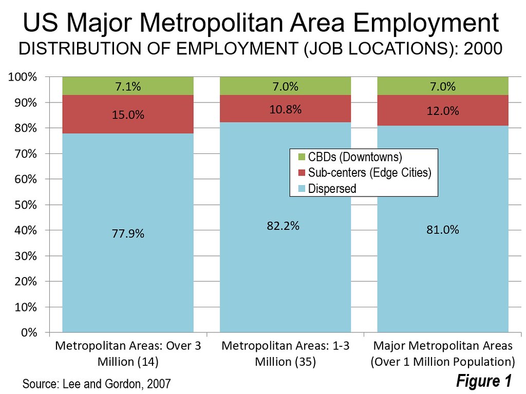
Bumsoo Lee, now at the University of Illinois (Champaign-Urbana) and Peter Gordon (University of Southern California) showed that only a decade after Garreau’s analysis most US metropolitan employment was dispersed well beyond the CBDs and even the edge cities (see: Dispersed American Urban Form Yields Quick Work Trips). Similar research was not found for China, but from observing its urban form and noting the industrial edge city research (Note 3), China is clearly trending toward greater employment dispersion.

Photograph: IFS Building, Cultural Center-Times Square edge city, Suzhou (by author). All photography by author except Image 4.

Note 1: Garreau defined Edge cities has having (1) More than 5 million square feet (465,000 square meters) of leasable space, (2) More than 600,000 square feet (56,000 square meters) of leasable retail space, has more jobs than bedrooms, (4) “is perceived by the population as one place” and (5) “was nothing like “city” as recently as 30 years ago.” Garreau further notes that each Edge city is larger than downtown Portland, Oregon or Tampa. His four principal examples were (1) the Route 128 (now Interstate 95) corridor in metropolitan Boston, (2) Schaumburg in metropolitan Chicago, (3) Perimeter Center in metropolitan Atlanta, and (4) Orange County’s Irvine in metropolitan Los Angeles (Page 5, Edge Cities).

Note 2: Top photo by Gonzalo Baeza H (Panorámica de Santiago) [CC BY 2.0 ], via Wikimedia Commons

Note 3: There is an important research paper on industrial edge cities by Siqi Zheng of the Massachusetts Institute of Technology, Weizeng Sun of Jinan University, Jianfeng Wu of Fudan University and Matthew E. Kahn of the University of Southern California. They examine 120 industrial edge cities in just 8 Chinese cities that had developed more than a decade ago. The paper includes maps showing their locations.

Wendell Cox is principal of Demographia, an international public policy and demographics firm. He is a Senior Fellow of the Center for Opportunity Urbanism (US), Senior Fellow for Housing Affordability and Municipal Policy for the Frontier Centre for Public Policy (Canada), and a member of the Board of Advisors of the Center for Demographics and Policy at Chapman University (California). He is co-author of the "Demographia International Housing Affordability Survey" and author of "Demographia World Urban Areas" and "War on the Dream: How Anti-Sprawl Policy Threatens the Quality of Life." He was appointed to three terms on the Los Angeles County Transportation Commission, where he served with the leading city and county leadership as the only non-elected member. He served as a visiting professor at the Conservatoire National des Arts et Metiers, a national university in Paris.

The Sordid History of Forest Service Fire Data

$
0
0

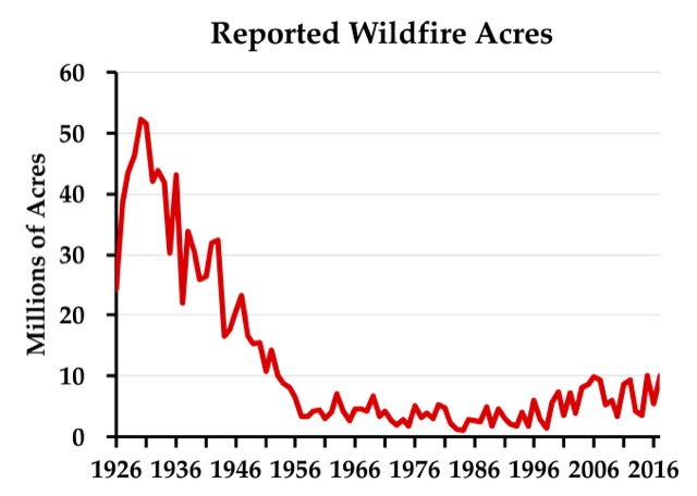
The latest wildfire situation report indicates that about 7.3 million acres have burned to date this year. That’s about 1.2 million acres less than this same date last year, but about 1.5 million acres more than the ten-year average and a lot more than the average in the 1950s and 1960s, which was about 3.9 million acres a year.


Some people use the data behind this chart to argue against anthropogenic climate change. The problem is that the data before about 1955 are a lie. Click image to go to the source data.

While some blame the increase in acres burned on human-caused climate change, skeptics of anthropogenic warming have pointed out that, according to the official records, far more acres burned in the 1930s — close to 40 million acres a year — than in any recent decade. The 1930s were indeed a decade of unusually bad droughts that can’t be blamed on anthropogenic climate change.

While the Antiplanner isn’t persuaded that recent fires are evidence of human-caused global warming, reports of acres burned from before about 1955 are not evidence of the opposite for a simple reason: the Forest Service lied. While the Antiplanner has alluded to this before, it’s important to tell the full story so that skeptics of climate change don’t reduce their credibility by using erroneous data.

The story begins in 1908, when Congress passed the Forest Fires Emergency Funds Act, authorizing the Forest Service to use whatever funds were available from any part of its budget to put out wildfires, with the promise that Congress would reimburse those funds. As far as I know, this is the only time any democratically elected government has given a blank check to any government agency; even in wartime, the Defense Department has to live within a budget set by Congress.

This law was tested just two years later with the Big Burn of 1910, which killed 87 people as it burned 3 million acres in the northern Rocky Mountains. Congress reimbursed the funds the Forest Service spent trying (with little success) to put out the fires, but — more important — a whole generation of Forest Service leaders learned from this fire that all forest fires were bad.

In 1924, Congress passed the Clarke-McNary Act, which allowed the Forest Service with (i.e., provide funds to) “appropriate officials of the various states or other suitable agencies” in developing “systems of forest fire prevention and suppression.” The Forest Service used its financial muscle to encourage states to form fire protection districts.

This led to a conflict over the science of fire that is well documented in a 1962 book titled Fire and Water: Scientific Heresy in the Forest Service. Owners of southern pine forests believed that they needed to burn the underbrush in their forests every few years or the brush would build up, creating the fuels for uncontrollable wildfires. But the mulish Forest Service insisted that all fires were bad, so it refused to fund fire protection districts in any state that allowed prescribed burning.

The Forest Service’s stubborn attitude may have come about because most national forests were in the West, where fuel build-up was slower and in many forests didn’t lead to serious wildfire problems. But it was also a public relations problem: after convincing Congress that fire was so threatening that it deserved a blank check, the Forest Service didn’t want to dilute the message by setting fires itself.

When a state refused to ban prescribed fire, the Forest Service responded by counting all fires in that state, prescribed or wild, as wildfires. Many southern landowners believed they needed to burn their forests every four or five years, so perhaps 20 percent of forests would be burned each year, compared with less than 1 percent of forests burned through actual wildfires. Thus, counting the prescribed fires greatly inflated the total number of acres burned.

The Forest Service reluctantly and with little publicity began to reverse its anti-prescribed-fire policy in the late 1930s. After the war, the agency publicly agreed to provide fire funding to states that allowed prescribed burning. As southern states joined the cooperative program one by one, the Forest Service stopped counting prescribed burns in those states as wildfires. This explains the steady decline in acres burned from about 1946 to 1956.

There were some big fires in the West in the 1930s that were not prescribed fires. I’m pretty sure that if someone made a chart like the one shown above for just the eleven contiguous western states, it would still show a lot more acres burned in real wildfires in the 1930s than any decade since — though not by as big a margin as when southern prescribed fires are counted. The above chart should not be used to show that fires were worse in the 1930s than today, however, because it is based on a lie derived from the Forest Service’s long refusal to accept the science behind prescribed burning.

This piece first appeared on The Antiplanner.

Randal O’Toole (rot@ti.org) is a senior fellow with the Cato Institute and author of the new book, Romance of the Rails: Why the Passenger Trains We Love Are Not the Transportation We Need, which will be released by the Cato Institute on October 10.

Summer Travel Offers Insights Into What Drives Economic Growth

$
0
0

Why do we travel? Alain de Botton suggests in his engaging meditation on this question, The Art of Travel, that it’s the human craving for variety that impels us to leave home and incur the headaches of exploring the world.

If you’re like me, you’ve just made the transition from the slower pace of summer into a busy fall. Perhaps you’ve recently returned from a wonderful summer trip. In my family’s case, we enjoyed a week with close friends in Spain. Reflecting on this experience, it turns out that summer travel offers insights into what drives economic growth – and why official growth measurements understate how fast human well-being is improving in the contemporary world.

One memorable experience on our trip was sampling a dazzling variety of olive oils, some quite different from anything we’d tasted here. We were just as delighted to enjoy a range of unfamiliar wines, cheeses, and tapas, as well as the distinctive art and architecture of Spain and the novel experience of watching World Cup games in a Barcelona bar.

This quintessentially human appetite for variety accounts for a larger proportion of economic activity than most people realize. The leisure and hospitality sector alone employs 11 percent of the U.S. workforce, or 16.5 million people, and 16 percent of the workforce in Spain.

And it’s growing fast. U.S. leisure and hospitality employment has grown 28 percent since 2010, compared to 10 percent for total employment. Wages in this sector, while relatively low, are growing faster than overall wages – 3.2 percent vs. 2.9 percent year-over-year in the last jobs report.  International tourist arrivals in both the U.S. and Spain have nearly doubled over the past 20 years.  As a share of the U.S. economy, the sector has more than doubled since the 1960s.

But our craving for variety energizes economic growth in more fundamental ways. Economists have found that the human preference for product variety, not just the desire to pay less for the same goods, motivates much of modern international trade. Others point towards a profound shift in human consumption towards goods categories that feature wide and growing variety. Also, a country’s GDP per capita is highly correlated with the variety of goods it produces. Most likely, causality runs both ways: wealthier people buy a more diverse basket of products, but economies that are successful in delighting people with a wide variety of products also become richer as a result.

Conventional measures of GDP growth, moreover, don’t do a good job of capturing the spectacular rise in the variety of products and experiences people can now enjoy in a lifetime relative to the monotonous world of past generations. One meal is equivalent to another in the process of adding up GDP, but our family’s well-being meaningfully improved thanks to the foods and wines of Spain, some of which were notably inexpensive. Since a dollar of wages buys far more variety than it did two generations ago, “real” incomes have increased faster than the typically gloomy headlines in the news let on.

This piece originally appeared in The Catalyst, a journal of ideas from the Bush Institute.

J.H. Cullum Clark is Director, Bush Institute-SMU Economic Growth Initiative and an Adjunct Professor of Economics at SMU.


The Sacred Cul-de-Sac: Lakewood

$
0
0

In 1901 John D. Rockefeller of Standard Oil (now ExxonMobil) began purchasing hundreds of acres of land around the town of Lakewood, New Jersey an hour and a half south of New York. He then built a thirty bedroom, twenty bathroom country estate. Lakewood was a prosperous year round vacation destination complete with swimming, tennis, golf, and ice skating, as well as numerous hotels, fine restaurants, a theater, and many large elegant homes. The grand Rockefeller mansion was demolished in 1966, but the property is now a 323 acre county park.

Lakewood peaked economically and culturally in 1929, then entered a prolonged period of seemingly terminal decline. Rockefeller sold the estate to his son in 1925 for over $3M but by 1938 the house sat on the market with no buyers at the drastically reduced price of $250K. At that time taxes came to $150K a year and by 1940 Rockefeller Jr. transferred the property to the county in order to stop the hemorrhaging. Lakewood’s prosperous families moved away, the large old homes lost value and were carved up into rental units, Main Street businesses failed, unemployment became a real problem, and the tax base withered. Everything has a beginning, a middle, and an end.

At the end of World War II suburban expansion soaked up the burgeoning middle class and nearly all the economic growth and political power for the rest of the twentieth century. Meanwhile, Lakewood suffered the fate of most older towns in America. It spiraled further into poverty, disinvestment, de facto racial segregation, and profound apathy from the majority culture.

A misguided attempt to “beautify” Main Street saw the installation of brick pavement, fancy street lamps, and other cosmetic upgrades meant to revive the town. What didn’t change was the underlying social, political, and economic dynamics. The town continued to limp along.

The middle class in neighboring suburban municipalities saw Lakewood as someone else’s problem that needed to be contained. Clear lines were drawn between school districts, tax bases, and service areas. The poor could scrape by in Lakewood on diminished resources so long as the rest of the county was insulated from the costs and consequences.

There’s been a mainstream Jewish community in Lakewood since the 1920s, but beginning in the early 1980s Orthodox Jews from Brooklyn started buying and inhabiting properties in significant numbers. The plentiful supply of big inexpensive homes around the historic Main Street made Lakewood an ideal relocation destination for whole congregations that were rapidly outgrowing their old neighborhoods. The fact that precious few people in authority in the county cared much about the town or its inhabitants made the transition that much easier.

For readers unfamiliar with Orthodox customs I like to describe them as a cross between Mormons and the Amish. They marry young, have unusually large families, live in tight knit inwardly focused communities, dress modestly, and are forbidden to operate machinery or engage in business transactions on the Sabbath. Since they can’t drive to Temple they live clustered together in walkable neighborhoods anchored by a Synagogue.

Every element of Orthodox life is supported by an associated institution from glatt kosher caterers to emergency medical services. The Orthodox didn’t care that Lakewood’s municipal services were mediocre when they began their big move to town. They effectively brought their own.

Of course, there’s always been friction between the Orthodox community and the rest of Lakewood’s population. The single most controversial issue centers around the ever growing number of school aged Jewish children who attend private Yeshivas compared to the rest of the inhabitants who go to underfunded public schools. Orthodox voters greatly outnumber the general electorate and do precisely what the suburban population has always done. They send representatives to office who vote in favor of programs they value, while starving other government departments they find unnecessary. It’s not pretty. I’m not defending it. But it’s absolutely the national norm as practiced for the last few hundred years from coast to coast.

So long as the Orthodox population remained in Lakewood the surrounding towns shrugged. “Blacks, Puerto Ricans, Mexicans, peculiar Jews… who cares? It’s Lakewood.” But Lakewood is beginning to overflow into neighboring jurisdictions. Alarm bells are going off in leafy subdivisions in Toms River, Brick, Howell, and Jackson as new housing complexes are built and quickly fill with Orthodox residents on the “wrong” side of the line. A combination of continuing migration from out of state and a spectacular fertility rate suggests the Orthodox population will reach a critical mass and dominate the county in about thirty years. Lakewood itself is on track to become the third largest city in New Jersey – and this is a town that only had 38,000 people in 1980.

I'm always on the lookout for techniques that can be used to achieve personal goals that are otherwise frowned upon by the authorities. The suburban landscape and its endemic culture are fundamentally opposed to density. These conventional cookie cutter homes have been tweaked just a bit. Each house is a legal duplex with three floors, eleven bedrooms, seven baths, and at least two kitchens. Plus each half of each duplex has a full daylight basement that constitutes a de facto additional living unit. These suburban condo townhomes are effectively Brooklyn brownstones – albeit made of chipboard, vinyl siding, and synthetic stone veneer. And no rules were broken to build them. It’s just a matter of optimizing for slightly different outcomes.

I noticed that almost none of the newly constructed homes have garages. The typical suburban obsession with cars, parking, and lawns appears to take a back seat to the desire to house more humans instead. A typical two car garage is 24′ x 20′ which is just big enough to fit two more bedrooms and another bath. Why waste that space and money on a little house for a couple of cars?

I’d like to say that the Orthodox Jews of Lakewood are building an urban environment that is as vibrant and appealing as Brooklyn. But that’s not quite the case. Building an actual Main Street town is simply not an option given the larger regulatory constraints. What they’re doing instead is focusing on the quotidian needs of their community. Each subdivision has a Temple, a Yeshiva, and a Mikvah. I noticed a wide variety of small businesses being run out of homes contrary to zoning regulations, but in a context where the neighbors welcome such activity rather than report it to the authorities.

The frenetic growth of Lakewood’s Orthodox population has come with stresses and strains on the public infrastructure. Traffic is brutal and keeps getting worse. The water supply and sewerage treatment facilities are stretched thin. But each time new housing is proposed the voters storm the relevant offices demanding to know why more homes aren’t being approved and why more units can’t be squeezed on to smaller lots. What’s with the ridiculous parking requirements? Sure, traffic is bad. You know what’s worse? Not having a home to live in. It’s a bit like an episode of The Twilight Zone or Black Mirror where everything is inverted.

I can’t honestly present Lakewood as a model for how anyone else should proceed. It’s a messy and often unsavory process. There are winners and losers and the resulting urban form is decidedly crap – suburban density without good urbanism. But these are the options we have under the present circumstances. Time will tell if what ultimately emerges is worthy of our affection or if the vinyl and chip board shtetls run their course and fail like so many other places.

This piece first appeared on Granola Shotgun.

John Sanphillippo lives in San Francisco and blogs about urbanism, adaptation, and resilience at granolashotgun.com. He's a member of the Congress for New Urbanism, films videos for faircompanies.com, and is a regular contributor to Strongtowns.org. He earns his living by buying, renovating, and renting undervalued properties in places that have good long term prospects. He is a graduate of Rutgers University.

America Keeps Winning Regardless Of Who Is President

$
0
0

Ever since the election of Donald Trump, many of our leading academic voices, like Paul Krugman, predicted everything from a stock market crash to a global recession. Slow growth, mainstream economists like Larry Summers, argued, was in the cards no matter who is in charge. That was then. Now the United States stands as by far the most dynamic high-income economy in the world.

In such areas as economic growth, the U.S. is generally outperforming other rich countries — such as Japan, Germany and the rest of the EU — by roughly two to one. Meanwhile our most serious global rival, an increasingly overextended China, as well as much of the developing world, are seeing drops in once rapid growth rates.

Donald Trump, being a braggart by nature, of course claims this success for himself. Even President Obama, who presided over the tepid recovery but can claim he pulled the economy “out of the ditch,” wants to take a bow. Yet the real hero here is neither president, but America itself, whose phenomenal advantages over its competitors have gotten stronger with time.

Sources of greatness

Perhaps nothing reveals fundamental insecurity in America than the debate over the issue of American “greatness.” Trump, of course, thinks he can bully the country into being great “again” while New York Gov. Andrew Cuomo suggest the country was “never that great.”

During her disastrous campaign, Hillary Clinton noted America was “already great” and in this case, she’s proving to be right. Despite the awful fools in both parties in Washington, and a press compromised by its own politics, the United States remains unique due to a three factors — our enormous natural endowment, innovative culture and more youthful demographics.

Our competitors may possess some of these things, but not all. Germany and Europe, for example, lack strong tech companies to drive growth or a great resource base. Many of these countries are far too dependent on merchandise trade, which is one reason why Trump holds the better hand in trade negotiations than his opponents. Exports of both goods and services, for example, account for less than 12 percent of U.S. GDP compared with over 16 percent in Japan, nearly 20 percent in China and a remarkable 46 percent for Germany. Trump can threaten to expand tariffs with all these countries, because they buy so much less from the U.S.

The continental edge

Unlike its European or Japanese competitors, America is a huge country with enormous natural resources. It not only can feed itself, but also much of the world. As China is learning, there’s no real substitute, at least at low prices, for American produce.

Perhaps even more critical are energy and natural resources. Japan, China and the EU remain largely dependent on such dicey countries as Iran, Saudi Arabia and Russia for their oil and gas. The U.S., already the world’s largest producer of oil and gas, has achieved what analyst Walter Russell Mead has called an “oil and gas boom that has sent geopolitical shocks through world affairs.”

Ultimately energy will prove critical to the manufacturing economy, the sector that Trump has most targeted. Lower energy costs offer U.S. firms unique advantages against their prime competitors. Industrial employment has reversed declines from the end of the Obama years, growing by 327,000 jobs over the past year, the best performance since 1995, producing the strongest output in August in 14 years. Retailers, home-builders, business service firms are all hiring, and, for the first time in over a decade, wages for the lower half of the labor force are actually rising and even the long-term unemployed are returning to the workforce.

What Trump misses — but America still has

Physical advantages or innovative companies are not the only things that makes America great. What matters as much, or more, is our demographics that remain considerably healthier than those of our prime competitors. This largely reflects the impact of immigration, something that Trump and his minions miss. By 2050, according to Pew, the U.S. population will be much younger and will still be growing, while our three major competitors — Japan, Germany and China — all will suffer more rapid aging as well as stagnant or even shrinking populations.

Immigrants are critical at almost every level of the economy, from low-wage service workers to the most elite technology researchers. They also have higher levels of entrepreneurship, now accounting for one in four businesses. Asians, now the largest group of new legal immigrants, boast both higher income and education levels than the general populace. To be sure, the country needs to modify its laws, and cut off illegal immigration, but moves by Trump allies to reduce legal immigration threaten to undermine our long-term economic future.

America needs political and media figures who actually understand our fundamental strategic advantages. We should not employ xenophobia to make ourselves feel better about ourselves, nor do we have to embrace the fundamental anti-patriotism increasingly characterizing the left. America deserves a political class that understands the roots of the country’s greatness and how best to press that advantage in the coming decades.

This piece originally appeared in The Orange County Register.

Joel Kotkin is executive editor of NewGeography.com. He is the Roger Hobbs Distinguished Fellow in Urban Studies at Chapman University and executive director of the Houston-based Center for Opportunity Urbanism. His newest book is The Human City: Urbanism for the rest of us. He is also author of The New Class Conflict, The City: A Global History, and The Next Hundred Million: America in 2050. He lives in Orange County, CA.

Photo: Gage Skidmore from Peoria, AZ, United States of America (Donald Trump) [CC BY-SA 2.0 ], via Wikimedia Commons

San Francisco Is Eating New York

$
0
0

A lot has been written about how the internet undermined and destroyed media. What we are seeing today may be the more important story, however, which is the tech industry is explicitly buying out the media, particular culture making elite media institutions.

This was illustrated again when it was recently announced that Salesforce CEO Mark Benioff is buying Time magazine for $190 million. Jeff Bezos already owns the Washington Post. Steve Job’s widow owns the Atlantic. These are all people who have essentially infinite funds to sustain these over the long term – as vanity projects if necessary. How many high status print publications are left to acquire? The New Yorker is owned by Condé Nast, which reportedly hemorrhages money, though is owned by a very wealthy family. The WSJ is already in corporate hands, so should be buyable at some point. The NYT is still family controlled for the time being. Broadcast media is tougher but might ultimately share the same fate. (Foreign elite media is a different story than the US).

This represents a wholesale shift of cultural power from New York/Washington to San Francisco/Seattle. I don’t think the media class full understands what is happening because they live in a world that thinks very differently from Silicon Valley.

Paul Graham’s essay Cities and Ambition talks about the difference between San Francisco and New York’s ambitions, and how they ultimately work to the detriment of New York.

When you ask what message a city sends, you sometimes get surprising answers. As much as they respect brains in Silicon Valley, the message the Valley sends is: you should be more powerful.

That’s not quite the same message New York sends. Power matters in New York too of course, but New York is pretty impressed by a billion dollars even if you merely inherited it. In Silicon Valley no one would care except a few real estate agents. What matters in Silicon Valley is how much effect you have on the world. The reason people there care about Larry and Sergey is not their wealth but the fact that they control Google, which affects practically everyone.

In the long term, that could be a bad thing for New York. The power of an important new technology does eventually convert to money. So by caring more about money and less about power than Silicon Valley, New York is recognizing the same thing, but slower. And in fact it has been losing to Silicon Valley at its own game: the ratio of New York to California residents in the Forbes 400 has decreased from 1.45 (81:56) when the list was first published in 1982 to .83 (73:88) in 2007.

Tech people are not interested in the social prestige of owning fancy publications. They care about power. It seems very likely that the media class will discover this to their chagrin sometime in the future. After the debacle of the New Republic, the tech titans are treading gently. Note how Benioff stresses that he is going to be a hand’s off owner:

I’m not going to get involved operationally. We don’t get operationally involved in our investments. I’m busy enough with my job. They have a great team. It’s a very strong business. Very profitable.

Don’t you believe it. If journalists think that technology people respect all the customs of their industry, such as editorial independence, they are sadly mistaken. At some point, the ownership of these properties will assert themselves. Think they are going to let the very media outlets they own indefinitely agitate for government investigations and regulations of the tech industry? Or do in depth investigative reporting of themselves? The tech people understand full well the true value of what they are buying.

It will be interesting to see how this plays out. Over time the number of big name, financially secure media people will decline as they cycle out into retirement. Once that hits a critical point, and they have reshaped their mastheads into a much more dependent and thus compliant class, we’ll see what these tech owners end up doing.

This piece originally appeared on Urbanophile.

Aaron M. Renn is a senior fellow at the Manhattan Institute, a contributing editor of City Journal, and an economic development columnist for Governing magazine. He focuses on ways to help America’s cities thrive in an ever more complex, competitive, globalized, and diverse twenty-first century. During Renn’s 15-year career in management and technology consulting, he was a partner at Accenture and held several technology strategy roles and directed multimillion-dollar global technology implementations. He has contributed to The Guardian, Forbes.com, and numerous other publications. Renn holds a B.S. from Indiana University, where he coauthored an early social-networking platform in 1991.

Photo: Via Urbanophile/Shuttershock

Is the Fever Breaking? Ground Zero Youngstown

$
0
0

Two years ago, I described the Youngstown area as “crossover ground zero” for Donald Trump and the politics of resentment in working-class and rust belt communities. In local rallies during the 2016 campaign and since he took office, Trump has repeatedly promised an economic renaissance and immigration reform. These issues resonated with local voters.

His success in Youngstown might seem surprising, since Mahoning and Trumbull Counties usually vote by large margins for Democratic Presidential candidates. In 2012, 63.5% of Mahoning County voters supported for Obama, even more than in 2008. But in the 2016 Republican primary, more than 6000 Mahoning County Democrats switched parties, and another 20,000 people who had not been registered voters signed up to vote. Clinton won the Presidential race here by less than 1%, and Trump won in Trumbull County.

When I returned to Youngstown this summer, I wondered whether Trump’s support remained strong. In this highly nationalistic working-class community, the first thing I saw driving into the city were American flags were plastered wall-to-wall on overpasses. No wonder Trump made a “rare Presidential visit” in July 2017 to boost his flagging support and renew his appeal to “Make America Great Again.”

But as the summer went on, I sensed an undercurrent of uneasiness, especially among the area’s much-touted swing voters. While Trump crows about what a “great job” he’s doing, some of his supporters wonder whether local residents will benefit from the tax cuts. The national debt climbs to over one trillion dollars, and rising health care costs and gas prices have eroded any financial gains for most Americans. Yes, unemployment rates have fallen, but underemployment, low wages, reduced pensions, low property values, and increasing precarity in the Mahoning Valley have made it hard to believe in Trump’s economic happy talk. And talk among some in Congress about cutting Social Security and Medicare benefits to offset the deficit is adding to the local anxiety.

The local economic picture clearly does not offer many signs of hope. The GM Lordstown plant has eliminated two shifts, cutting 3000 jobs since Trump took office. According to recently retired UAW Local Vice President Tim O’Hara, about 40% of union members voted for Trump in 2016. Dave Green, the current union President, has appealed to GM and President Trump to help bring a new car to the plant that currently builds the Chevy Cruze, but Trump has remained silent, and GM will not make a commitment. In fact, the company responded to the President’s trade policy by announcing that it will build a new car at its Ramos, Mexico plant, which also builds the Cruze. The local paper, The Vindicator, offered a blunt “reality check: Donald Trump is not going to intervene to save one of the leading employers in the Mahoning Valley.”

Yet Trump’s trade policy still appeals to many local voters. Youngstowners have long blamed the loss of its steel industry on unfair trade, and many here still support the protectionist ideas of Trump’s Secretary of Commerce Wilbur Ross, U.S. Trade Representative Robert Lighthizer, and local free trade critics like Democrats Sherrod Brown and Tim Ryan. But local steel producers and fabricators have indicated that instead of expanding their labor force here, they may downsize or move facilities to Mexico because of Trump’s trade policies, so more local workers can expect to lose good-paying jobs. As Trump supporter and local steelworker Michael Lang said in an interview with Reuters, “I voted for Trump because I thought he’d straighten things out, not do something like this.”

Few of the retail, public sector, and healthcare workers I’ve spoken with admitted they had supported Trump. Those who did were evasive and seemed uncomfortable talking about him. It seems likely that workers in these jobs are anxious about the continuing budget cuts, loss of local state funding and government assistance, and more recently the closing one of the two local hospitals, which displaced 400 nurses and other staff. Service workers who supported Trump may be starting to understand the limits of the politics of resentment.

Clearly, neither Trump’s campaign promises nor his policies are making Youngstown great again. The question is, will the community’s continuing economic struggles lead people to turn against Trump and the Republicans? Or bring them back to the Democrats? NPR reporter Asma Khalid, who has tracked Trump’s support in Youngstown for the past two years, is uncertain. Among the “disillusioned” Democrats she spoke with, some still support Trump, though they also plan vote for Democrats like Brown and Ryan this November.

Mahoning County Democratic Chairperson David Betras also doubts whether the Trump fever has broken in Youngstown. The best he can say is that “the temperature is going down.” His advice to Democrats: follow the lead of Brown and Ryan — stress concrete economic programs, healthcare, education, and building trust. A focus on the economy, Betras believes, will win out, even as Trump and the Republicans try to distract voters with often-racist cultural divides, like whether NFL players should be allowed to kneel.

Yet many in Youngstown are fed-up with both parties. When I asked retired small businessman, Democrat, and Trump enthusiast Sam Carely who he supports in 2018, his response reflects a distinct lack of enthusiasm: “I am not sure if I will vote. But if I do I would probably vote for a Democrat — if I could find a reason.” Carely is tired of interparty fighting, and he is not alone. Many would prefer to vote for Democrats, but they are desperate for an economic plan that isn’t just campaign rhetoric. For them, as for many voters around the country, the Trump fever will only break when Democrats give them something to believe in.

This piece originally appeared on Working-Class Perspectives.

John Russo is the former co-director of the Center for Working-Class Studies at Youngstown State University and currently a visiting scholar at Georgetown University’s Kalmanovitz Initiative for Labor and the Working Poor.

Highest Fertility & Gains Concentrated in US Midwest and South

$
0
0

The plunging of birth rates has emerged as one of the most significant demographic trends. For the first time, there appears to be the prospect of nations that will become materially smaller in population as a result. For example, the latest projections from the Japan’s National Institute of Population and Social Security Research are that by 2115, the population will be only 50.5 million, down 60 percent from the present 126 million.

Total Fertility Rates

Perhaps the best measure of birth rates is the Total Fertility Rate (TFR), which estimates the number of births a woman of child-bearing age has over her lifetime. Broadly, a figure of 2.1 is required to maintain the population at a stable level --- slightly more than two children per mother. Overall, the TFR tends to be lower in higher income nations and higher in poor nations.

The United States continues to have a higher TFR than other high income nations, yet has seen its rate drop to below replacement rate in recent years, according to annual data published by the Centers for Disease Control and Prevention. In 2016, the national TFR was 1.821, down 5.7 percent from the 1.931 of 2010. Even so, the US TFR continues to be above those of nations, like Japan (1.41), Germany (1.45), China (1.60) and Singapore, which at 0.83 may be the lowest in the world (2017 estimates).

Even nations with some of the highest historical fertility rates, like India (2.43 down from 5.83 in 1965) and Bangladesh (2.17 down from 6.88 in 1965) are not much above replacement rate.

This article also summarizes the latest TFRs (2016) at the state level and makes short term comparisons back to 2010. The District of Columbia is not included in the rankings, because its demographic makeup is largely urban core, and lacks the range from urban core to rural that exists in the 50 states. As would be expected from such demographics (largely due to the high percentage of single person households), DC’s TFR is lower than that of any state, at 1.49.

Lowest Total Fertility Rates

There are important regional differences between TFRs among the states. In 2016, all of the six states with the lowest TFRs were in all of the New England states. Vermont had the lowest TFR, at 1.540, but nearby Massachusetts, Rhode Island and New Hampshire were close behind, all at 1.55 or lower. Connecticut and Maine had the fifth and sixth lowest TFRs, at somewhat over 1.60. The regional concentration continues, with New York, which constitutes the western border of New England, ranking eighth lowest and Pennsylvania, which borders New York at 10th. Two western states are also included, with Oregon at 7th lowest TFR and Colorado at 9th (Figure 1). Low fertility New York and Pennsylvania are among the top ten states in population. All of the states with the lowest TFRs were in the East and West.

Largest Total Fertility Rate Declines

There is also a strong regional prescience among the states with the largest TFR declines from 2010. Eight of the 10 states with the largest reductions are in the West. New Mexico and Colorado have experienced declines of more than 10 percent in just six years. The next six states with the largest losses all fell more than eight percent, including Hawaii, Arizona, California, Alaska, Utah and Delaware. Oregon, the eighth western state among the largest decliners, and Massachusetts had declines just below eight percent (Figure 2).

Highest Total Fertility Rates

Only five of the 50 states had TFRs higher than the replacement rate. South Dakota had the highest TFR, at 2.26, followed by Utah at 2.24. This is a surprising development, since Utah has routinely had the highest TFR in the nation. The six Great Plains states North Dakota, South Dakota, Nebraska, Kansas. Oklahoma and Texas were among the highest ten in TFR, as well as nearby Iowa. North Dakota, Alaska and Nebraska also had TFRs above the 2.1 replacement rate. Idaho was only slightly below replacement rate. Texas, Kansas, Iowa and Oklahoma rounded out the highest 10 (Figure 3). Among the 10 largest states in the Union, only Texas had among the highest TFRs. Seven of the states with the highest TFRs were in the Midwest and South.

Most Stable Total Fertility Rates

All but one of the 50 states experienced TFR declines since 2010. The one state with a gain was North Dakota, which had a strong 6.4 percent gain. North Dakota state has experienced its first important population growth in more than 100 years, as domestic migration has increased to staff the state’s growing petroleum extraction industry. This has led to a reduction in the state’s median age to 35.0 years of age, from 37.4 in 2010. By comparison the US median age has risen from 37.2 to 37.9 years. The state’s improvement in the TFR reflects the younger age of the population and its association with a higher birth rate. Nebraska experienced a minor decline in TFR. The other states with lower TFR declines were in the middle of the country, South Dakota, Iowa, Louisiana, Minnesota, Kentucky, Arkansas and Wisconsin (Figure 4). All of the states that gained or had the least loss in TFR were in the Midwest and South.

Regional Concentration

The regional concentration of the data is compelling. The states with the highest TFRs and the most fertility rate stability are nearly all in the Midwest and South, with only nominal representation from the West and none from the East. Among the states with the lowest TFRs, all but one are either in the West or East.

Wendell Cox is principal of Demographia, an international public policy and demographics firm. He is a Senior Fellow of the Center for Opportunity Urbanism (US), Senior Fellow for Housing Affordability and Municipal Policy for the Frontier Centre for Public Policy (Canada), and a member of the Board of Advisors of the Center for Demographics and Policy at Chapman University (California). He is co-author of the "Demographia International Housing Affordability Survey" and author of "Demographia World Urban Areas" and "War on the Dream: How Anti-Sprawl Policy Threatens the Quality of Life." He was appointed to three terms on the Los Angeles County Transportation Commission, where he served with the leading city and county leadership as the only non-elected member. He served as a visiting professor at the Conservatoire National des Arts et Metiers, a national university in Paris.

Photograph: By Claude Covo-Farchi from Paris, France (Une étoile est née) [CC BY-SA 2.0 ], via Wikimedia Commons

Strong Cities Have Lots of Zeros

$
0
0

Big cities have big responsibilities. Coming with that are big scale, scope, complexities, priorities, and challenges. Texas has growth and all the other `bigs. We are not shying away from the `bigs’ and building great communities. To get there requires numbers with lots of zeros behind them. A recent Strong Towns website entry challenged Colin County with road projections. Challenge is good and not something to shy away.

The Strong Towns network is helping local government leaders plan and build better places. The facts about value and what gets produced with “traditional” land use patterns and not produced with acres of parking should make us all think about the habits and assumptions we currently have. I share the lessons with our City of Pearland team. For instance, the Building Resilient Communities (Public Management, ICMA, Sept 2018) by Charles Marohn, Jr. challenged the assumptions on value of the old and blighted block vs the appealing `shiny and new block’ from reinvestment.

However, there’s a current Strong Towns blog entry leading up to a conference that’s hitting closer to home and overemphasizes some numbers while minimizing the important one. In `A Texas-sized Pavement Problem’ (https://www.strongtowns.org/journal/2018/9/27/a-texas-sized-pavement-problem) by Daniel Herriges, there’s a critique on Collin County, Texas pursuing bond authorization for mobility improvements.

Ability to Pay mentioned, but the size of the immediate step dismissed

The `Pavement Problem’ is concerned that Collin County says it needs to spend on new roads in the next 30 years, $12.6 billion. This is a large numbers with lots of zeros.

However, there is not a $12.6 billion bond question being considered right now. There is a $750 million bond question being proposed. Big challenges usually are addressed incrementally. In Texas, we are used to $750 million in improvements and more moving forward. This incremental approach provides opportunities to assess and readjust.  

Texas is Bigger (and it is getting better results)

My wife and I have been living and working in Pearland, Texas for just over four years, moving from Michigan after 14 wonderful years there. We are not alone in relocating. The table shown here is to the left of `Net Domestic Migration. ‘ (from a presentation, `Clear Sailing Ahead,’ Dr. Mark Dotzour). The numbers for net migration over the first two decades of this century are stark.

There’s more. Employment growth is logically tracking with that population growth (or vice versa). Texas has seen 2.7 million new jobs over the first one-fifth of the 21st Century. Once you get past California and Florida, the total drops off precipitously. Having lived in Novi, Michigan outside Detroit and in Elgin, Illinois outside of Chicago, I know the challenges of building alongside area of low employment growth. It is indeed a challenge. We face a much more desirable challenge in Texas – growth support/management/guidance.

The numbers here in Texas are big, and there are corresponding investment needs for new infrastructure and public services required to meet them those needs. Such a big scale may not resonate to other parts of the country; however, deferred decision making can result in some eye-popping negative numbers down the road.

A case in point from the north would be the new bridge connection between Windsor and Detroit. The additional crossing is an essential transportation link to supplement an existing private toll bridge whose owner goes to any length to protect his nearly-monopoly on this international transport market. The Windsor-Detroit bridge was talked about for a decade or more. The Canadians even generously offered to pay for its construction, and yet it is only now taking bids, estimated at $3.8 billion (billion!) to design and construct for its opening at the end of 2024 (2024!).

Meanwhile, here in our corner of the Houston metropolitan area, there’s a new $1 billion public-private partnership to build new toll lanes and to reconstruct parallel freeway lane option that will open in September 2019 from Pearland to the massive Texas Medical Center and downtown Houston. There’s separate simultaneous new construction on the Harris County Toll Road Authority’s Beltway 8 on our northern city boundary. Generally, there’s investment in new capacity and reconstruction all over greater Houston and the vibrant core.

Our City of Pearland has grown a little over 1/3 in population from 2010 to 2018, with 134,000 residents currently estimated. We’ve added rooftops and done so while maintaining affordable housing options, while contributing a light touch of regulations. Those new neighborhood subdivisions enhance the resilience of the housing stock, as demonstrated in their performance during the epic rainfall of Hurricane Harvey in August 2017. The new developments withstood that massive stress test. Older areas and parts, mainly developed originally outside of city jurisdiction’s development requirements, generally saw the significant flooding.

I don’t know the specific needs in Collins County; what I do know is that grow communities must invest in transportation infrastructure. Examples include thriving cities in the DFW metroplex such as Plano and McKinney. It takes investment to build communities that are diverse, dynamic, and multi-modal. Companies and corresponding jobs are flocking to cities that invest. Ratings are high for their quality of life. Those places are not just myopically building roads upon roads, as Strong Towns implies, without considering and investing in alternative transportation choices and giving developers the chance to build dense developments for those that choose that.

Maintenance does have to get its just investment

The `Pavement Problem’ entry does make the point about once you build something, you have to maintain it. Moreover, where’s the money coming for that responsibility? Back to the beginning of this commentary, that fiscal accounting is a hallmark of the Strong Towns message. In our own community, we struggle with the reinvestment question for existing infrastructure. Our City budget discussions recognize there’s a gap between regular maintenance targets and the money we are actually putting towards that. However, the growth challenge requires adding to the maintenance budgets. Rest assured, with that Texas can-do track record, we will recapitalize our fleet, facilities, parks, sidewalks, pathways, and roads before they fall too far off the maintenance curve.

When Strong Towns convenes later this week in Plano, don’t be too quick to throw out the success of the area while enjoying those Plano high-quality restaurants and retail areas. Keep in mind that Texas is bigger -- There are more “zeros.” Big numbers are essential for the investments growing major metropolitan areas that are growing and attracting people and private investment. The $750 million Collin County bond issue question for roads seems a reasonable and necessary start while leadership there continues to build great places to meet the needs of its increasing population.

This piece originally appeared on Linkedin.

Clay Pearson joined the City of Pearland, Texas as City Manager in March 2014. During his career, Pearson gained a broad overview and understanding for the varied operations of City government and has worked with the Mayor and City Council to outline and deliver a strong vision of what can be accomplished in Pearland’s future. Pearland’s opportunities towards being one of the premier diverse and dynamic cities around metropolitan Houston area being delivered with community not-for-profit/volunteer partners, Brazoria and Harris counties, regional partners, other government agencies and more than 700 employees and volunteers dedicated to Pearland. Pearland is a complex full-service local government.

The Mines

$
0
0

There’s a literary trope in which an ambitious young man goes to work in the mines for a few years to earn an income with which to go back home. In the US it’s bundled into narratives of the Wild West (where incomes were very high until well into the 20th century), but it also exists elsewhere. For example, in The House of the Spirits, the deuterotagonist (who owns an unprofitable hacienda) works in the mines for a few years to earn enough money to ask to marry a society woman. The tradeoff is that working in the mines is unpleasant and dangerous, which is why the owners have to pay workers more money.

More recently, the same trope has applied in the oil industry. People who work on oil rigs, which as a rule are placed in remote locations, get paid premiums. Remote locations with oil have high incomes and high costs in North America, but even the Soviet Union paid people who freely migrated to Siberia or the far north extra. The high wages in this industry are especially remarkable given that the workers are typically not university-educated or (in the US) unionized; they cover for poor living conditions, and a hostile environment especially for families.

Read the entire piece at Pedestrian Observations.

Photo: Caroline Culler (User:Wgreaves) [CC BY-SA 3.0 or GFDL], from Wikimedia Commons


The Communities Changing Now

$
0
0

A couple days ago I referenced Pete Saunders’ observation that Sunbelt cities in their growth phase need to take advantage of their day in the sun to put in place the foundations for future next level prosperity.

I thought of this when I read a recent column by Bloomberg reporter Justin Fox. He was driving across the middle of the country. One of the suggestions I gave him was to check out Carmel, Indiana. He filed a story on their roundabouts:

"It was late one weekday afternoon in Fishers, an affluent Indianapolis suburb with a lot of offices and retail as well as houses, and the traffic was starting to get irritating. There were long waits at lights. At one intersection, the line of cars waiting to turn left blocked the main traffic lane.

Then I crossed over into Carmel, another affluent suburb with lots of offices and retail as well as houses, and everything changed. Instead of traffic lights, there was roundabout after roundabout after roundabout. There also weren’t any long waits or backups at intersections. I can’t say that I breezed through all of the roundabouts — the signage at the bigger ones was a little confusing for a first-timer — but all the other drivers seemed to know what they were doing. Traffic flowed, but it didn’t flow too fast. When a couple of pedestrians showed up at one roundabout, cars had no trouble stopping for them."

Carmel has more roundabouts than any other city in the United States, around 120 I believe. Fishers has 15 according to their web site. I’m not going to say that roundabouts are the ultimate in infrastructure, but clearly Carmel has invested heavily in its streets compared to Fishers and it shows, even to an out of town reporter from New York.

Discussion of Carmel tends to focus on its debt levels, which are very high. But the debt isn’t monolithic. I sort it into three major buckets: 1) traditional infrastructure, 2) developer subsidies, and 3) non-standard amenities.

Developer subsidies are frequently decried but are ubiquitous – even Hudson Yard in NYC got them. The non-standard amenities – like a $175 million publicly-financed concert hall – draw much of the ire.

But even if you reject all of those, a significant chunk of Carmel’s debt is for very standard, traditional infrastructure like water and streets. For example, a couple years ago the city issued a $250 million bond backed by property taxes to finance drainage improvements in older subdivisions, trails, and street improvements that include, to my count, 32 new roundabouts.

This is a lot of money to be sure – but it surfaces an important point. All the infrastructure needed to support a new suburb – streets, sewers, schools, parks, libraries, water, streets – is expensive. Frankly, when you add it all up, often it’s just plain unaffordable.

The traditional approach to this was to simply not build it. But as we discovered, in those places, as soon as the growth era is over and the houses, strip malls, etc. get old, the place quickly loses its attractiveness and abandonment and blight set in.

We’ve learned some lessons from this. Suburbs generally mandate that developers build full infrastructure in their developments now. They often charge impact fees to build parks, etc. But candidly most of them are still under-investing in infrastructure, especially streets.

Carmel, to their credit, has actually tried building out real infrastructure. I’m not even sure a wealthy suburb like them can afford to really upgrade all their streets to urban standards. But at least it’s a different strategy. Next door Fishers has done a lot with their major arterial streets. But otherwise not so much. There’s a sort of Tiebout sorting effect between these two going on right now.

In the immediate term, Carmel has better traffic than Fishers. In the longer term, we’ll have to see if Carmel’s debt creates problems vs. Fishers, or if Fishers’ unwillingness to make similar infrastructure investments ends up sending it down the same trajectory at earlier era suburbs of northern Indianapolis into decline. Both communities have over 90,000 people and buildout is not that far away for them.

This is the story that’s going to play out at the micro and macro level over time. Some places are going to find a way to assemble the political coalition necessary to make moves. Others are not. Some of those moves will work. Others won’t. As Pete showed, the cities that make the right moves are the ones that will differentiate themselves and perform over the longer term.

This piece originally appeared on Urbanophile.

Aaron M. Renn is a senior fellow at the Manhattan Institute, a contributing editor of City Journal, and an economic development columnist for Governing magazine. He focuses on ways to help America’s cities thrive in an ever more complex, competitive, globalized, and diverse twenty-first century. During Renn’s 15-year career in management and technology consulting, he was a partner at Accenture and held several technology strategy roles and directed multimillion-dollar global technology implementations. He has contributed to The Guardian, Forbes.com, and numerous other publications. Renn holds a B.S. from Indiana University, where he coauthored an early social-networking platform in 1991.

Autonomous Cars Are Our Real Future

$
0
0

Long a hotbed of new technologies, California insists on seeing its transit future in the rear mirror. Rather than use innovative approaches to getting people around and to work, our state insists on spending billions on early 20th century technology such as streetcars and light rail that have diminishing relevance to our actual lives.

California’s roads may be among the worst in the country, but the state seems more than anxious to spend billions on transit systems that are losing market share. Despite spending over $15 billion on trains since 1990, Los Angeles transit market share and ridership have dropped. As one member of the California Transportation Commission notes, the state’s planners largely ignore the role of technologies — including home-based work, ride hailing and autonomous vehicles — that offer the best hope for resolving our transportation woes.

Part of the problem lies in geography: the state refuses to address transportation needs within the reality of continued suburbanization of jobs and people. In major metropolitan areas since 2010, more than 90 percent of the population growth in the six largest metropolitan areas has been in the suburbs and exurbs, and less than 10 percent in the urban core favored by California’s policies. As growth heads to places such as south Orange County, the Inland Empire and northern L.A. County, the relevance of traditional transit — which works largely for downtown locations — continues to weaken.

Getting beyond the transit fantasy

Rather than hop on the rails, more residents are addressing traffic woes by simply staying home. By 2015, more Los Angeles-area residents were working at home than were taking transit, something also true across the country. Since 1990, the number of people working at home increased eight times as rapidly as the number of people using the transit system. The number of people driving increased even more rapidly compared to transit.

Promoting home-based work is one way California can develop a transit future that addresses the actual needs of of our people, who overwhelmingly live and work in suburban locations. The state really has one traditional functioning downtown — San Francisco — but most residents everywhere else favor personalized transportation because they commute to dispersed and diverse location. Already the convenience of driving keeps most of us in our cars and, for those who don’t want to drive, Uber and Lyft, both California companies, have become the carrier of choice.

We need a new vision

California government justifies its policies on environmental grounds, but increasingly the state’s priority is to reduce driving in order to produce its utopia of ever more crowded, densely packed cities. Yet these policies so far have not made the state a leader in GHG reduction but, as a new Chapman report reveals, actually behind the pack of most other states.

As the state emphasizes transportation that most people won’t use, it has favored a “road diet” to keep the freeways clogged. Against all market signals, it is determined to force people into “transit-oriented” areas, even as ridership falls. This approach ignores strategies that address mobility in ways both environmentally friendly way and also in touch with human realities. They largely ignore, for example, the potential of the ultimate, low-GHG technology, which is home-based work, a mode of work access that already is more widely used in the state, including the dense Los Angeles and San Jose areas, than transit.

But the biggest change, perhaps unfolding over the next two decades, will be the autonomous vehicle. MIT’s Alan Berger suggests this new technology will free up huge amounts of space in cities that now go for wide roads and garages, while finally liberating the overwhelmingly suburban majority from dependence on traditional cars. These new vehicles, Berger suggests, could be powered by solar power, stored in special garages, and be on call when needed. They will also likely drive a new dispersion to the outer suburbs as commutes become more tolerable, according to recent Bain study.

Streetcars, bullet trains and other waste needs to stop

Intoxicated with their transit obsession, our political leaders continue to fund ill-conceived projects such as Jerry Brown’s high-speed rail system with costs that have more than doubled since initial planning. Despite considerable scaling back, it is more than 10 years behind schedule. As many as two-thirds of Californians no longer want to fund it.

Possibly even more boneheaded are streetcar lines, which almost everywhere in the county are performing well below projections and losing riders. The construction of a 4.5-mile, $400 million trolley between Santa Ana and Garden Grove follows a route that promises few riders and seems doomed to a long money-losing career. Atlanta’s disastrously under-performing trolley has been nicknamed by some locals “a streetcar named undesirable.” Maybe we can do the same for the Santa Ana line — how does “a streetcar named stupidity” sound?

All this is all the more unconscionable at a time when more efficient, less costly technologies — electric cars, work at home and autonomous vehicles — all beckon with promise of better environmental results and greater mobility and efficiency. California may have developed many of these technologies, but our leaders have been maddeningly slow to even consider how to adopt them.

This piece originally appeared in The Orange County Register.

Joel Kotkin is executive editor of NewGeography.com. He is the Roger Hobbs Distinguished Fellow in Urban Studies at Chapman University and executive director of the Houston-based Center for Opportunity Urbanism. His newest book is The Human City: Urbanism for the rest of us. He is also author of The New Class Conflict, The City: A Global History, and The Next Hundred Million: America in 2050. He lives in Orange County, CA.

Photo: Ed and Eddie, via Flickr, using CC License.

Curated Diversity in Chicago

$
0
0

I came across a very intriguing premise several months ago that's stuck with me ever since. I think I've had a subconscious acknowledgement of it for some time, perhaps years, but it was only when reading an interview in the Atlantic with New York Times investigative journalist Nikole Hannah-Jones about school segregation that the notion clicked. The interview was conducted with The Atlantic's editor-in-chief Jeffery Goldberg, and offered a revealing and enlightening view of how segregation works today:

"Goldberg: What do you call “curated diversity”?

Hannah-Jones: I never talk about school inequality in terms of “diversity” because I think it’s a useless word. I think it’s a word that white people love. When I say “curated diversity,” it means white parents like a type of diversity so they’ll still be the majority and there won’t be too many black kids.

White Americans, in general, are willing to accept about the ratio of black Americans at large: 10 to 15 percent.

Goldberg: But you get into the 20s...

Hannah-Jones: When you get into the 20s, white folks start to exaggerate how large the percentage is. So in New York City, one of the most segregated school systems in the country, if you’re a white parent in the public schools, you don’t want all-white schools.

Goldberg: Because you’re a liberal?

Hannah-Jones: Yeah. But what you want is a majority-white school with a small number of black kids and a good number of Latino, a good number of Asian. That makes you feel very good about yourself because you feel like your child is getting this beautiful integrated experience. The problem is that the public schools in New York City are 70 percent black and Latino. So, for you to have your beautiful diversity, that means that most black and Latino kids get absolutely none.

The tolerance for increasing particularly the percentage of black kids is very low, and even lower if those black kids are poor. No white parents in New York City mind having my kid in their school because they feel like I’m on their level. But if you get too many of kids like mine who are black but poor, there’s very little tolerance."

What I'm finding is that in many cities, especially in Chicago where I am, there's a real desire to curate the diversity of the city. And the result is that it leads to widely varying views on actual diversity, and ultimately on economic and social inequality and mobility.

How so? Let's use Chicago as an example. In 1970 Chicago had a population of just under 3.4 million people. The Great Migration that brought hundreds of thousands of African-Americans to the city had essentially come to a close, and the wave of Latino growth driven by Mexican in-migation had yet to fully start. Chicago's demographic breakdown at the time fell approximately in this way:

White: 58.2%
Black: 32.7%
Latino: 7.3%
Asian: 0.9%
Other: 0.7%

In Chicago, as in many cities, you'd never find a geographic unit of any type that had the kind of demographic breakdown seen above. Most census tracts, neighborhoods, community areas, zip codes -- whatever unit of geography -- are overwhelmingly one group or another.

I borrowed a map from the DePaul University Institute of Housing Studies to illustrate this point. I colored in Chicago Community Areas (CCAs, which are the city's long-standing community units for small area data collection) by their concentration of white or minority population. Here, green CCAs had a population that was 80 percent or more white in 1970, blue CCAs had a population that was 80 percent or more minority in 1970 (in this case, black, Latino, Asian and "other"), and purple CCAs had a population that was between 20 percent and 80 percent white:


By 2015, the demographic characteristics of Chicago shifted dramatically. Overall the city's population dropped by almost 650,000 people, roughly equivalent to the current population of Portland, OR, or Memphis, TN. But decades of white population loss, enormous Latino population growth, substantial Asian population growth and moderate black population loss have created a very different demographic profile:

White: 32.2%
Black: 29.1%
Latino: 30.9%
Asian: 5.9%
Other: 1.9%

And here's a map of how concentrations of white and non-white populations, using the same categories as the 1970 map, are distributed in 2015:


My guess is that many readers look at this and see the loss of green areas and the increase in purple areas and interpret the change as progress; a more integrated Chicago. Indeed, in 1970, 39 of Chicago's 77 CCAs had a white population in excess of 80 percent. Twenty-one CCAs fell into the middle category (20%-80% white), and 17 had minority populations in excess of 80 percent. In 2015 only four CCAs had a white population greater than 80 percent, and 30 had white populations between 20 and 80 percent.

But just as noteworthy is the spread of blue on the 2015 map, indicative of the growth in the number of CCAs with minority populations greater than 80 percent. There were 17 in 1970 and 43 in 2015.

And that's where the notion of "curated diversity" comes in.

Chicago's North Side CCAs are more diverse than they've ever been. The North Side CCA of Lincoln Square (#4 on the map) was 94 percent white in 1970; in 2015 it was 65 percent. Irving Park, #16 on the map, was 96 percent white in 1970, and 40 percent in 2015. To the extent that those communities have become open to minorities, it is progress. There are many Chicagoans who are committed to, and just as importantly feel, that Chicago is a more tolerant and welcoming city.

By contrast, Chicago's West Side and South Side CCAs are nearly as segregated as they've always been. The Grand Boulevard community (#38 above), was 99 percent black in 1970. By 2015 it was 91 percent. Woodlawn's black population in 1970 was 96 percent; in 2015 it was 85 percent.

Moderate changes, yes. But it's clear that "diversity" is happening in the places where it's being curated.

How is this accomplished? It appears it's a matter of moving the goalposts in for many former supermajority white neighborhoods. In other words, Chicago neighborhoods that previously had overwhelmingly large white populations have been traded in for one that have a simple majority or plurality. There are neighborhoods that have indeed welcomed in greater numbers of minorities, particularly the rapidly growing Latino and Asian segments of the population. It's somewhat less true for African-Americans in Chicago, but there has indeed been a significant increase in the number of African-Americans in former supermajority white neighborhoods. However, there's been little corresponding movement into supermajority minority neighborhoods, particularly supermajority African-American neighborhoods.

What remains is a Chicago that, despite dramatic increases in the numbers of Latino and Asian residents, consistent numbers of African-American residents over time, and a substantial loss of white residents, is virtually as segregated today as it was nearly 50 years ago.

Why does this matter? Where we live vastly impacts our perceptions of how we live. It sets the stage for huge differences in how we view our schools, our police protection, how infrastructure investment decisions are made. It reinforces deep divides within a shared space.

I'll close with this quote from the Nikole Hannah-Jones interview, again spoken in the context of school segregation in New York City but certainly applicable to neighborhood segregation everywhere:

"I hear this all the time: “You can’t integrate schools in York City because there’s not enough white kids.” But that's only based on the premise that you can’t expect white kids to be in the minority. The demographics of the New York City public schools are about 40 percent Latino, almost 30 percent black, 15 percent Asian, 15 percent white. If you picture a classroom like that, that's a beautiful school. That’s a beautifully diverse, integrated school. You could have that if you chose. We just don’t choose it, because we automatically say, “You can’t expect that a white parent will put their kid in school with all those black kids.”"

And finally, this:

"We have a system where white people control the outcomes. And the outcome that most white Americans want is segregation. And I don’t mean the type of segregation that we saw in 1955. I don't mean complete segregation. I don't think there are very many white Americans who want entirely white schools. What they do want is a limited number of black kids in their schools."

The rigid lines of segregation have softened somewhat, but there's still quite a way to go.

This piece originally appeared on The Corner Side Yard.

Pete Saunders is a Detroit native who has worked as a public and private sector urban planner in the Chicago area for more than twenty years. He is also the author of "The Corner Side Yard," an urban planning blog that focuses on the redevelopment and revitalization of Rust Belt cities.

Top photo caption: From a citywide perspective, Chicago does indeed look like this. At more local levels, it doesn't. Source - prweek.com

Job Dispersion Eases Growth In Australian Cities

$
0
0

American cities have long been known for their dispersion of employment, moving from mono-centricity, to polycentricity (and edge cities) to, ultimately, dispersion. This transition was documented by Bumsoo Lee of the University of Illinois (Champaign-Urbana) and Peter Gordon of the University of Southern California (USC) using 2000 Census data (Figure 1). Even before that, in a 1998 Brookings Institution paper, Gordon and USC colleague Harry W. Richardson observed that employment dispersion to the suburbs helped cities adapt to growth, with “most commuting now takes place suburb-to-suburb on faster, less crowded roads."

Employment Dispersion in Australia

Employment dispersion in Australia’s metropolitan areas is one of the principal messages of a new report by Marion Terrill and Hugh Batrouney of the Grattan Institute (See: Remarkably adaptive Australian cities in a time of growth). The researchers relied upon work place data from the 2016 Census, conducted by the Australian Bureau of Statistics (ABS), to estimate the total work day population in the central business districts, sub-centers and all other employment, which is dispersed. Sub-centers are generally synonymous with the “edge city” concept developed by Joel Garreau in his 1999 book Edge City: Life on the New Frontier.

This is despite the fact that Australian cities are well known for their strong central business districts (CBDs or downtowns). Every one of the five major metropolitan areas (over 1,000,000 population) has more CBD jobs than all but 11 CBDs in the United States (out of 53 major metropolitan areas).

Generally, however, all of the CBDs in Australia’s largest cities are losing market share except in Sydney. Even in Sydney, more than 75 percent of the new jobs have been outside the CBD. In Brisbane, Perth and Adelaide, all of the new jobs have been outside the CBD (Figure 2). In fact, the CBD skyscrapers mask the reality that metropolitan employment is characterized far more by the dispersion of employment than centralization.

Australia’s five largest cities (Note) are defined by employment dispersion, with a minimum of 74 to 79 percent of employment outside the CBD and sub-centers (Figure 3). This analysis uses the maximum sub-center estimate developed by the Grattan researchers, with the balance being a minimum estimate for dispersed employment.

Sydney: Sydney, capital of New South Wales, Australia’s largest state, has been Australia’s largest city since overtaking Melbourne before the 1911 census. With a 2016 Census count of 4.8 million, Sydney has about the same population as Boston and is halfway between Toronto and Montréal. Sydney has a strong CBD, with 321,000 jobs, between the sizes of the Washington and San Francisco CBDs, which are the third and fourth largest in the US. It is nearly as large as Toronto (Canada’s largest CBD). Yet, the Sydney CBD has under 15 percent of Greater Sydney’s employment.

Terrill and Batrouney estimate Sydney’s sub-center employment at no more than 10 percent of the Greater Capital City Area employment. The remainder, at 77 percent, is dispersed throughout the metropolitan area. This is comparable to that of US metropolitan areas over 3,000,000 population in 2000 (Figure 1, above).

Melbourne: Melbourne is capital of the state of Victoria and Australia’s second largest city, with 4.5 million residents according to the the 2016 census (Melbourne was the largest city from at least 1861 through 1901). This is about the size of Phoenix or Riverside-San Bernardino (though growing faster than both) and somewhat larger than Montréal. According to demographer Malcolm McCrindle, Melbourne could again become Australia’s largest city by 2026. Like Sydney, Melbourne has a large CBD, with 221,000 jobs, nearly as many positions as in the CBDs of Boston, Philadelphia or Montréal. Melbourne added 21,200 jobs in the CBD between 2011 and 2016.

The Grattan Institute report also places sub-center employment at no more than 10 percent of Greater Melbourne. The result is that Melbourne has the most dispersed employment of the Australia’s largest cities, at 79 percent.

Brisbane: Brisbane is the capital of the state of Queensland and is Australia’s third largest city, with 2.3 million residents. This is about the size of Sacramento, Las Vegas or Vancouver. Brisbane’s CBD has 122,500 jobs, about equal to the CBDs of Denver or Ottawa. Approximately 12 percent of Greater Brisbane’s employment is in the CBD. The sub-centers have 10 to 15 percent of metropolitan employment. From 73 to 78 percent of Greater Brisbane’s employment is dispersed.

Perth: Perth is the capital of the state of Western Australia and Australia’s fourth largest city, with 1.9 million residents. This is about the population of Indianapolis or Nashville and between that of Vancouver and Calgary. The Perth CBD has 137,400 employees, about the same size as the Los Angeles CBD and twice that of Edmonton. The CBD has just under 17 percent of the metropolitan area’s employment. The sub-centers have 10 to 15 percent of Greater Perth’s employment. From 69 to 74 percent of employment is dispersed.

Adelaide: Adelaide is the capital of the state of South Australia and the nation’s fifth largest city, at 1.3 million residents. This is about the size of Raleigh, Edmonton or Ottawa. Adelaide’s CBD has 107,600 jobs, This is about equal to the jobs in downtown Minneapolis and slightly less than the Ottawa CBD. Adelaide has the highest CBD employment share in Australia, at 19.2 percent. Its CBD is so large that, it in the United States, Adelaide would rank 12th in employment. By comparison, Adelaide has less than one-half the population of any US metropolitan area with greater CBD employment.

Sub-centers are estimated to have between 10 and 15 percent of employment in Adelaide. The dispersion of jobs outside the CBD and sub-centers accounts for from 66 to 71 percent of Greater Adelaide’s employment.

Sub-center Stagnation Despite Planning Preference

The authors also cite evidence that larger sub-centers, long popular with planners, may add to the dispersion trend. The Greater Sydney Commission indicates that three centers, the CBD, Parramatta and the yet to be constructed Badgery’s Creek (West Sydney) Airport should contain 50 percent of the metropolitan area’s employment by the middle of the century. Today, the CBD and Parramatta combined have less than 17 percent of the employment. Parramatta, site of the 2000 Olympics stadium, has long been considered Sydney’s second downtown and is well served by Sydney’s large urban rail system. Yet Parramatta is not growing in employment share. The authors further note that Melbourne’s less remote Tullamarine Airport has attracted less than one percent of Melbourne’s employment, which may not bode well for Badgery’s Creek.

For policy makers, the implications are clear. As Terrill and Batrouney put it: “Despite governments’ longstanding plans, major suburban employment centres have not in fact been a significant source of jobs. Rather than being located in CBDs or employment sub-centres, the overwhelming majority of workplaces are widely dispersed across metropolitan areas. This characteristic is one reason Australia’s cities are managing to adapt to growing populations.”

Note: The Grattan Institute report also covers Canberra (Australian Capital Territory, the federal capital), Hobart (capital of the state of Tasmania) and Darwin (capital of the Northern Territory), which are not included in this analysis.

Wendell Cox is principal of Demographia, an international public policy and demographics firm. He is a Senior Fellow of the Center for Opportunity Urbanism (US), Senior Fellow for Housing Affordability and Municipal Policy for the Frontier Centre for Public Policy (Canada), and a member of the Board of Advisors of the Center for Demographics and Policy at Chapman University (California). He is co-author of the "Demographia International Housing Affordability Survey" and author of "Demographia World Urban Areas" and "War on the Dream: How Anti-Sprawl Policy Threatens the Quality of Life." He was appointed to three terms on the Los Angeles County Transportation Commission, where he served with the leading city and county leadership as the only non-elected member. He served as a visiting professor at the Conservatoire National des Arts et Metiers, a national university in Paris.

Photograph: Flinders Street Station, Melbourne (by author)

How Many Really Commute by Transit?

$
0
0

According to the 2017 American Community Survey, about 7.6 million Americans, or 5.3 percent of commuters, take transit to work. However, the actual question on the survey asks, how do you “usually get to work last week.” If someone took transit three days and drove two, then transit gets checked. So how many really use transit on any given day?


Fortunately, table 26 in the 2017 Summary of Travel Trends from the National Household Travel Survey helps answer this question. This survey asked both how people usually got to work and how they actually got to work on a particular day. The above table is a crosswalk showing that people who say they usually drove to work actually drove about 98 percent of the time, but people who say the usually take transit actually took transit only about 71 percent of the time. Carpooling was the big winner because people who say they usually took another mode most often carpooled when they didn’t use that other mode.

After accounting for how often people who usually used other modes sometimes took transit, the share of people who actually take transit on any given day is only about 76 percent of those who say they usually take transit. However, while 5.3 percent of commuters told the American Community Survey they usually take transit, 6.9 percent of commuters told the National Household Travel Survey they usually take transit, and 75 percent of that is 5.2 percent, almost exactly the same as the American Community Survey.

So, which is it: 5.2 percent or 76 percent of 5.3 percent (which is just under 4.0 percent)? I’m inclined to say closer to the latter number. The National Household Travel Survey results were based on answers from 26,000 households. The American Community Survey was based on answer from 3.5 million households, so it is likely to have a much smaller sampling error. (The National Household Travel Survey also surveyed another 100,000 households, but only in eleven states that paid for the privilege of having more detailed answers, and they weren’t likely a representative sample of the nation as a whole.)

So it seems likely that, on average, fewer than 6 million commuters, out of about 145 million, ride transit on any given day. While I wouldn’t say this reduction is reliable in any particular city (it is probably more reliable in, say, San Jose than in New York City), it is useful to keep in mind that transit commuting numbers in the American Community Survey are probably overestimated.

This piece first appeared on The Antiplanner.

Randal O’Toole (rot@ti.org) is a senior fellow with the Cato Institute and author of the new book, Romance of the Rails: Why the Passenger Trains We Love Are Not the Transportation We Need, which will be released by the Cato Institute on October 10.

Photo: Gillfoto from Juneau, Alaska, United States (CBJ Transit Center) [CC BY-SA 2.0 ], via Wikimedia Commons

Viewing all 3789 articles
Browse latest View live


Latest Images